


盒模型分类
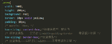
盒模型分类:IE盒模型,和标准盒模型,本质区别:宽高计算方式

水平方向的是主轴(main axis),垂直方向的是交叉轴(cross axis)
标题
<!DOCTYPE html>
<html>
<head>
<meta charset="utf-8">
<title></title>
<style>
.flex-container {
    display: -webkit-flex;
    display: flex;
    -webkit-justify-content: flex-end;
    justify-content: flex-end;
    width: 400px;
    height: 250px;
    background-color: lightgrey;
}

.flex-item {
    background-color: cornflowerblue;
    width: 100px;
    height: 100px;
    margin: 10px;
}
</style>
</head>
<body>

<div class="flex-container">
  <div class="flex-item">flex item 1</div>
  <div class="flex-item">flex item 2</div>
  <div class="flex-item">flex item 3</div>
</div>

</body>
</html>

以下实例演示了 center 的使用:
<!DOCTYPE html>
<html>
<head>
<meta charset="utf-8">
<title></title>
<style>
.flex-container {
    display: -webkit-flex;
    display: flex;
    -webkit-justify-content: center;
    justify-content: center;
    width: 400px;
    height: 250px;
    background-color: lightgrey;
}

.flex-item {
    background-color: cornflowerblue;
    width: 100px;
    height: 100px;
    margin: 10px;
}
</style>
</head>
<body>

<div class="flex-container">
  <div class="flex-item">flex item 1</div>
  <div class="flex-item">flex item 2</div>
  <div class="flex-item">flex item 3</div>
</div>

</body>
</html>

以下实例演示了 space-between 的使用:
<!DOCTYPE html>
<html>
<head>
<meta charset="utf-8">
<title></title>
<style>
.flex-container {
    display: -webkit-flex;
    display: flex;
    -webkit-justify-content: space-between;
    justify-content: space-between;
    width: 400px;
    height: 250px;
    background-color: lightgrey;
}

.flex-item {
    background-color: cornflowerblue;
    width: 100px;
    height: 100px;
    margin: 10px;
}
</style>
</head>
<body>

<div class="flex-container">
  <div class="flex-item">flex item 1</div>
  <div class="flex-item">flex item 2</div>
  <div class="flex-item">flex item 3</div>
</div>

</body>
</html>

以下实例演示了 stretch(默认值) 的使用:
<!DOCTYPE html>
<html>
<head>
<meta charset="utf-8">
<title></title>
<style>
.flex-container {
    display: -webkit-flex;
    display: flex;
    -webkit-align-items: stretch;
    align-items: stretch;
    width: 400px;
    height: 250px;
    background-color: lightgrey;
}

.flex-item {
    background-color: cornflowerblue;
    width: 100px;
    margin: 10px;
}
</style>
</head>
<body>

<div class="flex-container">
  <div class="flex-item">flex item 1</div>
  <div class="flex-item">flex item 2</div>
  <div class="flex-item">flex item 3</div>
</div>

</body>
</html>

以下实例演示了 flex-start 的使用:
<!DOCTYPE html>
<html>
<head>
<meta charset="utf-8">
<title></title>
<style>
.flex-container {
    display: -webkit-flex;
    display: flex;
    -webkit-align-items: flex-start;
    align-items: flex-start;
    width: 400px;
    height: 250px;
    background-color: lightgrey;
}

.flex-item {
    background-color: cornflowerblue;
    width: 100px;
    margin: 10px;
}
</style>
</head>
<body>

<div class="flex-container">
  <div class="flex-item">flex item 1</div>
  <div class="flex-item">flex item 2</div>
  <div class="flex-item">flex item 3</div>
</div>

</body>
</html>

以下实例演示了 flex-end 的使用:
<!DOCTYPE html>
<html>
<head>
<meta charset="utf-8">
<title></title>
<style>
.flex-container {
    display: -webkit-flex;
    display: flex;
    -webkit-align-items: flex-end;
    align-items: flex-end;
    width: 400px;
    height: 250px;
    background-color: lightgrey;
}

.flex-item {
    background-color: cornflowerblue;
    width: 100px;
    margin: 10px;
}
</style>
</head>
<body>

<div class="flex-container">
  <div class="flex-item">flex item 1</div>
  <div class="flex-item">flex item 2</div>
  <div class="flex-item">flex item 3</div>
</div>

</body>
</html>

完美的居中
以下实例将完美解决我们平时碰到的居中问题。
使用弹性盒子,居中变的很简单,只想要设置 margin: auto; 可以使得弹性子元素在两上轴方向上完全居中:
<!DOCTYPE html>
<html>
<head>
<meta charset="utf-8">
<title>W3Cschool教程(w3cschool.cn)</title>
<style>
.flex-container {
    display: -webkit-flex;
    display: flex;
    width: 400px;
    height: 250px;
    background-color: lightgrey;
}

.flex-item {
    background-color: cornflowerblue;
    width: 75px;
    height: 75px;
    margin: auto;
}
</style>
</head>
<body>

<div class="flex-container">
  <div class="flex-item">Perfect centering!</div>
</div>

</body>
</html>


 192
192


 被折叠的 条评论
为什么被折叠?
被折叠的 条评论
为什么被折叠?
 到【灌水乐园】发言


