


前言
在搭建vue之前,我们需要先进行一下准备活动,搭建好环境,安装好某些命令。
一、准备阶段
1.安装node.js
下载地址:http://nodejs.cn/download/
下载并安装好之后,可以打开终端,输入命令查看是否安装成功
node --version

2. 创建JS文件server.js
var http=require("http");

http.createServer(function(request,response){
    response.writeHead(200,{'Content-Type':'text/plain'});

    response.end('Hello World\n');
}).listen(8888);

console.log('Sever running at http://127.0.01:8888/');
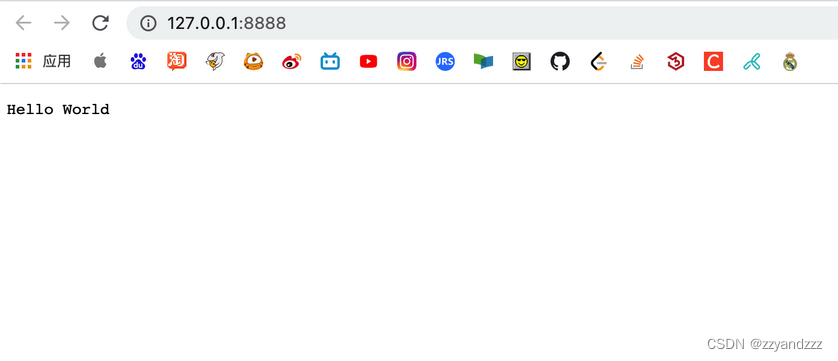
进入server.js的文件目录,运行文件
node server.js点开网址,成功显示
2.yarn
执行命令安装yarn
npm install -g yarn
3.git
git的入门教学:
- https://www.jianshu.com/p/7edb6b838a2e
- https://www.jianshu.com/p/ef1ff4c21452
二、使用步骤
1.搭建vite站
初始化(创建)项目
yarn create vite-app <project-name>
# 或者
npm init vite-app <project-name>
(在此 project-name 为 vue-d3-demo )
进入项目文件夹
cd vue-d3-demo
安装依赖
yarn启动项目
yarn dev
2.Vue+D3可视化
安装D3依赖
yarn add d3
安装Axios
yarn add axios准备数据:
我们在目录public里创建json文件:test.json,在 src/components 文件夹下新建 BarChart.vue 文件
<template>
    <h2>直方图</h2>
    <div id="bar-chart-container">
    <!--定义一个 bar-chart-container 的容器,以供 D3 操作。-->
      <p v-for="(char, i) in alphabet" :key="i">
        <span>{{ char.letter }}</span>
        <span>{{ char.frequency }}</span>
        <!--打印出json数据-->
      </p>
    </div>
</template>

<script>
  import axios from "axios";
  export default {
    /**
     * 在挂载后即开始执行
     */
    mounted() {
      axios.get("./test.json").then((res) => {
        console.log(res.data);
      });
    },
  };
</script>
在 src/App.vue 中加载该组件
<template>
  <img alt="Vue logo" src="./assets/logo.png" />
  <!--HelloWorld msg="Hello Vue 3 + Vite" /-->
  <BarChart />
</template>

<script>
import BarChart from "./components/BarChart.vue";
export default {
  name:"App",
  components:{
    BarChart,
  },
};
// This starter template is using Vue 3 experimental <script setup> SFCs
// Check out https://github.com/vuejs/rfcs/blob/script-setup-2/active-rfcs/0000-script-setup.md
</script>

<style>
#app {
  font-family: Avenir, Helvetica, Arial, sans-serif;
  -webkit-font-smoothing: antialiased;
  -moz-osx-font-smoothing: grayscale;
  text-align: center;
  color: #2c3e50;
  margin-top: 60px;
}
</style>

绘制直方图
此处为D3数据可视化知识
<script>
  export default {
    data() {
      return {
        color: "steelblue",
        margin: { top: 30, right: 0, bottom: 30, left: 40 },
      };
    },

    mounted(){
      ...
    },

    methods: {
      drawBarChart(data) {
        ...
      },
    },
  };
</script>
drawBarChart(data) {
      const margin = this.margin;

      const width = 800;
      const height = 500;

      // 初始化 SVG 元素
      const svg = d3
        .select("#bar-chart-container")
        .append("svg")
        .attr("class", "bar-chart")
        .attr("viewBox", `0 0 ${width} ${height}`)
        .attr("width", width)
        .attr("height", height)
        .append("g");

      // https://observablehq.com/@d3/d3-scaleband
      // x 轴的缩放比例尺
      const x = d3
        .scaleBand()
        .domain(d3.range(data.length))
        .range([margin.left, width - margin.right])
        .padding(0.1);

      // y 轴的缩放比例尺
      const y = d3
        .scaleLinear()
        .domain([0, d3.max(data, (d) => d.value)])
        .nice()
        .range([height - margin.bottom, margin.top]);

      // x 坐标轴
      // tickSizeOuter(0) 移除 0 处初始的标记
      // tickFormat https://github.com/d3/d3-scale/blob/master/README.md#tickFormat
      const xAxis = (g) =>
        g.attr("transform", `translate(0,${height - margin.bottom})`).call(
          d3
            .axisBottom(x)
            .tickFormat((i) => data[i].name)
            .tickSizeOuter(0)
        );

      // y 坐标轴
      const yAxis = (g) =>
        g
          .attr("transform", `translate(${margin.left},0)`)
          .call(d3.axisLeft(y).ticks(null, data.format))
          // 移除区域间的竖线
          .call((g) => g.select(".domain").remove())
          .call((g) =>
            g
              .append("text")
              .attr("x", -margin.left)
              .attr("y", 10)
              .attr("fill", "currentColor")
              .attr("text-anchor", "start")
              .text(data.y)
          );

      svg
        .append("g")
        .attr("fill", this.color)
        .selectAll("rect")
        .data(data)
        .join("rect")
        .attr("x", (d, i) => x(i))
        .attr("y", (d) => y(d.value))
        .attr("height", (d) => y(0) - y(d.value))
        .attr("width", x.bandwidth());

      // 绘制到 SVG
      svg.append("g").call(xAxis);
      svg.append("g").call(yAxis);
    },
<script>
  export default {
    ...,
    methods: {
      /**
       * 格式化数据
       */
      formatData(data) {
        return data
          .map(({ letter, frequency }) => {
            return { name: letter, value: frequency };
          })
          .sort((a, b) => d3.descending(a.value, b.value));
      },
      drawBarChart(data) {...},
    },
  };
</script>
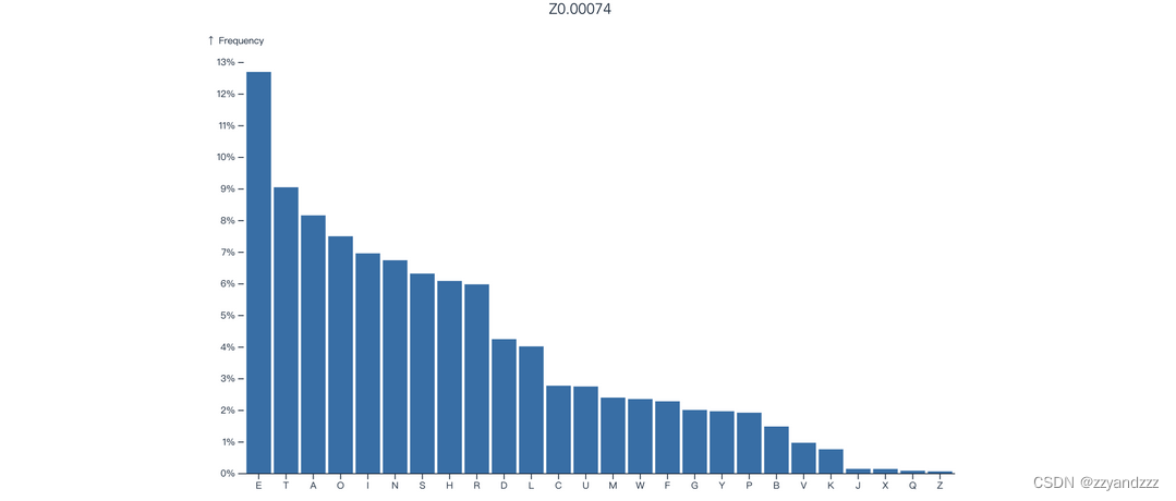
最后在 mounted 中执行我们定义好的各个函数即可看到我们想要的直方图效果
<script>
  export default {
    /**
     * 在挂载后即开始执行
     */
    mounted() {
      axios.get("./alphabet.json").then((res) => {
        const barChartData = Object.assign(this.formatData(res.data), {
          format: "%",
          y: "↑ Frequency",
        });
        this.drawBarChart(barChartData);
      });
    },
  };
</script>
效果

总结
到此,基于Vue和Vite的D3数据可视化入门学习就结束了,初探之后,还有很多知识技术待我们去探索


 1121
1121


 被折叠的 条评论
为什么被折叠?
被折叠的 条评论
为什么被折叠?
 到【灌水乐园】发言


