


1) 安装:
sudo aptitude install gnuplot-x112)画图:
先执行gnuplot,进入交互模式:
$ gnuplot

	G N U P L O T
	Version 4.6 patchlevel 4    last modified 2013-10-02
	Build System: Linux i686

	Copyright (C) 1986-1993, 1998, 2004, 2007-2013
	Thomas Williams, Colin Kelley and many others

	gnuplot home:     http://www.gnuplot.info
	faq, bugs, etc:   type "help FAQ"
	immediate help:   type "help"  (plot window: hit 'h')

Terminal type set to 'wxt'
gnuplot>
gnuplot> set xrange [0:1000]; plot x**(0.5),log(x)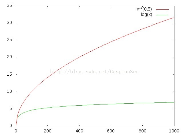
可以把这个图保存为图片文件。 可以是 jpeg, png等格式。
gnuplot> set terminal jpeg
Terminal type set to 'jpeg'
Options are 'nocrop font "/usr/share/fonts/truetype/liberation/LiberationSans-Regular.ttf,12" fontscale 1.0 size 640,480 '
gnuplot> set output 'function.jpg'
gnuplot> replot
3)数据可视化
假如有下面的一组数据:
$ cat test.dat
0.0000 5.5000 0.9322
0.2500 3.5781 0.3983
0.5000 0.0000 0.2844
0.7500 -3.0288 0.2348
1.0000 -3.9409 0.6686
1.2500 -2.5639 0.3601
1.5000 0.0000 0.2369
1.7500 2.1702 0.0262
2.0000 2.8238 0.3629
2.2500 1.8371 0.5087
2.5000 0.0000 0.4358
2.7500 -1.5550 0.366
3.0000 -2.0233 0.2310
3.2500 -1.3163 0.3458
3.5000 0.0000 0.2075
3.7500 1.1142 0.2695
4.0000 1.4498 0.0653
4.2500 0.9432 0.0927
4.5000 0.0000 0.0888
4.7500 -0.7984 0.0975
5.0000 -1.0388 0.1573
5.2500 -0.6758 0.0735
5.5000 0.0000 0.1147
5.7500 0.5721 0.0316
6.0000 0.7443 0.034
可以用gnuplot把数据画出来:
gnuplot> set title 'data visualization'
gnuplot> plot 'test.dat'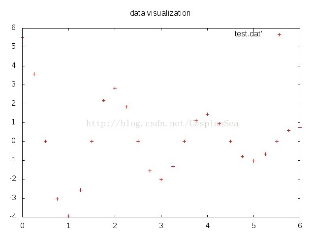
默认只画前两列。可以使用下面的方法把第三列画出来 (把第三列当做误差):
plot 'test.dat' using 1:2:3 with yerrorbars最后,可以使用save命令把执行的命令保存到文件里。以后,只要 执行 load命令,就会执行相应的命令了。
参考:
1. http://www.gnuplot.info/help.html


 502
502


 被折叠的 条评论
为什么被折叠?
被折叠的 条评论
为什么被折叠?
 到【灌水乐园】发言


