


对谷歌Build a Material Design App with the Android Design Support Library的要点记录
Themes and Colors
- Themes
使AppTheme继承自parent="Theme.AppCompat.Light.NoActionBar以移除默认的ActionBar - Colors
- colorPrimaryDark : 状态栏
- colorPrimary: ActionBar
- textColorPrimary: ActionBar文字颜色
- windowBackground
- navigationBarColor: 导航栏(这里是指部分手机最下面包含返回按钮和home按钮的导航栏)
Layout and Animation
在Activity的Layout中添加toolbar
<RelativeLayout xmlns:android="http://schemas.android.com/apk/res/android"
    xmlns:app="http://schemas.android.com/apk/res-auto"
    xmlns:tools="http://schemas.android.com/tools"
    android:layout_width="match_parent"
    android:layout_height="match_parent"
    tools:context=".MainActivity">

    <android.support.v7.widget.Toolbar
        android:id="@+id/toolbar"
        android:layout_width="match_parent"
        android:layout_height="?attr/actionBarSize"
        android:background="?attr/colorPrimary"
        app:layout_scrollFlags="scroll|enterAlways"
        app:popupTheme="@style/ThemeOverlay.AppCompat.Light" />

</RelativeLayout>
接着,在Activity的onCreate方法中,设置toolbar为ActionBar:
        // Adding Toolbar to Main screen
        Toolbar toolbar = (Toolbar) findViewById(R.id.toolbar);
        setSupportActionBar(toolbar);
添加tab栏
- 将默认生成的RelativeLayout换成CoordinatorLayout
添加AppBarLayout并将Toolbar和TabBarLayout依次添加到AppBarLayout中
最后的layout文件如下:<android.support.design.widget.CoordinatorLayout xmlns:android="http://schemas.android.com/apk/res/android" xmlns:app="http://schemas.android.com/apk/res-auto" android:id="@+id/main_content" android:layout_width="match_parent" android:layout_height="match_parent"> <android.support.design.widget.AppBarLayout android:id="@+id/appbar" android:layout_width="match_parent" android:layout_height="wrap_content" android:theme="@style/ThemeOverlay.AppCompat.Dark.ActionBar"> <android.support.v7.widget.Toolbar android:id="@+id/toolbar" android:layout_width="match_parent" android:layout_height="?attr/actionBarSize" android:background="?attr/colorPrimary" app:layout_scrollFlags="scroll|enterAlways" app:popupTheme="@style/ThemeOverlay.AppCompat.Light" /> <android.support.design.widget.TabLayout android:id="@+id/tabs" android:layout_width="match_parent" android:layout_height="wrap_content" /> </android.support.design.widget.AppBarLayout> </android.support.design.widget.CoordinatorLayout>在onCreate方法中添加如下代码:
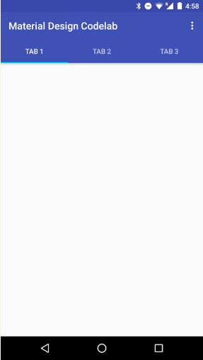
        TabLayout tabs = (TabLayout) findViewById(R.id.tabs);
        tabs.addTab(tabs.newTab().setText("Tab 1"));
        tabs.addTab(tabs.newTab().setText("Tab 2"));
        tabs.addTab(tabs.newTab().setText("Tab 3"));
最后显示效果如下:
添加ViewPager和Fragment
在布局文件中照常添加一个ViewPager,然后创建3个fragment
在onCreate中对TabBarLayout和ViewPager进行绑定:
tabBarLayout.setupWithViewPager(viewPager);
然后设置ViewPager的Adapter,只需比平常多重写一个getPageTitle方法即可,这个方法返回的就是tab的显示文本
最终adapter代码如下:class Adapter extends FragmentPagerAdapter { private final List<Fragment> mFragmentList = new ArrayList<>(); private final List<String> mFragmentTitleList = new ArrayList<>(); public Adapter(FragmentManager manager) { super(manager); } @Override public Fragment getItem(int position) { return mFragmentList.get(position); } @Override public int getCount() { return mFragmentList.size(); } public void addFragment(Fragment fragment, String title) { mFragmentList.add(fragment); mFragmentTitleList.add(title); } @Override public CharSequence getPageTitle(int position) { return mFragmentTitleList.get(position); } }为每个RecyclerView各自创建一个item的布局文件,并进行配置(这里略过)
为View设置样式并添加RecyclerView
首先,在build.gradle中导入依赖:
dependencies {
    compile 'com.android.support:appcompat-v7:23.4.0'
    compile 'com.android.support:design:23.4.0'
    compile 'com.android.support:cardview-v7:23.4.0'
    compile 'com.android.support:recyclerview-v7:23.4.0'
}
创建recycler_view.xml文件
<android.support.v7.widget.RecyclerView xmlns:android="http://schemas.android.com/apk/res/android"
    xmlns:app="http://schemas.android.com/apk/res-auto"
    android:id="@+id/my_recycler_view"
    android:layout_width="match_parent"
    android:layout_height="match_parent"
    android:clipToPadding="false"
    android:paddingBottom="@dimen/md_keylines"
    android:paddingTop="@dimen/md_keylines"
    android:scrollbars="vertical"
    app:layout_behavior="@string/appbar_scrolling_view_behavior" />
为RecyclerView创建Adapter
public static class ContentAdapter extends RecyclerView.Adapter<ViewHolder> {
// Set numbers of List in RecyclerView.
private static final int LENGTH = 18;

public ContentAdapter() {
}

@Override
public ViewHolder onCreateViewHolder(ViewGroup parent, int viewType) {
    return new ViewHolder(LayoutInflater.from(parent.getContext()), parent);
}

@Override
public void onBindViewHolder(ViewHolder holder, int position) {
    // no-op
}

@Override
public int getItemCount() {
    return LENGTH;
}

static class ViewHolder extends RecyclerView.ViewHolder {
    public ViewHolder(LayoutInflater inflater, ViewGroup parent) {
        super(inflater.inflate(R.layout.item_tile, parent, false));
    }
}
}
在onCreate方法中配置RecyclerView:
RecyclerView recyclerView = (RecyclerView) inflater.inflate(
                R.layout.recycler_view, container, false);
ContentAdapter adapter = new ContentAdapter();
recyclerView.setAdapter(adapter);
recyclerView.setLayoutManager(new GridLayoutManager(getActivity(), 2));
在其中一个RecycleView的item layout中,将layout布局使用CardView包裹
为图像使用Vector
Material Design Principles covered:
Responsive UI
即Material Design的原则之一:响应式用户界面
学习使用VectorDrawable
基本配置:在build.gralde中:
  // Gradle Plugin 2.0+
 android {
   defaultConfig {
     vectorDrawables.useSupportLibrary = true
    }
 }
导入资源:选择Drawable目录,按下Ctrl + Enter键,选择New->Vector Asset
使用资源:在xml文件中,使用app:srcCompat来代替ImageView的src属性:
<ImageButton
    android:id="@+id/share_button"
    android:layout_width="@dimen/cards_button_width"
    android:layout_height="@dimen/cards_button_height"
    android:layout_marginRight="@dimen/md_keylines"
    app:srcCompat="@drawable/ic_share"
    android:layout_below="@+id/card_text"
    android:layout_alignParentRight="true"
    style="?android:attr/borderlessButtonStyle"
    android:tint="@color/button_grey" />
添加侧边栏NavigationDrawer
Material Design Principles covered:
Tangible Surfaces
Bold Elements
在menu目录创建菜单文件menu_navigation.xml
<menu xmlns:android="http://schemas.android.com/apk/res/android">
<group android:checkableBehavior="single">
   <item
       android:icon="@drawable/ic_home_black_24dp"
       android:tint="@color/button_grey"
       android:title="One" />
   <item
       android:icon="@drawable/ic_favorite_black_24dp"
       android:tint="@color/button_grey"
       android:title="Two" />0
   <item
       android:icon="@drawable/ic_bookmark_border_black_24dp"
       android:tint="@color/button_grey"
       android:title="Three" />
</group>
</menu>
创建header的布局文件
<LinearLayout xmlns:android="http://schemas.android.com/apk/res/android" android:layout_width="match_parent" android:layout_height="@dimen/navheader_height" android:background="?attr/colorPrimaryDark" android:orientation="vertical" android:padding="@dimen/md_keylines"> </LinearLayout>- 用DrawerLayout包裹MainActivity的整个布局
在CoordinatorLayout之外添加一个NavigationView
<android.support.design.widget.NavigationView
        android:id="@+id/nav_view"
        android:layout_width="wrap_content"
        android:layout_height="match_parent"
        android:layout_gravity="start"
        android:fitsSystemWindows="true"
        app:headerLayout="@layout/navheader"
        app:menu="@menu/menu_navigation" />
Activity中配置:
基本配置
// Adding menu icon to Toolbar
ActionBar supportActionBar = getSupportActionBar();
if (supportActionBar != null) {
    supportActionBar.setHomeAsUpIndicator(R.drawable.ic_menu_white_24dp);
    supportActionBar.setDisplayHomeAsUpEnabled(true);
}

// Set behavior of Navigation drawer
navigationView.setNavigationItemSelectedListener(
    new NavigationView.OnNavigationItemSelectedListener() {
        // This method will trigger on item Click of navigation menu
        @Override
        public boolean onNavigationItemSelected(MenuItem menuItem) {
            // Set item in checked state
            menuItem.setChecked(true);
            // TODO: handle navigation
            // Closing drawer on item click
            mDrawerLayout.closeDrawers();
            return true;
        }
    });
配置打开关闭
@Override
public boolean onOptionsItemSelected(MenuItem item) {
    if (item.getItemId() == android.R.id.home) {
    mDrawerLayout.openDrawer(GravityCompat.START);
    }
    return super.onOptionsItemSelected(item);
}
添加FloatingActionButton
在布局文件中的CoordinatorLayout的最后添加FloatingActionButtonstyle文件
配置style使得状态栏透明(android 5.0以上)<style name="AppTheme" parent="AppTheme.Base"> <item name="android:windowDrawsSystemBarBackgrounds">true</item> <item name="android:statusBarColor">@android:color/transparent</item> </style>动画:自定义动画需要继承自
CoordinatorLayout.Behavior使用CollapsingToolbarLayout 实现可伸缩的头部
<android.support.design.widget.AppBarLayout
android:id="@+id/appbar"
android:layout_width="match_parent"
android:layout_height="@dimen/app_bar_height"
android:fitsSystemWindows="true"
android:theme="@style/ThemeOverlay.AppCompat.Dark.ActionBar">

<android.support.design.widget.CollapsingToolbarLayout
    android:id="@+id/collapsing_toolbar"
    android:layout_width="match_parent"
    android:layout_height="match_parent"
    android:fitsSystemWindows="true"
    android:theme="@style/ThemeOverlay.AppCompat.Dark"
    app:contentScrim="?attr/colorPrimary"
    app:expandedTitleMarginEnd="@dimen/article_keylines"
    app:expandedTitleMarginStart="@dimen/md_keylines"
    app:layout_scrollFlags="scroll|exitUntilCollapsed">

    <ImageView
        android:id="@+id/image"
        android:layout_width="match_parent"
        android:layout_height="match_parent"
        android:background="@drawable/paris"
        android:fitsSystemWindows="true"
        android:scaleType="centerCrop"
        app:layout_collapseMode="parallax" />

    <android.support.v7.widget.Toolbar
        android:id="@+id/toolbar"
        android:layout_width="match_parent"
        android:layout_height="?attr/actionBarSize"
        app:layout_collapseMode="pin"
        app:popupTheme="@style/ThemeOverlay.AppCompat.Light" />

</android.support.design.widget.CollapsingToolbarLayout>
</android.support.design.widget.AppBarLayout>
设置详情标题:
// Set title of Detail page
collapsingToolbar.setTitle(getString(R.string.item_title));


 扫一扫
扫一扫
 2996
2996

 被折叠的 条评论
为什么被折叠?
被折叠的 条评论
为什么被折叠?
 到【灌水乐园】发言


