原文地址:http://blog.csdn.net/u013634684/article/details/49646311
http://blog.csdn.net/abcjennifer/article/details/19848269
http://blog.csdn.net/dataningwei/article/details/53619534
最近开始学习Python编程,遇到scatter函数,感觉里面的参数不知道什么意思于是查资料,最后总结如下:
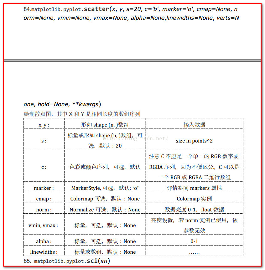
1、scatter函数原型
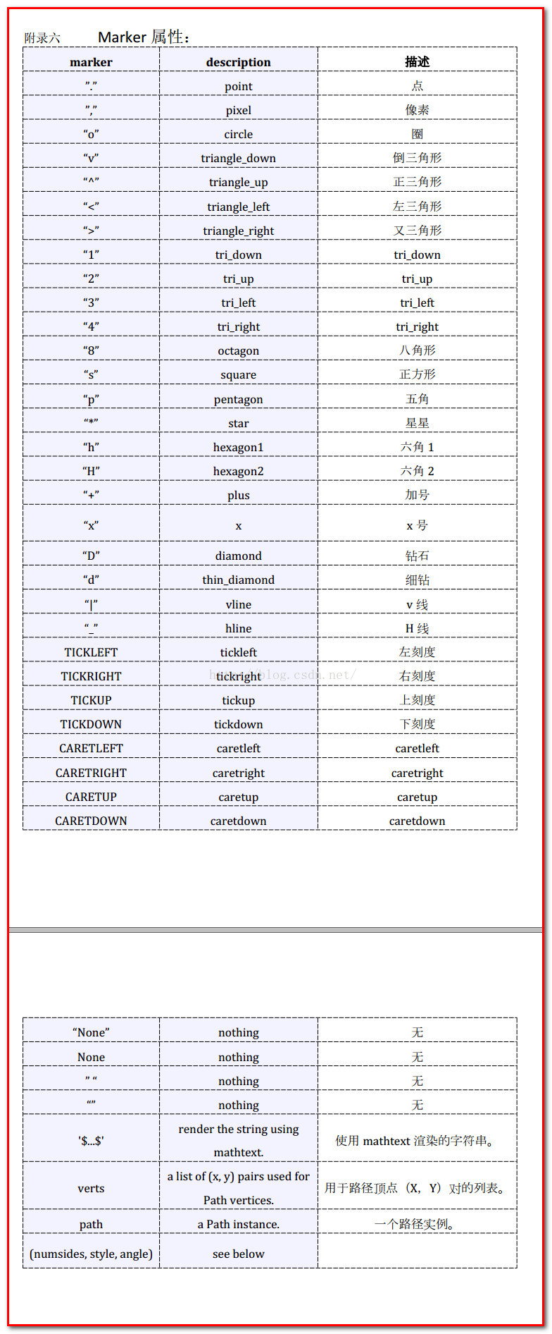
2、其中散点的形状参数marker如下:
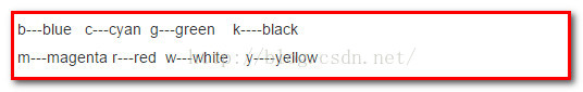
3、其中颜色参数c如下:
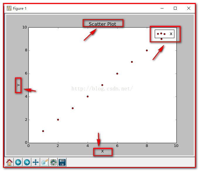
4、基本的使用方法如下:
-
- import numpy as np
- import matplotlib.pyplot as plt
-
- x = np.arange(1,10)
- y = x
- fig = plt.figure()
- ax1 = fig.add_subplot(111)
-
- ax1.set_title('Scatter Plot')
-
- plt.xlabel('X')
-
- plt.ylabel('Y')
-
- ax1.scatter(x,y,c = 'r',marker = 'o')
-
- plt.legend('x1')
-
- plt.show()
结果如下:
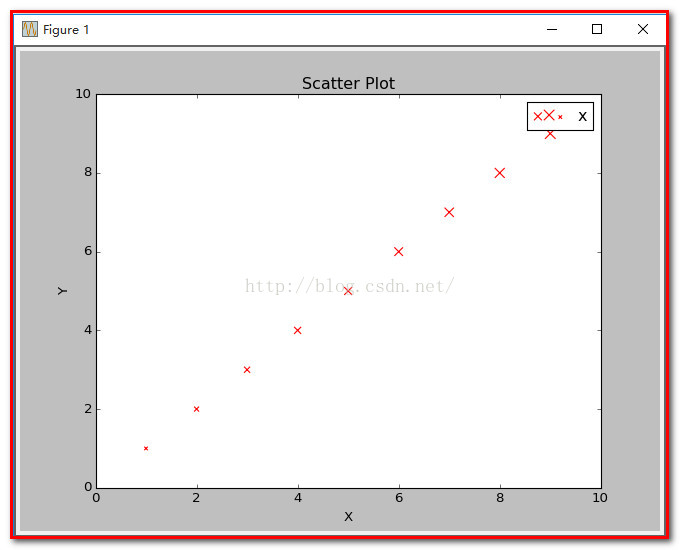
5、当scatter后面参数中数组的使用方法,如s,当s是同x大小的数组,表示x中的每个点对应s中一个大小,其他如c,等用法一样,如下:
(1)、不同大小
-
- import numpy as np
- import matplotlib.pyplot as plt
-
- x = np.arange(1,10)
- y = x
- fig = plt.figure()
- ax1 = fig.add_subplot(111)
-
- ax1.set_title('Scatter Plot')
-
- plt.xlabel('X')
-
- plt.ylabel('Y')
-
- sValue = x*10
- ax1.scatter(x,y,s=sValue,c='r',marker='x')
-
- plt.legend('x1')
-
- plt.show()
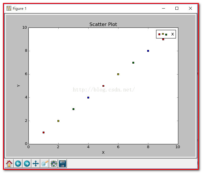
(2)、不同颜色
-
- import numpy as np
- import matplotlib.pyplot as plt
-
- x = np.arange(1,10)
- y = x
- fig = plt.figure()
- ax1 = fig.add_subplot(111)
-
- ax1.set_title('Scatter Plot')
-
- plt.xlabel('X')
-
- plt.ylabel('Y')
-
- cValue = ['r','y','g','b','r','y','g','b','r']
- ax1.scatter(x,y,c=cValue,marker='s')
-
- plt.legend('x1')
-
- plt.show()
结果:
(3)、线宽linewidths
-
- import numpy as np
- import matplotlib.pyplot as plt
-
- x = np.arange(1,10)
- y = x
- fig = plt.figure()
- ax1 = fig.add_subplot(111)
-
- ax1.set_title('Scatter Plot')
-
- plt.xlabel('X')
-
- plt.ylabel('Y')
-
- lValue = x
- ax1.scatter(x,y,c='r',s= 100,linewidths=lValue,marker='o')
-
- plt.legend('x1')
-
- plt.show()
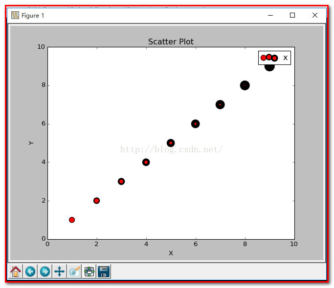
注: 这就是scatter基本的用法。
Python 中常用画图工具matplotlib.pyplot工具使用实验。
代码:
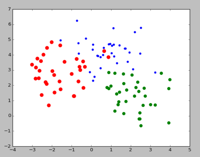
- from sklearn.datasets.samples_generator import make_blobs
- import matplotlib.pyplot as plt
-
- X, y = make_blobs(n_samples=100, centers=3, n_features=2,random_state=0)
- y=y+1;
-
-
- plt.figure(1)
- ax=plt.subplot(121)
- plt.scatter(X[:,0],X[:,1])
- ax.set_title('No lable')
- ax=plt.subplot(122)
- plt.scatter(X[:,0],X[:,1],y*30,y*30)
- ax.set_title('Have lable')
-
-
- plt.figure(2)
- ax=plt.subplot(111)
- id=(y==1)
- plt.scatter(X[id,0],X[id,1],s=20,color='b')
- id=(y==2)
- plt.scatter(X[id,0],X[id,1],s=50,color='r')
- id=(y==3)
- plt.scatter(X[id,0],X[id,1],s=70,color='g')
- plt.show()
显示结果:
fiugre1
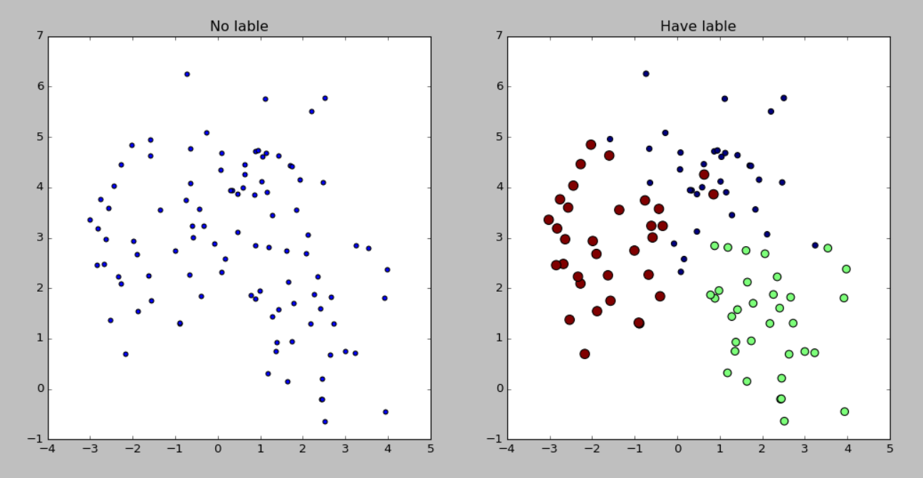
figure2
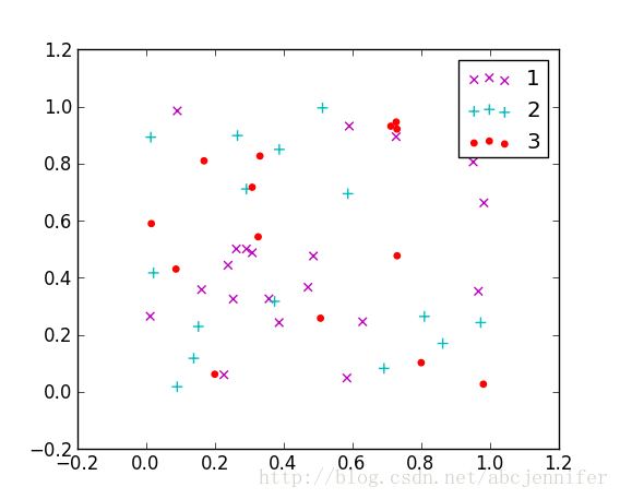
用matplotlib的scatter绘制散点图,legend和matlab中稍有不同,详见代码。
- x = rand(50,30)
- from numpy import *
- import matplotlib
- import matplotlib.pyplot as plt
-
-
- f1 = plt.figure(1)
- plt.subplot(211)
- plt.scatter(x[:,1],x[:,0])
-
-
- plt.subplot(212)
- label = list(ones(20))+list(2*ones(15))+list(3*ones(15))
- label = array(label)
- plt.scatter(x[:,1],x[:,0],15.0*label,15.0*label)
-
-
- f2 = plt.figure(2)
- idx_1 = find(label==1)
- p1 = plt.scatter(x[idx_1,1], x[idx_1,0], marker = 'x', color = 'm', label='1', s = 30)
- idx_2 = find(label==2)
- p2 = plt.scatter(x[idx_2,1], x[idx_2,0], marker = '+', color = 'c', label='2', s = 50)
- idx_3 = find(label==3)
- p3 = plt.scatter(x[idx_3,1], x[idx_3,0], marker = 'o', color = 'r', label='3', s = 15)
- plt.legend(loc = 'upper right')
result:
figure(1):
figure(2):
基本散列点绘制
from matplotlib import pyplot as plt
import numpy as np

# Generating a Gaussion dataset:
# creating random vectors from the multivariate normal distribution
# given mean and covariance
mu_vec1 = np.array([0,0])
cov_mat1 = np.array([[2,0],[0,2]])

x1_samples = np.random.multivariate_normal(mu_vec1, cov_mat1, 100)
x2_samples = np.random.multivariate_normal(mu_vec1+0.2, cov_mat1+0.2, 100)
x3_samples = np.random.multivariate_normal(mu_vec1+0.4, cov_mat1+0.4, 100)

# x1_samples.shape -> (100, 2), 100 rows, 2 columns

plt.figure(figsize=(8,6))

plt.scatter(x1_samples[:,0], x1_samples[:,1], marker='x',
            color='blue', alpha=0.7, label='x1 samples')
plt.scatter(x2_samples[:,0], x1_samples[:,1], marker='o',
            color='green', alpha=0.7, label='x2 samples')
plt.scatter(x3_samples[:,0], x1_samples[:,1], marker='^',
            color='red', alpha=0.7, label='x3 samples')
plt.title('Basic scatter plot')
plt.ylabel('variable X')
plt.xlabel('Variable Y')
plt.legend(loc='upper right')

plt.show()

带标签
import matplotlib.pyplot as plt

x_coords = [0.13, 0.22, 0.39, 0.59, 0.68, 0.74, 0.93]
y_coords = [0.75, 0.34, 0.44, 0.52, 0.80, 0.25, 0.55]

fig = plt.figure(figsize=(8,5))
plt.scatter(x_coords, y_coords, marker='s', s=50)

for x, y in zip(x_coords, y_coords):
    plt.annotate(
        '(%s, %s)' %(x, y),
        xy=(x, y),
        xytext=(0, -10),
        textcoords='offset points',
        ha='center',
        va='top')

plt.xlim([0,1])
plt.ylim([0,1])
plt.show()


 747
747


 被折叠的 条评论
为什么被折叠?
被折叠的 条评论
为什么被折叠?
 到【灌水乐园】发言


