


css负边距的奇技淫巧
前言:再来看看 CSS Box Model
在static元素中使用负边距
下面的图片已经说得很明白了,我们直接看代码。。。

<!doctype html>
    <html>
    <head>
        <meta charset="UTF-8">
        <title>static-margin</title>
        <style style="text/css">
            body{
                margin: 50px 0 0;
                padding: 0;
            }
            .margin-demo{
                width: 200px;
                height: 200px;
                margin: 0 auto;
            }
            div:first-child{
                background-color: yellow;
            }
            .second{
                background-color: #3f9;
                margin-top: -100px;
                color: #fff;
            }
            .third{
                background-color: yellow;
                margin-bottom: -100px;
                color: red;
            }
            .fifth{
                background-color: #3f9;
                color: #fff;
            }
        </style>
    </head>
    <body>
        <div class="margin-demo"></div>
        <div class="margin-demo second"><pre>.second{
  background-color: #3f9;
  margin-top: -100px;
  color: #fff;
}</pre></div>
        <hr />
        <div class="margin-demo third"><pre>.second{
  background-color: #3f9;
  margin-bottom: -100px;
  color: red;
}</pre></div>
        <div class="margin-demo fifth"></div>
    </body>
    </html>
在firebug下
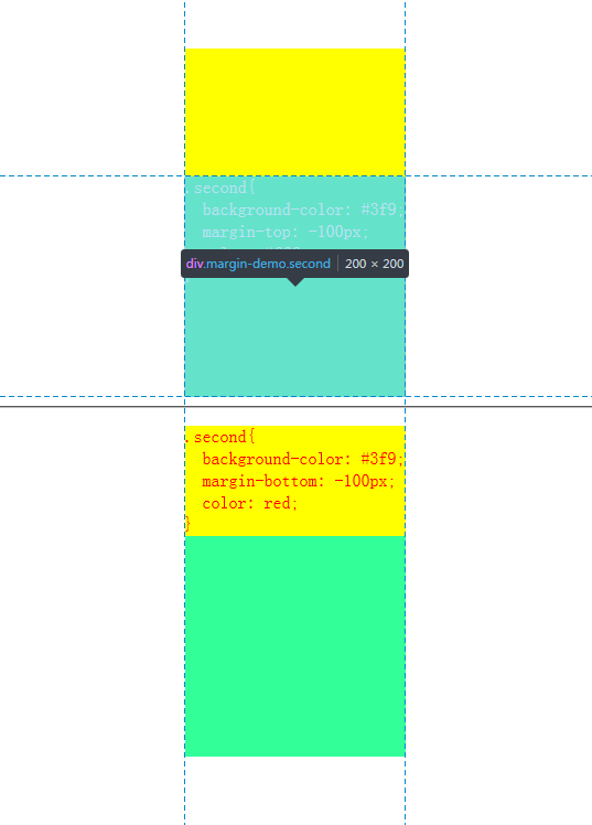
原文准确的解释是这样的;非常符合firebug下的结果,仅仅移动
/* Moves the element 10px upwards */
.second{ margin-top: -100px; }
/*
* All elements succeeding .third move up by
* 100px, while .third doesn’t even move an inch.
*/
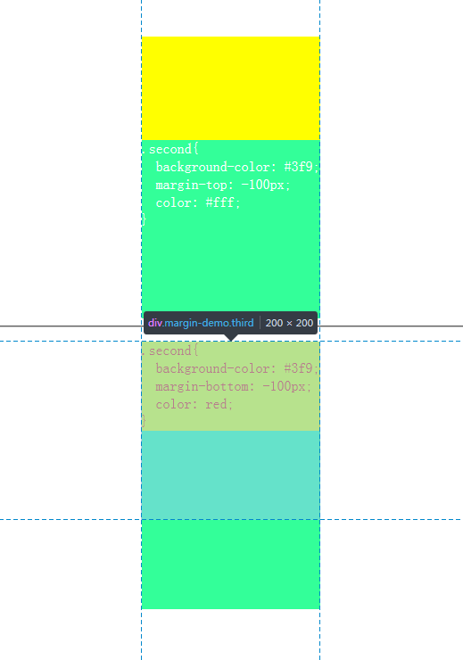
.third{ margin-bottom:-100px; }在chrome控制台下
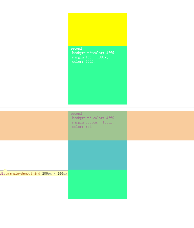
chrome控制台下的结果确实这样的,我们难道不应该理解为他们不仅只是移动吗?确实让人匪夷所思,至于造成这个差异的原因,大家猜猜都知道了,firefox和chrome的内核是不一样的,再试就研究到这里吧,再往下去确实更难研究,那也不是在我现在所能研究的范围之内,什么时候有这个水平了再继续研究吧!
If no width is applied, adding Negative Margins to its left/right pulls the element in both directions increasing its width. It’s here that the margin acts like a padding.
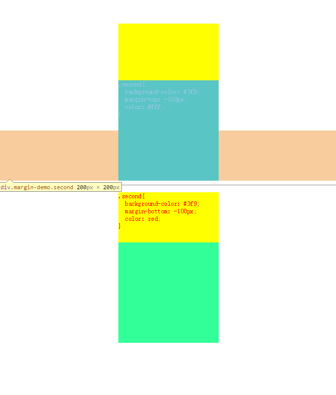
至于原文的这段话,我也是百思不得姐,实验也没有结果,不知道真是情况又是怎么一回事呢?原文是July 27th, 2009写的,是前端变化的太快了,已经不能体现出来,还是理解有问题,欢迎大家留言交流!
从内容来看firebug下的更正常,因为内容并没有受影响,这样看来仅仅是移动更正确!
在float元素中使用负边距
1、
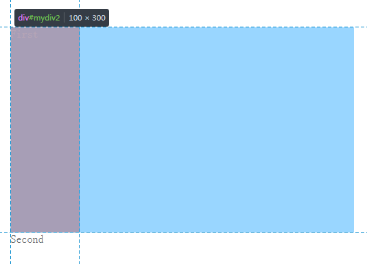
下面截取了原文的一段,我完全不知道原文作者是什么意思:
If a negative margin is applied opposite a float, it creates a void leading to the overlapping of content. This is great for liquid layouts where one column has a width of 100% while the other has a definite width, like 100px.
/* A negative margin is applied opposite the float */
<div id="mydiv1">First</div>
<div id="mydiv2">Second</div>
#mydiv1 {float: left; margin-right: -100px;}下面是我的小demo,可是跟原文作者的说法出入比较大!
<!doctype html>
    <html>
    <head>
        <meta charset="UTF-8">
        <title>float-margin1</title>
        <style style="text/css">
            body{
                margin: 50px auto;
                padding: 0;
                width: 500px;
            }
            /* A negative margin is applied opposite the float */
            #mydiv1 {
                float:left;
                background-color: #09f;
                opacity: 0.4;
                margin-right: -100px;
                width: 100%;
                height: 300px;
                color: #fff;
            }
            #mydiv2{
                background-color: #39f;
                opacity: 0.6;
                width: 100px;
                height: 300px;
                color: #000;
            }
            #mydiv2{
                background-color: red;
            }
        </style>
    </head>
    <body>
        <div id="mydiv1">First</div>
        <div id="mydiv2">Second</div>
    </body>
    </html>
贴上demo截图:
2、
<!doctype html>
    <html>
    <head>
        <meta charset="UTF-8">
        <title>float-margin2</title>
        <style style="text/css">
            body{
                margin: 50px auto;
                padding: 0;
                width: 500px;
            }
            .demo-box{
                width: 300px;
                height: 100px;
                background-color: #000;
                opacity: 0.5;
            }
            .demo-box1{
                width: 300px;
                height: 100px;
                background-color: #000;
                opacity: 0.5;
            }
            .float-margin{
                float: left;
                width: 100px;
                height: 100px;
            }

            .demo-box div:first-child{
                margin-left: -20px;
                background-color: #09f;
            }
            .demo-box .second{
                margin-left: -20px;
                background-color: #3f9;
            }
            .demo-box div:last-child{
                margin-left: -20px;
                background-color: red;
            }

            .demo-box1 div:first-child{
                margin-right: -20px;
                background-color: #09f;
            }
            .demo-box1 .second{
                margin-right: -20px;
                background-color: #3f9;
            }
            .demo-box1 div:last-child{
                margin-right: -20px;
                background-color: red;
            }
        </style>
    </head>
    <body>
        <div class="demo-box">
            <div class="float-margin">
                hello world!
                hello world!
                hello world!
                hello world!
                hello world!
                hello world!
            </div>
            <div class="float-margin second">
                hello world!
                hello world!
                hello world!
                hello world!
                hello world!
                hello world!
            </div>
            <div class="float-margin">
                hello!
                hello!
                hello!
                hello!
                hello!
                hello!
            </div>
        </div>
        <hr />
        <div class="demo-box1">
            <div class="float-margin">
                hello world!
                hello world!
                hello world!
                hello world!
                hello world!
                hello world!
            </div>
            <div class="float-margin second">
                hello world!
                hello world!
                hello world!
                hello world!
                hello world!
                hello world!
            </div>
            <div class="float-margin">
                hello!
                hello!
                hello!
                hello!
                hello!
                hello!
            </div>
        </div>
    </body>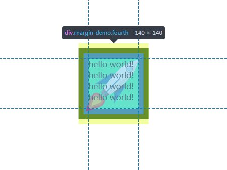
</html>如果元素同时向左浮动,并且设置负的左外边距,那么这些元素统一左移相应的值,内容会向右移相应的值(相对运动,这时的负外边距对文本来说相当于正内边距),从css的3d盒子模型来看,那就不仅仅是元素的移动了,还影响到了内容。。。(如图分割线以上)
如果元素同时向左浮动,并且设置负的右外边距,那么这些元素统一左移相应的值(除了第一个元素),并且覆盖左面元素在该位置的的值。。。从css的3d盒子模型来看,那么便仅仅是移动(如图分割线以下)
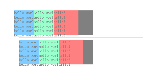
如果你觉得不知所云(其实我觉得我说的也不是太清楚),请复制代码到你喜欢的编辑器并运行它!
常用的几个实例
一列变成多列
<!doctype html>
    <html>
    <head>
        <meta charset="UTF-8">
        <title>float-margin1</title>
        <style style="text/css">
            body{
                margin: 100px auto;
                padding: 0;
                width: 500px;
            }
            ul {list-style:none;}
            li {line-height:1.3em;}
            .col2 {margin-left:100px;}
            .col3 {margin-left:200px;}
            .top {margin-top:-2.6em;} /* the clincher */
        </style>
    </head>
    <body>
        <ul>
            <li class="col1">Eggs</li>
            <li class="col1">Ham</li>
            <li class="col2 top">Bread</li>
            <li class="col2">Butter</li>
            <li class="col3 top">Flour</li>
            <li class="col3">Cream</li>
        </ul>
    </body>
    </html>
原理如下图:

三列等高布局
<!doctype html>
    <html>
    <head>
        <meta charset="UTF-8">
        <title>float-margin1</title>
        <style style="text/css">
            .container{
                margin: 50px auto 0;
                width: 1000px;
                overflow: hidden;
            }
            .left,
            .center,
            .right{
                float: left;
                margin-bottom: -10000px;
                padding-bottom: 10000px;
                width: 33.333%;
            }
            .left{
                background-color: #00ffba;
            }
            .center{
                background-color: #edff66;
            }
            .right{
                background-color: #c9f;
            }
            .footer{
                margin: 0 auto;
                background-color: #ccc;
                width: 1000px;
                height: 100px;
            }
        </style>
    </head>
    <body>
        <div class="container">
            <div class="left">
                hello world!<br />
                hello world!<br />
                hello world!<br />
                hello world!<br />
                hello world!<br />
                hello world!<br />
            </div>
            <div class="center">
               hello world!<br />
               hello world!<br />
               hello world!<br />
            </div>
            <div class="right">
                hello world!<br />
                hello world!<br />
                hello world!<br />
                hello world!<br />
                hello world!<br />
                hello world!<br />
                hello world!<br />
                hello world!<br />
                hello world!<br />
            </div>
        </div>
        <div class="footer"></div>
    </body>
    </html>
巧妙地运用了负的margin-bottom会让下面的元素向上移这一特性,完成了三列等高布局,当然也离不开float和overflow的作用。。。
感谢参考博文作者!
结束语:
今天不想跑,所以才去跑,这才是长跑者的思维方式!


 扫一扫
扫一扫
 2340
2340

 被折叠的 条评论
为什么被折叠?
被折叠的 条评论
为什么被折叠?
 到【灌水乐园】发言


