


本文为博主原创文章,转载请注明出处:http://blog.csdn.net/czd3355/article/details/52691067
一、ShapeDrawable的属性汇总
<shape
    xmlns:android="http://schemas.android.com/apk/res/android"
    android:shape=["rectangle" | "oval" | "line" | "ring"] >
    <corners
        android:radius="integer"
        android:topLeftRadius="integer"
        android:topRightRadius="integer"
        android:bottomLeftRadius="integer"
        android:bottomRightRadius="integer" />
    <gradient
        android:angle="integer"
        android:centerX="integer"
        android:centerY="integer"
        android:centerColor="integer"
        android:endColor="color"
        android:gradientRadius="integer"
        android:startColor="color"
        android:type=["linear" | "radial" | "sweep"]
        android:useLevel=["true" | "false"] />
    <padding
        android:left="integer"
        android:top="integer"
        android:right="integer"
        android:bottom="integer" />
    <size
        android:width="integer"
        android:height="integer" />
    <solid
        android:color="color" />
    <stroke
        android:width="integer"
        android:color="color"
        android:dashWidth="integer"
        android:dashGap="integer" />
</shape>
二、ShapeDrawable的属性分类介绍
android: shape
有4个选项,rectangle(矩形)oval(椭圆)line(横线)ring(圆环),默认为rectangle,需要注意line和ring需要通过标签来指定线的宽度和颜色等信息,否则无法达到预期效果
针对ring这个形状有5个特殊属性
| Value | Desciption |
|---|---|
| android:innerRadius | 圆环的内半径,和android:innerRadiusRatio同时存在时,以android:innerRadius为准 |
| android:thickness | 圆环厚度,即外半径减去内半径的大小,和android:thicknessRatio同时存在时,以android:thickness |
| android:innerRadiusRatio | 内半径占整个Drawable宽度的比例,默认为9,如果为n,那么内半径 = 宽度/n |
| android:thicknessRatio | 厚度占整个Drawable宽度的比例,默认为3,如果为n,那么厚度 = 宽度/n |
| android:useLevel | 一般都应该使用false,否则有可能无法达到预期的显示效果,除非它被当作LevelListDrawable来使用 |
- < stroke>
- Shape的描边有如下几个属性:
- android:color——描边的颜色
- android:width——描边的宽度,越大则shape的边缘线越粗
- android:dashWidth——组成虚线的线段的宽度
- android:dashGap——组成虚线的线段之间的间隔
需要注意:如果android:dashWidth和ndroid:dashGap有任何一个为0,那么虚线效果将不能生效
< corners>
它只适用于矩形shape,表示矩形四个角的圆角程度,用px来表示,它有5个属性:
- android:radius—— 给四个角设置相同的角度,优先级较低,会被其他四个属性覆盖
- android:bottomLeftRadius——设定左下角的角度
- android:bottomRightRadius——设定右下角的角度
- android:TopLeftRadius——设定左上角的角度
- android:TopRightRadius——设定右上角的角度
< solid>
表示纯色填充,通过android:color即可指定shape中填充的颜色
< gradient>
它与标签是相互排斥的,其中solid表示纯色填充,而gradient表示渐变效果。它有如下几个属性:
android:centerX——渐变的中心点横坐标
android:centerY——渐变的中心点纵坐标
android: startColor——渐变的起始颜色
android:centerColor——渐变的中间颜色
android:endColor——渐变的结束颜色
android:gradientRadiu——渐变半径,仅当android:type=”radial”时有效
android:useLevel——一般为false,当Drawable作为StateListDrawable使用时为false
android:type——渐变的类别,有linear(线性渐变)、radial(径向渐变)、sweep(扫描线渐变)三种,默认值为linear
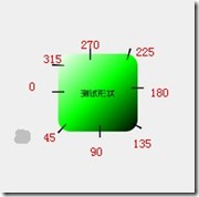
android:angle——渐变的角度,默认为0,其值必须是45的倍数,0表示从左到右,90表示从下到上。具体对应的位置如下图所示
- < padding>
表示内边距,即包含它的View的空白。有如下四个属性:
- android:left
- android:top
- android:right
android:bottom
- < size>
指shape的大小,一般不会用到。
三、效果图和核心代码展示:
xml代码如下:
<shape>
    <solid android:color="#006ac7"/>
    <corners android:radius="8dp"/>
</shape>


 扫一扫
扫一扫

 被折叠的 条评论
为什么被折叠?
被折叠的 条评论
为什么被折叠?
 到【灌水乐园】发言


