


QT的CSS样式表单是相当强大,跟网页设计的差不多,语法规范也大同小异。可以通过设置每个控件的样式,每个控件在不同状态下的样式,复合控件在不同环境下的样式。
QPushButton可以设置的选项有border,包含border-width、border-color、border-radius等。还可以设置QPushButton的前景和背景色。以及字体的样式和大小。
对于颜色,QT的样式表单还支持线性渐变和光圈渐变
UI源码,将如下文件保存为*.ui即可
<?xml version="1.0" encoding="UTF-8"?>
<ui version="4.0">
 <class>testui</class>
 <widget class="QWidget" name="testui">
  <property name="geometry">
   <rect>
    <x>0</x>
    <y>0</y>
    <width>712</width>
    <height>428</height>
   </rect>
  </property>
  <property name="windowTitle">
   <string>testui</string>
  </property>
  <property name="autoFillBackground">
   <bool>false</bool>
  </property>
  <property name="styleSheet">
   <string notr="true">/*default button style sheet*/
QPushButton:default{
background-color:rgba(125,200,0,200);
border-style:none;
}

QPushButton:default:hover{
background-color:rgba(0,0,125,255);
}

/*flat button style sheet*/
/*flat QPushButton :
default style is not work*/
QPushButton:flat{
background-color:yellow;
border-width:3px;
border-color:blue;
border-style:solid;
/*border的样式直接影响是否应该绘制边界,border样式必须要设置*/
}

/*most styles will not paint the button background unless the button is being pressed*/

QPushButton:flat:hover{
background-color:red;
	background-color: qlineargradient(spread:pad, x1:0, y1:0, x2:1, y2:0, stop:0 rgba(255, 0, 0, 255), stop:0.166 rgba(255, 255, 0, 255), stop:0.333 rgba(0, 255, 0, 255), stop:0.5 rgba(0, 255, 255, 255), stop:0.666 rgba(0, 0, 255, 255), stop:0.833 rgba(255, 0, 255, 255), stop:1 rgba(255, 0, 0, 255));
}</string>
  </property>
  <widget class="QPushButton" name="pushButton">
   <property name="geometry">
    <rect>
     <x>30</x>
     <y>30</y>
     <width>121</width>
     <height>41</height>
    </rect>
   </property>
   <property name="styleSheet">
    <string notr="true">QPushButton {
    border: 2px solid #8f8f91;
    border-radius: 6px;
    background-color: qlineargradient(x1: 0, y1: 0, x2: 0, y2: 1,
                                      stop: 0 #f6f7fa, stop: 1 #dadbde);
    min-width: 80px;
}

QPushButton:pressed {
    background-color: qlineargradient(x1: 0, y1: 0, x2: 0, y2: 1,
                                      stop: 0 #dadbde, stop: 1 #f6f7fa);
}

QPushButton:flat {
    border: none; /* no border for a flat push button */
}

QPushButton:default {
    border-color: navy; /* make the default button prominent */
}</string>
   </property>
   <property name="text">
    <string>PushButton</string>
   </property>
  </widget>
  <widget class="QPushButton" name="pushButton_2">
   <property name="geometry">
    <rect>
     <x>30</x>
     <y>100</y>
     <width>121</width>
     <height>41</height>
    </rect>
   </property>
   <property name="styleSheet">
    <string notr="true">QPushButton{
font: 75 12pt "微软雅黑";
border-width:2px;
border-color:blue;
background-color:yellow;
border-style: solid;
}

QPushButton:pressed{
background-color:rgb(0,0,125);
}

/*QPushButton:hover{
background-color:green;
}*/

</string>
   </property>
   <property name="text">
    <string>PushButton</string>
   </property>
  </widget>
  <widget class="QPushButton" name="pushButton_3">
   <property name="geometry">
    <rect>
     <x>30</x>
     <y>160</y>
     <width>121</width>
     <height>51</height>
    </rect>
   </property>
   <property name="styleSheet">
    <string notr="true">QPushButton#pushButton_3{
border-width:2px;
border-style:solid;
border-color:yellow;
margin-width:3px;
background-color:blue;
color:green;
font:75 12pt "微软雅黑";
}</string>
   </property>
   <property name="text">
    <string>PushButton</string>
   </property>
  </widget>
  <widget class="QPushButton" name="pushButton_4">
   <property name="geometry">
    <rect>
     <x>30</x>
     <y>230</y>
     <width>121</width>
     <height>51</height>
    </rect>
   </property>
   <property name="styleSheet">
    <string notr="true">/*x direction linear gradiant*/
background-color:qlineargradient(x1:0, y1:0, x2:0, y2:1, stop: 0 rgba(255,255,0,255), stop: 1 #654321);</string>
   </property>
   <property name="text">
    <string>PushButton</string>
   </property>
  </widget>
  <widget class="QPushButton" name="pushButton_5">
   <property name="geometry">
    <rect>
     <x>180</x>
     <y>30</y>
     <width>121</width>
     <height>41</height>
    </rect>
   </property>
   <property name="text">
    <string>Default_PushButton</string>
   </property>
   <property name="default">
    <bool>true</bool>
   </property>
   <property name="flat">
    <bool>false</bool>
   </property>
  </widget>
  <widget class="QPushButton" name="pushButton_6">
   <property name="geometry">
    <rect>
     <x>180</x>
     <y>100</y>
     <width>121</width>
     <height>41</height>
    </rect>
   </property>
   <property name="autoFillBackground">
    <bool>false</bool>
   </property>
   <property name="text">
    <string>Flat_PushButton</string>
   </property>
   <property name="flat">
    <bool>true</bool>
   </property>
  </widget>
  <widget class="QPushButton" name="pushButton_7">
   <property name="geometry">
    <rect>
     <x>180</x>
     <y>160</y>
     <width>121</width>
     <height>51</height>
    </rect>
   </property>
   <property name="text">
    <string>NoStyle_PushButton</string>
   </property>
  </widget>
 </widget>
 <layoutdefault spacing="6" margin="11"/>
 <resources/>
 <connections/>
</ui>
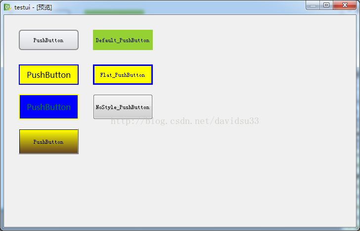
效果图:


 570
570


 被折叠的 条评论
为什么被折叠?
被折叠的 条评论
为什么被折叠?
 到【灌水乐园】发言


