


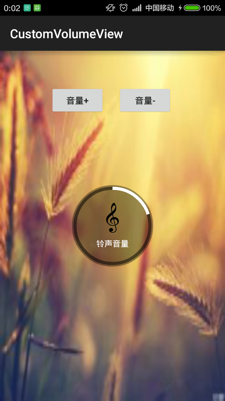
不少人应该见过小米手机系统音量控制UI,一个圆形带动画效果的音量加减UI,效果很好看。它是怎么实现的呢?这篇博客来揭开它的神秘面纱。先上效果图
相信很多人都知道Android自定义控件的三种方式,Android自定义控件View(一)自绘控件,Android自定义控件View(二)继承控件,还有就是这一节即将学习到的组合控件。我们通过实现圆形音量UI来讲解组合控件的定义和使用。
组合控件
所谓组合控件就是有多个已有的控件组合而成一个复杂的控件。比如上图的音量控件就是一个完美的组合控件。我们来分析一下,音量组合控件是由哪些子控件组合而成的?中间有一个ImageView和一个TextView实现,背景是有一个半透明圆形和白色圆环叠加构成的(我们暂且叫音量控件VolumeView)。因此音量组合控件(VolumeViewLayout)就是有3个子控件组合而成:VolumeView,ImageView,TextView。代码实现如下:
package com.xjp.customvolumeview;

import android.content.Context;
import android.util.AttributeSet;
import android.view.LayoutInflater;
import android.view.View;
import android.widget.FrameLayout;
import android.widget.ImageView;
import android.widget.RelativeLayout;
import android.widget.TextView;

/**
 * Description:组合布局实现类似小米手机音量UI
 * User: xjp
 * Date: 2015/5/29
 * Time: 18:06
 */

public class VolumeViewLayout extends FrameLayout {

    private VolumeView volumeView;
    private ImageView icon;
    private TextView title;

    public VolumeViewLayout(Context context) {
        this(context, null);
    }

    public VolumeViewLayout(Context context, AttributeSet attrs) {
        this(context, attrs, 0);
    }

    public VolumeViewLayout(Context context, AttributeSet attrs, int defStyleAttr) {
        super(context, attrs, defStyleAttr);
        LayoutInflater inflater = LayoutInflater.from(context);
        View view = inflater.inflate(R.layout.volume_view_layout, this);
        volumeView = (VolumeView) view.findViewById(R.id.volume);
        icon = (ImageView) view.findViewById(R.id.img_volume);
        title = (TextView) view.findViewById(R.id.text);
    }

    /**
     * 设置标题
     *
     * @param msg
     */
    public void setTitle(String msg) {
        title.setText(msg);
    }

    /**
     * 设置图片
     *
     * @param resId
     */
    public void setIcon(int resId) {
        icon.setImageResource(resId);
    }

    /**
     * 加音量
     */
    public void volumeUp() {
        volumeView.volumeUp();
    }

    /**
     * 减音量
     */
    public void volumeDown() {
        volumeView.volumeDown();
    }
}
VolumeViewLayout类中的构造方法通过LayoutInflater加载XML布局来构成一个组合控件,因此可以看出,如果你需要修改组合控件显示效果的话,你可以修改LayoutInflater加载XML布局就ok了。VolumeViewLayout是继承FrameLayout,你可以继承任何ViweGroup的父容器View。
VolumeViewLayout暴露出4个方法,分别是设置中间的Image图片,设置中间的文字,和音量加减操作方法。布局代码中这么使用:
<RelativeLayout xmlns:android="http://schemas.android.com/apk/res/android"
    xmlns:tools="http://schemas.android.com/tools"
    android:layout_width="match_parent"
    android:layout_height="match_parent"
    android:background="@drawable/back"
    tools:context=".MainActivity">

    <Button
        android:id="@+id/buttonAdd"
        android:layout_width="wrap_content"
        android:layout_height="wrap_content"
        android:layout_marginLeft="80dp"
        android:layout_marginTop="55dp"
        android:text="音量+" />

    <Button
        android:id="@+id/buttonDelete"
        android:layout_width="wrap_content"
        android:layout_height="wrap_content"
        android:layout_marginLeft="20dp"
        android:layout_marginTop="55dp"
        android:layout_toRightOf="@+id/buttonAdd"
        android:text="音量-" />

    <com.xjp.customvolumeview.VolumeViewLayout
        android:id="@+id/volumeView"
        android:layout_width="wrap_content"
        android:layout_height="wrap_content"
        android:layout_centerInParent="true"></com.xjp.customvolumeview.VolumeViewLayout>

</RelativeLayout>
代码调用中这么使用:
package com.xjp.customvolumeview;

import android.os.Bundle;
import android.support.v7.app.ActionBarActivity;
import android.view.View;
import android.widget.Button;


public class MainActivity extends ActionBarActivity implements View.OnClickListener {

    private Button buttonAdd;
    private Button buttonDelete;
    private VolumeViewLayout volumeView;

    @Override
    protected void onCreate(Bundle savedInstanceState) {
        super.onCreate(savedInstanceState);
        setContentView(R.layout.activity_main);

        buttonAdd = (Button) findViewById(R.id.buttonAdd);
        buttonAdd.setOnClickListener(this);
        buttonDelete = (Button) findViewById(R.id.buttonDelete);
        buttonDelete.setOnClickListener(this);
        volumeView = (VolumeViewLayout) findViewById(R.id.volumeView);
    }

    @Override
    public void onClick(View v) {
        switch (v.getId()) {
            case R.id.buttonAdd:
                volumeView.volumeUp();
                break;
            case R.id.buttonDelete:
                volumeView.volumeDown();
                break;
        }
    }
}
如需要改变音量UI中的图片和文字,可以分别调用如下方法即可
volumeView.setIcon(R.drawable.icon);
volumeView.setTitle("音乐音量");
以上就是真个组合控件实现的过程。我们来梳理一下流程:
- 在XML布局文件中定义好一个组合布局。
- 继承ViewGroup类自定义组合控件。
- 在自定义组合控件的构造方法中通过LayoutInflater加载组合布局。
- 在xml布局中使用组合控件。
自绘圆形带动画效果音量控件 VolumeView
整体上实现了组合控件。我们来看看音量控件VolumeView怎么实现的?其实VolumeView根据 Android自定义控件View(一)自绘控件来实现的。我们来回顾一下自绘控件的流程
- 自定义控件View的属性。
- 在View的构造方法中获得属性值。
- 重写onMeasure方法
- 重写onDraw方法
- 布局中使用自定义控件
自定义控件View的属性
<?xml version="1.0" encoding="utf-8"?>
<resources>
    <attr name="radius" format="dimension"></attr>
    <attr name="backgroundColor" format="color"></attr>
    <attr name="primaryVolumeColor" format="color"></attr>
    <attr name="volumeColor" format="color"></attr>
    <attr name="borderWidth" format="dimension"></attr>
    <attr name="maxVolume" format="integer"></attr>

    <declare-styleable name="VolumeView">
        <attr name="radius"></attr>
        <attr name="backgroundColor"></attr>
        <attr name="primaryVolumeColor"></attr>
        <attr name="volumeColor"></attr>
        <attr name="borderWidth"></attr>
        <attr name="maxVolume"></attr>
    </declare-styleable>

</resources>
在View的构造方法中获得属性值
 /**
     * 获取自定义View的属性值
     *
     * @param context
     * @param attrs
     */
    private void setAttrs(Context context, AttributeSet attrs) {
        TypedArray a = context.obtainStyledAttributes(attrs, R.styleable.VolumeView);
        if (null != a) {
            radius = a.getDimensionPixelSize(R.styleable.VolumeView_radius, defaultRadius);
            backgroundColor = a.getColor(R.styleable.VolumeView_backgroundColor, defaultBackgroundColor);
            volumeColor = a.getColor(R.styleable.VolumeView_volumeColor, defaultVolumeColor);
            primaryVolumeColor = a.getColor(R.styleable.VolumeView_primaryVolumeColor, defaultPrimaryVolumeColor);
            borderWidth = a.getDimensionPixelSize(R.styleable.VolumeView_borderWidth, defaultBorderWidth);
            maxVolume = a.getInt(R.styleable.VolumeView_maxVolume, 15);
            a.recycle();
        }

    }
重写onMeasure方法
@Override
    protected void onMeasure(int widthMeasureSpec, int heightMeasureSpec) {
        /**固定自定义圆形UI的大小,不管属性设置大小多少都不影响圆形UI大小,
         唯一影响圆形UI的大小只有圆的半径,言外之意:
         只能通过半径来控制圆形UI大小,所以属性里半径为必设值。*/
        setMeasuredDimension(radius * 2, radius * 2);
    }
重写onDraw方法
 @Override
    protected void onDraw(Canvas canvas) {
        //绘制背景
        paint.setAntiAlias(true);
        paint.setStyle(Paint.Style.FILL);
        paint.setColor(backgroundColor);
        radius = getWidth() / 2;
        canvas.drawCircle(radius, radius, radius, paint);

        //绘制音量线圈背景
        paint.setAntiAlias(true);
        paint.setColor(primaryVolumeColor);
        paint.setStyle(Paint.Style.STROKE);
        paint.setStrokeWidth(borderWidth);
        canvas.drawCircle(radius, radius, radius - borderWidth, paint);

        //绘制音量线圈
        paint.setAntiAlias(true);
        paint.setColor(volumeColor);
        rectF = new RectF(borderWidth, borderWidth, getWidth() - borderWidth, getHeight() - borderWidth);
        if (isVolumeUp) {//音量增加时
            canvas.drawArc(rectF, -90, angle * (volumeNum > 0 ? volumeNum - 1 : 0) + unitAngle * fraction, false, paint);
        } else {//音量减小时
            canvas.drawArc(rectF, -90, angle * (volumeNum + 1) - unitAngle * fraction, false, paint);
        }
    }
XML布局中使用控件
<?xml version="1.0" encoding="utf-8"?>
<RelativeLayout xmlns:android="http://schemas.android.com/apk/res/android"
    xmlns:custom="http://schemas.android.com/apk/res-auto"
    android:layout_width="wrap_content"
    android:layout_height="wrap_content"
    android:layout_gravity="center"
    android:gravity="center"
    android:orientation="vertical">

    <com.xjp.customvolumeview.VolumeView
        android:id="@+id/volume"
        android:layout_width="wrap_content"
        android:layout_height="wrap_content"
        custom:borderWidth="5dp"
        custom:maxVolume="10"
        custom:radius="65dp" />

    <LinearLayout
        android:layout_width="wrap_content"
        android:layout_height="wrap_content"
        android:layout_centerInParent="true"
        android:orientation="vertical">

        <ImageView
            android:id="@+id/img_volume"
            android:layout_width="58dp"
            android:layout_height="48dp"
            android:layout_gravity="center"
            android:scaleType="fitXY"
            android:src="@drawable/icon" />

        <TextView
            android:id="@+id/text"
            android:layout_width="wrap_content"
            android:layout_height="wrap_content"
            android:layout_below="@+id/img_volume"
            android:layout_gravity="center"
            android:layout_marginTop="8dp"
            android:text="铃声音量"
            android:textColor="@android:color/white"
            android:textSize="13sp" />
    </LinearLayout>

</RelativeLayout>
完整代码
package com.xjp.customvolumeview;

import android.animation.ValueAnimator;
import android.content.Context;
import android.content.res.TypedArray;
import android.graphics.Canvas;
import android.graphics.Color;
import android.graphics.Paint;
import android.graphics.RectF;
import android.util.AttributeSet;
import android.util.Log;
import android.view.View;

/**
 * Description:圆形音量控件
 * User: xjp
 * Date: 2015/5/29
 * Time: 14:08
 */

public class VolumeView extends View {

    private static final String TAG = "VolumeView";
    private static final boolean DEBUG = false;

    //圆形半径
    private int radius = 0;
    //音量边框底色
    private int primaryVolumeColor = 0;
    //音量边框颜色
    private int volumeColor = 0;
    //圆形音量背景颜色
    private int backgroundColor = 0;
    //音量边框宽度
    private int borderWidth = 0;
    //动画百分比
    private int fraction = 0;

    //以下都是默认值
    private int defaultRadius = 60;
    private int defaultBorderWidth = 8;
    private int defaultBackgroundColor = 0x60000000;
    private int defaultVolumeColor = Color.WHITE;
    private int defaultPrimaryVolumeColor = 0x80000000;

    private RectF rectF = null;

    private Paint paint = null;

    //最大音量次数
    private int maxVolume = 15;
    //音量每增加一次,对于的角度
    private float angle = 0;
    //动画的最大值
    private int maxAnimationValue = 10;
    //音量每增加一次的单位角度
    private float unitAngle = 0;
    //当前音量的次数
    private int volumeNum = 0;
    //是否是加音量
    private boolean isVolumeUp = true;

    public VolumeView(Context context) {
        this(context, null);
    }

    public VolumeView(Context context, AttributeSet attrs) {
        this(context, attrs, 0);
    }

    public VolumeView(Context context, AttributeSet attrs, int defStyleAttr) {
        super(context, attrs, defStyleAttr);
        setAttrs(context, attrs);
        initPaint();
    }

    /**
     * 初始化画笔
     */
    private void initPaint() {
        angle = 360f / maxVolume;
        unitAngle = angle / maxAnimationValue;
        paint = new Paint(Paint.ANTI_ALIAS_FLAG);
        paint.setAntiAlias(true);
        paint.setDither(true);
    }

    /**
     * 获取自定义View的属性值
     *
     * @param context
     * @param attrs
     */
    private void setAttrs(Context context, AttributeSet attrs) {
        TypedArray a = context.obtainStyledAttributes(attrs, R.styleable.VolumeView);
        if (null != a) {
            radius = a.getDimensionPixelSize(R.styleable.VolumeView_radius, defaultRadius);
            backgroundColor = a.getColor(R.styleable.VolumeView_backgroundColor, defaultBackgroundColor);
            volumeColor = a.getColor(R.styleable.VolumeView_volumeColor, defaultVolumeColor);
            primaryVolumeColor = a.getColor(R.styleable.VolumeView_primaryVolumeColor, defaultPrimaryVolumeColor);
            borderWidth = a.getDimensionPixelSize(R.styleable.VolumeView_borderWidth, defaultBorderWidth);
            maxVolume = a.getInt(R.styleable.VolumeView_maxVolume, 15);
            a.recycle();
        }

    }

    /**
     * 设置圆形半径
     *
     * @param radius
     */
    public void setRadius(int radius) {
        this.radius = radius;
    }

    /**
     * 设置音量边框的宽度
     *
     * @param borderWidth
     */
    public void setBorderWidth(int borderWidth) {
        this.borderWidth = borderWidth;
    }

    /**
     * 设置最大音量值
     *
     * @param maxVolume
     */
    public void setMaxVolume(int maxVolume) {
        this.maxVolume = maxVolume;
    }

    /**
     * 设置音量边框底色
     *
     * @param color
     */
    public void setPrimaryVolumeColor(int color) {
        primaryVolumeColor = color;
    }

    /**
     * 设置音量边框颜色
     *
     * @param color
     */
    public void setVolumeColor(int color) {
        volumeColor = color;
    }

    /**
     * 设置圆形音量的背景颜色
     *
     * @param color
     */
    public void setBackgroundColor(int color) {
        backgroundColor = color;
    }

    @Override
    protected void onMeasure(int widthMeasureSpec, int heightMeasureSpec) {
        /**固定自定义圆形UI的大小,不管属性设置大小多少都不影响圆形UI大小,
         唯一影响圆形UI的大小只有圆的半径,言外之意:
         只能通过半径来控制圆形UI大小,所以属性里半径为必设值。*/
        setMeasuredDimension(radius * 2, radius * 2);
    }

    @Override
    protected void onDraw(Canvas canvas) {
        //绘制背景
        paint.setAntiAlias(true);
        paint.setStyle(Paint.Style.FILL);
        paint.setColor(backgroundColor);
        radius = getWidth() / 2;
        canvas.drawCircle(radius, radius, radius, paint);

        //绘制音量线圈背景
        paint.setAntiAlias(true);
        paint.setColor(primaryVolumeColor);
        paint.setStyle(Paint.Style.STROKE);
        paint.setStrokeWidth(borderWidth);
        canvas.drawCircle(radius, radius, radius - borderWidth, paint);

        //绘制音量线圈
        paint.setAntiAlias(true);
        paint.setColor(volumeColor);
        rectF = new RectF(borderWidth, borderWidth, getWidth() - borderWidth, getHeight() - borderWidth);
        if (isVolumeUp) {//音量增加时
            canvas.drawArc(rectF, -90, angle * (volumeNum > 0 ? volumeNum - 1 : 0) + unitAngle * fraction, false, paint);
        } else {//音量减小时
            canvas.drawArc(rectF, -90, angle * (volumeNum + 1) - unitAngle * fraction, false, paint);
        }
    }


    /**
     * 控制音量增加减少时的动画效果
     */
    private void startAnim() {
        ValueAnimator valueAnimator = ValueAnimator.ofInt(0, maxAnimationValue);
        valueAnimator.setDuration(300);
        valueAnimator.addUpdateListener(new ValueAnimator.AnimatorUpdateListener() {
            @Override
            public void onAnimationUpdate(ValueAnimator animation) {
                fraction = (int) animation.getAnimatedValue();
                if (DEBUG) {
                    Log.e(TAG, "the fraction is " + fraction);
                }
                invalidate();
            }
        });
        valueAnimator.start();
    }

    /**
     * 加音量
     */
    public void volumeUp() {
        isVolumeUp = true;
        if (volumeNum < maxVolume) {
            volumeNum++;
            startAnim();
        }
    }

    /**
     * 减音量
     */
    public void volumeDown() {
        isVolumeUp = false;
        if (volumeNum > 0) {
            volumeNum--;
            startAnim();
        }
    }

}
VolumeView类暴露了很多方法,便于用户自定义圆形音量的UI风格。以上代码中实现了音量加减的动画效果,也就是如下代码:
/**
     * 控制音量增加减少时的动画效果
     */
    private void startAnim() {
        ValueAnimator valueAnimator = ValueAnimator.ofInt(0, maxAnimationValue);
        valueAnimator.setDuration(300);
        valueAnimator.addUpdateListener(new ValueAnimator.AnimatorUpdateListener() {
            @Override
            public void onAnimationUpdate(ValueAnimator animation) {
                fraction = (int) animation.getAnimatedValue();
                if (DEBUG) {
                    Log.e(TAG, "the fraction is " + fraction);
                }
                invalidate();
            }
        });
        valueAnimator.start();
    }
代码中通过属性动画监听动画更新接口获取每个时刻的动画值,根据这个值每次去重新绘制UI,也就是调用invalidate();之后系统会重新调用onDraw()方法绘制UI。
不了解属性动画这一块的童鞋可以参考前面关于属性动画的博客 Android属性动画Property Animation系列一之ValueAnimator。
以上就是全部的实现思路,代码就不一一解释了,毕竟有注释,效果还是很Nice~的。喜欢的童鞋,点赞吧!
~。


 460
460

 被折叠的 条评论
为什么被折叠?
被折叠的 条评论
为什么被折叠?
 到【灌水乐园】发言


