


尊重劳动成果,转载请注明出处:http://blog.csdn.net/growth58/article/details/47972467
关注新浪微博:@于卫国
邮箱:yuweiguocn@gmail.com
简介
在Google I/O 2015大会中,Google为Android开发者介绍了Design Support Library。这个library可以让开发者很容易地实现更多Material Design概念到他们的应用中,因为很多关键元素是不可用的在原来的框架外。首先就是很易于使用,Design Support Library向下兼容到API 7。Design Support Library可以引入到你的Android工程中通过导入Gradle依赖。
compile 'com.android.support:design:22.2.0'视觉组件
在Design支持库中有两个主要类别的工具:
- 视觉组件
- 动作组件
我们先看看有哪些新的视觉组件可以应用到你的App上。
Material Text Input
EditText自从最开始就已经在Android中了,并且使用很简单,他们一直没有什么改变。使用Design Support Library,Google已经介绍了新的包含容器叫作TextInputLayout。这个新的view添加功能到标准的EditText上,例如支持让你的用户界面弹出错误消息和动画提示。
正如下面的代码所示,TextInputLayout 可以包含在你的布局文件中包裹一个标准的EditText。
<android.support.design.widget.TextInputLayout
    android:id="@+id/textinput"
    android:layout_width="match_parent"
    android:layout_height="wrap_content">

    <EditText
        android:id="@+id/edittext"
        android:layout_width="match_parent"
        android:layout_height="wrap_content"
        android:hint="What is your name?" />

</android.support.design.widget.TextInputLayout>
Gianluca Segato 会带着你学习TextInputLayout 组件的使用在教程中。
Floating Action Buttons
在Material Design 应用中最占优势的用户界面组件之一就是Floating Action Buttons。自从他们的介绍后,开发者不得不从头开始创建这些按钮或者是从很多第三方设计的类库特别是这些按钮相关的选择一个。
使用Design 支持库,floating action buttons可以包含在一个布局中并且挂靠在屏幕的一部分用简单几行代码。每个按钮都可以用icons和colors很容易地进行自定义。可以使用两个sizes ,standard (56dp) 和 mini (40dp)。最大的优势之一是Google已经支持这些按钮作为他们的设计演变。
<android.support.design.widget.FloatingActionButton
    android:id="@+id/fab"
    android:layout_width="wrap_content"
    android:layout_height="wrap_content"
    android:layout_gravity="end|bottom"
    android:layout_margin="16dp"
    android:src="@drawable/ic_fab" />
导航组件
当ViewPager 和DrawerLayout 组件通过v4 support library可用时,Google已经对其进行了扩展通过提供两个新的相关的部件。第一个是官方版本常用的ViewPagerIndicator library由Jake Wharton开发称为TabLayout。第二个是NavigationView,提供drawer header的支持。
TabLayout
TabLayout组件可以用代码使用addTab方法手动添加内容。看看下面的例子。
tabLayout.addTab(tabLayout.newTab().setText("Tab 1"));
tabLayout.addTab(tabLayout.newTab().setText("Tab 2"));
tabLayout.addTab(tabLayout.newTab().setText("Tab 3"));另外,你可以将TabLayout和ViewPager组件进行关联。通过调用setupWithViewPager()可以完成,使用ViewPager作为参数。这是另一种方式切换ViewPager的页面。应该注意的是getPageTitle()需要被重写当使用TabLayout和ViewPager时给每个Tab一个合适的名称。
NavigationView
NavigationView是一个新的部件继承了DrawerLayout的功能。开发者使用这个组件能很容易地添加头布局到drawer 和标记已选择的部分。
除此之外,它现在可以通过菜单资源文件非常简单地创建sections和subsections在drawer 中。一个NavigationView需要和一个DrawerLayout进行关联在XML文件中。
<android.support.v4.widget.DrawerLayout      xmlns:android="http://schemas.android.com/apk/res/android"
    xmlns:app="http://schemas.android.com/apk/res-auto"
    android:id="@+id/drawer_layout"
    android:layout_height="match_parent"
    android:layout_width="match_parent"
    android:fitsSystemWindows="true">

    <include layout="@layout/content"/>

    <android.support.design.widget.NavigationView
        android:id="@+id/nav_view"
        android:layout_height="match_parent"
        android:layout_width="wrap_content"
        android:layout_gravity="start"
        android:fitsSystemWindows="true"
        app:headerLayout="@layout/nav_header"
        app:menu="@menu/drawer_view"/>

</android.support.v4.widget.DrawerLayout>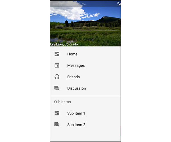
增强的Toasts
Toast消息成为Android中主要的功能已经多年,一个新的用户界面部件叫作Snackbar可用于提供相似功能但改善了外观。Snackbar 不仅能给用户提示短时间的信息,它还支持一个动作添加到上下文中基于你的应用的功能并且可以使用手势滑掉使其消失。
Snackbar 比Toast功能有所增强,使用它需要注意的是需要创建一个可以被用来找到应用显示的最底部的View。
Snackbar.make( view, "Action", Snackbar.LENGTH_LONG )
    .setAction("Action!", new View.OnClickListener() {
        @Override
        public void onClick(View v) {
            Log.e("App", "Action!");
        }
    } )
    .show();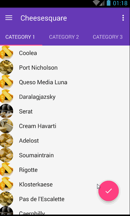
动作组件
一个用户界面特效和动画在Material Design中是非常重要的。为了促进这个,Googlen已经发布了多个常见用例的组件在Design支持库中。Kerry Perez-Huanca将会在教程中带着大家学习Design支持库中的这方面的组件。
Reactive Views
你可能已经注意到了在之前例子中的FloatingActionButton会在Snackbar出现的时候向上移动。这是用一个新的部件叫作CoordinatorLayout完成的,用它包裹的view应该给其它view留出空间。
改善Quick Return and Toolbars
很多开发者询问用最简单的方式显示一个视差图片作用于快速返回设计模式,随着用户上下滑动而出现或消失。你可以在Play Store的应用列表看到这个效果。为了让开发者实现这个功能不用写大量冗余代码,Google发布了CollapsingToolBarLayout 和AppBarLayout views。在这些部件里使用不同的选项,开发者能固定views在屏幕的顶部或特定的位置当这些views应该随着用户滑动显示时。
总结
Design 支持库带来了大量期待已久的工具在Android上。当它和AppCompat 库配合使用时,它变得很容易地添加Material Design到应用上并且保持向下兼容。
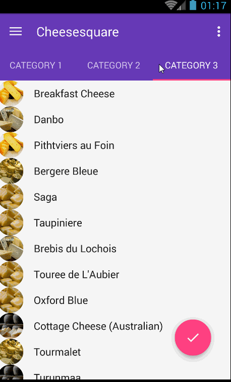
可以在Google官方相关的应用上找到这些新组件是怎样工作的很多例子,CheeseSquare,Tuts+将会继续提供深入教程在怎样实现这些新特征上。
请我喝杯咖啡,请使用支付宝扫描下方二维码:

原文地址:http://code.tutsplus.com/articles/overview-of-the-android-design-support-library–cms-24234


 扫一扫
扫一扫


 374
374

 被折叠的 条评论
为什么被折叠?
被折叠的 条评论
为什么被折叠?
 到【灌水乐园】发言


