使用 circular-progress-button 实现环形进度按钮

效果图:


源码地址:https://github.com/dmytrodanylyk/circular-progress-button


使用说明:

Usage

Declare button inside your layout XML file:

<com.dd.CircularProgressButton
    android:id="@+id/btnWithText"
    android:layout_width="196dp"
    android:layout_height="64dp"
    android:layout_marginTop="16dp"
    android:textColor="@color/white"
    android:textSize="18sp"
    app:textComplete="@string/Complete"
    app:textError="@string/Error"
    app:textIdle="@string/Upload" />

Button state depends on progress:

  • normal state [0]
  • progress state [1-99]
  • success state [100]
  • error state [-1]

To change progress use CircularProgressButton.setProgress(int value) method.

Idle state

CircularProgressButton.setProgress(0)

  • To change text app:textIdle="@string/Upload"
  • To change background color app:colorIdle="@color/green"

Progress state 1

CircularProgressButton.setProgress(1) will automatically morph button from idle (square shape) state to progress (circle shape) state.

  • To change indicator color app:colorIndicator="@color/blue"
  • To change indicator background color app:colorIndicatorBackground="@color/grey"
  • To change circle background color app:colorProgress="@color/white"

Progress state 50

CircularProgressButton.setProgress(50)

Complete state 100

CircularProgressButton.setProgress(-1)

  • To change text app:textError="@string/Error"
  • To change background color app:colorError="@color/red"

Error state -1

CircularProgressButton.setProgress(-1)

  • To change text app:textComplete="@string/Complete"
  • To change background color app:colorComplete="@color/green"

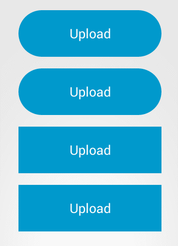
You can set rounded corners

app:cornerRadius="48dp"

You can use icons for complete & error states

app:iconComplete="@drawable/ic_action_accept"

app:iconError="@drawable/ic_action_cancel"


  • 4
    点赞
  • 9
    收藏
    觉得还不错? 一键收藏
  • 0
    评论
package com.example.androidtest.view; import android.annotation.SuppressLint; import android.content.Context; import android.content.res.ColorStateList; import android.content.res.TypedArray; import android.graphics.Canvas; import android.graphics.drawable.Drawable; import android.graphics.drawable.GradientDrawable; import android.graphics.drawable.StateListDrawable; import android.os.Build; import android.os.Parcel; import android.os.Parcelable; import android.util.AttributeSet; import android.util.StateSet; import android.widget.Button; import com.example.androidtest.R; public class CircularProgressButton extends Button { /** * 状态代号 * 0为初始状态,-1失败状态,100为完成状态,50为不明确中间状态 */ public static final int IDLE_STATE_PROGRESS = 0; public static final int ERROR_STATE_PROGRESS = -1; public static final int SUCCESS_STATE_PROGRESS = 100; public static final int INDETERMINATE_STATE_PROGRESS = 50; /** * 背景StrokeGradientDrawable * A Drawable with a color gradient for buttons, backgrounds, etc. * It can be defined in an XML file with the element. */ private StrokeGradientDrawable background; /** * 环形动画背景 */ private CircularAnimatedDrawable mAnimatedDrawable; /** * 环形进度背景 */ private CircularProgressDrawable mProgressDrawable; /** * ColorStateList对象可以在XML中定义,像color一样使用,它能根据它应用到的View对象的状态实时改变颜色 * 当每次状态改变时,StateList都会从上到下遍历一次,第一个匹配当前状态的item将被使用——选择的过程不是基于“最佳匹配”, * 只是符合state的最低标准的第一个item。 */ private ColorStateList mIdleColorState; /** * 完成状态ColorStateList */ private ColorStateList mCompleteColorState; /** * 失败状态ColorStateList */ private ColorStateList mErrorColorState; /** * 用于根据状态改变drawable * 初始状态背景 */ private StateListDrawable mIdleStateDrawable;

“相关推荐”对你有帮助么?

  • 非常没帮助
  • 没帮助
  • 一般
  • 有帮助
  • 非常有帮助
提交
评论
添加红包

请填写红包祝福语或标题

红包个数最小为10个

红包金额最低5元

当前余额3.43前往充值 >
需支付:10.00
成就一亿技术人!
领取后你会自动成为博主和红包主的粉丝 规则
hope_wisdom
发出的红包
实付
使用余额支付
点击重新获取
扫码支付
钱包余额 0

抵扣说明:

1.余额是钱包充值的虚拟货币,按照1:1的比例进行支付金额的抵扣。
2.余额无法直接购买下载,可以购买VIP、付费专栏及课程。

余额充值