


 本文介绍了一种带有进度条显示的按钮实现方法,通过自定义Button类并使用GradientDrawable来实现不同状态间的平滑过渡动画,包括从初始状态到圆环状态再到完成状态的变化。
带进度条显示的按钮, 其效果如下所示:
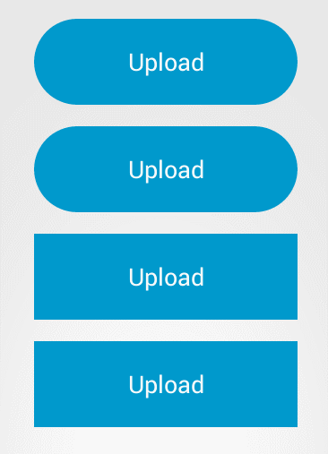
其由三部分动画组成: 初始状态->圆环状态->完成状态.
0. 实现从初始到圆环的简单实现:
继承自button 类, 设置其背景
public class CircleButton extends Button implements View.OnClickListener {private StateListDrawable mIdleStateDrawable;private StrokeGradientDrawable background;public CircleButton(Context context, AttributeSet attrs) {super(context, attrs);background = new StrokeGradientDrawable();// init();// setBackground(mIdleStateDrawable);setBackground(background.getGradientDrawable());setOnClickListener(this);}//.......}
其中的StrokeGradientDrawable(照搬源码) 如下:
public class StrokeGradientDrawable {private int mStrokeColor; //描边颜色private int mStrokeWidth; //描边宽度public int getStrokeColor() {return mStrokeColor;}public void setStrokeColor(int strokeColor) {mStrokeColor = strokeColor;mGradientDrawable.setStroke(getStrokeWidth(), strokeColor);}public int getStrokeWidth() {return mStrokeWidth;}public void setStrokeWidth(int strokeWidth) {mStrokeWidth = strokeWidth;mGradientDrawable.setStroke(strokeWidth, getStrokeColor());}public StrokeGradientDrawable() {mGradientDrawable = new GradientDrawable();mGradientDrawable.setColor(0xff99cc00);mStrokeWidth = 5;}public GradientDrawable getGradientDrawable() {return mGradientDrawable;}public void setmGradientDrawable(GradientDrawable mGradientDrawable) {this.mGradientDrawable = mGradientDrawable;}private GradientDrawable mGradientDrawable;}
其中的GradientDrawable 为动画的关键所在
在该类中,可以设置其圆角, 填充颜色, 描边, 尺寸等. 因此,当点击按钮时,可通过动画的方式渐变到目的状态, 其实现如下(源码见MorphingAnimation 类):
@Overridepublic void onClick(View v) {final GradientDrawable gradientDrawable = background.getGradientDrawable();final int mFromWidth = getWidth();final int mToWidth = getHeight();//宽度动画ValueAnimator widthAnimation = ValueAnimator.ofInt(mFromWidth, mToWidth);widthAnimation.addUpdateListener(new ValueAnimator.AnimatorUpdateListener() {@Overridepublic void onAnimationUpdate(ValueAnimator animation) {Integer value = (Integer) animation.getAnimatedValue();int leftOffset;int rightOffset;int padding;if (mFromWidth > mToWidth) {leftOffset = (mFromWidth - value) / 2;rightOffset = mFromWidth - leftOffset;} else {leftOffset = (mToWidth - value) / 2;rightOffset = mToWidth - leftOffset;}gradientDrawable.setBounds(leftOffset, 0, rightOffset, getHeight());}});//填充颜色ObjectAnimator bgColorAnimation = ObjectAnimator.ofInt(gradientDrawable, "color", 0xff99cc00, Color.WHITE);bgColorAnimation.setEvaluator(new ArgbEvaluator());//描边ObjectAnimator strokeColorAnimation =ObjectAnimator.ofInt(background, "strokeColor", 0xff99cc00, Color.GRAY);strokeColorAnimation.setEvaluator(new ArgbEvaluator());//圆角ObjectAnimator cornerAnimation =ObjectAnimator.ofFloat(gradientDrawable, "cornerRadius", 0, 30);AnimatorSet animatorSet = new AnimatorSet();animatorSet.setDuration(2000);animatorSet.playTogether(bgColorAnimation, cornerAnimation, widthAnimation,strokeColorAnimation);animatorSet.start();}
1. 源码分析(此处以Sample2Activity 为实例):
按钮的几种状态, [
 , IDLE,

 ,]
,]
, IDLE,
,]
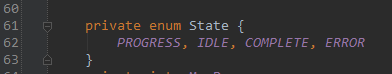
初始为IDLE 状态.
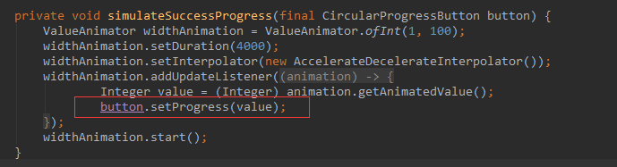
在Sample2Activity 中, 仅仅只是调用了setProgress()来实现其整个过程.其value的值从0-100
不断的递增
在setProgress()方法中,其中的从初始化进入加载的圆环状态如下
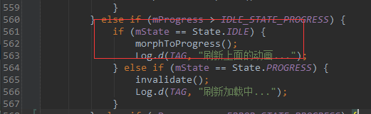
在morphToProgress() 方法,实现了从初始化到圆环状态的过度.在setListener(mProgressStateListener)中当动画完成的时候将mState 置为Progress
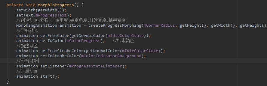
在createProgressMorphing() 中为创建一个MorphingAnimation实例, 其主要设置动画的圆角,宽度,颜色等等 ,在0中的简单实现也用到了这个类中的一些代码(
MorphingAnimation.start() 方法中的代码片段)
.
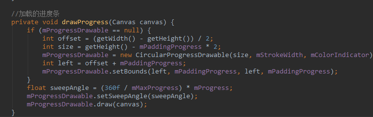
在动画完成后,在setProgress 中将进行不断的界面刷新invalidate() 在调用此方法,则系统将进行重绘调用onDraw()方法
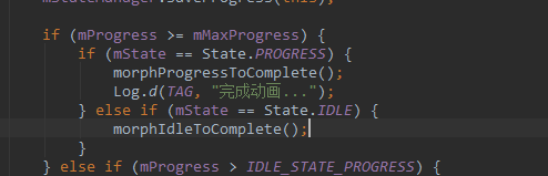
当setProgress() 到达100的时候则会调用到morphProgressToComplete() 来转换到完成的状态.
---------------------------------------------------END---------------------------------------------------------------------------------------
StateListDrawable 类, 在xml 中,通过设置<selector/> 来的background来进行按钮点击时候的背景的切换,此类则是该xml 的实现.
ColorStateList 类似.


 扫一扫
扫一扫


 3253
3253

 被折叠的 条评论
为什么被折叠?
被折叠的 条评论
为什么被折叠?
 到【灌水乐园】发言


