Android AlertDialog对话框自定义风格的另类实现

一、引子
学过Android的同学都知道,对话框的重要程度非常高,任何一款 app几乎都离不开对话框,值得庆幸的是,对话框的运用在Android中还是相对比较容易的。虽然很简单,但我在项目中还是碰到些问题,比如,如何实现自定义的对话框NegativeButton的点击效果、如何改变标题的字体大小和颜色等。

二、分析和实现
下面来看一下下面那张效果图,微信长按通讯录时弹出的对话框。
这里写图片描述
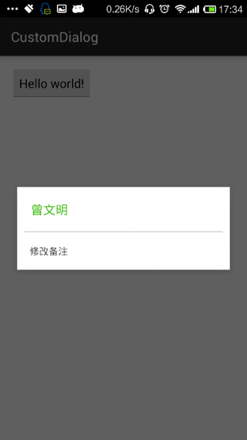
我相信,只要是有了一定Android基础的同学都能实现此功能,就算一时忘记了,稍微google下也是能做出来的;根据效果图可以看到,系统自带的alertDialog肯定无法实现这样的效果,所以得通过自定义xml来实现布局,并在AlertDialog.Builder中调用AlertDialog.Builder.setView(View view)把自定义的布局文件塞进去,代码也很简单,直接贴出来。

1、wechat_dialog.xml

<?xml version="1.0" encoding="utf-8"?>
<LinearLayout xmlns:android="http://schemas.android.com/apk/res/android"
              android:orientation="vertical"
              android:layout_width="match_parent"
              android:layout_height="match_parent"
    android:background="@color/white">
    <TextView
        android:id="@+id/id_name"
        android:layout_width="wrap_content"
        android:layout_height="wrap_content"
        android:textSize="18sp"
        android:text="曾文明"
        android:textColor="@color/bigColor"
        android:padding="20dp"/>
    <View
        android:layout_width="match_parent"
        android:layout_height="1dp"
        android:background="@color/lineColor"
        android:layout_marginLeft="10dp"
        android:layout_marginRight="10dp"
        />
    <TextView
        android:layout_width="wrap_content"
        android:layout_height="wrap_content"
        android:text="修改备注"
        android:padding="18dp"
        android:textSize="14sp"
        android:textColor="@color/txtColor"/>
</LinearLayout>

在MainActivity中调用

public static void showWeChatTitleDialog(Context context){
        AlertDialog.Builder dialogBuilder = new AlertDialog.Builder(context) ;
        dialogBuilder.create() ;
        LayoutInflater inflater = LayoutInflater.from(context) ;
        View view = inflater.inflate(R.layout.wechat_dialog, null) ;
       dialogBuilder.setView(view) ;
       dialogBuilder.show() ;
}

运行效果就是上图的效果。到这里为止,不能说明任何问题,最多只能说明AlertDialog使用起来并不复杂,接下来才是重点;还是先来看一张效果图
这里写图片描述
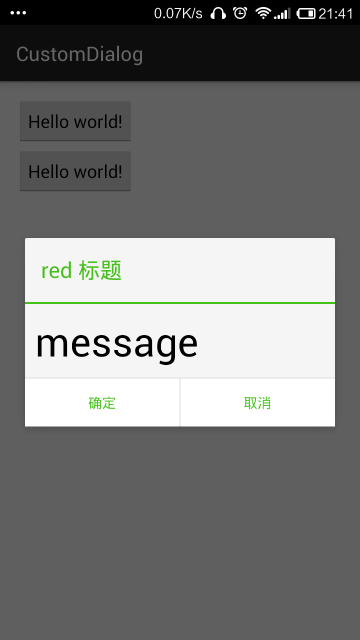
也许你会说,这个也很简单,跟前面那张图的实现方式一样,自己写一个布局,然后通过 setView 把布局设置进去,没错,我相信很多人都是这样实现的。但是我告诉大家,这里的实现方式不是通过 setView()的方式来实现的,而是通过修改 Android 系统原生的 AlertDialog 中的控件来达到我们想要的效果。这样做的好处是什么呢?我们知道,如果是我们自己写布局文件肯定是需要为最下方的两个按钮设置点击事件,这样代码量就非常大;而 AlertDialog 的NegativeButton和PositiveButton已经为我们提供了点击事件的接口,使用起来非常简单。
先来看看如何修改NegativeButton的字体颜色?
1、毫无疑问第一步我们先要获取Button,在 AlertDialog 中有这样一个方法

public Button getButton(int whichButton) {
        return mAlert.getButton(whichButton);
}

所以 可以通过以下代码获取

Button mNegativeButton = mAlertDialog.getButton(AlertDialog.BUTTON_NEGATIVE) ;

2、设置Button的字体颜色为绿色,同时也可以设置点击状态

mNegativeButton
  • 5
    点赞
  • 18
    收藏
    觉得还不错? 一键收藏
  • 21
    评论
在安卓中要改变AlertDialog的外观是非常不容易的事情,即便是HoneyComb之后增加了android:singleChoiceItemLayout属性。AlertDialogPro可以让事情变得简单,它包含了AlertDialog的所有功能,同时还具有灵活的自定义功能,代码中还自带了已经定义好的holo和material 两种风格对话框。项目地址:https://github.com/fengdai/AlertDialogPro 效果图:如何使用1.创建AlertDialogPro除了将AlertDialog.Builder替换成AlertDialogPro.Builder之外其他的和AlertDialog没有区别。AlertDialogPro.Builder builder = new AlertDialogPro.Builder(getContext()); builder.setTitle("Title").        setIcon(R.drawable.ic_launcher).        setMessage("Message").        setNeutralButton("Neutral", null).        setPositiveButton("OK", null).        setNegativeButton("Cancel", null).        show();2.holo风格dialog包含两种holo:Theme.AlertDialogPro.Holo和Theme.AlertDialogPro.Holo.Light只需在style文件中加入alertDialogProTheme属性:<style name="AppTheme" parent="AppBaseTheme">   ...   <!-- Use Holo dark theme as global theme of this app -->   <item name="alertDialogProTheme">@style/Theme.AlertDialogPro.Holo</item> </style>或者是在代码中创建dialog的时候设置:AlertDialogPro.Builder builder = new AlertDialogPro.Builder(getContext(), R.style.Theme_AlertDialogPro_Holo_Light);3.Material风格dialog包含Theme.AlertDialogPro.Material 和Theme.AlertDialogPro.Material.Light 两种风格,使用方法和上面的holo差不多,但是需要AppCompat-v21的支持。4.自定义如果其中某一种风格符合你的绝大部分需求,但是需要做些改动,你可以设置以下属性:<!-- Minimum height of title panel--> <attr name="adpTitleMinHeight" format="dimension" /> <!-- The text appearance for the dialog's message text --> <attr name="adpMessageTextAppearance" format="reference" /> <!-- Minimum height of ListView's items --> <attr name="adpListItemMinHeight" format="dimension" /> <!-- The text color for ListView's items --> <attr name="adpListItemTextColor" format="reference|color" /> <!-- The text appearance for normal ListView's items --> <attr name="adpListItemTextAppearance" format="reference" /> <!-- The text appearance for "multi-choice" ListView's items --> <attr name="adpListMultiChoiceTextAppearance" format="reference" /> <!-- The text appearance for "single-choice" ListView's items --> <attr name="adpListSingleChoiceTextAppearance" format="reference" /> <!-- Divider for the ListView --> <attr name="adpListDivider" format="reference" /> <!-- Selector in a ListView --> <attr name="adpListItemBackground" format="reference" /> <!-- Style for button bars --> <attr name="adpButtonBarStyle" format="reference" /> <!-- Style for buttons within button bars --> <attr name="adpButtonBarButtonStyle" format="reference" /> <!-- Style for the "positive" buttons within button bars --> <attr name="adpButtonBarPositiveButtonStyle" format="reference" /> <!-- Style for the "negative" buttons within button bars --> <attr name="adpButtonBarNegativeButtonStyle" format="reference" /> <!-- Style for the "neutral" buttons within button bars --> <attr name="adpButtonBarNeutralButtonStyle" format="reference" />你甚至可以设置alertdialog的整个布局,如果你需要的是高度自定义dialog,这是非常重要的。<style name="AlertDialogPro.Material">   <!-- As HoneyComb's android:layout.        Specify your AlertDialogPro's layout -->   <item name="adpLayout">@layout/adp_alert_dialog_material</item>   <!-- As HoneyComb's android:listLayout.        Specify your AlertDialogPro's ListView layout. -->   <item name="adpListLayout">@layout/adp_select_dialog_material</item>   <!-- As HoneyComb's android:listItemLayout.        Specify your AlertDialogPro's list item layout. -->   <item name="adpListItemLayout">@layout/adp_select_dialog_item_material</item>   <!-- As HoneyComb's android:multiChoiceItemLayout.        Specify your AlertDialogPro's multi choice list item layout. -->   <item name="adpMultiChoiceItemLayout">@layout/adp_select_dialog_multichoice_material</item>   <!-- As HoneyComb's android:singleChoiceItemLayout.        Specify your AlertDialogPro's single choice list item layout. -->   <item name="adpSingleChoiceItemLayout">@layout/adp_select_dialog_singlechoice_material</item> </style>使用上面自定义alertdialog<item name="alertDialogProStyle">@style/AlertDialogPro.Material</item>

“相关推荐”对你有帮助么?

  • 非常没帮助
  • 没帮助
  • 一般
  • 有帮助
  • 非常有帮助
提交
评论 21
添加红包

请填写红包祝福语或标题

红包个数最小为10个

红包金额最低5元

当前余额3.43前往充值 >
需支付:10.00
成就一亿技术人!
领取后你会自动成为博主和红包主的粉丝 规则
hope_wisdom
发出的红包
实付
使用余额支付
点击重新获取
扫码支付
钱包余额 0

抵扣说明:

1.余额是钱包充值的虚拟货币,按照1:1的比例进行支付金额的抵扣。
2.余额无法直接购买下载,可以购买VIP、付费专栏及课程。

余额充值