


原文地址
1. layer-list 是啥?有啥作用?
(1). layer-list 是啥?
简单理解,layer 是层,list 是列表,那么 layer-list 就是层列表的意思。但是,是什么层列表呢?? 其实 layer-list 是用来创建 LayerDrawable 的,LayerDrawable 是 DrawableResource 的一种, 所以,layer-list 创建出来的是 图层列表,也就是一个drawable 图形。
在Android中xml资源文件是一个非常强大的工具,类似圆角矩形的图案,完全不用单独绘制图片文件,使用xml编写代码就完全可以实现。
其实质原理是通过xml代码控制,绘制多个图层,图层堆叠而达到所想要绘制图形的效果。例如绘制一个蓝色边框矩形:
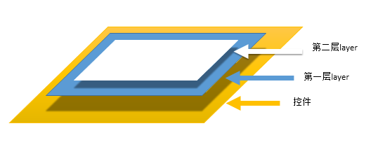
从上面看,由于白色图层面积比蓝色图层小一圈,便产生了蓝色边框矩形的效果。
这样编写的xml包含几个重要的元素:
1. layer-list: 根元素
2. item:对应一个图层。图层中绘制的内容是他的子元素
3. shape: 所绘制的图形。与xml自定义图形一样
(2). layer-list 有啥作用?
上面已经说过,layer-list 是用来创建 图层列表的,通过它能创建出一些特殊的 drawable, 比如:
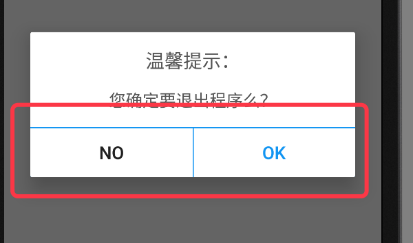
下图 AlertDialog 中,我们只需要设置 button 的 顶部边线,以及 左侧button的右边线(或者右侧button的左边线),这种时候我们就无法直接使用 shape 了,因为直接使用 shape 绘制出来的是四个边框; 如果让美工切图也可以,但那样的话灵活度就差了很多,而且会增加app的体积;这种情况下,使用 layer-list 就是最佳选择。当然,layer-list 的用途还有很多,这里只是举一个例子,具体的使用请继续往下看。
2. layer-list 的大致原理
layer-list 的大致原理类似 RelativeLayout(或者FrameLayout) ,也是一层层的叠加 ,后添加的会覆盖先添加的。在 layer-list 中可以通过 控制后添加图层距离最底部图层的 左上右下的四个边距等属性,得到不同的显示效果。
上面示例图中,AlertDialog 底部的 ok按钮 的背景就是用layer-list实现的。该layer-list 中,底层使用一个填充色为蓝色 的shape,上层使用一个填充色为白色的shape ,然后控制上层距离最底层的顶部边距为1dp , 这样在视觉上就形成了一个 具有蓝色顶部边线的白色背景。具体代码继续往下看。
3. layer-list 基本使用示例:
因 layer-list 创建出来的也是 drawable 资源,所以,同 shape selector 一样,都是定义在 res 中的 drawable 文件夹中,也是一个 xml 文件。使用的时候,同shape selector , 布局文件中使用 @drawable/ xxx 引用, 代码中使用 R.drawable.xxx 引用。
layer-list 中不同的图层使用 item 节点来定义。
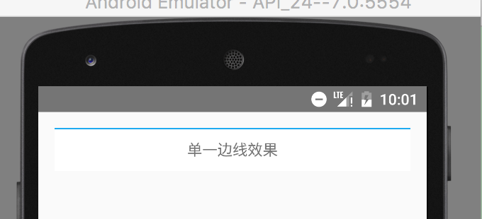
(1). 效果1 :单一边线
效果图:
图中,TextView 只有一个顶部边线
具体代码:
- 创建带有蓝色顶部边线的 layer-list 图
在 res 目录中的 drawable 目录下,创建名称为 singleline.xml 的xml 文件,然后编辑 layer-list 的详细代码,如下:
- 1
- 2
- 3
- 4
- 5
- 6
- 7
- 8
- 9
- 10
- 11
- 12
- 13
- 14
- 15
- 16
- 17
- 1
- 2
- 3
- 4
- 5
- 6
- 7
- 8
- 9
- 10
- 11
- 12
- 13
- 14
- 15
- 16
- 17
- 使用 layer-list 图,设置为textView的背景
- 1
- 2
- 3
- 4
- 5
- 6
- 1
- 2
- 3
- 4
- 5
- 6
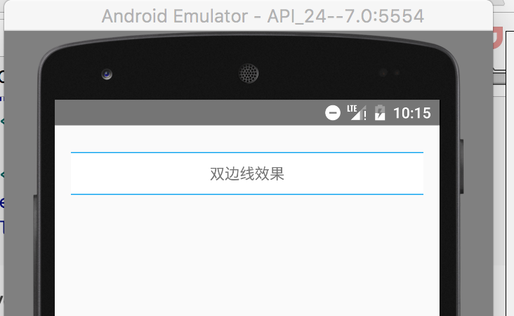
(2). 效果2 :双边线
效果图:
图中,TextView 具有上下边线
具体代码:
- 创建带有蓝色顶部和底部边线的 layer-list 图
- 1
- 2
- 3
- 4
- 5
- 6
- 7
- 8
- 9
- 10
- 11
- 12
- 13
- 14
- 15
- 16
- 17
- 18
- 1
- 2
- 3
- 4
- 5
- 6
- 7
- 8
- 9
- 10
- 11
- 12
- 13
- 14
- 15
- 16
- 17
- 18
- 使用 layer-list 图,设置为textView的背景
- 1
- 2
- 3
- 4
- 5
- 6
- 7
- 8
- 1
- 2
- 3
- 4
- 5
- 6
- 7
- 8
(3). 效果3 :阴影
效果图:
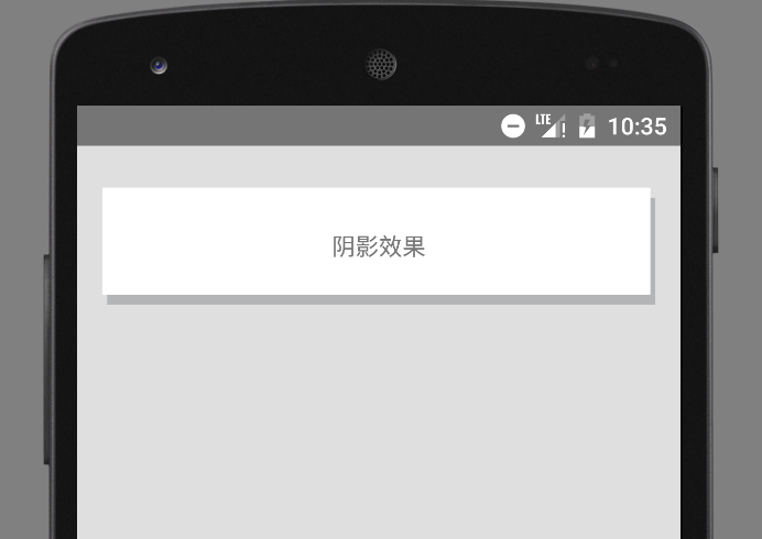
具体代码:
- 创建 layer-list
- 1
- 2
- 3
- 4
- 5
- 6
- 7
- 8
- 9
- 10
- 11
- 12
- 13
- 14
- 15
- 16
- 17
- 18
- 19
- 1
- 2
- 3
- 4
- 5
- 6
- 7
- 8
- 9
- 10
- 11
- 12
- 13
- 14
- 15
- 16
- 17
- 18
- 19
- 使用 layer-list 图,
- 1
- 2
- 3
- 4
- 5
- 6
- 7
- 1
- 2
- 3
- 4
- 5
- 6
- 7
(4). 效果4 : 图片层叠
图片层叠的时候,有两种效果,一种是缩放后层叠,一种是不缩放的层叠。默认是缩放效果。具体效果以及实现代码如下:
效果图 1) : 带有缩放效果的

具体代码 1):
- 创建 layer-list
- 1
- 2
- 3
- 4
- 5
- 6
- 7
- 8
- 9
- 10
- 11
- 12
- 13
- 14
- 15
- 16
- 17
- 18
- 19
- 20
- 1
- 2
- 3
- 4
- 5
- 6
- 7
- 8
- 9
- 10
- 11
- 12
- 13
- 14
- 15
- 16
- 17
- 18
- 19
- 20
或者也可以使用如下代码,实现缩放的叠加图:
- 1
- 2
- 3
- 4
- 5
- 6
- 7
- 8
- 9
- 10
- 11
- 12
- 13
- 14
- 15
- 1
- 2
- 3
- 4
- 5
- 6
- 7
- 8
- 9
- 10
- 11
- 12
- 13
- 14
- 15
- 使用 layer-list 图,
- 1
- 2
- 3
- 4
- 5
- 1
- 2
- 3
- 4
- 5
效果图 2):不带缩放效果的
注意:
A. 不缩放的时候,必须在 item 节点中使用 bitmap 节点,并给 bitmap 设置 gravity=center ;B. 虽然在实现缩放效果的时候,可以直接使用 item 中的 drawable属性,但实现不缩放的效果时,如果还用drawable 属性,即便给item 设置了gravity =center ,在真机上的效果依旧是缩放的。(但模拟器是不缩放的)

具体代码 2):
- 创建 layer-list
- 1
- 2
- 3
- 4
- 5
- 6
- 7
- 8
- 9
- 10
- 11
- 12
- 13
- 14
- 15
- 16
- 17
- 18
- 19
- 20
- 21
- 22
- 1
- 2
- 3
- 4
- 5
- 6
- 7
- 8
- 9
- 10
- 11
- 12
- 13
- 14
- 15
- 16
- 17
- 18
- 19
- 20
- 21
- 22
- 使用 layer-list 图,
- 1
- 2
- 3
- 4
- 5
- 1
- 2
- 3
- 4
- 5
(5). 效果5 :叠加旋转
效果图:
具体代码:
- 创建 layer-list
- 1
- 2
- 3
- 4
- 5
- 6
- 7
- 8
- 9
- 10
- 11
- 12
- 13
- 14
- 15
- 16
- 17
- 18
- 19
- 20
- 21
- 22
- 23
- 24
- 1
- 2
- 3
- 4
- 5
- 6
- 7
- 8
- 9
- 10
- 11
- 12
- 13
- 14
- 15
- 16
- 17
- 18
- 19
- 20
- 21
- 22
- 23
- 24
旋转的时候,只需要给出 起始的角度( fromdegress )即可。
- 使用 layer-list 图,
- 1
- 2
- 3
- 4
- 5
- 1
- 2
- 3
- 4
- 5
4. layer-list 的扩展使用
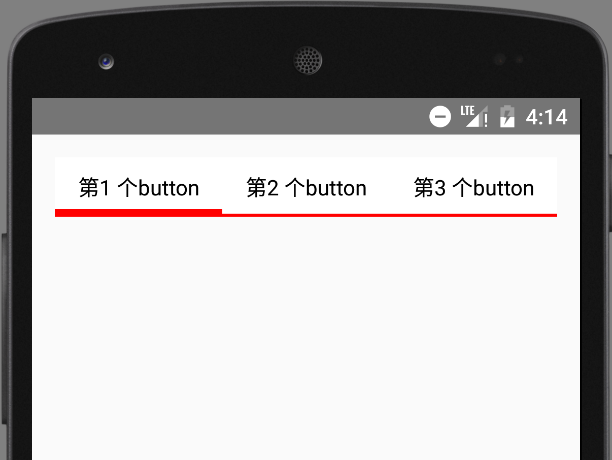
(1).实现选择器的效果
主要使用组件:RadioGroup Selector layer-list
1). 效果图:
2). 具体代码
- 定义 selector 选择器
selector 的 item 节点中,直接嵌套 layer-list
当然也可以先写好layer-list ,然后再去引用
- 1
- 2
- 3
- 4
- 5
- 6
- 7
- 8
- 9
- 10
- 11
- 12
- 13
- 14
- 15
- 16
- 17
- 18
- 19
- 20
- 21
- 22
- 23
- 24
- 25
- 26
- 27
- 28
- 29
- 30
- 31
- 32
- 33
- 34
- 1
- 2
- 3
- 4
- 5
- 6
- 7
- 8
- 9
- 10
- 11
- 12
- 13
- 14
- 15
- 16
- 17
- 18
- 19
- 20
- 21
- 22
- 23
- 24
- 25
- 26
- 27
- 28
- 29
- 30
- 31
- 32
- 33
- 34
注意:
在上面的代码中,由于并没有具体的shape ,所以可以省略shape , 直接用 color , 简化后的代码如下:
- 1
- 2
- 3
- 4
- 5
- 6
- 7
- 8
- 9
- 10
- 11
- 12
- 13
- 14
- 15
- 16
- 17
- 18
- 19
- 20
- 21
- 22
- 23
- 24
- 25
- 26
- 27
- 1
- 2
- 3
- 4
- 5
- 6
- 7
- 8
- 9
- 10
- 11
- 12
- 13
- 14
- 15
- 16
- 17
- 18
- 19
- 20
- 21
- 22
- 23
- 24
- 25
- 26
- 27
- 使用selector
- 1
- 2
- 3
- 4
- 5
- 6
- 7
- 8
- 9
- 10
- 11
- 12
- 13
- 14
- 15
- 16
- 17
- 18
- 19
- 20
- 21
- 22
- 23
- 24
- 25
- 26
- 27
- 28
- 29
- 30
- 31
- 32
- 33
- 34
- 35
- 36
- 37
- 38
- 39
- 40
- 41
- 42
- 1
- 2
- 3
- 4
- 5
- 6
- 7
- 8
- 9
- 10
- 11
- 12
- 13
- 14
- 15
- 16
- 17
- 18
- 19
- 20
- 21
- 22
- 23
- 24
- 25
- 26
- 27
- 28
- 29
- 30
- 31
- 32
- 33
- 34
- 35
- 36
- 37
- 38
- 39
- 40
- 41
- 42
注意:
在 RadioGroup 中,是通过 RadioButton 的 id 来控制是否选中。
所以,如果需要设置某一个 RadioButton 为默认选中,就必须给该 RadioButton 设置 id ;
如果不设置 id ,导致的结果就是该 RadioButton 会一直处于选中状态!!!


 356
356


 被折叠的 条评论
为什么被折叠?
被折叠的 条评论
为什么被折叠?
 到【灌水乐园】发言


