


前言
上一篇总结了css3动画的属性,就把先前做的小demo做了一遍,来加深一些css动画属性,这篇博客仅仅是加深自己的能力啦,大神越过喵过。不过,我是向着大神的心,一直努力的,相信以自己的风格节奏学习总有一天,我自认为达到大神级别。想想多木帅。纯属个人ni想,不过我的博客我做主,管它呢。bb多了,直接上上自己的技术分享。
实现思路----动画属性实现轮播图
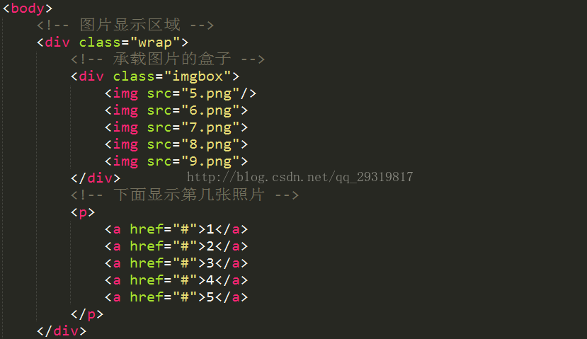
1.html文档结构
文档结构是必须的,代码如下:
2.在包裹图片的元素,设置animation动画属性,在帧@keyframes使其改变该属性的margin-left从而实现轮播的效果
注意:动画的停留时间,和过渡时间
假如6照片,设置“1张照片”的过渡时间,一共有100帧,故每张停留的时间为100/7,留一张照片的帧来做过渡帧效果。
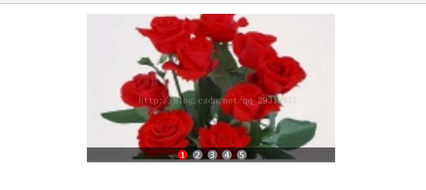
效果图如下:
实现代码如下:
<!DOCTYPE html>
<html>
<head>
	<title>css3动画属性实现简单的轮播图</title>
	<meta charset="utf-8"/>
	<style type="text/css">
		*{
			margin:0;
			padding:0;
		}
		/*图片显示区域*/
		.wrap{
			width: 500px;
			height: 300px;
			margin:20px auto;
			position: relative;
			overflow:hidden;
			/*background-color: gray;*/  /*test color*/
		}
		/*承载图片的盒子  在其中设置animation动画属性*/
		.imgbox{
			width: 2500px;
			height: 300px;
			animation:imgbox 4s ease-in-out infinite forwards;
		}
		/*设置鼠标移动到图片上,动画处于暂停状态*/
		.imgbox:hover{
			animation-play-state: paused;
		}
		/*这里一共有5张照片,加上“2张照片”的过渡时间帧(30帧的过渡时间帧),共7张,来分享这动画的100帧*/
		@keyframes imgbox{
			0%,14%{
				margin-left: 0;
			}
			21%,35%{
				margin-left:-500px;
			}
			42%,56%{
				margin-left:-1000px;
			}
			63%,77%{
				margin-left:-1500px;
			}
			86%,to{
				margin-left:-2000px;
			}
		}
		/*这里一共有5张照片,加上“1张照片”的过渡时间帧(10帧的过渡时间帧),共7张,来分享这动画的100帧*/
		@keyframes imgbox1{
			0%,16%{
				margin-left: 0;
			}
			18%,34%{
				margin-left:-500px;
			}
			36%,52%{
				margin-left: -1000px;
			}
			55%,71%{
				margin-left: -1500px;
			}
			74%,to{
				margin-left: -2000px;
			}
		}
		.imgbox img{
			width: 500px;
			height: 300px;
			float: left;
		}
		.wrap p{
			width: 100%;
			height: 30px;
			background-color: rgba(0,0,0,.6);
			position: absolute;
			left: 0;
			bottom:0;
			text-align:center;
		}
		.wrap p a{
			display: inline-block;
			width: 20px;
			height: 20px;
			line-height: 20px;
			border-radius:50%;
			color:#fff;
			text-decoration: none;
			margin-top:5px;
			margin-left: 5px;
			background-color: gray;
		}
		/*实现照片转动时,下面p标签的a标签有相应变化*/
		.wrap p a:nth-of-type(1){
			animation:a1 4s infinite;
		}
		@keyframes a1{
			0%,20%{
				background-color: red;
			}
			21%,to{
				background-color: gray;
			}
		}
		.wrap p a:nth-of-type(2){
			animation:a2 4s infinite;
		}
		@keyframes a2{
			0%,20%{
				background-color: gray;
			}
			21%,41%{
				background-color: red;
			}
			42%,to{
				background-color: gray;
			}
		}
		.wrap p a:nth-of-type(3){
			animation: a3 4s infinite;
		}
		@keyframes a3{
			0%,41%{
				background-color: gray;
			}
			42%,62%{
				background-color: red;
			}
			63%,to{
				background-color: gray;
			}
		}
		.wrap p a:nth-of-type(4){
			animation:a4 4s infinite;
		}
		@keyframes a4{
			0%,62%{
				background-color: gray;
			}
			63%,85%{
				background-color: red;
			}
			86%,to{
				background-color: gray;
			}
		}
		.wrap p a:nth-of-type(5){
			animation: a5 4s infinite;
		}
		@keyframes a5{
			0%,85%{
				background-color: gray;
			}
			86%,to{
				background-color: red;
			}
		}
	</style>
</head>
<body>
	<!-- 图片显示区域 -->
	<div class="wrap">
		<!-- 承载图片的盒子 -->
		<div class="imgbox">
			<img src="5.png"/>
			<img src="6.png">
			<img src="7.png">
			<img src="8.png">
			<img src="9.png">
		</div>
		<!-- 下面显示第几张照片 -->
		<p>
			<a href="#">1</a>
			<a href="#">2</a>
			<a href="#">3</a>
			<a href="#">4</a>
			<a href="#">5</a>
		</p>
	</div>
</body>
</html>
使用css属性待解决轮播效果问题
大神有空,热烈欢迎留言
1.鼠标移动到照片或者下面标识(如:“1”,“2”)时,使俩者都处于相应的停留状态
2.鼠标移动到下面的标识,则自动匹配该标识的照片
生活寄语
爱代码,爱上生活!


 5008
5008


 被折叠的 条评论
为什么被折叠?
被折叠的 条评论
为什么被折叠?
 到【灌水乐园】发言


