3D立体相册,一个可旋转的立体相册


11359.gif

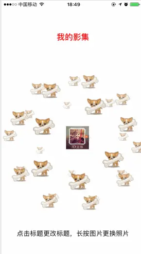
主要功能:立体球体展示 可自行添加本地照片 可旋转,照片可放大

商城下载: App Store

github下载

用的代码是用的云标签的code,代码略有改动
主要代码调用

   // 调用展示
self.sphereView = [[YoungSphere alloc] initWithFrame:CGRectMake(20, 200, 340, 320)];
NSMutableArray *array = [[NSMutableArray alloc] initWithCapacity:0];
for (NSInteger i = 0; i < 30; i ++) {
    self.btn = [UIButton buttonWithType:UIButtonTypeSystem];
    [_btn setBackgroundImage:[UIImage imageNamed:@"dog"] forState:(UIControlStateNormal)];
    _btn.frame = CGRectMake(0, 0, 60, 60);
    [_btn addTarget:self action:@selector(buttonPressed:) forControlEvents:UIControlEventTouchUpInside];
    [array addObject:_btn];
    [_sphereView addSubview:_btn];
}
[_sphereView setCloudTags:array];
_sphereView.backgroundColor = [UIColor whiteColor];

[self.view addSubview:_sphereView];

当然里面的很多元素都是可以改动的,根据自己需要自己改动即可
这里用的是Button,你也可改为其他的,数量也可改动

这里图片的存储,展示用的很笨拙,大家不要学我,要用好的管理方式。因为刚开始只是做着玩的,后来就慢慢完善成小项目了。

说一下图片的管理吧:
因为是单个展示,这里用的是单个数组的存储,展示。
当做到线上的那个复杂形式的时候,就远远不够了,因为会涉及到多个相册的展示,删除,还有和标题的联动性,线上的用的是字典和数组相结合的方式。


纯CSS实现鼠标经过3D立体动态展示图片特效代码 @charset "utf-8"; *{ margin:0; padding:0; } body{ max-width: 100%; min-width: 100%; height: 100%; background-size: cover; background-repeat: no-repeat; background-attachment: fixed; background-size:100% 100%; position: absolute; margin-left: auto; margin-right: auto; } li{ list-style: none; } .box{ width:200px; height:200px; background-size: cover; background-repeat: no-repeat; background-attachment: fixed; background-size:100% 100%; position: absolute; margin-left: 42%; margin-top: 22%; -webkit-transform-style:preserve-3d; -webkit-transform:rotateX(13deg); -webkit-animation:move 5s linear infinite; } .minbox{ width:100px; height:100px; position: absolute; left:50px; top:30px; -webkit-transform-style:preserve-3d; } .minbox li{ width:100px; height:100px; position: absolute; left:0; top:0; } .minbox li:nth-child(1){ background: url(img/01.png) no-repeat 0 0; -webkit-transform:translateZ(50px); } .minbox li:nth-child(2){ background: url(img/02.png) no-repeat 0 0; -webkit-transform:rotateX(180deg) translateZ(50px); } .minbox li:nth-child(3){ background: url(img/03.png) no-repeat 0 0; -webkit-transform:rotateX(-90deg) translateZ(50px); } .minbox li:nth-child(4){ background: url(img/04.png) no-repeat 0 0; -webkit-transform:rotateX(90deg) translateZ(50px); } .minbox li:nth-child(5){ background: url(img/05.png) no-repeat 0 0; -webkit-transform:rotateY(-90deg) translateZ(50px); } .minbox li:nth-child(6){ background: url(img/06.png) no-repeat 0 0; -webkit-transform:rotateY(90deg) translateZ(50px); } .maxbox li:nth-child(1){ background: url(img/1.png) no-repeat 0 0; -webkit-transform:translateZ(50px); } .maxbox li:nth-child(2){ background: url(img/2.png) no-repeat 0 0; -webkit-transform:translateZ(50px); } .maxbox li:nth-child(3){ background: url(img/3.png) no-repeat 0 0; -webkit-transform:rotateX(-90deg) translateZ(50px); } .maxbox li:nth-child(4){ background: url(img/4.png) no-repeat 0 0; -webkit-transform:rotateX(90deg) translateZ(50px); } .maxbox li:nth-child(5){ background: url(img/5.png) no-repeat 0 0; -webkit-transform:rotateY(-90deg) translateZ(50px); } .maxbox li:nth-child(6){ background: url(img/6.png) no-repeat 0 0; -webkit-transform:rotateY(90deg) translateZ(50px); } .maxbox{ width: 800px; height: 400px; position: absolute; left: 0; top: -20px; -webkit-transform-style: preserve-3d; } .maxbox li{ width: 200px; height: 200px; background: #fff; border:1px solid #ccc; position: absolute; left: 0; top: 0; opacity: 0.2; -webkit-transition:all 1s ease; } .maxbox li:nth-child(1){ -webkit-transform:translateZ(100px); } .maxbox li:nth-child(2){ -webkit-transform:rotateX(180deg) translateZ(100px); } .maxbox li:nth-child(3){ -webkit-transform:rotateX(-90deg) translateZ(100px); } .maxbox li:nth-child(4){ -webkit-transform:rotateX(90deg) translateZ(100px); } .maxbox li:nth-child(5){ -webkit-transform:rotateY(-90deg) translateZ(100px); } .maxbox li:nth-child(6){ -webkit-transform:rotateY(90deg) translateZ(100px); } .box:hover ol li:nth-child(1){ -webkit-transform:translateZ(300px); width: 400px; height: 400px; opacity: 0.8; left: -100px; top: -100px; } .box:hover ol li:nth-child(2){ -webkit-transform:rotateX(180deg) translateZ(300px); width: 400px; height: 400px; opacity: 0.8; left: -100px; top: -100px; } .box:hover ol li:nth-child(3){ -webkit-transform:rotateX(-90deg) translateZ(300px); width: 400px; height: 400px; opacity: 0.8; left: -100px; top: -100px; } .box:hover ol li:nth-child(4){ -webkit-transform:rotateX(90deg) translateZ(300px); width: 400px; height: 400px; opacity: 0.8; left: -100px; top: -100px; } .box:hover ol li:nth-child(5){ -webkit-transform:rotateY(-90deg) translateZ(300px); width: 400px; height: 400px; opacity: 0
评论 5
添加红包

请填写红包祝福语或标题

红包个数最小为10个

红包金额最低5元

当前余额3.43前往充值 >
需支付:10.00
成就一亿技术人!
领取后你会自动成为博主和红包主的粉丝 规则
hope_wisdom
发出的红包

打赏作者

阿三先生

你的鼓励将是我创作的最大动力

¥1 ¥2 ¥4 ¥6 ¥10 ¥20
扫码支付:¥1
获取中
扫码支付

您的余额不足,请更换扫码支付或充值

打赏作者

实付
使用余额支付
点击重新获取
扫码支付
钱包余额 0

抵扣说明:

1.余额是钱包充值的虚拟货币,按照1:1的比例进行支付金额的抵扣。
2.余额无法直接购买下载,可以购买VIP、付费专栏及课程。

余额充值