


最近看到App上一个不错的导航效果:一个导航滑动的效果,被选中的背景会有变化,会随着fragment的滑动有个位移动画。感觉挺有意思。
两种方式:第一种:
使用TabLayout实现效果,第二种使用自定义TabLayout实现效果。还是自定义的好用。
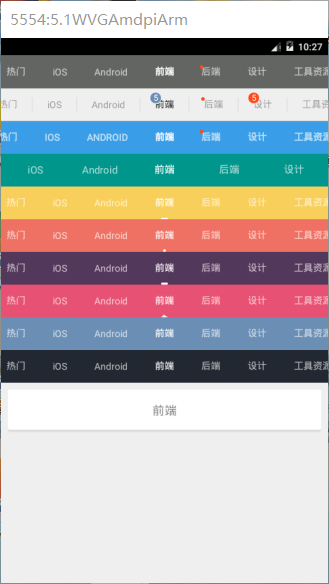
上图:
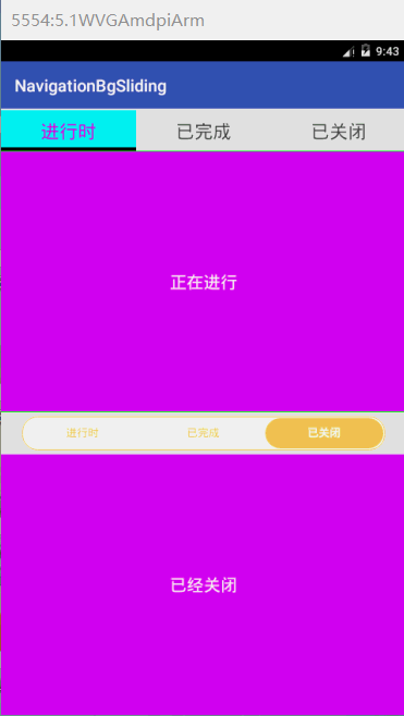
效果:实现选中卡片的背景滑动效果。
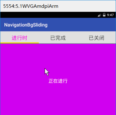
分析:第一种使用TabLayout显得比较生硬,但我们想实现的是像下划线这种渐变滑动。
使用TabLayout 则需要添加背景动画。比较麻烦。
当我们不在导航中使用背景移动效果时,建议使用TabLayout。
效果还是不错的:
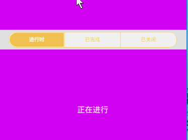
第二种:自定义TabLayout集成自FrameLayout,并实现AnimatorUpdateListener接口。其实是个帧布局。当我们滑动时修改选项卡被选中的位置。并invalidate()UI。
该方法需要我们计算移动偏移量。设置差值器,并执行动画。也需要我们自定义属性。
也需要我们同时对 选项卡和ViewPager添加两个监听事件。完成联动效果。
废话少说上代码:
<?xml version="1.0" encoding="utf-8"?>
<resources>

    <!-- 设置字体加粗 -->
    <attr name="zq_textBold" format="enum">
        <enum name="NONE" value="0"/>
        <enum name="SELECT" value="1"/>
        <enum name="BOTH" value="2"/>
    </attr>

    <!--自定义属性 -->
    <declare-styleable name="MyTabLayout">

        <!-- indicator   样式 设置显示器颜色  高度 -->
        <attr name="zq_indicator_color" format="color"/>
        <attr name="zq_indicator_height" format="dimension"/>
        <attr name="zq_indicator_width" format="dimension"/>

        <!--外边距-->
        <attr name="zq_indicator_margin_left" format="dimension"/>
        <attr name="zq_indicator_margin_top" format="dimension"/>
        <attr name="zq_indicator_margin_right" format="dimension"/>
        <attr name="zq_indicator_margin_bottom" format="dimension"/>
        <attr name="zq_indicator_corner_radius"  format="dimension"/>
        <!-- 设置显示器支持动画-->
        <attr name="zq_indicator_anim_enable" format="boolean"/>
        <!-- 设置显示器动画时间-->
        <attr name="zq_indicator_anim_duration"  format="integer"/>
        <!-- 设置显示器支持动画回弹效果-->
        <attr name="zq_indicator_bounce_enable" format="boolean"/>

        <!-- divider -->
        <attr name="zq_divider_color" format="color"/>
        <attr name="zq_divider_width" format="dimension"/>
        <attr name="zq_divider_padding" format="dimension"/>

        <!-- tabpaddingLeft和paddingRight  设置tab大小等分  设置tab固定大小  -->
        <attr name="zq_tab_padding"  format="dimension"/>
        <attr name="zq_tab_space_equal" format="boolean"/>
        <attr name="zq_tab_width" format="dimension"/>

        <!--字体大小  字体被选中的颜色 -->
        <attr name="zq_textsize" format="dimension"/>
        <attr name="zq_textSelectColor" format="color"/>
        <attr name="zq_textUnselectColor" format="color"/>
        <attr name="zq_textBold"/>
        <!-- 设置字体全大写 -->
        <attr name="zq_textAllCaps" format="boolean"/>

        <!--定义  导航条的背景色  边界颜色  和边界宽度-->
        <attr name="zq_bar_color" format="color"/>
        <attr name="zq_bar_stroke_color" format="color"/>
        <attr name="zq_bar_stroke_width" format="dimension"/>
    </declare-styleable>


    <declare-styleable name="MsgView">
        <!-- 圆角矩形背景色 -->
        <attr name="mv_backgroundColor" format="color"/>
        <!-- 圆角弧度,单位dp-->
        <attr name="mv_cornerRadius" format="dimension"/>
        <!-- 圆角弧度,单位dp-->
        <attr name="mv_strokeWidth" format="dimension"/>
        <!-- 圆角边框颜色-->
        <attr name="mv_strokeColor" format="color"/>
        <!-- 圆角弧度是高度一半-->
        <attr name="mv_isRadiusHalfHeight" format="boolean"/>
        <!-- 圆角矩形宽高相等,取较宽高中大值-->
        <attr name="mv_isWidthHeightEqual" format="boolean"/>
    </declare-styleable>

</resources>
activity_main.xml中引用:
<!--添加命名空间-->
  xmlns:zq="http://schemas.android.com/apk/res-auto"
<!--其他代码省略-->


 <!--自定义  Tablayout   使用自定义属性-->
        <com.hero.zhaoq.navigationbgsliding.widgets.MyTabLayout
            android:id="@+id/my_tab"
            android:layout_width="match_parent"
            android:layout_height="40dp"
            android:paddingLeft="25dp"
            android:paddingRight="25dp"
            zq:zq_bar_color="#ffffff"
            android:layout_marginTop="5dp"
            android:layout_marginBottom="5dp"
            zq:zq_indicator_anim_enable="true"
            zq:zq_indicator_color="#F6CE59"
            zq:zq_indicator_margin_bottom="2dp"
            zq:zq_indicator_margin_left="2dp"
            zq:zq_indicator_margin_right="2dp"
            zq:zq_indicator_margin_top="2dp"
            zq:zq_textBold="SELECT"/>
在此可以实现动画的 开启和关闭效果:
关闭后,则滑动没有逐渐移动的效果。
MyTabLayout.java:自定义选项卡类:
package com.hero.zhaoq.navigationbgsliding.widgets;

import android.animation.TypeEvaluator;
import android.animation.ValueAnimator;
import android.content.Context;
import android.content.res.TypedArray;
import android.graphics.Canvas;
import android.graphics.Color;
import android.graphics.Paint;
import android.graphics.Rect;
import android.graphics.drawable.GradientDrawable;
import android.util.AttributeSet;
import android.util.TypedValue;
import android.view.Gravity;
import android.view.View;
import android.view.ViewGroup;
import android.view.animation.OvershootInterpolator;
import android.widget.FrameLayout;
import android.widget.LinearLayout;
import android.widget.TextView;

import com.hero.zhaoq.navigationbgsliding.R;
import com.hero.zhaoq.navigationbgsliding.fragments.BaseFragment;
import com.hero.zhaoq.navigationbgsliding.utils.FragmentChangeManager;

import java.util.List;

/**
 * Package_name:com.hero.zhaoq.navigationbgsliding.widgets
 * Author:zhaoQiang
 * Email:zhao_hero@163.com
 * Date:2016/9/9  13:44
 *
 * 自定义  导航选项卡
 */
public class MyTabLayout extends FrameLayout implements ValueAnimator.AnimatorUpdateListener{

    public MyTabLayout(Context context) {
        this(context,null,0);
    }

    public MyTabLayout(Context context, AttributeSet attrs) {
        this(context, attrs, 0);
    }

    private Context mContext;
    private LinearLayout mTabsContainer;

    private int mHeight;
    /** anim */
    private ValueAnimator mValueAnimator;

    private IndicatorPoint mCurrentP = new IndicatorPoint();
    private IndicatorPoint mLastP = new IndicatorPoint();

    public MyTabLayout(Context context, AttributeSet attrs, int defStyleAttr) {
        super(context, attrs, defStyleAttr);
        //初始化数据
        setWillNotDraw(false);//重写onDraw方法,需要调用这个方法来清除flag
        setClipChildren(false);
        setClipToPadding(false);

        this.mContext = context;
        mTabsContainer = new LinearLayout(context);  //创建  线性布局
        addView(mTabsContainer); //添加到 帧布局中

        obtainAttributes(context, attrs);  //获取属性集

        //get layout_height
        String height = attrs.getAttributeValue("http://schemas.android.com/apk/res/android", "layout_height");

        //create
        if (height.equals(ViewGroup.LayoutParams.MATCH_PARENT + "")) {
        } else if (height.equals(ViewGroup.LayoutParams.WRAP_CONTENT + "")) {
        } else {
            int[] systemAttrs = {android.R.attr.layout_height};
            TypedArray a = context.obtainStyledAttributes(attrs, systemAttrs);
            mHeight = a.getDimensionPixelSize(0, ViewGroup.LayoutParams.WRAP_CONTENT);
            a.recycle();
        }

        mValueAnimator = ValueAnimator.ofObject(new PointEvaluator(), mLastP, mCurrentP);
        mValueAnimator.addUpdateListener(this);
    }

    private float mTabPadding;
    private boolean mTabSpaceEqual;
    private float mTabWidth;

    /** indicator */
    private int mIndicatorColor;
    private float mIndicatorHeight;
    private float mIndicatorCornerRadius;
    private float mIndicatorMarginLeft;
    private float mIndicatorMarginTop;
    private float mIndicatorMarginRight;
    private float mIndicatorMarginBottom;
    private long mIndicatorAnimDuration;
    private boolean mIndicatorAnimEnable;
    private boolean mIndicatorBounceEnable;

    /** divider */
    private int mDividerColor;
    private float mDividerWidth;
    private float mDividerPadding;
    /** title */
    private static final int TEXT_BOLD_NONE = 0;
    private static final int TEXT_BOLD_WHEN_SELECT = 1;
    private static final int TEXT_BOLD_BOTH = 2;
    private float mTextsize;
    private int mTextSelectColor;
    private int mTextUnselectColor;
    private int mTextBold;
    private boolean mTextAllCaps;

    private int mBarColor;
    private int mBarStrokeColor;
    private float mBarStrokeWidth;

    //获取  属性集
    private void obtainAttributes(Context context, AttributeSet attrs) {
        TypedArray ta = context.obtainStyledAttributes(attrs, R.styleable.MyTabLayout);

        mIndicatorColor = ta.getColor(R.styleable.MyTabLayout_zq_indicator_color, Color.parseColor("#222831"));
        mIndicatorHeight = ta.getDimension(R.styleable.MyTabLayout_zq_indicator_height, -1);
        mIndicatorCornerRadius = ta.getDimension(R.styleable.MyTabLayout_zq_indicator_corner_radius, -1);
        mIndicatorMarginLeft = ta.getDimension(R.styleable.MyTabLayout_zq_indicator_margin_left, dp2px(0));
        mIndicatorMarginTop = ta.getDimension(R.styleable.MyTabLayout_zq_indicator_margin_top, 0);
        mIndicatorMarginRight = ta.getDimension(R.styleable.MyTabLayout_zq_indicator_margin_right, dp2px(0));
        mIndicatorMarginBottom = ta.getDimension(R.styleable.MyTabLayout_zq_indicator_margin_bottom, 0);
        mIndicatorAnimEnable = ta.getBoolean(R.styleable.MyTabLayout_zq_indicator_anim_enable, false);
        mIndicatorBounceEnable = ta.getBoolean(R.styleable.MyTabLayout_zq_indicator_bounce_enable, true);
        mIndicatorAnimDuration = ta.getInt(R.styleable.MyTabLayout_zq_indicator_anim_duration, -1);

        mDividerColor = ta.getColor(R.styleable.MyTabLayout_zq_divider_color, mIndicatorColor);
        mDividerWidth = ta.getDimension(R.styleable.MyTabLayout_zq_divider_width, dp2px(1));
        mDividerPadding = ta.getDimension(R.styleable.MyTabLayout_zq_divider_padding, 0);

        mTextsize = ta.getDimension(R.styleable.MyTabLayout_zq_textsize, sp2px(13f));
        mTextSelectColor = ta.getColor(R.styleable.MyTabLayout_zq_textSelectColor, Color.parseColor("#ffffff"));
        mTextUnselectColor = ta.getColor(R.styleable.MyTabLayout_zq_textUnselectColor, mIndicatorColor);
        mTextBold = ta.getInt(R.styleable.MyTabLayout_zq_textBold, TEXT_BOLD_NONE);
        mTextAllCaps = ta.getBoolean(R.styleable.MyTabLayout_zq_textAllCaps, false);

        mTabSpaceEqual = ta.getBoolean(R.styleable.MyTabLayout_zq_tab_space_equal, true);
        mTabWidth = ta.getDimension(R.styleable.MyTabLayout_zq_tab_width, dp2px(-1));
        mTabPadding = ta.getDimension(R.styleable.MyTabLayout_zq_tab_padding, mTabSpaceEqual || mTabWidth > 0 ? dp2px(0) : dp2px(10));

        mBarColor = ta.getColor(R.styleable.MyTabLayout_zq_bar_color, Color.TRANSPARENT);
        mBarStrokeColor = ta.getColor(R.styleable.MyTabLayout_zq_bar_stroke_color, mIndicatorColor);
        mBarStrokeWidth = ta.getDimension(R.styleable.MyTabLayout_zq_bar_stroke_width, dp2px(1));

        ta.recycle();
    }

    /** 用于绘制显示器 矩形*/
    private Rect mIndicatorRect = new Rect();
    private GradientDrawable mIndicatorDrawable = new GradientDrawable();
    private GradientDrawable mRectDrawable = new GradientDrawable();

    private Paint mDividerPaint = new Paint(Paint.ANTI_ALIAS_FLAG);

    private int mCurrentTab;  //记录当前选项卡
    private int mLastTab;  //选项卡
    private int mTabCount; //数量
    private boolean mIsFirstDraw = true;

    //开始绘制
    @Override
    protected void onDraw(Canvas canvas) {
        super.onDraw(canvas);

        if (isInEditMode() || mTabCount <= 0) {
            return;
        }

        int height = getHeight();
        int paddingLeft = getPaddingLeft();

        if (mIndicatorHeight < 0) {
            mIndicatorHeight = height - mIndicatorMarginTop - mIndicatorMarginBottom;
        }

        if (mIndicatorCornerRadius < 0 || mIndicatorCornerRadius > mIndicatorHeight / 2) {
            mIndicatorCornerRadius = mIndicatorHeight / 2;
        }

        //draw rect  绘制矩形   背景
        mRectDrawable.setColor(mBarColor);
        mRectDrawable.setStroke((int) mBarStrokeWidth, mBarStrokeColor);
        mRectDrawable.setCornerRadius(mIndicatorCornerRadius);
        mRectDrawable.setBounds(getPaddingLeft(), getPaddingTop(), getWidth() - getPaddingRight(), getHeight() - getPaddingBottom());
        mRectDrawable.draw(canvas);

        // draw divider  绘制分割线
        if (!mIndicatorAnimEnable && mDividerWidth > 0) {
            mDividerPaint.setStrokeWidth(mDividerWidth);
            mDividerPaint.setColor(mDividerColor);
            for (int i = 0; i < mTabCount - 1; i++) {
                View tab = mTabsContainer.getChildAt(i);
                canvas.drawLine(paddingLeft + tab.getRight(), mDividerPadding, paddingLeft + tab.getRight(), height - mDividerPadding, mDividerPaint);
            }
        }

        //draw indicator line
        if (mIndicatorAnimEnable) { //是否支持动画
            if (mIsFirstDraw) {
                mIsFirstDraw = false;
                calcIndicatorRect();
            }
        } else {
            //不支持动画
            calcIndicatorRect();
        }
        mIndicatorDrawable.setColor(mIndicatorColor);
        mIndicatorDrawable.setBounds(paddingLeft + (int) mIndicatorMarginLeft + mIndicatorRect.left,
                (int) mIndicatorMarginTop, (int) (paddingLeft + mIndicatorRect.right - mIndicatorMarginRight),
                (int) (mIndicatorMarginTop + mIndicatorHeight));
        mIndicatorDrawable.setCornerRadii(mRadiusArr);
        mIndicatorDrawable.draw(canvas);
    }

    private float[] mRadiusArr = new float[8]; //角度

    //  绘制   选项卡  被选动画
    private void calcIndicatorRect() {
        View currentTabView = mTabsContainer.getChildAt(this.mCurrentTab);
        float left = currentTabView.getLeft();
        float right = currentTabView.getRight();

        mIndicatorRect.left = (int) left;
        mIndicatorRect.right = (int) right;

        if (!mIndicatorAnimEnable) { //不支持动画  这样绘制
            if (mCurrentTab == 0) { //第一个选项卡
                /**The corners are ordered top-left, top-right, bottom-right, bottom-left*/
                mRadiusArr[0] = mIndicatorCornerRadius;
                mRadiusArr[1] = mIndicatorCornerRadius;
                mRadiusArr[2] = 0;
                mRadiusArr[3] = 0;
                mRadiusArr[4] = 0;
                mRadiusArr[5] = 0;
                mRadiusArr[6] = mIndicatorCornerRadius;
                mRadiusArr[7] = mIndicatorCornerRadius;
            } else if (mCurrentTab == mTabCount - 1) { //最后一个选项卡
                /**The corners are ordered top-left, top-right, bottom-right, bottom-left*/
                mRadiusArr[0] = 0;
                mRadiusArr[1] = 0;
                mRadiusArr[2] = mIndicatorCornerRadius;
                mRadiusArr[3] = mIndicatorCornerRadius;
                mRadiusArr[4] = mIndicatorCornerRadius;
                mRadiusArr[5] = mIndicatorCornerRadius;
                mRadiusArr[6] = 0;
                mRadiusArr[7] = 0;
            } else { //中间的选项卡
                /**The corners are ordered top-left, top-right, bottom-right, bottom-left*/
                mRadiusArr[0] = 0;
                mRadiusArr[1] = 0;
                mRadiusArr[2] = 0;
                mRadiusArr[3] = 0;
                mRadiusArr[4] = 0;
                mRadiusArr[5] = 0;
                mRadiusArr[6] = 0;
                mRadiusArr[7] = 0;
            }
        } else {//支持动画  这样绘制
            /**The corners are ordered top-left, top-right, bottom-right, bottom-left*/
            mRadiusArr[0] = mIndicatorCornerRadius;
            mRadiusArr[1] = mIndicatorCornerRadius;
            mRadiusArr[2] = mIndicatorCornerRadius;
            mRadiusArr[3] = mIndicatorCornerRadius;
            mRadiusArr[4] = mIndicatorCornerRadius;
            mRadiusArr[5] = mIndicatorCornerRadius;
            mRadiusArr[6] = mIndicatorCornerRadius;
            mRadiusArr[7] = mIndicatorCornerRadius;
        }
    }

    //实现  动画监听事件
    @Override
    public void onAnimationUpdate(ValueAnimator animation) {
        IndicatorPoint p = (IndicatorPoint) animation.getAnimatedValue();
        mIndicatorRect.left = (int) p.left;
        mIndicatorRect.right = (int) p.right;
        invalidate();  //更新UI
    }

    //更新选项卡  样式   每次   设置选项卡属性值时会调用
    private void updateTabStyles() {
        for (int i = 0; i < mTabCount; i++) {
            View tabView = mTabsContainer.getChildAt(i);
            tabView.setPadding((int) mTabPadding, 0, (int) mTabPadding, 0);
            TextView tv_tab_title = (TextView) tabView.findViewById(R.id.tv_tab_title);
            tv_tab_title.setTextColor(i == mCurrentTab ? mTextSelectColor : mTextUnselectColor);
            tv_tab_title.setTextSize(TypedValue.COMPLEX_UNIT_PX, mTextsize);
//            tv_tab_title.setPadding((int) mTabPadding, 0, (int) mTabPadding, 0);
            if (mTextAllCaps) {
                tv_tab_title.setText(tv_tab_title.getText().toString().toUpperCase());
            }

            if (mTextBold == TEXT_BOLD_BOTH) {
                tv_tab_title.getPaint().setFakeBoldText(true);
            } else if (mTextBold == TEXT_BOLD_NONE) {
                tv_tab_title.getPaint().setFakeBoldText(false);
            }
        }
    }
    //被选中的   选项卡样式
    private void updateTabSelection(int position) {
        for (int i = 0; i < mTabCount; ++i) {
            View tabView = mTabsContainer.getChildAt(i);
            final boolean isSelect = i == position;
            TextView tab_title = (TextView) tabView.findViewById(R.id.tv_tab_title);
            tab_title.setTextColor(isSelect ? mTextSelectColor : mTextUnselectColor);
            if (mTextBold == TEXT_BOLD_WHEN_SELECT) {
                tab_title.getPaint().setFakeBoldText(isSelect);
            }
        }
    }

    private OvershootInterpolator mInterpolator = new OvershootInterpolator(0.8f);

    //计算  选项卡的偏移量
    private void calcOffset() {
        final View currentTabView = mTabsContainer.getChildAt(this.mCurrentTab);
        mCurrentP.left = currentTabView.getLeft();
        mCurrentP.right = currentTabView.getRight();

        final View lastTabView = mTabsContainer.getChildAt(this.mLastTab);
        mLastP.left = lastTabView.getLeft();
        mLastP.right = lastTabView.getRight();

//        Log.d("AAA", "mLastP--->" + mLastP.left + "&" + mLastP.right);
//        Log.d("AAA", "mCurrentP--->" + mCurrentP.left + "&" + mCurrentP.right);
        if (mLastP.left == mCurrentP.left && mLastP.right == mCurrentP.right) {
            invalidate();
        } else {
            mValueAnimator.setObjectValues(mLastP, mCurrentP);
            if (mIndicatorBounceEnable) {
                mValueAnimator.setInterpolator(mInterpolator);  //设置差值器
            }

            if (mIndicatorAnimDuration < 0) {
                mIndicatorAnimDuration = mIndicatorBounceEnable ? 500 : 250;
            }
            mValueAnimator.setDuration(mIndicatorAnimDuration);  //时间
            mValueAnimator.start(); //开始执行动画
        }
    }

    //-----------------------------------------------------  对外暴露方法
    /** 当前类只提供了少许设置未读消息属性的方法,可以通过该方法获取MsgView对象从而各种设置 */
    public MsgView getMsgView(int position) {
        if (position >= mTabCount) {
            position = mTabCount - 1;
        }
        View tabView = mTabsContainer.getChildAt(position);
        MsgView tipView = (MsgView) tabView.findViewById(R.id.rtv_msg_tip);
        return tipView;
    }

    private String[] mTitles;

    //设置    导航数据
    public void setTabData(List<BaseFragment> fragments){
        String[] titles = new String[fragments.size()];
        for(int i=0;i<fragments.size();i++){
            titles[i] = fragments.get(i).getFragmentTitle();
        }
        if (titles == null || titles.length == 0) {
            throw new IllegalStateException("Titles can not be NULL or EMPTY !");
        }
        this.mTitles = titles;
        //更新数据
        notifyDataSetChanged();
    }

    /** 更新数据 */
    public void notifyDataSetChanged() {
        mTabsContainer.removeAllViews();
        this.mTabCount = mTitles.length;
        View tabView;
        for (int i = 0; i < mTabCount; i++) {
            tabView = View.inflate(mContext, R.layout.layout_tab_segment, null);
            tabView.setTag(i);
            addTab(i, tabView);  //添加  选项卡
        }
        updateTabStyles();
    }

    //--------------------------------------------------------------
    private OnTabSelectListener mListener;

    public void setOnTabSelectListener(OnTabSelectListener listener) {
        this.mListener = listener;
    }
    /** 创建并添加tab */
    private void addTab(final int position, View tabView) {
        TextView tv_tab_title = (TextView) tabView.findViewById(R.id.tv_tab_title);
        tv_tab_title.setText(mTitles[position]);

        tabView.setOnClickListener(new OnClickListener() {
            @Override
            public void onClick(View v) {
                int position = (Integer) v.getTag();
                if (mCurrentTab != position) {
                    setCurrentTab(position);
                    if (mListener != null) {
                        mListener.onTabSelect(position);
                    }
                } else {
                    if (mListener != null) {
                        mListener.onTabReselect(position);
                    }
                }
            }
        });

        /** 每一个Tab的布局参数 */
        LinearLayout.LayoutParams lp_tab = mTabSpaceEqual ?
                new LinearLayout.LayoutParams(0, LayoutParams.MATCH_PARENT, 1.0f) :
                new LinearLayout.LayoutParams(LayoutParams.WRAP_CONTENT, LayoutParams.MATCH_PARENT);
        if (mTabWidth > 0) {
            lp_tab = new LinearLayout.LayoutParams((int) mTabWidth, LayoutParams.MATCH_PARENT);
        }
        mTabsContainer.addView(tabView, position, lp_tab);
    }
    //--------------------------------------------------------------

    public interface OnTabSelectListener {
        void onTabSelect(int position);
        void onTabReselect(int position);
    }

    //自定义  估值器  用来确定在动画过程中每时每刻动画的具体值
    class PointEvaluator implements TypeEvaluator<IndicatorPoint> {
        @Override
        public IndicatorPoint evaluate(float fraction, IndicatorPoint startValue, IndicatorPoint endValue) {
            float left = startValue.left + fraction * (endValue.left - startValue.left);
            float right = startValue.right + fraction * (endValue.right - startValue.right);
            IndicatorPoint point = new IndicatorPoint();
            point.left = left;
            point.right = right;
            return point;
        }
    }

    class IndicatorPoint {
        public float left;
        public float right;
    }

    //工具方法  dp To px
    protected int dp2px(float dp) {
        final float scale = mContext.getResources().getDisplayMetrics().density;
        return (int) (dp * scale + 0.5f);
    }
    //工具方法
    protected int sp2px(float sp) {
        final float scale = this.mContext.getResources().getDisplayMetrics().scaledDensity;
        return (int) (sp * scale + 0.5f);
    }

    private FragmentChangeManager mFragmentChangeManager;

    //----------------------------------setter and getter
    //setter and getter
    public void setCurrentTab(int currentTab) {  //设置当前被选中的选项卡
        mLastTab = this.mCurrentTab;
        this.mCurrentTab = currentTab;
        updateTabSelection(currentTab);   //更新  被选中的   tab选项卡背景
        if (mFragmentChangeManager != null) {
            mFragmentChangeManager.setFragments(currentTab);
        }
        if (mIndicatorAnimEnable) { //当前  开启动画
            calcOffset();  //计算偏移量
        } else {
            invalidate();  //否则  更新UI
        }
    }

    public void setTabPadding(float tabPadding) {
        this.mTabPadding = dp2px(tabPadding);
        updateTabStyles();
    }

    public void setTabSpaceEqual(boolean tabSpaceEqual) {
        this.mTabSpaceEqual = tabSpaceEqual;
        updateTabStyles();
    }

    public void setTabWidth(float tabWidth) {
        this.mTabWidth = dp2px(tabWidth);
        updateTabStyles();
    }

    public void setIndicatorColor(int indicatorColor) {
        this.mIndicatorColor = indicatorColor;
        invalidate();
    }

    public void setIndicatorHeight(float indicatorHeight) {
        this.mIndicatorHeight = dp2px(indicatorHeight);
        invalidate();
    }

    public void setIndicatorCornerRadius(float indicatorCornerRadius) {
        this.mIndicatorCornerRadius = dp2px(indicatorCornerRadius);
        invalidate();
    }

    public void setIndicatorMargin(float indicatorMarginLeft, float indicatorMarginTop,
                                   float indicatorMarginRight, float indicatorMarginBottom) {
        this.mIndicatorMarginLeft = dp2px(indicatorMarginLeft);
        this.mIndicatorMarginTop = dp2px(indicatorMarginTop);
        this.mIndicatorMarginRight = dp2px(indicatorMarginRight);
        this.mIndicatorMarginBottom = dp2px(indicatorMarginBottom);
        invalidate();
    }

    public void setIndicatorAnimDuration(long indicatorAnimDuration) {
        this.mIndicatorAnimDuration = indicatorAnimDuration;
    }

    public void setIndicatorAnimEnable(boolean indicatorAnimEnable) {
        this.mIndicatorAnimEnable = indicatorAnimEnable;
    }

    public void setIndicatorBounceEnable(boolean indicatorBounceEnable) {
        this.mIndicatorBounceEnable = indicatorBounceEnable;
    }

    public void setDividerColor(int dividerColor) {
        this.mDividerColor = dividerColor;
        invalidate();
    }

    public void setDividerWidth(float dividerWidth) {
        this.mDividerWidth = dp2px(dividerWidth);
        invalidate();
    }

    public void setDividerPadding(float dividerPadding) {
        this.mDividerPadding = dp2px(dividerPadding);
        invalidate();
    }

    public void setTextsize(float textsize) {
        this.mTextsize = sp2px(textsize);
        updateTabStyles();
    }

    public void setTextSelectColor(int textSelectColor) {
        this.mTextSelectColor = textSelectColor;
        updateTabStyles();
    }

    public void setTextUnselectColor(int textUnselectColor) {
        this.mTextUnselectColor = textUnselectColor;
        updateTabStyles();
    }

    public void setTextBold(int textBold) {
        this.mTextBold = textBold;
        updateTabStyles();
    }

    public void setTextAllCaps(boolean textAllCaps) {
        this.mTextAllCaps = textAllCaps;
        updateTabStyles();
    }

    public int getTabCount() {
        return mTabCount;
    }

    public int getCurrentTab() {
        return mCurrentTab;
    }

    public float getTabPadding() {
        return mTabPadding;
    }

    public boolean isTabSpaceEqual() {
        return mTabSpaceEqual;
    }

    public float getTabWidth() {
        return mTabWidth;
    }

    public int getIndicatorColor() {
        return mIndicatorColor;
    }

    public float getIndicatorHeight() {
        return mIndicatorHeight;
    }

    public float getIndicatorCornerRadius() {
        return mIndicatorCornerRadius;
    }

    public float getIndicatorMarginLeft() {
        return mIndicatorMarginLeft;
    }

    public float getIndicatorMarginTop() {
        return mIndicatorMarginTop;
    }

    public float getIndicatorMarginRight() {
        return mIndicatorMarginRight;
    }

    public float getIndicatorMarginBottom() {
        return mIndicatorMarginBottom;
    }

    public long getIndicatorAnimDuration() {
        return mIndicatorAnimDuration;
    }

    public boolean isIndicatorAnimEnable() {
        return mIndicatorAnimEnable;
    }

    public boolean isIndicatorBounceEnable() {
        return mIndicatorBounceEnable;
    }

    public int getDividerColor() {
        return mDividerColor;
    }

    public float getDividerWidth() {
        return mDividerWidth;
    }

    public float getDividerPadding() {
        return mDividerPadding;
    }

    public float getTextsize() {
        return mTextsize;
    }

    public int getTextSelectColor() {
        return mTextSelectColor;
    }

    public int getTextUnselectColor() {
        return mTextUnselectColor;
    }

    public int getTextBold() {
        return mTextBold;
    }

    public boolean isTextAllCaps() {
        return mTextAllCaps;
    }

    public TextView getTitleView(int tab) {
        View tabView = mTabsContainer.getChildAt(tab);
        TextView tv_tab_title = (TextView) tabView.findViewById(R.id.tv_tab_title);
        return tv_tab_title;
    }
}项目源码:https://github.com/zqHero/NavigationBgSliding
我在代码中有详细的对步骤的介绍和说明。笔者不在赘述。
另外在介绍一个关于导航的开源项目:
https://github.com/NavicateOpenSource/FlycoTabLayout
这有很多你意想不到的导航效果:


 5231
5231


 被折叠的 条评论
为什么被折叠?
被折叠的 条评论
为什么被折叠?
 到【灌水乐园】发言


