


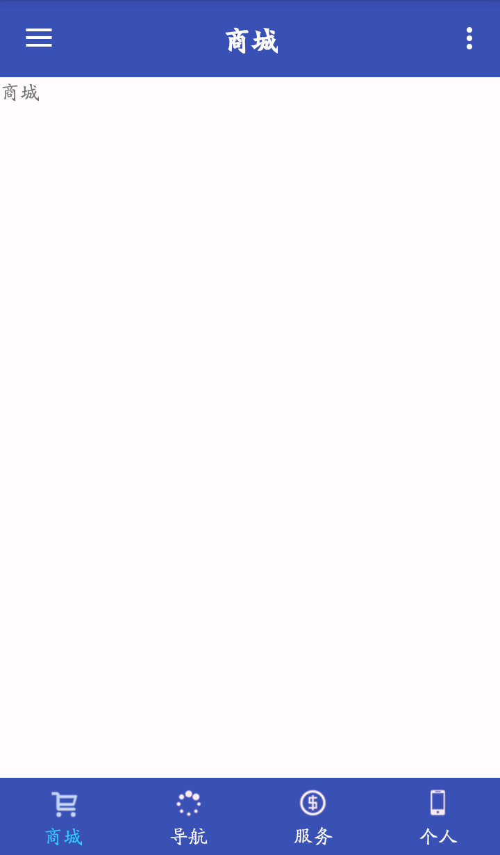
最终实现的简易效果图:
1、先定义每个RadioButton的style,在styles.xml文件中定义TabStyle:
<!--自定义底部Tab的style-->
<style name="TabStyle">
    <item name="android:layout_width">0dp</item>
    <item name="android:layout_height">match_parent</item>
    <item name="android:layout_weight">1</item>
    <item name="android:text">@string/tab_name1</item>
    <item name="android:button">@null</item>
    <item name="android:gravity">center</item>
    <item name="android:drawableTop">@mipmap/tab_icon1</item>
    <item name="android:textColor">@drawable/tab_text_color</item>
    <item name="android:paddingBottom">5dp</item>
    <item name="android:paddingTop">5dp</item>
    <item name="android:background">@drawable/tag_bg</item>
</style>
其中显示点击效果的有:
1)background,使用/drawable/tag_bg.xml来定义:
<?xml version="1.0" encoding="utf-8"?>
<!--Tab的背景色,点击显示白色-->
<selector xmlns:android="http://schemas.android.com/apk/res/android">
    <item android:state_pressed="true" android:drawable="@color/tabPressed"/>
    <item android:drawable="@color/colorPrimary"/>
</selector>
<?xml version="1.0" encoding="utf-8"?>
<!--TAB字体变色-->
<selector xmlns:android="http://schemas.android.com/apk/res/android">
    <item android:state_checked="true" android:color="@color/tabPressed"/>
    <item android:color="@android:color/white"/>
</selector><?xml version="1.0" encoding="utf-8"?>
<selector xmlns:android="http://schemas.android.com/apk/res/android">
<item android:state_checked="true" android:drawable="@mipmap/tab_icon1_checked"/>
<item android:drawable="@mipmap/tab_icon1"/>
</selector>2、在布局文件layout中使用自定义的TabStyle,来实现Tabs:
<?xml version="1.0" encoding="utf-8"?>
<RelativeLayout xmlns:android="http://schemas.android.com/apk/res/android"
    xmlns:app="http://schemas.android.com/apk/res-auto"
    xmlns:tools="http://schemas.android.com/tools"
    android:layout_width="match_parent"
    android:layout_height="match_parent"
    app:layout_behavior="@string/appbar_scrolling_view_behavior"
    tools:context=".MainActivity"
    tools:showIn="@layout/app_bar_main">

    <LinearLayout
        android:id="@+id/main_container"
        android:layout_width="match_parent"
        android:layout_height="match_parent"
        android:orientation="horizontal"
        ></LinearLayout>

    <RadioGroup
        android:id="@+id/tab_radioGp"
        android:layout_width="match_parent"
        android:layout_height="wrap_content"
        android:orientation="horizontal"
        android:layout_alignParentBottom="true"
        android:background="?attr/colorPrimary"
        >
        <RadioButton
            android:id="@+id/tab1"
            style="@style/TabStyle"
            android:text="@string/tab_name1"
            android:drawableTop="@drawable/tab1_bt"
            android:checked="true"
            />
        <RadioButton
            android:id="@+id/tab2"
            style="@style/TabStyle"
            android:text="@string/tab_name2"
            android:drawableTop="@drawable/tab2_bt"
            />
        <RadioButton
            android:id="@+id/tab3"
            style="@style/TabStyle"
            android:text="@string/tab_name3"
            android:drawableTop="@drawable/tab3_bt"
            />
        <RadioButton
            android:id="@+id/tab4"
            style="@style/TabStyle"
            android:text="@string/tab_name4"
            android:drawableTop="@drawable/tab4_bt"
            />
    </RadioGroup>

</RelativeLayout>
3、在代码中添加Tabs的点击切换Fragments的响应:
public class MainActivity extends AppCompatActivity
        implements NavigationView.OnNavigationItemSelectedListener {
    public static final String LOG_TAG = "LOG_TAG";

    private TextView toolbar_title; // ToolBar的标题
    private RadioGroup tab_radioGroup;

    private FragmentManager mFragmentManager;
    private Fragment currFragment;
    private Fragment[] mFragments;
    private String[] mFragmentClasses =
            {"edu.hust.com.threedmap.tabfirst.FirstFragment",
            "edu.hust.com.threedmap.tabsecond.SecondFragment",
            "edu.hust.com.threedmap.tabthird.ThirdFragment",
            "edu.hust.com.threedmap.tabfourth.FourthFragment"};
    private final static int TABS_NUM = 4;

    @Override
    protected void onCreate(Bundle savedInstanceState) {
        super.onCreate(savedInstanceState);
        setContentView(R.layout.activity_main);
        mFragmentManager = getSupportFragmentManager();
        mFragments = new Fragment[TABS_NUM];

        initView();
    }

    // ======== 初始化界面 ========
    private void initView() {
        Toolbar toolbar = (Toolbar) findViewById(R.id.toolbar);
        toolbar.setTitle("");
        setSupportActionBar(toolbar);

        toolbar_title = (TextView) findViewById(R.id.toolbar_title);

        // 设置默认显示界面
        changeFragment(0);

        tab_radioGroup = (RadioGroup) findViewById(R.id.tab_radioGp);
        tab_radioGroup.setOnCheckedChangeListener(new RadioGroup.OnCheckedChangeListener() {
            @Override
            public void onCheckedChanged(RadioGroup group, int checkedId) {
                switch (checkedId) {
                    case R.id.tab1:
                        setToolbar_title(R.string.tab_name1);
                        changeFragment(0);
                        break;
                    case R.id.tab2:
                        setToolbar_title(R.string.tab_name2);
                        changeFragment(1);
                        break;
                    case R.id.tab3:
                        setToolbar_title(R.string.tab_name3);
                        changeFragment(2);
                        break;
                    case R.id.tab4:
                        setToolbar_title(R.string.tab_name4);
                        changeFragment(3);
                        break;
                    default:
                        break;
                }
            }
        });
    }

    // 切换Fragment
    private void changeFragment(int index){
        if (index >= TABS_NUM)
            return;
        Fragment fragment = mFragments[index];
        try {
            if (fragment == null) {
                // 创建相应的Fragment实例
                Class clazz = Class.forName(mFragmentClasses[index]);
                fragment = (Fragment) clazz.newInstance();
            }

            // 切换Fragment
            if (currFragment != fragment) {
                FragmentTransaction transaction = mFragmentManager.beginTransaction();
                transaction.replace(R.id.main_container, fragment);
                transaction.commit();

                currFragment = fragment;
            }
        } catch (Exception e) {
            Log.i(LOG_TAG, e.toString());
        }
    }

    // 设置ToolBar Title
    public void setToolbar_title(int string_res) {
        try {
            toolbar_title.setText(string_res);
        } catch (Exception e) {
        }
    }
}
Tips:Toolbar实现居中显示:
可以设置ToolBar的标题为空,然后再Bar布局中添加一个TextView使其居中显示即可;
<android.support.v7.widget.Toolbar
    android:id="@+id/toolbar"
    android:layout_width="match_parent"
    android:layout_height="?attr/actionBarSize"
    android:background="?attr/colorPrimary"
    app:popupTheme="@style/AppTheme.PopupOverlay"
    >

    <TextView
        android:id="@+id/toolbar_title"
        android:layout_width="wrap_content"
        android:layout_height="wrap_content"
        android:layout_centerInParent="true"
        android:layout_gravity="center"
        android:text="@string/tab_name1"
        android:textColor="@android:color/white"
        android:textSize="20sp"
        android:textStyle="bold" />

</android.support.v7.widget.Toolbar>Toolbar toolbar = (Toolbar) findViewById(R.id.toolbar);
toolbar.setTitle("");
setSupportActionBar(toolbar);
代码地址:


 扫一扫
扫一扫
 5463
5463

 被折叠的 条评论
为什么被折叠?
被折叠的 条评论
为什么被折叠?
 到【灌水乐园】发言


