


Android:改变 Toolbar 的文字和溢出图标颜色
原文:Android: Changing the Toolbar’s text color and overflow icon color
Light on Dark and Dark on Light.
Android 默认拥有有标准(黑色)主题和浅色主题,尽管新的材料设计的例子上用的都是浅色主题。
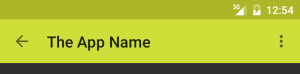
浅色主题期望你的 App Bar (Toolbar 或者 ActionBar)拥有浅色背景,因此给你用上了黑色的标题和溢出菜单图标(三个竖直的点):
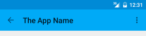
深色主题期望你的 App Bar 拥有深色的背景,因此给你设置了白色的标题和溢出菜单图标:
这些对于 Holo 主题和新的 Material themes 来说都是正确的。
如果你想使用浅色主题但希望自己的 App Bar 拥有一个深色背景,或者使用深色主题希望 toolbar 拥有浅色背景,事情就变地麻烦了。当然了,这可能不是个明智的设计,但在材料设计指导建议中并没有反对这样做。
改变 ActionBar 的文字颜色相当简单,但改变它的溢出菜单图标颜色就非常困难了。看起来通常情况会提供一个全新的溢出图标来替换标准的图标,只是为了得到正确的颜色。
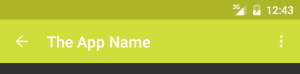
Android 3.0 提供了新的 Toolbar 来代替 ActionBar,它使改变标题和菜单溢出图标(还有 Up/Back 图标)的颜色变地简单了。因此我最终在深色主题的浅色背景上拥有了黑色文本和图标:
Toolbar theme and popupTheme
我花了很长时间才弄明白如何做到这些,因此希望下面的解释可以节省你们的时间。
我的主题继承自 Theme.AppCompat (不是 Theme.AppCompat.Light),这是兼容旧设备的深色材料主题,因为我希望我的大部分 UI 都是深色的。
<style name="AppTheme" parent="AppTheme.Base" />
<!-- Base application theme.
     Defining this lets values-v21/styles.xml reuse it with changes. -->
</style>
<style name="AppTheme.Base" parent="Theme.AppCompat.NoActionBar">
  <!-- colorPrimary is used, for instance, for the default ActionBar
       (but not Toolbar) background.
        We specify the same color for the toolbar background in
        toolbar.xml.. -->
  <item name="colorPrimary">@color/color_primary</item>

  <!-- colorPrimaryDark is used for the status bar (with the
       battery, clock, etc). -->
  <item name="colorPrimaryDark">@color/color_primary_dark</item>

   <!-- colorAccent is used as the default value for
        colorControlActivated which is used to tint widgets. -->
  <item name="colorAccent">@color/color_accent</item>
</style>(更新:在我从这里了解到 Theme.AppCompat.NoActionBar 主题之前,我用的都是 Theme.AppCompat 主题,并且手动设置 windowActionBar 为 false,在我看来二者并没有区别)
另:colorPrimary 是用于 ActionBar 背景,而不是 Toolbar 的背景
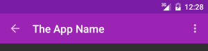
但是深色主题在 App Bar 浅色背景(译者注:在 Toolbar 定义时指定了其 backgroud 为 colorPrimary 得到浅色背景)上给我白色的文本和图标:
我希望使用黑色主题的同时还拥有浅色的工具栏背景,因此我需要设置文本和图标为黑色来替换默认的白色。顺便说一下,Material Design Color Palette 页面似乎很赞同的我想法,在我选择的石灰色彩(Material Design Color Palette 页面上一个调色板名字)上使用黑色标题,但其它几乎所有颜色都使用白色。
因此我的 Toolbar XML布局指定不同的主题(android:theme,如果使用22.1.0之前的兼容包的话是 app:theme),如下所示:
<android.support.v7.widget.Toolbar
  xmlns:android="http://schemas.android.com/apk/res/android"
  xmlns:app="http://schemas.android.com/apk/res-auto"
  android:id="@+id/toolbar"
  android:layout_width="match_parent"
  android:layout_height="wrap_content"
  android:background="@color/color_primary"
  android:theme="@style/GalaxyZooThemeToolbarDarkOverflow"
  app:popupTheme="@style/Theme.AppCompat.NoActionBar" />
那个工具栏主题(上面代码中的 android:theme 属性)指定了 textColorPrimary 和 textColorSecondary 配置来改变标题和菜单溢出按钮的颜色(见下面 GalaxyZooThemeToolbarDarkOverflow 具体定义)。你可以为这个 toolbar 仅指定标准的 Theme.AppCompat.Light.NoActionBar 主题来得到深色文本和溢出图标,但我希望继承我自己的主题并作出微小改变,因为我不知道是否还会有其它的什么地方会受到影响。
<style name="GalaxyZooThemeToolbarDarkOverflow" parent="Theme.AppCompat.NoActionBar">
  <!-- android:textColorPrimary is the  color of the title text
       in the Toolbar, in the Theme.AppCompat theme:  -->
  <item name="android:textColorPrimary">@color/abc_primary_text_material_light</item>

  <!-- android:textColorPrimaryInverse is the  color of the title
       text in the Toolbar, in the Theme.AppCompat.Light theme:  -->
  <!-- <item name="android:textColorPrimaryInverse">@color/abc_primary_text_material_light</item> -->

  <!-- android:actionMenuTextColor is the color of the text of
        action (menu) items in the Toolbar, at least in the
        Theme.AppCompat theme.
        For some reason, they already get the textColorPrimary
        when running on API 21, but not on older versions of
        Android, so this is only necessary to support older
        Android versions.-->
        <item name="actionMenuTextColor">@color/abc_primary_text_material_light</item>
  <!-- android:textColorSecondary is the color of the menu
       overflow icon (three vertical dots) -->
  <item name="android:textColorSecondary">@color/abc_secondary_text_material_light</item>

  <!-- This would set the toolbar's background color,
        but setting this also changes the popup menu's background,
        even if we define popupTheme for our <Toolbar> -->
  <!-- <item name="android:background">@color/color_primary</item> -->
</style>
这样使我在使用深色主题的 App Bar 上得到了黑色文本和图标:

这实际上是灰色而不是黑色,但白色图标却是真正的白色,因此你可能希望使用自定义颜色以得到真正的黑色或白色标准图标:
<item name="android:textColorSecondary">@color/my_black_icon_color</item>注意 Toolbar 还使用了 popupTheme(SDK >= 21时是android:popupTheme,使用兼容包时是app:popupTheme)。没有它的话溢出菜单的样子会受到 Toolbar 样式的影响,导致黑色背景上出现黑色文本的情况:
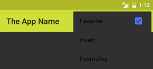
通过指定 Toolbar 的 popupTheme 属性,我们可以达到如下效果:
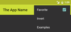
上面 Toolbar 定义中 popupTheme 指定为 Theme.AppCompat.NoActionBar 主题,这是黑色主题,因此菜单字体颜色是白色的。
也可以去看看我的另一篇文章:changing the colors of your own action icons with Android 5.0’s drawable tinting feature


 1227
1227


 被折叠的 条评论
为什么被折叠?
被折叠的 条评论
为什么被折叠?
 到【灌水乐园】发言


