纯css做switch开关

  <!-- HTML部分 -->
<div class="switch">
      <!-- 复选框用来模拟选中和未选中的状态 -->
      <input type="checkbox">
      <span class="checked"></span>
    </div>
/* css部分 */
.switch {
  position: relative;
  width: 48px;
  height: 22px;
}

input[type=checkbox] {
  position: absolute;
  margin: 0;
  padding: 0;
  /* 复选框宽高都为100%,保证点击哪都可以触发移动 */
  height: 100%;
  width: 100%;
  z-index: 99;
  opacity: 0;
}

span.checked {
  position: absolute;
  width: 100%;
  height: 100%;
  border-radius: 20px;
  background-color: #dcdfe6;
  z-index: -1;
  transition: all .5s;
}

span.checked::before {
  content: '';
  position: absolute;
  top: 2px;
  left: 2px;
  width: 18px;
  height: 18px;
  border-radius: 50%;
  background-color: #fff;
  transition: all .5s;
}

/* 复选框被选中时,让圆圈的left=26px */
input[type=checkbox]:checked+span.checked::before {
  left: 26px;
}
/* 复选框被选中时,让开关背景变色 */
input[type=checkbox]:checked+span.checked {
  background-color: #57ef10;
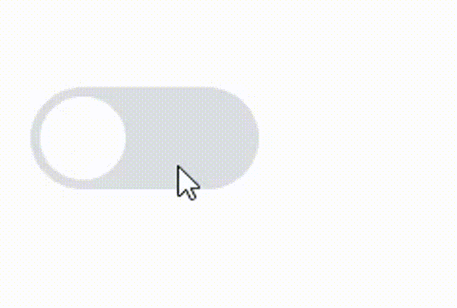
}

执行效果:

未解决的问题:

若通过设置animation做打开关闭效果,会有个小问题。由于刷新后,复选框是未选中状态,因此会调off动画,所以我就废弃了这个方法:

/* 复选框选中时,为圆圈添加on动画 */
input[type=checkbox]:checked+span.checked::before {
  /* left: 26px; */
  animation: on .5s forwards;
}

/* 复选框选中时,为圆圈添加off动画 */
input[type=checkbox]+span.checked::before{
animation: off .5s forwards;
}

@keyframes on {
  0% {  
    left: 2px;
  }

  100% {
    left: 26px;
  }
}

/* 一刷新,就走一遍off */
@keyframes off {
  0% {
    left: 26px
  }

  100% {
    left: 2px;
  }
}

  • 0
    点赞
  • 0
    收藏
    觉得还不错? 一键收藏
  • 1
    评论
在 Vue2 中,可以通过 `v-model` 和 `@change` 事件来实现一个开关组件。以下是一个简单的示例: ```html <template> <div> <label class="switch"> <input type="checkbox" v-model="isChecked" @change="handleChange"> <span class="slider"></span> </label> </div> </template> <script> export default { data() { return { isChecked: false }; }, methods: { handleChange(event) { console.log(event.target.checked); // 处理开关状态改变事件 } } }; </script> <style> .switch { position: relative; display: inline-block; width: 60px; height: 34px; } .switch input { opacity: 0; width: 0; height: 0; } .slider { position: absolute; cursor: pointer; top: 0; left: 0; right: 0; bottom: 0; background-color: #ccc; -webkit-transition: .4s; transition: .4s; } .slider:before { position: absolute; content: ""; height: 26px; width: 26px; left: 4px; bottom: 4px; background-color: white; -webkit-transition: .4s; transition: .4s; } input:checked + .slider { background-color: #2196F3; } input:focus + .slider { box-shadow: 0 0 1px #2196F3; } input:checked + .slider:before { -webkit-transform: translateX(26px); -ms-transform: translateX(26px); transform: translateX(26px); } </style> ``` 在上面的示例中,我们使用了一个 `label` 元素包含了一个 `input[type=checkbox]` 元素和一个 `span` 元素。CSS 样式通过 `position` 属性来定位开关组件的背景和按钮,并使用 `:before` 伪元素来表示按钮的位置。在 Vue 组件中,我们使用 `v-model` 指令将 `isChecked` 属性与 `input` 的 `checked` 属性绑定在一起,使用 `@change` 事件监听开关状态的改变,从而实现开关组件的功能。

“相关推荐”对你有帮助么?

  • 非常没帮助
  • 没帮助
  • 一般
  • 有帮助
  • 非常有帮助
提交
评论 1
添加红包

请填写红包祝福语或标题

红包个数最小为10个

红包金额最低5元

当前余额3.43前往充值 >
需支付:10.00
成就一亿技术人!
领取后你会自动成为博主和红包主的粉丝 规则
hope_wisdom
发出的红包
实付
使用余额支付
点击重新获取
扫码支付
钱包余额 0

抵扣说明:

1.余额是钱包充值的虚拟货币,按照1:1的比例进行支付金额的抵扣。
2.余额无法直接购买下载,可以购买VIP、付费专栏及课程。

余额充值