


绘制直方图:
使用hist()函数可以快速的绘制直方图
hist(x,bins=None,range=None,density=None,weights=None,cumulative=False,bottom=None,histtype='bar',align='mid',orientation='vertical'等)
x:表示x轴的数据,可以为 单个数组或多个数组的序列(元祖,列表,字典)
bins:矩形条数,默认10;
histtype:直方图类型(bar:传统直方图;barstacked:堆积直方图;step:未填充的线条直方图;stepfilled:填充的线条直方图)
导入模块
import matplotlib.pyplot as plt
import numpy as np
创建画布并添加绘画区域
fig = plt.figure()
ax = fig.add_subplot(111)
准备数据
x = np.random.randint(0,100,50) 调用hist函数
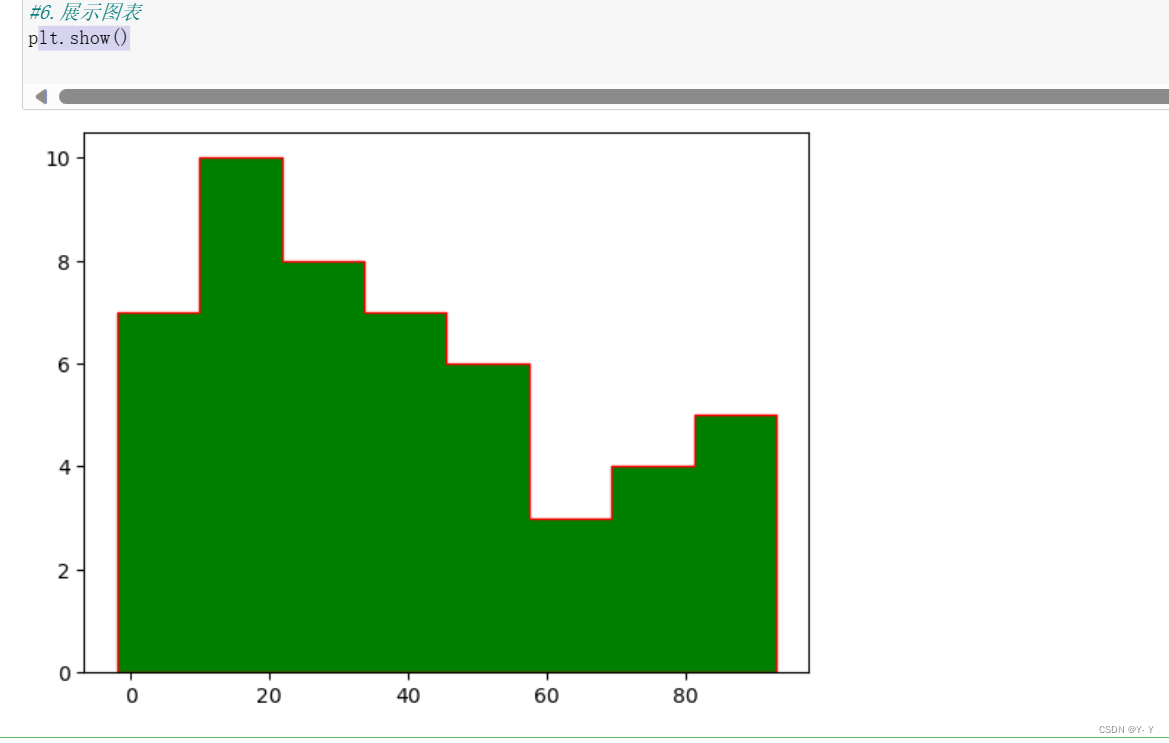
ax.hist(x, bins=8, histtype='stepfilled' ,edgecolor='r',align='left',color='g')#在8个统计区间中,计算每个区间出现的频次。
edgecolor:边缘颜色为红色;
align:矩形条边界线的对齐方式为左边
color:填充的颜色为绿色
绘制图表:
plt.show()
图表如下图
全部代码如下:
#1.导入模块
import matplotlib.pyplot as plt
import numpy as np

#2.创建画布
fig = plt.figure()

#3. 在画布上添加绘图区域
ax = fig.add_subplot(111)

#4. 数据准备
x = np.random.randint(0,100,50)         #准备50个随机测试数据

#5.调用绘图方法绘制图表
ax.hist(x, bins=8, histtype='stepfilled' ,edgecolor='r',align='left',color='g')
edgecolor:边缘线条颜色
align:矩形条边界的对齐方式
color:填充的颜色

#6.展示图表
plt.show()
绘制饼图
使用pie()函数快速绘制饼图或圆环图
pie(x,explode=None,labels=None,autopct=None,pctdistance=0.6,shadow=False,labeldistance=1.1,startangle=Noen,radius=None,counterclock=True,wedgerops=None等)
explode:表示扇形离开圆心的距离
autopct:表示扇形的数值显示的字符串
pctdistance:表示扇形对应数值标签距离圆心得比例,默认为0.6
labeldistance:表示标签文本的绘制位置,相对于半径的比例,默认为1.1
startangle:表示绘制角度,默认从x轴的正方向逆时针绘制
randius:表示扇形的半径
frame:表示是否显示图框
导入模块
import matplotlib.pyplot as plt
import numpy as np
import matplotlib as mp1
创建画布并添加绘画区域
fig = plt.figure()
ax = fig.add_subplot(111)
设置中文
mp1.rcParams['font.sans-serif'] = ['SimHei']
mp1.rcParams['axes.unicode_minus'] = False
准备数据
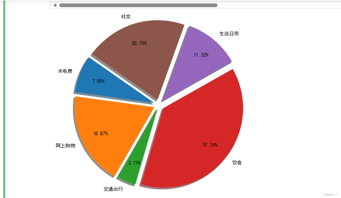
x = np.array([200, 500, 100, 1000, 300, 550])
explode_position = [0.1, 0.1, 0.07, 0.1, 0.1, 0.1]
外侧文字说明
kinds = ['水电费','网上购物','交通出行','饮食','生活日用','社交']
调用pie()函数
ax.pie(x, explode=explode_position, radius=1.5, labels=kinds, autopct='%.2f%%',shadow=True, startangle=145,pctdistance=0.75)
explode:扇形或楔形离开圆心的距离
radius:扇形或楔形的半径
labels:标签文本
autopct:小数点后的位数
shadow:表示是否阴影
startangle:起始绘制角度
pctdistance:扇形对应数值标签距离圆心得比例
展示图表
plt.show()
全部代码如下:
#1.导入模块
import matplotlib.pyplot as plt
import numpy as np
import matplotlib as mp1

#创建画布,在画布上添加绘图区域
fig = plt.figure()
ax = fig.add_subplot(111)

#设置中文
mp1.rcParams['font.sans-serif'] = ['SimHei']
mp1.rcParams['axes.unicode_minus'] = False

#数据准备
x = np.array([200, 500, 100, 1000, 300, 550])
explode_position = [0.1, 0.1, 0.07, 0.1, 0.1, 0.1]

#外侧文字说明
kinds = ['水电费','网上购物','交通出行','饮食','生活日用','社交']

#5.调用绘图方法绘制图表
ax.pie(x, explode=explode_position, radius=1.5, labels=kinds, autopct='%.2f%%',shadow=True, startangle=145,pctdistance=0.75)
plt.show()
绘制散点图
使用scatter()函数绘制散点图或气泡图
scatter(x,y,s=None,c=None,marker=None,cmap=None,norm=Nonee,vmin=None,vmax=None,vmax=None,alpha=None,linewidth=None,verts=None,edgecolors=None等)
x,y:数据点的位置
s:数据点大小
marker:数据点的样式,默认为圆心
cmap:数据点的颜色映射表
norm:数据点亮度
vimax、vimin:亮度最大最小值
linewidths:数据点边缘宽度
edgecolors:数据点边缘的颜色
导入模块
import matplotlib.pyplot as plt
import numpy as np
import matplotlib as mp1
创建画布并添加绘画区域
fig = plt.figure()
ax = fig.add_subplot(111)
准备数据
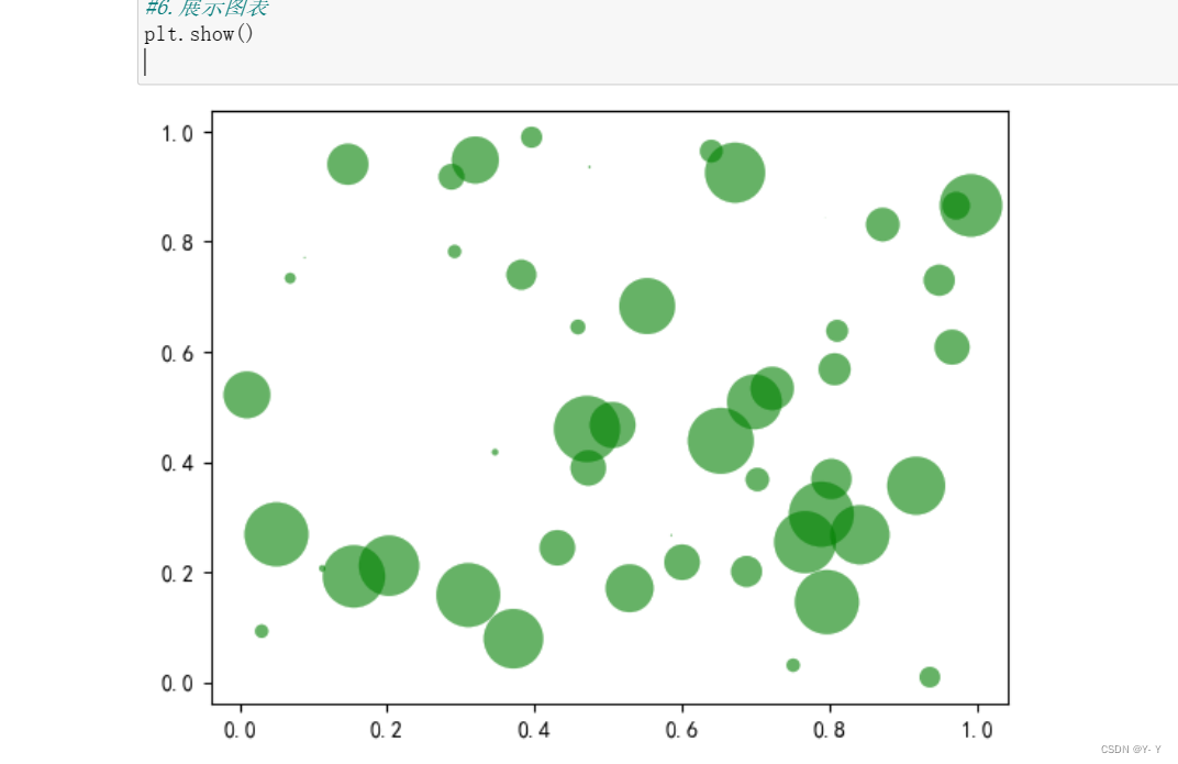
num = 50
x = np.random.rand(num)
y = np.random.rand(num)
area = (30*np.random.rand(num))**2
调用matter()函数
调用绘图方法绘制图表
ax.scatter(x, y, s=area, c='g', alpha=0.6,linewidths=0.2)
展示图表
plt.show()
全部代码如下:
导入模块
import matplotlib.pyplot as plt
import numpy as np

创建画布在画布上添加绘图区域
fig = plt.figure()
ax = fig.add_subplot(111)

数据准备
num = 50
x = np.random.rand(num)
y = np.random.rand(num)
area = (30*np.random.rand(num))**2

调用绘图方法绘制图表
ax.scatter(x, y, s=area, c='g', alpha=0.6,linewidths=0.2)

展示图表
plt.show()
绘制误差棒图

导入模块
import matplotlib.pyplot as plt
import numpy as np
import matplotlib as mp1
创建画布并添加绘画区域
fig = plt.figure()
ax = fig.add_subplot(111)
设置中文:
mp1.rcParams['font.sans-serif'] = ['SimHei']
mp1.rcParams['axes.unicode_minus'] = False
准备数据(准备x轴和轴的数据)
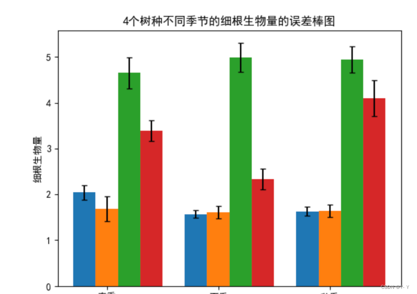
x = np.arange(3)
y1 = np.array([2.04, 1.57, 1.63])
y2 = np.array([1.69, 1.61, 1.64])
y3 = np.array([4.65, 4.99, 4.94])
y4 = np.array([3.39, 2.33, 4.10])
error1 = [0.16, 0.08, 0.10]           #指定测量偏差
error2 = [0.27, 0.14, 0.14]
error3 = [0.34, 0.32, 0.29]
error4 = [0.23, 0.23, 0.39]
使用errorbar()函数绘制误差棒图
bar_width = 0.2                #柱形宽度
ax.bar(x, y1,width=bar_width)
ax.bar(x+width, y2,align='center',tick_label=['春季','夏季','秋季'],width=bar_width)
ax.bar(x+2*width, y3,width=bar_width)
ax.bar(x+3*width, y4,width=bar_width)
ax.errorbar(x,y1,yerr=error1,capsize=3,fmt='k,')                     #绘制误差棒
ax.errorbar(x+width,y2,yerr=error2,capsize=3,fmt='k,')           #xerr,yerr:数据的误差范围
ax.errorbar(x+2*width,y3,yerr=error3,capsize=3,fmt='k,')        #capsize:误差棒边界横杆的大小
ax.errorbar(x+3*width,y4,yerr=error4,capsize=3,fmt='k,')
展示图表
plt.show()
全部代码如下:
import matplotlib.pyplot as plt
import numpy as np
import matplotlib as mp1

#.创建画布在画布上添加绘图区域
fig = plt.figure()

ax = fig.add_subplot(111)

#数据准备
x = np.arange(3)
y1 = np.array([2.04, 1.57, 1.63])
y2 = np.array([1.69, 1.61, 1.64])
y3 = np.array([4.65, 4.99, 4.94])
y4 = np.array([3.39, 2.33, 4.10])
error1 = [0.16, 0.08, 0.10]           #指定测量偏差
error2 = [0.27, 0.14, 0.14]
error3 = [0.34, 0.32, 0.29]
error4 = [0.23, 0.23, 0.39]
#设置中文
mp1.rcParams['font.sans-serif'] = ['SimHei']
mp1.rcParams['axes.unicode_minus'] = False

#5.调用绘图方法绘制图表
bar_width = 0.2                #柱形宽度
ax.bar(x, y1,width=bar_width)
ax.bar(x+width, y2,align='center',tick_label=['春季','夏季','秋季'],width=bar_width)
ax.bar(x+2*width, y3,width=bar_width)
ax.bar(x+3*width, y4,width=bar_width)
ax.errorbar(x,y1,yerr=error1,capsize=3,fmt='k,')                     #绘制误差棒
ax.errorbar(x+width,y2,yerr=error2,capsize=3,fmt='k,')           #xerr,yerr:数据的误差范围
ax.errorbar(x+2*width,y3,yerr=error3,capsize=3,fmt='k,')        #capsize:误差棒边界横杆的大小
ax.errorbar(x+3*width,y4,yerr=error4,capsize=3,fmt='k,')

plt.ylabel("细根生物量")                                                 #y轴标签
plt.title("4个树种不同季节的细根生物量的误差棒图")    #标题标签

#6.展示图表
plt.show()


 2360
2360


 被折叠的 条评论
为什么被折叠?
被折叠的 条评论
为什么被折叠?
 到【灌水乐园】发言


