


本人在校高中生,闲得无聊,写了个简易的html表白代码,喜欢的可以拿走
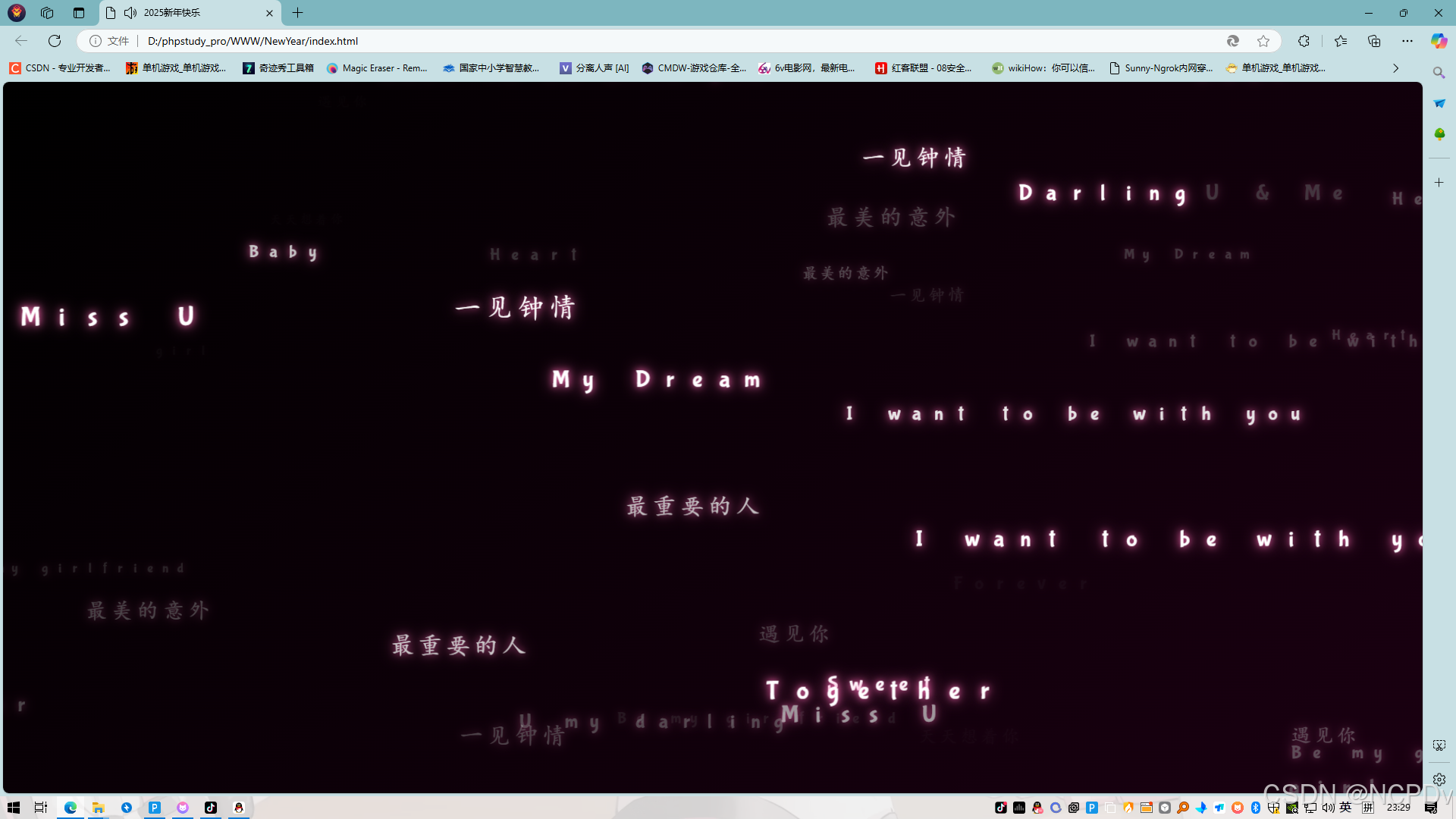
效果展示
 代码如下:
代码如下:
<!DOCTYPE html>
<html lang="zh">
<head>
    <meta charset="UTF-8">
    <meta name="viewport" content="width=device-width, initial-scale=1.0, maximum-scale=1.0, user-scalable=no">
    <title>❤</title>
    <link href="https://fonts.googleapis.com/css2?family=Bubblegum+Sans&display=swap" rel="stylesheet">
    <style>
        body {
            margin: 0;
            overflow: hidden;
            background: linear-gradient(135deg, #000000, #1a0011);
            display: flex;
            justify-content: center;
            align-items: center;
            height: 100vh;
            color: #fff;
        }

        #love-container {
            position: absolute;
            width: 100%;
            height: 100%;
            overflow: hidden;
            pointer-events: none;
        }

        .love-text {
            position: fixed;
            left: 50%;
            top: 50%;
            transform-origin: center;
            font-size: 32px;
            opacity: 0;
            font-family: 'Bubblegum Sans', cursive;
            writing-mode: vertical-lr;
            text-orientation: upright;
            letter-spacing: 8px;
            white-space: nowrap;
            z-index: 1;
            color: #fff;
            text-shadow: 0 0 10px #ff69b4,
                        0 0 20px #ff69b4;
            will-change: transform, opacity;
            animation-timing-function: ease-in-out;
            pointer-events: none;
        }

        @keyframes floatFromTop {
            0% {
                opacity: 0;
                transform: translate(-50%, -150vh) scale(0.8);
            }
            30% {
                opacity: 0.3;
                transform: translate(
                    calc(-50% + var(--startX)),
                    calc(-50% + var(--startY))
                ) scale(0.9);
            }
            50% {
                opacity: 1;
                transform: translate(
                    calc(-50% + var(--startX)),
                    calc(-50% + var(--startY))
                ) scale(1);
            }
            80% {
                opacity: 1;
                transform: translate(
                    calc(-50% + var(--moveX)),
                    calc(-50% + var(--moveY))
                ) scale(1);
            }
            100% {
                opacity: 0;
                transform: translate(
                    calc(-50% + var(--moveX)),
                    calc(-50% + var(--moveY) + 20vh)
                ) scale(0.8);
            }
        }

        @keyframes floatFromBottom {
            0% {
                opacity: 0;
                transform: translate(-50%, 150vh) scale(0.8);
            }
            30% {
                opacity: 0.3;
                transform: translate(
                    calc(-50% + var(--startX)),
                    calc(-50% + var(--startY))
                ) scale(0.9);
            }
            50% {
                opacity: 1;
                transform: translate(
                    calc(-50% + var(--startX)),
                    calc(-50% + var(--startY))
                ) scale(1);
            }
            80% {
                opacity: 1;
                transform: translate(
                    calc(-50% + var(--moveX)),
                    calc(-50% + var(--moveY))
                ) scale(1);
            }
            100% {
                opacity: 0;
                transform: translate(
                    calc(-50% + var(--moveX)),
                    calc(-50% + var(--moveY) - 20vh)
                ) scale(0.8);
            }
        }

        @keyframes floatFromLeft {
            0% {
                opacity: 0;
                transform: translate(-150vw, -50%) scale(0.8);
            }
            30% {
                opacity: 0.3;
                transform: translate(
                    calc(-50% + var(--startX)),
                    calc(-50% + var(--startY))
                ) scale(0.9);
            }
            50% {
                opacity: 1;
                transform: translate(
                    calc(-50% + var(--startX)),
                    calc(-50% + var(--startY))
                ) scale(1);
            }
            80% {
                opacity: 1;
                transform: translate(
                    calc(-50% + var(--moveX)),
                    calc(-50% + var(--moveY))
                ) scale(1);
            }
            100% {
                opacity: 0;
                transform: translate(
                    calc(-50% + var(--moveX) + 20vw),
                    calc(-50% + var(--moveY))
                ) scale(0.8);
            }
        }

        @keyframes floatFromRight {
            0% {
                opacity: 0;
                transform: translate(150vw, -50%) scale(0.8);
            }
            30% {
                opacity: 0.3;
                transform: translate(
                    calc(-50% + var(--startX)),
                    calc(-50% + var(--startY))
                ) scale(0.9);
            }
            50% {
                opacity: 1;
                transform: translate(
                    calc(-50% + var(--startX)),
                    calc(-50% + var(--startY))
                ) scale(1);
            }
            80% {
                opacity: 1;
                transform: translate(
                    calc(-50% + var(--moveX)),
                    calc(-50% + var(--moveY))
                ) scale(1);
            }
            100% {
                opacity: 0;
                transform: translate(
                    calc(-50% + var(--moveX) - 20vw),
                    calc(-50% + var(--moveY))
                ) scale(0.8);
            }
        }

        /* 主按钮样式 */
        #mainButton {
            position: relative;
            z-index: 10;
            pointer-events: auto;
            padding: 15px 30px;
            font-size: 18px;
            background: rgba(255, 105, 180, 0.8);
            border: none;
            border-radius: 8px;
            color: white;
            cursor: pointer;
            transition: all 0.3s ease;
            box-shadow: 0 0 15px rgba(255, 105, 180, 0.5);
            overflow: hidden;
            font-family: 'Bubblegum Sans', cursive;
            font-size: 18px;
            text-shadow: 0 2px 4px rgba(0, 0, 0, 0.2);
            backdrop-filter: blur(5px);
        }

        #mainButton:hover {
            background: rgba(255, 105, 180, 0.9);
            transform: scale(1.05);
            box-shadow: 0 0 25px rgba(255, 105, 180, 0.7);
        }

        #mainButton:active {
            transform: scale(0.95);
        }

        .ripple {
            position: absolute;
            background: rgba(255, 255, 255, 0.3);
            border-radius: 50%;
            transform: scale(0);
            animation: ripple 0.6s linear;
            pointer-events: none;
        }

        @keyframes ripple {
            to {
                transform: scale(4);
                opacity: 0;
            }
        }

        .button-container {
            position: fixed;
            left: 50%;
            top: 50%;
            transform: translate(-50%, -50%);
            z-index: 100;
            pointer-events: auto;
        }

        /* 添加按钮消失的动画 */
        @keyframes buttonVanish {
            0% {
                transform: translate(-50%, -50%) scale(1) rotate(0deg);
                opacity: 1;
            }
            50% {
                transform: translate(-50%, -50%) scale(1.2) rotate(180deg);
                opacity: 0.5;
            }
            100% {
                transform: translate(-50%, -50%) scale(0) rotate(360deg);
                opacity: 0;
            }
        }

        .button-container.vanish {
            animation: buttonVanish 1s cubic-bezier(0.4, 0, 0.2, 1) forwards;
        }
    </style>
</head>
<body>
    <div id="love-container"></div>
    <div class="button-container">
        <button id="mainButton" onclick="handleBiuClick(event)">Biu Biu~</button>
    </div>
    <audio id="bgMusic" src="https://music.163.com/song/media/outer/url?id=2622667253.mp3" preload="auto"></audio>

    <script>
        // 定义全局变量
        let isAnimating = false;

        function createLoveText() {
            const container = document.getElementById('love-container');

            if (container.children.length > 120) {
                return;
            }

            const text = document.createElement('div');
            text.className = 'love-text';

            // 随机选择动画
            const animations = ['floatFromTop', 'floatFromBottom', 'floatFromLeft', 'floatFromRight'];
            const randomAnim = animations[Math.floor(Math.random() * animations.length)];

            // 随机起始和结束位置
            const startX = (Math.random() - 0.5) * 160;
            const startY = (Math.random() - 0.5) * 160;

            // 计算移动距离,减小移动范围
            const moveX = startX + (Math.random() - 0.5) * 20;
            const moveY = startY + (Math.random() - 0.5) * 20;

            // 设置CSS变量
            text.style.setProperty('--startX', `${startX}vw`);
            text.style.setProperty('--startY', `${startY}vh`);
            text.style.setProperty('--moveX', `${moveX}vw`);
            text.style.setProperty('--moveY', `${moveY}vh`);

            // 随机大小
            const size = 20 + Math.random() * 16;
            text.style.fontSize = `${size}px`;

            // 设置动画时间(15-25秒)
            const duration = 15 + Math.random() * 10;
            text.style.animation = `${randomAnim} ${duration}s cubic-bezier(0.1, 0.1, 0.1, 1)`;

            // 随机文字
            const texts = [
                'L○ve',
                'Sweet',
                'Kiss',
                'Heart',
                '你是唯一',
                '我喜欢你',
                '想和你在一起',
                'Dear',
                '♥',
                'U & Me',
                '天天想着你',
                'Always',
                'I want to be with you',
                'Miss U',
                'Honey',
                '520',
                'XOXO',
                'Luv U',
                'Together',
                'Baby',
                'girl',
                'Be my girlfriend',
                'Darling',
                'U my darling',
                '心动',
                '喜欢',
                '一见钟情',
                '遇见你',
                '最美的意外',
                '我的唯一',
                '最重要的人',
                'My Dream',
                'Forever',
            ];
            const randomText = texts[Math.floor(Math.random() * texts.length)];
            text.innerHTML = randomText.split('').join('<br>');

            container.appendChild(text);

            // 动画结束后移除元素
            text.addEventListener('animationend', () => {
                if (text.parentNode === container) {
                    container.removeChild(text);
                }
            });
        }

        // 使用不同的时间间隔创建文字
        function startCreatingText() {
            createLoveText();
            const nextTime = 50 + Math.random() * 100;
            setTimeout(startCreatingText, nextTime);
        }

        // 初始快速填充
        function initialFill() {
            for (let i = 0; i < 40; i++) {
                setTimeout(() => createLoveText(), i * 50);
            }
        }

        function createRipple(event) {
            const button = event.currentTarget;
            const ripple = document.createElement('div');
            const rect = button.getBoundingClientRect();

            const size = Math.max(rect.width, rect.height);
            ripple.style.width = ripple.style.height = `${size}px`;

            ripple.style.left = `${event.clientX - rect.left - size/2}px`;
            ripple.style.top = `${event.clientY - rect.top - size/2}px`;

            ripple.className = 'ripple';
            button.appendChild(ripple);

            ripple.addEventListener('animationend', () => {
                ripple.remove();
            });
        }

        function handleBiuClick(event) {
            if (isAnimating) return;
            isAnimating = true;

            const button = event.currentTarget;
            const buttonContainer = document.querySelector('.button-container');
            const audio = document.getElementById('bgMusic');

            createRipple(event);
            audio.play().catch(e => console.log('Music autoplay failed:', e));

            // 添加按钮消失动画
            buttonContainer.classList.add('vanish');

            // 开始创建漂浮文字
            setTimeout(() => {
                startCreatingText();
                initialFill();
            }, 400);
        }

        // 页面加载时预加载音乐
        document.addEventListener('DOMContentLoaded', function() {
            const audio = document.getElementById('bgMusic');
            audio.load();
        });
    </script>
</body>
</html>
使用的音乐:Hours
链接:https://music.163.com/song/media/outer/url?id=2622667253.mp3
大佬们可以在原有基础上进行改进
(●ˇ∀ˇ●)


 扫一扫
扫一扫


 2万+
2万+

 被折叠的 条评论
为什么被折叠?
被折叠的 条评论
为什么被折叠?
 到【灌水乐园】发言


