


一、图形定制
1.图形Drawable
使用drawable:“@drawable/不含扩展名的文件名称”
2.形状图片
常用来描述常见的几何图形:矩形、圆角矩形、圆形、椭圆
例如:
<?xml version="1.0" encoding="utf-8"?>
<LinearLayout xmlns:android="http://schemas.android.com/apk/res/android"
    android:layout_width="match_parent"
    android:layout_height="match_parent"
    android:orientation="vertical">
    <View
        android:id="@+id/v_content"
        android:layout_width="match_parent"
        android:layout_height="200dp"
        android:layout_margin="10dp"/>
    <LinearLayout
        android:layout_width="match_parent"
        android:layout_height="wrap_content"
        android:orientation="horizontal">
        <Button
            android:id="@+id/btn_rect"
            android:layout_width="0dp"
            android:layout_weight="1"
            android:layout_height="wrap_content"
            android:text="圆角矩形背景"/>
        <Button
            android:id="@+id/btn_oval"
            android:layout_width="0dp"
            android:layout_weight="1"
            android:layout_height="wrap_content"
            android:text="椭圆背景"/>

    </LinearLayout>


</LinearLayout>
在drawable定义矩形:
<?xml version="1.0" encoding="utf-8"?>
<shape xmlns:android="http://schemas.android.com/apk/res/android">
    <!--指定了形状内部的填充颜色-->
    <solid android:color="#ffdd66"/>
    <!--指定了形状轮廓的粗细与颜色-->
    <stroke android:width="1dp" android:color="#aaaaaa"/>
    <!--指定了形状四个角的半径-->
    <corners android:radius="10dp"/>

</shape>
在drawable定义椭圆:
<?xml version="1.0" encoding="utf-8"?>
<shape xmlns:android="http://schemas.android.com/apk/res/android"
    android:shape="oval">
    <!--指定了形状内部的填充颜色-->
    <solid android:color="#ff66aa"/>
    <!--指定了形状轮廓的粗细与颜色-->
    <stroke android:width="1dp" android:color="#aaaaaa"/>
    <!--指定了形状四个角的半径-->
    <corners android:radius="10dp"/>

</shape>
点击事件:
public class DrawableShapeActivity extends AppCompatActivity implements View.OnClickListener {

    private View v_content;

    @Override
    protected void onCreate(Bundle savedInstanceState) {
        super.onCreate(savedInstanceState);
        setContentView(R.layout.activity_drawable_shape);
        v_content = findViewById(R.id.v_content);
        findViewById(R.id.btn_rect).setOnClickListener(this);
        findViewById(R.id.btn_oval).setOnClickListener(this);
        //v_content 的背景设置为圆角矩形
        v_content.setBackgroundResource(R.drawable.shape_rect_gold);

    }

    @Override
    public void onClick(View v) {
        switch (v.getId()){
            case R.id.btn_rect:
                v_content.setBackgroundResource(R.drawable.shape_rect_gold);
                break;
            case R.id.btn_oval:
                v_content.setBackgroundResource(R.drawable.shape_oval_rose);
                break;
        }
    }
}
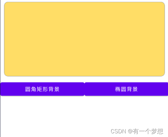
效果:
3.九宫格图片
用来防止图片拉伸变形。
4.状态列表图片
主要用于修改图标颜色。例如底部导航栏图标点击变颜色。
<?xml version="1.0" encoding="utf-8"?>
<selector xmlns:android="http://schemas.android.com/apk/res/android">
    <item android:state_checked="true" android:drawable="@mipmap/patientmanagement"/>
    <item android:state_checked="false" android:drawable="@mipmap/patientmanagement"/>
</selector>
二、选择按钮
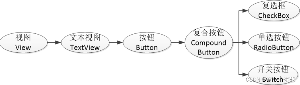
1.复选框CheckBox
(1)复合按钮的继承关系
2.CompoundButton在XML文件中主要使用下面两个属性
checked:指定按钮的勾选状态,true表示勾选,false则表示未勾选。默认为未勾选。
button:指定左侧勾选图标的图形资源,如果不指定就使用系统的默认图标。
3.CompoundButton在Java代码中主要使用下列4种方法
setChecked:设置按钮的勾选状态。
setButtonDrawable:设置左侧勾选图标的图形资源。
setOnCheckedChangeListener:设置勾选状态变化的监听器。
isChecked:判断按钮是否勾选。
例子:
布局文件:
<?xml version="1.0" encoding="utf-8"?>
<LinearLayout xmlns:android="http://schemas.android.com/apk/res/android"
    android:layout_width="match_parent"
    android:layout_height="match_parent"
    android:orientation="vertical"
    android:padding="5dp">
    <CheckBox
        android:id="@+id/ck_system"
        android:layout_width="match_parent"
        android:layout_height="wrap_content"
        android:padding="5dp"
        android:text="这是系统的CheckBox"/>
    <CheckBox
        android:id="@+id/ck_custom"
        android:layout_width="match_parent"
        android:layout_height="wrap_content"
        android:layout_marginTop="10dp"
        android:button="@drawable/check_selector"
        android:padding="5dp"
        android:checked="true"
        android:text="这个CheckBox换了图标"/>

</LinearLayout>
资源文件:
<selector xmlns:android="http://schemas.android.com/apk/res/android">
    <item android:state_checked="true" android:drawable="@mipmap/check_choose"/>
    <item android:drawable="@mipmap/check_unchoose"/>

</selector>
Java代码:
public class CheckBoxActivity extends AppCompatActivity implements CompoundButton.OnCheckedChangeListener {

    @Override
    protected void onCreate(Bundle savedInstanceState) {
        super.onCreate(savedInstanceState);
        setContentView(R.layout.activity_check_box);
        CheckBox ck_system=findViewById(R.id.ck_system);
        CheckBox ck_custom=findViewById(R.id.ck_custom);

        ck_system.setOnCheckedChangeListener(this);
        ck_custom.setOnCheckedChangeListener(this);
    }

    @Override
    public void onCheckedChanged(CompoundButton buttonView, boolean isChecked) {
        String desc=String.format("您%s了这个CheckBox",isChecked ? "勾选":"取消勾选");
        buttonView.setText(desc);
    }
}
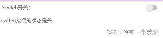
2.开关按钮Switch
Switch控件新添加的XML属性说明:
- textOn:设置左侧开启时的文本
- textOff:设置左侧开启时的文本
- track:设置开关轨道的背景
- thumb:设置开关标识的图标
例子:
<?xml version="1.0" encoding="utf-8"?>
<LinearLayout xmlns:android="http://schemas.android.com/apk/res/android"
    xmlns:app="http://schemas.android.com/apk/res-auto"
    xmlns:tools="http://schemas.android.com/tools"
    android:layout_width="match_parent"
    android:layout_height="match_parent"
    android:orientation="vertical"
    android:padding="5dp">

    <LinearLayout
        android:layout_width="match_parent"
        android:layout_height="wrap_content"
        android:orientation="horizontal">
        <TextView
            android:layout_width="0dp"
            android:layout_weight="1"
            android:layout_height="wrap_content"
            android:layout_gravity="start"
            android:padding="5dp"
            android:text="Switch开关:"/>

        <Switch
            android:id="@+id/sw_status"
            android:layout_width="80dp"
            android:layout_height="30dp"
            android:layout_gravity="end"
            android:padding="5dp"/>

    </LinearLayout>
<!--用于提示是否点击开或关-->
    <TextView
        android:id="@+id/tv_result"
        android:layout_width="match_parent"
        android:layout_height="wrap_content"
        android:layout_marginTop="10dp"
        android:gravity="start"/>

</LinearLayout>
仿iOS的开关按钮
借助状态列表图形StateListDrawable,分别定义已选中时候的“开”图形
把CheckBox控件的background属性设置为该状态图形。
将布局文件中的Switch控件改成CheckBox:
<CheckBox
            android:id="@+id/ck_status"
            android:layout_width="60dp"
            android:layout_height="40dp"
            android:background="@drawable/switch_selector"
            android:layout_gravity="end"
            android:button="@null"/>
复制图片制作资源文件:

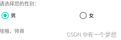
3.单选按钮RadioButton
单选按钮要在一组中只能选其中一项,需要RadioGroup容器。
RadioGroup实际上是个布局,同一组RadioButton都要放在同一个RadioGroup节点下。除了RadioButton也允许放置其它控件。
例子:
<?xml version="1.0" encoding="utf-8"?>
<LinearLayout xmlns:android="http://schemas.android.com/apk/res/android"
    xmlns:app="http://schemas.android.com/apk/res-auto"
    xmlns:tools="http://schemas.android.com/tools"
    android:layout_width="match_parent"
    android:layout_height="match_parent"
    android:orientation="vertical"
    android:padding="5dp">


    <TextView
            android:layout_width="match_parent"
            android:layout_height="wrap_content"
            android:text="请选择您的性别:"/>

    <RadioGroup
        android:id="@+id/rg_gender"
        android:layout_width="match_parent"
        android:layout_height="wrap_content"
        android:orientation="horizontal">
        <RadioButton
            android:id="@+id/rb_male"
            android:layout_width="0dp"
            android:layout_weight="1"
            android:layout_height="wrap_content"
            android:text="男"/>
        <RadioButton
            android:id="@+id/rb_female"
            android:layout_width="0dp"
            android:layout_weight="1"
            android:layout_height="wrap_content"
            android:text="女"/>

    </RadioGroup>

    <TextView
        android:id="@+id/tv_result"
        android:layout_width="match_parent"
        android:layout_height="wrap_content"
        android:layout_marginTop="10dp"
        android:gravity="start"/>

</LinearLayout>
public class RadioHorizaontalActivity extends AppCompatActivity implements RadioGroup.OnCheckedChangeListener {

    private TextView tv_result;

    @Override
    protected void onCreate(Bundle savedInstanceState) {
        super.onCreate(savedInstanceState);
        setContentView(R.layout.activity_radio_horizaontal);
        RadioGroup rg_gender=findViewById(R.id.rg_gender);
        tv_result = findViewById(R.id.tv_result);
        rg_gender.setOnCheckedChangeListener(this);
    }

    @Override
    public void onCheckedChanged(RadioGroup group, int checkedId) {
        switch (checkedId){
            case R.id.rb_male:
                tv_result.setText("哇哦,帅哥");
                break;
            case R.id.rb_female:
                tv_result.setText("哇哦,美女");
                break;
        }
    }
}
三、文本输入
1.编辑框EditText
编辑框EditText用于接收软键盘输入的文字,例如用户名、密码、评价内容等,它由文本视图派生而来,除了TextView已有的各种属性和方法,EditText还支持下列XML属性。
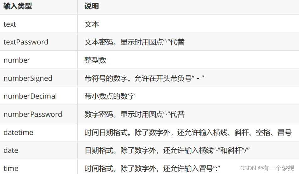
inputType:指定输入的文本类型。输入类型的取值说明见表5-4,若同时使用多种文本类型,则可使用竖线“|”把多种文本类型拼接起来。
maxLength:指定文本允许输入的最大长度。
hint:指定提示文本的内容。
textColorHint:指定提示文本的颜色。
例子:
<?xml version="1.0" encoding="utf-8"?>
<LinearLayout xmlns:android="http://schemas.android.com/apk/res/android"
xmlns:tools="http://schemas.android.com/tools"
android:layout_width="match_parent"
android:layout_height="match_parent"
android:orientation="vertical"
android:padding="5dp">
<EditText
android:layout_width="match_parent"
android:layout_height="wrap_content"
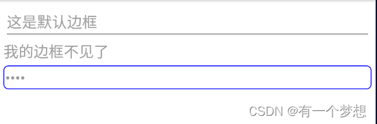
android:hint="这是默认边框"
android:inputType="text"/>
<EditText
android:layout_width="match_parent"
android:layout_height="wrap_content"
android:background="@null"
android:hint="我的边框不见了"
android:inputType="textPassword"/>
<EditText
android:layout_width="match_parent"
android:layout_height="wrap_content"
android:layout_marginTop="5dp"
android:background="@drawable/editext_selector"
android:hint="我的边框是圆角"
android:inputType="textPassword"/>
</LinearLayout>
制作圆角矩形:
<?xml version="1.0" encoding="utf-8"?>
<shape xmlns:android="http://schemas.android.com/apk/res/android">
<solid android:color="@color/white"/>
    <stroke
        android:width="1dp"
        android:color="#aaaaaa"/>
    <corners android:radius="5dp"/>
    <padding
        android:bottom="2dp"
        android:left="2dp"
        android:right="2dp"
        android:top="2dp"/>
</shape>
2.焦点变更监听器
调用编辑框对象的setOnFocusChangeListener方法,即可在光标切换之时(获得光标和失去光标)触发焦点变更事件。
例子:
<?xml version="1.0" encoding="utf-8"?>
<LinearLayout xmlns:android="http://schemas.android.com/apk/res/android"
xmlns:tools="http://schemas.android.com/tools"
android:layout_width="match_parent"
android:layout_height="match_parent"
android:orientation="vertical"
android:padding="5dp">
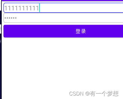
<EditText
android:id="@+id/et_phone"
android:layout_width="match_parent"
android:layout_height="wrap_content"
android:background="@drawable/editext_selector"
android:hint="请输入11位手机号"
android:inputType="number"
android:maxLength="11"/>
<EditText
android:id="@+id/et_password"
android:layout_width="match_parent"
android:layout_height="wrap_content"
android:background="@drawable/editext_selector"
android:hint="请输入6位密码"
android:inputType="numberPassword"
android:maxLength="6"/>
<Button
android:id="@+id/btn_login"
android:layout_width="match_parent"
android:layout_height="wrap_content"
android:text="登录"/>
</LinearLayout>
public class EditFocusActivity extends AppCompatActivity implements View.OnFocusChangeListener {

    private EditText et_phone;

    @Override
    protected void onCreate(Bundle savedInstanceState) {
        super.onCreate(savedInstanceState);
        setContentView(R.layout.activity_edit_focus);
        et_phone = findViewById(R.id.et_phone);
        EditText et_password=findViewById(R.id.et_password);
        et_password.setOnFocusChangeListener(this);
    }

    @Override
    public void onFocusChange(View v, boolean hasFocus) {
        if (hasFocus){
            String phone=et_phone.getText().toString();
            //手机号码不足11位
            if (TextUtils.isEmpty(phone)||phone.length()<11){
                //手机号码编辑框请求焦点,也就是把光标移回手机号码编辑框
                et_phone.requestFocus();
                Toast.makeText(this,"请输入11位手机号码", Toast.LENGTH_SHORT).show();
            }
        }
    }
}
3.文本变化监听器
(1)判断输入满位之后自动关闭软键盘
(2)文本变化监听器的用法:
调用编辑对象的addTextChangedListener方法即可注册文本监听器。
文本监听器的接口名称为TextWatcher,该接口提供了3个监控方法,具体说明如下:
- beforeTextChanged:在文本改变之前触发
- onTextChanged:在文本改变过程中触发
- afterTextChanged:在文本改变之后触发
public class EditHideActivity extends AppCompatActivity {

    @Override
    protected void onCreate(Bundle savedInstanceState) {
        super.onCreate(savedInstanceState);
        setContentView(R.layout.activity_edit_hide);
        EditText et_phone = findViewById(R.id.et_phone);
        EditText et_password=findViewById(R.id.et_password);
        et_phone.addTextChangedListener(new HideTextWatcher(et_phone,11));
        et_password.addTextChangedListener(new HideTextWatcher(et_password,6));
    }
//定义一个编辑框监听器,在输入文本达到指定长度时自动隐藏输入法
    private class HideTextWatcher implements TextWatcher {
        //声明一个编辑框对象
        private EditText mView;
        //声明一个最大长度变量
        private int mMaxLength;
        public HideTextWatcher(EditText v, int maxLength) {
            this.mView=v;
            this.mMaxLength=maxLength;
        }

        @Override
        public void beforeTextChanged(CharSequence s, int start, int count, int after) {

        }

        @Override
        public void onTextChanged(CharSequence s, int start, int before, int count) {

        }
//在编辑框输入文本变化后触发
        @Override
        public void afterTextChanged(Editable s) {
            //获得已输入的文本字符串
            String str=s.toString();
            //输入文本达到11位,或6位时关闭输入法
            if (str.length()==mMaxLength){
                //隐藏输入法软键盘
                ViewUtil.hideOneInputMethod(EditHideActivity.this,mView);
            }

        }
    }
}
四、对话框
1.提醒对话框AlertDialog
AlertDialog可以完成常见的交互操作,例如提示、确认、选择等功能。AlertDialog借助及建造器AlertDialog.Buider才能完成参数设置。
调用建造器的create方法生成对话框实例,在调用对话框实例的show方法,在页面上弹出提醒对话框。
<?xml version="1.0" encoding="utf-8"?>
<LinearLayout xmlns:android="http://schemas.android.com/apk/res/android"
xmlns:tools="http://schemas.android.com/tools"
android:layout_width="match_parent"
android:layout_height="match_parent"
android:orientation="vertical"
android:padding="5dp">
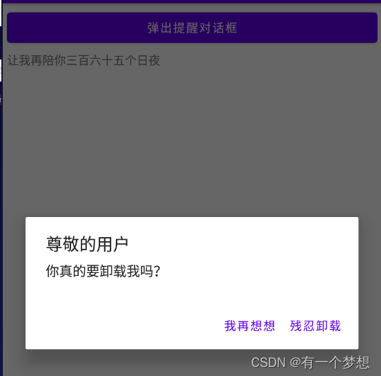
<Button
android:id="@+id/btn_alert"
android:layout_width="match_parent"
android:layout_height="wrap_content"
android:text="弹出提醒对话框"/>
<TextView
android:id="@+id/tv_alert"
android:layout_width="match_parent"
android:layout_height="wrap_content"
android:layout_marginTop="5dp"/>
</LinearLayout>
public class AlertDialogActivity extends AppCompatActivity implements View.OnClickListener {

    private TextView tv_alert;

    @Override
    protected void onCreate(Bundle savedInstanceState) {
        super.onCreate(savedInstanceState);
        setContentView(R.layout.activity_alert_dialog);
        findViewById(R.id.btn_alert).setOnClickListener(this);
        tv_alert = findViewById(R.id.tv_alert);
    }

    @Override
    public void onClick(View v) {
        //创建提醒对话框的构造器
        AlertDialog.Builder builder=new AlertDialog.Builder(this);
        //设置对话框的标题文本
        builder.setTitle("尊敬的用户");
        //设置对话框的内容文本
        builder.setMessage("你真的要卸载我吗?");
        //设置对话框的肯定按钮文本及其点击监听器
        builder.setPositiveButton("残忍卸载",(dialog, which) -> {
            tv_alert.setText("虽然依依不舍,但是只能离开");
        });
        //设置对话框的否定按钮文本及其点击监听器
        builder.setNegativeButton("我再想想",(dialog, which) -> {
            tv_alert.setText("让我再陪你三百六十五个日夜");
        });
        //根据建造器构建提醒对话框对象
        AlertDialog dialog = builder.create();
        //显示提醒对话框
        dialog.show();


    }
}
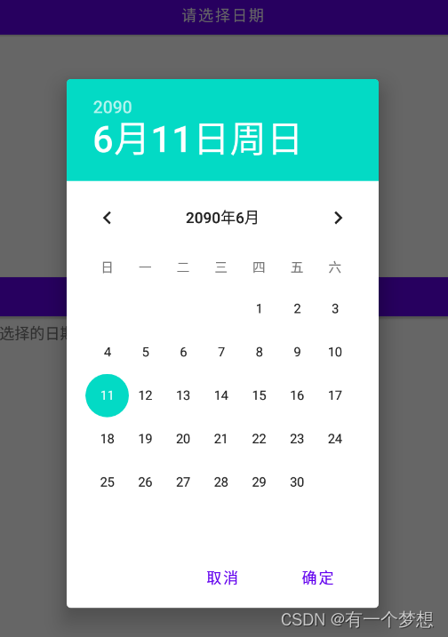
2.日期对话框DatePickerDialog
DatePickerDialog相当于在AlertDialog上装载了DatePicker,编码时只需调用构造方法设置当前的年、月、日,然后调用show方法即可弹出日期对话框。日期选择事件则由监听OnDateSetListener负责响应,在该监听器的onDateSet方法中,开发者获取用户选择的具体日期,再做后续处理。特别注意onDateSet的月份参数,它的起始值不是1而是0。也就是说,一月份对应的参数值为0,十二月份对应的参数值为11,中间月份的数值以此类推。
例子:
<?xml version="1.0" encoding="utf-8"?>
<LinearLayout xmlns:android="http://schemas.android.com/apk/res/android"
xmlns:tools="http://schemas.android.com/tools"
android:layout_width="match_parent"
android:layout_height="match_parent"
android:orientation="vertical"
android:padding="5dp">
<Button
android:id="@+id/btn_date"
android:layout_width="match_parent"
android:layout_height="wrap_content"
android:text="请选择日期"/>
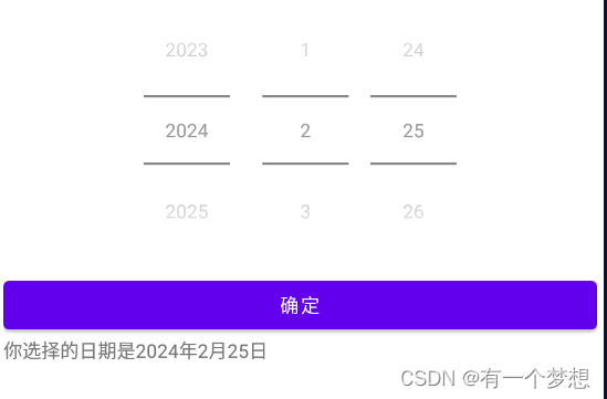
<DatePicker
android:id="@+id/dp_date"
android:layout_width="match_parent"
android:layout_height="wrap_content"
android:datePickerMode="spinner"
android:calendarViewShown="false"/>
<Button
android:id="@+id/btn_ok"
android:layout_width="match_parent"
android:layout_height="wrap_content"
android:text="确定"/>
<TextView
android:id="@+id/tv_date"
android:layout_width="match_parent"
android:layout_height="wrap_content" />
</LinearLayout>
public class DatePickerActivity extends AppCompatActivity implements View.OnClickListener, DatePickerDialog.OnDateSetListener {

    private DatePicker dp_date;
    private TextView tv_date;

    @Override
    protected void onCreate(Bundle savedInstanceState) {
        super.onCreate(savedInstanceState);
        setContentView(R.layout.activity_date_picker);
        findViewById(R.id.btn_ok).setOnClickListener(this);
        findViewById(R.id.btn_date).setOnClickListener(this);
        tv_date = findViewById(R.id.tv_date);
        dp_date = findViewById(R.id.dp_date);
    }

    @Override
    public void onClick(View v) {
        switch (v.getId()){
            case R.id.btn_ok:
                String desc=String.format("你选择的日期是%d年%d月%d日",dp_date.getYear(),dp_date.getMonth()+1,dp_date.getDayOfMonth());
                tv_date.setText(desc);
                break;
            case R.id.btn_date:
                //获取日历的一个实例,里面包含了当前的年月日
//                Calendar calendar=Calendar.getInstance();
//                calendar.get(Calendar.YEAR);
//                calendar.get(Calendar.MONTH);
//                calendar.get(Calendar.DAY_OF_MONTH);
                DatePickerDialog dialog=new DatePickerDialog(this,this,2090,5,11);
                //显示日期对话框
                dialog.show();
                break;
        }
    }

    @Override
    public void onDateSet(DatePicker view, int year, int month, int dayOfMonth) {
        String desc=String.format("你选择的日期是%d年%d月%d日",dp_date.getYear(),dp_date.getMonth()+1,dp_date.getDayOfMonth());
        tv_date.setText(desc);
    }
}
3.时间对话框TimerPickerDialog
时间选择器可以让用户选择具体的小时和分钟。用法类似于DataPickerDialog。


 538
538


 被折叠的 条评论
为什么被折叠?
被折叠的 条评论
为什么被折叠?
 到【灌水乐园】发言


