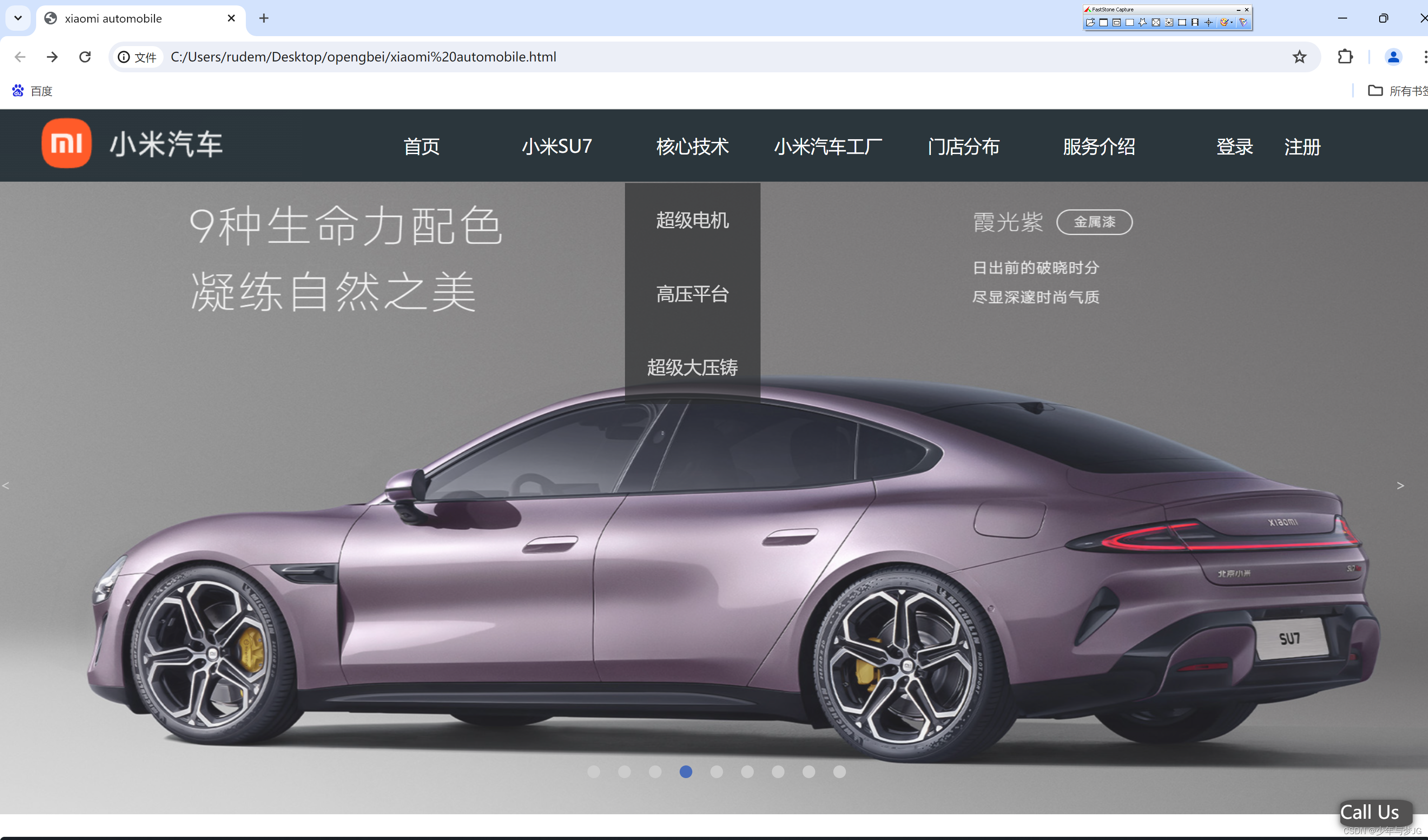
在经历了Web前端的一系列学习之后,想做一个网站来总结这段时间对前端的学习,于是想了个小米汽车主题,只展示部分重点代码,想看完整效果的我发布有视频,首页效果图如下:
下拉菜单栏的代码如下:
HTML部分
<!DOCTYPE html>
<html lang="en">
<head>
<meta charset="UTF-8">
<meta name="viewport" content="width=device-width, initial-scale=1.0">
<title>xiaomi automobile</title>
</head>
<link rel="stylesheet" href="css\chencss\chenshouye.css">
<body vlink="white" alink="white" onload="init()">
<div class="one" style="position:relative;">
<div class="jpg1" style="position:absolute;z-index:2;"><img src="chenimg\小米.png" alt=""></div>
<div class="container">
<ul class="dropdown">
<li>
<a href="xiaomi automobile.html">首页</a>
</li>
<li>
<a href="xiaomi automobile.html">小米SU7</a>
<ol>
<li><a href="xiaomiSU7 Original edition.html">小米SU7创始版</a></li>
<li><a href="Model comparison.html">车型对比</a></li>
</ol>
</li>
<li>
<a href="#">核心技术</a>
<ol>
<li><a href="dainJi.html">超级电机</a></li>
<li><a href="gaoYa.html">高压平台</a></li>
<li><a href="chaoJi.html">超级大压铸</a></li>
</ol>
</li>
<li>
<a href="xiaomiqichegongchang.html">小米汽车工厂</a>
</li>
<li>
<a href="mendianfenbu.html">门店分布</a>
</li>
<li>
<a href="#">服务介绍</a>
<ol>
<li><a href="fuwubaozhang.html">服务保障</a></li>
<li><a href="chodianbunneng.html">充电补能</a></li>
<li><a href="jinrongshisuan.html">金融试算</a></li>
</ol>
</li>
<li>
<a href="login.html">登录</a>
</li>
<div class="zhuce">
<li>
<a href="regurition.html">注册</a>
</li>
</div>
</ul>
</div>
</div>
CSS部分:
html,
body {
width: 100%;
margin: 0;
padding: 0;
}
.one {
width: 100%;
height: 80px;
background-color: #2B363C;
z-index: 999;
}
.container {
width: 800px;
height: 80px;
margin-left: 320px;
}
.jpg1 {
float: left;
}
ul {
list-style: none;
}
* {
margin: 0;
padding: 0;
}
.one {
width: 100%;
height: 80px;
background-color: #2B363C;
z-index: 999;
}
.container {
width: 800px;
height: 80px;
margin: 0 auto;
}
.jpg1 {
float: left;
}
ul {
list-style: none;
}
* {
padding: 0;
margin: 0;
box-sizing: border-box;
}
ul,
ol {
list-style: none;
}
.dropdown {
width: 1200px;
height: 80px;
background-color: #2B363C;
}
.dropdown>li {
width: 150px;
height: 50px;
float: left;
line-height: 80px;
text-align: center;
}
.zhuce{
position: absolute;
margin-left: 1030px;
margin-top: 27.3px;
}
a {
color: white;
font-size: 20px;
text-decoration-line: none;
}
ol {
background-color: #2c2e2f;
display: none;
}
.dropdown>li:hover>ol {
display: block;
opacity: 0.7;
}
ol>li:hover {
background-color: #273137;
}
下拉菜单就是运用简单的div标签的class属性,将其当成一个盒子,灵活运用ul和ol的性质,运用CSS的知识来使其能够下拉等。
轮播部分代码如下:
CSS部分:
.box {
width: 100%;
height: 260px;
position: relative;
}
.box-img {
width: 100%;
height: 700px;
position: absolute;
top: 0;
left: 0;
/*//图片都隐藏*/
opacity: 0;
transition: all 1s;
}
/*第一张显示*/
.box-img:nth-child(1) {
opacity: 1;
}
.box-left {
width: 50px;
height: 70px;
color: #ccc;
position: absolute;
top: 300px;
left: 0;
line-height: 70px;
}
.box-right {
width: 50px;
height: 70px;
color: #ccc;
position: absolute;
top: 300px;
right: -11px;
line-height: 70px;
}
.box-left:hover,
.box-right:hover {
background: #00000050;
color: #fff;
}
.box-zhiding {
position: absolute;
bottom: -400px;
left : 650px;
}
.box-zhiding ul {
margin: 0;
padding: 0;
list-style: none;
}
.box-zhiding li {
width: 14px;
height: 14px;
border-radius: 100%;
background: #ccc;
float: left;
margin-right: 20px;
}
.box-zhiding li:hover {
background: #fff;
}
.current {
background: rgb(72, 108, 186) !important;
}
HTML部分:
<div class="box">
<div><img class="box-img" src="huangimg\1.png" alt=""></div>
<div><img class="box-img" src="huangimg\2.png" alt=""></div>
<div><img class="box-img" src="huangimg\3.png" alt=""></div>
<div><img class="box-img" src="huangimg\4.png" alt=""></div>
<div><img class="box-img" src="huangimg\5.png" alt=""></div>
<div><img class="box-img" src="huangimg\6.png" alt=""></div>
<div><img class="box-img" src="huangimg\7.png" alt=""></div>
<div><img class="box-img" src="huangimg\8.png" alt=""></div>
<div><img class="box-img" src="huangimg\9.png" alt=""></div>
<div class="box-left"> <</div>
<div class="box-right"> ></div>
<div class="box-zhiding">
<ul>
<li class="botton current"></li>
<li class="botton"></li>
</ul>
</div>
</div>
JS部分:
$(function () {
var index = 0;
var length = $('.box-img').length - 1;
dingshi()
var f;
function dingshi() {
f = setInterval(function () {
// 到头了
if (index == length) {
index = 0;
show(index)
} else {
index++;
show(index)
}
}, 4000)
}
$('.box-left').click(function () {
clearInterval(f)
if (index == 0) {
index = length;
show(index)
dingshi()
} else {
index--;
show(index)
dingshi()
}
})
$('.box-right').click(function () {
clearInterval(f)
if (index == length) {
index = 0;
show(index)
dingshi()
} else {
index++;
show(index)
dingshi()
}
})
$('.botton').click(function () {
clearInterval(f)
var indexx = $(this).index()
index = indexx
show(index)
dingshi()
})
function show(index) {
$('.box-img').css("opacity", "0");
$('.box-img').eq(index).css("opacity", "1");
$('.botton').removeClass('current').eq(index).addClass('current');
}
})
这个轮播效果就是要HTML+CSS+JavaScript的灵活运用。
还有视频介绍
CSS部分
.videobox {
width: 100%;
height: 530px;
margin-top: 900px;
margin-left: 50px;
}
#player {
height: 500px;
width: 1060px;
box-shadow: 5px 5px 10px 2px black;
-moz-box-shadow: 5px 5px 10px 2px black;
background-color: white;
position: absolute;
margin-top: 10px;
}
#player>#video {
width: 100%;
height: 94.5%;
}
#selector {
overflow: auto;
height: 500px;
width: 400px;
background-color: white;
position: absolute;
margin-left: 1100px;
margin-top: 10px;
}
#selector>div {
/*这是selector里每个选项框*/
width: 100%;
height: 30%;
padding: 2px 0px;
border-bottom: 2px solid black;
}
#selector>div>video {
/*选项的视频*/
width: 100%;
height: 100%;
float: left;
}
#selector>div>div {
position: absolute;
padding: 2px 1px;
margin-top: 20px;
margin-left: 135px;
cursor: default;
float: right;
color: white;
z-index: 9999;
}
HTML部分:
<div class="videobox">
<h1 style="text-indent: -9999"></h1>
<div id="player">
<video id="video" src="1.mp4" controls="controls" autoplay="autoplay"></video>
<div id="name">请选择视频</div>
</div>
<div id="selector"></div>
<div id="d" style="width: 0px; height: 0px;"></div>
</div>
JS部分:
function init() {
window.a = ["", "智能空气动力学", "", "智能底盘精锐操作", "", "双电机狂暴电力", "", "代客泊车",
"", "高速领航服务", "", "城市领航服务", "", "紧致舒适的驾驶质感",
"", "丰富多样的驾驶乐趣", "", "小米汽车现场发布会"];
window.late = document.getElementById("d"); //创建一个全局变量late用于保存上次播放的视频
window.late_1 = document.getElementById("d"); //创建一个全局变量late_1用于保存上次悬浮的div
for (window.i = 1; i < 10; i++) { //window.变量名:定义全局变量
var video = document.createElement("video"); //创建一个视频并复制src
video.src = i + ".mp4";
d();
shipin(video);
text(window.a[i - 1]);
}
}
function d() {
window.div = document.createElement("div"); //创建视频栏目div用于保存一个视频信息
div.setAttribute("id", i); //setAttribute() :方法添加指定的属性,并为其赋指定的值。
document.getElementById("selector").appendChild(div);
window.div.onmouseover = function () { //鼠标悬浮事件
if (this != window.late) //避免鼠标移到正在播放的视频栏目 上时也改变背景色
this.style.backgroundColor = "cadetblue";
window.late_1 = this;
}
window.div.onmouseleave = function () { //鼠标离开事件
if (window.late != window.late_1) //避免在离开正在播放的视频栏目时也会恢复其背景色
window.late_1.style.backgroundColor = "transparent";
}
}
function shipin(video) {
window.div.appendChild(video);
window.div.onclick = function () { //视频栏目的onclick事件
document.getElementById("video").src = video.src;
window.late.style.backgroundColor = "transparent"; //将前一个视频背景色恢复
this.style.backgroundColor = "#808080"; //将当前选中的视频背景色改变
document.getElementById("name").innerHTML = a[this.id * 2 - 1]; //动态改变视频名称
window.late = this; //更新late变量
}
}
function text(map) {
var div2 = document.createElement("div"); //视频的说明文字
div2.innerHTML = window.a[i * 2 - 1]; //a数组每两个元素存放一个视频的信息(视频名),所以这里同i*2-1即可找到视频名(i从1开始,下标从0开始)
window.div.appendChild(div2);
}
每一步做法基本注释都有,大家经历过JS的学习过后都会容易看明白。
这是以旋转图片的形式对车每处细节的介绍
HTML部分:
<div id="div2">
<div id="photo_box">
<img src="chenimg\15.png">
<img src="chenimg\16.png">
<img src="chenimg\17.png">
<img src="chenimg\18.png">
<img src="chenimg\19.png">
<img src="chenimg\20.png">
<img src="chenimg\21.png">
<img src="chenimg\22.png">
<img src="chenimg\23.png">
<img src="chenimg\24.png">
<img src="chenimg\25.png">
</div>
</div>
CSS部分:
#div2 {
background-image: url(w3.jpeg);
position: absolute;
top: 0;
left: 0;
width: 100%;
height: 100%;
min-width: 1000px;
z-index: -10;
zoom: 1;
background-color: #fff;
background-repeat: no-repeat;
background-size: cover;
-webkit-background-size: cover;
-o-background-size: cover;
background-position: center 0;
}
#photo_box {
width: 280px;
height: 400px;
position: absolute;
left: 0;
right: 0;
top: 1050px;
bottom: 0;
margin: 200px auto;
transform-style: preserve-3d;
/*表示所有子元素在3D空间中呈现*/
transform: rotateX(-5deg) rotateY(0deg);
animation: run 30s linear infinite;
/*循环执行run动画,每30秒执行一次*/
}
/*设置图像大小、边框、圆角、位置*/
#photo_box img {
width: 250px;
height: 350px;
border: 5px solid #ccc;
border-radius: 5px;
position: absolute;
left: 0;
top: 0;
}
/*依次设置图像盒子中每个图像旋转后位置*/
#photo_box img:nth-child(1) {
transform: rotateY(0deg) translateZ(500px);
}
#photo_box img:nth-child(2) {
transform: rotateY(36deg) translateZ(500px);
}
#photo_box img:nth-child(3) {
transform: rotateY(72deg) translateZ(500px);
}
#photo_box img:nth-child(4) {
transform: rotateY(108deg) translateZ(500px);
}
#photo_box img:nth-child(5) {
transform: rotateY(144deg) translateZ(500px);
}
#photo_box img:nth-child(6) {
transform: rotateY(180deg) translateZ(500px);
}
#photo_box img:nth-child(7) {
transform: rotateY(216deg) translateZ(500px);
}
#photo_box img:nth-child(8) {
transform: rotateY(252deg) translateZ(500px);
}
#photo_box img:nth-child(9) {
transform: rotateY(288deg) translateZ(500px);
}
#photo_box img:nth-child(10) {
transform: rotateY(324deg) translateZ(500px);
}
#photo_box img:nth-child(11) {
transform: rotateY(360deg) translateZ(500px);
}
@keyframes run {
0% {
transform: rotateX(0deg) rotateY(0deg);
}
25% {
transform: rotateX(10deg) rotateY(90deg);
}
50% {
transform: rotateX(0deg) rotateY(180deg);
}
75% {
transform: rotateX(-10deg) rotateY(270deg);
}
100% {
transform: rotateX(0deg) rotateY(360deg);
}
}
.photo_box img {
height: 200px;
width: 200px;
margin: 10px;
}
.photo_box img:hover{
height: 400px;
width: 400px;
}
运用了旋转图片的交错出现的原理。
炫丽的点击烟花效果
在每个页面的body里面引用同一个JS就行
(function () {
var a_idx = 0;
window.onclick = function (event) {
var a = new Array("小米","极致体验,尽在小米","小米", "让生活更便捷,小米在你身边", "小米","小米,让世界感受科技的美好", "小米","小米手机,连接未来,触手可及", "小米", "小米,让智能生活更美好","小米", "轻生活,快享受——小米,为你而来!","小米", "追求卓越,小米创造非凡","小米", "小米,让你的生活更智能!", "连接未来,小米伴你",
"小米", "卓越品质,小米无忧","小米", "小米,为你打造极致生活体验","小米", "创新无界,小米无限");
var heart = document.createElement("b"); //创建b元素
heart.onselectstart = new Function('event.returnValue=false'); //防止拖动
document.body.appendChild(heart).innerHTML = a[a_idx]; //将b元素添加到页面上
a_idx = (a_idx + 1) % a.length;
heart.style.cssText = "position: fixed;left:-100%;"; //给p元素设置样式
var f = 16, // 字体大小
x = event.clientX - f / 2, // 横坐标
y = event.clientY - f, // 纵坐标
c = randomColor(), // 随机颜色
a = 1, // 透明度
s = 1.2; // 放大缩小
var timer = setInterval(function () { //添加定时器
if (a <= 0) {
document.body.removeChild(heart);
clearInterval(timer);
} else {
heart.style.cssText = "font-size:16px;cursor: default;position: fixed;color:" +
c + ";left:" + x + "px;top:" + y + "px;opacity:" + a + ";transform:scale(" +
s + ");";
y--;
a -= 0.016;
s += 0.002;
}
}, 15)
}
// 随机颜色
function randomColor() {
return "rgb(" + (~~(Math.random() * 255)) + "," + (~~(Math.random() * 255)) + "," + (~~(Math
.random() * 255)) + ")";
}
}());
function clickEffect() {
let balls = [];
let longPressed = false;
let longPress;
let multiplier = 0;
let width, height;
let origin;
let normal;
let ctx;
const colours = ["#F73859", "#14FFEC", "#00E0FF", "#FF99FE", "#FAF15D"];
const canvas = document.createElement("canvas");
document.body.appendChild(canvas);
canvas.setAttribute("style", "width: 100%; height: 100%; top: 0; left: 0; z-index: 99999; position: fixed; pointer-events: none;");
const pointer = document.createElement("span");
pointer.classList.add("pointer");
document.body.appendChild(pointer);
if (canvas.getContext && window.addEventListener) {
ctx = canvas.getContext("2d");
updateSize();
window.addEventListener('resize', updateSize, false);
loop();
window.addEventListener("mousedown", function(e) {
pushBalls(randBetween(10, 20), e.clientX, e.clientY);
document.body.classList.add("is-pressed");
longPress = setTimeout(function(){
document.body.classList.add("is-longpress");
longPressed = true;
}, 500);
}, false);
window.addEventListener("mouseup", function(e) {
clearInterval(longPress);
if (longPressed == true) {
document.body.classList.remove("is-longpress");
pushBalls(randBetween(50 + Math.ceil(multiplier), 100 + Math.ceil(multiplier)), e.clientX, e.clientY);
longPressed = false;
}
document.body.classList.remove("is-pressed");
}, false);
window.addEventListener("mousemove", function(e) {
let x = e.clientX;
let y = e.clientY;
pointer.style.top = y + "px";
pointer.style.left = x + "px";
}, false);
} else {
console.log("canvas or addEventListener is unsupported!");
}
function updateSize() {
canvas.width = window.innerWidth * 2;
canvas.height = window.innerHeight * 2;
canvas.style.width = window.innerWidth + 'px';
canvas.style.height = window.innerHeight + 'px';
ctx.scale(2, 2);
width = (canvas.width = window.innerWidth);
height = (canvas.height = window.innerHeight);
origin = {
x: width / 2,
y: height / 2
};
normal = {
x: width / 2,
y: height / 2
};
}
class Ball {
constructor(x = origin.x, y = origin.y) {
this.x = x;
this.y = y;
this.angle = Math.PI * 2 * Math.random();
if (longPressed == true) {
this.multiplier = randBetween(14 + multiplier, 15 + multiplier);
} else {
this.multiplier = randBetween(6, 12);
}
this.vx = (this.multiplier + Math.random() * 0.5) * Math.cos(this.angle);
this.vy = (this.multiplier + Math.random() * 0.5) * Math.sin(this.angle);
this.r = randBetween(8, 12) + 3 * Math.random();
this.color = colours[Math.floor(Math.random() * colours.length)];
}
update() {
this.x += this.vx - normal.x;
this.y += this.vy - normal.y;
normal.x = -2 / window.innerWidth * Math.sin(this.angle);
normal.y = -2 / window.innerHeight * Math.cos(this.angle);
this.r -= 0.3;
this.vx *= 0.9;
this.vy *= 0.9;
}
}
function pushBalls(count = 1, x = origin.x, y = origin.y) {
for (let i = 0; i < count; i++) {
balls.push(new Ball(x, y));
}
}
function randBetween(min, max) {
return Math.floor(Math.random() * max) + min;
}
function loop() {
ctx.fillStyle = "rgba(255, 255, 255, 0)";
ctx.clearRect(0, 0, canvas.width, canvas.height);
for (let i = 0; i < balls.length; i++) {
let b = balls[i];
if (b.r < 0) continue;
ctx.fillStyle = b.color;
ctx.beginPath();
ctx.arc(b.x, b.y, b.r, 0, Math.PI * 2, false);
ctx.fill();
b.update();
}
if (longPressed == true) {
multiplier += 0.2;
} else if (!longPressed && multiplier >= 0) {
multiplier -= 0.4;
}
removeBall();
requestAnimationFrame(loop);
}
function removeBall() {
for (let i = 0; i < balls.length; i++) {
let b = balls[i];
if (b.x + b.r < 0 || b.x - b.r > width || b.y + b.r < 0 || b.y - b.r > height || b.r < 0) {
balls.splice(i, 1);
}
}
}
}
clickEffect();//调用特效函数
这只是我做的这个网页一部分的亮点,还有其他亮点可直接在顶部下载我的全部代码,可以指出不足之处让我加以改正,我也会继续努力学习Web前端开发技术。