


最近想着一步步搭建一个前后端项目,将每一步详细的做出来。(如果有不足或者建议,也希望大佬们指出哦)
前端初始化
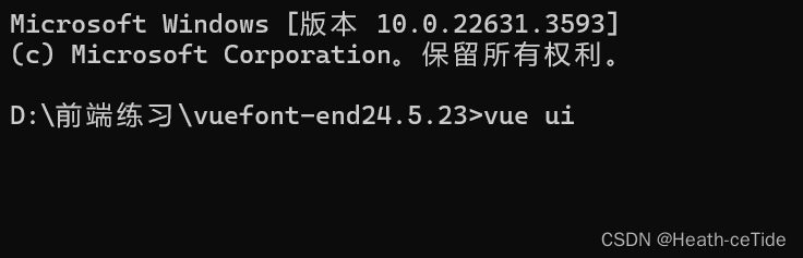
1.根据vue脚手架创建vue项目
这里可以用很多方法创建vue项目,大家看着创建吧,只要能创建出来就可以了(用的vue3)


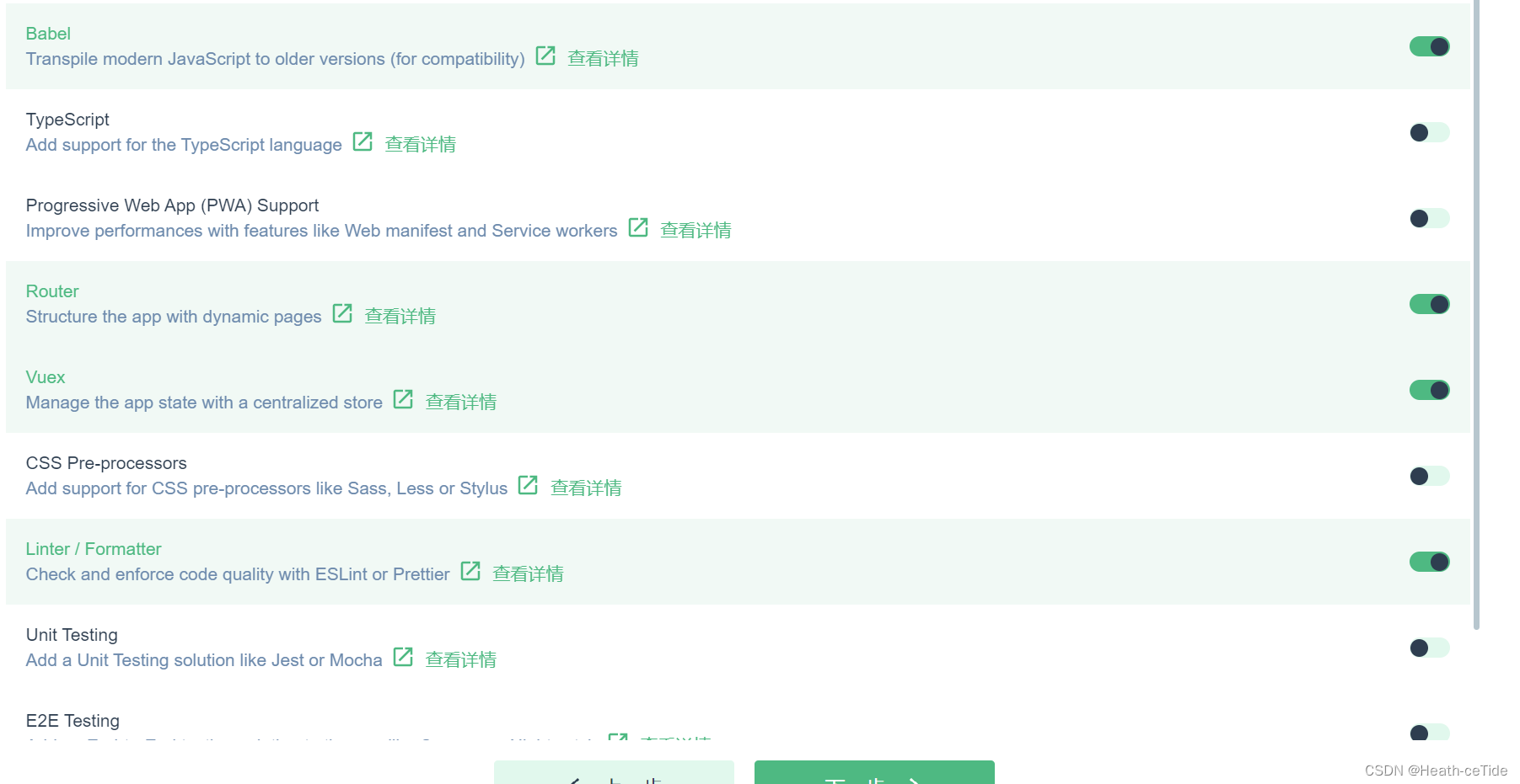
这里我加了router和vuex,emm,就不用ts了(感觉还是js用的更好一点)

OK,项目创建完毕,即可开始写前端代码了。
2.安装依赖:
1.挑一个自己喜欢的组件库引用一手,这里我选用arco design(也没必要只用Element-ui,可以试试其他的)
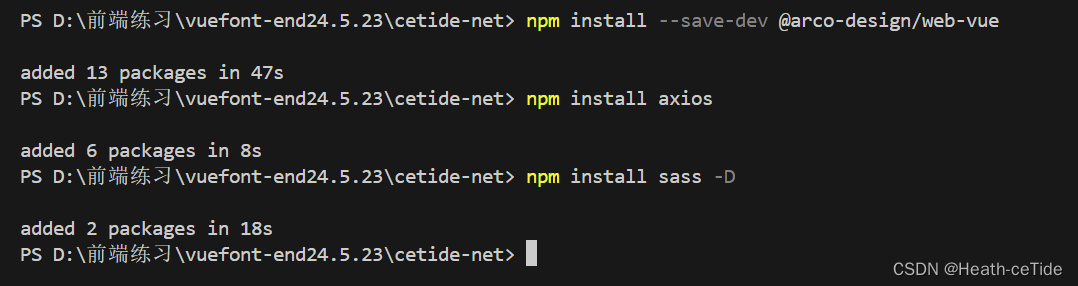
npm install --save-dev @arco-design/web-vueOKOK,开始下载
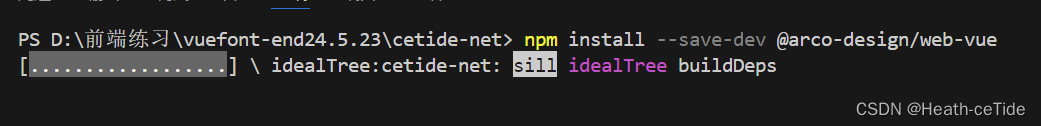
安装好了之后,我们还要安装一些必要的依赖,比如axios,sass这些,emmmm,目前就安装这几个吧。
npm install axios
npm install sass -D
然后根据组件库官网的操作进行引入
import { createApp } from 'vue'
import ArcoVue from '@arco-design/web-vue';
import App from './App.vue';
import '@arco-design/web-vue/dist/arco.css';

const app = createApp(App);
app.use(ArcoVue);
app.mount('#app');
改造一下main.js中的代码
import { createApp } from 'vue'
import App from './App.vue'
import router from './router'
import store from './store'
import ArcoVue from '@arco-design/web-vue';
import '@arco-design/web-vue/dist/arco.css';


createApp(App).use(store).use(ArcoVue).use(router).mount('#app')
注意注意:引入组件库之后,可以找个组件看看能不能使用该组件库,以防万一;
呐,这里我们就去官网看看
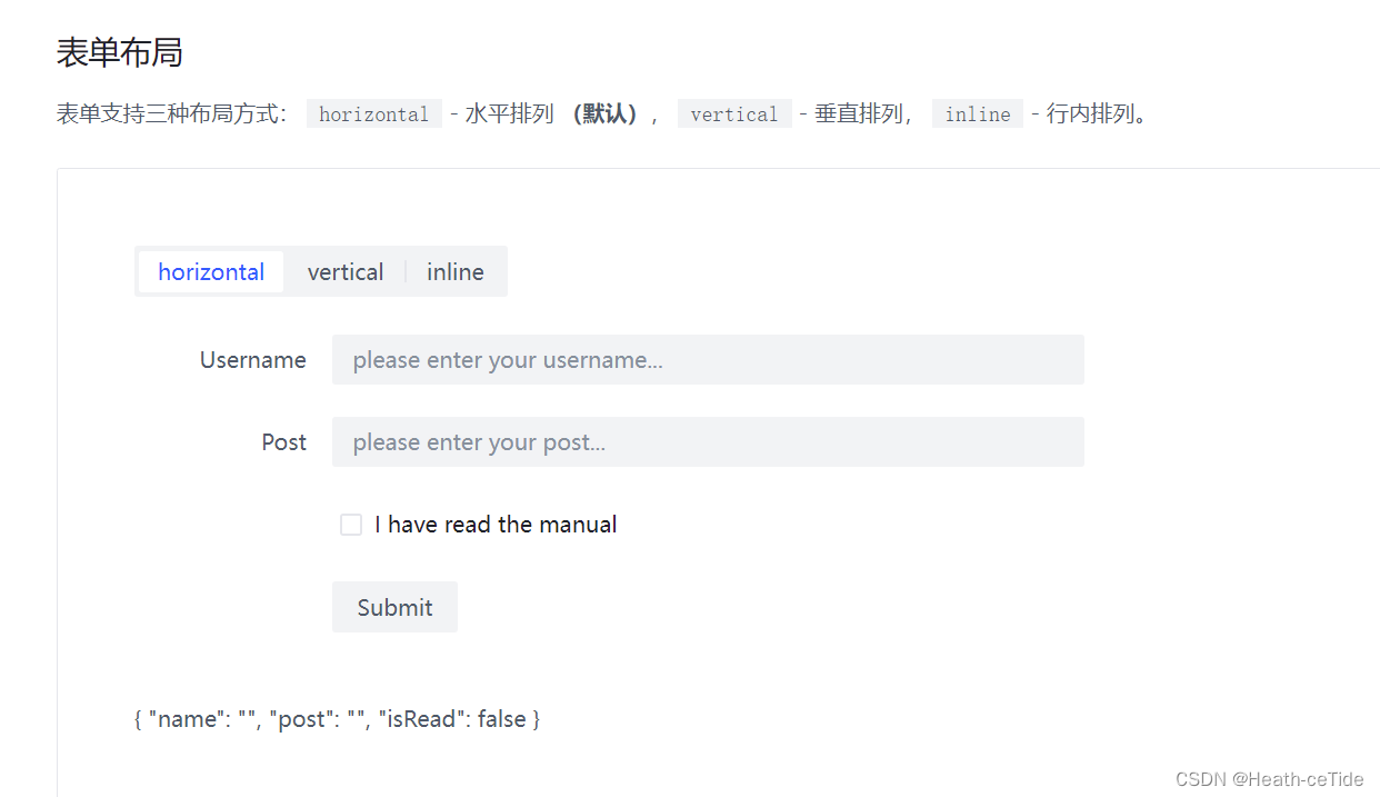
很好,就是你了,表单布局,我们点击其下方代码,将其放入App.vue试试能不能用


好嘞,随机找一串串代码放到App.vue中试试(不要试着从图片中照抄我的哈,自己去官网找一个试试Arco Design Vue)咱,主打一个快速。

嚯,出现了!那么组件库是能用哒!
好,第二步也就完成了。
这里我建议每做几步就开启调试一下。
3.调整目录,初始化项目:
1.清空components(把HelloWorld.vue删了)
2.新建目录api,utils,views
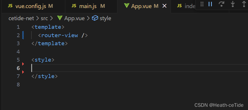
3.把App.vue中用不到的代码都给删了,留一个 <router-view />就好了,然后,把router的index.js的代码全给注释了(emmm,直接删了感觉太麻烦,注释了后面写起来好做参照)
 目前的目录结构就是这样了;
 (App.vue就变成这样啦)
4.定义请求工具:
大家不要一开始写前端就直奔优美的”可跳转“页面,这边先整体规定一个向后端发请求的工具request.js
在utils目录下创建request.js文件:
import axios from 'axios';//导入axios
//定义前缀
const URL = 'http://localhost:8080';
const instance = axios.create({URL})


//来一个响应拦截器
instance.interceptors.response.use(
    result=>{
        if(result.data.code == 0){
            return result.data;
        }
        //如果不为0则表示失败
        alert(result.data.message||'出现错误')
        return Promise.reject(err);//异步的状态转化成失败的状态
    },
    err=>{
        alert('服务异常');
        return Promise.reject(err);//异步的状态转化成失败的状态
    }
)
export default instance;
解释一下这段代码:引入发请求的axios,然后定义一个开发时期的请求必有前缀(这里直接写http://localhost:8080其实是有问题的,对于后面出现的跨域问题....emmmm,其实前端后端都有方式解决,看情况吧,后面再讲),做一个相应拦截器,对结果进行判断,然后导出
(这里需要提示一下统一相应有哪些(不然可能会不太好理解))
后端那一块统一相应数据:code:0表示成功,1表示失败;msg: 提示信息;data:数据
前端代码编写开始!!
OK啊各位,初始化完成我们便要开始编写代码了。
首先,我们先明确一波步骤:
确定布局 --> 填充各部分代码 --> 后端插入
(如果涉及与后端的交互,遵循以下步骤
1.搭建页面(html,css)-> 2.绑定数据与事件 -> 3.调用后端接口)
好嘞,熟悉了吗各位,不熟练也没事,我们先找一个练练手。
先从组件库这里找到布局:

这布局,看似普通,实则帅的雅痞,就它了。引入代码
回到目录component下,创建一个新的文件GlobalPage.vue
(众所周知的小技巧:<vue>可快速构建vue文件)
<template>
   <a-layout style="height: 400px;">
      <a-layout-header>Header</a-layout-header>
      <a-layout>
        <a-layout-sider theme="dark">Sider</a-layout-sider>
        <a-layout-content>Content</a-layout-content>
      </a-layout>
      <a-layout-footer>Footer</a-layout-footer>
    </a-layout>
</template>

<script>
export default {

}
</script>

<style scoped>
.layout-demo :deep(.arco-layout-header),
.layout-demo :deep(.arco-layout-footer),
.layout-demo :deep(.arco-layout-sider-children),
.layout-demo :deep(.arco-layout-content) {
  display: flex;
  flex-direction: column;
  justify-content: center;
  color: var(--color-white);
  font-size: 16px;
  font-stretch: condensed;
  text-align: center;
}


.layout-demo :deep(.arco-layout-header),
.layout-demo :deep(.arco-layout-footer) {
  height: 64px;
  background-color: var(--color-primary-light-4);
}

.layout-demo :deep(.arco-layout-sider) {
  width: 206px;
  background-color: var(--color-primary-light-3);
}

.layout-demo :deep(.arco-layout-content) {
  background-color: rgb(var(--arcoblue-6));
}
</style>
然后我们改一下index.js文件(将GlobalPage引入)(要是看着那些注解感觉不美观的话就直接删了)
import { createRouter, createWebHashHistory } from 'vue-router'
import MainPage from '../components/GlobalPage.vue'

const routes = [
  // {
  //   path: '/',
  //   name: 'home',
  //   component: HomeView
  // },
  // {
  //   path: '/about',
  //   name: 'about',
  //   // route level code-splitting
  //   // this generates a separate chunk (about.[hash].js) for this route
  //   // which is lazy-loaded when the route is visited.
  //   component: () => import(/* webpackChunkName: "about" */ '../views/AboutView.vue')
  // }
  {
    path: '/',
    name: 'mainPage',
    component: MainPage
  }
]

const router = createRouter({
  history: createWebHashHistory(),
  routes
})

export default router
运行一手看看(记得每次有一些大改就要看看情况,改多再看就会很麻烦,bug也不好排查)
 运行出来就是这么个界面
搭建Header和Footer代码
先把头部和尾部的代码解决了。
先来尾部吧,我觉得这个比较简单(哈)
一般来说,网站的底部都是一些网站运营的介绍什么的(大多都是哈,也不一定全是)
这里我就以大家都爱的4399为例(大多都是哈,也不一定全是,哈哈哈)
emmm,这里我们可以把Footer这一块封装为一个组件,因为虽然定义的GlobalPage属于是全局的页面,但万一之后会跳转到其他的页面呢,这里我觉得封装成组件更好一些(看起来也更轻巧一些)
在views目录下创建GlobalFooter.vue
<template>
  <div id="header">由Heath ceTide 创作的网站 XXX 有限公司</div>
</template>

<script>
export default {};
</script>

<style>
#header {
  font-family: "Satisfy", cursive;
  font-size: 16px;
  color: rgb(102, 149, 164);
  margin-right: 20px;
}
</style>
差不多了,将其替换掉GlobalPage的header
<template>
   <a-layout style="height: 400px;">
      <a-layout-header>Header</a-layout-header>
      <a-layout>
        <a-layout-sider theme="dark">Sider</a-layout-sider>
        <a-layout-content>Content</a-layout-content>
      </a-layout>
      <a-layout-footer>
        <global-footer></global-footer>
      </a-layout-footer>
    </a-layout>
</template>
<script>
import GlobalFooter from '../views/GlobalFooter.vue'
export default {
  components: { GlobalFooter },

}
</script>
展示出了样式就行了,(之后可以美化以下),好,然后我们开始整Header,
这一块导航栏,我觉得吧,还是用组件比较合适(倒不是不会整,毕竟也麻烦,不用自己手敲的绝不自己手敲代码)

就选这个深色模式导航啦,新建GlobalHeader.vue文件把代码用CV大法放进去
<template>
  <div class="menu-demo">
    <a-menu mode="horizontal" theme="dark" :default-selected-keys="['1']">
      <a-menu-item key="0" :style="{ padding: 0, marginRight: '38px' }" disabled>
        <div
          :style="{
            width: '80px',
            height: '30px',
            background: 'var(--color-fill-3)',
            cursor: 'text',
          }"
        />
      </a-menu-item>
      <a-menu-item key="1">Home</a-menu-item>
      <a-menu-item key="2">Solution</a-menu-item>
      <a-menu-item key="3">Cloud Service</a-menu-item>
      <a-menu-item key="4">Cooperation</a-menu-item>
    </a-menu>
  </div>
</template>
<style scoped>
.menu-demo {
  box-sizing: border-box;
  width: 100%;
  background-color: var(--color-neutral-2);
}
</style>
<template>
  <a-layout style="height: 400px">
    <a-layout-header><global-header></global-header></a-layout-header>
    <a-layout>
      <a-layout-sider theme="dark">Sider</a-layout-sider>
      <a-layout-content>Content</a-layout-content>
    </a-layout>
    <a-layout-footer>
      <global-footer class="footer"></global-footer>
    </a-layout-footer>
  </a-layout>
</template>

<script>
import GlobalFooter from "../views/GlobalFooter.vue";
import GlobalHeader from "../views/GlobalHeader.vue";
export default {
  components: { GlobalFooter, GlobalHeader },
};
</script>

<style scoped>
.layout-demo :deep(.arco-layout-header),
.layout-demo :deep(.arco-layout-footer),
.layout-demo :deep(.arco-layout-sider-children),
.layout-demo :deep(.arco-layout-content) {
  display: flex;
  flex-direction: column;
  justify-content: center;
  color: var(--color-white);
  font-size: 16px;
  font-stretch: condensed;
  text-align: center;
}

.layout-demo :deep(.arco-layout-header),
.layout-demo :deep(.arco-layout-footer) {
  height: 64px;
  background-color: var(--color-primary-light-4);
}

.layout-demo :deep(.arco-layout-sider) {
  width: 206px;
  background-color: var(--color-primary-light-3);
}

.layout-demo :deep(.arco-layout-content) {
  background-color: rgb(var(--arcoblue-6));
}

.footer {
  background-color: aliceblue;
  padding: 16px;
  position: sticky;
  bottom: 0;
  left: 0;
  right: 0;
  text-align: center;
  letter-spacing: 3px;
}
</style>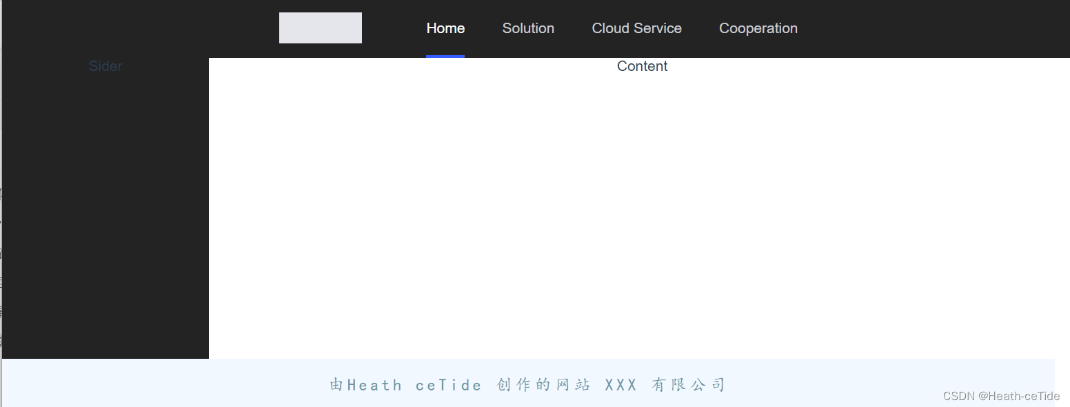
其实这个空的区域可以加一个logo或者其他什么的
呐,就像这样
OK,目前的页面就是这个样子了;
搭建搜索页面
好的,下面整一个全局的搜索框页面吧
创建一个SearchPage.vue 文件
从组件库中找到一个合适的搜索框

<!--SearchPage.vue代码-->
<template>
  <a-space direction="vertical" size="large">
    <a-input-search
      :style="{ width: '320px' }"
      placeholder="Please enter something"
      button-text="Search"
      search-button
    />
  </a-space>
</template>

<script>
export default {};
</script>

<style>
</style>
将新组件放到GlobalPage中(暂时的,之后还是要处理路由的)
<template>
  <a-layout style="height: 400px">
    <a-layout-header><global-header></global-header></a-layout-header>
    <a-layout>
      <a-layout-sider theme="dark">Sider</a-layout-sider>
      <a-layout-content><search-page></search-page></a-layout-content>
    </a-layout>
    <a-layout-footer>
      <global-footer class="footer"></global-footer>
    </a-layout-footer>
  </a-layout>
</template>

<script>
import GlobalFooter from "../views/GlobalFooter.vue";
import GlobalHeader from "../views/GlobalHeader.vue";
import SearchPage from '../views/SearchPage.vue';
export default {
  components: { GlobalFooter, GlobalHeader, SearchPage },
};
</script>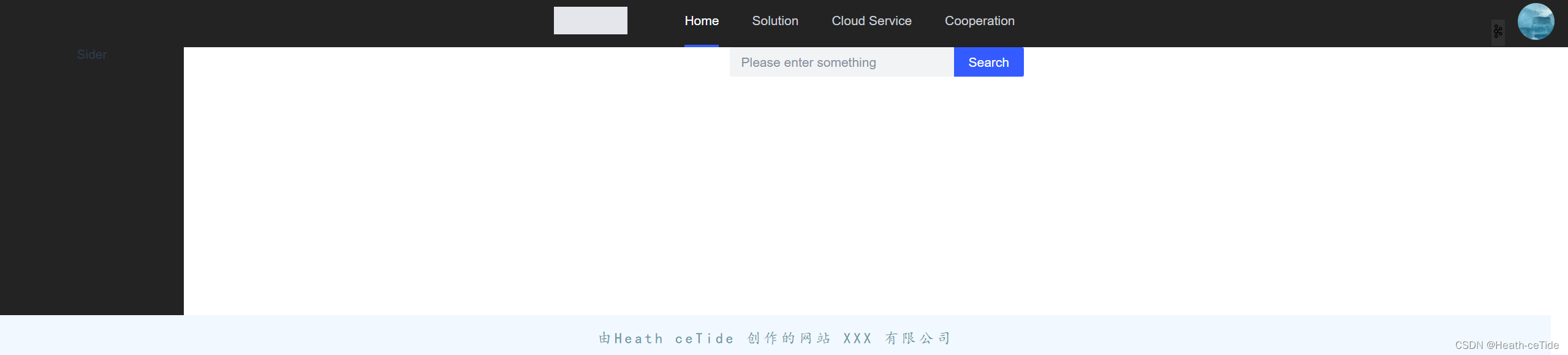
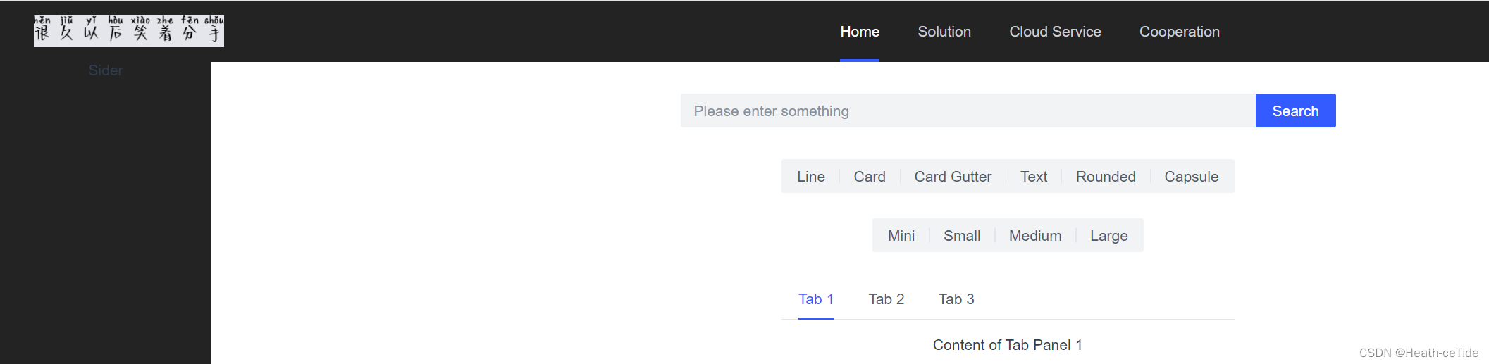
现在搜索框就出来了,(这里最右边加了一点点小细节(不重要)之后会把代码发出来)
这里其实可以加一个搜索框等待效果
<template>
  <div id="search">
    <a-space direction="vertical" size="large">
      <a-input-search
        :style="{ width: '320px' }"
        placeholder="Please enter something"
        button-text="Search"
        search-button
      />
    </a-space>
    <a-space direction="vertical" size="large">
      <a-input-search
        :style="{ width: '320px' }"
        placeholder="Please enter something"
        button-text="Search"
        search-button
        loading
      />
    </a-space>
  </div>
</template>

<script>
export default {};
</script>

<style>
</style>
这里其实是复制了两个搜索框代码,不过另外一个加上了loading属性,这样就能表现出等待中的效果

呐呐呐,就是这样,然后我们再用v-if定义一下它的显示和隐藏就可以了
ok,演示一下:
先设置script 为setup,然后引入ref
<script setup>
import {ref} from 'vue';
还记得之前说的三部曲吗: 1.搭建页面(html,css)-> 2.绑定数据与实践 -> 3.调用后端接口)
那我们以及写好了搜索框了,也该进行数据绑定了(这里暂时不进行后端接口调用,(毕竟还没开发))
对于一个组件的显示和隐藏我们直接写
<script setup>
import {ref} from 'vue';
const isSearch = ref(false)
然后呢,两个搜索框绑定该属性(一个是isSearch,一个是!isSearch),这样就能保持一个显示,一个隐藏了。那么,如何实现转换呢,平时在搜索的时候,当我们点击了搜索按钮的时候就会出现转换效果,如果网比较好的话,估计也就直接跳转了,(如果网不好的话,搜索框转圈转了一会儿就会恢复原样)
那么,我们定义一个函数,在正常情况下点击搜索的时候触发,转换为搜索中的样式,然后过几秒就恢复原状。
那么开始定义吧;
<script setup>
import {ref} from 'vue';
const isSearch = ref(false)


const onSearch = () => {
  isSearch.value = true;
  setTimeout(() => {
    isSearch.value = false;
  }, 5000);
};
</script>
这里定义了一个函数,点击之后,isSearch改变,等到五秒之后,值恢复。来试试吧
<template>
  <div id="search">
    <a-space direction="vertical" size="large" v-if="!isSearch">
      <a-input-search
        :style="{ width: '320px' }"
        placeholder="Please enter something"
        button-text="Search"
        search-button
        @click=onSearch
      />
    </a-space>
    <a-space direction="vertical" size="large" v-if="isSearch">
      <a-input-search
        :style="{ width: '320px' }"
        placeholder="Please enter something"
        button-text="Search"
        search-button
        loading
      />
    </a-space>
  </div>
</template>

<script setup>
import {ref} from 'vue';
const isSearch = ref(false)


const onSearch = () => {
  isSearch.value = true;
  setTimeout(() => {
    isSearch.value = false;
  }, 5000);
};
</script>

成功了,那再来完善一下
有搜索框,当然要有显示搜索内容的区域,
再去组件库看看有没有什么合适的

就用这个吧,
<template>
  <div id="searchPage">

    <div class="search">
      <a-space direction="vertical" size="large" v-if="!isSearch">
        <a-input-search
          :style="{ width: '620px' }"
          placeholder="Please enter something"
          button-text="Search"
          search-button
          @click="onSearch"
        />
      </a-space>
      <a-space direction="vertical" size="large" v-if="isSearch">
        <a-input-search
          :style="{ width: '620px' }"
          placeholder="Please enter something"
          button-text="Search"
          search-button
          loading
        />
      </a-space>
    </div>
    <a-space direction="vertical" size="large">
      <a-radio-group v-model="type" type="button">
        <a-radio value="line">Line</a-radio>
        <a-radio value="card">Card</a-radio>
        <a-radio value="card-gutter">Card Gutter</a-radio>
        <a-radio value="text">Text</a-radio>
        <a-radio value="rounded">Rounded</a-radio>
        <a-radio value="capsule">Capsule</a-radio>
      </a-radio-group>
      <a-radio-group v-model="size" type="button">
        <a-radio value="mini">Mini</a-radio>
        <a-radio value="small">Small</a-radio>
        <a-radio value="medium">Medium</a-radio>
        <a-radio value="large">Large</a-radio>
      </a-radio-group>
      <a-tabs :type="type" :size="size">
        <a-tab-pane key="1" title="Tab 1"> Content of Tab Panel 1 </a-tab-pane>
        <a-tab-pane key="2" title="Tab 2"> Content of Tab Panel 2 </a-tab-pane>
        <a-tab-pane key="3" title="Tab 3"> Content of Tab Panel 3 </a-tab-pane>
      </a-tabs>
    </a-space>
  </div>
</template>

<script setup>
import { ref } from "vue";
const isSearch = ref(false);

const onSearch = () => {
  isSearch.value = true;
  setTimeout(() => {
    isSearch.value = false;
  }, 5000);
};
</script>

<style scoped>
.search{
    margin: 30px auto;

}
</style>
添加代码并做一些优化

目前就是这个样子了。
emmm,感觉不太对,好像有点快了,要不还是做一个登录注册页面吧。。。
搭建登录注册页面
创建LoginPage.vue
这一块我觉得还挺容易的,先给个示例代码吧
<template>
  <div class="container">
    <div class="login-box">
      <!-- Login Form -->
      <form action="">
        <h2>Login</h2>
        <div class="input-box">
          <span class="icon"><i class="fa-solid fa-envelope"></i></span>
          <input type="email" required placeholder="Email" />
        </div>
        <div class="input-box">
          <span class="icon"><i class="fa-solid fa-lock"></i></span>
          <input type="password" placeholder="Password" required />
        </div>
        <div class="remember-forget">
          <label><input type="checkbox" />Remember Me</label>
          <a href="#">Forgot Password?</a>
        </div>
        <button type="submit">Login</button>
        <div class="register-link">
          <a href="#">Don't have an account? Create Now!</a>
        </div>
      </form>
    </div>
  </div>
</template>

<script>
export default {

}
</script>

<style scoped>
* {
  margin: 0;
  padding: 0;
  box-sizing: border-box;
  font-family: "Poppins", sans-serif;
}
.container {
  width: 100%;
  height: 100vh;
  background: url("../assets/background.jpg") no-repeat;
  background-size: cover;
  background-position: center;
  display: flex;
  justify-content: center;
  align-items: center;
}

.container .login-box {
  position: relative;
  width: 390px;
  height: 420px;
  background-color: transparent;
  border: 2px solid rgba(255, 255, 255, 0.5);
  border-radius: 20px;
  display: flex;
  justify-content: center;
  align-items: center;
  backdrop-filter: blur(15px);
}

.login-box h2 {
  font-size: 28px;
  color: #fff;
  text-align: center;
}

.login-box .input-box {
  position: relative;
  width: 310px;
  margin: 30px 0;
  border-bottom: 2px solid #fff;
}

.input-box input {
  width: 100%;
  height: 50px;
  background: transparent;
  border: none;
  outline: none;
  font-size: 16px;
  color: #fff;
  padding: 0 35px 0 5px;
}

.input-box input::placeholder {
  color: #f9f9f9;
}

.input-box .icon {
  position: absolute;
  right: 8px;
  color: #fff;
  font-size: 18px;
  line-height: 50px;
}

.login-box .remember-forget {
  margin: -15px 0 15px;
  font-size: 15px;
  color: #fff;
  display: flex;
  justify-content: space-between;
}

.remember-forget label input {
  margin-right: 3px;
}

.login-box button {
  width: 100%;
  height: 40px;
  background: #fff;
  border: none;
  outline: none;
  border-radius: 40px;
  cursor: pointer;
  font-size: 16px;
  color: #000;
  transition: all 0.5s;
}

.login-box button:hover {
  background: #1f73c9;
  color: #fff;
}

.login-box .register-link {
  font-size: 15px;
  color: #fff;
  text-align: center;
  margin: 20px 0 10px;
}

.remember-forget a,
.register-link a {
  color: #fff;
  text-decoration: none;
}

.remember-forget a:hover,
.register-link a:hover {
  text-decoration: underline;
}

/* Responsive Design */
@media (max-width: 460px) {
  .container .login-box {
    width: 350px;
  }

  .login-box .input-box {
    width: 290px;
  }
}

@media (max-width: 360px) {
  .container .login-box {
    width: 100%;
    height: 100vh;
    border: none;
  }
}
</style>
这一块代码是之前找到的一个登录页代码,我觉着就还挺好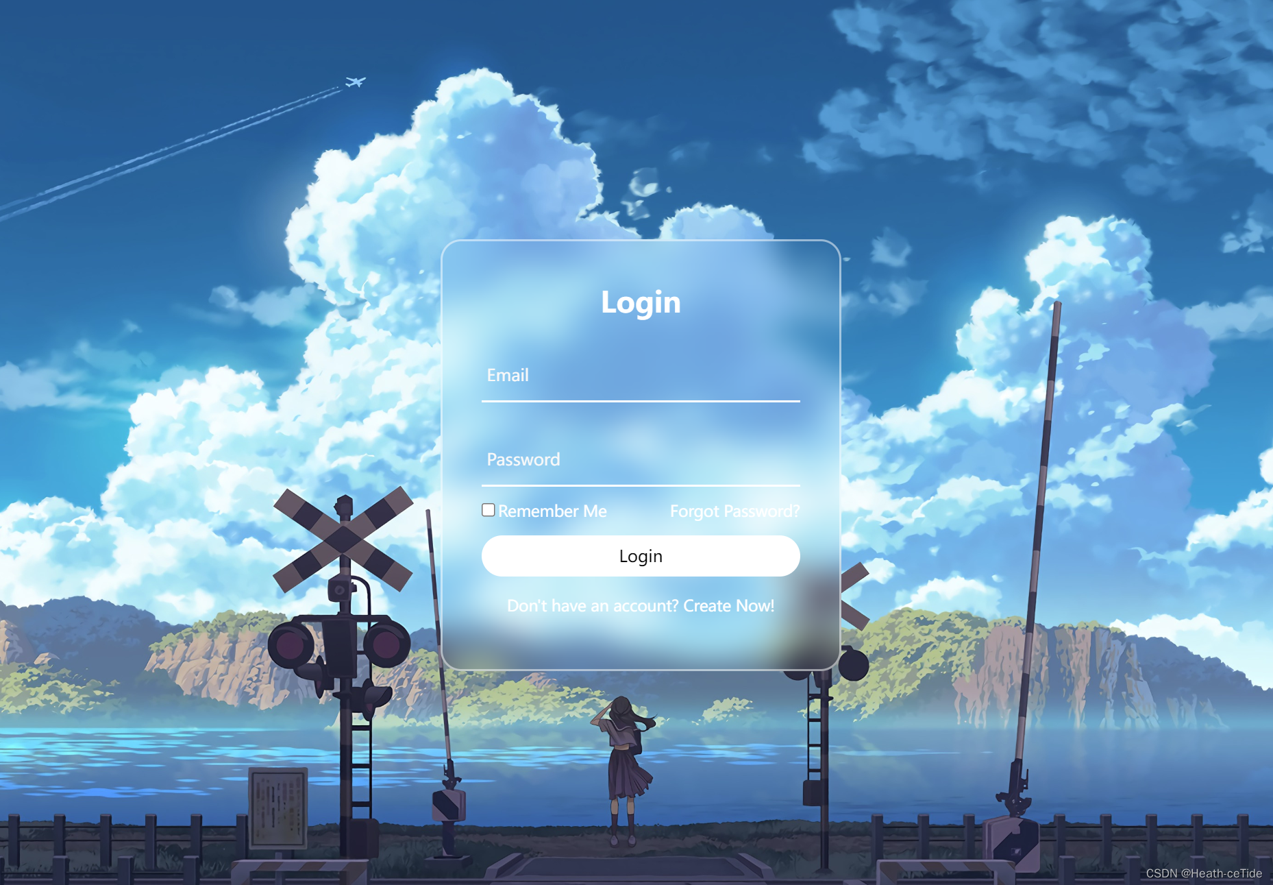
不过吧,我决定还是不用这个代码,去组件库上找找吧(主要还是要加深一下组件库的使用)
好了就用这个

小改一下吧;
<template>
  <div class="container">
    <div class="login-box">
      <a-form
        :model="form"
        :style="{ width: '600px' }"
        @submit="handleSubmit"
        class="input-box"
      >
        <h2 style="margin-bottom: 60px">Login</h2>
        <a-form-item
          field="name"
          tooltip="Please enter username"
          label="账号"
          class="element"
        >
          <a-input
            v-model="form.name"
            placeholder="please enter your username..."
            style="margin-right: 40px"
          />
        </a-form-item>
        <a-form-item field="post" label="密码" class="element">
          <a-input
            v-model="form.post"
            placeholder="please enter your password..."
            style="margin-right: 40px"
          />
        </a-form-item>
        <a-form-item field="isRead">
          <a-checkbox v-model="form.isRead">
            I have read the manual
          </a-checkbox>
        </a-form-item>
        <a-form-item>
          <a-button html-type="submit" class="input-box">Submit</a-button>
        </a-form-item>
        <div class="register-link">
          <a href="#">Don't have an account? Create Now!</a>
        </div>
      </a-form>
    </div>
  </div>
</template>

<script>

</script>

<style scoped>
* {
  margin: 0;
  padding: 0;
  box-sizing: border-box;
  font-family: "Poppins", sans-serif;
  display: flex;
  justify-content: center;
}
.container {
  width: 100%;
  height: 100vh;
  background: url("../assets/background.jpg") no-repeat;
  background-size: cover;
  background-position: center;
  display: flex;
  justify-content: center;
  align-items: center;
}

.container .login-box {
  position: relative;
  width: 500px;
  height: 580px;
  background-color: transparent;
  border: 2px solid rgba(255, 255, 255, 0.5);
  border-radius: 20px;
  display: flex;
  justify-content: center;
  align-items: center;
  backdrop-filter: blur(15px);
}

.login-box h2 {
  font-size: 28px;
  color: #fff;
  text-align: center;
}

.login-box .input-box {
  position: relative;
  width: 310px;
  margin: 30px 0;
}

.input-box input {
  width: 80%;
  height: 60px;
  background: transparent;
  border: none;
  outline: none;
  font-size: 16px;
  color: #fff;
  padding: 0 2px 0 5px;
}

.input-box input::placeholder {
  color: #f9f9f9;
}

.input-box .icon {
  position: absolute;
  right: 8px;
  color: #fff;
  font-size: 16px;
  line-height: 25px;
}

.login-box .remember-forget {
  margin: -15px 0 15px;
  font-size: 15px;
  color: #fff;
  display: flex;
  justify-content: space-between;
}

.remember-forget label input {
  margin-right: 30px;
}

.login-box button {
  width: 100%;
  height: 40px;
  background: #fff;
  border: none;
  outline: none;
  border-radius: 40px;
  cursor: pointer;
  font-size: 16px;
  color: #000;
  transition: all 0.5s;
}

.login-box button:hover {
  background: #1f73c9;
  color: #fff;
}

.login-box .register-link {
  font-size: 15px;
  color: #fff;
  text-align: center;
  margin: 5px 0 5px;
}

.remember-forget a,
.register-link a {
  color: #fff;
  text-decoration: none;
}

.remember-forget a:hover,
.register-link a:hover {
  text-decoration: underline;
}

/* Responsive Design */
@media (max-width: 460px) {
  .container .login-box {
    width: 350px;
  }

  .login-box .input-box {
    width: 290px;
  }
}

@media (max-width: 360px) {
  .container .login-box {
    width: 100%;
    height: 100vh;
    border: none;
  }
}
.element {
  margin: 20px 0;
}
</style>
emmm,这代码可谓一坨(发出来也需要些勇气啊。。)
大家如果有自己的写的规范代码就用自己的(hhh)
那么,我们开始前面的三部曲:搭建页面以及完成,可以开始绑定数据与事件了。
<script setup>
import {ref} from 'vue';
const loginData = ref({
    username: '',
    password: '',
    isRead: false,
})
先引入ref,然后创建loginData,然后v-model绑定数据
<template>
  <div class="container">
    <div class="login-box">
      <a-form
        :model="loginData"
        :style="{ width: '600px' }"
        @submit="handleSubmit"
        class="input-box"
      >
        <h2 style="margin-bottom: 60px">Login</h2>
        <a-form-item
          field="name"
          tooltip="Please enter username"
          label="账号"
          class="element"
          :rules= "rules"
        >
          <a-input
            v-model="loginData.username"
            placeholder="please enter your username..."
            style="margin-right: 40px"
          />
        </a-form-item>
        <a-form-item field="post" label="密码" class="element" :rules= "rules">
          <a-input
            v-model="loginData.password"
            placeholder="please enter your password..."
            style="margin-right: 40px"
          />
        </a-form-item>
        <a-form-item field="isRead">
          <a-checkbox v-model="loginData.isRead">
            I have read the manual
          </a-checkbox>
        </a-form-item>
        <a-form-item>
          <a-button html-type="submit" class="input-box">Submit</a-button>
        </a-form-item>
        <div class="register-link">
          <a href="#">Don't have an account? Create Now!</a>
        </div>
      </a-form>
    </div>
  </div>
</template>
<script setup>
import {ref} from 'vue';
const loginData = ref({
    username: '',
    password: '',
    isRead: false,
})
const rules = [{
      validator: (value, cb) => {
        return new Promise(resolve => {
          window.setTimeout(() => {
            if (value !== ' ') {
              cb('content not empty')
            }
            resolve()
          }, 1000)
        })
      }
    }];

</script>

<style scoped>
* {
  margin: 0;
  padding: 0;
  box-sizing: border-box;
  font-family: "Poppins", sans-serif;
  display: flex;
  justify-content: center;
}
.container {
  width: 100%;
  height: 100vh;
  background: url("../assets/background.jpg") no-repeat;
  background-size: cover;
  background-position: center;
  display: flex;
  justify-content: center;
  align-items: center;
}

.container .login-box {
  position: relative;
  width: 500px;
  height: 580px;
  background-color: transparent;
  border: 2px solid rgba(255, 255, 255, 0.5);
  border-radius: 20px;
  display: flex;
  justify-content: center;
  align-items: center;
  backdrop-filter: blur(15px);
}

.login-box h2 {
  font-size: 28px;
  color: #fff;
  text-align: center;
}

.login-box .input-box {
  position: relative;
  width: 310px;
  margin: 30px 0;
}

.input-box input {
  width: 80%;
  height: 60px;
  background: transparent;
  border: none;
  outline: none;
  font-size: 16px;
  color: #fff;
  padding: 0 2px 0 5px;
}

.input-box input::placeholder {
  color: #f9f9f9;
}

.input-box .icon {
  position: absolute;
  right: 8px;
  color: #fff;
  font-size: 16px;
  line-height: 25px;
}

.login-box .remember-forget {
  margin: -15px 0 15px;
  font-size: 15px;
  color: #fff;
  display: flex;
  justify-content: space-between;
}

.remember-forget label input {
  margin-right: 30px;
}

.login-box button {
  width: 100%;
  height: 40px;
  background: #fff;
  border: none;
  outline: none;
  border-radius: 40px;
  cursor: pointer;
  font-size: 16px;
  color: #000;
  transition: all 0.5s;
}

.login-box button:hover {
  background: #1f73c9;
  color: #fff;
}

.login-box .register-link {
  font-size: 15px;
  color: #fff;
  text-align: center;
  margin: 5px 0 5px;
}

.remember-forget a,
.register-link a {
  color: #fff;
  text-decoration: none;
}

.remember-forget a:hover,
.register-link a:hover {
  text-decoration: underline;
}

/* Responsive Design */
@media (max-width: 460px) {
  .container .login-box {
    width: 350px;
  }

  .login-box .input-box {
    width: 290px;
  }
}

@media (max-width: 360px) {
  .container .login-box {
    width: 100%;
    height: 100vh;
    border: none;
  }
}
.element {
  margin: 20px 0;
}
</style>
这里可以添加一个校验规则,
 在组件库这里找一下表单的校验规则
<script setup>
import {ref} from 'vue';
const loginData = ref({
    username: '',
    password: '',
    isRead: false,
})
const rules = [{
      validator: (value, cb) => {
        return new Promise(resolve => {
          window.setTimeout(() => {
            if (value === ' ') {
              cb('content not empty')
            }
            resolve()
          }, 1000)
        })
      }
    }];

</script>
随便定义了一个,大家可以自己定义看看,(emmm,这里我感觉element-ui的校验规则更好一丢丢)。
好了,既然定义好了登录界面,就可以试试向后端发起请求了。
这里开始在api文件夹下面创建一个文件user.js然后编写一个登录接口函数

import request from '../utils/request'

//创建一个调用登录接口函数
export const userLoginService = (loginData) =>{
    //用urlSearchParams完成传递
    const params = new URLSearchParams()
    for(let key in loginData){
        params.append(key,loginData[key]);
    }
    return request.post('/user/login',params);
}
定义之后就去登录页调用
        <a-form-item>
          <a-button html-type="submit" class="input-box" @click="login"
            >Submit</a-button
          >
        </a-form-item>
在submit提交这里加上@click="login"
然后定义方法:(获取信息,如果msg提示信息不为0,则显示消息,为0就表示登陆成功)
const login = async()=>{
    let result = await userLoginService(loginData.value);
    alert(result.msg?result.msg:'登录成功');
}
不过,这里用浏览器默认的alert感觉不太美观啊,毕竟都用组件库了,

消息类型:就决定是你了!
引入一手修改代码,
<script setup>
import { h } from 'vue';
import { IconExclamationCircleFill } from '@arco-design/web-vue/es/icon';
import { ref } from "vue";
import {userLoginService} from '../api/user'
const loginData = ref({
  username: "",
  password: "",
  isRead: false,
});


const rules = [
  {
    validator: (value, cb) => {
      return new Promise((resolve) => {
        window.setTimeout(() => {
          if (value !== " ") {
            cb("content not empty");
          }
          resolve();
        }, 1000);
      });
    },
  },
];
const renderIcon = () => h(IconExclamationCircleFill);
const login = async()=>{
    let result = await userLoginService(loginData.value);
    renderIcon(result.msg?result.msg:'登录成功');
}

</script>
好,感觉这样也就差不多了,下面展示一下登录页代码
<template>
  <div class="container">
    <div class="login-box">
      <a-form
        :model="loginData"
        :style="{ width: '600px' }"
        @submit="handleSubmit"
        class="input-box"
      >
        <h2 style="margin-bottom: 60px">Login</h2>
        <a-form-item
          field="name"
          tooltip="Please enter username"
          label="账号"
          class="element"
          :rules="rules"
        >
          <a-input
            v-model="loginData.username"
            placeholder="please enter your username..."
            style="margin-right: 40px"
          />
        </a-form-item>
        <a-form-item field="post" label="密码" class="element" :rules="rules">
          <a-input
            v-model="loginData.password"
            placeholder="please enter your password..."
            style="margin-right: 40px"
          />
        </a-form-item>
        <a-form-item field="isRead">
          <a-checkbox v-model="loginData.isRead">
            I have read the manual
          </a-checkbox>
        </a-form-item>
        <a-form-item>
          <a-button html-type="submit" class="input-box" @click="login"
            >Submit</a-button
          >
        </a-form-item>
        <div class="register-link">
          <a href="#">Don't have an account? Create Now!</a>
        </div>
      </a-form>
    </div>
  </div>
</template>
<script setup>
import { h } from 'vue';
import { IconExclamationCircleFill } from '@arco-design/web-vue/es/icon';
import { ref } from "vue";
import {userLoginService} from '../api/user'
const loginData = ref({
  username: "",
  password: "",
  isRead: false,
});


const rules = [
  {
    validator: (value, cb) => {
      return new Promise((resolve) => {
        window.setTimeout(() => {
          if (value !== " ") {
            cb("content not empty");
          }
          resolve();
        }, 1000);
      });
    },
  },
];
const renderIcon = () => h(IconExclamationCircleFill);
const login = async()=>{
    let result = await userLoginService(loginData.value);
    renderIcon(result.msg?result.msg:'登录成功');
}

</script>

<style scoped>
* {
  margin: 0;
  padding: 0;
  box-sizing: border-box;
  font-family: "Poppins", sans-serif;
  display: flex;
  justify-content: center;
}
.container {
  width: 100%;
  height: 100vh;
  background: url("../assets/background.jpg") no-repeat;
  background-size: cover;
  background-position: center;
  display: flex;
  justify-content: center;
  align-items: center;
}

.container .login-box {
  position: relative;
  width: 500px;
  height: 580px;
  background-color: transparent;
  border: 2px solid rgba(255, 255, 255, 0.5);
  border-radius: 20px;
  display: flex;
  justify-content: center;
  align-items: center;
  backdrop-filter: blur(15px);
}

.login-box h2 {
  font-size: 28px;
  color: #fff;
  text-align: center;
}

.login-box .input-box {
  position: relative;
  width: 310px;
  margin: 30px 0;
}

.input-box input {
  width: 80%;
  height: 60px;
  background: transparent;
  border: none;
  outline: none;
  font-size: 16px;
  color: #fff;
  padding: 0 2px 0 5px;
}

.input-box input::placeholder {
  color: #f9f9f9;
}

.input-box .icon {
  position: absolute;
  right: 8px;
  color: #fff;
  font-size: 16px;
  line-height: 25px;
}

.login-box .remember-forget {
  margin: -15px 0 15px;
  font-size: 15px;
  color: #fff;
  display: flex;
  justify-content: space-between;
}

.remember-forget label input {
  margin-right: 30px;
}

.login-box button {
  width: 100%;
  height: 40px;
  background: #fff;
  border: none;
  outline: none;
  border-radius: 40px;
  cursor: pointer;
  font-size: 16px;
  color: #000;
  transition: all 0.5s;
}

.login-box button:hover {
  background: #1f73c9;
  color: #fff;
}

.login-box .register-link {
  font-size: 15px;
  color: #fff;
  text-align: center;
  margin: 5px 0 5px;
}

.remember-forget a,
.register-link a {
  color: #fff;
  text-decoration: none;
}

.remember-forget a:hover,
.register-link a:hover {
  text-decoration: underline;
}

/* Responsive Design */
@media (max-width: 460px) {
  .container .login-box {
    width: 350px;
  }

  .login-box .input-box {
    width: 290px;
  }
}

@media (max-width: 360px) {
  .container .login-box {
    width: 100%;
    height: 100vh;
    border: none;
  }
}
.element {
  margin: 20px 0;
}
</style>
好了,今天的前端就忙碌到这里吧(下一篇文章再见)。
总结一下:1.完成了前端初始化4步,2.完成了全局页面的布局,3.完成了搜索页的代码,和登录页的代码。


 3902
3902


 被折叠的 条评论
为什么被折叠?
被折叠的 条评论
为什么被折叠?
 到【灌水乐园】发言


