


前端讨论班--第二周培训一)盒子模型1.盒子模型-组成2.盒子模型 - 边线框3.盒子模型 - 内边距4.盒子模型 - 尺寸计算5.盒子模型 - 外边距6.清除默认样式8.外边距问题 - 合并现象9.外边距问题 - 塌陷问题10.行内元素 - 内外边距问题11.盒子模型 - 圆角12.盒子模型 - 阴影二)浮动1.基本使用与布局2.清除浮动三)flex1.flex - 认识2.flex - 组成3.主轴对齐方式4.侧轴对齐方式5.修改主轴方向6.弹性伸缩比7.弹性换行8.行对齐方式四)定位1.作用:灵活的改变盒子在网页中的位置2.实现:3.定位模式:4.堆叠层级z-index五)CSS精灵六)字体图标1.字体图标 - 下载字体2.字体图标 - 使用字体3.字体图标 - 上传矢量图4.垂直对齐方式 vertical - align
前端讨论班--第二周培训
一)盒子模型
1.盒子模型-组成
-
内容区域 - width&height
-
内边距 - padding
-
边线框 - border
-
外边距 - margin(出现在盒子外面)

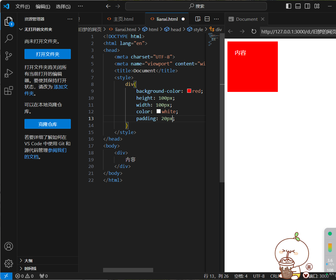
<!DOCTYPE html>
<html lang="en">
<head>
    <meta charset="UTF-8">
    <meta name="viewport" content="width=device-width, initial-scale=1.0">
    <title>Document</title>
    <style>
        div{
            background-color: red;
            height: 100px;
            width: 100px;
            color: white;
            padding: 20px;
            margin: 20px;
            border: 1px solid black;
        }
    </style>
</head>
<body>
    <div>
        内容
    </div>
</body>
</html>
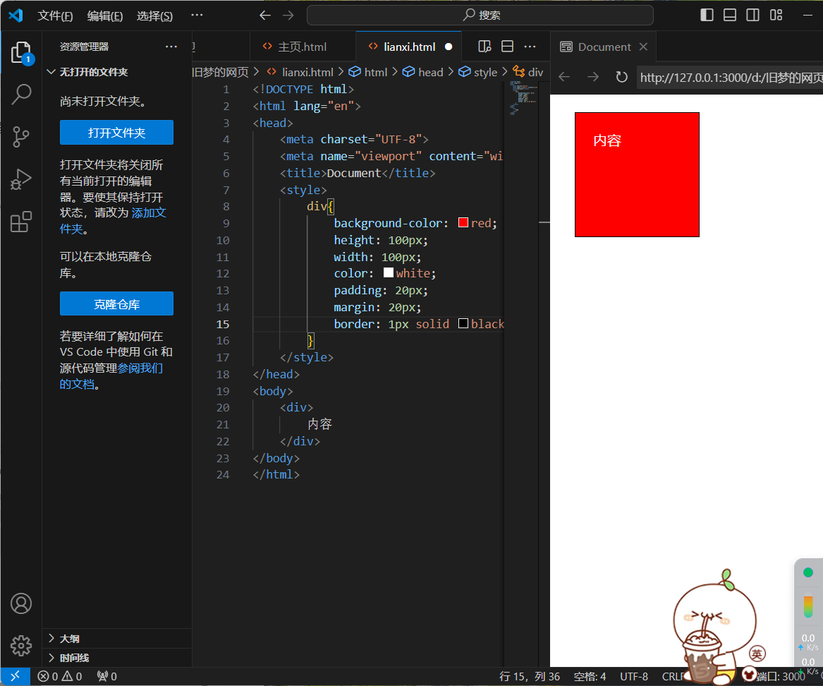
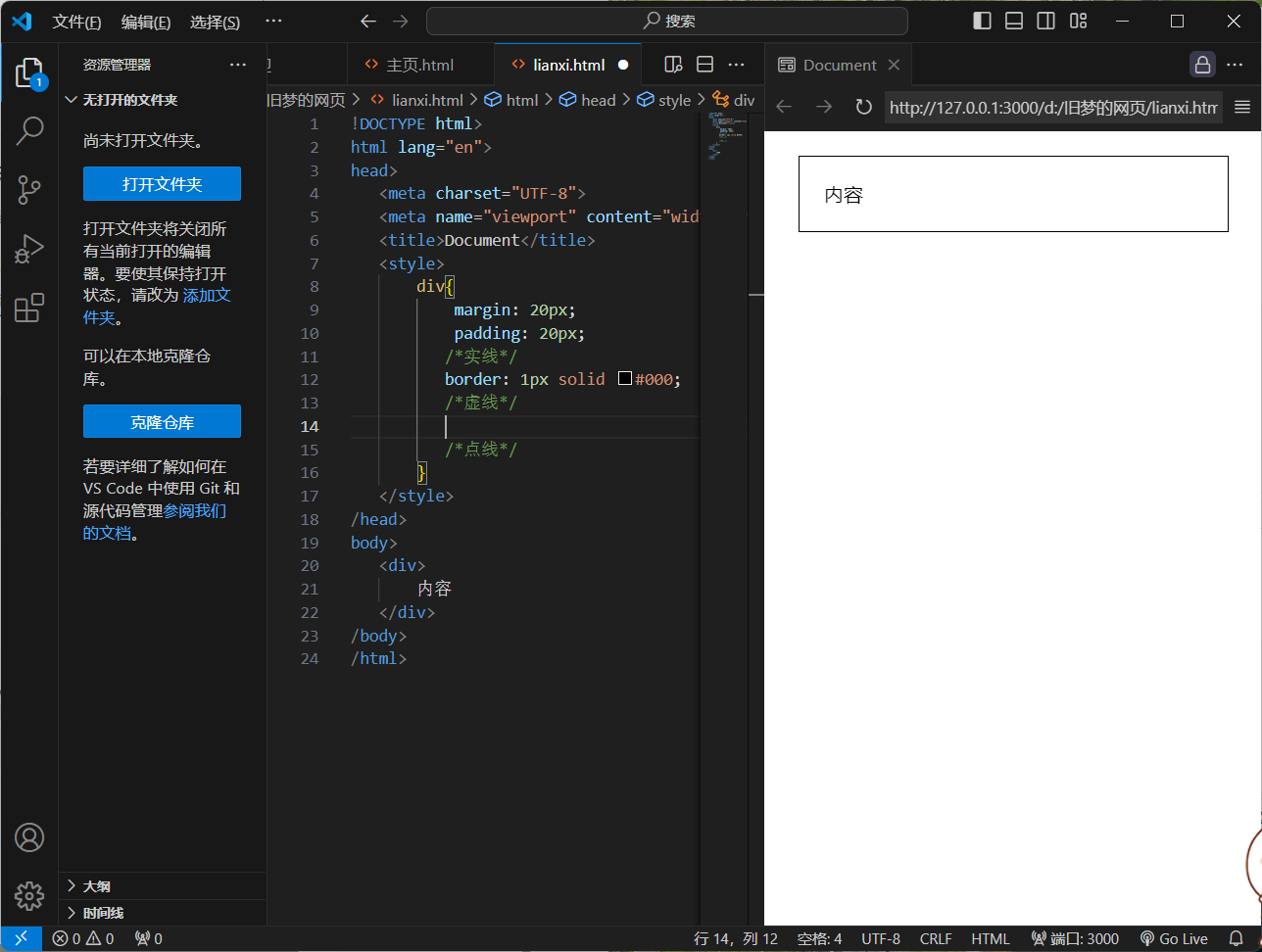
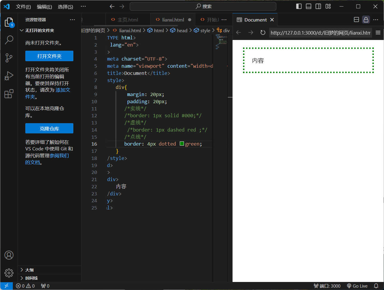
2.盒子模型 - 边线框
1.属性名:border / border - 方位名词
2.属性值:边线框粗细 线条样式 颜色
3.常用线条样式:solid(实线) dotted(点线) dashed(虚线)

<!DOCTYPE html>
<html lang="en">
<head>
    <meta charset="UTF-8">
    <meta name="viewport" content="width=device-width, initial-scale=1.0">
    <title>Document</title>
    <style>
        div{
            margin: 20px;
            padding: 20px;
           /*实线*/
           /*border: 1px solid #000;*/
           /*虚线*/
            /*border: 1px dashed red ;*/
           /*点线*/
           border: 4px dotted green;
        }
    </style>
</head>
<body>
    <div>
        内容
    </div>
</body>
</html>
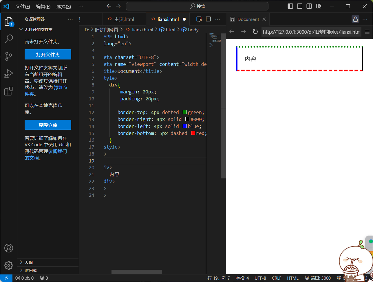
4.设置单方向边线框
<!DOCTYPE html>
<html lang="en">
<head>
    <meta charset="UTF-8">
    <meta name="viewport" content="width=device-width, initial-scale=1.0">
    <title>Document</title>
    <style>
        div{
            margin: 20px;
            padding: 20px;

           border-top: 4px dotted green;
           border-right: 4px solid #000;
           border-left: 4px solid blue;
           border-bottom: 5px dashed red;
        }
    </style>
</head>
<body>
    <div>
        内容
    </div>
</body>
</html>
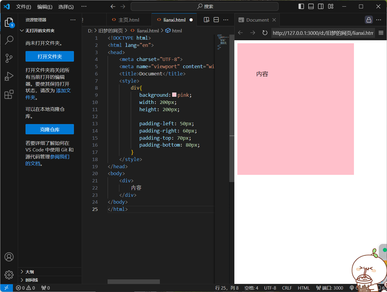
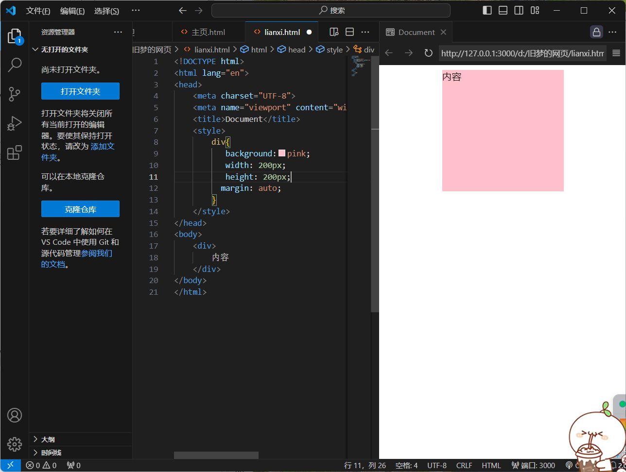
3.盒子模型 - 内边距
1.作用:设置 内容 与 盒子边缘 之间的距离
2.属性名:padding / padding - 方位名词

<!DOCTYPE html>
<html lang="en">
<head>
<meta charset="UTF-8">
<meta name="viewport" content="width=device-width, initial-scale=1.0">
<title>Document</title>
<style>
div{
background:pink;
width: 200px;
height: 200px;
padding: 50px;
}
</style>
</head>
<body>
<div>
内容
</div>
</body>
</html>
<!DOCTYPE html>
<html lang="en">
<head>
<meta charset="UTF-8">
<meta name="viewport" content="width=device-width, initial-scale=1.0">
<title>Document</title>
<style>
div{
background:pink;
width: 200px;
height: 200px;
padding-left: 50px;
padding-right: 60px;
padding-top: 70px;
padding-bottom: 80px;
}
</style>
</head>
<body>
<div>
内容
</div>
</body>
</html>
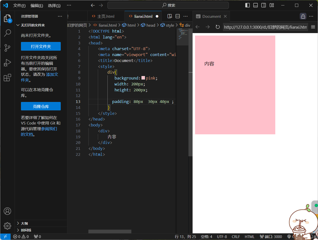
3.多值写法
4个值(上右下左)

<!DOCTYPE html>
<html lang="en">
<head>
<meta charset="UTF-8">
<meta name="viewport" content="width=device-width, initial-scale=1.0">
<title>Document</title>
<style>
div{
background:pink;
width: 200px;
height: 200px;
padding: 10px 20px 30px 40px ;
}
</style>
</head>
<body>
<div>
内容
</div>
</body>
</html>
3个值(上 左右 下)
<!DOCTYPE html>
<html lang="en">
<head>
<meta charset="UTF-8">
<meta name="viewport" content="width=device-width, initial-scale=1.0">
<title>Document</title>
<style>
div{
background:pink;
width: 200px;
height: 200px;
padding: 80px 30px 40px ;
}
</style>
</head>
<body>
<div>
内容
</div>
</body>
</html>
2个值(上下 左右)

<!DOCTYPE html>
<html lang="en">
<head>
<meta charset="UTF-8">
<meta name="viewport" content="width=device-width, initial-scale=1.0">
<title>Document</title>
<style>
div{
background:pink;
width: 200px;
height: 200px;
padding: 50px 40px ;
}
</style>
</head>
<body>
<div>
内容
</div>
</body>
</html>
4.盒子模型 - 尺寸计算
1.默认情况:盒子尺寸 = 内容尺寸 + border尺寸 + 内边距(padding)尺寸
2.border/padding会撑大盒子
解决方法:自己计算 内减模式(box-sizing:boder-box)
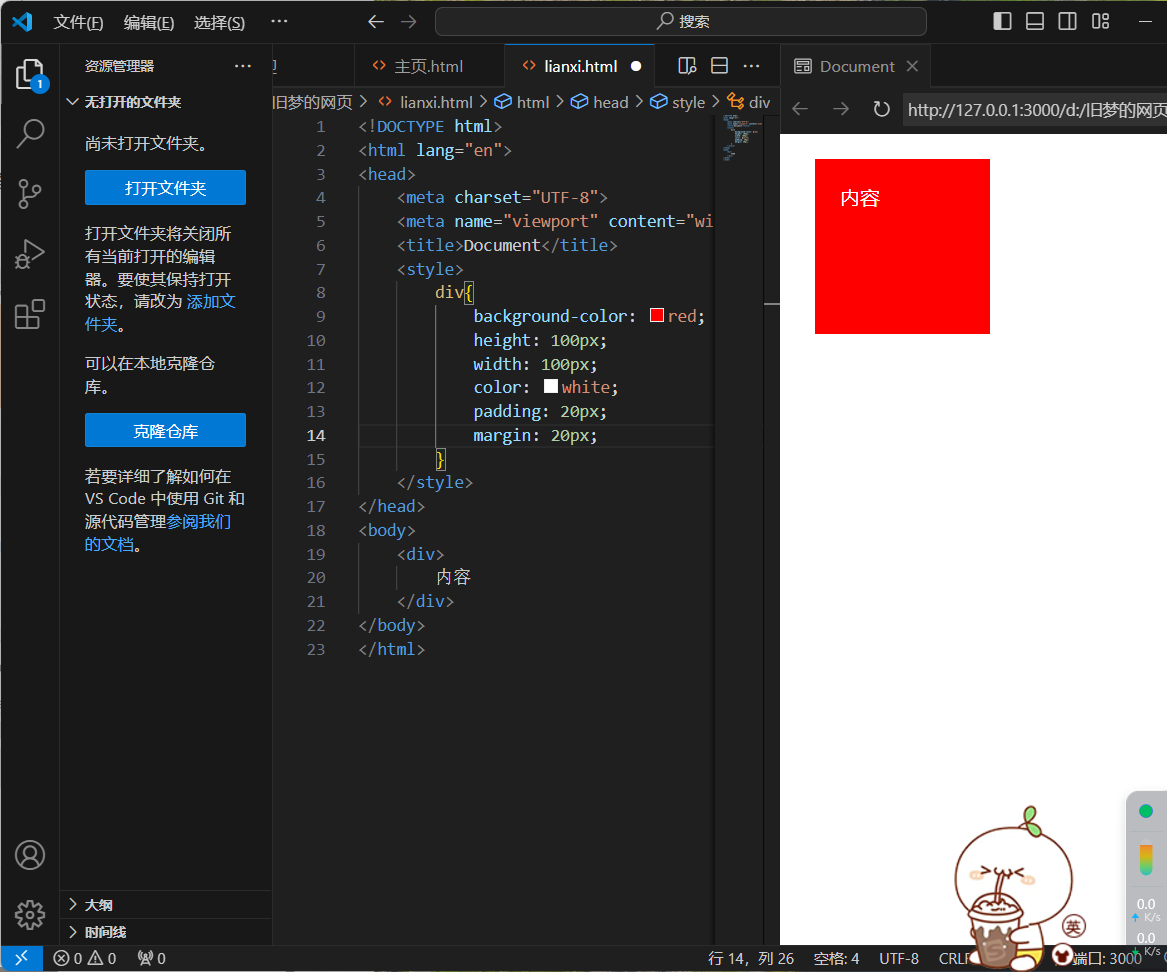
5.盒子模型 - 外边距
1.作用:拉开两个盒子之间的距离
2.属性名:margin
3.版心居中
<!DOCTYPE html>
<html lang="en">
<head>
    <meta charset="UTF-8">
    <meta name="viewport" content="width=device-width, initial-scale=1.0">
    <title>Document</title>
    <style>
        div{
           background:pink;
           width: 200px;
           height: 200px;
          margin: auto;
        }
    </style>
</head>
<body>
    <div>
        内容
    </div>
</body>
</html>
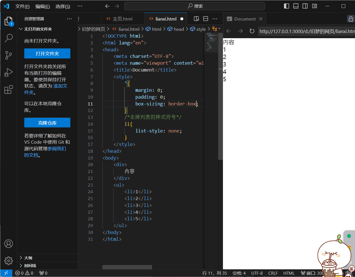
6.清除默认样式
诸如:
`*{
margin: 0;
padding: 0;
box-sizing: border-box;
}`
<!DOCTYPE html>
<html lang="en">
<head>
    <meta charset="UTF-8">
    <meta name="viewport" content="width=device-width, initial-scale=1.0">
    <title>Document</title>
    <style>
        *{
            margin: 0;
            padding: 0;
            box-sizing: border-box;
        }
        /*去掉列表的样式符号*/
        li{
            list-style: none;
        }
    </style>
</head>
<body>
    <div>
        内容
    </div>
    <ul>
        <li>1</li>
        <li>2</li>
        <li>3</li>
        <li>4</li>
        <li>5</li>
    </ul>
</body>
</html>
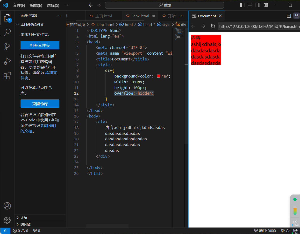
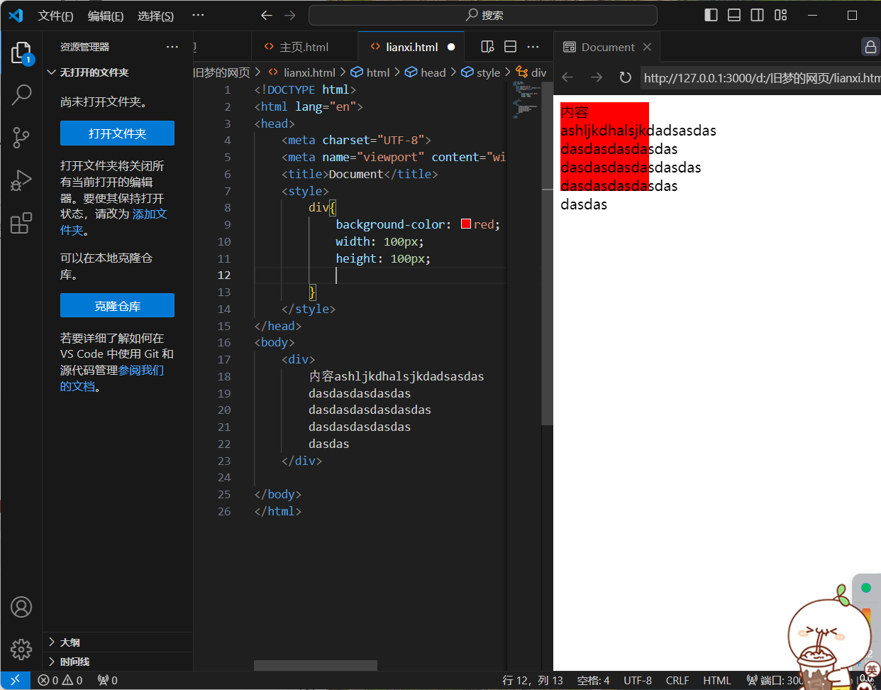
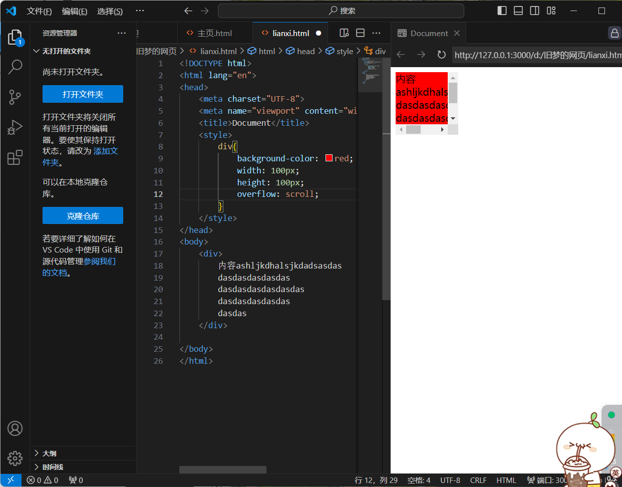
7.盒子模型 - 元素溢出
1.作用:控制溢出元素的内容的显示方式
2.属性名:overflow
3.属性值:hidden(溢出隐藏) scroll(溢出滚动,无论是否溢出,都有滚动条) auto(溢出滚动,内容溢出才显示滚动条)
<!DOCTYPE html>
<html lang="en">
<head>
    <meta charset="UTF-8">
    <meta name="viewport" content="width=device-width, initial-scale=1.0">
    <title>Document</title>
    <style>
        div{
            background-color: red;
            width: 100px;
            height: 100px;
            overflow: hidden;
        }
    </style>
</head>
<body>
    <div>
        内容ashljkdhalsjkdadsasdas
        dasdasdasdasdas
        dasdasdasdasdasdas
        dasdasdasdasdas
        dasdas
    </div>

</body>
</html>
<!DOCTYPE html>
<html lang="en">
<head>
    <meta charset="UTF-8">
    <meta name="viewport" content="width=device-width, initial-scale=1.0">
    <title>Document</title>
    <style>
        div{
            background-color: red;
            width: 100px;
            height: 100px;
            overflow: scroll;
        }
    </style>
</head>
<body>
    <div>
        内容ashljkdhalsjkdadsasdas
        dasdasdasdasdas
        dasdasdasdasdasdas
        dasdasdasdasdas
        dasdas
    </div>

</body>
</html>

<!DOCTYPE html>
<html lang="en">
<head>
    <meta charset="UTF-8">
    <meta name="viewport" content="width=device-width, initial-scale=1.0">
    <title>Document</title>
    <style>
        div{
            background-color: red;
            width: 100px;
            height: 100px;
            overflow:auto;
        }
    </style>
</head>
<body>
    <div>
        内容ashljkdhalsjkdadsasdas
        dasdasdasdasdas
        dasdasdasdasdasdas
        dasdasdasdasdas
        dasdas
    </div>

</body>
</html>
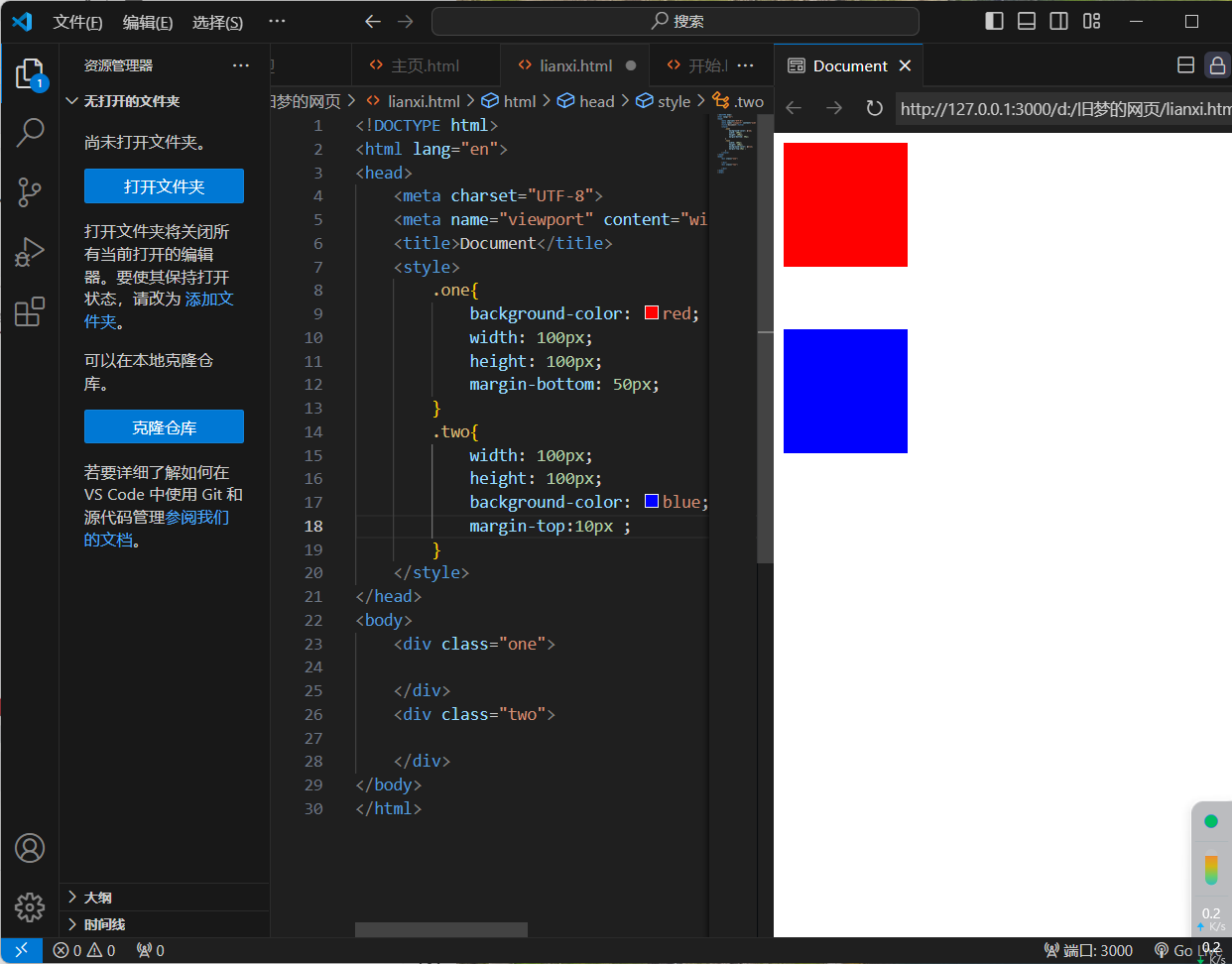
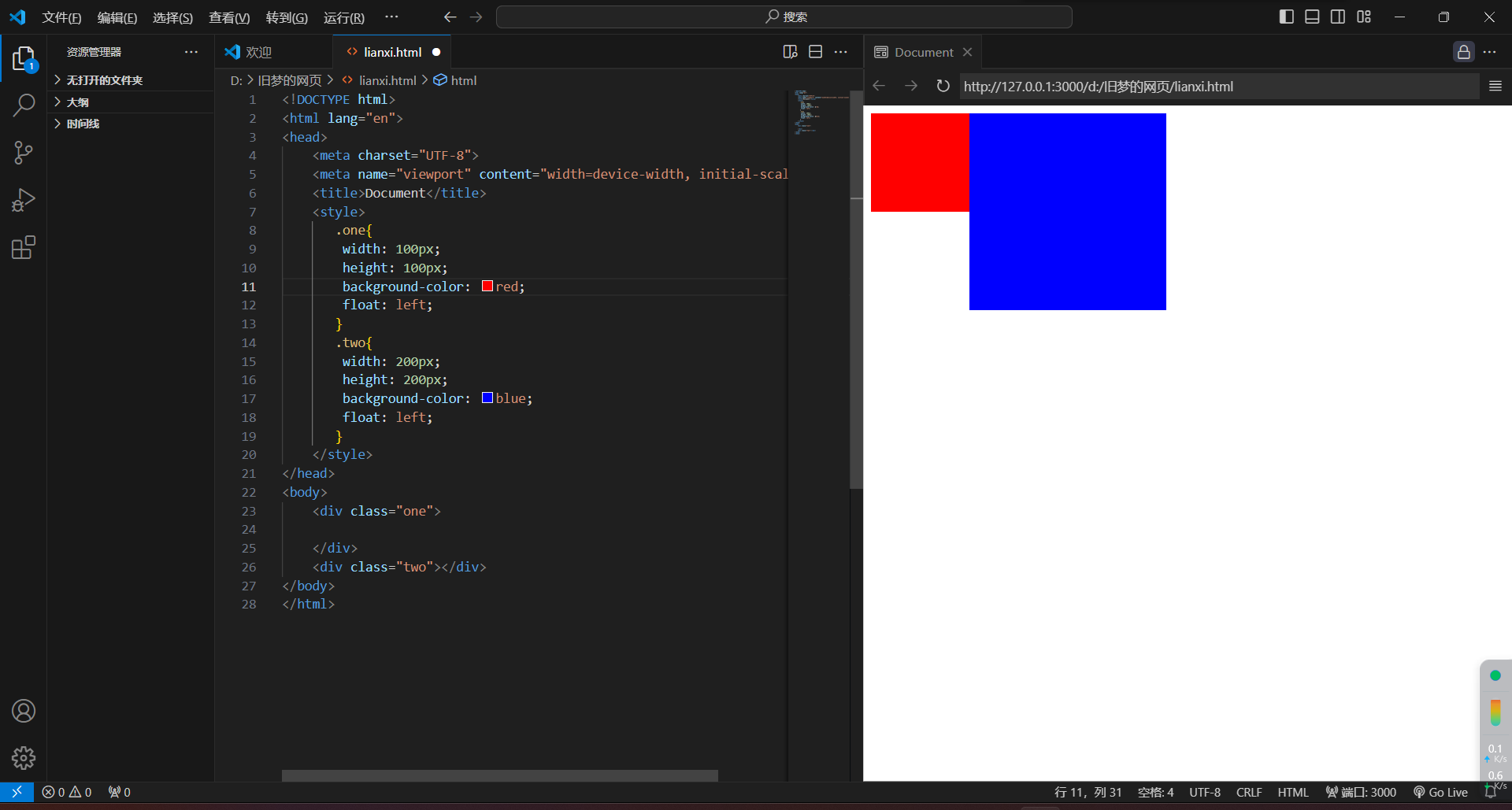
8.外边距问题 - 合并现象
1.场景:垂直排列的兄弟元素,上下margin会合并
2.现象:取两个margin中的较大值生效
<!DOCTYPE html>
<html lang="en">
<head>
    <meta charset="UTF-8">
    <meta name="viewport" content="width=device-width, initial-scale=1.0">
    <title>Document</title>
    <style>
        .one{
            background-color: red;
            width: 100px;
            height: 100px;
            margin-bottom: 50px;
        }
        .two{
            width: 100px;
            height: 100px;
            background-color: blue;
            margin-top:10px ;
        }
    </style>
</head>
<body>
    <div class="one">

    </div>
    <div class="two">

    </div>
</body>
</html>
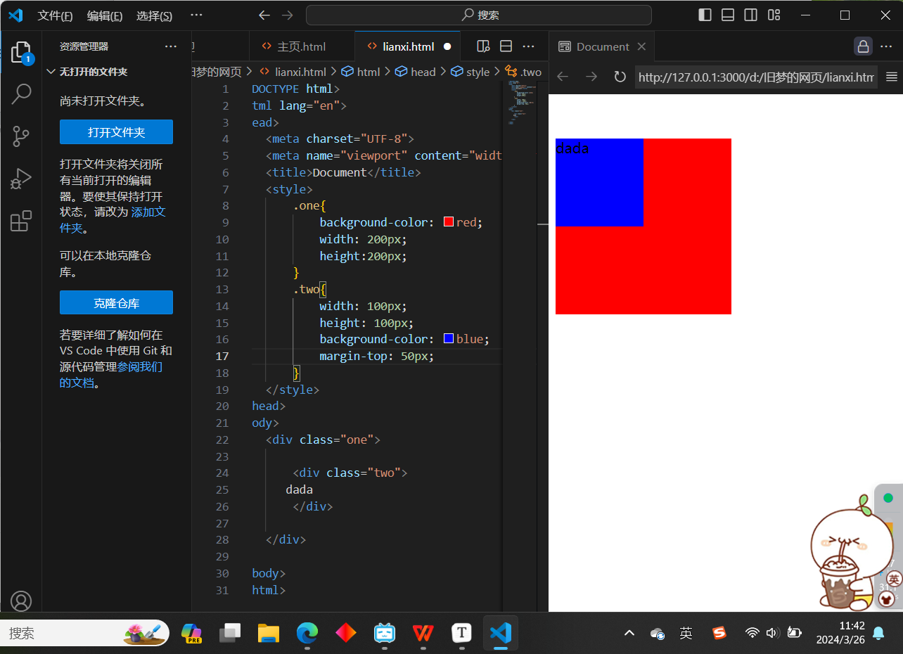
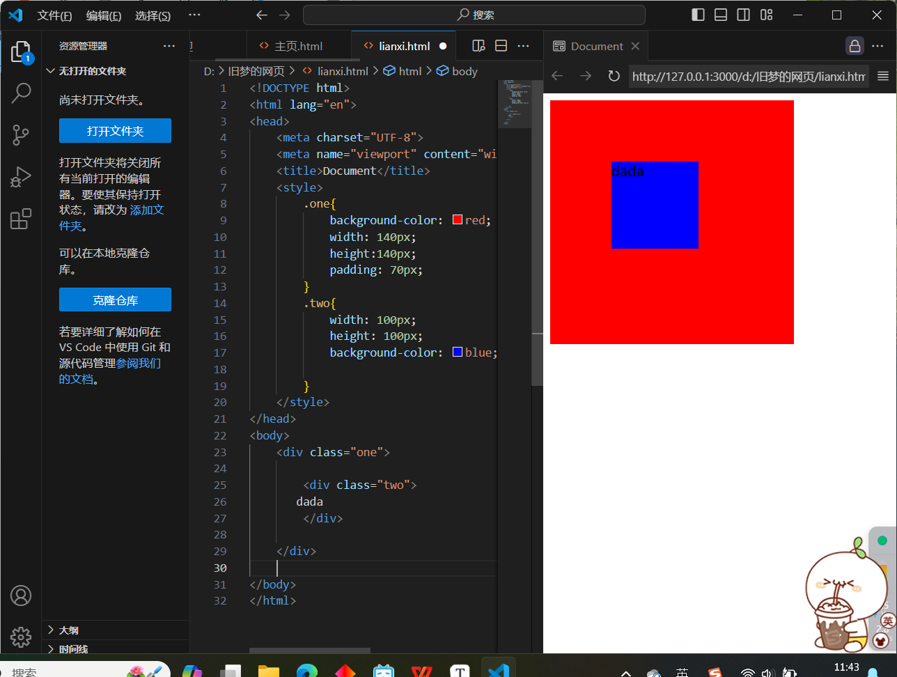
9.外边距问题 - 塌陷问题
1.场景:父子级的标签,子级的添加上外边距会产生塌陷问题
2.现象:导致父级一起向下移动
3.解决方法:
-
取消子级margin,父级设置padding
-
父级设置overflow:hidden
-
父级设置boder-top
<!DOCTYPE html>
<html lang="en">
<head>
    <meta charset="UTF-8">
    <meta name="viewport" content="width=device-width, initial-scale=1.0">
    <title>Document</title>
    <style>
        .one{
            background-color: red;
            width: 200px;
            height:200px;
        }
        .two{
            width: 100px;
            height: 100px;
            background-color: blue;
            margin-top: 50px;
        }
    </style>
</head>
<body>
    <div class="one">

        <div class="two">
       dada
        </div>

    </div>

</body>
</html>
<!DOCTYPE html>
<html lang="en">
<head>
    <meta charset="UTF-8">
    <meta name="viewport" content="width=device-width, initial-scale=1.0">
    <title>Document</title>
    <style>
        .one{
            background-color: red;
            width: 140px;
            height:140px;
            padding: 70px;
        }
        .two{
            width: 100px;
            height: 100px;
            background-color: blue;

        }
    </style>
</head>
<body>
    <div class="one">

        <div class="two">
       dada
        </div>

    </div>

</body>
</html>
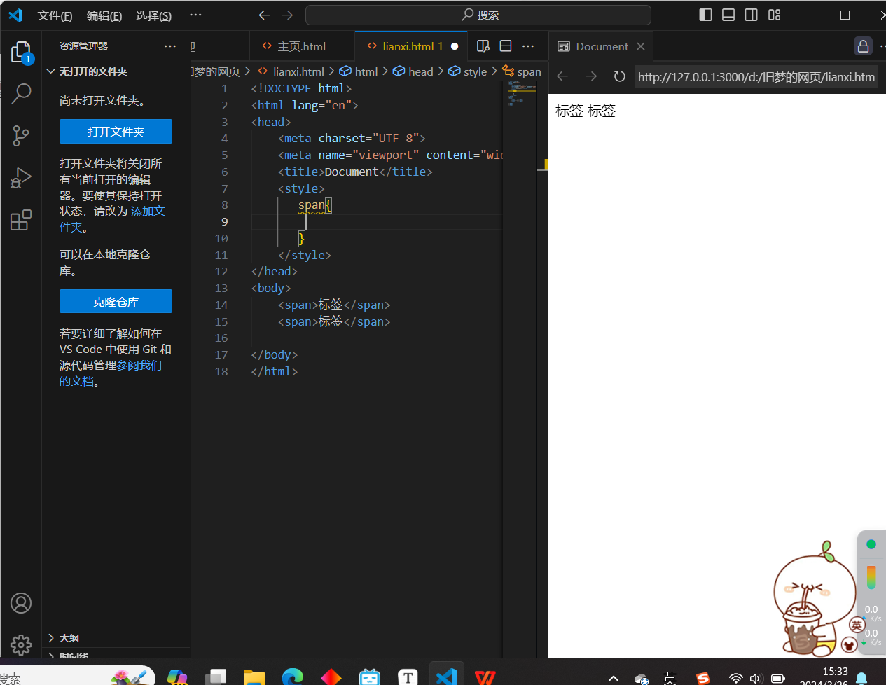
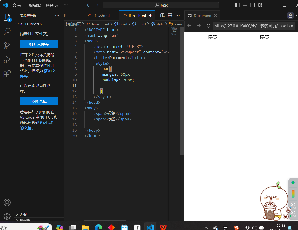
10.行内元素 - 内外边距问题
1.场景:行内元素添加margin和padding,无法改变元素垂直位置
2.解决方法:给行内元素添加line-height可以改变垂直位置

<!DOCTYPE html>
<html lang="en">
<head>
    <meta charset="UTF-8">
    <meta name="viewport" content="width=device-width, initial-scale=1.0">
    <title>Document</title>
    <style>
       span{
        margin: 50px;
        padding: 20px;
        line-height: 100px;
       }
    </style>
</head>
<body>
    <span>标签</span>
    <span>标签</span>

</body>
</html>
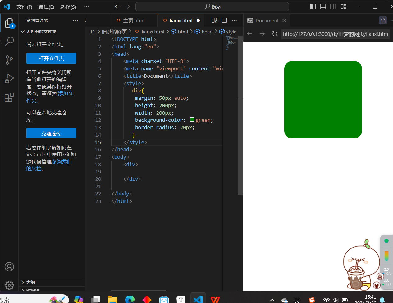
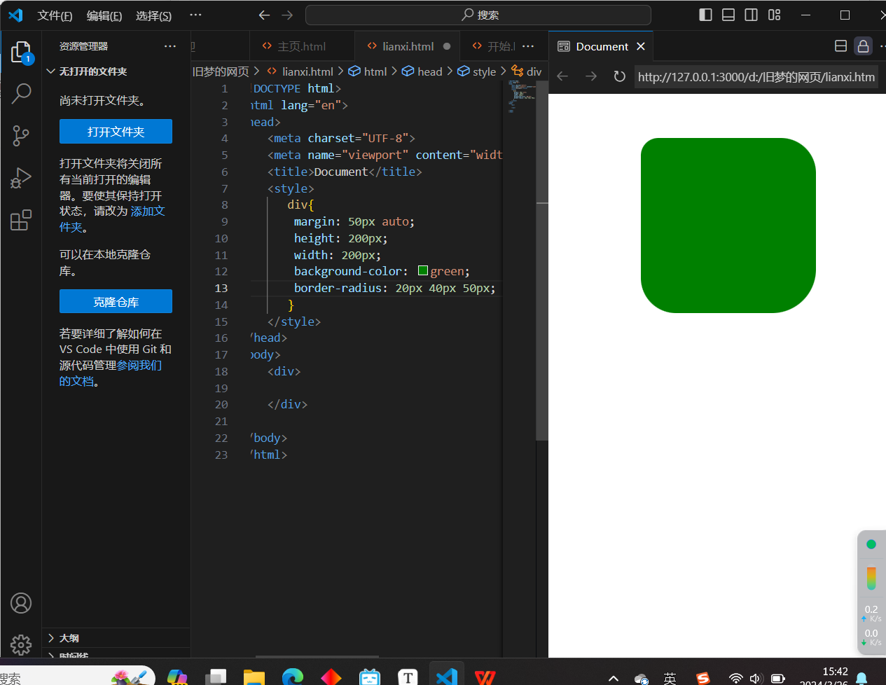
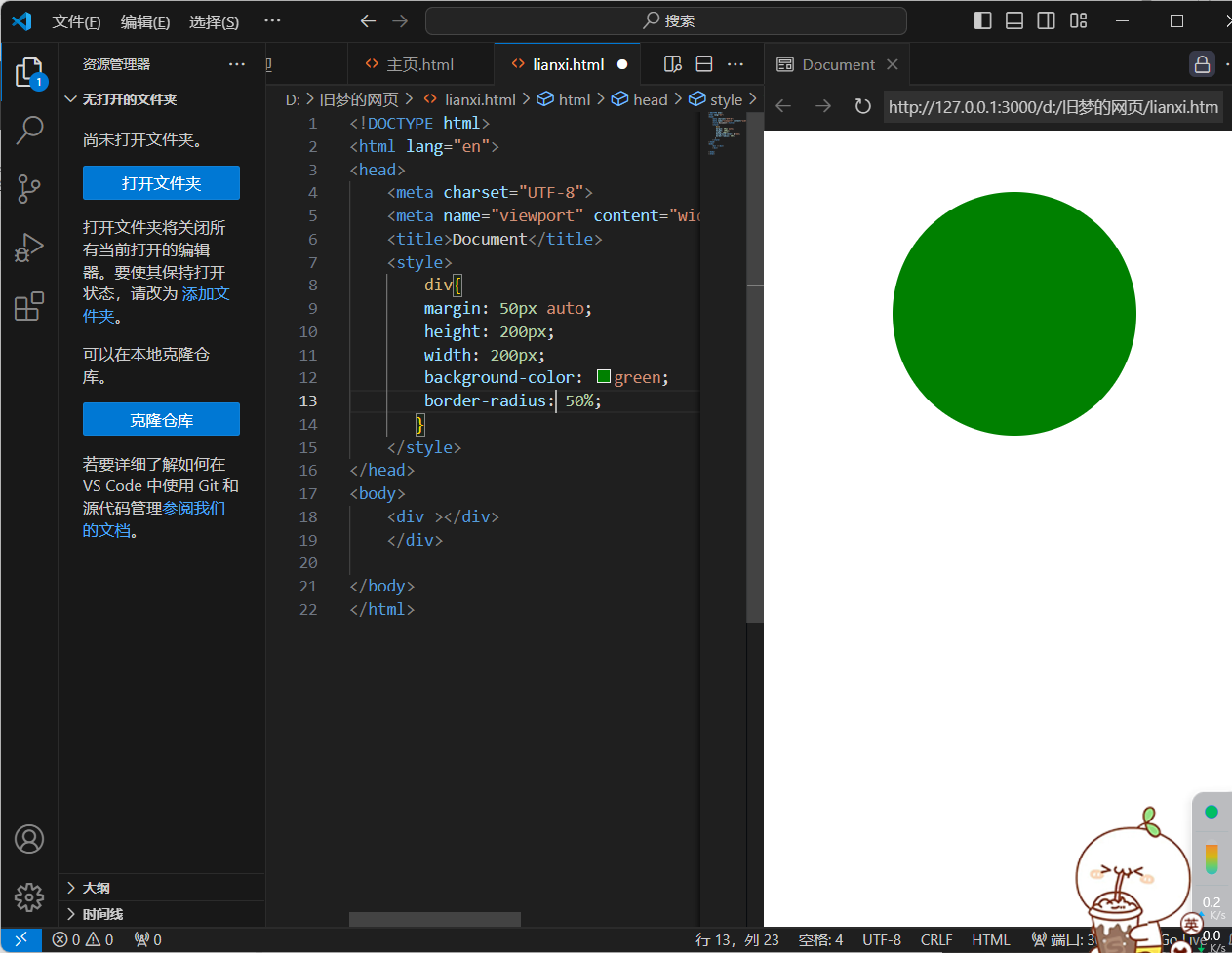
11.盒子模型 - 圆角
1.作用:设置元素的外边框为圆角
2.属性名:border-radius
3.属性值:数字+px/百分比(多个值的话,在左上角开始顺时针变化,如果本身没被赋值,那么就与对角一样)


<!DOCTYPE html>
<html lang="en">
<head>
    <meta charset="UTF-8">
    <meta name="viewport" content="width=device-width, initial-scale=1.0">
    <title>Document</title>
    <style>
       div{
        margin: 50px auto;
        height: 200px;
        width: 200px;
        background-color: green;
        border-radius: 20px 40px 60px 80px;
       }
    </style>
</head>
<body>
    <div>

    </div>

</body>
</html>
4.常见应用 - 正圆形状(给正方形盒子设置圆角属性值为宽高的一半/50%)
<!DOCTYPE html>
<html lang="en">
<head>
    <meta charset="UTF-8">
    <meta name="viewport" content="width=device-width, initial-scale=1.0">
    <title>Document</title>
    <style>
        div{
        margin: 50px auto;
        height: 200px;
        width: 200px;
        background-color: green;
        border-radius: 50%;
       }
    </style>
</head>
<body>
    <div ></div>
    </div>

</body>
</html>
<!DOCTYPE html>
<html lang="en">
<head>
    <meta charset="UTF-8">
    <meta name="viewport" content="width=device-width, initial-scale=1.0">
    <title>Document</title>
    <style>
       img{
        height: 200px;
        width: 200px;
        border-radius: 100px;
       }
    </style>
</head>
<body>
    <img src="./images/1.jpg" alt="">

</body>
</html>
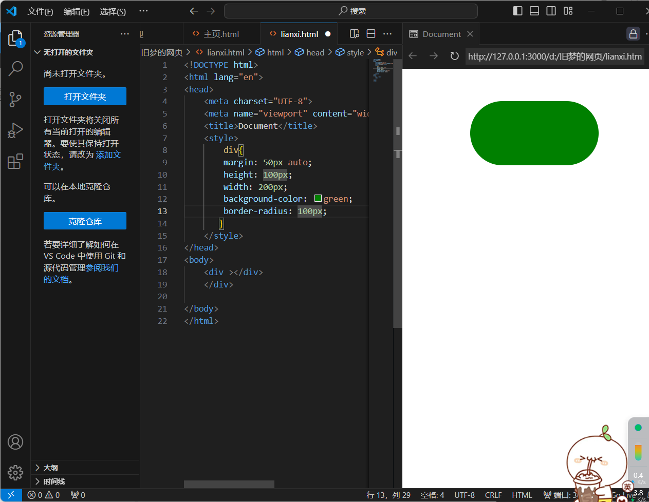
5.常见应用 - 胶囊形状(给长方形盒子设置圆角属性值为盒子高度的一半)
<!DOCTYPE html>
<html lang="en">
<head>
    <meta charset="UTF-8">
    <meta name="viewport" content="width=device-width, initial-scale=1.0">
    <title>Document</title>
    <style>
        div{
        margin: 50px auto;
        height: 100px;
        width: 200px;
        background-color: green;
        border-radius: 100px;
       }
    </style>
</head>
<body>
    <div ></div>
    </div>

</body>
</html>
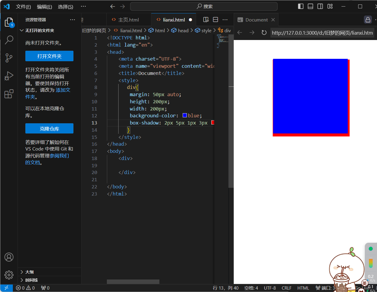
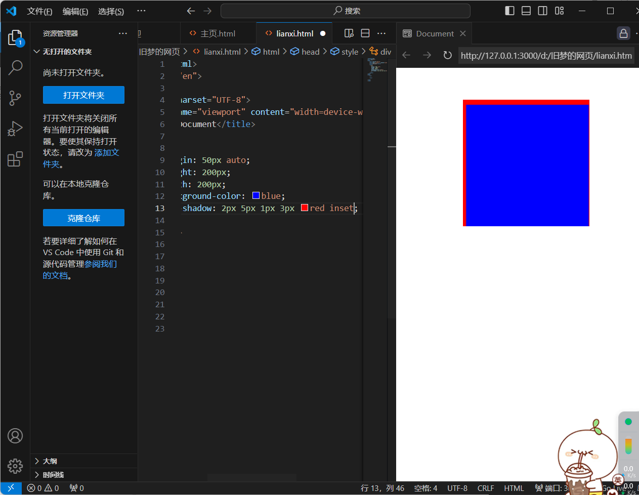
12.盒子模型 - 阴影
1.作用:给元素设置阴影效果
2.属性名:box-shadow
3:属性值:x轴偏移量 y轴偏移量 模糊半径 扩散半径 颜色 内外阴影
注意:x轴偏移量 和 y轴偏移量必须书写
默认是外阴影,内阴影需要添加inset
<!DOCTYPE html>
<html lang="en">
<head>
    <meta charset="UTF-8">
    <meta name="viewport" content="width=device-width, initial-scale=1.0">
    <title>Document</title>
    <style>
       div{
        margin: 50px auto;
        height: 200px;
        width: 200px;
        background-color: blue;
        box-shadow: 2px 5px 1px 3px red inset;
       }
    </style>
</head>
<body>
    <div>

    </div>

</body>
</html>
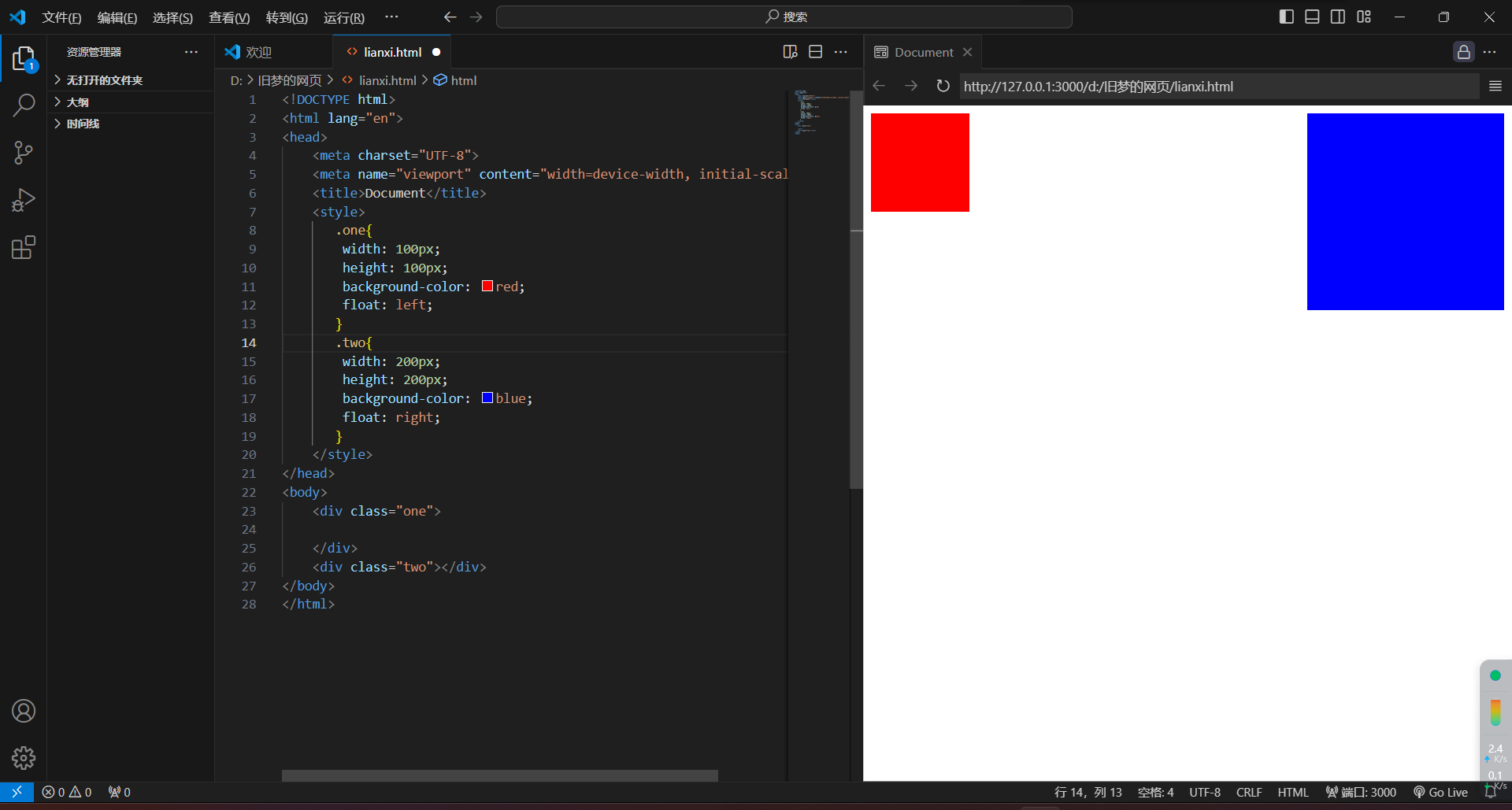
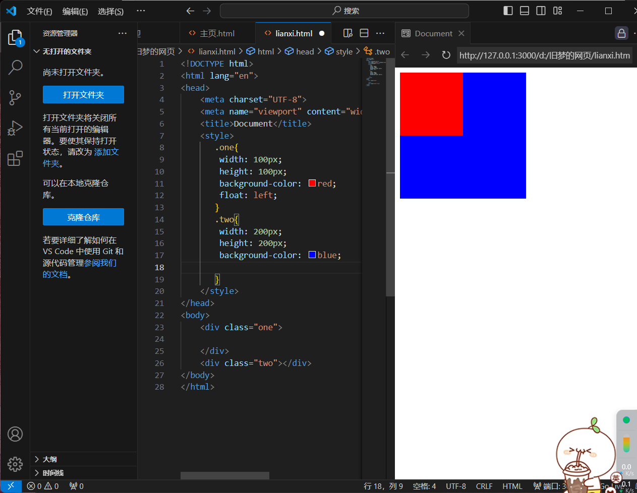
二)浮动
1.基本使用与布局
1.作用:让块元素水平排列
2.属性名:float
3.属性值:left right
4.特点:顶对齐,行内块模式显示,浮动的盒子会脱离标准流的控制
<!DOCTYPE html>
<html lang="en">
<head>
    <meta charset="UTF-8">
    <meta name="viewport" content="width=device-width, initial-scale=1.0">
    <title>Document</title>
    <style>
       .one{
        width: 100px;
        height: 100px;
        background-color: red;
        float: left;
       }
       .two{
        width: 200px;
        height: 200px;
        background-color: blue;
        float: left;
       }
    </style>
</head>
<body>
    <div class="one">

    </div>
    <div class="two"></div>
</body>
</html>
<!DOCTYPE html>
<html lang="en">
<head>
    <meta charset="UTF-8">
    <meta name="viewport" content="width=device-width, initial-scale=1.0">
    <title>Document</title>
    <style>
       .one{
        width: 100px;
        height: 100px;
        background-color: red;
        float: left;
       }
       .two{
        width: 200px;
        height: 200px;
        background-color: blue;
        float: right;
       }
    </style>
</head>
<body>
    <div class="one">

    </div>
    <div class="two"></div>
</body>
</html>
<!DOCTYPE html>
<html lang="en">
<head>
    <meta charset="UTF-8">
    <meta name="viewport" content="width=device-width, initial-scale=1.0">
    <title>Document</title>
    <style>
       .one{
        width: 100px;
        height: 100px;
        background-color: red;
        float: left;
       }
       .two{
        width: 200px;
        height: 200px;
        background-color: blue;

       }
    </style>
</head>
<body>
    <div class="one">

    </div>
    <div class="two"></div>
</body>
</html>
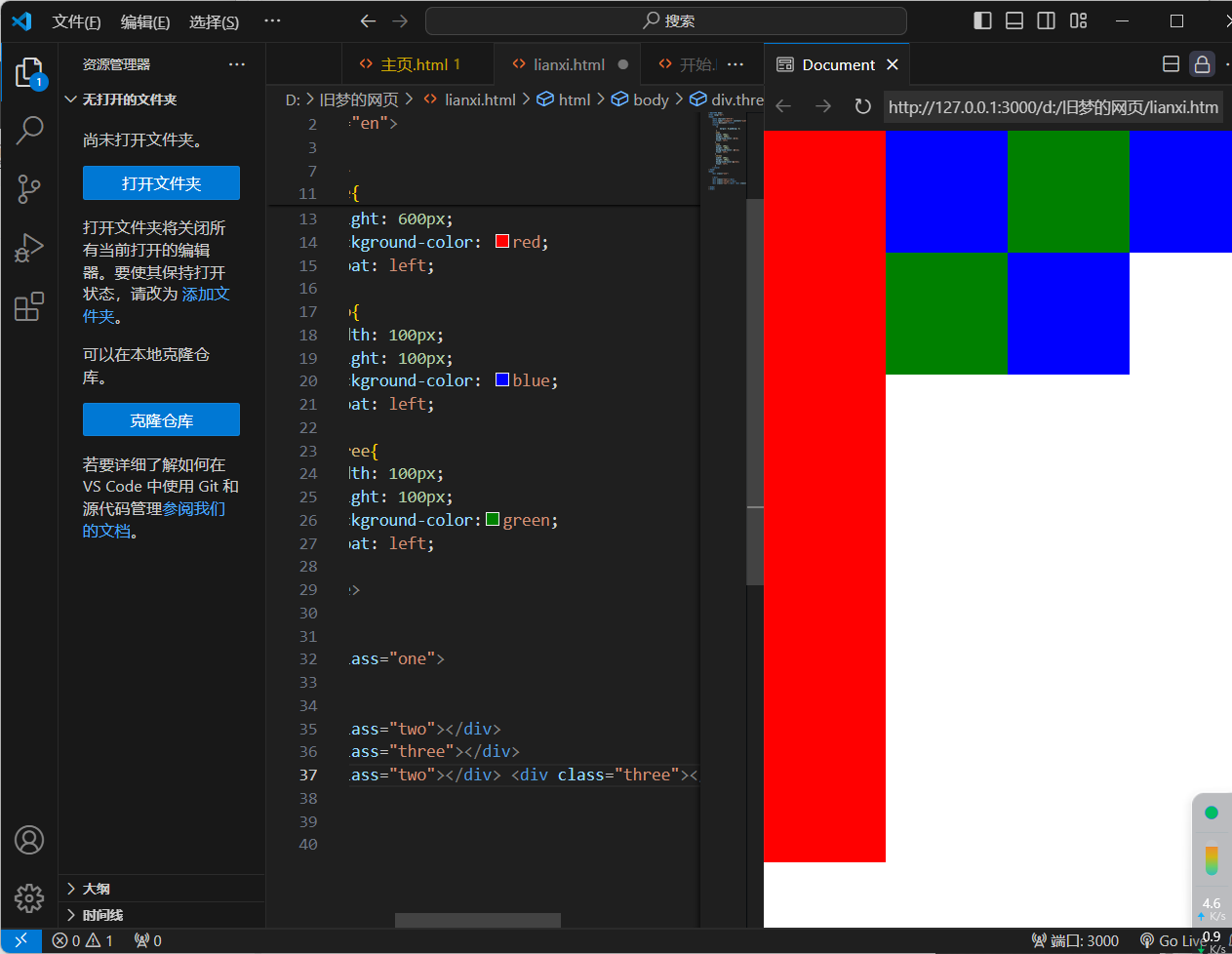
5.浮动 - 产品区域布局
<!DOCTYPE html>
<html lang="en">
<head>
    <meta charset="UTF-8">
    <meta name="viewport" content="width=device-width, initial-scale=1.0">
    <title>Document</title>
    <style>
        *{
            margin: 0;padding: 0;
        }
       .one{
        width: 100px;
        height: 600px;
        background-color: red;
        float: left;
       }
       .two{
        width: 100px;
        height: 100px;
        background-color: blue;
        float: left;
       }
       .three{
        width: 100px;
        height: 100px;
        background-color:green;
        float: left;
       }
    </style>
</head>
<body>
    <div class="one">

    </div>
    <div class="two"></div>
    <div class="three"></div>
    <div class="two"></div> <div class="three"></div> <div class="two"></div>

</body>
</html>
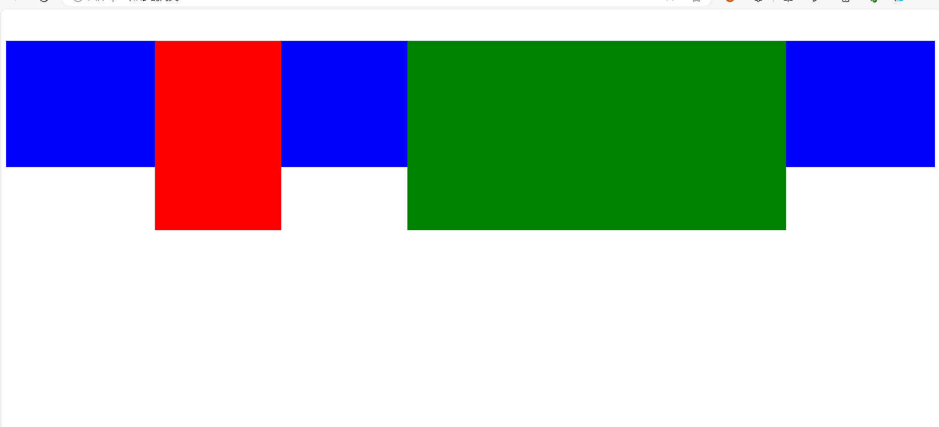
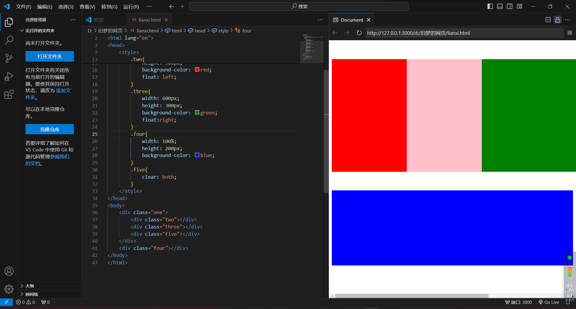
2.清除浮动
方法一:在父元素内容的最后添加一个块级元素,设置CSS属性clear:both
<!DOCTYPE html>
<html lang="en">
<head>
    <meta charset="UTF-8">
    <meta name="viewport" content="width=device-width, initial-scale=1.0">
    <title>Document</title>
    <style>
        .one{
            width: 1000px;
            background-color: pink;
            margin: 50px auto;
        }
        .two{
            width: 200px;
            height: 300px;
            background-color: red;
            float: left;
        }
        .three{
            width: 600px;
            height: 300px;
            background-color: green;
            float:right;
        }
        .four{
            width: 100%;
            height: 200px;
            background-color: blue;
        }
    </style>
</head>
<body>
    <div class="one">
        <div class="two"></div>
        <div class="three"></div>
    </div>
    <div class="four"></div>
</body>
</html>
<!DOCTYPE html>
<html lang="en">
<head>
    <meta charset="UTF-8">
    <meta name="viewport" content="width=device-width, initial-scale=1.0">
    <title>Document</title>
    <style>
        .one{
            width: 1000px;
            background-color: pink;
            margin: 50px auto;
        }
        .two{
            width: 200px;
            height: 300px;
            background-color: red;
            float: left;
        }
        .three{
            width: 600px;
            height: 300px;
            background-color: green;
            float:right;
        }
        .four{
            width: 100%;
            height: 200px;
            background-color: blue;
        }
        .five{
            clear: both;
        }
    </style>
</head>
<body>
    <div class="one">
        <div class="two"></div>
        <div class="three"></div>
        <div class="five"></div>
    </div>
    <div class="four"></div>
</body>
</html>
方法二:单伪元素法
  .five::after{
            content: "";
            display: block;
            clear: both;
        }

<!DOCTYPE html>
<html lang="en">
<head>
    <meta charset="UTF-8">
    <meta name="viewport" content="width=device-width, initial-scale=1.0">
    <title>Document</title>
    <style>
        .one{
            width: 1000px;
            background-color: pink;
            margin: 50px auto;
        }
        .two{
            width: 200px;
            height: 300px;
            background-color: red;
            float: left;
        }
        .three{
            width: 600px;
            height: 300px;
            background-color: green;
            float:right;
        }
        .four{
            width: 100%;
            height: 200px;
            background-color: blue;
        }
        .five::after{
            content: "";
            display: block;
            clear: both;
        }
    </style>
</head>
<body>
    <div class="one">
        <div class="two"></div>
        <div class="three"></div>
        <div class="five"></div>
    </div>
    <div class="four"></div>
</body>
</html>
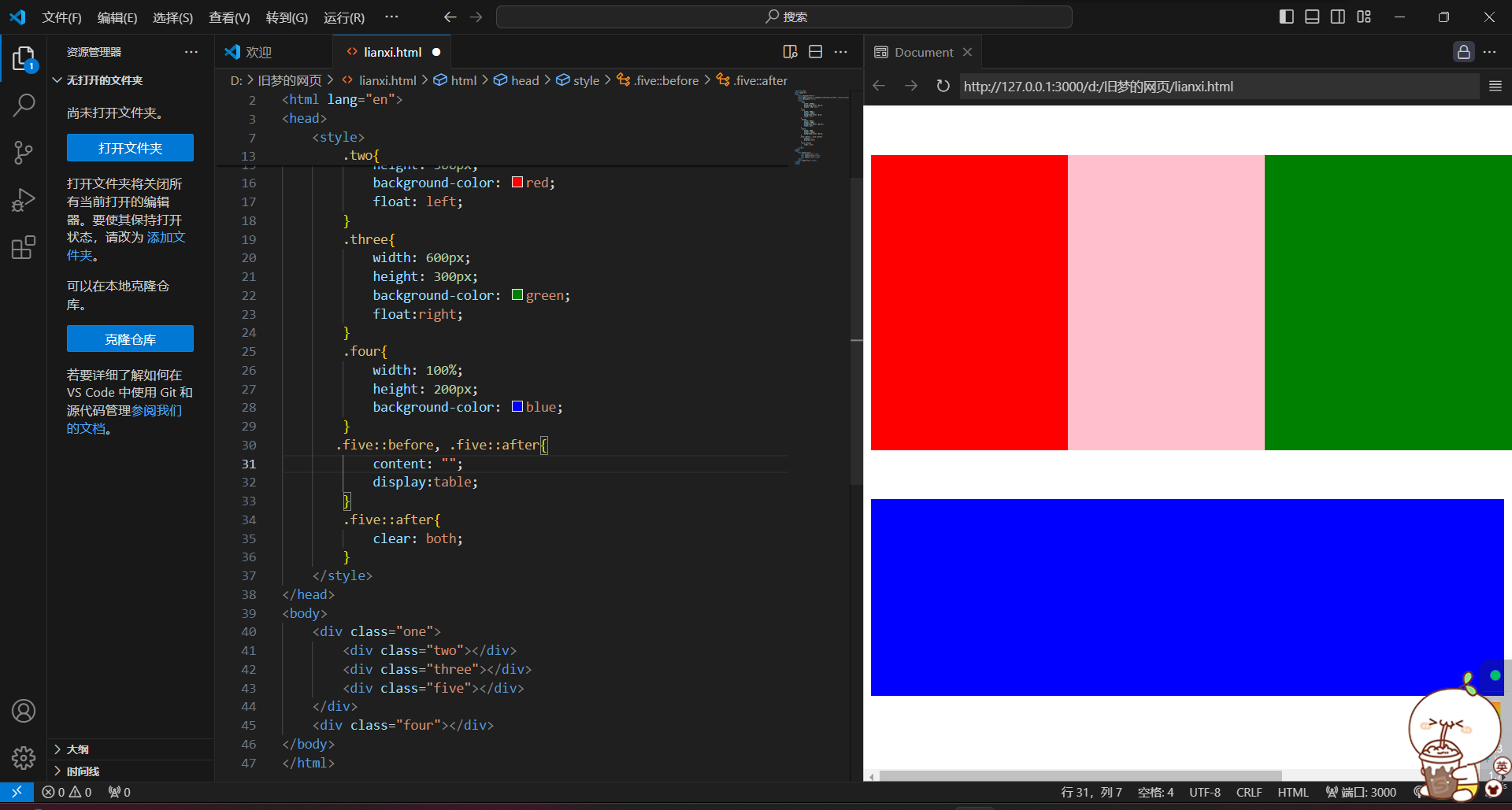
方法三:双伪元素法
<!DOCTYPE html>
<html lang="en">
<head>
    <meta charset="UTF-8">
    <meta name="viewport" content="width=device-width, initial-scale=1.0">
    <title>Document</title>
    <style>
        .one{
            width: 1000px;
            background-color: pink;
            margin: 50px auto;
        }
        .two{
            width: 200px;
            height: 300px;
            background-color: red;
            float: left;
        }
        .three{
            width: 600px;
            height: 300px;
            background-color: green;
            float:right;
        }
        .four{
            width: 100%;
            height: 200px;
            background-color: blue;
        }
       .five::before, .five::after{
            content: "";
            display:table;
        }
        .five::after{
            clear: both;
        }
    </style>
</head>
<body>
    <div class="one">
        <div class="two"></div>
        <div class="three"></div>
        <div class="five"></div>
    </div>
    <div class="four"></div>
</body>
</html>
注:在工作中,该伪类名经常用clearfix
方法四:overflow,父元素添加CSS属性overflow:hidden

<!DOCTYPE html>
<html lang="en">
<head>
    <meta charset="UTF-8">
    <meta name="viewport" content="width=device-width, initial-scale=1.0">
    <title>Document</title>
    <style>
        .one{
            width: 1000px;
            background-color: pink;
            margin: 50px auto;
            overflow: hidden;
        }
        .two{
            width: 200px;
            height: 300px;
            background-color: red;
            float: left;
        }
        .three{
            width: 600px;
            height: 300px;
            background-color: green;
            float:right;
        }
        .four{
            width: 100%;
            height: 200px;
            background-color: blue;
        }
    </style>
</head>
<body>
    <div class="one">
        <div class="two"></div>
        <div class="three"></div>
        <div class="five"></div>
    </div>
    <div class="four"></div>
</body>
</html>
三)flex
1.flex - 认识
1.又叫弹性布局,是浏览器提倡的布局模型,提供了强大的空间分布和对齐能力。不会产生浮动布局中脱标现象,布局网页更简单、更灵活。
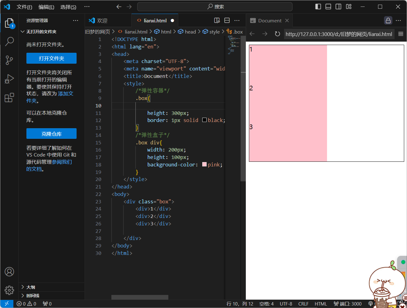
2.flex - 组成
1.设置方式:给父元素设置display:flex,子元素可以自动挤压或拉伸
2.组成部分:
-
弹性容器
-
弹性盒子
-
主轴:默认在水平方向
-
侧轴/交叉轴:默认在垂直方向
<!DOCTYPE html>
<html lang="en">
<head>
    <meta charset="UTF-8">
    <meta name="viewport" content="width=device-width, initial-scale=1.0">
    <title>Document</title>
    <style>
        /*弹性容器*/
        .box{

            height: 300px;
            border: 1px solid black;
        }
        /*弹性盒子*/
        .box div{
            width: 200px;
            height: 100px;
            background-color: pink;
        }
    </style>
</head>
<body>
    <div class="box">
        <div>1</div>
        <div>2</div>
        <div>3</div>

    </div>
</body>
</html>
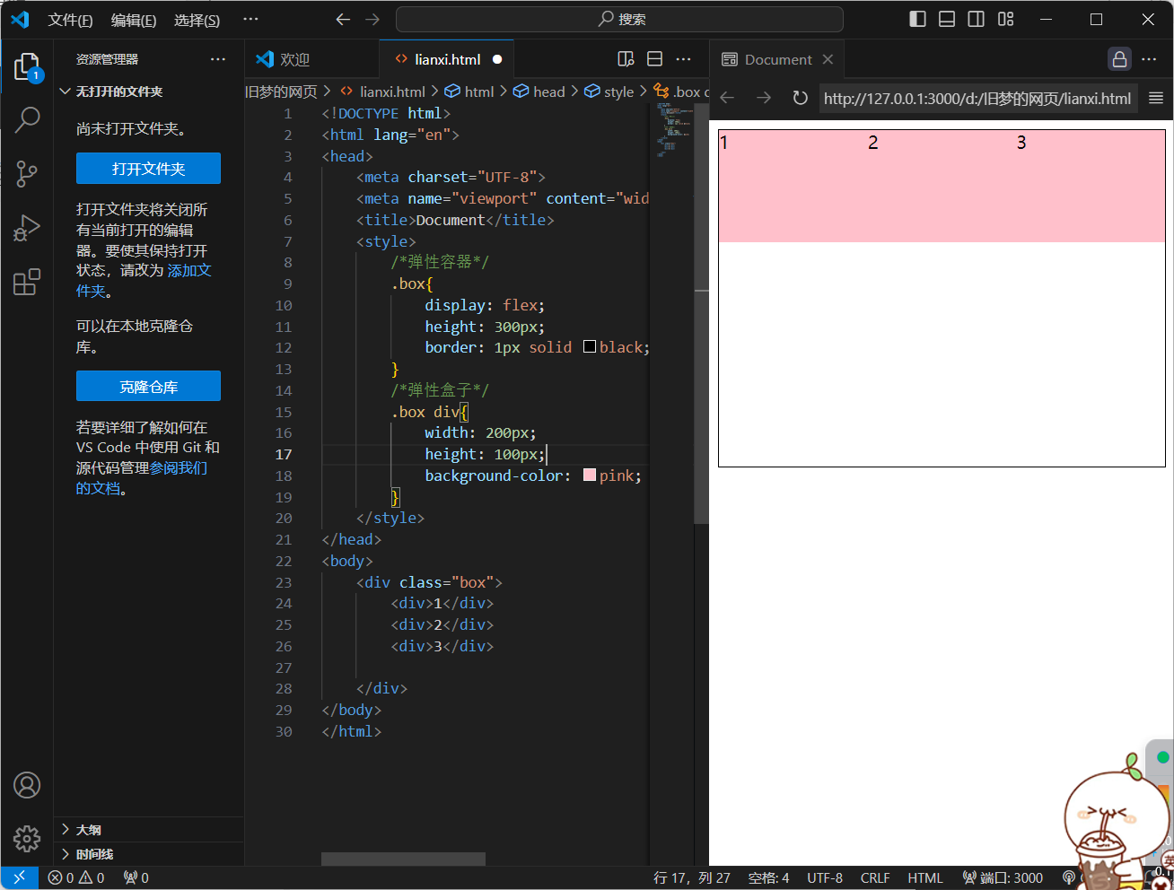
加上flex的效果
<!DOCTYPE html>
<html lang="en">
<head>
    <meta charset="UTF-8">
    <meta name="viewport" content="width=device-width, initial-scale=1.0">
    <title>Document</title>
    <style>
        /*弹性容器*/
        .box{
            display: flex;
            height: 300px;
            border: 1px solid black;
        }
        /*弹性盒子*/
        .box div{
            width: 200px;
            height: 100px;
            background-color: pink;
        }
    </style>
</head>
<body>
    <div class="box">
        <div>1</div>
        <div>2</div>
        <div>3</div>

    </div>
</body>
</html>
<!DOCTYPE html>
<html lang="en">
<head>
    <meta charset="UTF-8">
    <meta name="viewport" content="width=device-width, initial-scale=1.0">
    <title>Document</title>
    <style>
        /*弹性容器*/
        .box{
            display: flex;
            height: 300px;
            border: 1px solid black;
        }
        /*弹性盒子*/
        .box div{
            width: 200px;
            height: 100px;
            background-color: pink;
        }
    </style>
</head>
<body>
    <div class="box">
        <div>1</div>
        <div>2</div>
        <div>3</div>
        <div>1</div>
        <div>2</div>
        <div>3</div> <div>1</div>
        <div>2</div>
        <div>3</div> <div>1</div>
        <div>2</div>
        <div>3</div> <div>1</div>
        <div>2</div>
        <div>3</div>
    </div>
</body>
</html>
3.主轴对齐方式
1.属性名:justify-content
2.属性值:
1)flex-start(默认值)
<!DOCTYPE html>
<html lang="en">
<head>
    <meta charset="UTF-8">
    <meta name="viewport" content="width=device-width, initial-scale=1.0">
    <title>Document</title>
    <style>
        /*弹性容器*/
        .box{
            display: flex;
            justify-self: start;
            height: 300px;
            border: 1px solid black;
        }
        /*弹性盒子*/
        .box div{
            width: 200px;
            height: 100px;
            background-color: pink;
        }
    </style>
</head>
<body>
    <div class="box">
        <div>1</div>
        <div>2</div>
        <div>3</div>

    </div>
</body>
</html>
2)flex-end(相当于右对齐)
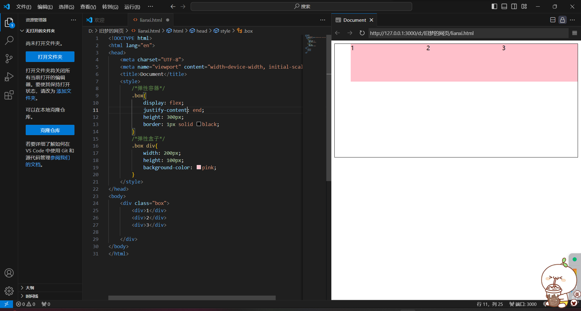
<!DOCTYPE html>
<html lang="en">
<head>
    <meta charset="UTF-8">
    <meta name="viewport" content="width=device-width, initial-scale=1.0">
    <title>Document</title>
    <style>
        /*弹性容器*/
        .box{
            display: flex;
            justify-content: end;
            height: 300px;
            border: 1px solid black;
        }
        /*弹性盒子*/
        .box div{
            width: 200px;
            height: 100px;
            background-color: pink;
        }
    </style>
</head>
<body>
    <div class="box">
        <div>1</div>
        <div>2</div>
        <div>3</div>

    </div>
</body>
</html>
3)flex-center(居中)
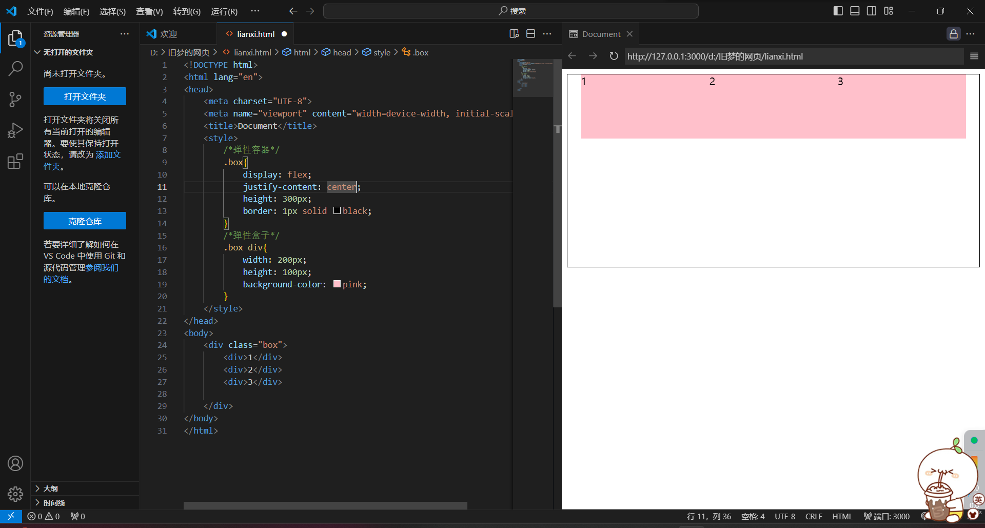
<!DOCTYPE html>
<html lang="en">
<head>
    <meta charset="UTF-8">
    <meta name="viewport" content="width=device-width, initial-scale=1.0">
    <title>Document</title>
    <style>
        /*弹性容器*/
        .box{
            display: flex;
            justify-content: center;
            height: 300px;
            border: 1px solid black;
        }
        /*弹性盒子*/
        .box div{
            width: 200px;
            height: 100px;
            background-color: pink;
        }
    </style>
</head>
<body>
    <div class="box">
        <div>1</div>
        <div>2</div>
        <div>3</div>

    </div>
</body>
</html>
4)space-between(产生相同的空白间距,将父级剩下的宽分为空白间距)
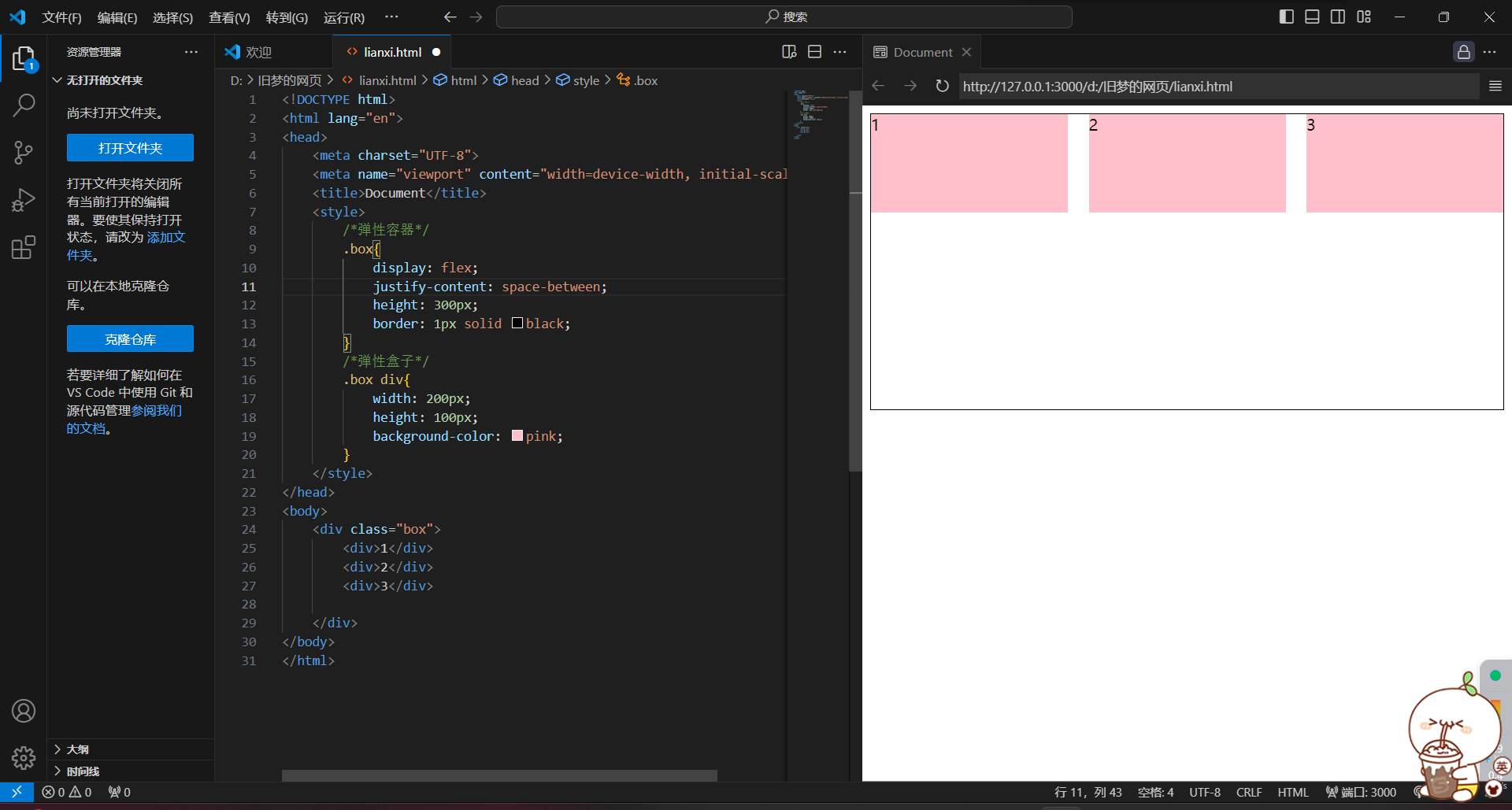
<!DOCTYPE html>
<html lang="en">
<head>
    <meta charset="UTF-8">
    <meta name="viewport" content="width=device-width, initial-scale=1.0">
    <title>Document</title>
    <style>
        /*弹性容器*/
        .box{
            display: flex;
            justify-content: space-between;
            height: 300px;
            border: 1px solid black;
        }
        /*弹性盒子*/
        .box div{
            width: 200px;
            height: 100px;
            background-color: pink;
        }
    </style>
</head>
<body>
    <div class="box">
        <div>1</div>
        <div>2</div>
        <div>3</div>

    </div>
</body>
</html>
5)space-around(间距出现在盒子两侧)
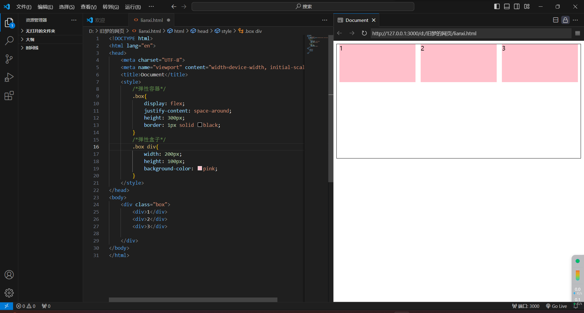
<!DOCTYPE html>
<html lang="en">
<head>
    <meta charset="UTF-8">
    <meta name="viewport" content="width=device-width, initial-scale=1.0">
    <title>Document</title>
    <style>
        /*弹性容器*/
        .box{
            display: flex;
            justify-content: space-around;
            height: 300px;
            border: 1px solid black;
        }
        /*弹性盒子*/
        .box div{
            width: 200px;
            height: 100px;
            background-color: pink;
        }
    </style>
</head>
<body>
    <div class="box">
        <div>1</div>
        <div>2</div>
        <div>3</div>

    </div>
</body>
</html>
6)space-evenly(空白是同样大的)
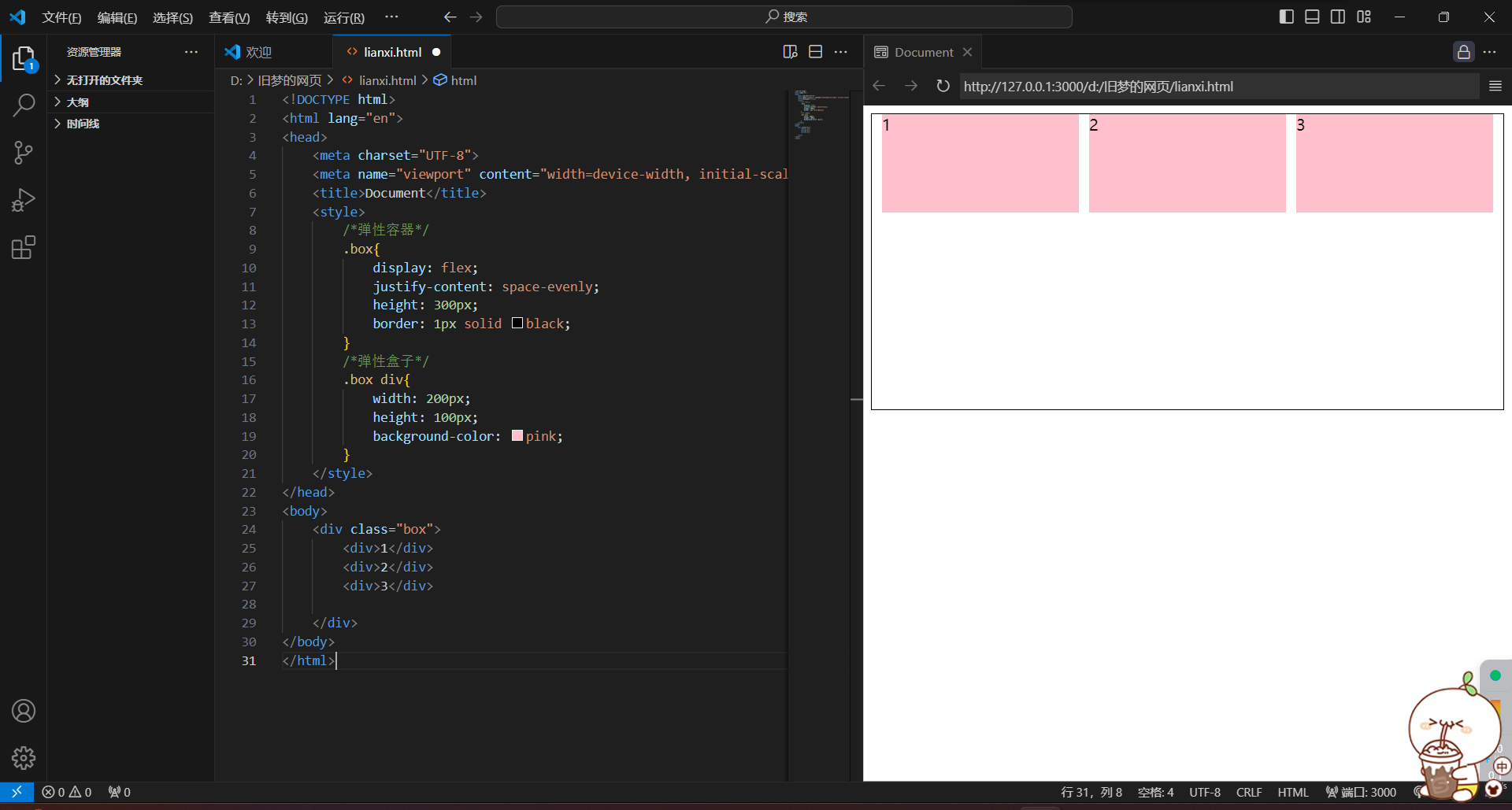
<!DOCTYPE html>
<html lang="en">
<head>
    <meta charset="UTF-8">
    <meta name="viewport" content="width=device-width, initial-scale=1.0">
    <title>Document</title>
    <style>
        /*弹性容器*/
        .box{
            display: flex;
            justify-content: space-evenly;
            height: 300px;
            border: 1px solid black;
        }
        /*弹性盒子*/
        .box div{
            width: 200px;
            height: 100px;
            background-color: pink;
        }
    </style>
</head>
<body>
    <div class="box">
        <div>1</div>
        <div>2</div>
        <div>3</div>

    </div>
</body>
</html>
4.侧轴对齐方式
1.align-items 当前弹性容器内所有弹性盒子的侧轴对齐方式(给弹性容器设置)
2.align-self 单独控制某个弹性盒子的侧轴对齐方式(给弹性盒子设置)
1)align-items:stretch(侧轴方向没长度才可以拉伸)
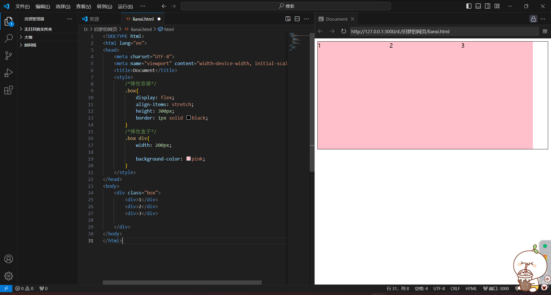
<!DOCTYPE html>
<html lang="en">
<head>
    <meta charset="UTF-8">
    <meta name="viewport" content="width=device-width, initial-scale=1.0">
    <title>Document</title>
    <style>
        /*弹性容器*/
        .box{
            display: flex;
            align-items: stretch;
            height: 300px;
            border: 1px solid black;
        }
        /*弹性盒子*/
        .box div{
            width: 200px;

            background-color: pink;
        }
    </style>
</head>
<body>
    <div class="box">
        <div>1</div>
        <div>2</div>
        <div>3</div>

    </div>
</body>
</html>
2)align-items:center
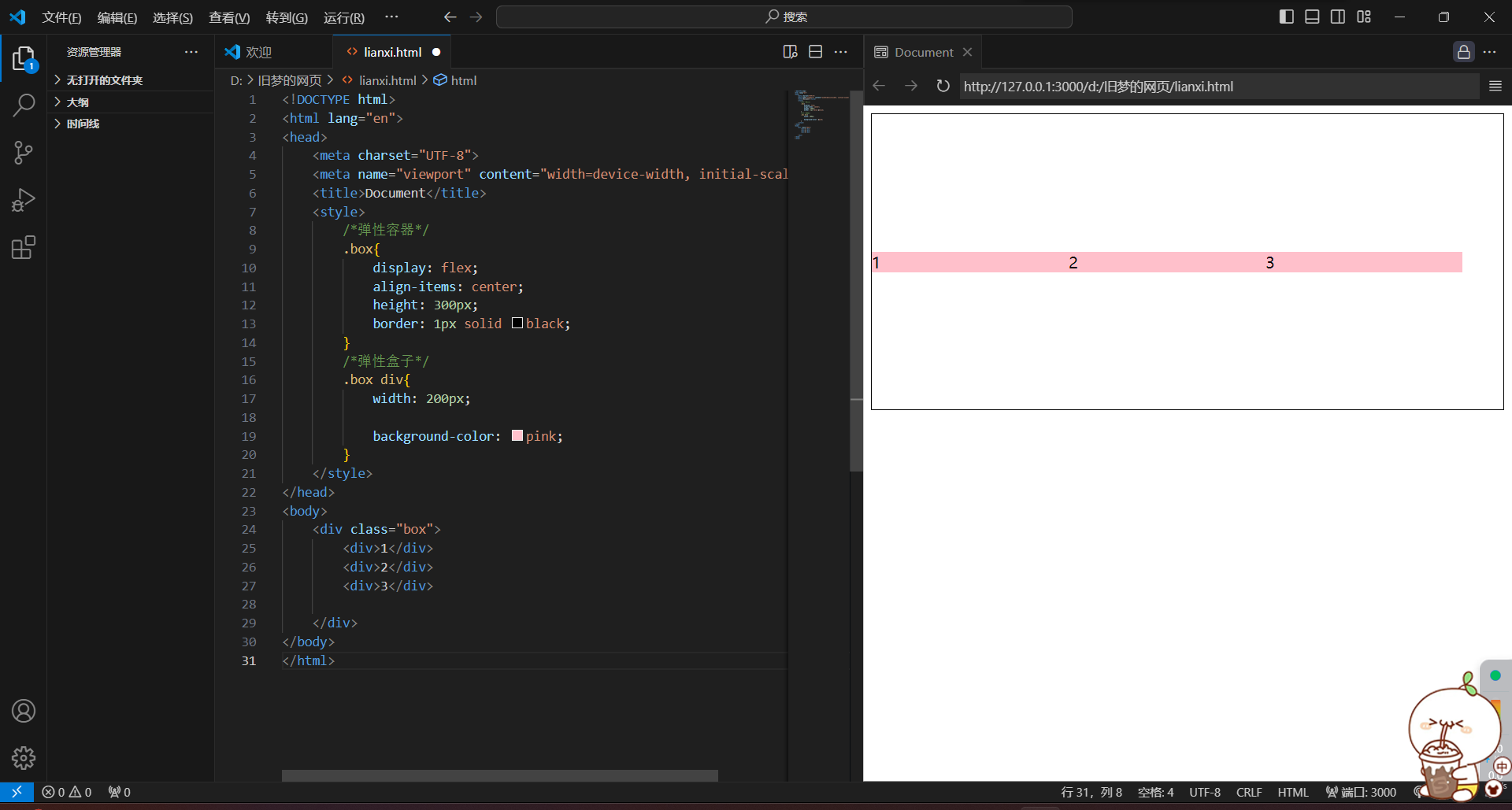
<!DOCTYPE html>
<html lang="en">
<head>
    <meta charset="UTF-8">
    <meta name="viewport" content="width=device-width, initial-scale=1.0">
    <title>Document</title>
    <style>
        /*弹性容器*/
        .box{
            display: flex;
            align-items: center;
            height: 300px;
            border: 1px solid black;
        }
        /*弹性盒子*/
        .box div{
            width: 200px;

            background-color: pink;
        }
    </style>
</head>
<body>
    <div class="box">
        <div>1</div>
        <div>2</div>
        <div>3</div>

    </div>
</body>
</html>
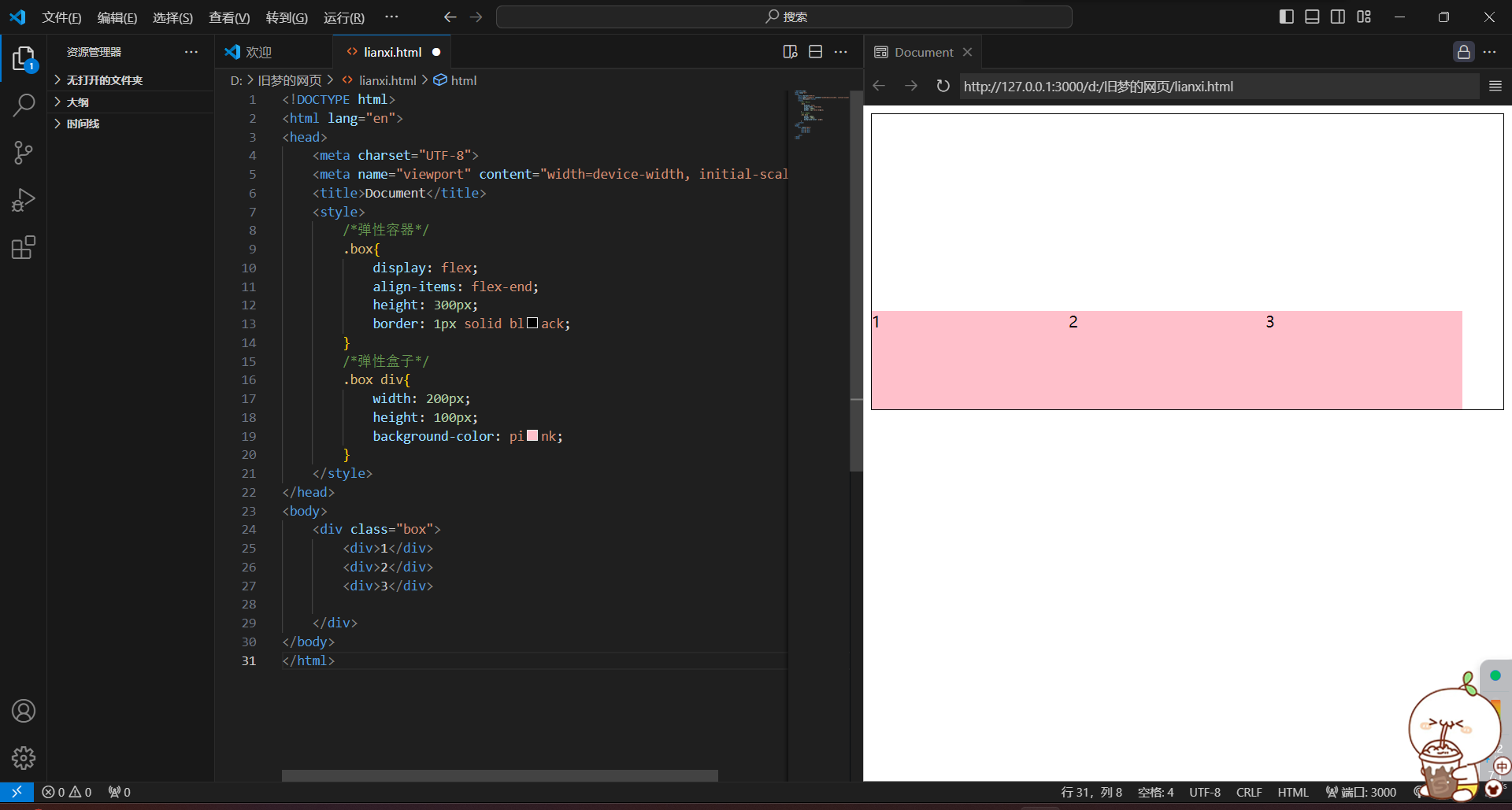
3)align-items:flex-start
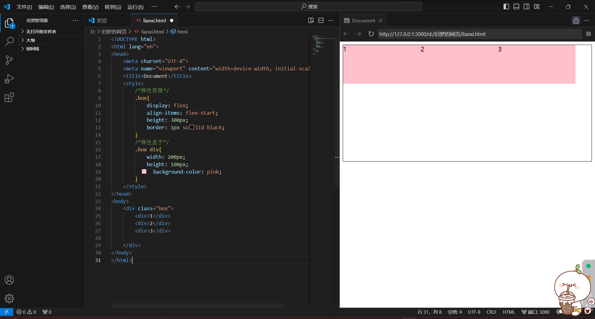
<!DOCTYPE html>
<html lang="en">
<head>
    <meta charset="UTF-8">
    <meta name="viewport" content="width=device-width, initial-scale=1.0">
    <title>Document</title>
    <style>
        /*弹性容器*/
        .box{
            display: flex;
            align-items: flex-start;
            height: 300px;
            border: 1px solid black;
        }
        /*弹性盒子*/
        .box div{
            width: 200px;
            height: 100px;
            background-color: pink;
        }
    </style>
</head>
<body>
    <div class="box">
        <div>1</div>
        <div>2</div>
        <div>3</div>

    </div>
</body>
</html>
4)align-items:flex-end
<!DOCTYPE html>
<html lang="en">
<head>
    <meta charset="UTF-8">
    <meta name="viewport" content="width=device-width, initial-scale=1.0">
    <title>Document</title>
    <style>
        /*弹性容器*/
        .box{
            display: flex;
            align-items: flex-end;
            height: 300px;
            border: 1px solid black;
        }
        /*弹性盒子*/
        .box div{
            width: 200px;
            height: 100px;
            background-color: pink;
        }
    </style>
</head>
<body>
    <div class="box">
        <div>1</div>
        <div>2</div>
        <div>3</div>

    </div>
</body>
</html>
5.修改主轴方向
1.主轴默认在水平方向,侧轴默认在垂直方向
2.属性名:flex-direction
3.属性值:column
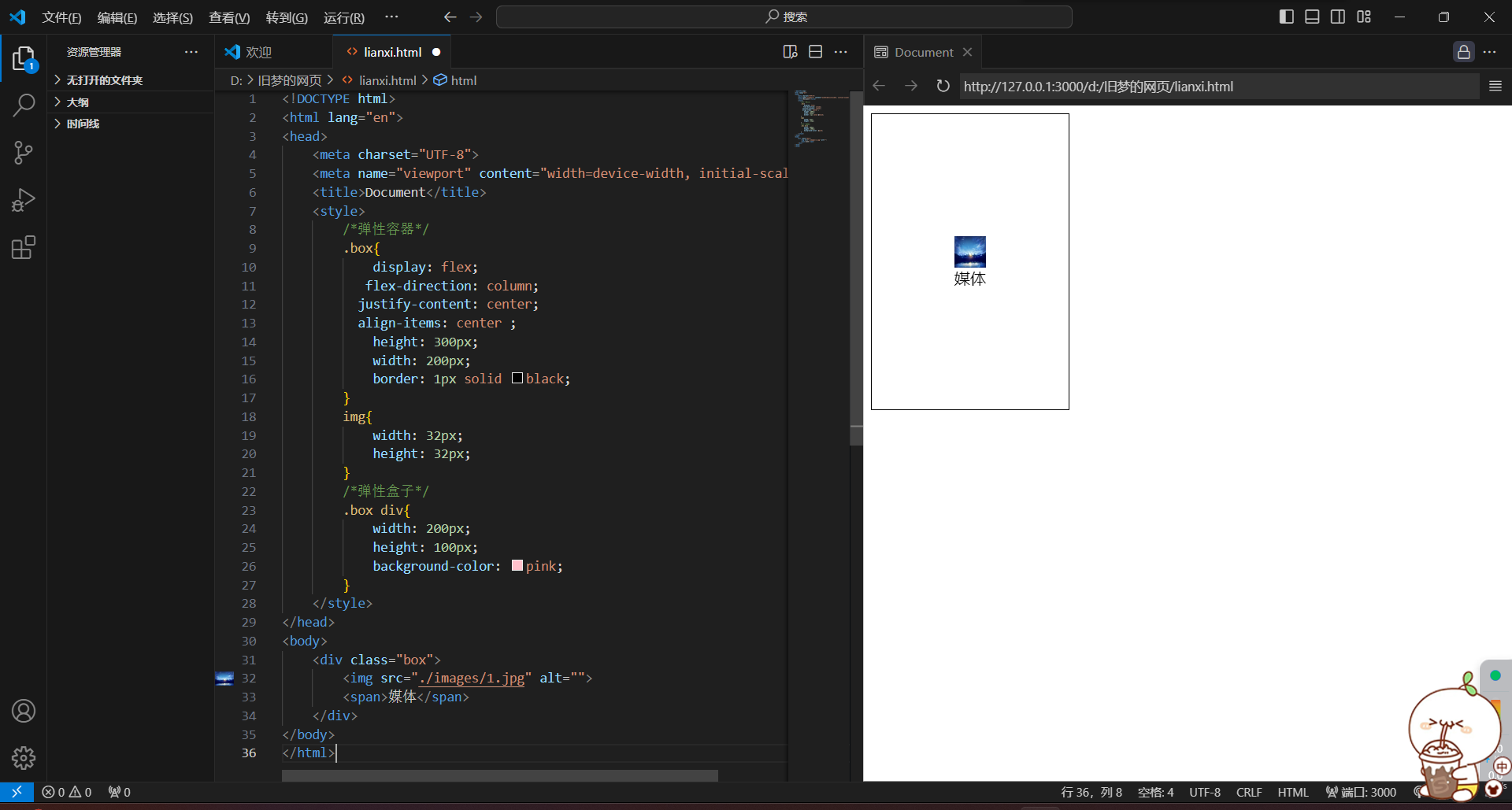
<!DOCTYPE html>
<html lang="en">
<head>
    <meta charset="UTF-8">
    <meta name="viewport" content="width=device-width, initial-scale=1.0">
    <title>Document</title>
    <style>
        /*弹性容器*/
        .box{
            display: flex;
           flex-direction: column;
          justify-content: center;
          align-items: center ;
            height: 300px;
            width: 200px;
            border: 1px solid black;
        }
        img{
            width: 32px;
            height: 32px;
        }
        /*弹性盒子*/
        .box div{
            width: 200px;
            height: 100px;
            background-color: pink;
        }
    </style>
</head>
<body>
    <div class="box">
        <img src="./images/1.jpg" alt="">
        <span>媒体</span>
    </div>
</body>
</html>
6.弹性伸缩比
1.设置弹性盒子在主轴方向的尺寸
2.属性名:flex
3.属性值:整数数字,表示占用父级剩余尺寸的份数
注:默认情况下:主轴靠内容拉伸
竖直
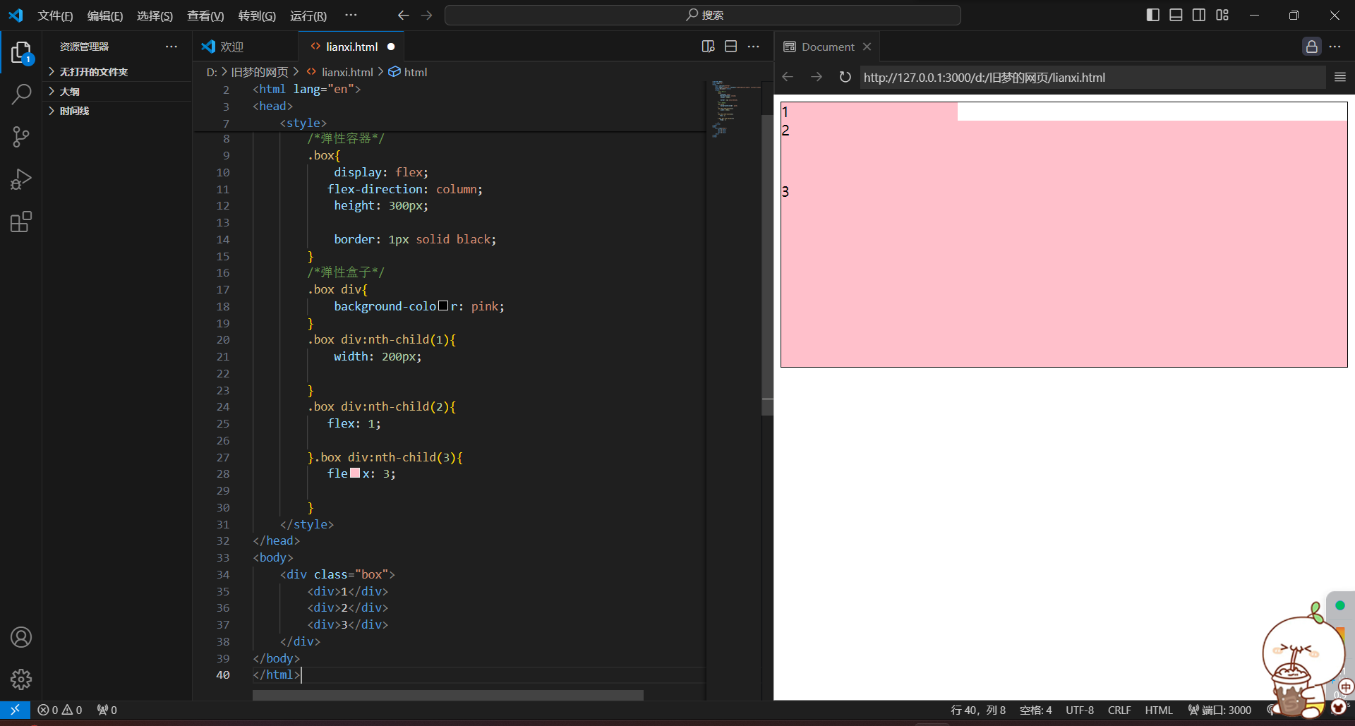
<!DOCTYPE html>
<html lang="en">
<head>
    <meta charset="UTF-8">
    <meta name="viewport" content="width=device-width, initial-scale=1.0">
    <title>Document</title>
    <style>
        /*弹性容器*/
        .box{
            display: flex;
           flex-direction: column;
            height: 300px;

            border: 1px solid black;
        }
        /*弹性盒子*/
        .box div{
            background-color: pink;
        }
        .box div:nth-child(1){
            width: 200px;

        }
        .box div:nth-child(2){
           flex: 1;

        }.box div:nth-child(3){
           flex: 3;

        }
    </style>
</head>
<body>
    <div class="box">
        <div>1</div>
        <div>2</div>
        <div>3</div>
    </div>
</body>
</html>
水平

<!DOCTYPE html>
<html lang="en">
<head>
    <meta charset="UTF-8">
    <meta name="viewport" content="width=device-width, initial-scale=1.0">
    <title>Document</title>
    <style>
        /*弹性容器*/
        .box{
            display: flex;

            height: 300px;

            border: 1px solid black;
        }
        /*弹性盒子*/
        .box div{
            background-color: pink;
        }
        .box div:nth-child(1){
            width: 200px;

        }
        .box div:nth-child(2){
           flex: 1;

        }.box div:nth-child(3){
           flex: 5;

        }
    </style>
</head>
<body>
    <div class="box">
        <div>1</div>
        <div>2</div>
        <div>3</div>
    </div>
</body>
</html>
7.弹性换行
1.属性名:flex-wrap
2.属性值:
-
wrap:换行
-
nowrap:不换行(默认)

<!DOCTYPE html>
<html lang="en">
<head>
    <meta charset="UTF-8">
    <meta name="viewport" content="width=device-width, initial-scale=1.0">
    <title>Document</title>
    <style>
        /*弹性容器*/
        .box{


            height: 300px;

            border: 1px solid black;
        }
        /*弹性盒子*/
        .box div{
            background-color: pink;
            width: 200px;
            height: 100px;
        }

    </style>
</head>
<body>
    <div class="box">
        <div>1</div>
        <div>2</div>
        <div>3</div>
        <div>1</div>
        <div>2</div>
        <div>3</div>
    </div>
</body>
</html>

<!DOCTYPE html>
<html lang="en">
<head>
    <meta charset="UTF-8">
    <meta name="viewport" content="width=device-width, initial-scale=1.0">
    <title>Document</title>
    <style>
        /*弹性容器*/
        .box{
           display: flex;

            height: 300px;

            border: 1px solid black;
        }
        /*弹性盒子*/
        .box div{
            background-color: pink;
            width: 200px;
            height: 100px;
        }

    </style>
</head>
<body>
    <div class="box">
        <div>1</div>
        <div>2</div>
        <div>3</div>
        <div>1</div>
        <div>2</div>
        <div>3</div>
    </div>
</body>
</html>
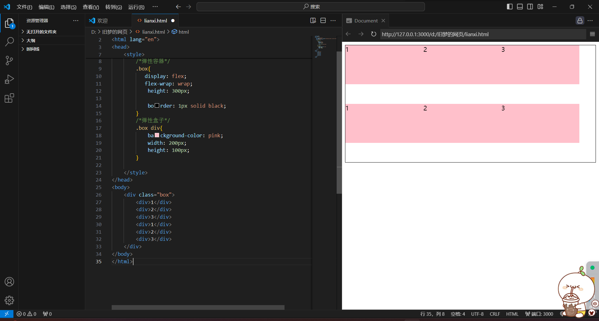
<!DOCTYPE html>
<html lang="en">
<head>
    <meta charset="UTF-8">
    <meta name="viewport" content="width=device-width, initial-scale=1.0">
    <title>Document</title>
    <style>
        /*弹性容器*/
        .box{
           display: flex;
           flex-wrap: wrap;
            height: 300px;

            border: 1px solid black;
        }
        /*弹性盒子*/
        .box div{
            background-color: pink;
            width: 200px;
            height: 100px;
        }

    </style>
</head>
<body>
    <div class="box">
        <div>1</div>
        <div>2</div>
        <div>3</div>
        <div>1</div>
        <div>2</div>
        <div>3</div>
    </div>
</body>
</html>
8.行对齐方式
1.属性名:align-content
2.属性值:与主轴对齐相同

<!DOCTYPE html>
<html lang="en">
<head>
    <meta charset="UTF-8">
    <meta name="viewport" content="width=device-width, initial-scale=1.0">
    <title>Document</title>
    <style>
        /*弹性容器*/
        .box{
           display: flex;
           flex-wrap: wrap;
            height: 300px;
           justify-content: space-between;
            border: 1px solid black;
            align-content: flex-end;
        }
        /*弹性盒子*/
        .box div{
            background-color: pink;
            width: 200px;
            height: 100px;
        }

    </style>
</head>
<body>
    <div class="box">
        <div>1</div>
        <div>2</div>
        <div>3</div>
        <div>1</div>
        <div>2</div>
        <div>3</div>
    </div>
</body>
</html>
四)定位
1.作用:灵活的改变盒子在网页中的位置
2.实现:
1)定位模式:position
2)边偏移:设置盒子的位置(left right top bottom)
3.定位模式:
1)相对定位:position:relative(相对于原来的位置,不脱标)
<!DOCTYPE html>
<html lang="en">
<head>
    <meta charset="UTF-8">
    <meta name="viewport" content="width=device-width, initial-scale=1.0">
    <title>Document</title>
    <style>
        *{
            margin: 0;
            padding: 0;
        }
        div{
            position: relative;
            top: 100px;
            left: 60px;

        }
    </style>
</head>
<body>
    <p>dhsajlkdhaskjdhasljkdhasdladhaslasdasdlasdlasdlasdlasdllasdlasdlasdlasdlasdls</p>
    <p>aaaaaaaaaaaaaaaaaaaaaaaaaaaaaaaaaa</p>
    <p></p><div><img src="./images/1.jpg" alt="" width="300px" height="300px"></div>
    <p>aaaaaaaaaaaaaaaaaaaaaaaaaaaaaaaaaaa</p>
    <p>aaaaaaaaaaaaaaaaaaaaaaaaaaaaaaaaaa</p>
</body>
</html>
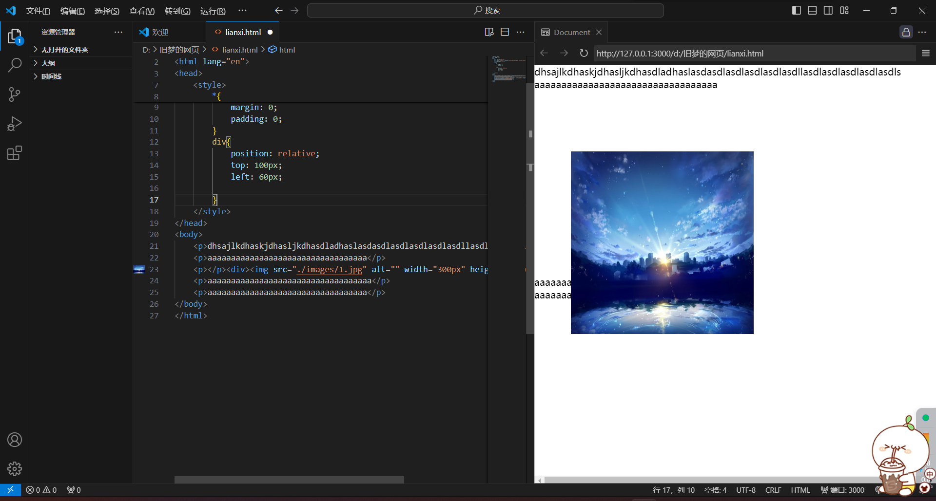
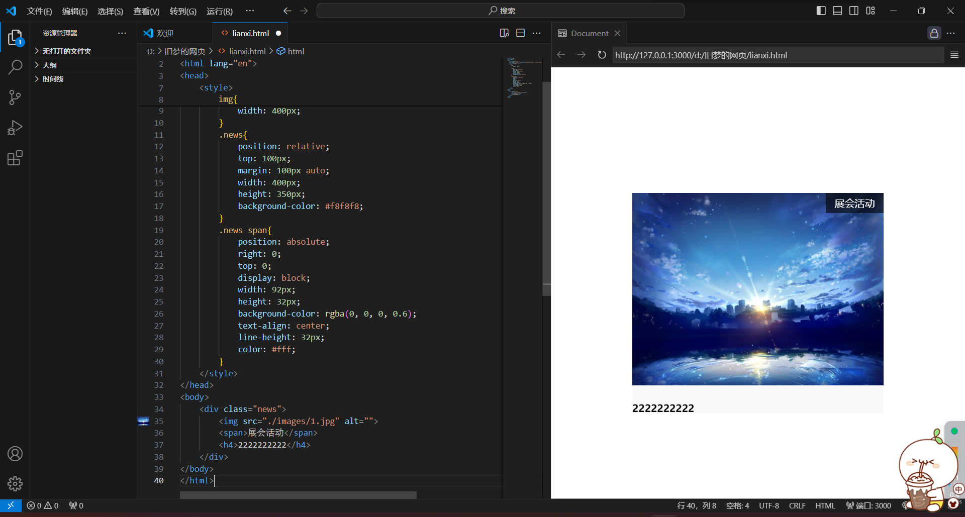
2)绝对定位:position:absolute(使用场景:子级绝对定位,父级相对定位)(子绝父相)
特点:
1.拖表,不占位
2.参照物:先寻找附近的已定位的祖先元素,如果所有祖先元素没有定位,那么按照浏览器修改可视区域位置
3.显示模式特点改变:宽高生效(具备了行内块的特点)
<!DOCTYPE html>
<html lang="en">
<head>
    <meta charset="UTF-8">
    <meta name="viewport" content="width=device-width, initial-scale=1.0">
    <title>Document</title>
    <style>
        img{
            width: 400px;
        }
        .news{
            position: relative;
            top: 100px;
            margin: 100px auto;
            width: 400px;
            height: 350px;
            background-color: #f8f8f8;
        }
        .news span{
            position: absolute;
            right: 0;
            top: 0;
            display: block;
            width: 92px;
            height: 32px;
            background-color: rgba(0, 0, 0, 0.6);
            text-align: center;
            line-height: 32px;
            color: #fff;
        }
    </style>
</head>
<body>
    <div class="news">
        <img src="./images/1.jpg" alt="">
        <span>展会活动</span>
        <h4>2222222222</h4>
    </div>
</body>
</html>
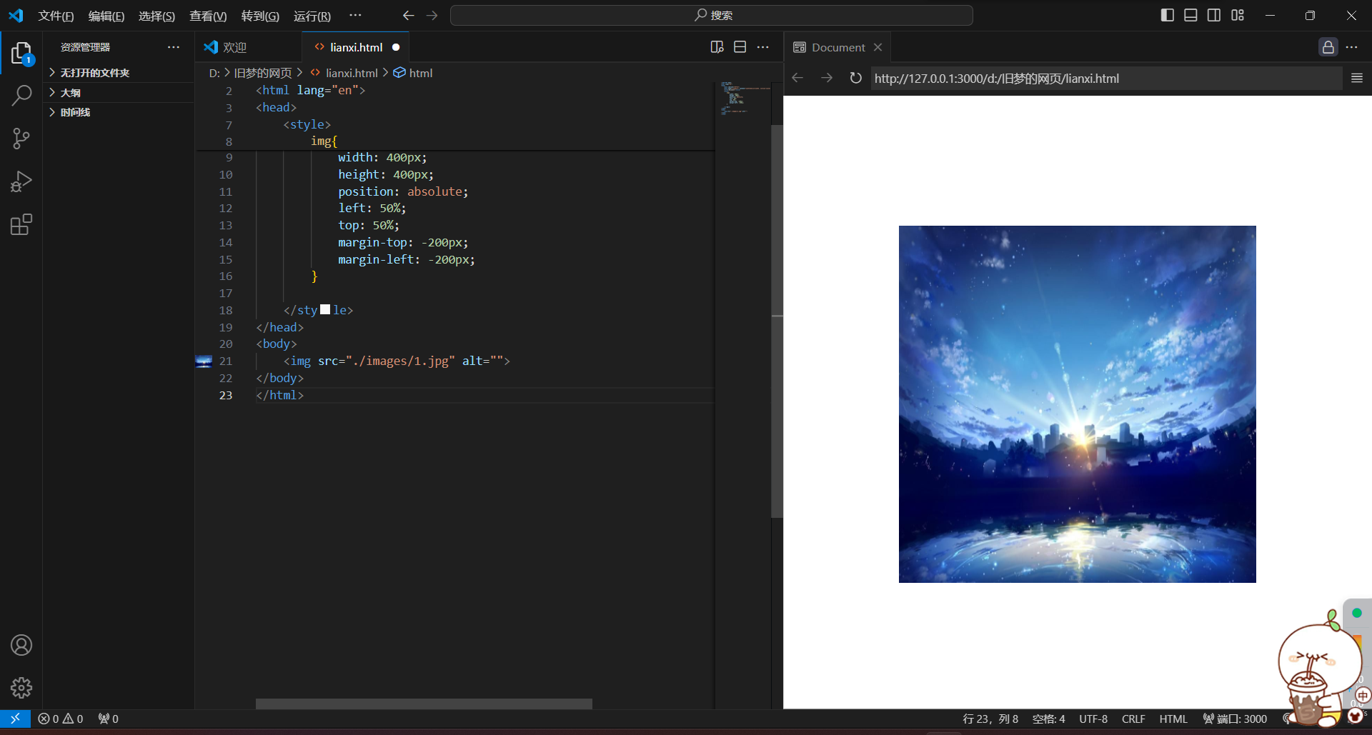
定位居中
实现步骤:
1.绝对定位
2.水平、垂直边偏移为50%
3.子级向左、上移动自身尺寸的一半
-
左、上的外边距为 - 尺寸的一半
-
transform:translate(-50%,-50%)
<!DOCTYPE html>
<html lang="en">
<head>
    <meta charset="UTF-8">
    <meta name="viewport" content="width=device-width, initial-scale=1.0">
    <title>Document</title>
    <style>
        img{
            width: 400px;
            height: 400px;
            position: absolute;
            left: 50%;
            top: 50%;
            margin-top: -200px;
            margin-left: -200px;
        }

    </style>
</head>
<body>
    <img src="./images/1.jpg" alt="">
</body>
</html>
<!DOCTYPE html>
<html lang="en">
<head>
    <meta charset="UTF-8">
    <meta name="viewport" content="width=device-width, initial-scale=1.0">
    <title>Document</title>
    <style>
        img{
            width: 400px;
            height: 400px;
            position: absolute;
            left: 50%;
            top: 50%;
         transform: translate(-50%,-50%);
        }

    </style>
</head>
<body>
    <img src="./images/1.jpg" alt="">
</body>
</html>
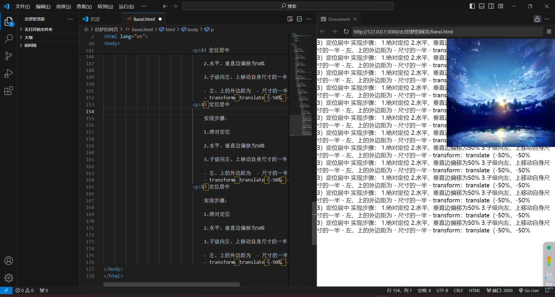
4)固定定位:position:fixed(场景:元素的位置在网页滚动时不会改变)
特点:
1.脱标,不占位
2.改变位置的参照物是浏览器的窗口
3.显示模式特点:具有行内块特点
<!DOCTYPE html>
<html lang="en">
<head>
    <meta charset="UTF-8">
    <meta name="viewport" content="width=device-width, initial-scale=1.0">
    <title>Document</title>
    <style>
        *{
            margin: 0;
            padding: 0;
        }
        div{
            position: fixed;
            top: 0;
            right: 0;

        }
    </style>
</head>
<body>
    <p>3)定位居中

        实现步骤:

        1.绝对定位

        2.水平、垂直边偏移为50%

        3.子级向左、上移动自身尺寸的一半

        - 左、上的外边距为  - 尺寸的一半
        - transform:translate(-50%,-50%</p>
        <p>3)定位居中

            实现步骤:

            1.绝对定位

            2.水平、垂直边偏移为50%

            3.子级向左、上移动自身尺寸的一半

            - 左、上的外边距为  - 尺寸的一半
            - transform:translate(-50%,-50%</p>
        <p>3)定位居中

            实现步骤:

            1.绝对定位

            2.水平、垂直边偏移为50%

            3.子级向左、上移动自身尺寸的一半

            - 左、上的外边距为  - 尺寸的一半
            - transform:translate(-50%,-50%</p>
        <p>3)定位居中

            实现步骤:

            1.绝对定位

            2.水平、垂直边偏移为50%

            3.子级向左、上移动自身尺寸的一半

            - 左、上的外边距为  - 尺寸的一半
            - transform:translate(-50%,-50%</p>    <p>3)定位居中

            实现步骤:

            1.绝对定位

            2.水平、垂直边偏移为50%

            3.子级向左、上移动自身尺寸的一半

            - 左、上的外边距为  - 尺寸的一半
            - transform:translate(-50%,-50%</p>
            <div><img src="./images/1.jpg" alt="" width="300px" height="300px"></div>
            <p>3)定位居中

                实现步骤:

                1.绝对定位

                2.水平、垂直边偏移为50%

                3.子级向左、上移动自身尺寸的一半

                - 左、上的外边距为  - 尺寸的一半
                - transform:translate(-50%,-50%</p>
                <p>3)定位居中

                    实现步骤:

                    1.绝对定位

                    2.水平、垂直边偏移为50%

                    3.子级向左、上移动自身尺寸的一半

                    - 左、上的外边距为  - 尺寸的一半
                    - transform:translate(-50%,-50%</p>
                    <p>3)定位居中

                        实现步骤:

                        1.绝对定位

                        2.水平、垂直边偏移为50%

                        3.子级向左、上移动自身尺寸的一半

                        - 左、上的外边距为  - 尺寸的一半
                        - transform:translate(-50%,-50%</p>
                        <p>3)定位居中

                            实现步骤:

                            1.绝对定位

                            2.水平、垂直边偏移为50%

                            3.子级向左、上移动自身尺寸的一半

                            - 左、上的外边距为  - 尺寸的一半
                            - transform:translate(-50%,-50%</p>
                            <p>3)定位居中

                                实现步骤:

                                1.绝对定位

                                2.水平、垂直边偏移为50%

                                3.子级向左、上移动自身尺寸的一半

                                - 左、上的外边距为  - 尺寸的一半
                                - transform:translate(-50%,-50%</p>
                                <p>3)定位居中

                                    实现步骤:

                                    1.绝对定位

                                    2.水平、垂直边偏移为50%

                                    3.子级向左、上移动自身尺寸的一半

                                    - 左、上的外边距为  - 尺寸的一半
                                    - transform:translate(-50%,-50%</p>
</body>
</html>
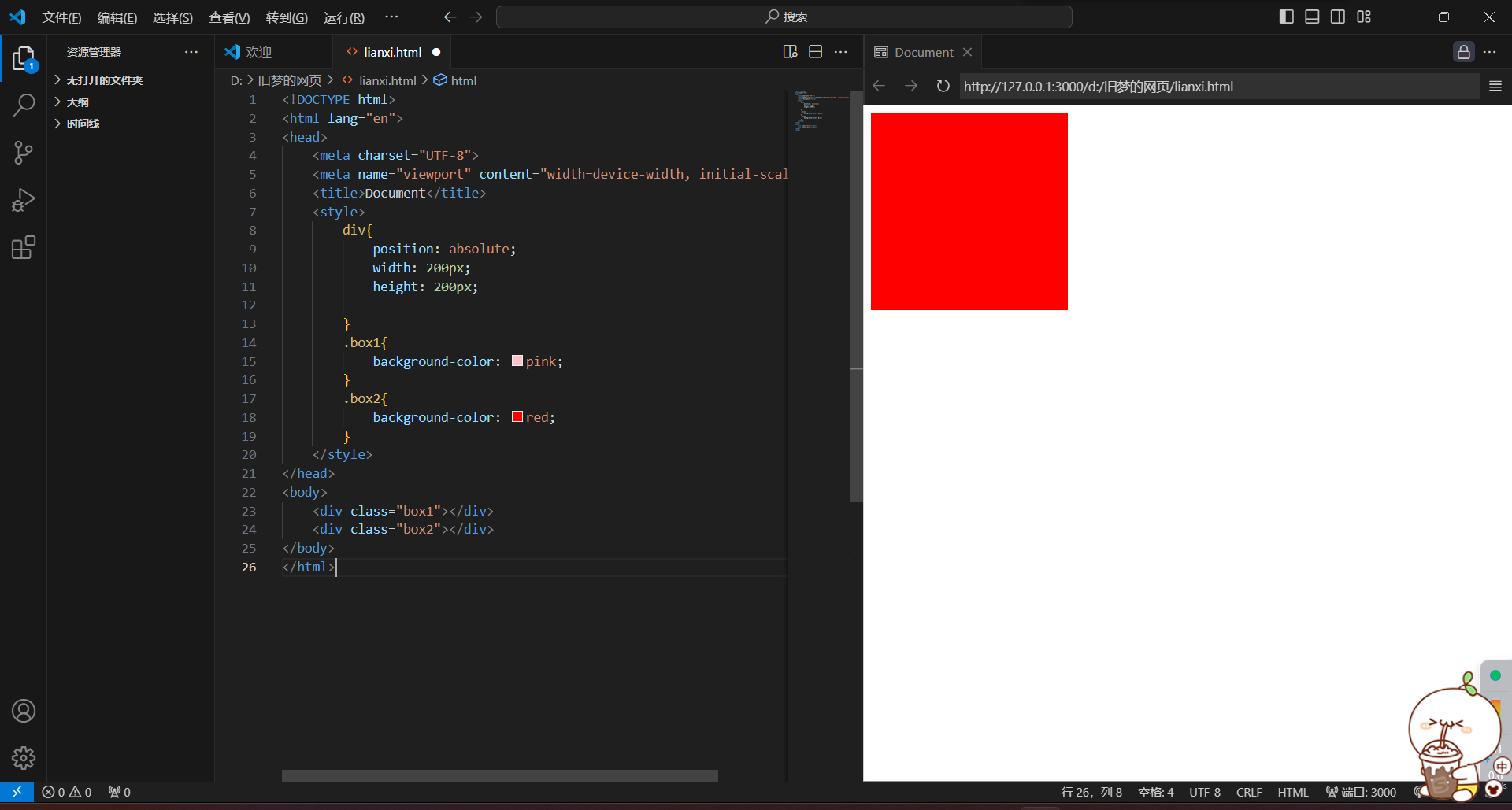
4.堆叠层级z-index
默认效果:按照标签书写顺序,后来者居上
作用:设置定位元素的层级顺序,改变定位元素的显示顺序
<!DOCTYPE html>
<html lang="en">
<head>
    <meta charset="UTF-8">
    <meta name="viewport" content="width=device-width, initial-scale=1.0">
    <title>Document</title>
    <style>
        div{
            position: absolute;
            width: 200px;
            height: 200px;

        }
        .box1{
            background-color: pink;
        }
        .box2{
            background-color: red;
        }
    </style>
</head>
<body>
    <div class="box1"></div>
    <div class="box2"></div>
</body>
</html>
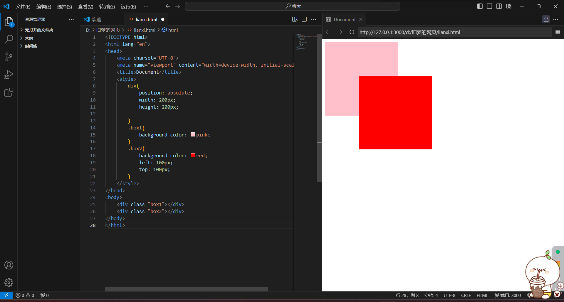
<!DOCTYPE html>
<html lang="en">
<head>
    <meta charset="UTF-8">
    <meta name="viewport" content="width=device-width, initial-scale=1.0">
    <title>Document</title>
    <style>
        div{
            position: absolute;
            width: 200px;
            height: 200px;

        }
        .box1{
            background-color: pink;
        }
        .box2{
            background-color: red;
            left: 100px;
            top: 100px;
        }
    </style>
</head>
<body>
    <div class="box1"></div>
    <div class="box2"></div>
</body>
</html>
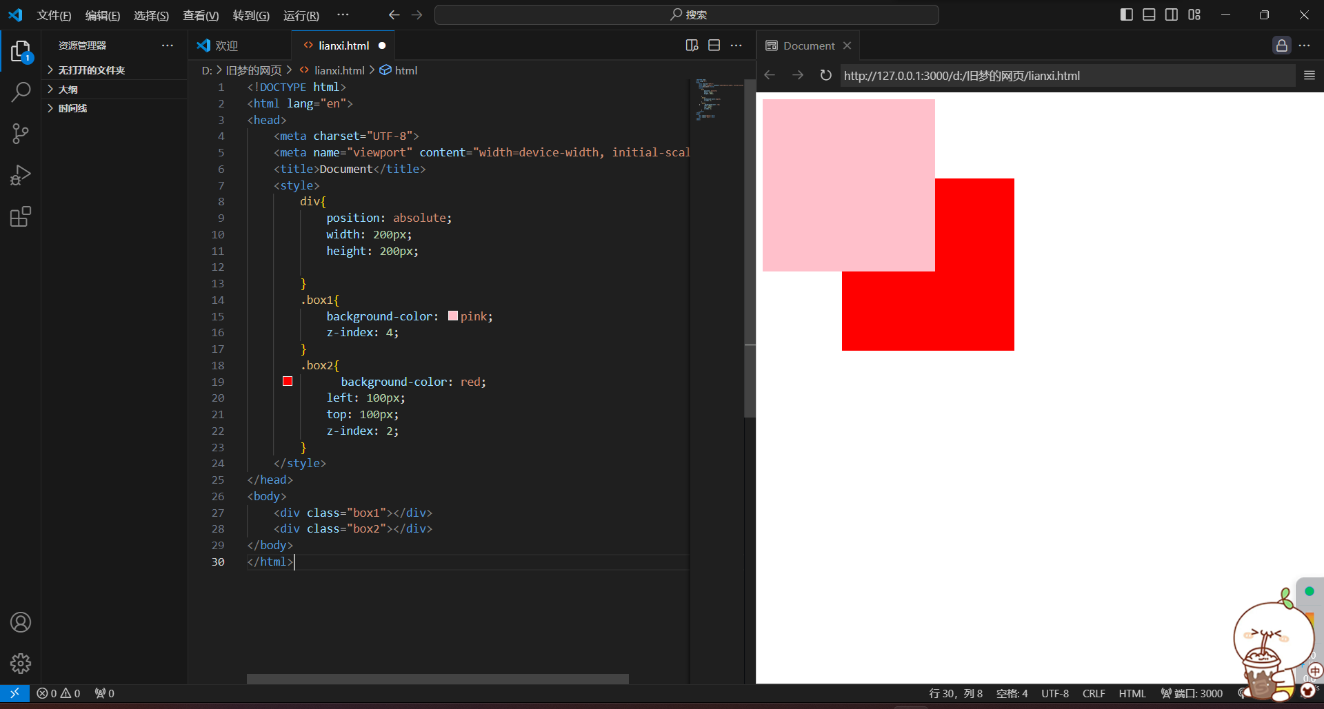
<!DOCTYPE html>
<html lang="en">
<head>
    <meta charset="UTF-8">
    <meta name="viewport" content="width=device-width, initial-scale=1.0">
    <title>Document</title>
    <style>
        div{
            position: absolute;
            width: 200px;
            height: 200px;

        }
        .box1{
            background-color: pink;
            z-index: 4;
        }
        .box2{
            background-color: red;
            left: 100px;
            top: 100px;
            z-index: 2;
        }
    </style>
</head>
<body>
    <div class="box1"></div>
    <div class="box2"></div>
</body>
</html>
z-index取值越大显示顺序越靠上
五)CSS精灵
定义:CSS精灵,也叫CSS Sprites,是一种网页图片应用处理方式。八王爷中一些背景图片正和岛一张图片文件中,再background-position精确的定位出背景图片的位置
优点:减少服务器被请求次数、减轻服务器的压力,提高页面加载速度
实现步骤:
1.创建盒子,盒子尺寸与小图片尺寸相同
2.设置盒子背景图为精灵图
3.添加background-position属性,改变背景图位置
3.1 使用PxCook测量小图片左上角坐标
3.2 取负数坐标为background-position属性值(向坐上移动图片位置)
鹅鹅鹅,没下载上pxcook
六)字体图标
展示的是图标,本质是字体
作用:在网页中添加简单的、颜色单一的小图标
优点:
1.灵活性:灵活的修改样式,例如:尺寸,颜色
2.轻量级:体积小、渲染快、降低服务器请求次数
3.兼容性:几乎兼容所有主流浏览器
4.使用方便:先下载再使用
1.字体图标 - 下载字体
iconfont图标库:iconfont-阿里巴巴矢量图标库
下载字体:登录---素材库---官方图标库---进入图标库---选图标,加入购物车---购物车,添加至项目,确定---下载至本地
2.字体图标 - 使用字体
1)引入字体样式表(iconfont.css)
2)标签使用字体图标类名
1.iconfont:字体图标基本样式(字体名、字体大小等等)
2.icon-xxx:图标对应的类名

<!DOCTYPE html>
<html lang="en">
<head>
    <meta charset="UTF-8">
    <meta name="viewport" content="width=device-width, initial-scale=1.0">
    <title>Document</title>
    <link rel="stylesheet" href="./iconfont/iconfont.css">
    <style>
        .iconfont{
            font-size: 100px;
            color: red;
        }
    </style>
</head>
<body>
    <span class="iconfont icon-shouye-zhihui"></span>
</body>
</html>
3.字体图标 - 上传矢量图
作用:项目特有的图标传到iconfont图标库,生成字体
4.垂直对齐方式 vertical - align
属性名:vertical - align
属性值:
1.baseline 基线对齐(默认)
2.top 顶部对齐
3.middle 居中对齐
4.bottom 底部对齐
1.

<!DOCTYPE html>
<html lang="en">
<head>
    <meta charset="UTF-8">
    <meta name="viewport" content="width=device-width, initial-scale=1.0">
    <title>Document</title>
    <style>
        div{
            border: 1px solid black;
        }
        img{
            vertical-align: baseline;
        }
    </style>
</head>
<body>
   <div> <img src="./images/1.jpg" alt="" width="300px" height="300px"> 我是谁我在那</div>
</body>
</html>
2.

<!DOCTYPE html>
<html lang="en">
<head>
    <meta charset="UTF-8">
    <meta name="viewport" content="width=device-width, initial-scale=1.0">
    <title>Document</title>
    <style>
        div{
            border: 1px solid black;
        }
        img{
            vertical-align: top;
        }
    </style>
</head>
<body>
   <div> <img src="./images/1.jpg" alt="" width="300px" height="300px"> 我是谁我在那</div>
</body>
</html>
3.
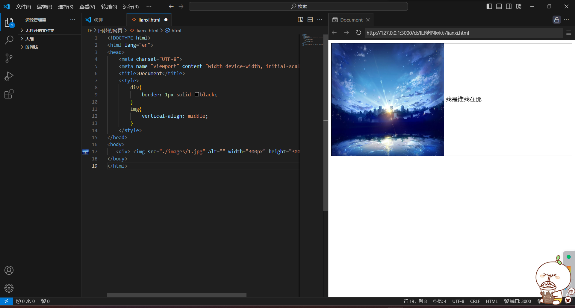
<!DOCTYPE html>
<html lang="en">
<head>
    <meta charset="UTF-8">
    <meta name="viewport" content="width=device-width, initial-scale=1.0">
    <title>Document</title>
    <style>
        div{
            border: 1px solid black;
        }
        img{
            vertical-align: middle;
        }
    </style>
</head>
<body>
   <div> <img src="./images/1.jpg" alt="" width="300px" height="300px"> 我是谁我在那</div>
</body>
</html>
4.

<!DOCTYPE html>
<html lang="en">
<head>
    <meta charset="UTF-8">
    <meta name="viewport" content="width=device-width, initial-scale=1.0">
    <title>Document</title>
    <style>
        div{
            border: 1px solid black;
        }
        img{
            vertical-align: bottom;
        }
    </style>
</head>
<body>
   <div> <img src="./images/1.jpg" alt="" width="300px" height="300px"> 我是谁我在那</div>
</body>
</html>


 1367
1367


 被折叠的 条评论
为什么被折叠?
被折叠的 条评论
为什么被折叠?
 到【灌水乐园】发言


