


又是一周一度的提升时间啦,这周我们来学习CSS进阶
目录
一、盒子模型:CSS 中控制页面布局的核心概念
什么是盒子模型?
盒子模型指的是 HTML 元素在页面中所占有的空间,其包括标签的元素内容(content),内边距(padding),边框(border)和外边距(margin)四个部分。这四个部分围成了一个盒子,它的大小由宽度和高度定义。这四个部分的大小可通过 CSS 设置。
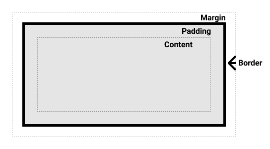
上图是一个盒子模型的示例。其中,黄色区域为元素内容,橙色区域为内边距,红色区域为边框,蓝色区域为外边距。
这里我们用通俗一点的话来讲:
内容(CONCENT):就是最中间的长方形,写东西的地方
内边距(PADDING):就是内容到边框中间的那一部分的距离
边框(BORDER):就是边框的那条把盒子包起来的线
外边距(MARGIN):就是盒子本身距离盒子外的元素的距离
CSS 盒子模型通过以上四部分在页面中进行布局,从而实现各种页面效果。
如何控制盒子模型的各部分?
在 CSS 中,可以使用以下属性来控制盒子模型的各部分:
1. Content
元素的内容,如文本和图像。
#box {
  width: 200px;
  height: 100px;
  background-color: #eee;
  font-size: 16px;
}
以上代码设置了一个 id 为 box 的元素,它的内容部分将被设置为灰色的背景和 16px 大小的文本。
2. Padding
内边距,用于在内容和边框之间创建空间。
#box {
  padding: 20px;
}
以上代码设置了 id 为 box 的元素的内边距(距离上右下左边距离)为 20px。
可以在padding后写四个像素单位,分别代表上、右、下、左,例如:
padding: 20px 10px 5px 9px;
根据实际需求自行调整
3. Border
边框,围绕内容和内边距。
连写属性:如下方例子就是边框宽度+边框样式+边框颜色
#box {
  border: 2px solid black;
}
以上代码设置了 id 为 box 的元素的边框为 2px 的黑色实线。
4. Margin
外边距,用于元素与其他元素之间创建空间。
#box {
  margin: 20px;
}
以上代码设置了 id 为 box 的元素的外边距为 20px。
与padding一样:
可以在margin后写四个像素单位,分别代表上、右、下、左,例如:
margin: 20px 10px 5px 9px;
根据实际需求自行调整
盒子模型的计算方法
在 CSS 中,盒子模型的大小计算公式为:
| 总宽度 = width + padding-left + padding-right + border-left + border-right + margin-left + margin-right; |
| 总高度 = height + padding-top + padding-bottom + border-top + border-bottom + margin-top + margin-bottom; |
盒子模型的大小由各个部分的大小和位置、以及元素的宽度和高度共同决定。在花费时间来计算和调整某个盒子的大小和位置时,请务必牢记这一点。
示例:盒子实现元素在其中居中
下面是一个示例,演示了如何使用盒子模型来实现将元素居中显示在页面上的效果。
<!DOCTYPE html>
<html>
<head>
  <title>居中的盒子</title>
  <style>
    #box {
      width: 200px;
      height: 200px;
      background-color: #eee;
      margin: auto;
      text-align: center;
      line-height: 200px;
    }
  </style>
</head>
<body>
  <div id="box">这是居中显示的内容</div>
</body>
</html>
以上代码定义了一个 div 元素,设置了其宽度、高度、背景颜色,并将其通过 margin: auto 以及 text-align: center 和 line-height: 200px 属性将其居中对齐。
效果如下: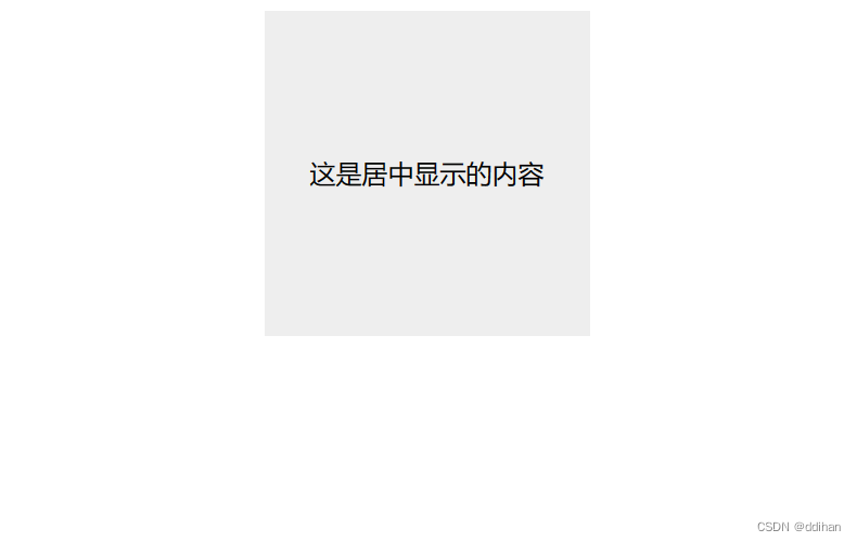
总结
盒子模型是 CSS 的一个核心概念,它为页面布局提供了重要的方式。盒子模型由元素的内容、内边距、边框和外边距四部分组成,因此在进行页面设计时,需要充分考虑这些部分的大小和位置以及宽度和高度等因素。
二、CSS浮动:使页面更好的布局
什么是CSS浮动
CSS浮动是一种布局技术,通过给元素设置浮动属性,可以让元素“浮”在父元素的文档流中,从而实现多个元素并排排列的效果。浮动的元素可以向左或向右移动,直到遇到其包含块或另一个浮动元素。
如何使用CSS浮动
我们可以通过将元素的 float 属性设置为 left 或 right,来让这个元素浮动起来。例如,下面这个示例代码将两个 div 元素设置为向左浮动,并实现了两列布局。
<!DOCTYPE html>
<html lang="en">
<head>
    <meta charset="UTF-8">
    <meta http-equiv="X-UA-Compatible" content="IE=edge">
    <meta name="viewport" content="width=device-width, initial-scale=1.0">
    <title>Document</title>
    <style>
    .left-column {
    float: left;
    width: 50%;
    background-color: pink;
  }

  .right-column {
    float: left;
    width: 50%;
    background-color: pink;
  }
  </style>
</head>
<body>
    <div class="container">
    <div class="left-column">这是左边的列</div>
    <div class="right-column">这是右边的列</div>
    </div>
</body>
</html>
这样,左边的列和右边的列就会像下图一样并列在一起:
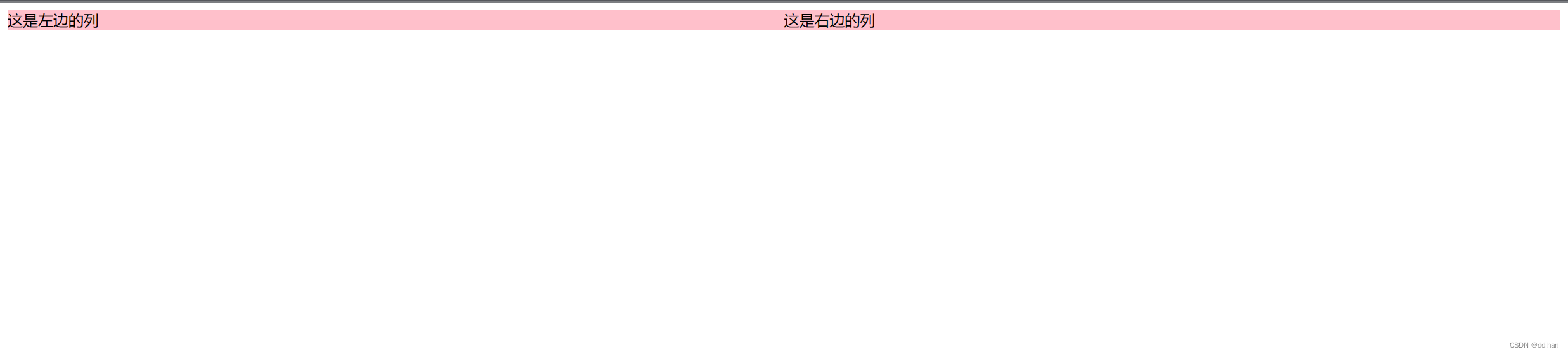
在上面的例子中,我们将左侧列和右侧列都设置为浮动元素,并将它们的宽度设为 50%。这样它们就会并排排列在一起。需要注意的是,浮动元素的宽度加起来要小于等于包含它们的父元素的宽度,否则右侧元素可能会换行到下一行。
不过使用float浮动布局时,也会遇到一些问题,例如清除浮动、父容器高度塌陷等问题。需要注意的是,浮动元素会影响其父容器的高度,如果浮动元素高度不一,会导致父容器的高度不合预期,这时可以采用下面的方法:
清除浮动
当我们使用浮动布局时,可能会遇到一些问题,例如浮动元素会溢出父元素、父元素高度塌陷等问题。了解如何清除浮动元素对于解决这些问题非常重要。
使用伪元素清除浮动
使用伪元素来给父容器添加一个 "clearfix" 的样式,强制浮动元素停止影响父容器的高度。我们可以在浮动元素后面添加一个空元素,将其清除浮动。例如,下面这段代码使用 clearfix 类来清除浮动,并将其应用在 container 元素上:
<div class="container clearfix">
  <div class="left-column">这是左边的列</div>
  <div class="right-column">这是右边的列</div>
  <div class="clearfix"></div>
</div>
.clearfix::after {
  content: '';
  display: table;
  clear: both;
}

.left-column {
  float: left;
  width: 50%;
}

.right-column {
  float: left;
  width: 50%;
}其中,clearfix 类的样式定义了一个伪元素 ::after,它会在元素的内容后面插入一个空白内容,并设置 display: table; 和 clear: both;,使其能够将浮动元素从两侧清除。
使用overflow属性清除浮动
我们还可以使用父元素的 overflow 属性来清除浮动。当我们将父元素的 overflow 属性设置为 hidden、auto 或 scroll 时,父元素会创建一个新的块格式化上下文,从而使浮动元素不会溢出父元素。(但这可能会造成一些副作用,例如隐藏了父元素中的其他内容)
例如,下面这段代码就使用了 overflow: hidden; 来清除浮动:
<div class="container clearfix">
  <div class="left-column">这是左边的列</div>
  <div class="right-column">这是右边的列</div>
</div>
.left-column {
  float: left;
  width: 50%;
}

.right-column {
  float: left;
  width: 50%;
}

.container {
  overflow: hidden;
}
总结
CSS浮动是一种常用的布局技术,可以实现多列布局、图片浮动等效果。但使用浮动布局时,也需要注意一些问题,如清除浮动等。
三、CSS定位:让元素动起来
CSS定位是CSS中非常重要的一个概念,它可以让我们的网页设计更加灵活多变。通过定位,我们可以将元素放置在页面上的任意位置,并且可以随意改变它们的大小和位置。接下来,我们将深入了解CSS定位的具体实现方法。
1.绝对定位
首先,我们先来介绍一下绝对定位。绝对定位可以让你把一个元素放到页面上的任何位置,不会受到其他元素的影响。比如,下面这段代码可以让一个元素定位在页面的左上角并且长宽都为100px。
position: absolute;
top: 0;
left: 0;
width: 100px;
height: 100px;
上面的代码中,position: absolute表示将元素的定位方式设置为绝对定位,top: 0和left: 0表示将元素放置在页面的左上角,width: 100px和height: 100px表示元素的长宽分别为100px。
2.相对定位
相对定位可以让元素相对于它原来应该在的位置进行移动,而不是绝对定位的完全脱离文档流。比如,下面这段代码可以将一个元素向下移动50px。
position: relative;
top: 50px;
上面的代码中,position: relative表示将元素的定位方式设置为相对定位,top: 50px表示将元素向下移动50px。
3.固定定位
固定定位可以让元素固定在页面的某个位置,即使页面滚动了也不会改变它的位置(就像一些网站上你页面划到哪跟到哪的小广告)。比如,下面这段代码可以将一个元素固定在页面的右下角。
position: fixed;
bottom: 0;
right: 0;
上面的代码中,position: fixed表示将元素的定位方式设置为固定定位,bottom: 0和right: 0表示将元素放置在页面的右下角。
4.居中定位(绝对定位实现)
居中定位是一种比较常见的定位方式,它可以让元素水平和垂直居中。比如,下面这段代码可以让一个元素水平和垂直居中。
position: absolute;
top: 50%;
left: 50%;
transform: translate(-50%, -50%);
上面的代码中,position: absolute表示将元素的定位方式设置为绝对定位,top: 50%和left: 50%表示将元素放置在页面的中心位置,transform: translate(-50%, -50%)表示将元素向左移动50%自身宽度和向上移动50%自身高度,从而使得元素水平和垂直居中。
5.定位的注意事项
在进行元素定位的时候,需要注意以下几点:
- 使用定位的元素需要设置宽高。
- 定位的元素需要设置
left、top、right、bottom中的至少一项。 - 对于相对定位和绝对定位,如果没有设置偏移量,则元素不会发生位置上的变化,只会发生相应的层叠顺序上的变化。
- 如果使用的是相对定位或绝对定位,注意使用
z-index属性进行图层的层叠顺序控制。 - 在使用绝对定位的时候,如果父元素没有设置
position属性,定位元素则以body元素为基准。 - 在使用相对定位的时候,定位元素还在文档流中,可以影响后面的元素排列。
总结
CSS定位是一种非常重要的技能,它可以让我们将元素放置在页面的任意位置,并且可以随意改变它们的大小和位置。在进行元素定位的时候,需要注意一些细节问题,比如定位元素的position属性和偏移量的设置等等。
四、CSS伪类:让你的样式更有价值
CSS伪类是一种特殊的CSS选择器,可以选择不处于文档树中的元素,并为其应用样式。通过使用伪类,我们可以为网页增加更多的交互效果和动态效果。这篇文章将为你详细介绍CSS伪类的相关知识。
1.CSS伪类的种类
CSS伪类包括以下几种:
1.:hover
:hover伪类可以选中鼠标悬停在元素上的状态。常用于改变元素的样式,如改变字体颜色、背景色、边框等。
示例:
a:hover {
    color: red;
}
2.:active
:active伪类可以选中被点击后的元素状态。和:hover一样,:active也常用于改变元素的样式。
示例:
a:active {
    color: blue;
}
3.:focus
:focus伪类可以选中获得焦点的元素状态。被选中的元素通常是用户可以输入的表单元素,如input、textarea等。
示例:
input:focus {
    border: 1px solid blue;
}
4.:visited
:visited伪类可以选中用户已经浏览过的链接状态。这个伪类有安全问题,在现代浏览器中放宽了使用限制。
示例:
a:visited {
    color: gray;
}
4.:first-child
:first-child伪类可以选中父元素中的第一个子元素,常用于改变列表、表格等的样式。
示例:
li:first-child {
    color: red;
}
5.:last-child
:last-child伪类可以选中父元素中的最后一个子元素,常用于改变列表、表格等的样式。
示例:
li:last-child {
    color: red;
}
6.:nth-child()
:nth-child()伪类可以选中指定位置的子元素。可以用于设置分隔行、交替颜色等效果。
这个链接是我写的补充博客,讲述了:nth-child()选中的位置是什么,怎么用,不理解位置怎么用的小伙伴戳这里~~~
示例:
ul li:nth-child(odd) {
    background-color: gray;
}
7.:nth-last-child()
:nth-last-child()伪类可以选中从后往前数的子元素。可以用于设置列表最后几项等效果。
示例:
ul li:nth-last-child(3) {
    color: red;
}
2.CSS伪类的用法
CSS伪类的用法是通过将伪类添加到选择器中来实现的。伪类通常用来描述元素的状态、位置、跳转等。通过选择不同的伪类,可以对不同的元素状态进行样式的设置。
常见用途:
-
设置鼠标悬停、被点击和焦点等状态下元素的样式。
-
改变列表、表格和导航等的样式。
-
控制表单元素的样式和操作。
3.CSS伪类的应用
CSS伪类在网页设计中应用广泛,下面是一些用法示例。
1.鼠标悬停状态:通过:hover伪类设计按钮的动态效果。
.btn:hover {
    background-color: red;
    color: white;
}
2.点击状态:通过:active伪类在链接被点击后改变链接的颜色。
a:active {
    color: blue;
}
3.输入框获取焦点状态:通过:focus伪类控制文本框获取焦点时的样式。
input:focus {
    border: 1px solid blue;
}
4.列表斑马纹效果:通过:nth-child()伪类设置列表项的背景颜色。
ul li:nth-child(odd) {
    background-color: #f2f2f2;
}
5.鼠标悬停表格效果:通过:hover伪类在表格行上添加阴影效果。
table tr:hover {
    box-shadow: 0 8px 12px rgba(0, 0, 0, 0.1);
}
4.链接伪类(上文提到了此处内容,只不过放在一起更好理解)
链接伪类是针对链接的状态进行样式的设置,它包括以下四种状态:未访问(即超链接的默认状态)、已访问、悬停和活动。下面是一些针对链接伪类的样式设置:
a:link { /* 未访问状态 */
  color: blue;
  text-decoration: none;
}

a:visited { /* 已访问状态 */
  color: purple;
  text-decoration: none;
}

a:hover { /* 悬停状态 */
  color: red;
  text-decoration: underline;
}

a:active { /* 活动状态(鼠标按钮按下时的状态) */
  color: green;
  text-decoration: underline;
}
上面的代码中,:link表示未访问状态,:visited表示已访问状态,:hover表示悬停状态,:active表示活动状态。样式设置可以包括文本颜色、文本装饰(如下划线)、背景颜色、背景图片等等。
5.状态伪类(上文提到了此处内容,只不过放在一起更好理解)
状态伪类是用于根据某个元素的状态来选择并改变其样式的伪类。常见的状态伪类有四种:
hover:鼠标悬停时的状态。active:元素被点击并按住鼠标的状态。focus:元素获得焦点的状态(例如当你点击一个文本框并在里面输入时,它就获得了焦点)checked:用于选择被选中的复选框或单选框。
使用状态伪类,我们可以为用户提供更加交互、视觉效果更好的页面体验。例如,我们可以为链接定义悬停时的颜色、为按钮定义被点击时的样式等等。同时,状态伪类也可以结合 JavaScript 使用,在特定状态下动态的修改或更新页面元素。
以下是一个例子,我们使用 :hover 和 :active 伪类为按钮添加样式:
.btn {
  padding: 10px 20px;
  background-color: #4caf50;
  border: none;
  color: white;
  font-size: 16px;
  cursor: pointer;
}

.btn:hover {
  background-color: #3e8e41;
}

.btn:active {
  background-color: #3e8e41;
  transform: translateY(2px);
}
上述代码中,我们定义了一个名为 .btn 的样式,它用于定义普通状态下按钮的样式。然后我们使用 :hover 伪类,当鼠标悬停在按钮上时,按钮的背景颜色会变为深色。而使用 :active 伪类,当用户点击并按住鼠标时,按钮的背景颜色变为深色,同时有一个向下偏移的动画效果,给用户视觉上的反馈。
这样,我们可以为页面中的交互元素添加一些视觉效果,提高用户的使用体验。
总结
CSS伪类是一种非常强大的CSS选择器,可以让我们为网页增加更多的交互效果和动态效果。链接伪类、目标伪类和状态伪类可以满足我们对于不同状态下元素的样式设置需求。
五、CSS伪元素:更好的修饰页面
1.CSS伪元素的定义
CSS伪元素是CSS2引入的一种语法机制,用于在元素的特定位置插入模拟的元素。伪元素不是真正的DOM元素,而是在文档渲染时由浏览器自动创建并渲染的。由于伪元素并不在HTML中真正存在,因此可以用来表示一些HTML中不存在的内容,比如描述某个元素的前面或后面的图标、元素的第一行文本等。
2.CSS伪元素的种类和用法
CSS伪元素一般用于为HTML文档的样式修饰,可以通过content属性来上述一个字符或自定义样式来改变元素的表现形式。伪元素可以通过选择器来控制,如::before、::after、::first-letter、::first-line等等。
常见用途:
-
插入文本内容,并应用css样式。
-
插入一些风格化的图标等图形元素。
-
对元素的某一部分进行特殊样式的修饰,如首行字体变化、首字母大小等。
-
为文档添加伪元素的触发器。
CSS伪元素包括以下几种:
1.::before
::before伪元素允许在一个元素的开头插入内容。可以用:before伪元素在一个元素之前插入一些内容,一般用于添加样式的效果,比如添加一个前置图标等。
示例:
<div class="icon">Icon</div>
.icon::before {
  content: "[";
  color: red;
}
渲染效果为:[Icon
2.::after
::after伪元素允许在一个元素的结尾插入内容。可以用:after伪元素在一个元素之后插入一些内容,一般用于添加样式的效果,比如添加一个后置图标等。
示例:
<div class="icon">Icon</div>
.icon::after {
  content: "]";
  color: red;
}
渲染效果为:Icon]
3.::first-letter
::first-letter伪元素允许选中元素的第一个字母,并为其应用样式。通常用于标题、文章第一个字母等的样式修饰,如设置字母大小、颜色等。
示例:
<h2>Welcome</h2>
h2::first-letter {
  font-size: 30px;
  color: red;
}
渲染效果为:Welcome
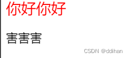
4.::first-line
::first-line伪元素允许选中元素的第一行,并为其应用样式。一般用于设置段落首行特殊样式,如缩进、颜色、字体等。
示例:
<p>你好你好<br>害害害</p>
p::first-line {
  font-size: 20px;
  color: red;
}
渲染效果为:
总结
CSS伪元素是CSS2引入的非常有用的语法机制,它可以让我们在HTML文档中实现更加灵活和多样化的样式效果。通过插入内容以及样式控制,我们可以让Web页面在视觉上更具吸引力和美感。
听课后补充
1.伪元素默认为行内元素,大部分情况需调整
2.浮动元素会在一行内显示并且元素顶部对齐,如果父级宽度装不下这些浮动的盒子,多出的盒子会另起一行对齐(之前写经常遇到这种问题)
3.新了解到了怪异盒子模型
4.新了解到圆形的制作方式:boder-radius 50%;
5.麻将作业总结(4.10日完成)
效果对比图:
写的有些冗长,在写的过程中逐渐发现了规律,从最开始的一个个写调试位置,到最后设置外边距,使得连在一起的八筒、九筒的圆形在一起设置,共同移动更加方便;也从只用正数调整位置,如top 10px;到使用负数反着调试位置都是我在写作业过程中慢慢调试出来的,如果没有这次作业我也不会进步这么多!
代码展示:
<!DOCTYPE html>
<html lang="en">
<head>
    <meta charset="UTF-8">
    <meta http-equiv="X-UA-Compatible" content="IE=edge">
    <meta name="viewport" content="width=device-width, initial-scale=1.0">
    <title>Document</title>
    <style>
        .bg{
            height: 745px;
            width: 565px;
            background-color: darkgreen;
        }
        .block{
            height: 220px;
            width: 160px;
            background-color: #fff;
            position: relative;
            border-top-left-radius: 10px;
            border-top-right-radius: 10px;
            border-bottom-left-radius: 10px;
            border-bottom-right-radius: 10px;
            position: relative;
            top: 10px;
            left: 10px;
            float: left;
            margin: 10px;

        }
        .circle1{
            border-radius: 50%;
            height: 88px;
            width: 88px;
            background-color: red;
            position: relative;
            top: 62px;
            left: 36.5px;
        }
        .cricle21{
            border-radius: 50%;
            height: 70px;
            width: 70px;
            background-color: blue;
            position: relative;
            top: 26px;
            left:45px;
        }
        .cricle22{
            border-radius: 50%;
            height: 70px;
            width: 70px;
            background-color: blue;
            position: relative;
            top: 47px;
            left: 45px;
        }
        .circle31{
            border-radius: 50%;
            height: 50px;
            width: 50px;
            background-color: blue;
            position: relative;
            top: 20px;
            left: 20px;
        }
        .circle32{
            border-radius: 50%;
            height: 50px;
            width: 50px;
            background-color: red;
            position: relative;
            top: 30px;
            left: 55px;
        }
        .circle33{
            border-radius: 50%;
            height: 50px;
            width: 50px;
            background-color: darkgreen;
            position: relative;
            top: 40px;
            left: 90px;
        }
        .circle41{
            border-radius: 50%;
            height: 50px;
            width: 50px;
            background-color: darkgreen;
            position: relative;
            top: 40px;
            left: 20px;
        }
        .circle42{
            border-radius: 50%;
            height: 50px;
            width: 50px;
            background-color: blue;
            position: absolute;
            top: 40px;
            left: 88px;
        }
        .circle43{
            border-radius: 50%;
            height: 50px;
            width: 50px;
            background-color: blue;
            position: relative;
            top: 70px;
            left: 20px;
        }
        .circle44{
            border-radius: 50%;
            height: 50px;
            width: 50px;
            background-color: darkgreen;
            position: absolute;
            top: 120px;
            left: 88px;
        }
        .circle51{
            border-radius: 50%;
            width: 50px;
            height: 50px;
            background-color: darkgreen;
            position: relative;
            top: 20px;
            left: 20px;
        }
        .circle52{
            border-radius: 50%;
            width: 50px;
            height: 50px;
            background-color: blue;
            position: absolute;
            top: 20px;
            left: 86px;
        }
        .circle53{
            border-radius: 50%;
            width: 50px;
            height: 50px;
            background-color: red;
            position: relative;
            top: 30px;
            left: 52px;
        }
        .circle54{
            border-radius: 50%;
            width: 50px;
            height: 50px;
            background-color: blue;
            position: relative;
            top: 40px;
            left: 20px;
        }
        .circle55{
            border-radius: 50%;
            width: 50px;
            height: 50px;
            background-color: darkgreen;
            position: absolute;
            top: 139.5px;
            left: 87px;
        }
        .circle61{
            border-radius: 50%;
            width: 45px;
            height: 45px;
            background-color: red;
            position: relative;
            top: 30px;
            left: 37px;
        }
        .circle62{
            border-radius: 50%;
            width: 45px;
            height: 45px;
            background-color: red;
            position: absolute;
            top: 30px;
            left: 82px;
        }
        .circle63{
            border-radius: 50%;
            width: 45px;
            height: 45px;
            background-color: darkgreen;
            position: relative;
            top: 55px;
            left: 82px;
        }
        .circle64{
            border-radius: 50%;
            width: 45px;
            height: 45px;
            background-color: darkgreen;
            position: relative;
            top: 55px;
            left: 82px;
        }
        .circle65{
            border-radius: 50%;
            width: 45px;
            height: 45px;
            background-color: darkgreen;
            position: absolute;
            top: 100px;
            left: 37px;
        }
        .circle66{
            border-radius: 50%;
            width: 45px;
            height: 45px;
            background-color: darkgreen;
            position: relative;
            top: 10px;
            left: 37px;
        }
        .circle71{
            border-radius: 50%;
            width: 43px;
            height: 43px;
            background-color: red;
            position: relative;
            top: 20px;
            left: 20px;
        }
        .circle72{
            border-radius: 50%;
            width: 43px;
            height: 43px;
            background-color: red;
            position: absolute;
            top: 30px;
            left: 62px;
        }
        .circle73{
            border-radius: 50%;
            width: 43px;
            height: 43px;
            background-color: red;
            position: absolute;
            top: 40px;
            left: 104px;
        }
        .circle74{
            border-radius: 50%;
            width: 43px;
            height: 43px;
            background-color: darkgreen;
            position: relative;
            top: 60px;
            left: 38px;
        }
        .circle75{
            border-radius: 50%;
            width: 43px;
            height: 43px;
            background-color: darkgreen;
            position: relative;
            top: 60px;
            left: 38px;
        }
        .circle76{
            border-radius: 50%;
            width: 43px;
            height: 43px;
            background-color: darkgreen;
            position: absolute;
            top: 103px;
            left: 81px;
        }
        .circle77{
            border-radius: 50%;
            width: 43px;
            height: 43px;
            background-color: darkgreen;
            position: relative;
            top: 17px;
            left: 81px;
        }
        .circle8l{
            border-radius: 50%;
            height: 40px;
            width: 40px;
            background-color: black;
            position: relative;
            top: 15px;
            left:33px;
            margin: 5px;
        }
        .circle8r{
            border-radius: 50%;
            height: 40px;
            width: 40px;
            background-color: black;
            position: relative;
            top: -164px;
            left: 80px;
            margin: 5px;
        }
        .circle91{
            border-radius: 50%;
            height: 43px;
            width: 43px;
            background-color: blue;
            position: relative;
            display: inline-block;
            top: 35px;
            left: 18px;
            margin: -2px;
        }
        .circle92{
            border-radius: 50%;
            height: 43px;
            width: 43px;
            background-color: red;
            position: relative;
            display: inline-block;
            top: 50px;
            left: 18px;
            margin: -2px;
        }
        .circle93{
            border-radius: 50%;
            height: 43px;
            width: 43px;
            background-color: darkgreen;
            position: relative;
            display: inline-block;
            top: 65px;
            left: 18px;
            margin: -2px;
        }
    </style>
</head>
<body>
    <div class="bg">
        <div class="block">
            <div class="circle1"></div>
        </div>
        <div class="block">
            <div class="cricle21"></div>
            <div class="cricle22"></div>
        </div>
        <div class="block">
            <div class="circle31"></div>
            <div class="circle32"></div>
            <div class="circle33"></div>
        </div>
        <div class="block">
            <div class="circle41"></div>
            <div class="circle42"></div>
            <div class="circle43"></div>
            <div class="circle44"></div>
        </div>
        <div class="block">
            <div class="circle51"></div>
            <div class="circle52"></div>
            <div class="circle53"></div>
            <div class="circle54"></div>
            <div class="circle55"></div>
        </div>
        <div class="block">
            <div class="circle61"></div>
            <div class="circle62"></div>
            <div class="circle63"></div>
            <div class="circle64"></div>
            <div class="circle65"></div>
            <div class="circle66"></div>
        </div>
        <div class="block">
            <div class="circle71"></div>
            <div class="circle72"></div>
            <div class="circle73"></div>
            <div class="circle74"></div>
            <div class="circle75"></div>
            <div class="circle76"></div>
            <div class="circle77"></div>
        </div>
        <div class="block">
            <div class="circle8l"></div>
            <div class="circle8l"></div>
            <div class="circle8l"></div>
            <div class="circle8l"></div>
            <div class="circle8r"></div>
            <div class="circle8r"></div>
            <div class="circle8r"></div>
            <div class="circle8r"></div>
        </div>
        <div class="block">
            <div class="circle91"></div>
            <div class="circle91"></div>
            <div class="circle91"></div>
            <div class="circle92"></div>
            <div class="circle92"></div>
            <div class="circle92"></div>
            <div class="circle93"></div>
            <div class="circle93"></div>
            <div class="circle93"></div>
        </div>
    </div>
</body>
</html>
写在最后
本文共9200字,希望对看到这个博客的同学有帮助,也希望看到的同学可以帮我批评指正,我要冲冲冲!写好博客,进一步完善前端技术!


 扫一扫
扫一扫


 385
385

 被折叠的 条评论
为什么被折叠?
被折叠的 条评论
为什么被折叠?
 到【灌水乐园】发言


