


目录
第一阶段:CSS基础理念
1:CSS是什么?—— 网页的“化妆师”
- 核心概念:CSS(层叠样式表)负责控制HTML元素的视觉效果(颜色、大小、位置等)。
- 核心规则:层叠(优先级)与继承(父元素样式传递子元素)。
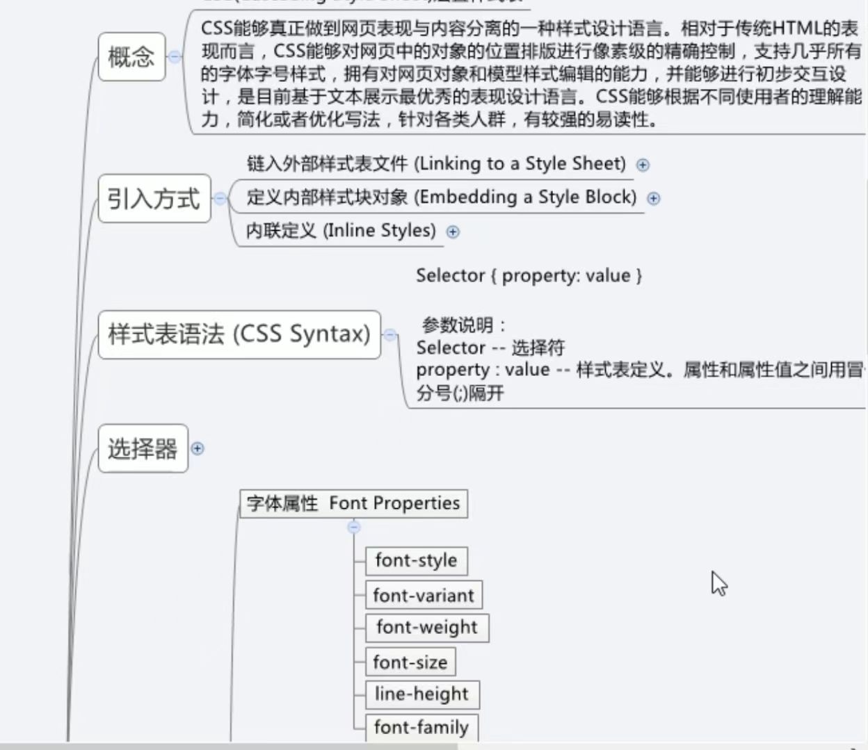
- 如何引入CSS:
<!-- 1. 内联样式(优先级最高,少用) --> <div style="color: red;">内容</div> <!-- 2. 内部样式表(适合小项目) --> <head> <style> body { background: #f0f0f0; } </style> </head> <!-- 3. 外部样式表(最推荐!) --> <head> <link rel="stylesheet" href="style.css"> </head> - CSS语法:
语法1
选择器{
样式属性键:样式属性值
Eg:color:red
样式属性键:样式属性值1 样式属性值2 样式属性值3····(样式属性值之间使用空格)
语法2:
style="样式属性键:样式属性值"
}
2:选择器——精准定位元素的“GPS”
/* 1. 标签选择器 */
p { color: blue; }

/* 2. 类选择器(最常用) */
.text-red { color: red; }
/* HTML: <p class="text-red">红色文字</p> */

/* 3. ID选择器(唯一性) */
#header { height: 80px; }
/* HTML: <div id="header"></div> */

/* 4. 后代选择器 */
nav a { text-decoration: none; } /* nav下的所有a标签 */

/* 5. 伪类选择器(交互状态) */
a:hover { color: orange; } /* 鼠标悬停时 */
2.1、 标签选择器
<!DOCTYPE html>
<html lang="en">
<head>
    <meta charset="UTF-8">
    <meta name="viewport" content="width=device-width, initial-scale=1.0">
    <title>标签选择器.html</title>
    <!--
        标签选择器
        标签名称{

        }
    -->

    <style type="text/css">
        a{
            color:aqua
        }
    </style>
</head>
<body>
    <a>
        This is my HTML.page
    </a>
</body>
</html>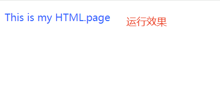
2.2、id选择器
- 注意:使用id时,要保证id的值在页面中是唯一的
- 例如:使用两个a标签,是第一个a标签的内容变黄色,而第二个不变
<!DOCTYPE html>
<html lang="en">
<head>
    <meta charset="UTF-8">
    <meta name="viewport" content="width=device-width, initial-scale=1.0">
    <title>id选择器.html</title>
    <!--
        id选择器
        #标签id{

        }
    -->

    <style type="text/css">
        #one{
            color:yellow

        }
    </style>
</head>
<body>
    <a id="one">
        This is my HTML.page
    </a><br>

    <a>
        This is my HTML.page
    </a>
</body>
</html>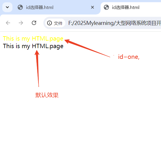
2.3、class选择器
- 实例:页面上有《a》和《p》标签,希望第一个a标签和p标签颜色变化
<!DOCTYPE html>
<html lang="en">
<head>
    <meta charset="UTF-8">
    <meta name="viewport" content="width=device-width, initial-scale=1.0">
    <title>class选择器.html</title>
    <!--
        class选择器
        .class标签名称{

        }
    -->

    <style type="text/css">
        .one{
            color:green

        }
    </style>
</head>
<body>
    <a class="one">  This is my HTML.page  </a><br>

    <a>This is my HTML.page </a>

    <p class="one">This is my HTML.page </p>

    <p>This is my HTML.page </p>


</body>
</html>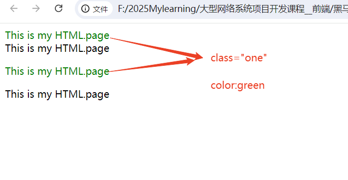
2.4、伪类选择器
<!DOCTYPE html>
<html lang="en">
<head>
    <meta charset="UTF-8">
    <meta name="viewport" content="width=device-width, initial-scale=1.0">
    <title>伪类选择器.html</title>
    <!--
        伪类选择器
        选择标签的某个状态,需要配合其他选择器来使用
        link:表示未访问过
        visited:表示访问过
        hover:表示悬浮
        active:表示激活,点击
    -->

    <style type="text/css">
        a:link{
            color:green

        }
        a:visited{
            color:aqua

        }
        a:hover{
            color:rgb(228, 131, 168)

        }
        a:active{
            color:rgb(196, 52, 8)

        }


    </style>
</head>
<body>
   <a href="类选择器.html">点我</a>


</body>
</html>
2.5、后代选择器
<!DOCTYPE html>
<html lang="en">
<head>
    <meta charset="UTF-8">
    <meta name="viewport" content="width=device-width, initial-scale=1.0">
    <title>后代选择器.html</title>


    <style type="text/css">
        #one,.two,font{
            color: #3366ff

        }
    </style>
</head>
<body>
    <p id="one">This is my HTML.page</p><br>
    <a class="two">This is my HTML.page</a><br>
    <font>This is my HTML.page</font>


</body>
</html>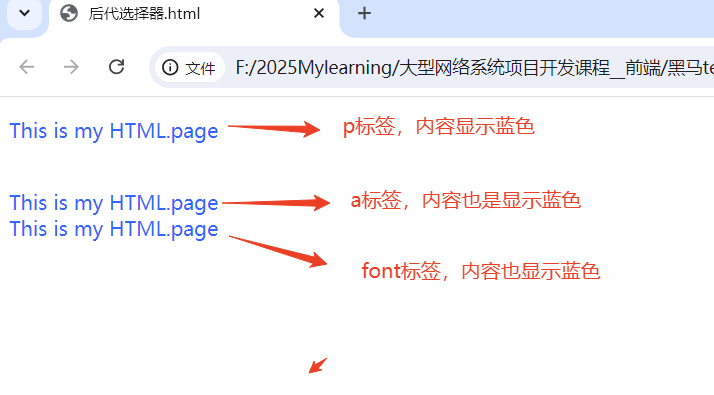
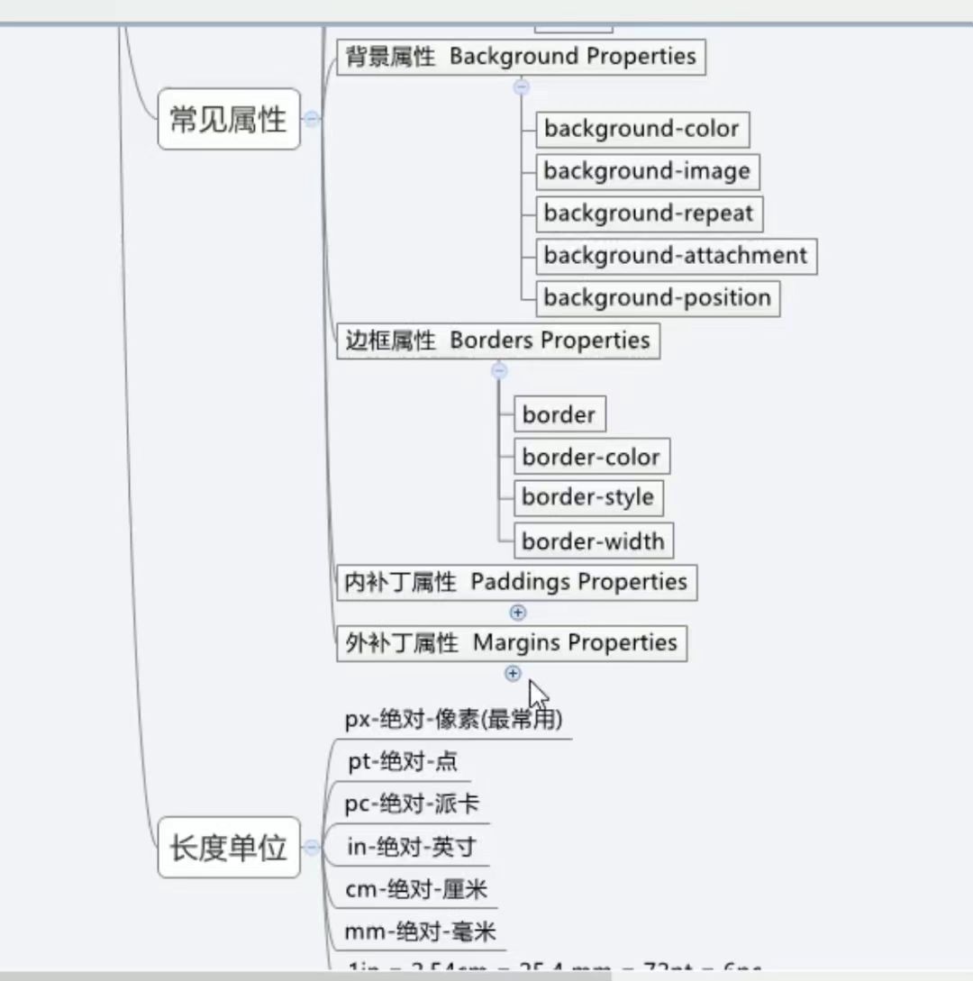
2.6、常见的css属性
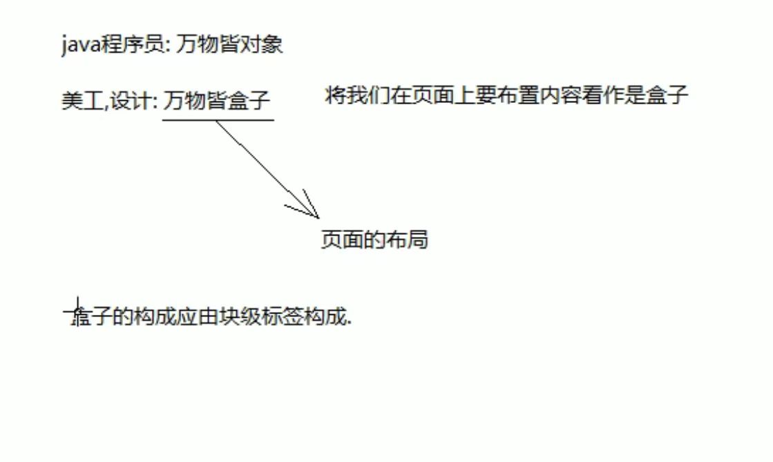
3:盒模型——所有元素的“生存空间”
块级标签:div => 占据的范围是一行
行内标签 : span => 占据的是行中的一部分
div {
  width: 200px;     /* 内容宽度 */
  height: 100px;    /* 内容高度 */
  padding: 20px;    /* 内边距(内容与边框的间距) */
  border: 2px solid black;  /* 边框 */
  margin: 30px;     /* 外边距(元素与其他元素的间距) */

  /* 重要!改变盒模型计算方式 */
  box-sizing: border-box; /* width包含padding和border */
}
4:常用样式属性
/* 文字样式 */
p {
  font-family: "Microsoft YaHei", sans-serif; /* 字体栈 */
  font-size: 16px;
  font-weight: bold;
  text-align: center; /* 左left/中center/右right */
  line-height: 1.6;   /* 行高(重要!) */
}

/* 颜色与背景 */
div {
  color: #ff0000;        /* 文字颜色 */
  background-color: rgba(0,0,0,0.5); /* 半透明黑色背景 */
  background-image: url("bg.jpg");
  background-size: cover;
}
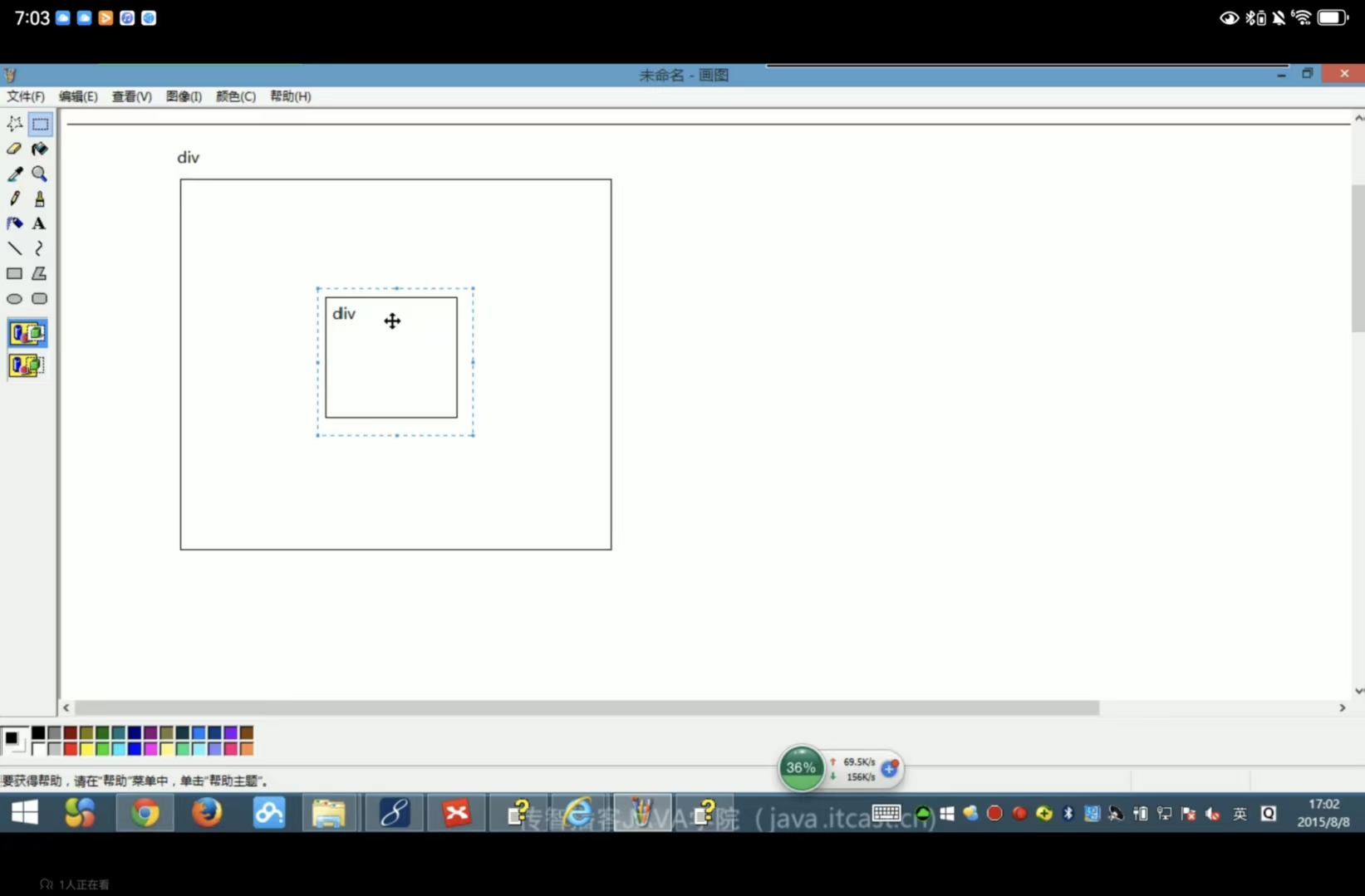
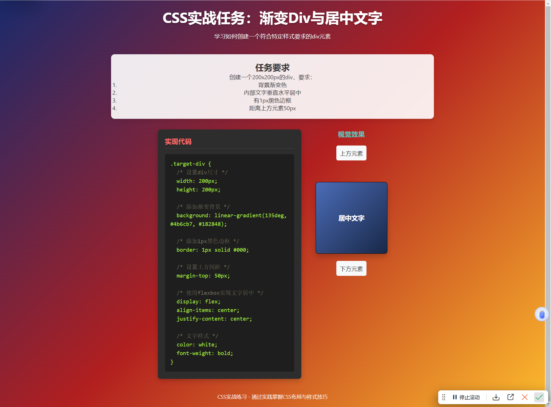
- 实战小任务
创建一个200x200px的div,要求:
① 背景渐变色 ② 内部文字垂直水平居中
③ 有1px黑色边框 ④ 距离上方元素50px
- 最终实现代码
<!DOCTYPE html>
<html lang="zh-CN">
<head>
    <meta charset="UTF-8">
    <meta name="viewport" content="width=device-width, initial-scale=1.0">
    <title>CSS实战任务:渐变Div与居中文字</title>
    <style>
        /* 重置默认样式以确保一致性 */
        * {
            margin: 0;
            padding: 0;
            box-sizing: border-box;
        }

        body {
            font-family: 'Segoe UI', Tahoma, Geneva, Verdana, sans-serif;
            background: linear-gradient(135deg, #1a2a6c, #b21f1f, #fdbb2d);
            min-height: 100vh;
            display: flex;
            flex-direction: column;
            align-items: center;
            justify-content: center;
            padding: 20px;
            color: #333;
        }

        .container {
            max-width: 900px;
            width: 100%;
            text-align: center;
        }

        header {
            margin-bottom: 40px;
            color: white;
            text-shadow: 0 2px 4px rgba(0,0,0,0.3);
        }

        h1 {
            font-size: 2.5rem;
            margin-bottom: 15px;
        }

        .instructions {
            background: rgba(255, 255, 255, 0.9);
            border-radius: 10px;
            padding: 20px;
            margin-bottom: 30px;
            box-shadow: 0 5px 15px rgba(0,0,0,0.1);
        }

        .task-container {
            display: flex;
            justify-content: center;
            gap: 40px;
            flex-wrap: wrap;
        }

        /* 代码演示区域样式 */
        .code-demo {
            background: #2d2d2d;
            color: #f8f8f2;
            border-radius: 8px;
            padding: 20px;
            width: 400px;
            box-shadow: 0 5px 15px rgba(0,0,0,0.2);
            text-align: left;
        }

        .code-demo h3 {
            color: #ff6b6b;
            margin-bottom: 15px;
            border-bottom: 1px solid #444;
            padding-bottom: 8px;
        }

        pre {
            background: #1e1e1e;
            padding: 15px;
            border-radius: 5px;
            overflow-x: auto;
            font-family: 'Consolas', 'Monaco', monospace;
            line-height: 1.5;
            white-space: pre-wrap;
        }

        .css-code {
            color: #a5e844;
        }

        .comment {
            color: #75715e;
        }

        /* 任务要求实现的目标div */
        .target-div {
            /* 设置div尺寸为200x200像素 */
            width: 200px;
            height: 200px;

            /* 添加渐变背景 - 从左上到右下的蓝紫色渐变 */
            background: linear-gradient(135deg, #4b6cb7, #182848);

            /* 添加1px黑色实线边框 */
            border: 1px solid #000;

            /* 设置距离上方元素50px的间距 */
            margin-top: 50px;

            /* 使用flexbox实现内部文字垂直水平居中 */
            display: flex;
            align-items: center;
            justify-content: center;

            /* 文字样式 */
            color: white;
            font-weight: bold;
            font-size: 18px;

            /* 添加一些圆角使视觉效果更柔和 */
            border-radius: 8px;

            /* 添加阴影增强立体感 */
            box-shadow: 0 8px 16px rgba(0, 0, 0, 0.2);
        }

        .visual-output {
            display: flex;
            flex-direction: column;
            align-items: center;
        }

        .visual-output h3 {
            color: #4ecdc4;
            margin-bottom: 20px;
        }

        footer {
            margin-top: 40px;
            color: white;
            text-align: center;
            font-size: 0.9rem;
        }
    </style>
</head>
<body>
    <div class="container">
        <header>
            <h1>CSS实战任务:渐变Div与居中文字</h1>
            <p>学习如何创建一个符合特定样式要求的div元素</p>
        </header>

        <div class="instructions">
            <h2>任务要求</h2>
            <p>创建一个200x200px的div,要求:</p>
            <ol>
                <li>背景渐变色</li>
                <li>内部文字垂直水平居中</li>
                <li>有1px黑色边框</li>
                <li>距离上方元素50px</li>
            </ol>
        </div>

        <div class="task-container">
            <div class="code-demo">
                <h3>实现代码</h3>
                <pre><span class="css-code">.target-div {
  <span class="comment">/* 设置div尺寸 */</span>
  width: 200px;
  height: 200px;

  <span class="comment">/* 添加渐变背景 */</span>
  background: linear-gradient(135deg, #4b6cb7, #182848);

  <span class="comment">/* 添加1px黑色边框 */</span>
  border: 1px solid #000;

  <span class="comment">/* 设置上方间距 */</span>
  margin-top: 50px;

  <span class="comment">/* 使用flexbox实现文字居中 */</span>
  display: flex;
  align-items: center;
  justify-content: center;

  <span class="comment">/* 文字样式 */</span>
  color: white;
  font-weight: bold;
}</span></pre>
            </div>

            <div class="visual-output">
                <h3>视觉效果</h3>
                <!-- 这是上方的元素,用于演示margin-top的效果 -->
                <div style="background: #f8f9fa; padding: 10px; border-radius: 5px; margin-bottom: 10px;">
                    上方元素
                </div>

                <!-- 这是我们要创建的目标div -->
                <div class="target-div">
                    居中文字
                </div>

                <div style="margin-top: 20px; background: #f8f9fa; padding: 10px; border-radius: 5px;">
                    下方元素
                </div>
            </div>
        </div>

        <footer>
            <p>CSS实战练习 - 通过实践掌握CSS布局与样式技巧</p>
        </footer>
    </div>
</body>
</html>
2.最终实现效果
3、代码解析,
设置Div尺寸
/* 设置div尺寸为200x200像素 */
width: 200px;
height: 200px;
创建渐变背景
/* 添加渐变背景 - 从左上到右下的蓝紫色渐变 */
background: linear-gradient(135deg, #4b6cb7, #182848);
linear-gradient()函数创建线性渐变135deg设置渐变方向为从左上到右下- 可以添加多个颜色值创建更复杂的渐变
添加边框
/* 添加1px黑色实线边框 */
border: 1px solid #000;
border是边框的简写属性1px设置边框宽度solid设置边框样式为实线#000设置边框颜色为黑色
设置上方间距
/* 设置距离上方元素50px的间距 */
margin-top: 50px;
argin-top控制元素上方的外边距- 这会在此div和它上方的元素之间创建50px的空间
实现文字居中
/* 使用flexbox实现内部文字垂直水平居中 */
display: flex;
align-items: center;
justify-content: center;
display: flex将元素设置为Flex容器align-items: center垂直居中子元素justify-content: center水平居中子元素
第三阶段:布局艺术
5:传统布局方案
/* 1. 浮动布局(传统方案) */
.left { float: left; width: 70%; }
.right { float: right; width: 28%; }
.clearfix::after { /* 清除浮动 */
  content: "";
  display: block;
  clear: both;
}

/* 2. 定位布局 */
.parent { position: relative; }
.child {
  position: absolute;
  top: 50%;
  left: 50%;
  transform: translate(-50%, -50%); /* 经典居中方案 */
}
6:Flex布局
.container {
  display: flex;
  justify-content: center;   /* 主轴对齐方式 */
  align-items: center;       /* 交叉轴对齐方式 */
  flex-wrap: wrap;           /* 换行 */
}

.item {
  flex: 1;                   /* 弹性比例 */
  align-self: flex-start;    /* 单个项目对齐 */
}
7:Grid布局(二维布局之王)
.container {
  display: grid;
  grid-template-columns: 1fr 2fr 1fr; /* 3列,中间列是两侧2倍 */
  grid-gap: 20px;           /* 间距 */
}

.item {
  grid-column: 1 / 3;        /* 从第1列到第3列 */
  grid-row: 1;               /* 在第1行 */
}
实战任务3: 用Flex布局实现: 一个水平居中的容器,内部有3个等宽按钮 用Grid布局实现: 3x3的九宫格布局,每个格子100x100px
最终实现代码
<!DOCTYPE html>
<html lang="zh-CN">
<head>
    <meta charset="UTF-8">
    <meta name="viewport" content="width=device-width, initial-scale=1.0">
    <title>Flex与Grid布局实战</title>
    <style>
        /* 全局样式重置 */
        * {
            margin: 0;
            padding: 0;
            box-sizing: border-box;
        }

        body {
            font-family: 'Segoe UI', Tahoma, Geneva, Verdana, sans-serif;
            background: linear-gradient(135deg, #1a2a6c, #b21f1f, #fdbb2d);
            min-height: 100vh;
            display: flex;
            flex-direction: column;
            align-items: center;
            padding: 40px 20px;
            color: #fff;
        }

        .container {
            width: 100%;
            max-width: 1000px;
            margin: 0 auto;
        }

        header {
            text-align: center;
            margin-bottom: 40px;
            text-shadow: 0 2px 4px rgba(0,0,0,0.3);
        }

        h1 {
            font-size: 2.5rem;
            margin-bottom: 15px;
        }

        .task-section {
            background: rgba(255, 255, 255, 0.9);
            border-radius: 12px;
            padding: 25px;
            margin-bottom: 40px;
            box-shadow: 0 8px 25px rgba(0,0,0,0.15);
            color: #333;
        }

        h2 {
            color: #1a2a6c;
            margin-bottom: 20px;
            padding-bottom: 10px;
            border-bottom: 2px solid #ddd;
        }

        h3 {
            color: #b21f1f;
            margin: 20px 0 15px;
        }

        /* Flex布局任务样式 */
        .flex-container {
            /* 设置为flex容器 */
            display: flex;
            /* 主轴(水平方向)上居中 */
            justify-content: center;
            /* 设置容器宽度为80% */
            width: 80%;
            /* 水平居中容器 */
            margin: 0 auto;
            /* 添加内边距 */
            padding: 20px;
            /* 添加背景色 */
            background-color: #f8f9fa;
            /* 添加圆角 */
            border-radius: 10px;
            /* 添加阴影效果 */
            box-shadow: 0 4px 12px rgba(0,0,0,0.1);
        }

        .flex-btn {
            /* 设置按钮弹性增长,使它们等宽 */
            flex: 1;
            /* 设置内边距 */
            padding: 12px 0;
            /* 设置字体大小 */
            font-size: 16px;
            /* 设置字体粗细 */
            font-weight: 600;
            /* 设置背景颜色 */
            background: linear-gradient(to right, #4b6cb7, #182848);
            /* 设置文字颜色 */
            color: white;
            /* 移除按钮默认边框 */
            border: none;
            /* 添加圆角 */
            border-radius: 6px;
            /* 添加光标指针样式 */
            cursor: pointer;
            /* 添加过渡效果 */
            transition: all 0.3s ease;
            /* 设置最大宽度,避免在大屏幕上过宽 */
            max-width: 150px;
            /* 添加按钮间距 */
            margin: 0 8px;
        }

        .flex-btn:hover {
            /* 鼠标悬停时变换背景 */
            background: linear-gradient(to right, #182848, #4b6cb7);
            /* 添加悬停时的阴影效果 */
            box-shadow: 0 6px 12px rgba(0,0,0,0.15);
            /* 轻微向上移动 */
            transform: translateY(-2px);
        }

        /* Grid布局任务样式 */
        .grid-container {
            /* 设置为grid容器 */
            display: grid;
            /* 创建3列,每列100px */
            grid-template-columns: 100px 100px 100px;
            /* 创建3行,每行100px */
            grid-template-rows: 100px 100px 100px;
            /* 设置网格项之间的间隙 */
            gap: 10px;
            /* 水平居中容器 */
            margin: 0 auto;
            /* 添加内边距 */
            padding: 20px;
            /* 添加背景色 */
            background-color: #f8f9fa;
            /* 添加圆角 */
            border-radius: 10px;
            /* 添加阴影效果 */
            box-shadow: 0 4px 12px rgba(0,0,0,0.1);
            /* 设置容器宽度以适应内容 */
            width: fit-content;
        }

        .grid-item {
            /* 设置背景颜色 */
            background: linear-gradient(45deg, #fdbb2d, #b21f1f);
            /* 添加圆角 */
            border-radius: 8px;
            /* 设置文字颜色 */
            color: white;
            /* 设置字体大小 */
            font-size: 24px;
            /* 设置字体粗细 */
            font-weight: bold;
            /* 使用flex让数字在格子中居中 */
            display: flex;
            /* 水平居中 */
            justify-content: center;
            /* 垂直居中 */
            align-items: center;
            /* 添加阴影效果 */
            box-shadow: 0 4px 8px rgba(0,0,0,0.1);
            /* 添加过渡效果 */
            transition: all 0.3s ease;
        }

        .grid-item:hover {
            /* 鼠标悬停时变换背景 */
            background: linear-gradient(45deg, #b21f1f, #fdbb2d);
            /* 添加悬停时的阴影效果 */
            box-shadow: 0 6px 12px rgba(0,0,0,0.2);
            /* 旋转效果 */
            transform: rotate(5deg);
        }

        .code-container {
            background: #2d2d2d;
            color: #f8f8f2;
            border-radius: 8px;
            padding: 20px;
            margin-top: 25px;
            box-shadow: 0 5px 15px rgba(0,0,0,0.2);
        }

        pre {
            background: #1e1e1e;
            padding: 15px;
            border-radius: 5px;
            overflow-x: auto;
            font-family: 'Consolas', 'Monaco', monospace;
            line-height: 1.5;
            white-space: pre-wrap;
        }

        .css-code {
            color: #a5e844;
        }

        .comment {
            color: #75715e;
        }

        .flex-example, .grid-example {
            display: flex;
            flex-direction: column;
            align-items: center;
            margin: 25px 0;
        }

        footer {
            margin-top: 40px;
            color: white;
            text-align: center;
            font-size: 0.9rem;
        }
    </style>
</head>
<body>
    <div class="container">
        <header>
            <h1>Flex与Grid布局实战</h1>
            <p>掌握现代CSS布局的强大技术</p>
        </header>

        <div class="task-section">
            <h2>实战任务</h2>
            <p>使用Flex布局实现水平居中的等宽按钮,使用Grid布局实现3×3九宫格。</p>

            <div class="flex-example">
                <h3>Flex布局:水平居中的等宽按钮</h3>
                <div class="flex-container">
                    <button class="flex-btn">首页</button>
                    <button class="flex-btn">产品</button>
                    <button class="flex-btn">联系</button>
                </div>

                <div class="code-container">
                    <h3>Flex布局代码实现</h3>
                    <pre><span class="css-code"><span class="comment">/* Flex容器样式 */</span>
.flex-container {
  display: flex;           <span class="comment">/* 设置为flex容器 */</span>
  justify-content: center; <span class="comment">/* 主轴(水平方向)上居中 */</span>
  width: 80%;             <span class="comment">/* 设置容器宽度 */</span>
  margin: 0 auto;         <span class="comment">/* 水平居中容器 */</span>
}

<span class="comment">/* Flex项目(按钮)样式 */</span>
.flex-btn {
  flex: 1;                <span class="comment">/* 使按钮等宽 */</span>
  max-width: 150px;       <span class="comment">/* 设置最大宽度 */</span>
  margin: 0 8px;          <span class="comment">/* 添加按钮间距 */</span>
}</span></pre>
                </div>
            </div>

            <div class="grid-example">
                <h3>Grid布局:3×3九宫格(每个格子100×100px)</h3>
                <div class="grid-container">
                    <div class="grid-item">1</div>
                    <div class="grid-item">2</div>
                    <div class="grid-item">3</div>
                    <div class="grid-item">4</div>
                    <div class="grid-item">5</div>
                    <div class="grid-item">6</div>
                    <div class="grid-item">7</div>
                    <div class="grid-item">8</div>
                    <div class="grid-item">9</div>
                </div>

                <div class="code-container">
                    <h3>Grid布局代码实现</h3>
                    <pre><span class="css-code"><span class="comment">/* Grid容器样式 */</span>
.grid-container {
  display: grid;                    <span class="comment">/* 设置为grid容器 */</span>
  grid-template-columns: 100px 100px 100px; <span class="comment">/* 创建3列,每列100px */</span>
  grid-template-rows: 100px 100px 100px;    <span class="comment">/* 创建3行,每行100px */</span>
  gap: 10px;                        <span class="comment">/* 设置网格项之间的间隙 */</span>
  margin: 0 auto;                   <span class="comment">/* 水平居中容器 */</span>
}

<span class="comment">/* Grid项目(格子)样式 */</span>
.grid-item {
  width: 100px;          <span class="comment">/* 设置宽度 */</span>
  height: 100px;         <span class="comment">/* 设置高度 */</span>
  display: flex;          <span class="comment">/* 使用flex让内容居中 */</span>
  justify-content: center; <span class="comment">/* 水平居中内容 */</span>
  align-items: center;    <span class="comment">/* 垂直居中内容 */</span>
}</span></pre>
                </div>
            </div>
        </div>

        <footer>
            <p>CSS布局实战练习 - 掌握Flex和Grid布局技术</p>
        </footer>
    </div>
</body>
</html>
实现效果

Flex布局实现步骤
- 创建Flex容器
   .flex-container {
     display: flex;           /* 设置为flex容器 */
     justify-content: center; /* 主轴(水平方向)上居中 */
     width: 80%;             /* 设置容器宽度 */
     margin: 0 auto;         /* 水平居中容器 */
   }
2、设置Flex项目(按钮)
   .flex-btn {
     flex: 1;                /* 使按钮等宽 */
     max-width: 150px;       /* 设置最大宽度 */
     margin: 0 8px;          /* 添加按钮间距 */
   }
Grid布局实现步骤
- 创建Grid容器
   .grid-container {
     display: grid;                    /* 设置为grid容器 */
     grid-template-columns: 100px 100px 100px; /* 创建3列,每列100px */
     grid-template-rows: 100px 100px 100px;    /* 创建3行,每行100px */
     gap: 10px;                        /* 设置网格项之间的间隙 */
     margin: 0 auto;                   /* 水平居中容器 */
   }
2设置Grid项目(格子)
   .grid-item {
     width: 100px;          /* 设置宽度 */
     height: 100px;         /* 设置高度 */
     display: flex;          /* 使用flex让内容居中 */
     justify-content: center; /* 水平居中内容 */
     align-items: center;    /* 垂直居中内容 */
   }
Flex布局要点
display: flex创建一个flex容器justify-content控制主轴(默认水平方向)对齐方式flex: 1使flex项目等分可用空间Grid布局要点
display: grid创建一个grid容器grid-template-columns定义列数和列宽grid-template-rows定义行数和行高gap设置网格项之间的间距
区别
| 特性 | Flexbox (一维) | Grid (二维) |
|---|---|---|
| 维度 | 一次处理一行或一列 | 同时处理行和列 |
| 核心思想 | 内容流、弹性 | 预先定义的结构、精准放置 |
| 控制方式 | 在主轴和交叉轴上对齐、分布内容 | 将项目放置到明确定义的网格单元格中 |
| 最适合 | 小型组件、线性布局、内容动态的布局 | 大型布局、整体页面架构、需要精确控制的布局 |
第四阶段:高级技巧与响应式
8:响应式设计
/* 1. 媒体查询(断点) */
@media (max-width: 768px) { /* 平板 */
  .container { flex-direction: column; }
}

@media (max-width: 480px) { /* 手机 */
  .item { width: 100%; }
}

/* 2. 响应式单位 */
div {
  width: 80vw;    /* 视口宽度的80% */
  height: 50vh;   /* 视口高度的50% */
  font-size: 2rem;/* 基于根元素字体大小 */
}
9:炫酷特效
/* 1. 过渡动画 */
.button {
  transition: all 0.3s ease;
}
.button:hover {
  transform: scale(1.1);
  box-shadow: 0 5px 15px rgba(0,0,0,0.3);
}

/* 2. 关键帧动画 */
@keyframes slideIn {
  from { transform: translateX(-100%); }
  to { transform: translateX(0); }
}

.element {
  animation: slideIn 0.5s ease forwards;
}


 扫一扫
扫一扫


 311
311

 被折叠的 条评论
为什么被折叠?
被折叠的 条评论
为什么被折叠?
 到【灌水乐园】发言


