


<!DOCTYPE html>
<html lang="en">
<head>
    <meta charset="UTF-8">
    <meta name="viewport" content="width=device-width, initial-scale=1.0">
    <title>Document</title>
    <link rel="stylesheet" href="./1.css">
</head>
<body>
    <div class="demoOne">
        <div class="boxOne">1</div>
        <div class="boxTwo">2</div>
        <div class="boxThree">3</div>
     </div>
</body>
</html>
.demoOne{
height: 600;
width: 600;
}
.boxOne{
width: 100px;
height: 100px;
background-color: red;
}
.boxTwo{
width: 100px;
height: 100px;
background-color: yellow;
}
.boxThree{
width: 100px;
height: 100px;
background-color: green;
}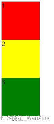 当输入上述代码时网页会呈现这样三个盒子
那么怎么实现让它们在同一行呢?
这时就要用到flex了
.demoOne{
    height: 600;
    width: 600;
    display: flex;
}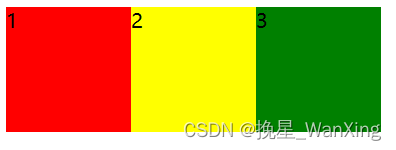
这样这三个盒子就在同一行了


 9372
9372


 被折叠的 条评论
为什么被折叠?
被折叠的 条评论
为什么被折叠?
 到【灌水乐园】发言


