


展现多个系列的数据,一般习惯使用柱状图或折线图.本文使用个人比较喜爱的Pyecharts库,绘制呈现多个系列数据的普通折现图(line chart)、堆叠图(stack chart)、面积堆叠图(stack area chart).
环境准备
首先安装Pyecharts,我使用的是最新版本:1.9.1,团队介绍会在明年发布2.0版本.
其次,导入以下模块:
import pyecharts.options as opts
from pyecharts.charts import Line
from pyecharts.commons.utils import JsCode
options和Line都比较常见,JsCode是Pyecharts直接与echarts转化的中间对象,我比较常用它来创建颜色渐变的效果,让图形更富有表现力.
数据
为了书写方便,数据选取尽量简单,如下一个x轴,三个系列:
x_data = ["周一", "周二", "周三", "周四", "周五", "周六", "周日"]
y_data1 = [140, 232, 101, 264, 90, 340, 250]
y_data2 = [120, 282, 111, 234, 220, 340, 310]
y_data3 = [320, 132, 201, 334, 190, 130, 220]
普通折现图
我们先来看看绘制结果,如下所示,线条堆叠现象严重,不够清晰.
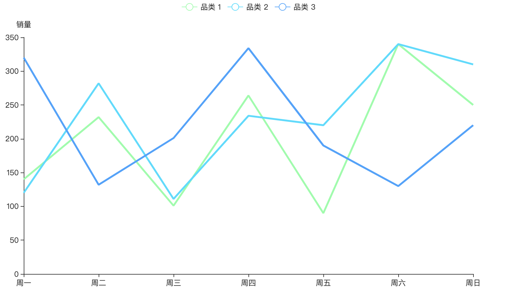
普通折线图
堆叠折线图
为了解决线条堆叠问题,就有了堆叠折线图,有意思的是,堆叠折线图并不堆叠.
如下所示,三个系列折线图完全被分离开:
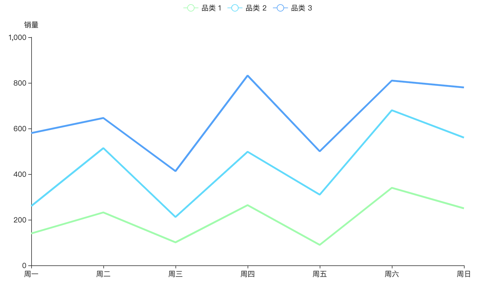
堆叠折线图
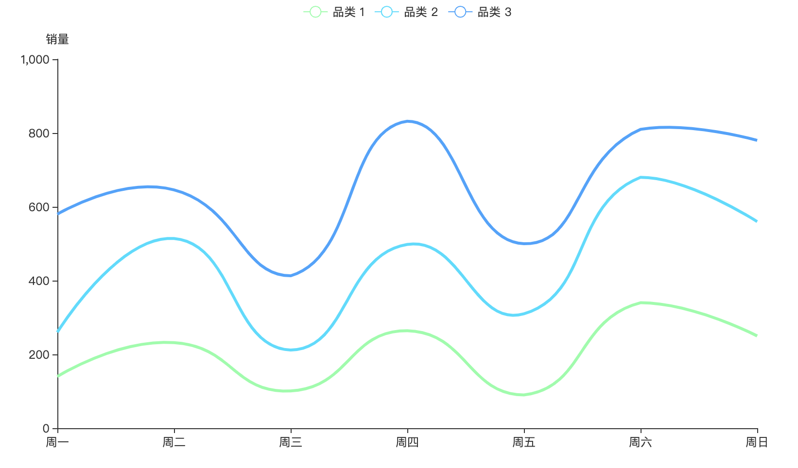
上面折线图,点与点之间的过渡是通过线段连接,其实还可以通过平滑的曲线过渡.
这在Pyecharts中,只需设置is_smooth参数为True就行:
.add_yaxis(
        y_axis=y_data1,
        is_smooth=True
        )
这样就绘制出了平滑过渡的折线图:
面积堆叠图
先看下我绘制的面积堆叠图,可以看到它与上面平滑过渡的折线图的相比,填充了颜色,一下就能吸引我们的眼球.
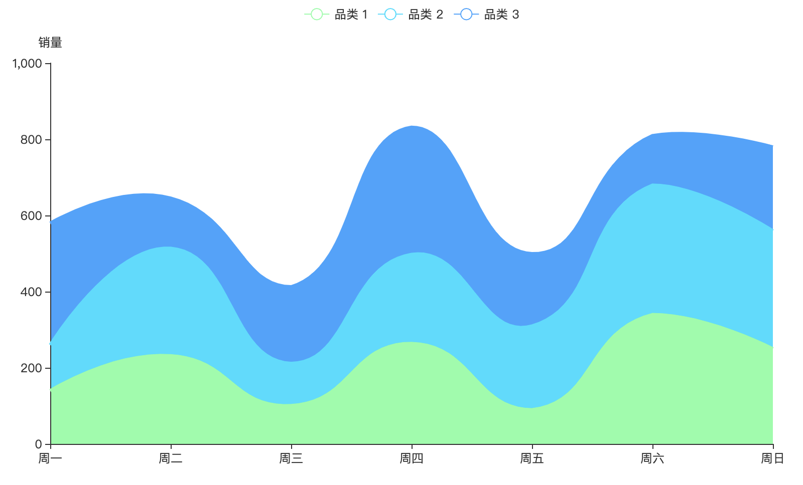
面积堆叠图
这是怎么做到的?其实,相比于折线图,它只是配置上了areastyle_opts,非常方便!
areastyle_opts=opts.AreaStyleOpts(opacity=1)
当然,上面填充的颜色没有渐变效果,要想添加也非常简单.
通过上面说到的JsCode,很容易添加上,并且代码基本是固定的,复用性强.
最终实现的颜色渐变效果如下:
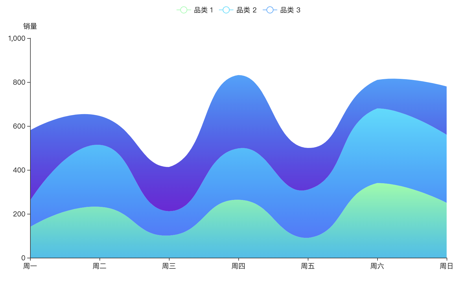
面积堆叠图
完整代码
Pyecharts绘制

下面是完整代码

# encoding: utf-8

"""

@file: area_graph.py

@desc:

@author: zhenguo

@time: 2021/12/12

"""

import pyecharts.options as opts

from pyecharts.charts import Line

from pyecharts.commons.utils import JsCode


x_data = ["周一", "周二", "周三", "周四", "周五", "周六", "周日"]

y_data1 = [140, 232, 101, 264, 90, 340, 250]

y_data2 = [120, 282, 111, 234, 220, 340, 310]

y_data3 = [320, 132, 201, 334, 190, 130, 220]


(

    Line()

        .add_xaxis(xaxis_data=x_data)

        .add_yaxis(

        series_name="品类 1",

        color='#80FFA5',

        y_axis=y_data1,

        is_smooth=True,

        stack='总量',

        is_symbol_show=False,

        label_opts=opts.LabelOpts(is_show=False),

        linestyle_opts=opts.LineStyleOpts(width=0),

        areastyle_opts=opts.AreaStyleOpts(opacity=1,

                                          color=JsCode(

                                              """new echarts.graphic.LinearGradient(0, 0, 0, 1, [

                                              {

                                                offset: 0,

                                                color: 'rgba(128, 255, 165)'

                                              },

                                              {

                                                offset: 1,

                                                color: 'rgba(1, 191, 236)'

                                              }

                                            ])"""

                                          )

                                          ),

    ).add_yaxis(

        series_name="品类 2",

        color='#00DDFF',

        y_axis=y_data2,

        is_smooth=True,

        stack='总量',

        is_symbol_show=False,

        label_opts=opts.LabelOpts(is_show=False),

        linestyle_opts=opts.LineStyleOpts(width=0),

        areastyle_opts=opts.AreaStyleOpts(opacity=1,

                                          color=JsCode(

                                              """new echarts.graphic.LinearGradient(0, 0, 0, 1, [

                                              {

                                                offset: 0,

                                                color: 'rgba(0, 221, 255)'

                                              },

                                              {

                                                offset: 1,

                                                color: 'rgba(77, 119, 255)'

                                              }

                                            ])"""

                                          )

                                          ),

    ).add_yaxis(

        series_name="品类 3",

        color='#37A2FF',

        y_axis=y_data3,

        is_smooth=True,

        stack='总量',

        is_symbol_show=False,

        label_opts=opts.LabelOpts(is_show=False, position="top"),

        linestyle_opts=opts.LineStyleOpts(width=0),

        areastyle_opts=opts.AreaStyleOpts(opacity=1,

                                          color=JsCode(

                                              """new echarts.graphic.LinearGradient(0, 0, 0, 1, [

                                              {

                                                offset: 0,

                                                color: 'rgba(55, 162, 255)'

                                              },

                                              {

                                                offset: 1,

                                                color: 'rgba(116, 21, 219)'

                                              }

                                            ])"""

                                          )

                                          ),

    ).set_global_opts(

        tooltip_opts=opts.TooltipOpts(is_show=True,

                                      trigger='axis',

                                      axis_pointer_type='cross'),

        yaxis_opts=opts.AxisOpts(type_="value", name="销量"),

        xaxis_opts=opts.AxisOpts(boundary_gap=False, type_="category"),

    )

        .render("stacked_area_chart.html")

)
- 感谢大家的关注和支持!想了解更多Python编程精彩知识内容,请关注我的 微信公众号:python小胡子,有最新最前沿的的python知识和人工智能AI与大家共享,同时,如果你觉得这篇文章对你有帮助,不妨点个赞,并点击关注.动动你发财的手,万分感谢!!!
- 原创文章不易,求点赞、在看、转发或留言,这样对我创作下一个精美文章会有莫大的动力!


 7913
7913


 被折叠的 条评论
为什么被折叠?
被折叠的 条评论
为什么被折叠?
 到【灌水乐园】发言


