


目录
一.了解无人售货机数据情况
1.简介
目前,无人售货机后台管理系统积累了大量用户的购买记录。
在无人售货机信息表数据的预处理与建模完成后,从无人售货机销售的整体情况、销售情况、库存情况和用户情况4个方向对预处理和建模后的数据进行可视化展现与分析。
我们有4个分析方向:1.销售情况总分析,销售分析,库存分析,用户分析
2.可视化使用到的数据表如表所示。
二.可视化展示销售情况总分析
1.实现代码:
// 销售金额 & 订单量 & 毛利润 & 售货机数量 & 购买用户数
$.get("data/无人售货机各特征数据.json").done(function (data) {
    //data = JSON.parse(data);
    saleT('saleM', '销售金额', 0, data.销售金额[0], data.销售金额[1], data.销售金额[2], '','#1779d9','rgba(23,121,217,0.6)');
    saleT('orderQ', '订单量', 0, data.订单量[0], data.订单量[1], data.订单量[2], '','#30b761','rgba(48,183,97,0.5)');
    saleT('grossM', '毛利润', 0, data.毛利润[0], data.毛利润[1], data.毛利润[2], '','#d04a4b','rgba(208,74,75,0.5)');
    saleT('discount', '折扣额', 0, data.折扣额[0], data.折扣额[1], data.折扣额[2], '千','#ca841e','rgba(202,132,30,0.5)');
    saleT('unitP', '客单价', 0, data.客单价[0], data.客单价[1], data.客单价[2], '','#00a7c2','rgba(0,167,194,0.5)');
});
/*
 *id: chart容器id;
 *title: 仪表盘名称
 *min: 最小值
 *max: 最大值
 *val: 当前实际值
 *tag: 目标值
 *unit: 单位符号
 *color1: 主轴颜色
 */

var saleM = echarts.init(document.getElementById("saleM"));
var orderQ = echarts.init(document.getElementById("orderQ"));
var grossM = echarts.init(document.getElementById("grossM"));
var discount = echarts.init(document.getElementById("discount"));
var unitP = echarts.init(document.getElementById("unitP"));

function saleT(id, title, min, max, val, tag, unit, color1,  color2) {

    var myChart = echarts.init(document.getElementById(id));

    option = {
        tooltip: {
            confine:true,
            trigger: 'item',
            formatter:function(data){
                hbl = (data.value/tag).toFixed(2);
                return title + ":" + data.value + '<br/>' + name + ":" + hbl
            }
        },
        series: [{
            startAngle: 180,
            endAngle: 0,
            splitNumber: 1,
            name: title,
            type: 'gauge',
            radius: '100%',
            axisLine: {
                lineStyle: {
                    color: [
                        [0.25, '#1779da'],
                        [0.5, '#1779da'],
                        [1, '#ddd']
                    ],
                    width: 20
                }
            },
            axisTick: { show: false },
            axisLabel: {
                distance:0,
                width:30,
                height:24,
                lineHeight:24,
                padding:[25,-30,0],
                color:'rgba(255,255,255,0.5)',
                formatter: function (value) {
                    if(unit=='千'){
                        return (value/1000).toFixed(1) + ' ' + unit;
                    }else if(unit=='万'){
                        return (value/10000).toFixed(1) + ' ' + unit;
                    }else{
                        return value;
                    }
                }
            },
            splitLine: { show: false },
            pointer: { show:false, width: 3 },
            title: {
                offsetCenter: [0, '92%'],
                color:'rgba(255,255,255,0.7)'
            },
            detail: {
                offsetCenter: [0, '-10%'],
                formatter: function(value){
                    value1 = value / tag;
                    return '{a|' + value.toFixed(1) + '}';
                },
                rich: {
                    a: {
                        fontSize:'16',
                        fontWeight:'bold'
                    }
                }
            },
            data: [{}]
        }]
    };
    option.series[0].min = min;
    option.series[0].max = max;
    option.series[0].data[0].value = val;
    option.series[0].axisLine.lineStyle.color[0][0] = (tag - min) / (max - min);
    option.series[0].axisLine.lineStyle.color[0][1] = color2;
    option.series[0].axisLine.lineStyle.color[1][0] = (val - min) / (max - min);
    option.series[0].axisLine.lineStyle.color[1][1] = color1;

    myChart.setOption(option);

}


//销售金额变化趋势
//初始化图表
var saleRate = echarts.init(document.getElementById('saleRate'));
//设置图表option值
$.get("data/售货机销售金额及其环比增长率.json").done(function (data) {
    //data = JSON.parse(data);
	saleRate.setOption({
    tooltip: {
        trigger: 'axis',
        axisPointer: {
            type: 'cross'
        }
    },
    grid: {
        //用网格定位图表四边留空及顶部避开标题位置
        x: 10,
        y: 50,
        x2: 10,
        y2: 10,
        //使坐标轴数据能完整显示
        containLabel: true
    },
    //设置legend位置及数据,位于图表右上方
    legend: {
        data:['销售金额','销售金额环比增长率'],
        top: 10
    },
    barCategoryGap:'40%',
    xAxis: [
        {
            type: 'category',
            //日期数据
            data: data.日期,
            axisPointer: {
                type: 'shadow'
            },
            //运用eCharts内置方法格式化日期,使x轴日期数据更简洁,同时不影响原数据在鼠标交互时的完整展现
            axisLabel: {
                formatter: function(value){
                    return echarts.format.formatTime('dd', value);
                }
            }
        }
    ],
    yAxis: [
        {
            type: 'value',
            name: '销售金额(元)',
            //设置Y坐标轴最小值
            min: 0,
            //设置Y坐标轴最大值
            max: 15000,
            //设置Y坐标轴值间隔值
            interval: 5000
        },
        //定义Y轴右侧坐标轴
        {
            type: 'value',
            name: '环比增长率(%)',
            min: -0.5,
            max: 1,
            interval: 0.5
        }
    ],
    series: [
        {
            name:'销售金额',
            type:'bar',
            //设置显示坐标点数值
            label:{
                show:'true'
            },
            //销售金额数据
            data:data.销售金额
        },
        {
            name:'销售金额环比增长率',
            type:'line',
            //设置“销售金额环比增长率”数值样式,圆角矩形黑底白字,位于数据点上方
            label:{
                //设置显示坐标点数值
                show:'true',
                color:'#fff',
                backgroundColor:'rgba(0,0,0,0.7)',
                verticalAlign:'middle',
                padding:4,
                borderRadius:4,
                position:'top'
            },
            //设置“销售金额环比增长率”在坐标轴右侧显示
            yAxisIndex: 1,
            //销售金额环比增长率数据
            data:data.销售金额环比增长率
        }
    ]
		})
});


//商品销售金额Top5
var saleMtop5 = echarts.init(document.getElementById('saleMtop5'));
$.get("data/商品销售金额前5名.json").done(function (data) {
    //data = JSON.parse(data);
	saleMtop5.setOption({
    tooltip: {
        trigger: 'axis',
        axisPointer: {
            type: 'shadow'
        }
    },
    grid: {
        x: 10,
        y: 20,
        x2: 10,
        y2: 10,
        containLabel: true
    },
    barCategoryGap:'40%',
    xAxis: {
        type: 'value',
        boundaryGap: [0, 0.01],
        axisLine:{lineStyle:{width:0}},
    },
    yAxis: {
        type: 'category',
        splitLine:{lineStyle:{width:0}},
        data: data.商品名称
    },
    series: [
        {
            name: '售出总数量',
            type: 'bar',
            label:{
                position:'right',
                verticalAlign:'middle',
            },
            data: data.销售金额
        }
    ]
		})
});


//售货机销售情况
var saleOrder = echarts.init(document.getElementById('saleOrder'));
$.get("data/不同地点售货机销售数据.json").done(function (data) {
    //data = JSON.parse(data);
	saleOrder.setOption({
    tooltip: {
        trigger: 'axis',
        axisPointer: {
            type: 'cross',
            crossStyle: {
                color: '#999'
            }
        }
    },
    grid: {
        x: 10,
        y: 50,
        x2: 10,
        y2: 10,
        containLabel: true
    },
    toolbox: {
        show:false,
        feature: {
            dataView: {show: true, readOnly: false},
            magicType: {show: true, type: ['line', 'bar']},
            restore: {show: true},
            saveAsImage: {show: true}
        }
    },
    legend: {
        top:10
    },
    barGap:'10%',
    barCategoryGap:'35%',
    xAxis: [
        {
            type: 'category',
            data: data.地点,
            axisPointer: {
                type: 'shadow'
            },
            splitLine:{lineStyle:{width:0}},
        }
    ],
    yAxis: [
        {
            type: 'value',
            name: '',
            min: 0,
            axisLabel: {
                formatter: '{value}'
            },
            axisLine:{lineStyle:{width:0}},
        }
    ],
    series: [
        {
            name:'销售金额',
            type:'bar',
            data:data.销售金额
        },
        {
            name:'订单量',
            type:'bar',
            data:data.订单量
        },
        {
            name:'毛利润',
            type:'bar',
            data:data.毛利润
        }
    ]
		})
});


//支付方式占比
var payWay = echarts.init(document.getElementById('payWay'));
$.get("data/不同支付方式用户人数.json").done(function (data) {
    //data = JSON.parse(data);
	payWay.setOption({
    tooltip : {
        trigger: 'item',
        formatter: "{a} <br/>{b} : {c} ({d}%)"
    },
    legend: {
        data: data.支付方式,
        orient:'vertical',
        left:0,
        top:"25%"
    },
    grid: {
        left: '0%',
        right: '0%',
        bottom: '0%',
        containLabel: true
    },
    series : [
        {
            name: '支付方式占比',
            type: 'pie',
            radius : '62%',
            center: ['65%', '50%'],
            label:{
                formatter:"{b}\n{a|{d}%}",
                rich: {
                    a: {
                        padding:6,
                        align:'left',
                        color:'#999',
                    }
                }
            },
            data:data.data,
            itemStyle: {
                emphasis: {
                    shadowBlur: 10,
                    shadowOffsetX: 0,
                    shadowColor: 'rgba(0, 0, 0, 0.5)'
                }
            }
        }
    ]
		})
});


window.onresize = function() {
    saleM.resize();
    orderQ.resize();
    grossM.resize();
    discount.resize();
    unitP.resize();
    saleRate.resize();
    saleMtop5.resize();
    saleOrder.resize();
    payWay.resize();
};
2.整体效果展示:
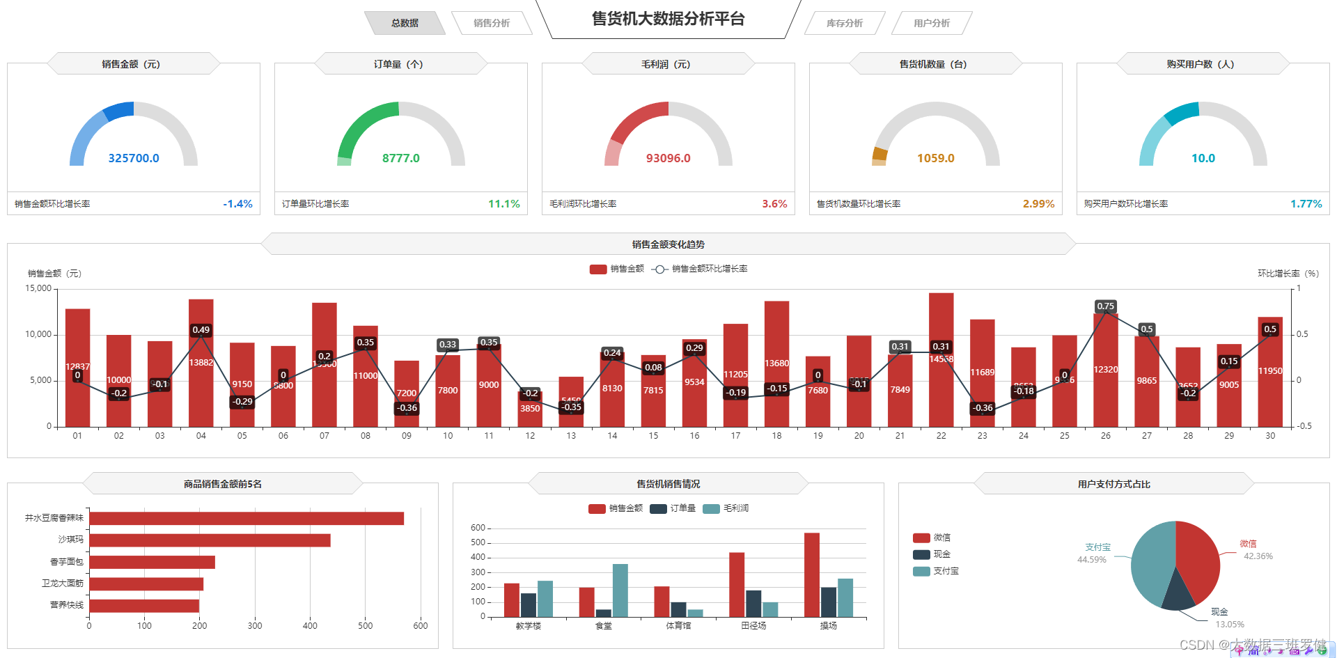
3.无人收货的仪表盘效果实现:
由图可知:我们销售分析有5个框架需要仪表盘,分别是 1.销售金额 2.订单量 3 毛利润 4 售货机数量 5.购买用户 所以我们可以一起实现
1)代码实现:
// 销售金额 & 订单量 & 毛利润 & 售货机数量 & 购买用户数
$.get("data/无人售货机各特征数据.json").done(function (data) {
    //data = JSON.parse(data);
    saleT('saleM', '销售金额', 0, data.销售金额[0], data.销售金额[1], data.销售金额[2], '','#1779d9','rgba(23,121,217,0.6)');
    saleT('orderQ', '订单量', 0, data.订单量[0], data.订单量[1], data.订单量[2], '','#30b761','rgba(48,183,97,0.5)');
    saleT('grossM', '毛利润', 0, data.毛利润[0], data.毛利润[1], data.毛利润[2], '','#d04a4b','rgba(208,74,75,0.5)');
    saleT('discount', '折扣额', 0, data.折扣额[0], data.折扣额[1], data.折扣额[2], '千','#ca841e','rgba(202,132,30,0.5)');
    saleT('unitP', '客单价', 0, data.客单价[0], data.客单价[1], data.客单价[2], '','#00a7c2','rgba(0,167,194,0.5)');
});
/*
 *id: chart容器id;
 *title: 仪表盘名称
 *min: 最小值
 *max: 最大值
 *val: 当前实际值
 *tag: 目标值
 *unit: 单位符号
 *color1: 主轴颜色
 */

var saleM = echarts.init(document.getElementById("saleM"));
var orderQ = echarts.init(document.getElementById("orderQ"));
var grossM = echarts.init(document.getElementById("grossM"));
var discount = echarts.init(document.getElementById("discount"));
var unitP = echarts.init(document.getElementById("unitP"));

function saleT(id, title, min, max, val, tag, unit, color1,  color2) {

    var myChart = echarts.init(document.getElementById(id));

    option = {
        tooltip: {
            confine:true,
            trigger: 'item',
            formatter:function(data){
                hbl = (data.value/tag).toFixed(2);
                return title + ":" + data.value + '<br/>' + name + ":" + hbl
            }
        },
        series: [{
            startAngle: 180,
            endAngle: 0,
            splitNumber: 1,
            name: title,
            type: 'gauge',
            radius: '100%',
            axisLine: {
                lineStyle: {
                    color: [
                        [0.25, '#1779da'],
                        [0.5, '#1779da'],
                        [1, '#ddd']
                    ],
                    width: 20
                }
            },
            axisTick: { show: false },
            axisLabel: {
                distance:0,
                width:30,
                height:24,
                lineHeight:24,
                padding:[25,-30,0],
                color:'rgba(255,255,255,0.5)',
                formatter: function (value) {
                    if(unit=='千'){
                        return (value/1000).toFixed(1) + ' ' + unit;
                    }else if(unit=='万'){
                        return (value/10000).toFixed(1) + ' ' + unit;
                    }else{
                        return value;
                    }
                }
            },
            splitLine: { show: false },
            pointer: { show:false, width: 3 },
            title: {
                offsetCenter: [0, '92%'],
                color:'rgba(255,255,255,0.7)'
            },
            detail: {
                offsetCenter: [0, '-10%'],
                formatter: function(value){
                    value1 = value / tag;
                    return '{a|' + value.toFixed(1) + '}';
                },
                rich: {
                    a: {
                        fontSize:'16',
                        fontWeight:'bold'
                    }
                }
            },
            data: [{}]
        }]
    };
    option.series[0].min = min;
    option.series[0].max = max;
    option.series[0].data[0].value = val;
    option.series[0].axisLine.lineStyle.color[0][0] = (tag - min) / (max - min);
    option.series[0].axisLine.lineStyle.color[0][1] = color2;
    option.series[0].axisLine.lineStyle.color[1][0] = (val - min) / (max - min);
    option.series[0].axisLine.lineStyle.color[1][1] = color1;

    myChart.setOption(option);

}
2)代码分析:
$.get("data/无人售货机各特征数据.json").done(function (data) {
    //data = JSON.parse(data);
    saleT('saleM', '销售金额', 0, data.销售金额[0], data.销售金额[1], data.销售金额[2], '','#1779d9','rgba(23,121,217,0.6)');
    saleT('orderQ', '订单量', 0, data.订单量[0], data.订单量[1], data.订单量[2], '','#30b761','rgba(48,183,97,0.5)');
    saleT('grossM', '毛利润', 0, data.毛利润[0], data.毛利润[1], data.毛利润[2], '','#d04a4b','rgba(208,74,75,0.5)');
    saleT('discount', '折扣额', 0, data.折扣额[0], data.折扣额[1], data.折扣额[2], '千','#ca841e','rgba(202,132,30,0.5)');
    saleT('unitP', '客单价', 0, data.客单价[0], data.客单价[1], data.客单价[2], '','#00a7c2','rgba(0,167,194,0.5)');
});
这里的代码表示异步数据同步,从无人售货机各特征数据.json文件中获取数据到销售金额saleM,订单量orederQ等,
tooltip: {
            confine:true,
            trigger: 'item',
            formatter:function(data){
                hbl = (data.value/tag).toFixed(2);
                return title + ":" + data.value + '<br/>' + name + ":" + hbl
            }
        },
这里是写提示框
        series: [{
            startAngle: 180,
            endAngle: 0,
            splitNumber: 1,
            name: title,
            type: 'gauge',
            radius: '100%',
            axisLine: {
                lineStyle: {
                    color: [
                        [0.25, '#1779da'],
                        [0.5, '#1779da'],
                        [1, '#ddd']
                    ],
                    width: 20
                }
            },
            axisTick: { show: false },
            axisLabel: {
                distance:0,
                width:30,
                height:24,
                lineHeight:24,
                padding:[25,-30,0],
                color:'rgba(255,255,255,0.5)',
                formatter: function (value) {
                    if(unit=='千'){
                        return (value/1000).toFixed(1) + ' ' + unit;
                    }else if(unit=='万'){
                        return (value/10000).toFixed(1) + ' ' + unit;
                    }else{
                        return value;
                    }
                }
            },
这里写的框架,表示我们用的是仪表盘类型,起始位置和结束位置0-180,和宽度为20,且axisTick这里表示的把刻度关闭了,然后axisLable:这里所实现的就都是对刻度标签的一个设置
            splitLine: { show: false },
            pointer: { show:false, width: 3 },
            title: {
                offsetCenter: [0, '92%'],
                color:'rgba(255,255,255,0.7)'
            },
            detail: {
                offsetCenter: [0, '-10%'],
                formatter: function(value){
                    value1 = value / tag;
                    return '{a|' + value.toFixed(1) + '}';
                },
                rich: {
                    a: {
                        fontSize:'16',
                        fontWeight:'bold'
                    }
                }
            },
            data: [{}]
        }]
    };
这里的splitLine表达的是分割线不显示,pointer:是表示的指针不显示,title这里是对标题的设置
detail这里是详情显示,也就是对框架显示补充细节,
4.柱状和折线图来实现销售金额变化趋势(双y轴)
1)代码实现
var saleRate = echarts.init(document.getElementById('saleRate'));
//设置图表option值
$.get("data/售货机销售金额及其环比增长率.json").done(function (data) {
    //data = JSON.parse(data);
	saleRate.setOption({
    tooltip: {
        trigger: 'axis',
        axisPointer: {
            type: 'cross'
        }
    },
    grid: {
        //用网格定位图表四边留空及顶部避开标题位置
        x: 10,
        y: 50,
        x2: 10,
        y2: 10,
        //使坐标轴数据能完整显示
        containLabel: true
    },
    //设置legend位置及数据,位于图表右上方
    legend: {
        data:['销售金额','销售金额环比增长率'],
        top: 10
    },
    barCategoryGap:'40%',
    xAxis: [
        {
            type: 'category',
            //日期数据
            data: data.日期,
            axisPointer: {
                type: 'shadow'
            },
            //运用eCharts内置方法格式化日期,使x轴日期数据更简洁,同时不影响原数据在鼠标交互时的完整展现
            axisLabel: {
                formatter: function(value){
                    return echarts.format.formatTime('dd', value);
                }
            }
        }
    ],
    yAxis: [
        {
            type: 'value',
            name: '销售金额(元)',
            //设置Y坐标轴最小值
            min: 0,
            //设置Y坐标轴最大值
            max: 15000,
            //设置Y坐标轴值间隔值
            interval: 5000
        },
        //定义Y轴右侧坐标轴
        {
            type: 'value',
            name: '环比增长率(%)',
            min: -0.5,
            max: 1,
            interval: 0.5
        }
    ],
    series: [
        {
            name:'销售金额',
            type:'bar',
            //设置显示坐标点数值
            label:{
                show:'true'
            },
            //销售金额数据
            data:data.销售金额
        },
        {
            name:'销售金额环比增长率',
            type:'line',
            //设置“销售金额环比增长率”数值样式,圆角矩形黑底白字,位于数据点上方
            label:{
                //设置显示坐标点数值
                show:'true',
                color:'#fff',
                backgroundColor:'rgba(0,0,0,0.7)',
                verticalAlign:'middle',
                padding:4,
                borderRadius:4,
                position:'top'
            },
            //设置“销售金额环比增长率”在坐标轴右侧显示
            yAxisIndex: 1,
            //销售金额环比增长率数据
            data:data.销售金额环比增长率
        }
    ]
		})
});
2)代码分析
var saleRate = echarts.init(document.getElementById('saleRate'));
//设置图表option值
$.get("data/售货机销售金额及其环比增长率.json").done(function (data) {
    //data = JSON.parse(data);
	saleRate.setOption({
    tooltip: {
        trigger: 'axis',
        axisPointer: {
            type: 'cross'
        }
    },
var 初始化图表,和引用售货机金额及其环比增长率.json文件导入数据,和对标题的描写
    grid: {
        x: 10,
        y: 50,
        x2: 10,
        y2: 10,
        containLabel: true
这里是为了用网格定位图表四边留空及顶部避开标题位置,和使坐标轴数据能完整显示
legend: {
        data:['销售金额','销售金额环比增长率'],
        top: 10
    },
    barCategoryGap:'40%',
这里写的图例,
xAxis: [
        {
            type: 'category',
            //日期数据
            data: data.日期,
            axisPointer: {
                type: 'shadow'
            },
            //运用eCharts内置方法格式化日期,使x轴日期数据更简洁,同时不影响原数据在鼠标交互时的完整展现
            axisLabel: {
                formatter: function(value){
                    return echarts.format.formatTime('dd', value);
                }
            }
        }
    ],
    yAxis: [
        {
            type: 'value',
            name: '销售金额(元)',
            //设置Y坐标轴最小值
            min: 0,
            //设置Y坐标轴最大值
            max: 15000,
            //设置Y坐标轴值间隔值
            interval: 5000
        },
        //定义Y轴右侧坐标轴
        {
            type: 'value',
            name: '环比增长率(%)',
            min: -0.5,
            max: 1,
            interval: 0.5
        }
    ],
这里是对x,y轴进行设置,把y轴设置一个双y轴,然后定义左右轴
    series: [
        {
            name:'销售金额',
            type:'bar',
            //设置显示坐标点数值
            label:{
                show:'true'
            },
            //销售金额数据
            data:data.销售金额
        },
        {
            name:'销售金额环比增长率',
            type:'line',
            //设置“销售金额环比增长率”数值样式,圆角矩形黑底白字,位于数据点上方
            label:{
                //设置显示坐标点数值
                show:'true',
                color:'#fff',
                backgroundColor:'rgba(0,0,0,0.7)',
                verticalAlign:'middle',
                padding:4,
                borderRadius:4,
                position:'top'
            },
            //设置“销售金额环比增长率”在坐标轴右侧显示
            yAxisIndex: 1,
            //销售金额环比增长率数据
            data:data.销售金额环比增长率
        }
    ]
		})
});
这里是导入数据,导入到左y轴和有y轴,左y轴设置成柱状图,右y轴设置成折线图
5.条形图来实现商品销售金额前5名
1)实现代码:
var saleMtop5 = echarts.init(document.getElementById('saleMtop5'));
$.get("data/商品销售金额前5名.json").done(function (data) {
    //data = JSON.parse(data);
	saleMtop5.setOption({
    tooltip: {
        trigger: 'axis',
        axisPointer: {
            type: 'shadow'
        }
    },
    grid: {
        x: 10,
        y: 20,
        x2: 10,
        y2: 10,
        containLabel: true
    },
    barCategoryGap:'40%',
    xAxis: {
        type: 'value',
        boundaryGap: [0, 0.01],
        axisLine:{lineStyle:{width:0}},
    },
    yAxis: {
        type: 'category',
        splitLine:{lineStyle:{width:0}},
        data: data.商品名称
    },
    series: [
        {
            name: '售出总数量',
            type: 'bar',
            label:{
                position:'right',
                verticalAlign:'middle',
            },
            data: data.销售金额
        }
    ]
		})
});
2)代码分析
 xAxis: {
        type: 'value',
        boundaryGap: [0, 0.01],
        axisLine:{lineStyle:{width:0}},
    },
    yAxis: {
        type: 'category',
        splitLine:{lineStyle:{width:0}},
        data: data.商品名称
我们只需要在柱状图的基础上把x轴改成数据轴即可
6.柱状图来实现售货机销售情况。
实现代码:
var saleOrder = echarts.init(document.getElementById('saleOrder'));
$.get("data/不同地点售货机销售数据.json").done(function (data) {
    //data = JSON.parse(data);
	saleOrder.setOption({
    tooltip: {
        trigger: 'axis',
        axisPointer: {
            type: 'cross',
            crossStyle: {
                color: '#999'
            }
        }
    },
    grid: {
        x: 10,
        y: 50,
        x2: 10,
        y2: 10,
        containLabel: true
    },
    toolbox: {
        show:false,
        feature: {
            dataView: {show: true, readOnly: false},
            magicType: {show: true, type: ['line', 'bar']},
            restore: {show: true},
            saveAsImage: {show: true}
        }
    },
    legend: {
        top:10
    },
    barGap:'10%',
    barCategoryGap:'35%',
    xAxis: [
        {
            type: 'category',
            data: data.地点,
            axisPointer: {
                type: 'shadow'
            },
            splitLine:{lineStyle:{width:0}},
        }
    ],
    yAxis: [
        {
            type: 'value',
            name: '',
            min: 0,
            axisLabel: {
                formatter: '{value}'
            },
            axisLine:{lineStyle:{width:0}},
        }
    ],
    series: [
        {
            name:'销售金额',
            type:'bar',
            data:data.销售金额
        },
        {
            name:'订单量',
            type:'bar',
            data:data.订单量
        },
        {
            name:'毛利润',
            type:'bar',
            data:data.毛利润
        }
    ]
		})
});
代码分析
    xAxis: [
        {
            type: 'category',
            data: data.地点,
            axisPointer: {
                type: 'shadow'
            },
            splitLine:{lineStyle:{width:0}},
        }
    ],
    yAxis: [
        {
            type: 'value',
            name: '',
            min: 0,
            axisLabel: {
                formatter: '{value}'
            },
            axisLine:{lineStyle:{width:0}},
        }
    ],
这里与条状不同是y轴为数据轴,,且设置了轴线的宽度等
series: [
        {
            name:'销售金额',
            type:'bar',
            data:data.销售金额
        },
        {
            name:'订单量',
            type:'bar',
            data:data.订单量
        },
        {
            name:'毛利润',
            type:'bar',
            data:data.毛利润
        }
    ]
想要实现多个柱状,我们需要导入多个数据给他们名字,和类型,异步数据即可
7.饼图来分析用户支付方式占比。
实现代码
var payWay = echarts.init(document.getElementById('payWay'));
$.get("data/不同支付方式用户人数.json").done(function (data) {
    //data = JSON.parse(data);
	payWay.setOption({
    tooltip : {
        trigger: 'item',
        formatter: "{a} <br/>{b} : {c} ({d}%)"
    },
    legend: {
        data: data.支付方式,
        orient:'vertical',
        left:0,
        top:"25%"
    },
    grid: {
        left: '0%',
        right: '0%',
        bottom: '0%',
        containLabel: true
    },
    series : [
        {
            name: '支付方式占比',
            type: 'pie',
            radius : '62%',
            center: ['65%', '50%'],
            label:{
                formatter:"{b}\n{a|{d}%}",
                rich: {
                    a: {
                        padding:6,
                        align:'left',
                        color:'#999',
                    }
                }
            },
            data:data.data,
            itemStyle: {
                emphasis: {
                    shadowBlur: 10,
                    shadowOffsetX: 0,
                    shadowColor: 'rgba(0, 0, 0, 0.5)'
                }
            }
        }
    ]
		})
});
代码分析
 series : [
        {
            name: '支付方式占比',
            type: 'pie',
            radius : '62%',
            center: ['65%', '50%'],
            label:{
                formatter:"{b}\n{a|{d}%}",
                rich: {
                    a: {
                        padding:6,
                        align:'left',
                        color:'#999',
                    }
                }
            },
            data:data.data,
            itemStyle: {
                emphasis: {
                    shadowBlur: 10,
                    shadowOffsetX: 0,
                    shadowColor: 'rgba(0, 0, 0, 0.5)'
                }
            }
        }
    ]
		})
});
这里是设置他为饼图类型
center设置他的饼图的中心(圆心)坐标,数组的第一项是横坐标,第二项是纵坐标
和显示触发显示等
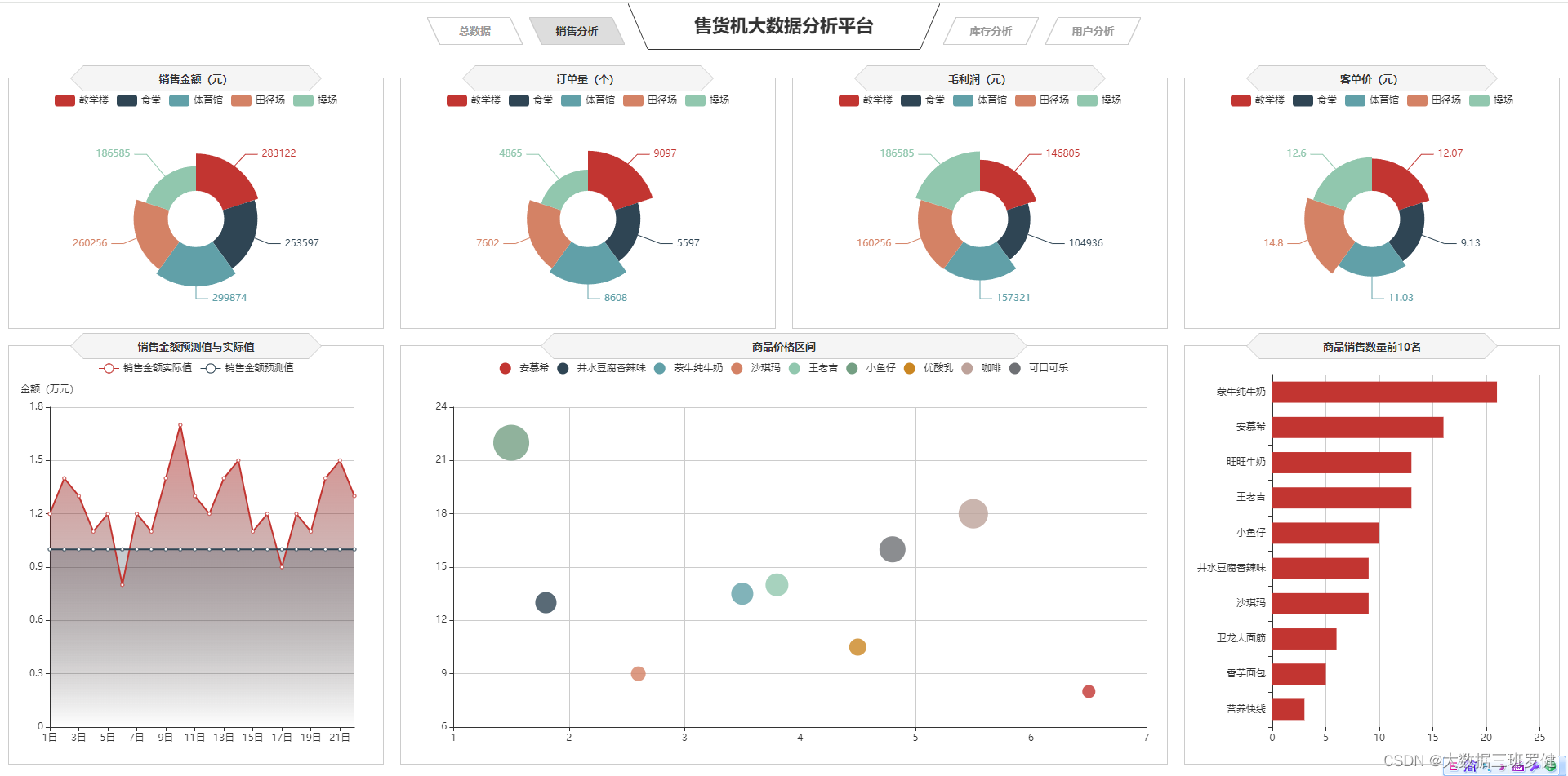
三.可视化展示销售分析
实现代码:
// 销售金额
var saleM_Site = echarts.init(document.getElementById('saleM_Site'));
$.get("data/不同区域的各指标数据.json").done(function (data) {
    //data = JSON.parse(data),
	saleM_Site.setOption({
    tooltip : {
        trigger: 'item',
        formatter: "{b}:<br/>{c} 元<br/>({d}%)"
    },
    legend: {
        type:'scroll',
        data:data.where
    },
    toolbox: {
        show : false,
        feature : {
            mark : {show: true},
            dataView : {show: true, readOnly: false},
            magicType : {
                show: true,
                type: ['pie', 'funnel']
            },
            restore : {show: true},
            saveAsImage : {show: true}
        }
    },
    calculable : true,
    series : [
        {
            name:'地点',
            type:'pie',
            radius : ["25%", '60%'],
            center : ['50%', '57%'],
            roseType : 'area',
            label:{
                show:true,
                formatter:'{c}'
            },
            data:data.sale
        },
        {
            type:'pie',radius:'25%',center:['50%','57%'],
            label: {normal:{position:'center',color:'#fff'}},
            labelLine:{normal:{show:false}},itemStyle:{color:'transparent'},
            data:[{value:1,name:'地点',tooltip:{formatter:' ',backgroundColor:'none'}}]
        },
    ]
		})
});


// 订单量
var orderQ_Site = echarts.init(document.getElementById('orderQ_Site'));
$.get("data/不同区域的各指标数据.json").done(function (data) {
    //data = JSON.parse(data),
	orderQ_Site.setOption({
    tooltip : {
        trigger: 'item',
        formatter:  "{b}:<br/>{c} 个<br/>({d}%)"
    },
    legend: {
        type:'scroll',
        data:data.where
    },
    toolbox: {
        show : false,
        feature : {
            mark : {show: true},
            dataView : {show: true, readOnly: false},
            magicType : {
                show: true,
                type: ['pie', 'funnel']
            },
            restore : {show: true},
            saveAsImage : {show: true}
        }
    },
    calculable : true,
    series : [
        {
            name:'地点',
            type:'pie',
            radius : ["25%", '60%'],
            center : ['50%', '57%'],
            roseType : 'area',
            label:{
                show:true,
                formatter:'{c}'
            },
            data:data.order
        },
        {
            type:'pie',radius:'25%',center:['50%','57%'],
            label: {normal:{position:'center',color:'#fff'}},
            labelLine:{normal:{show:false}},itemStyle:{color:'transparent'},
            data:[{value:1,name:'地点',tooltip:{formatter:' ',backgroundColor:'none'}}]
        },
    ]
		})
});


// 毛利润
var grossM_Site = echarts.init(document.getElementById('grossM_Site'));
$.get("data/不同区域的各指标数据.json").done(function (data) {
    //data = JSON.parse(data),
	grossM_Site.setOption({
    tooltip : {
        trigger: 'item',
        formatter:  "{b}:<br/>{c} 元<br/>({d}%)"
    },
    legend: {
        type:'scroll',
        data:data.where
    },
    toolbox: {
        show : false,
        feature : {
            mark : {show: true},
            dataView : {show: true, readOnly: false},
            magicType : {
                show: true,
                type: ['pie', 'funnel']
            },
            restore : {show: true},
            saveAsImage : {show: true}
        }
    },
    calculable : true,
    series : [
        {
            name:'地点',
            type:'pie',
            radius : ["25%", '60%'],
            center : ['50%', '57%'],
            roseType : 'area',
            label:{
                show:true,
                formatter:'{c}'
            },
            data:data.gross
        },
        {
            type:'pie',radius:'25%',center:['50%','57%'],
            label: {normal:{position:'center',color:'#fff'}},
            labelLine:{normal:{show:false}},itemStyle:{color:'transparent'},
            data:[{value:1,name:'地点',tooltip:{formatter:' ',backgroundColor:'none'}}]
        },
    ]
		})
});


// 客单价平均值
var unitP_Site = echarts.init(document.getElementById('unitP_Site'));
$.get("data/不同区域的各指标数据.json").done(function (data) {
    //data = JSON.parse(data),
	unitP_Site.setOption({
    tooltip : {
        trigger: 'item',
        formatter:  "{b}:<br/>{c} 元<br/>({d}%)"
    },
    legend: {
        type:'scroll',
        data:data.where
    },
    toolbox: {
        show : false,
        feature : {
            mark : {show: true},
            dataView : {show: true, readOnly: false},
            magicType : {
                show: true,
                type: ['pie', 'funnel']
            },
            restore : {show: true},
            saveAsImage : {show: true}
        }
    },
    calculable : true,
    series : [
        {
            name:'地点',
            type:'pie',
            radius : ["25%", '60%'],
            center : ['50%', '57%'],
            roseType : 'area',
            label:{
                show:true,
                formatter:'{c}'
            },
            data:data.unit
        },
        {
            type:'pie',radius:'25%',center:['50%','57%'],
            label: {normal:{position:'center',color:'#fff'}},
            labelLine:{normal:{show:false}},itemStyle:{color:'transparent'},
            data:[{value:1,name:'地点',tooltip:{formatter:' ',backgroundColor:'none'}}]
        },
    ]
		})
});


// 商品销售数量Top10
var saleMtop10 = echarts.init(document.getElementById('saleMtop10'));
$.get("data/商品销售数量前10.json").done(function (data) {
    //data = JSON.parse(data),
	saleMtop10.setOption({
    tooltip: {
        trigger: 'axis',
        axisPointer: {
            type: 'shadow'
        }
    },
    grid: {
        left: '0%',
        top:'20',
        right:'2%',
        bottom: '10',
        containLabel: true
    },
    barCategoryGap:'40%',
    xAxis: {
        type: 'value',
        min: 0,
        interval: 5,
        boundaryGap: [0, 0.01],
        axisLine:{lineStyle:{width:0}},
    },
    yAxis: {
        type: 'category',
        splitLine:{lineStyle:{width:0}},
        data: data.商品名称
    },
    series: [
        {
            name: '售出总数量',
            type: 'bar',
            label:{
                position:'right',
                verticalAlign:'middle',
            },
            data: data.销售数量
        }
    ]
		})
});


// 商品价格区间
var priceRange = echarts.init(document.getElementById('priceRange'));
$.get("data/商品销量数量和价格数据.json").done(function (data) {
    //data = JSON.parse(data),
	priceRange.setOption({
    grid: {
        left: '3%',
        right: '10',
        bottom: '10',
        containLabel: true
    },
    tooltip : {
        showDelay : 0,
        formatter : function (params) {
                return params.seriesName + '<br/>'
                + '单价:' + params.value[0] + '<br/>'
                + '销量:' + params.value[1];
        },
        axisPointer:{
            show: true,
            type : 'cross',
            lineStyle: {
                type : 'dashed',
                width : 1
            }
        }
    },

    legend: {
        type:'scroll',
    },
    xAxis :{ scale:true},
    yAxis :{ scale:true},
	})
});
$.get("data/商品销量数量和价格数据.json").done(function (data) {
    //data = JSON.parse(data);
    var series=[];
    for(var i = 0;i < data.data.length;i++){
        series.push({
            name: data.data[i].name,
            type: 'scatter',
            data: [data.data[i].value],
            symbolSize:data.data[i].value[1]*2
        });
    }
    priceRange.setOption({
        series:series
    });
});


// 销售金额预测值与实际值
var saleAll = echarts.init(document.getElementById('saleAll'));
$.get("data/销售金额实际值与预测值.json").done(function (data) {
    //data = JSON.parse(data),
	saleAll.setOption({
    tooltip: {
        trigger: 'axis'
    },
    legend: {
        type:'scroll'
    },
    grid: {
        left: '10',
        right: '20',
        bottom: '10',
        containLabel: true
    },
    xAxis:  {
        type: 'category',
        boundaryGap: false,
        data: ['1日','2日','3日','4日','5日','6日','7日','8日','9日','10日',
		'11日','12日','13日','14日','15日','16日','17日','18日','19日','20日','21日','22日']
    },
    yAxis: {
        type: 'value',
        name: '金额(万元)',
        axisLabel: {
            formatter: '{value}'
        }
    },
    series: [
        {
            name:'销售金额实际值',
            type:'line',
            data:data.T,
            areaStyle: {
                normal: {
                    color: new echarts.graphic.LinearGradient(0, 0, 0, 1, [{
                        offset: 0,
                        color: 'rgba(194, 53, 49,.8)'
                    }, {
                        offset: 1,
                        color: 'transparent'
                    }])
                }
            },
        },
        {
            type:'line',
            name:'销售金额预测值',
            data:data.Y,
            areaStyle:{
                normal: {
                    color: new echarts.graphic.LinearGradient(0, 0, 0, 1, [{
                        offset: 0,
                        color: 'rgba(47, 69, 84,.4)'
                    }, {
                        offset: 1,
                        color: 'transparent'
                    }])
                }
            }
        },
    ]
		})
});


window.onresize = function() {
    saleM_Site.resize();
    orderQ_Site.resize();
    grossM_Site.resize();
    unitP_Site.resize();
    saleMtop10.resize();
    priceRange.resize();
    saleAll.resize();
}
整体效果展示:
1无人售货的南丁格尔图的效果实现
1)实现代码
var saleM_Site = echarts.init(document.getElementById('saleM_Site'));
$.get("data/不同区域的各指标数据.json").done(function (data) {
    //data = JSON.parse(data),
	saleM_Site.setOption({
    tooltip : {
        trigger: 'item',
        formatter: "{b}:<br/>{c} 元<br/>({d}%)"
    },
    legend: {
        type:'scroll',
        data:data.where
    },
    toolbox: {
        show : false,
        feature : {
            mark : {show: true},
            dataView : {show: true, readOnly: false},
            magicType : {
                show: true,
                type: ['pie', 'funnel']
            },
            restore : {show: true},
            saveAsImage : {show: true}
        }
    },
    calculable : true,
    series : [
        {
            name:'地点',
            type:'pie',
            radius : ["25%", '60%'],
            center : ['50%', '57%'],
            roseType : 'area',
            label:{
                show:true,
                formatter:'{c}'
            },
            data:data.sale
        },
        {
            type:'pie',radius:'25%',center:['50%','57%'],
            label: {normal:{position:'center',color:'#fff'}},
            labelLine:{normal:{show:false}},itemStyle:{color:'transparent'},
            data:[{value:1,name:'地点',tooltip:{formatter:' ',backgroundColor:'none'}}]
        },
    ]
		})
});
2)代码分析
    series : [
        {
            name:'地点',
            type:'pie',
            radius : ["25%", '60%'],
            center : ['50%', '57%'],
            roseType : 'area',
            label:{
                show:true,
                formatter:'{c}'
            },
            data:data.sale
        },
        {
            type:'pie',radius:'25%',center:['50%','57%'],
            label: {normal:{position:'center',color:'#fff'}},
            labelLine:{normal:{show:false}},itemStyle:{color:'transparent'},
            data:[{value:1,name:'地点',tooltip:{formatter:' ',backgroundColor:'none'}}]
        },
    ]
这里设置了类型为饼图类型,且圆形的center设置他的饼图的中心(圆心)坐标,数组的第一项是横坐标,第二项是纵坐标,和内圆心及设置为南丁格尔图然后文本标签(lable)设置为显示之后同上异步数据即可完成南丁格尔图
2.无人售货的销售金额预测值与实际值
1)实现代码:
var saleAll = echarts.init(document.getElementById('saleAll'));
$.get("data/销售金额实际值与预测值.json").done(function (data) {
    //data = JSON.parse(data),
	saleAll.setOption({
    tooltip: {
        trigger: 'axis'
    },
    legend: {
        type:'scroll'
    },
    grid: {
        left: '10',
        right: '20',
        bottom: '10',
        containLabel: true
    },
    xAxis:  {
        type: 'category',
        boundaryGap: false,
        data: ['1日','2日','3日','4日','5日','6日','7日','8日','9日','10日',
		'11日','12日','13日','14日','15日','16日','17日','18日','19日','20日','21日','22日']
    },
    yAxis: {
        type: 'value',
        name: '金额(万元)',
        axisLabel: {
            formatter: '{value}'
        }
    },
    series: [
        {
            name:'销售金额实际值',
            type:'line',
            data:data.T,
            areaStyle: {
                normal: {
                    color: new echarts.graphic.LinearGradient(0, 0, 0, 1, [{
                        offset: 0,
                        color: 'rgba(194, 53, 49,.8)'
                    }, {
                        offset: 1,
                        color: 'transparent'
                    }])
                }
            },
        },
        {
            type:'line',
            name:'销售金额预测值',
            data:data.Y,
            areaStyle:{
                normal: {
                    color: new echarts.graphic.LinearGradient(0, 0, 0, 1, [{
                        offset: 0,
                        color: 'rgba(47, 69, 84,.4)'
                    }, {
                        offset: 1,
                        color: 'transparent'
                    }])
                }
            }
        },
    ]
		})
});
2)代码分析
由于这是折线图我们可以同理柱状和折线图来实现销售金额变化趋势
3.用散点图来分析商品价格区间
1)实现代码
var priceRange = echarts.init(document.getElementById('priceRange'));
$.get("data/商品销量数量和价格数据.json").done(function (data) {
    //data = JSON.parse(data),
	priceRange.setOption({
    grid: {
        left: '3%',
        right: '10',
        bottom: '10',
        containLabel: true
    },
    tooltip : {
        showDelay : 0,
        formatter : function (params) {
                return params.seriesName + '<br/>'
                + '单价:' + params.value[0] + '<br/>'
                + '销量:' + params.value[1];
        },
        axisPointer:{
            show: true,
            type : 'cross',
            lineStyle: {
                type : 'dashed',
                width : 1
            }
        }
    },

    legend: {
        type:'scroll',
    },
    xAxis :{ scale:true},
    yAxis :{ scale:true},
	})
});
$.get("data/商品销量数量和价格数据.json").done(function (data) {
    //data = JSON.parse(data);
    var series=[];
    for(var i = 0;i < data.data.length;i++){
        series.push({
            name: data.data[i].name,
            type: 'scatter',
            data: [data.data[i].value],
            symbolSize:data.data[i].value[1]*2
        });
    }
    priceRange.setOption({
        series:series
    });
});
2)代码分析
legend: {
        type:'scroll',
这里与之前不同的是我们的图例设置了滚动
    xAxis :{ scale:true},
    yAxis :{ scale:true},
xAxis:是否是脱离 0 值比例。设置成 true 后坐标刻度不会强制包含零刻度。在双数值轴的散点图中比较有用
yAxis:是否是脱离 0 值比例。设置成 true 后坐标刻度不会强制包含零刻度。在双数值轴的散点图中比较有用,且只在数值轴中(type: 'value')有效
    var series=[];
    for(var i = 0;i < data.data.length;i++){
        series.push({
            name: data.data[i].name,
            type: 'scatter',
            data: [data.data[i].value],
            symbolSize:data.data[i].value[1]*2
        });
    }
    priceRange.setOption({
        series:series
    });
});
这里我们异步数据同步到散点图中即可实现散点图的绘制
4.用条形图来分析商品销售数量前10名
1)代码实现
var saleMtop10 = echarts.init(document.getElementById('saleMtop10'));
$.get("data/商品销售数量前10.json").done(function (data) {
    //data = JSON.parse(data),
	saleMtop10.setOption({
    tooltip: {
        trigger: 'axis',
        axisPointer: {
            type: 'shadow'
        }
    },
    grid: {
        left: '0%',
        top:'20',
        right:'2%',
        bottom: '10',
        containLabel: true
    },
    barCategoryGap:'40%',
    xAxis: {
        type: 'value',
        min: 0,
        interval: 5,
        boundaryGap: [0, 0.01],
        axisLine:{lineStyle:{width:0}},
    },
    yAxis: {
        type: 'category',
        splitLine:{lineStyle:{width:0}},
        data: data.商品名称
    },
    series: [
        {
            name: '售出总数量',
            type: 'bar',
            label:{
                position:'right',
                verticalAlign:'middle',
            },
            data: data.销售数量
        }
    ]
		})
});
2)代码分析
同理:条形图来实现商品销售金额前5名分析
四、可视化展现库存分析
1.实现代码:
<!doctype html>
<html>
<head>
<meta charset="utf-8">
<title>售货机大数据分析平台</title>
<link rel="stylesheet" type="text/css" href="css/reset.css" />
</head>
<body>
<div class="header">
  <div class="sysName">
    <h1 class="tit">售货机大数据分析平台</h1>
  </div>
  <div class="menu">
    <ul>
      <li><a href="total.html">总数据</a></li>
      <li><a href="sale.html">销售分析</a></li>
      <li class="sysnameN"></li>
      <li class="on"><a href="inventory.html">库存分析</a></li>
      <li><a href="user.html">用户分析</a></li>
    </ul>
  </div>
</div>
<div class="chartWarp inventoryWarp">

  <div class="pure-g int-row1">
    <!-- 存销量 -->
    <div class="pure-u-1-3">
      <!-- 设备容量 -->
      <div class="chartBlock h55">
        <div class="hd">
          <div class="chartTit">
            <h2 class="titContent">设备容量</h2>
          </div>
        </div>
        <div class="bd">
          <div id="mVolume" class="chartDiv"></div>
        </div>
      </div>
      <!-- 品类库存占比 -->
      <div class="chartBlock h45">
        <div class="hd">
          <div class="chartTit">
            <h2 class="titContent">品类库存占比</h2>
          </div>
        </div>
        <div class="bd">
          <div id="categoryStock" class="chartDiv"></div>
        </div>
      </div>
    </div>
    <div class="pure-u-1-3">
      <div class="chartBlock">
        <div class="hd">
          <div class="chartTit">
            <h2 class="titContent">存销量</h2>
          </div>
        </div>
        <div class="bd">
          <div id="stockSales" class="chartDiv"></div>
        </div>
      </div>
    </div>
    <div class="pure-u-1-3">
      <!-- 商品存货周转天数 -->
      <div class="chartBlock h55">
        <div class="hd">
          <div class="chartTit">
            <h2 class="titContent">商品存货周转天数</h2>
          </div>
        </div>
        <div class="bd">
          <div id="turnaround" class="chartDiv"></div>
        </div>
      </div>
      <!-- 滞销商品 -->
      <div class="chartBlock h45">
        <div class="hd">
          <div class="chartTit">
            <h2 class="titContent">滞销商品</h2>
          </div>
        </div>
        <div class="bd">
          <div id="unsalable" class="chartDiv"></div>
        </div>
      </div>
    </div>
  </div>
</div>
</body>
<script language="javascript" type="text/javascript" src="js/echarts.js"></script>
<script language="javascript" type="text/javascript" src="js/jquery-3.3.1.js"></script>
<script language="javascript" type="text/javascript" src="js/charts.int.js"></script>
</html>
2.整体效果展示
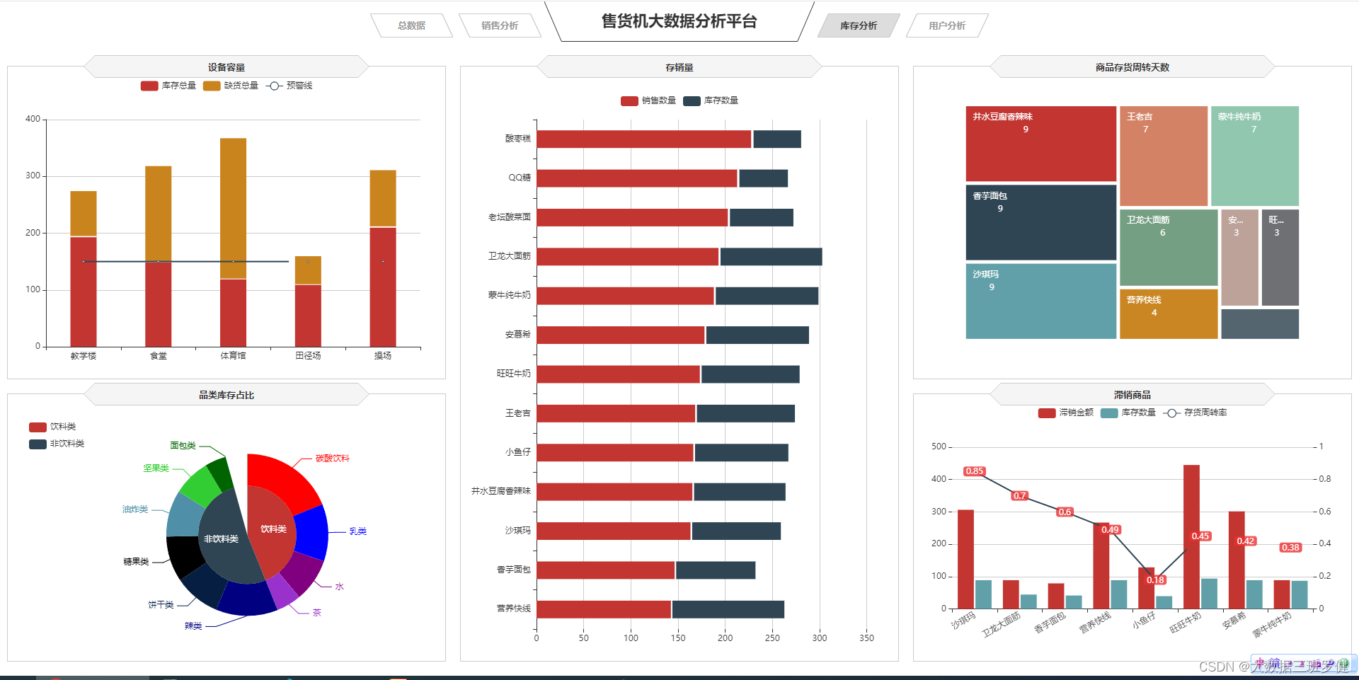
1.用矩形树图来商品存货周转天数
1)实现代码
$.get("data/各类商品存货周转天数.json").done(function (data) {
    //data = JSON.parse(data),
    turnaround.setOption({
        tooltip:{
        formatter: '{b}:{c}'
    },
    series: [{
        type: 'treemap',
        label:{
            show:true,
            position:'insideTopLeft',
            distance:0,
            padding:10,
            formatter:"{b}\n{a|{c}}",
            rich: {
                a: {
                    padding:6,
                    align:'right',
                    verticalAlign:'bottom',
                    color:'#fff',
                }
            }
        },
        roam:false,
        nodeClick:false,
        breadcrumb:{show:false},
        itemStyle:{
            gapWidth:5,
            borderColor:'transparent'
        },
        data: data.data
    }]
        })
});
2)代码分析
series: [{
        type: 'treemap',
        label:{
            show:true,
            position:'insideTopLeft',
            distance:0,
            padding:10,
            formatter:"{b}\n{a|{c}}",
            rich: {
                a: {
                    padding:6,
                    align:'right',
                    verticalAlign:'bottom',
                    color:'#fff',
                }
            }
        },
series设置图表标题位置的属性 内边距,设置标签的填充,对齐方式以及颜色
roam:false,
nodeClick:false,
breadcrumb:{show:false},
itemStyle:{
gapWidth:5,
borderColor:'transparent'
        },
2.用柱状堆积设备容量
1.实现代码:
var stockSales = echarts.init(document.getElementById('stockSales'));
$.get("data/商品库存数量和销售数量.json").done(function (data) {
    //data = JSON.parse(data),
	stockSales.setOption({
	tooltip: {
		trigger: 'axis',
		axisPointer: {
			type: 'shadow'
		}
	},
	grid: {
		left: '0%',
		top:'60',
		right:'5%',
		bottom: '10',
		containLabel: true
	},
	barWidth:'45%',
	legend: {
		data:data.数量类型,
		top:'22'
	},
	xAxis: {
		type: 'value',
		min: 0,
		boundaryGap: [0, 0.01],
		axisLine:{lineStyle:{width:0}},
	},
	yAxis: {
		type: 'category',
		splitLine:{lineStyle:{width:0}},
		data: data.商品名称
	},
	series: [
		{
			name: '销售数量',
			type: 'bar',
			stack: '数量',
			label:{
				position:'insideRight',
				padding:[0,5,0,0],
			},
			data: data.销售数量
		},
		{
			name: '库存数量',
			type: 'bar',
			stack: '数量',
			label:{
				position:'insideRight',
				padding:[0,5,0,0],
			},
			data: data.库存数量
		}
	]
		})
});
2)代码分析
xAxis:  {
        type: 'category',
        data: data.地点
    },
    yAxis: {
        type: 'value',
    },
    series: [
        {
            name:'库存总量',
            type:'bar',
            stack: '总量',
            label:{
                position:'insideTop',
                padding:[5,0,0,0]
            },
            data:data.库存数量,
        },
        {
            type:'line',
            name:'预警线',
            connectNulls: 'true',
            data:[150,150,150,150,150],
        },
        {
            name:'缺货总量',
            type:'bar',
            stack: '总量',
            label:{
                position:'insideTop',
                padding:[5,0,0,0]
            },
            itemStyle:{
                color:'#ca841e'
            },
            data:data.缺货数量,
        }
    ]
        })
});
设置x、y轴,并实现堆积柱状
3.存销量条形堆积
1)实现代码
var unsalable = echarts.init(document.getElementById('unsalable'));
$.get("data/商品滞销数据.json").done(function (data) {
	//data = JSON.parse(data),
	unsalable.setOption({
    tooltip: {
        trigger: 'axis',
        axisPointer: {
            type: 'cross',
            crossStyle: {
                color: '#999'
            }
        }
    },
    grid: {
        left: '10',
        right: '10',
        bottom: '10',
        containLabel: true
    },
    toolbox: {
        show:false,
        feature: {
            dataView: {show: true, readOnly: false},
            magicType: {show: true, type: ['line', 'bar']},
            restore: {show: true},
            saveAsImage: {show: true}
        }
    },
    legend: {
        data:data.name
    },
    barGap:'10%',
    barCategoryGap:'25%',
    xAxis: [
        {
            type: 'category',
            data: data.商品名称,
            axisPointer:{type:'shadow'},
            splitLine:{lineStyle:{width:0}},
            axisLabel:{rotate:30}
        }
    ],
    yAxis: [
        {
            type: 'value',
            name: '',
            min: 0,
            max: 500,
            interval: 100,
            axisLabel: {
                formatter: '{value}'
            },
            axisLine:{lineStyle:{width:0}},
        },
        {
            type: 'value',
            name: '',
            min: 0,
            max: 1,
            interval: 0.2,
            axisLabel: {
                formatter: '{value} '
            },
            axisLine:{lineStyle:{width:0}},

        }
    ],
    series: [
        {
            name:'滞销金额',
            type:'bar',
            data:data.滞销金额
        },
        {
            name:'存货周转率',
            type:'line',
            yAxisIndex: 1,
            label:{
                show:'true',
                color:'#fff',
                backgroundColor:'rgba(235,48,48,0.8)',
                verticalAlign:'middle',
                padding:[2,4,0,4],
                borderRadius:4,
                position:'inside'
            },
            data:data.存货周转率
        },
        {
            name:'库存数量',
            type:'bar',
            data:data.库存数量
        }
    ]
		})
});
2)代码分析
同理与用柱状堆积设备容量
4.双y轴来实现滞销商品
1)实现代码
var unsalable = echarts.init(document.getElementById('unsalable'));
$.get("data/商品滞销数据.json").done(function (data) {
	//data = JSON.parse(data),
	unsalable.setOption({
    tooltip: {
        trigger: 'axis',
        axisPointer: {
            type: 'cross',
            crossStyle: {
                color: '#999'
            }
        }
    },
    grid: {
        left: '10',
        right: '10',
        bottom: '10',
        containLabel: true
    },
    toolbox: {
        show:false,
        feature: {
            dataView: {show: true, readOnly: false},
            magicType: {show: true, type: ['line', 'bar']},
            restore: {show: true},
            saveAsImage: {show: true}
        }
    },
    legend: {
        data:data.name
    },
    barGap:'10%',
    barCategoryGap:'25%',
    xAxis: [
        {
            type: 'category',
            data: data.商品名称,
            axisPointer:{type:'shadow'},
            splitLine:{lineStyle:{width:0}},
            axisLabel:{rotate:30}
        }
    ],
    yAxis: [
        {
            type: 'value',
            name: '',
            min: 0,
            max: 500,
            interval: 100,
            axisLabel: {
                formatter: '{value}'
            },
            axisLine:{lineStyle:{width:0}},
        },
        {
            type: 'value',
            name: '',
            min: 0,
            max: 1,
            interval: 0.2,
            axisLabel: {
                formatter: '{value} '
            },
            axisLine:{lineStyle:{width:0}},

        }
    ],
    series: [
        {
            name:'滞销金额',
            type:'bar',
            data:data.滞销金额
        },
        {
            name:'存货周转率',
            type:'line',
            yAxisIndex: 1,
            label:{
                show:'true',
                color:'#fff',
                backgroundColor:'rgba(235,48,48,0.8)',
                verticalAlign:'middle',
                padding:[2,4,0,4],
                borderRadius:4,
                position:'inside'
            },
            data:data.存货周转率
        },
        {
            name:'库存数量',
            type:'bar',
            data:data.库存数量
        }
    ]
		})
});
2)代码分析
同理于4.柱状和折线图来实现销售金额变化趋势(双y轴)
5.用圆环饼图来实现品类库存占比
1)实现代码
var categoryStock = echarts.init(document.getElementById('categoryStock'));
$.get("data/不同类型的商品库存数量.json").done(function (data) {
	//data = JSON.parse(data),
	categoryStock.setOption({
    tooltip: {
        trigger: 'item',
        formatter: "{a} <br/>{b}: {c} ({d}%)"
    },
    legend: {
        orient: 'vertical',
        data:data.类型,
        left: 10,
        top: 20,
    },
    series: [
        {
            name:'品类',
            type:'pie',
            radius: [0, '40%'],
            center : ['55%', '53%'],
            label: {
                normal: {
                    position: 'inner'
                }
            },
            labelLine: {
                normal: {
                    show: false
                }
            },
            data:data.一级商品
        },
        {
            name:'品类',
            type:'pie',
            color:['LimeGreen', 'DarkGreen', 'red', 'blue', 'Purple',
                'DarkOrchid', 'Navy', '#061e42', 'black', '#4f8fa8'],
            radius: ['40%', '66%'],
            center : ['55%', '53%'],
            selectedMode: 'multiple',
            itemStyle:{
                borderWidth:'2',
                borderColor:'none'
            },
            label: {
            },
            data:data.二级商品
        }
    ]
		})
});
2)代码分析
series: [
        {
            name:'品类',
            type:'pie',
            radius: [0, '40%'],
            center : ['55%', '53%'],
            label: {
                normal: {
                    position: 'inner'
                }
            },
            labelLine: {
                normal: {
                    show: false
                }
            },
            data:data.一级商品
        },
        {
            name:'品类',
            type:'pie',
            color:['LimeGreen', 'DarkGreen', 'red', 'blue', 'Purple',
                'DarkOrchid', 'Navy', '#061e42', 'black', '#4f8fa8'],
            radius: ['40%', '66%'],
            center : ['55%', '53%'],
            selectedMode: 'multiple',
            itemStyle:{
                borderWidth:'2',
                borderColor:'none'
            },
            label: {
            },
            data:data.二级商品
        }
    ]
        })
});
设置series设置图表标题位置的属性 内边距,设置标签的填充,对齐方式以及颜色,实则就是圆环和饼图的结合
五.可视化展示用户分析
实现代码:
// 近5日用户人数新增和流失趋势
var lossGrowth = echarts.init(document.getElementById('lossGrowth'));
$.get("data/近5日新增和流失用户数据.json").done(function (data) {
    //data = JSON.parse(data);
	lossGrowth.setOption({
        tooltip: {
            trigger: 'axis'
        },
        legend: {
            type:'scroll'
        },
        grid: {
            left: '10',
            right: '30',
            bottom: '10',
            containLabel: true
        },
        xAxis: {
            type: 'category',
            boundaryGap: false,
            data: data.日期
        },
        yAxis: {
            type: 'value'
        },
        series: [
            {
                name:'新增人数',
                type:'line',
                data:data.新增人数,
                symbol:'circle',
                areaStyle: {
                    normal: {
                        color: new echarts.graphic.LinearGradient(0, 0, 0, 1, [{
                            offset: 0,
                            color: 'rgba(194, 53, 49,.8)'
                        }, {
                            offset: 1,
                            color: 'transparent'
                        }])
                    }
                }
            },
            {
                name:'流失人数',
                type:'line',
                symbol:'circle',
                data:data.流失人数,
                areaStyle: {
                    normal: {
                        color: new echarts.graphic.LinearGradient(0, 0, 0, 1, [{
                            offset: 0,
                            color: 'rgba(47, 69, 84,.8)'
                        }, {
                            offset: 1,
                            color: 'transparent'
                        }])
                    }
                }
            }
        ]
	});
});


//用户类型人数
var cSorNum = echarts.init(document.getElementById('cSorNum'));
$.get("data/不同类型用户的人数.json").done(function (data) {
    //data = JSON.parse(data);
	cSorNum.setOption({
    tooltip : {
        trigger: 'item',
        formatter: "{a} <br/>{b} : {c} ({d}%)"
    },
    legend: {
        show:false
    },
    grid: {
        left: '0%',
        right: '0%',
        bottom: '0%',
        containLabel: true
    },
    series : [
        {
            name: '用户类型人数',
            type: 'pie',
            radius: ['40%', '70%'],
            center: ['50%', '50%'],
            label:{
                formatter:"{b}\n{a|{d}%}",
                rich: {
                    a: {
                        padding:6,
                        align:'left',
                        color:'#fff'
                    }
                }
            },
            data:data.data,
            itemStyle: {
                emphasis: {
                    shadowBlur: 10,
                    shadowOffsetX: 0,
                    shadowColor: 'rgba(0, 0, 0, 0.5)'
                }
            }
        }
    ]
		})
});


// 用户分群
var userGroup = echarts.init(document.getElementById('userGroup'));
$.get("data/用户分群数据.json").done(function (data) {
    //data = JSON.parse(data);
	userGroup.setOption({
    tooltip: {},
    legend: {
    },
    radar: {
        name: {
            textStyle: {
                color: '#fff',
                borderRadius: 3,
                padding: [3, 5]
           }
        },
        center: ['50%', '58%'],
        splitArea: {
            areaStyle: {
                color:'transparent'
            }
        },
        axisLine: { lineStyle: {color: '#061e42' }},
        splitLine: { lineStyle: {color: '#061e42' }},
        indicator: [
           { name: '消费金额', max: 80,color:'black'},
           { name: '购买数量', max: 80,color:'black'},
           { name: '购买频率', max: 80,color:'black'},
           { name: '交易次数', max: 80,color:'black'},
           { name: '客单价', max: 80,color:'black' }
        ]
    },
    series: [{
        name: '用户分群',
        type: 'radar',

        areaStyle:{
            show:true,
            opacity:0.3
        },
        data : data.data
    }]
		})
});


// 用户消费时段
var expTime = echarts.init(document.getElementById('expTime'));
$.get("data/用户消费时段数据.json").done(function (data) {
    //data = JSON.parse(data);
	expTime.setOption({
    tooltip: {
        trigger: 'axis',
        axisPointer: {
            type: 'shadow'
        }
    },
    grid: {
        left: '10',
        top:'30',
        right:'10',
        bottom: '10',
        containLabel: true
    },
    barCategoryGap:'50%',
    xAxis: {
        type: 'value',
        min: 0,
        boundaryGap: [0, 0.01],
        axisLine:{lineStyle:{width:0}}
    },
    yAxis: {
        type: 'category',
        splitLine:{lineStyle:{width:0}},
        data: data.消费时段
    },
    series: [
        {
            name: '售出总数量',
            type: 'bar',
            label:{
                position:'right',
                verticalAlign:'middle'
            },
            data: data.用户人数
        }
    ]
		})
});


// 用户消费地点
var expLoc = echarts.init(document.getElementById('expLoc'));
$.get("data/用户消费地点数据.json").done(function (data) {
    //data = JSON.parse(data),
	expLoc.setOption({
    tooltip: {
        trigger: 'axis',
    },
    grid: {
        left: '10',
        right: '10',
        bottom: '0',
        top:'30',
        containLabel: true
    },
    barCategoryGap:'60%',
    xAxis: [
        {
            type: 'category',
            data: data.消费地点,
            axisPointer: {
                type: 'shadow'
            },
            splitLine:{lineStyle:{width:0}}
        }
    ],
    yAxis: [
        {
            type: 'value',
            name: '',
            min: 0,
        }
    ],
    series: [
        {
            type:'bar',
            data:data.用户人数,
        }
    ]
		})
});


// 商品价格区间
var pInterval = echarts.init(document.getElementById('pInterval'));
pInterval.setOption({
    grid: {
        left: '3%',
        right: '10',
        bottom: '10',
        containLabel: true
    },
    tooltip : {
        showDelay : 0,
        formatter : function (params) {
                return params.seriesName + '<br/>' + '单价:' + params.value[0] + '<br/>' + '销量:' + params.value[1];
        },
        axisPointer:{
            show: true,
            type : 'cross',
            lineStyle: {
                type : 'dashed',
                width : 1
            }
        }
    },

    legend: {
        type:'scroll',
    },
    xAxis :{ scale:true},
    yAxis :{ scale:true},
});

$.get("data/商品销量数量和价格数据.json").done(function (data) {
    //data = JSON.parse(data);
    var series=[];
    for(var i = 0;i < data.data.length;i++){
        series.push({
            name: data.data[i].name,
            type: 'scatter',
            data: [data.data[i].value],
            symbolSize:data.data[i].value[1]*2
        });
    }
    pInterval.setOption({
        series:series
    });
});


// 用户画像
var chart = echarts.init(document.getElementById('userHot'));
$.get("data/用户购买的商品名称和商品数量数据.json").done(function (data) {
    //data = JSON.parse(data);
    var option = {
        tooltip : {
            trigger: 'item',
            formatter:function(item){
                return item.name + ":" + item.value.toFixed(2);
            }
        },
        series: [ {
            type: 'wordCloud',
            sizeRange: [10,30],
            rotationRange: [0, 0],
            rotationStep: 180,
            gridSize: 0,
            autoSize: {enable:true, minSize:5},
            shape: 'roundRect',
            left: 'center',
            top: 'center',
            width: '100%',
            height: '100%',
            right: null,
            bottom: null,
            textStyle: {
                normal: {
                    color: function () {
                        return 'rgb(' + [
                            Math.round(Math.random() * 160),
                            Math.round(Math.random() * 160),
                            Math.round(Math.random() * 160)
                        ].join(',') + ')';
                    }
                },
                emphasis: {
                    shadowBlur: 26,
                    color:'#333',
                    shadowColor: '#ccc',
                    fontSize:20
                }
            },
            data: data.data.sort(function (a, b) {
                return b.value  - a.value;
            })
        } ]
    };
    chart.setOption(option);
});


window.onresize = function() {
    cSorNum.resize();
    lossGrowth.resize();
    expTime.resize();
    expLoc.resize();
    pInterval.resize();
    userGroup.resize();
    chart.resize();
};
效果展示:
可化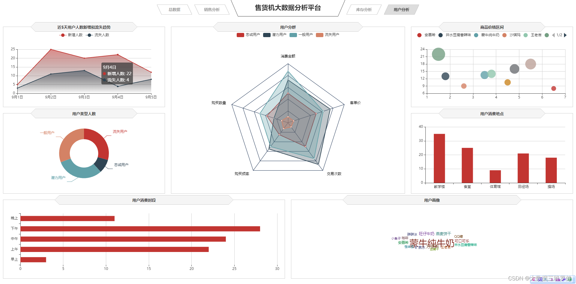 展示用户分
展示用户分
1.用折线图来绘制近5天用户人数新增和流失趋势
1)实现代码
var lossGrowth = echarts.init(document.getElementById('lossGrowth'));
$.get("data/近5日新增和流失用户数据.json").done(function (data) {
    //data = JSON.parse(data);
	lossGrowth.setOption({
        tooltip: {
            trigger: 'axis'
        },
        legend: {
            type:'scroll'
        },
        grid: {
            left: '10',
            right: '30',
            bottom: '10',
            containLabel: true
        },
        xAxis: {
            type: 'category',
            boundaryGap: false,
            data: data.日期
        },
        yAxis: {
            type: 'value'
        },
        series: [
            {
                name:'新增人数',
                type:'line',
                data:data.新增人数,
                symbol:'circle',
                areaStyle: {
                    normal: {
                        color: new echarts.graphic.LinearGradient(0, 0, 0, 1, [{
                            offset: 0,
                            color: 'rgba(194, 53, 49,.8)'
                        }, {
                            offset: 1,
                            color: 'transparent'
                        }])
                    }
                }
            },
            {
                name:'流失人数',
                type:'line',
                symbol:'circle',
                data:data.流失人数,
                areaStyle: {
                    normal: {
                        color: new echarts.graphic.LinearGradient(0, 0, 0, 1, [{
                            offset: 0,
                            color: 'rgba(47, 69, 84,.8)'
                        }, {
                            offset: 1,
                            color: 'transparent'
                        }])
                    }
                }
            }
        ]
	});
});
2)代码分析:
同理.柱状和折线图来实现销售金额变化趋势,不过多分析
2.用雷达图来实现用户分群
1)代码实现
var userGroup = echarts.init(document.getElementById('userGroup'));
$.get("data/用户分群数据.json").done(function (data) {
    //data = JSON.parse(data);
	userGroup.setOption({
    tooltip: {},
    legend: {
    },
    radar: {
        name: {
            textStyle: {
                color: '#fff',
                borderRadius: 3,
                padding: [3, 5]
           }
        },
        center: ['50%', '58%'],
        splitArea: {
            areaStyle: {
                color:'transparent'
            }
        },
        axisLine: { lineStyle: {color: '#061e42' }},
        splitLine: { lineStyle: {color: '#061e42' }},
        indicator: [
           { name: '消费金额', max: 80,color:'black'},
           { name: '购买数量', max: 80,color:'black'},
           { name: '购买频率', max: 80,color:'black'},
           { name: '交易次数', max: 80,color:'black'},
           { name: '客单价', max: 80,color:'black' }
        ]
    },
    series: [{
        name: '用户分群',
        type: 'radar',

        areaStyle:{
            show:true,
            opacity:0.3
        },
        data : data.data
    }]
		})
});
2)代码分析:
center: ['50%', '58%'],
        splitArea: {
            areaStyle: {
                color:'transparent'
            }
        },
        axisLine: { lineStyle: {color: '#061e42' }},
        splitLine: { lineStyle: {color: '#061e42' }},
        indicator: [
           { name: '消费金额', max: 80,color:'black'},
           { name: '购买数量', max: 80,color:'black'},
           { name: '购买频率', max: 80,color:'black'},
           { name: '交易次数', max: 80,color:'black'},
           { name: '客单价', max: 80,color:'black' }
        ]
    },
    series: [{
        name: '用户分群',
        type: 'radar',

        areaStyle:{
            show:true,
            opacity:0.3
        },
        data : data.data
    }]
		})
});
这里设置了center即的中心(圆心)坐标,数组的第一项是横坐标,第二项是纵坐标
indicator设置了雷达图的五个点的名称和最大值及颜色
type:设置了为雷达图的类型
data:异步数据同步完成雷达图的设置
3.用词云图来实现用户画像
1)实现代码:
var chart = echarts.init(document.getElementById('userHot'));
$.get("data/用户购买的商品名称和商品数量数据.json").done(function (data) {
    //data = JSON.parse(data);
    var option = {
        tooltip : {
            trigger: 'item',
            formatter:function(item){
                return item.name + ":" + item.value.toFixed(2);
            }
        },
        series: [ {
            type: 'wordCloud',
            sizeRange: [10,30],
            rotationRange: [0, 0],
            rotationStep: 180,
            gridSize: 0,
            autoSize: {enable:true, minSize:5},
            shape: 'roundRect',
            left: 'center',
            top: 'center',
            width: '100%',
            height: '100%',
            right: null,
            bottom: null,
            textStyle: {
                normal: {
                    color: function () {
                        return 'rgb(' + [
                            Math.round(Math.random() * 160),
                            Math.round(Math.random() * 160),
                            Math.round(Math.random() * 160)
                        ].join(',') + ')';
                    }
                },
                emphasis: {
                    shadowBlur: 26,
                    color:'#333',
                    shadowColor: '#ccc',
                    fontSize:20
                }
            },
            data: data.data.sort(function (a, b) {
                return b.value  - a.value;
            })
        } ]
    };
    chart.setOption(option);
});
2)代码分析:
            type: 'wordCloud',
            sizeRange: [10,30],
            rotationRange: [0, 0],
            rotationStep: 180,
            gridSize: 0,
            autoSize: {enable:true, minSize:5},
            shape: 'roundRect',
            left: 'center',
            top: 'center',
            width: '100%',
            height: '100%',
            right: null,
            bottom: null,
这里设置了type类型为词云图
和大小区间为10到30
和词云词语位置居中
宽度和高度都是100%
right和bottom为空
            textStyle: {
                normal: {
                    color: function () {
                        return 'rgb(' + [
                            Math.round(Math.random() * 160),
                            Math.round(Math.random() * 160),
                            Math.round(Math.random() * 160)
                        ].join(',') + ')';
                    }
                },
                emphasis: {
                    shadowBlur: 26,
                    color:'#333',
                    shadowColor: '#ccc',
                    fontSize:20
                }
            },
这里设置的文字样式,颜色和字体大小等等
      data: data.data.sort(function (a, b) {
                return b.value  - a.value;
异步数据和函数的引用即可使词云图实现显示
4.用条形图来实现用户消费时段
1)代码实现
var expTime = echarts.init(document.getElementById('expTime'));
$.get("data/用户消费时段数据.json").done(function (data) {
    //data = JSON.parse(data);
	expTime.setOption({
    tooltip: {
        trigger: 'axis',
        axisPointer: {
            type: 'shadow'
        }
    },
    grid: {
        left: '10',
        top:'30',
        right:'10',
        bottom: '10',
        containLabel: true
    },
    barCategoryGap:'50%',
    xAxis: {
        type: 'value',
        min: 0,
        boundaryGap: [0, 0.01],
        axisLine:{lineStyle:{width:0}}
    },
    yAxis: {
        type: 'category',
        splitLine:{lineStyle:{width:0}},
        data: data.消费时段
    },
    series: [
        {
            name: '售出总数量',
            type: 'bar',
            label:{
                position:'right',
                verticalAlign:'middle'
            },
            data: data.用户人数
        }
    ]
		})
});
2)代码分析:
同理5.条形图来实现商品销售金额前5名不过多分析
5.用散点图来实现商品价格区间
1)代码实现:
var pInterval = echarts.init(document.getElementById('pInterval'));
pInterval.setOption({
    grid: {
        left: '3%',
        right: '10',
        bottom: '10',
        containLabel: true
    },
    tooltip : {
        showDelay : 0,
        formatter : function (params) {
                return params.seriesName + '<br/>' + '单价:' + params.value[0] + '<br/>' + '销量:' + params.value[1];
        },
        axisPointer:{
            show: true,
            type : 'cross',
            lineStyle: {
                type : 'dashed',
                width : 1
            }
        }
    },

    legend: {
        type:'scroll',
    },
    xAxis :{ scale:true},
    yAxis :{ scale:true},
});
2)代码分析
同理.用散点图来分析商品价格区间
6.用柱状图来实现用户消费地点
1)代码实现
2)代码分析
同理6.柱状图来实现售货机销售情况。
7.用环形图来实现用户类型人数
1)代码实现
var cSorNum = echarts.init(document.getElementById('cSorNum'));
$.get("data/不同类型用户的人数.json").done(function (data) {
    //data = JSON.parse(data);
	cSorNum.setOption({
    tooltip : {
        trigger: 'item',
        formatter: "{a} <br/>{b} : {c} ({d}%)"
    },
    legend: {
        show:false
    },
    grid: {
        left: '0%',
        right: '0%',
        bottom: '0%',
        containLabel: true
    },
    series : [
        {
            name: '用户类型人数',
            type: 'pie',
            radius: ['40%', '70%'],
            center: ['50%', '50%'],
            label:{
                formatter:"{b}\n{a|{d}%}",
                rich: {
                    a: {
                        padding:6,
                        align:'left',
                        color:'#fff'
                    }
                }
            },
            data:data.data,
            itemStyle: {
                emphasis: {
                    shadowBlur: 10,
                    shadowOffsetX: 0,
                    shadowColor: 'rgba(0, 0, 0, 0.5)'
                }
            }
        }
    ]
		})
});
2)代码分析
同理与5.用圆环饼图来实现品类库存占比


 1476
1476

 被折叠的 条评论
为什么被折叠?
被折叠的 条评论
为什么被折叠?
 到【灌水乐园】发言


