


1.盒子布局
1.1 border
盒子的主体为border,border表示边框,它有几种标签限制:
none(定义无标签)
hidden(作用与“none”相似,hidden用于解决边框冲突)
dotted(定义点状边框)
dashed(定义虚线)
solid(定义实线)

  <!DOCTYPE html>
<html lang="en">
<head>
    <meta charset="UTF-8">
    <meta http-equiv="X-UA-Compatible" content="IE=edge">
    <meta name="viewport" content="width=device-width, initial-scale=1.0">
    <title>border</title>
<style>
   div1{
    border: 1px dotted black;
   }
   div2{
    border: 1px dashed black;
   }
   div3{
    border: 1px solid black;
   }
   div4{
    border: 1px none ;
    background-color: bisque;
   }
   div5{
    border: 1px hidden;
    background-color: aqua;
   }

</style>
</head>
<body>
    <div1>这是点状边框(dotted)</div1>
    <div2>这是虚线边框(dashed)</div2>
    <div3>这是实线边框(solid)</div3>
    <div4>没有边框(none型)</div4>
    <div5>没有边框(hidden型)</div5>
</body>
</html>
1.2 padding和margin
padding表示内边距(内容距离边框的距离,有上(top)下(bottom)左(left)右(right))
margin表示外边距(边框距离页面的距离,有上(top)下(bottom)左(left)右(right))
例如
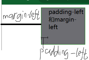
<!DOCTYPE html>
<html lang="en">
<head>
    <meta charset="UTF-8">
    <meta http-equiv="X-UA-Compatible" content="IE=edge">
    <meta name="viewport" content="width=device-width, initial-scale=1.0">
    <title>border</title>
  <style>
    div{
      width: 100px;
      height: 100px;
      background-color: rgb(109, 109, 114);
      border: 1px solid green;
      padding-left: 20px;
      margin-left: 100px;
      }
  </style>
</head>
<body>
    <div>padding-left和margin-left</div>
</body>
</html>
2 元素的分类
块级元素---独占一行(自动换行)div p hn(n是数字) hr可以设置宽度和高度
行内元素(内联)-----不会自动换行 a span 不可以设置宽度和高度(不起作用)
display标签可以实现块级元素和行内元素之间互换,它有以下几种取值
none---该元素不会被显示
block---将元素变为块级元素,会自动换行(默认有个换行符)
inline---将元素变为行内元素
故可知在css中隐藏元素的方式有display:none; width:0;height:0;
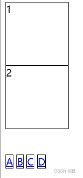
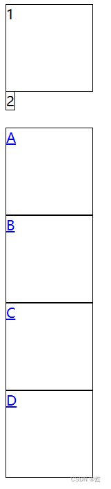
使用display:inline和display:block前 使用display:inline和display:block后
<!DOCTYPE html>
<html lang="en">
<head>
<meta charset="UTF-8">
<meta http-equiv="X-UA-Compatible" content="IE=edge">
<meta name="viewport" content="width=device-width, initial-scale=1.0">
<title>display的应用</title>
<head>
<style>
 div{
    width: 100px;
    height: 100px;
    border: 1px solid black;
    }
.x{
    width: 100px;
    height: 100px;
    border: 1px solid black;
    display: inline;
    }
a{
    width: 100px;
    height: 100px;
    border: 1px solid black;
    display: block;
    }
</style>
</head>
    <body>
        <div>1</div>
        <div class="x">2</div>
        <br>
        <br>
        <a href="#">A</a>
        <a href="#">B</a>
        <a href="#">C</a>
        <a href="#">D</a>
    </body>
</html>
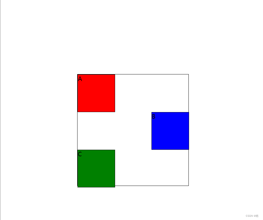
3 浮动布局
通过float属性去设置浮动布局
取值:left none(不浮动) right
注意:如果浮动的取值为left(左浮),会对后面的元素产生一定的影响
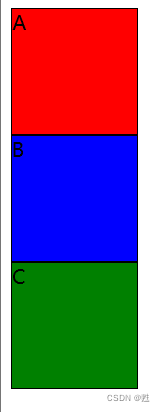 不浮动
不浮动 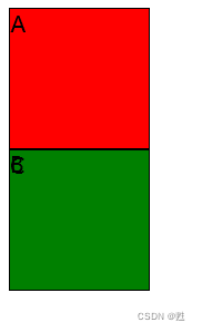 左浮
左浮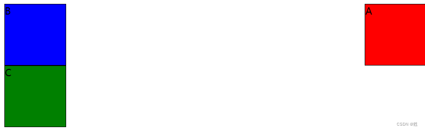
右浮
<!DOCTYPE html>
<html lang="en">
<head>
<meta charset="UTF-8">
<meta http-equiv="X-UA-Compatible" content="IE=edge">
<meta name="viewport" content="width=device-width, initial-scale=1.0">
<title>浮动布局</title>
<style>
.box1{
width: 100px;
height: 100px;
border: 1px solid black;
background-color: red;
/*float:none*/
/*float:left;*/
/*float: right;*/
}
.box2{
width: 100px;
height: 100px;
border: 1px solid black;
background-color: blue;
}
.box3{
width: 100px;
height: 100px;
border: 1px solid black;
background-color:green;
}
</style>
</head>
<body>
<div class="box1">A</div>
<div class="box2">B</div>
<div class="box3">C</div>
</body>
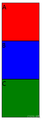
</html>如果要消除这种浮动,可以通过clear属性,它有以下几种属性
none:默认允许两边都可以浮动
left:不允许左边浮动
right:不允许右边浮动
both:不允许两侧有浮动
例如
<!DOCTYPE html>
<html lang="en">
<head>
<meta charset="UTF-8">
<meta http-equiv="X-UA-Compatible" content="IE=edge">
<meta name="viewport" content="width=device-width, initial-scale=1.0">
<title>浮动布局</title>
<style>
.box1{
     width: 100px;
     height: 100px;
     border: 1px solid black;
     background-color: red;
     float: left;
    }
.box2{
     width: 100px;
     height: 100px;
     border: 1px solid black;
     background-color: blue;
     clear: left;
    }
.box3{
     width: 100px;
     height: 100px;
     border: 1px solid black;
     background-color:green;
    }
</style>
</head>
    <body>
        <div class="box1">A</div>
        <div class="box2">B</div>
        <div class="box3">C</div>
    </body>
</html>
4 定位布局
position----设置对象的定位方式,有以下属性
static----静态定位(没有设置位置)默认
absolute----绝对定位:将对象从文档流中分离出来,设置left top right bottom这四个方向去设 置相较于父级对象的相对定位,如果不存在这样的父级对象,那么父级是body
relative ----相对定位:对象不从文档流中分离出来,设置left top right bottom这四个方向去设置 相较于自身的相对定位
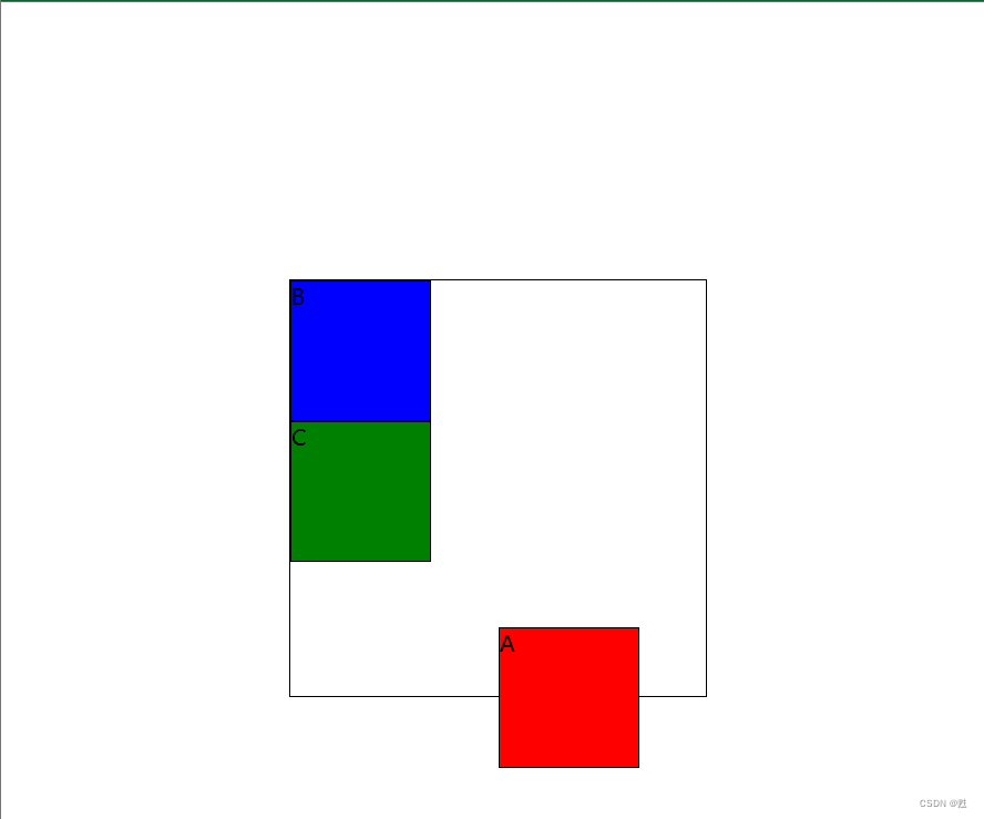
绝对定位 (absolute) 相对定位(relative)
<!DOCTYPE html>
<html lang="en">
<head>
<meta charset="UTF-8">
<meta http-equiv="X-UA-Compatible" content="IE=edge">
<meta name="viewport" content="width=device-width, initial-scale=1.0">
<title>浮动布局</title>
<style>
    #z{
        width: 300px;
        height: 300px;
        border: 1px solid black;
        margin: 200px;
        position: relative;
        }
    .box1{
        width: 100px;
        height: 100px;
        border: 1px solid black;
        background-color: red;
        /* position:absolute;
        top: 250px;
        left: 150px; */
        }
    .box2{
        width: 100px;
        height: 100px;
        border: 1px solid black;
        background-color: blue;
        /* position: relative;
        left: 200px; */
        }
    .box3{
        width: 100px;
        height: 100px;
        border: 1px solid black;
        background-color:green;
        }
</style>
</head>
<body>
    <div id="z">
        <div class="box1">A</div>
        <div class="box2">B</div>
        <div class="box3">C</div>
    </div>
</body>
</html>
5 其他属性
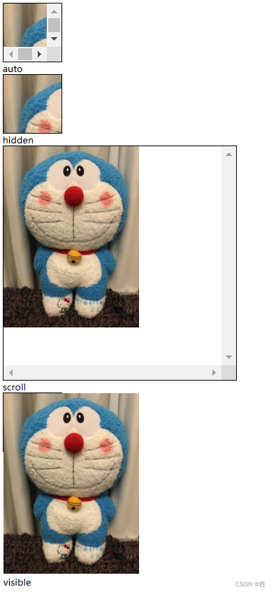
5.1 overflow
设置对象内容超过指定高度或宽度的时候,可以通过以下值进行管理
visible----- 默认值 不剪切内容也不添加滚动条
auto ----- 在必需时对象才会被裁剪或者添加滚动条
hidden ----- 不显示超过对象尺寸的内容(会被隐藏)
scroll ---- 总会显示滚动条
其中overflow:hidden可以隐藏元素
<!DOCTYPE html>
<html lang="en">
<head>
<meta charset="UTF-8">
<meta http-equiv="X-UA-Compatible" content="IE=edge">
<meta name="viewport" content="width=device-width, initial-scale=1.0">
<title>Document</title>
<style>
.zp{
width: 100px;
height: 100px;
border: 1px solid black;
overflow: visible;
}
.a{
width: 100px;
height: 100px;
border: 1px solid black;
overflow:auto;
}
.b{
width: 100px;
height: 100px;
border: 1px solid black;
overflow: hidden;
}
.c{
width: 400px;
height: 400px;
border: 1px solid black;
overflow: scroll;
}
</style>
</head>
<body>
<div class="a">
<img src="..\images\哆啦A梦.jpg" alt="">
</div>
auto
<div class="b">
<img src="..\images\哆啦A梦.jpg" alt="">
</div>
hidden
<div class="c">
<img src="..\images\哆啦A梦.jpg" alt="">
</div>
scroll
<div class="zp">
<img src="..\images\哆啦A梦.jpg" alt="">visible
</div>
</body>
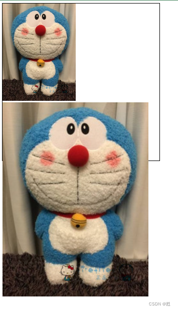
</html>5.2 zoom
设置或检索对象的缩放比例
normal : 默认值 显示的是对象的实际尺寸
number: 百分比|无符号的浮点数 浮点数为1.0相当于100%相当于取值为normal
<!DOCTYPE html>
<html lang="en">
<head>
<meta charset="UTF-8">
<meta http-equiv="X-UA-Compatible" content="IE=edge">
<meta name="viewport" content="width=device-width, initial-scale=1.0">
<title>Document</title>
<style>
.x{
width: 500px;
height: 500px;
border: 1px solid black;
}
.img1{
zoom: 1;
}
.img2{
zoom: 2;
}
</style>
</head>
<body>
<div class="x">
<img src="..\images\哆啦A梦.jpg" alt="" class="img1">
<img src="..\images\哆啦A梦.jpg" alt="" class="img2">
</div>
</body>
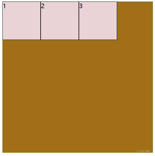
</html>6 弹性盒子css3
弹性盒子是由弹性容器(Flexible或Flexbox)和弹性元素(Flex-item)组合
设置弹性容器是通过display属性进行设置(display:flex或inline-flex)
注意:一个弹性盒子可以包含多个弹性元素
<!DOCTYPE html>
<html lang="en">
<head>
<meta charset="UTF-8">
<meta http-equiv="X-UA-Compatible" content="IE=edge">
<meta name="viewport" content="width=device-width, initial-scale=1.0">
<title>Document</title>
    <style>
        .flex-contain{
        width: 400px;
        height: 400px;
        background-color: rgb(159, 112, 23);
        display: inline-flex;
        }
        .flex-item{
        width: 100px;
        height: 100px;
        background-color: rgb(232, 212, 212);
        border: 1px solid black;
        }
    </style>
</head>
<body>
    <div class="flex-contain">
        <div class="flex-item">1</div>
        <div class="flex-item">2</div>
        <div class="flex-item">3</div>
    </div>
</body>
</html>
6.1 常见属性
flex- direction ------- 指的是弹性容器中子元素的排列方式
flex-wrap ------ 指的是弹性容器中子元素超出父容器时是否换行
flex-flow ----flex- direction 和flex-wrap 的简写
align-items --- 设置的弹性容器中元素在侧轴(纵轴)的对齐方式
justify-content ------ 设置的弹性容器中元素在主轴(横轴)的对齐方式
align-content-------修改了flex-flow 的行为,类似于align-items,它是对齐的弹性线
6.1.1 flex-dirction(弹性容器中子元素的排列方式)
row ----- 左对齐(横向的从左到右排列),默认
row- reverse ------ 反向的横向排列(右对齐),从后往前排,最后一项排在最前面
column ----- 纵向排列
column-reverse ----- 反向纵向排列
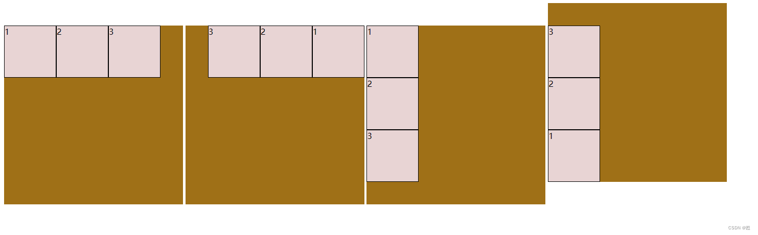 row row-reverse colum colum-reverse
<!DOCTYPE html>
<html lang="en">
<head>
<meta charset="UTF-8">
<meta http-equiv="X-UA-Compatible" content="IE=edge">
<meta name="viewport" content="width=device-width, initial-scale=1.0">
<title>Document</title>
    <style>
        .flex-contain1{
        width: 350px;
        height: 350px;
        background-color: rgb(159, 112, 23);
        display: inline-flex;
        flex-direction: row;
        }
        .flex-contain2{
        width: 350px;
        height: 350px;
        background-color: rgb(159, 112, 23);
        display: inline-flex;
        flex-direction: row-reverse;
        }
        .flex-contain3{
        width: 350px;
        height: 350px;
        background-color: rgb(159, 112, 23);
        display: inline-flex;
        flex-direction: column;
        }
        .flex-contain4{
        width: 350px;
        height: 350px;
        background-color: rgb(159, 112, 23);
        display: inline-flex;
        flex-direction: column-reverse;
        }
        .flex-item{
        width: 100px;
        height: 100px;
        background-color: rgb(232, 212, 212);
        border: 1px solid black;
        }
    </style>
</head>
<body>
    <div class="flex-contain1">
        <div class="flex-item">1</div>
        <div class="flex-item">2</div>
        <div class="flex-item">3</div>
    </div>
    <div class="flex-contain2">
        <div class="flex-item">1</div>
        <div class="flex-item">2</div>
        <div class="flex-item">3</div>
    </div>
    <div class="flex-contain3">
        <div class="flex-item">1</div>
        <div class="flex-item">2</div>
        <div class="flex-item">3</div>
    </div>
    <div class="flex-contain4">
        <div class="flex-item">1</div>
        <div class="flex-item">2</div>
        <div class="flex-item">3</div>
    </div>
</body>
</html>
6.1.2 flex-wrap(弹性容器中子元素超过父元素时是否换行)
nowrap ---- 默认值,规定弹性元素不会换行
wrap ---- 弹性元素在需要的时候会换行
wrap-reverse ------ 会换行,但是是反方向
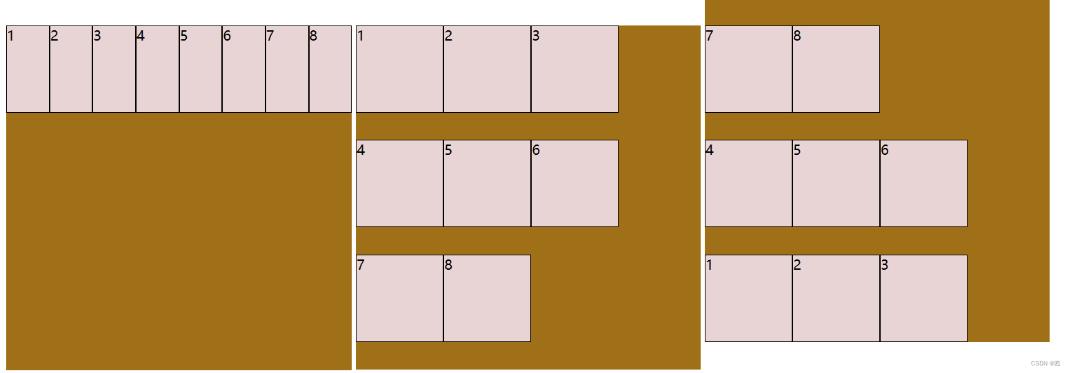
nowrap wrap wrap-reverse
<!DOCTYPE html>
<html lang="en">
<head>
<meta charset="UTF-8">
<meta http-equiv="X-UA-Compatible" content="IE=edge">
<meta name="viewport" content="width=device-width, initial-scale=1.0">
<title>Document</title>
<style>
.flex-contain1{
width: 401px;
height: 401px;
background-color: rgb(159, 112, 23);
display: inline-flex;
flex-wrap: nowrap;
}
.flex-contain2{
width: 400px;
height: 400px;
background-color: rgb(159, 112, 23);
display: inline-flex;
flex-wrap: wrap;
}
.flex-contain3{
width: 400px;
height: 400px;
background-color: rgb(159, 112, 23);
display: inline-flex;
flex-wrap: wrap-reverse;
}
.flex-item{
width: 100px;
height: 100px;
background-color: rgb(232, 212, 212);
border: 1px solid black;
}
</style>
</head>
<body>
<div class="flex-contain1">
<div class="flex-item">1</div>
<div class="flex-item">2</div>
<div class="flex-item">3</div>
<div class="flex-item">4</div>
<div class="flex-item">5</div>
<div class="flex-item">6</div>
<div class="flex-item">7</div>
<div class="flex-item">8</div>
</div>
<div class="flex-contain2">
<div class="flex-item">1</div>
<div class="flex-item">2</div>
<div class="flex-item">3</div>
<div class="flex-item">4</div>
<div class="flex-item">5</div>
<div class="flex-item">6</div>
<div class="flex-item">7</div>
<div class="flex-item">8</div>
</div>
<div class="flex-contain3">
<div class="flex-item">1</div>
<div class="flex-item">2</div>
<div class="flex-item">3</div>
<div class="flex-item">4</div>
<div class="flex-item">5</div>
<div class="flex-item">6</div>
<div class="flex-item">7</div>
<div class="flex-item">8</div>
</div>
</body>
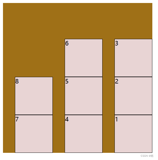
</html>6.1.3 flex-flow(是前两种的组合缩写)
flex-flow是flex- direction 和flex-wrap 的简写,将两种属性按先后顺序输入
<!DOCTYPE html>
<html lang="en">
<head>
<meta charset="UTF-8">
<meta http-equiv="X-UA-Compatible" content="IE=edge">
<meta name="viewport" content="width=device-width, initial-scale=1.0">
<title>Document</title>
<style>
.flex-contain1{
width: 401px;
height: 401px;
background-color: rgb(159, 112, 23);
display: inline-flex;
flex-flow: column-reverse wrap-reverse;
}
.flex-item{
width: 100px;
height: 100px;
background-color: rgb(232, 212, 212);
border: 1px solid black;
}
</style>
</head>
<body>
<div class="flex-contain1">
<div class="flex-item">1</div>
<div class="flex-item">2</div>
<div class="flex-item">3</div>
<div class="flex-item">4</div>
<div class="flex-item">5</div>
<div class="flex-item">6</div>
<div class="flex-item">7</div>
<div class="flex-item">8</div>
</div>
</body>
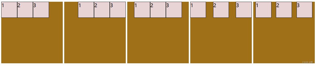
</html>6.1.4 align-items(设置弹性容器中元素在纵轴的对齐方式)
stretch---默认,子元素被拉伸以适应容器
center---子元素位于容器中央
flex-start---子元素位于容器的开头
flex-end---子元素位于容器的末端
baseline---子元素位于容器的基线
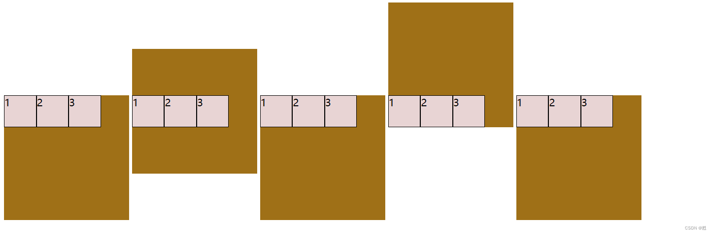
stretch center flex-start flex-end baseline
<!DOCTYPE html>
<html lang="en">
<head>
    <meta charset="UTF-8">
    <meta http-equiv="X-UA-Compatible" content="IE=edge">
    <meta name="viewport" content="width=device-width, initial-scale=1.0">
    <title>Document</title>
    <style>
         .flex-contain1{
        width: 200px;
        height: 200px;
        background-color: rgb(159, 112, 23);
        display: inline-flex;
        align-items: stretch;
        }
        .flex-contain2{
        width: 200px;
        height: 200px;
        background-color: rgb(159, 112, 23);
        display: inline-flex;
        align-items:center;
        }
        .flex-contain3{
        width: 200px;
        height: 200px;
        background-color: rgb(159, 112, 23);
        display: inline-flex;
        align-items: flex-start;
        }
        .flex-contain4{
        width: 200px;
        height: 200px;
        background-color: rgb(159, 112, 23);
        display: inline-flex;
        align-items: flex-end;
        }
        .flex-contain5{
        width: 200px;
        height: 200px;
        background-color: rgb(159, 112, 23);
        display: inline-flex;
        align-items: baseline;
        }
        .flex-item{
        width: 50px;
        height: 50px;
        background-color: rgb(232, 212, 212);
        border: 1px solid black;
        }
    </style>
</head>
<body>
    <div class="flex-contain1">
        <div class="flex-item">1</div>
        <div class="flex-item">2</div>
        <div class="flex-item">3</div>
    </div>
    <div class="flex-contain2">
        <div class="flex-item">1</div>
        <div class="flex-item">2</div>
        <div class="flex-item">3</div>
    </div>
    <div class="flex-contain3">
        <div class="flex-item">1</div>
        <div class="flex-item">2</div>
        <div class="flex-item">3</div>
    </div>
    <div class="flex-contain4">
        <div class="flex-item">1</div>
        <div class="flex-item">2</div>
        <div class="flex-item">3</div>
    </div>
    <div class="flex-contain5">
        <div class="flex-item">1</div>
        <div class="flex-item">2</div>
        <div class="flex-item">3</div>
    </div>
</body>
</html>
6.1.5 justify-content(设置弹性容器中子元素在横轴的对齐方式)
flex-start---默认值,子元素位于容器开头
flex-end---子元素位于容器的结尾
center---子元素位于容器中央
space-between---子元素在行与行有间隔
space-around---子元素在行之前、行之间和行之后有空间
flex-start flex-end center space-between space-around
<!DOCTYPE html>
<html lang="en">
<head>
    <meta charset="UTF-8">
    <meta http-equiv="X-UA-Compatible" content="IE=edge">
    <meta name="viewport" content="width=device-width, initial-scale=1.0">
    <title>Document</title>
    <style>
         .flex-contain1{
        width: 200px;
        height: 200px;
        background-color: rgb(159, 112, 23);
        display: inline-flex;
        justify-content: flex-start;
        }
        .flex-contain2{
        width: 200px;
        height: 200px;
        background-color: rgb(159, 112, 23);
        display: inline-flex;
       justify-content: flex-end;
        }
        .flex-contain3{
        width: 200px;
        height: 200px;
        background-color: rgb(159, 112, 23);
        display: inline-flex;
       justify-content: center;
        }
        .flex-contain4{
        width: 200px;
        height: 200px;
        background-color: rgb(159, 112, 23);
        display: inline-flex;
       justify-content: space-between;
        }
        .flex-contain5{
        width: 200px;
        height: 200px;
        background-color: rgb(159, 112, 23);
        display: inline-flex;
       justify-content: space-around;
        }
        .flex-item{
        width: 50px;
        height: 50px;
        background-color: rgb(232, 212, 212);
        border: 1px solid black;
        }
    </style>
</head>
<body>
    <div class="flex-contain1">
        <div class="flex-item">1</div>
        <div class="flex-item">2</div>
        <div class="flex-item">3</div>
    </div>
    <div class="flex-contain2">
        <div class="flex-item">1</div>
        <div class="flex-item">2</div>
        <div class="flex-item">3</div>
    </div>
    <div class="flex-contain3">
        <div class="flex-item">1</div>
        <div class="flex-item">2</div>
        <div class="flex-item">3</div>
    </div>
    <div class="flex-contain4">
        <div class="flex-item">1</div>
        <div class="flex-item">2</div>
        <div class="flex-item">3</div>
    </div>
    <div class="flex-contain5">
        <div class="flex-item">1</div>
        <div class="flex-item">2</div>
        <div class="flex-item">3</div>
    </div>
</body>
</html>
6.1.6 align-content(修改了flex-flow的行为,类似align-items,它是对齐的弹性线)
stretch---默认值,行拉伸以占据剩余空间
center---朝着弹性容器中央的对行打包
flex-start---朝着弹性容器的开头对行打包
flex-end---朝着弹性容器的结尾对行打包
space-between---行均匀分布在弹性容器中
space-around---行均匀分布在弹性容器中,两端各占一半
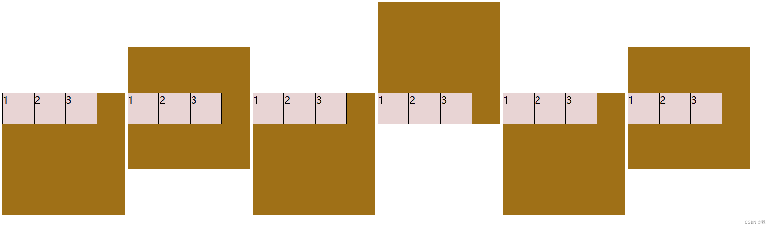
stretch center flex-start flex-end space-between space-around
<!DOCTYPE html>
<html lang="en">
<head>
    <meta charset="UTF-8">
    <meta http-equiv="X-UA-Compatible" content="IE=edge">
    <meta name="viewport" content="width=device-width, initial-scale=1.0">
    <title>Document</title>
    <style>
         .flex-contain1{
        width: 200px;
        height: 200px;
        background-color: rgb(159, 112, 23);
        display: inline-flex;
        flex-wrap: wrap;
       align-content: stretch;
        }
        .flex-contain2{
        width: 200px;
        height: 200px;
        background-color: rgb(159, 112, 23);
        display: inline-flex;
        flex-wrap: wrap;
      align-content: center;
        }
        .flex-contain3{
        width: 200px;
        height: 200px;
        background-color: rgb(159, 112, 23);
        display: inline-flex;
        flex-wrap: wrap;
      align-content: flex-start;
        }
        .flex-contain4{
        width: 200px;
        height: 200px;
        background-color: rgb(159, 112, 23);
        display: inline-flex;
        flex-wrap: wrap;
       align-content: flex-end;
        }
        .flex-contain5{
        width: 200px;
        height: 200px;
        background-color: rgb(159, 112, 23);
        display: inline-flex;
        flex-wrap: wrap;
       align-content: space-between;
        }
        .flex-contain6{
        width: 200px;
        height: 200px;
        background-color: rgb(159, 112, 23);
        display: inline-flex;
        flex-wrap: wrap;
       align-content: space-around;
        }
        .flex-item{
        width: 50px;
        height: 50px;
        background-color: rgb(232, 212, 212);
        border: 1px solid black;
        }
    </style>
</head>
<body>
    <div class="flex-contain1">
        <div class="flex-item">1</div>
        <div class="flex-item">2</div>
        <div class="flex-item">3</div>
    </div>
    <div class="flex-contain2">
        <div class="flex-item">1</div>
        <div class="flex-item">2</div>
        <div class="flex-item">3</div>
    </div>
    <div class="flex-contain3">
        <div class="flex-item">1</div>
        <div class="flex-item">2</div>
        <div class="flex-item">3</div>
    </div>
    <div class="flex-contain4">
        <div class="flex-item">1</div>
        <div class="flex-item">2</div>
        <div class="flex-item">3</div>
    </div>
    <div class="flex-contain5">
        <div class="flex-item">1</div>
        <div class="flex-item">2</div>
        <div class="flex-item">3</div>
    </div>
    <div class="flex-contain6">
        <div class="flex-item">1</div>
        <div class="flex-item">2</div>
        <div class="flex-item">3</div>
    </div>
</body>
</html>


 5005
5005


 被折叠的 条评论
为什么被折叠?
被折叠的 条评论
为什么被折叠?
 到【灌水乐园】发言


