


pyecharts 是一个用于生成 Echarts 图表的类库。Echarts 是百度开源的一个数据可视化 JS 库。用 Echarts 生成的图可视化效果非常棒,pyecharts 是为了与 Python 进行对接,方便在 Python 中直接使用数据生成图。
今天我们就用jupyter notebook(工具)和pyecharts(库)绘制图形
一、Pyecharts绘制饼图
from pyecharts.charts import Pie
import pyecharts.options as opts
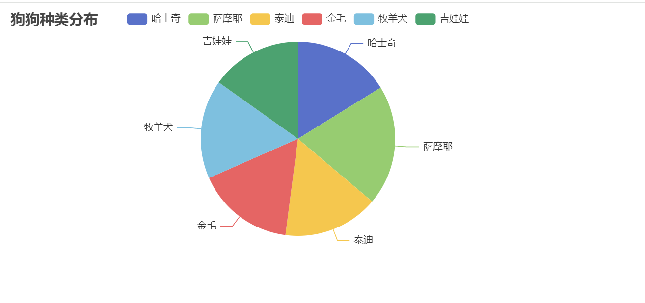
num = [110, 136, 108, 111, 112, 103]
lab = ['哈士奇', '萨摩耶', '泰迪', '金毛', '牧羊犬', '吉娃娃']
# 创建饼图
pie_chart = (
Pie(init_opts=opts.InitOpts(width='720px', height='320px'))
.add("", [(j, i) for i, j in zip(num, lab)])
.set_global_opts(title_opts=opts.TitleOpts(title="狗狗种类分布"))
.render("pie_chart.html") # 保存为 HTML 文件
)
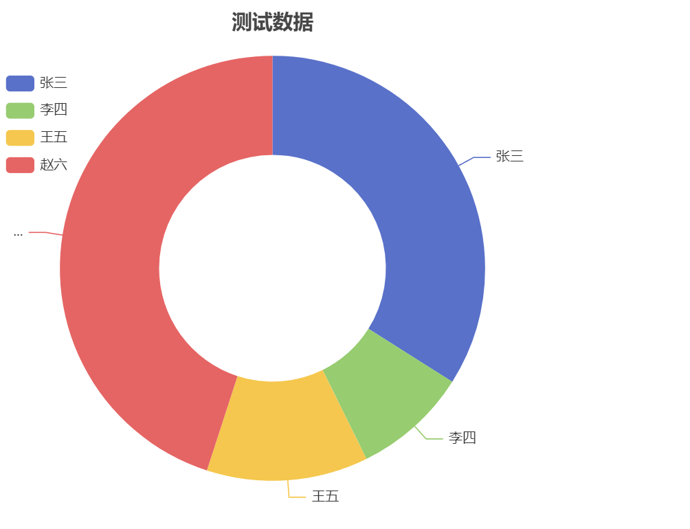
# 导入库

from pyecharts.charts import  Pie
from pyecharts import  options as opts

#数据
x_data = ['张三','李四','王五','赵六']
y_data = [830,214,300,1100]

# Pie 设置指定的格式
data_pair = [list(z) for z in  list(zip(x_data,y_data))] # [['张三', 830], ['李四', 214], ['王五', 300], ['赵六', 1100]]

c = Pie(init_opts=opts.InitOpts(width='500px',height='500px'))
c.add(series_name='访问来源',data_pair=data_pair,radius=['40%','75%']) #radius 讲饼图展示位环形图

# 设置全局项
c.set_global_opts(title_opts=opts.TitleOpts(title='测试数据',pos_left='center',pos_top=20),
legend_opts=opts.LegendOpts(orient='vertical',pos_top='15%',pos_left='2%')) #图例


# 设置每项数据占比
c.set_series_opts(tooltip_opts=opts.TooltipOpts(trigger='item',formatter="{a} <br/> {b}:{c} ({d}%)")) #formatter 图表悬
最低0.47元/天 解锁文章


 2708
2708

 被折叠的 条评论
为什么被折叠?
被折叠的 条评论
为什么被折叠?
 到【灌水乐园】发言


