


使用plot()库绘制反映最高气温和最低气温趋势的折线图
import matplotlib.pyplot as plt
import numpy as np
#准备数据
x=np.arange(4,19)
y1 = np.array([32,33,34,34,33,31,30,29,30,29,26,23,21,25,31])
y2 = np.array([19,19,20,22,22,21,22,16,18,18,17,14,15,16,16])
#创建代表画布的Figure类的对象fig
fig = plt.figure()
#在画布fig上添加坐标系风格的绘图区域ax
ax = fig.add_subplot(111)
#绘制折线图
plt.plot(x,y2)
plt.plot(x,y1,'-r')
plt.show()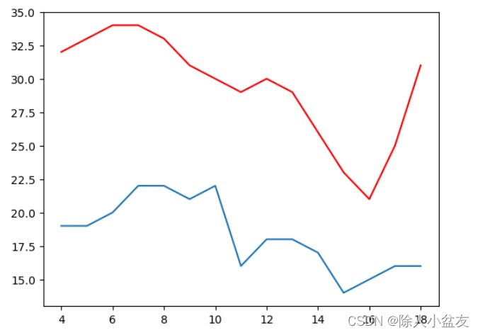
使用bar()函数绘制多组柱形图
import numpy as up
import matplotlib.pyplot as plt
x = np.arange(5)
y1 = np.array([10,8,7,11,13])
y2 = np.array([10,8,7,11,13])
#创建代表画布的Figure类的对象fig
fig = plt.figure()
#在画布fig上添加坐标系风格的绘图区域ax
ax = fig.add_subplot(111)
#柱形高度
bar_width = 0.3
#绘制柱形图x+bar_width
plt.bar(x,y1,tick_label=['a','b','c','d','e'],width=bar_width)
plt.bar(x+0.5,y2,tick_label=['a','b','c','d','e'],width=bar_width)
plt.show()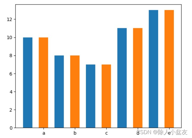


 385
385


 被折叠的 条评论
为什么被折叠?
被折叠的 条评论
为什么被折叠?
 到【灌水乐园】发言


