


 本文详细介绍了鸿蒙ArkUI框架中Tabs组件的使用,包括简单使用方法、设置TabBar布局模式、调整位置和排列方向、自定义TabBar样式,并通过示例代码展示了如何创建可滚动、可自定义样式的页签,帮助开发者实现内容视图的切换。
概述
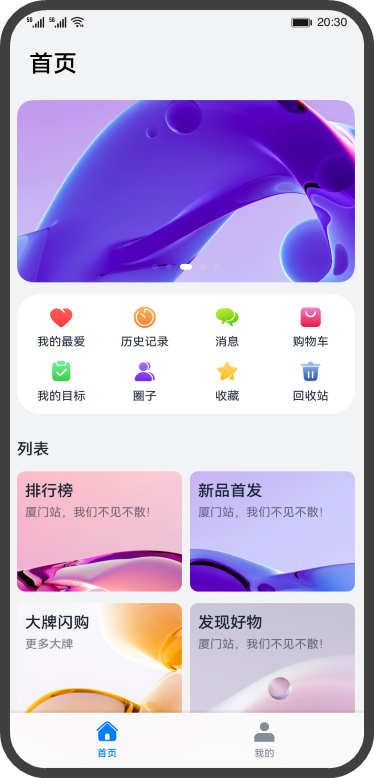
在我们常用的应用中,经常会有视图内容切换的场景,来展示更加丰富的内容。比如下面这个页面,点击底部的页签的选项,可以实现“首页”和“我的”
两个内容视图的切换。
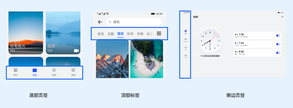
ArkUI开发框架提供了一种页签容器组件Tabs,开发者通过Tabs组件可以很容易的实现内容视图的切换。页签容器Tabs的形式多种多样,不同的页面设计页签不一样,可以把页签设置在底部、顶部或者侧边。
本文将详细介绍Tabs组件的使用。
Tabs组件的简单使用
Tabs组件仅可包含子组件TabContent,每一个页签对应一个内容视图即TabContent组件。下面的示例代码构建了一个简单的页签页面:
- @Entry
- @Component
- struct TabsExample {
- private controller: TabsController = new TabsController()
- build() {
- Column() {
- Tabs({ barPosition: BarPosition.Start, controller: this.controller }) {
- TabContent() {
- Column().width('100%').height('100%').backgroundColor(Color.Green)
- }
- .tabBar('green')
- TabContent() {
- Column().width('100%').height('100%').backgroundColor(Color.Blue)
- }
- .tabBar('blue')
- TabContent() {
- Column().width('100%').height('100%').backgroundColor(Color.Yellow)
- }
- .tabBar('yellow')
- TabContent() {
- Column().width('100%').height('100%').backgroundColor(Color.Pink)
- }
- .tabBar('pink')
- }
- .barWidth('100%') // 设置TabBar宽度
- .barHeight(60) // 设置TabBar高度
- .width('100%') // 设置Tabs组件宽度
- .height('100%') // 设置Tabs组件高度
- .bac
 最低0.47元/天 解锁文章


 2655
2655

 被折叠的 条评论
为什么被折叠?
被折叠的 条评论
为什么被折叠?
 到【灌水乐园】发言


