


这是博主第一次正式学习软件,本科专攻硬件,因物联网项目需要故学习小程序制作的技巧,算是0基础学习软件。推荐观看B站up主三分钟实验室的视频来当新手入门,该博主不仅很懂网页还会教你熟练使用AI来提升效率。听说前端坑还是挺多的。
有问题欢迎在评论区下留言,博主看到了一定会尽力回复,文章末尾有完整代码及效果展示。
这是最后实现的效果
下面是开发软件所需的技术栈
一,基本框架
<!DOCTYPE html>
<html lang="en">
<head>
    <meta charset="UTF-8">
    <meta name="viewport" content="width=device-width, initial-scale=1.0">
    <title>Document</title>
</head>
<body>
    <h1>Hello world</h1>
</body>
</html>
AI解释:
<!DOCTYPE html>  <!-- 📜 告诉浏览器:"这是现代HTML,不是1999年的老代码!" -->
<html lang="en"> <!-- 🌍 整个房子的地基,lang="en"表示用英语(影响翻译/语音) -->
<head>          <!-- 🧠 房子的「大脑」:这里写的东西用户看不见 -->
    <meta charset="UTF-8">  <!-- 🔤 用「UTF-8字典」翻译文字,避免中文变乱码 -->
    <meta name="viewport" content="width=device-width, initial-scale=1.0">
    <!-- 📱 手机适配咒语:让网页宽度=手机宽度,别缩放 -->
    <title>Document</title> <!-- 🏷️ 浏览器标签页标题(不是网页里的标题) -->
</head>
<body>           <!-- 👀 房子的「身体」:用户能看到的所有内容 -->
    <h1>Hello world</h1>  <!-- 📢 最大的标题,像报纸头版头条 -->
</body>
</html>
其中注意双标签和单标签的用法,还有属性的概念,html的标签有点像别的语言的语法。盒子的概念有点类似于集合。
DIV配合CSS可以搞定前端的大部分工作。
1,往网页里面添加图片
1-1.添加网络图片
随便去网上找一张图片,右键单击这个图片,跳出菜单,这时我们选择复制图像链接,你会得到像这样的地址,然后把它复制到src里面去,这样就可以显示网络图片了。https://cdn-docs-new.pingcode.com/baike/wp-content/uploads/2024/09/4e2e04ffe75c82f4c1c5791d3206093b.webp
<body>
<input type="test">
<img
src="https://cdn-docs-new.pingcode.com/baike/wp-content/uploads/2024/09/4e2e04ffe75c82f4c1c5791d3206093b.webp"
alt=""
/>
</body>1-2.添加本地图片
图片放在与html文件同一目录下(即同一个文件夹里),在body双标签里使用img单标签,然后在img里,添加属性src="图片名称与格式"。
<body>

    <input type="test">
    <img
        src="花火.jpg"
        alt=""
    />

</body>2,创建一个小方块
*body双标签里必须同时包含div双标签和style双标签才起效
<body>

    <div></div>

    <style>
        div{
            width: 100px;
            height: 100px;
            background-color: rgb(11, 3, 3);
        }
    </style>


</body>html部分:div语句的功能:创建一个看不见的透明容器(此时就像空气方块)
css部分:div{...}的作用为
-
width: 100px
→ 把容器宽度设为 100 像素(像规定模具横向尺寸) -
height: 100px
→ 把容器高度设为 100 像素(像规定模具纵向尺寸) -
background-color: rgb(11, 3, 3)
→ 用 RGB 颜色模式调配颜色:-
红色光 11/255 ≈ 4%
-
绿色光 3/255 ≈ 1%
-
蓝色光 3/255 ≈ 1%
→ 混合成接近黑色的深褐色(像浓稠的黑巧克力)
-
我们还可以创建多个小方块且颜色不一样:
先放代码后解释
<body>

    <div class="box"></div>
    <div class="box1"></div>
    <div class="box"></div>

    <style>
        .box{
            margin-top: 10px;
            width: 100px;
            height: 100px;
            background-color: black;
        }
        .box1{
            margin-top: 10px;
            width: 100px;
            height: 100px;
            background-color: rgb(232, 15, 203);
        }
    </style>


</body>
我们需要学会用选择器:
🏷️ 选择器 = 给元素贴标签
就像快递员通过地址标签找到收件人,CSS 通过选择器找到要装饰的 HTML 元素
可以通过选择器给不同的容器添加属性
🔍 6 大常用选择器速查表
| 类型 | 写法 | 特点 | 类比 |
|---|---|---|---|
| 1. 标签选择器 | div | 选中所有同类标签 | 给所有顺丰快递贴红标 |
| 2. 类选择器 | .box | 通过 class 属性筛选 | 给贴有「易碎品」标签的包裹特殊处理 |
| 3. ID选择器 | #header | 通过唯一 id 精准定位 | 快递单号 SF123456(唯一) |
| 4. 属性选择器 | [type="text"] | 按属性值筛选 | 筛选「到付」包裹 |
| 5. 后代选择器 | nav a | 选择嵌套在 nav 内的所有a标签 | 仓库A区3号货架上的箱子 |
| 6. 伪类选择器 | a:hover | 特定状态时生效 |
3,设置页面的背景颜色
<head>
    <meta charset="UTF-8">
    <meta name="viewport" content="width=device-width, initial-scale=1.0">
    <title>Hello</title>

    <style>
        body {
            /* 设置画布高度为整个可视区域 */
            min-height: 100vh;
            /* 使用线性渐变刷子从左到右刷颜色 */
            background: linear-gradient(
                to right,          /* 方向:从左到右 */
                #8A2BE2,           /* 起始颜色:紫色 */
                #4169E1            /* 结束颜色:蓝色 */
            );
            /* 禁止渐变重复平铺 */
            background-repeat: no-repeat;
        }
    </style>

</head>
把style放在head里面执行更好,其实一般标准html写法都是把style等标签放在head里,理由:
尽量将 <style> 标签放在 <head> 中,以确保页面加载时样式已经准备好,同时提升页面的可维护性和可读性。
加载顺序:
- 放在
<head>中:- 浏览器会在加载页面内容之前就解析和应用这些样式。这意味着在渲染页面内容之前,样式已经准备好了,用户可以看到样式化的内容,而不是先看到无样式的内容。
- 放在
<body>中:- 样式在加载到
<body>后才会被解析和应用,这可能导致页面在加载时先显示未样式化的内容(闪烁效果),这种体验对用户的视觉效果更差。
- 样式在加载到
div.todo-app后回车可以快捷创建一个名字为todo-app的标签。
<head>
    <meta charset="UTF-8">
    <meta name="viewport" content="width=device-width, initial-scale=1.0">
    <title>Hello</title>

    <div class="todo-app"></div>

    <style>
        body {
            /* 设置画布高度为整个可视区域 */
            min-height: 100vh;
            /* 使用线性渐变刷子从左到右刷颜色 */
            background: linear-gradient(
                to right,          /* 方向:从左到右 */
                #8A2BE2,           /* 起始颜色:紫色 */
                #4169E1            /* 结束颜色:蓝色 */
            );
            /* 禁止渐变重复平铺 */
            background-repeat: no-repeat;
        }
        .todo-app{
            width: 98%;
            height: 500px;
            background-color: #ffff;
        }
    </style>


</head>
小细节:百分比宽度是可以随着网页的宽度而改变,而固定宽度的话则不会。
border-radius: 10px;这个语句用来实现对盒子边角的控制
border-radius(圆形边框)
margin-top: 10px;这个语句用来实现盒子距离页面顶端有多高
同理还有margin-right,margin-left,margin-bottom。。。
margin(外边距)
4,在白色盒子里加标题
想要在已有的盒子上面再显示一个盒子,需要将后面div标签写在之前的div标签里。
下面是核心代码
<head>
    <meta charset="UTF-8">
    <meta name="viewport" content="width=device-width, initial-scale=1.0">
    <title>Hello</title>

    <div class="todo-app">
        <div class="title">XXX的Todo App</div>
    </div>

    <style>
        body {
            /* 设置画布高度为整个可视区域 */
            min-height: 100vh;
            /* 使用线性渐变刷子从左到右刷颜色 */
            background: linear-gradient(
                to right,          /* 方向:从左到右 */
                #8A2BE2,           /* 起始颜色:紫色 */
                #4169E1            /* 结束颜色:蓝色 */
            );
            /* 禁止渐变重复平铺 */
            background-repeat: no-repeat;
        }
        .todo-app{
            width: 98%;
            height: 600px;
            box-sizing: border-box;
            padding-top: 30px;
            background-color: #ffff;
            border-radius: 5px;
            margin-top: 40px;
            margin-left: 1%;
        }
        .title{
            font-size: 50px;
            font-weight: 700;
            text-align: center;
        }
    </style>
</head>
<div class="todo-app">
<div class="title">XXX的Todo App</div>
</div>
这条语句的作用是在类名为todo-app的盒子里创建类名为title的盒子,并且在title的盒子里放入XXX的Todo App这行文字。
font-size: 50px;(设置字体的大小)
font-weight: 700;(设置字体的粗细)
text-align: center;(设置字的位置)
注意margin针塌陷的问题,当我们需要给两个标签设置上边距时,如果使用两个margin-top,第二个会不起作用,所以为了解决这个问题,我们需要使用padding-top这个指令。
但是padding指令也有缺陷,它会把原来的白色盒子撑大,原因是计算盒子的高度是使用这个:height+padding。解决方法是box-sizing: border-box;用这个语句。
5,在白色盒子里添加搜索框
需要给定样式才取类名,class后面跟的就是类名。在盒子内部似乎没办法写注释。
<head>
    <div class="todo-app">
        <div class="title">XXX的Todo App</div>
        <div class="todo-from">
            <input class="todo-input" type="text" placeholder="add a todo">
            <div class="todo-button">add to do</div>
        </div>
    </div>

    <style>


        /*输入框右边按钮的属性*/
        .todo-button{
            width: 100px;
            height: 52px;
            border-radius: 0 20px 20px 0;/*左上起顺时针设置四个角的样式*/

            background: linear-gradient(
                to right,          /* 方向:从左到右 */
                #8A2BE2,           /* 起始颜色:紫色 */
                #4169E1            /* 结束颜色:蓝色 */
            );

            text-align: center;/*使内部文字横向居中*/
            line-height: 52px;/*使内部文字竖向居中,即内部文字行高对齐盒高*/
            color: #ffff;/*内部文字的颜色*/

            cursor: pointer;/*当鼠标置于按钮上时鼠标变为手指而不是I型*/
            user-select: none;/*使鼠标无法选中文字*/
        }


        /*输入框的属性*/
        .todo-input{
            margin-bottom: 20px;
            padding-left: 15px;/*输入框的左内边距*/
            border: 1px solid #dfe1e5;/*边框的宽和颜色*/
            outline: none;/*实现点击边框不变黑的效果*/
            width: 60%;
            height: 50px;
            border-radius: 20px 0 0 20px;/*左上起顺时针设置四个角的样式*/
        }

        .todo-from{
            display: flex;/*使它内部的所有盒子横着排*/
            margin-top: 20px;
            margin-left: 30px;
        }

    </style>
</head>
5-1.创建容纳输入框的盒子
<div class="todo-from">
<input class="todo-input" type="text" placeholder="add a todo">
<div class="todo-button">add to do</div>
</div>
5-2.创建输入框
/*输入框的属性*/
.todo-input{
margin-bottom: 20px;
padding-left: 15px;/*输入框的左内边距*/
border: 1px solid #dfe1e5;/*边框的宽和颜色*/
outline: none;/*实现点击边框不变黑的效果*/
width: 60%;
height: 50px;
border-radius: 20px 0 0 20px;/*左上起顺时针设置四个角的样式*/
}
5-3.创建输入框右边的按钮
.todo-button{
width: 100px;
height: 52px;
border-radius: 0 20px 20px 0;/*左上起顺时针设置四个角的样式*/
background: linear-gradient(
to right, /* 方向:从左到右 */
#8A2BE2, /* 起始颜色:紫色 */
#4169E1 /* 结束颜色:蓝色 */
);
text-align: center;/*使内部文字横向居中*/
line-height: 52px;/*使内部文字竖向居中,即内部文字行高对齐盒高*/
color: #ffff;/*内部文字的颜色*/
cursor: pointer;/*当鼠标置于按钮上时鼠标变为手指而不是I型*/
user-select: none;/*使鼠标无法选中文字*/
}
5-4.使输入框和输入确认按钮并排排列
.todo-from{
display: flex;/*使它内部的所有盒子横着排*/
margin-top: 20px;
margin-left: 30px;
}
6,在白色盒子里添加待办框
<head>

    <div class="todo-app">

        <div class="item completed">
            <div>
                <input type="checkbox" />
                <span class="name">吃饭</span>
            </div>

            <div class="del">del</div>
        </div>

        <div class="item">
            <div>
                <input type="checkbox" />
                <span class="name">吃饭</span>
            </div>

            <div class="del">del</div>
        </div>

        <div class="item">
            <div>
                <input type="checkbox" />
                <span class="name">吃饭</span>
            </div>

            <div class="del">del</div>
        </div>
    </div>

    <style>
        /*del的属性*/
        .del{
            color: red;
        }
        /*completed的属性*/
        .completed{
            text-decoration: line-through;/*在所有的字上画一条线*/
            opacity: 0.4;/*字体的透明度*/
        }

        /*待办框的属性*/
        .item{
            display: flex;/*内部盒子横向排列*/

            align-items: center;/*让这个框更加地居中*/
            justify-content: space-between;/*让这个盒子里面的元素自动地平分里面的空间*/

            box-sizing: border-box;
            width: 80%;
            height: 50px;
            margin: 8px auto;/*当margin只有两个值时,第一个值代表上下,第二个值代表左右,Auto代表左右自适应*/
            padding: 16px;
            border-radius: 20px;
            /*item是没有边框的,所以要添加阴影来体现边界*/
            box-shadow: rgba(149, 157, 165, 0.2)0px 8px 20px;/*给盒子边缘添加阴影,这几个参数分别是阴影颜色,水平偏移,垂直偏移,模糊半径*/
        }


    </style>
</head>
span和div差不多,唯一不同的是div是默认竖着排,span是默认横着排。
一个盒子可以具备多个类名,且其具有多个类名的属性,两个类名间用空格隔开。
6-1.先创建三个盒子,其中第一个盒子不一样,比另外两个盒子多具备了一个属性
<div class="todo-app">
<div class="item completed">
<div>
<input type="checkbox" />
<span class="name">吃饭</span>
</div>
<div class="del">del</div>
</div>
<div class="item">
<div>
<input type="checkbox" />
<span class="name">吃饭</span>
</div>
<div class="del">del</div>
</div>
<div class="item">
<div>
<input type="checkbox" />
<span class="name">吃饭</span>
</div>
<div class="del">del</div>
</div>
</div>
6-2.先定义待办框的属性
/*待办框的属性*/
.item{
display: flex;/*内部盒子横向排列*/
align-items: center;/*让这个框更加地居中*/
justify-content: space-between;/*让这个盒子里面的元素自动地平分里面的空间*/
box-sizing: border-box;
width: 80%;
height: 50px;
margin: 8px auto;/*当margin只有两个值时,第一个值代表上下,第二个值代表左右,Auto代表左右自适应*/
padding: 16px;
border-radius: 20px;
/*item是没有边框的,所以要添加阴影来体现边界*/
box-shadow: rgba(149, 157, 165, 0.2)0px 8px 20px;/*给盒子边缘添加阴影,这几个参数分别是阴影颜色,水平偏移,垂直偏移,模糊半径*/
}
6-3.再定义待办框内部两个盒子的属性
/*del的属性*/
.del{
color: red;
}
/*completed的属性*/
.completed{
text-decoration: line-through;/*在所有的字上画一条线*/
opacity: 0.4;/*字体的透明度*/
}
二,最后的完整代码以及实现的效果
最后,让我们将所有的模块给整合起来:
<!DOCTYPE html>
<html lang="en">
<head>
<meta charset="UTF-8">
<meta name="viewport" content="width=device-width, initial-scale=1.0">
<title>Hello</title>
<div class="todo-app">
<div class="title">XXX的Todo App</div>
<div class="todo-from">
<input class="todo-input" type="text" placeholder="add a todo">
<div class="todo-button">add to do</div>
</div>
<div class="item completed">
<div>
<input type="checkbox" />
<span class="name">吃饭</span>
</div>
<div class="del">del</div>
</div>
<div class="item">
<div>
<input type="checkbox" />
<span class="name">吃饭</span>
</div>
<div class="del">del</div>
</div>
<div class="item">
<div>
<input type="checkbox" />
<span class="name">吃饭</span>
</div>
<div class="del">del</div>
</div>
</div>
<style>
/*del的属性*/
.del{
color: red;
}
/*completed的属性*/
.completed{
text-decoration: line-through;/*在所有的字上画一条线*/
opacity: 0.4;/*字体的透明度*/
}
/*待办框的属性*/
.item{
display: flex;/*内部盒子横向排列*/
align-items: center;/*让这个框更加地居中*/
justify-content: space-between;/*让这个盒子里面的元素自动地平分里面的空间*/
box-sizing: border-box;
width: 80%;
height: 50px;
margin: 8px auto;/*当margin只有两个值时,第一个值代表上下,第二个值代表左右,Auto代表左右自适应*/
padding: 16px;
border-radius: 20px;
/*item是没有边框的,所以要添加阴影来体现边界*/
box-shadow: rgba(149, 157, 165, 0.2)0px 8px 20px;/*给盒子边缘添加阴影,这几个参数分别是阴影颜色,水平偏移,垂直偏移,模糊半径*/
}
/*输入框右边按钮的属性*/
.todo-button{
width: 100px;
height: 52px;
border-radius: 0 20px 20px 0;/*左上起顺时针设置四个角的样式*/
background: linear-gradient(
to right, /* 方向:从左到右 */
#8A2BE2, /* 起始颜色:紫色 */
#4169E1 /* 结束颜色:蓝色 */
);
text-align: center;/*使内部文字横向居中*/
line-height: 52px;/*使内部文字竖向居中,即内部文字行高对齐盒高*/
color: #ffff;/*内部文字的颜色*/
cursor: pointer;/*当鼠标置于按钮上时鼠标变为手指而不是I型*/
user-select: none;/*使鼠标无法选中文字*/
}
/*输入框的属性*/
.todo-input{
margin-bottom: 20px;
padding-left: 15px;/*输入框的左内边距*/
border: 1px solid #dfe1e5;/*边框的宽和颜色*/
outline: none;/*实现点击边框不变黑的效果*/
width: 60%;
height: 50px;
border-radius: 20px 0 0 20px;/*左上起顺时针设置四个角的样式*/
}
.todo-from{
display: flex;/*使它内部的所有盒子横着排*/
margin-top: 20px;
margin-left: 30px;
}
/*页面最低层的属性*/
body {
/* 设置画布高度为整个可视区域 */
min-height: 100vh;
/* 使用线性渐变刷子从左到右刷颜色 */
background: linear-gradient(
to right, /* 方向:从左到右 */
#8A2BE2, /* 起始颜色:紫色 */
#4169E1 /* 结束颜色:蓝色 */
);
/* 禁止渐变重复平铺 */
background-repeat: no-repeat;
}
/*白色盒子的属性*/
.todo-app{
width: 98%;
height: 600px;
box-sizing: border-box;/*防止设置内边距撑大盒子的大小*/
padding-top: 30px;/*内边距的长度*/
background-color: #ffff;
border-radius: 5px;/*盒子边界弧度*/
margin-top: 40px;/*外边距据页面顶端的高度*/
margin-left: 1%;/*外边距据页面左端的距离*/
}
/*白色盒子内部标题的属性*/
.title{
font-size: 50px;/*文字的大小*/
font-weight: 700;/*文字的粗细*/
text-align: center;/*文字的位置*/
}
</style>
</head>
<body>
</body>
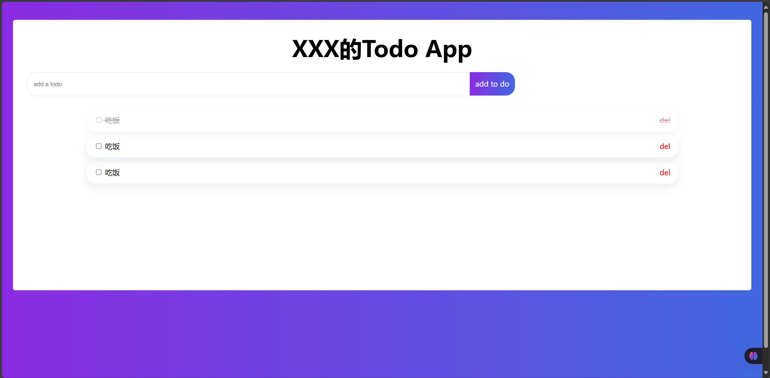
</html>PC端打开的效果,现在是本地打开:

然后可将你创建的HTML文件上传至服务器代理,这样就可以实现互联网访问。
可以使用sealos这个网站,新用户有免费额度
sealos地址:https://cloud.sealos.run/?uid=Kt1gH3_BTa
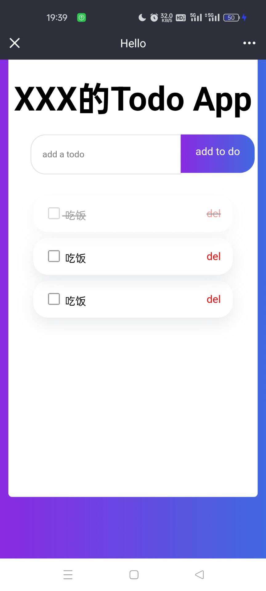
最后是手机端访问的效果:
最后感谢你看到这里,祝你学业顺利。


 扫一扫
扫一扫


 被折叠的 条评论
为什么被折叠?
被折叠的 条评论
为什么被折叠?
 到【灌水乐园】发言


