


}
50% {
transform: translateX(300%);
}
100% {
transform: translateX(0);
}
}
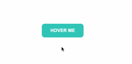
二、霓虹效果
======
效果

HTML
Hover me
Hover me
Hover me
CSS
#neon-btn {
display: flex;
align-items: center;
justify-content: space-around;
height: 100vh;
background: #031628;
}
.btn {
border: 1px solid;
background-color: transparent;
text-transform: uppercase;
font-size: 14px;
padding: 10px 20px;
font-weight: 300;
}
.one {
color: #4cc9f0;
}
.two {
color: #f038ff;
}
.three {
color: #b9e769;
}
.btn:hover {
color: white;
border: 0;
}
.one:hover {
background-color: #4cc9f0;
-webkit-box-shadow: 10px 10px 99px 6px rgba(76,201,240,1);
-moz-box-shadow: 10px 10px 99px 6px rgba(76,201,240,1);
box-shadow: 10px 10px 99px 6px rgba(76,201,240,1);
}
.two:hover {
background-color: #f038ff;
-webkit-box-shadow: 10px 10px 99px 6px rgba(240, 56, 255, 1);
-moz-box-shadow: 10px 10px 99px 6px rgba(240, 56, 255, 1);
box-shadow: 10px 10px 99px 6px rgba(240, 56, 255, 1);
}
.three:hover {
background-color: #b9e769;
-webkit-box-shadow: 10px 10px 99px 6px rgba(185, 231, 105, 1);
-moz-box-shadow: 10px 10px 99px 6px rgba(185, 231, 105, 1);
box-shadow: 10px 10px 99px 6px rgba(185, 231, 105, 1);
}
三、边框效果
======
效果

HTML
Hover me
CSS
#draw-border {
display: flex;
align-items: center;
justify-content: center;
height: 100vh;
}
button {
border: 0;
background: none;
text-transform: uppercase;
color: #4361ee;
font-weight: bold;
position: relative;
outline: none;
padding: 10px 20px;
box-sizing: border-box;
}
button::before, button::after {
box-sizing: inherit;
position: absolute;
content: ‘’;
border: 2px solid transparent;
width: 0;
height: 0;
}
button::after {
bottom: 0;
right: 0;
}
button::before {
top: 0;
left: 0;
}
button:hover::before, button:hover::after {
width: 100%;
height: 100%;
}
button:hover::before {
border-top-color: #4361ee;
border-right-color: #4361ee;
transition: width 0.3s ease-out, height 0.3s ease-out 0.3s;
}
button:hover::after {
border-bottom-color: #4361ee;
border-left-color: #4361ee;
transition: border-color 0s ease-out 0.6s, width 0.3s ease-out 0.6s, height 0.3s ease-out 1s;
}
四、圆形渐进效果
========
效果

HTML
// 这里有一个svg元素
Hover me
CSS
#circle-btn {
display: flex;
align-items: center;
justify-content: center;
height: 100vh;
}
.btn-container {
position: relative;
}
button {
border: 0;
border-radius: 50px;
color: white;
background: #5f55af;
padding: 15px 20px 16px 60px;
text-transform: uppercase;
background: linear-gradient(to right, #f72585 50%, #5f55af 50%);
background-size: 200% 100%;
background-position: right bottom;
transition:all 2s ease;
}
svg {
background: #f72585;
padding: 8px;
border-radius: 50%;
position: absolute;
left: 0;
top: 0%;
}
button:hover {
background-position: left bottom;
}
五、圆角效果
======
效果
HTML
Hover me
CSS
#border-btn {
display: flex;
align-items: center;
justify-content: center;
height: 100vh;
}
button {
border: 0;
border-radius: 10px;
background: #2ec4b6;
text-transform: uppercase;
color: white;
font-size: 16px;
font-weight: bold;
padding: 15px 30px;
outline: none;
position: relative;
transition: border-radius 3s;
-webkit-transition: border-radius 3s;
}
button:hover {
border-bottom-right-radius: 50px;
border-top-left-radius: 50px;
border-bottom-left-radius: 10px;
border-top-right-radius: 10px;
}
六、冰冻效果
======
效果

HTML
Hover me
Hover me
CSS
#frozen-btn {
display: flex;
align-items: center;
justify-content: center;
height: 100vh;
}
button {
border: 0;
margin: 20px;
text-transform: uppercase;
font-size: 20px;
font-weight: bold;
padding: 15px 50px;
border-radius: 50px;
color: white;
outline: none;
position: relative;
}
button:before{
content: ‘’;
display: block;
background: linear-gradient(to left, rgba(255, 255, 255, 0) 50%, rgba(255, 255, 255, 0.4) 50%);
background-size: 210% 100%;
background-position: right bottom;
height: 100%;
width: 100%;
position: absolute;
top: 0;
bottom:0;
right:0;
left: 0;
border-radius: 50px;
transition: all 1s;
-webkit-transition: all 1s;
}
.green {
background-image: linear-gradient(to right, #25aae1, #40e495);
box-shadow: 0 4px 15px 0 rgba(49, 196, 190, 0.75);
}
.purple {
background-image: linear-gradient(to right, #6253e1, #852D91);
box-shadow: 0 4px 15px 0 rgba(236, 116, 149, 0.75);
}
.purple:hover:before {
background-position: left bottom;
}
.green:hover:before {
background-position: left bottom;
}
七、闪亮效果
======
效果

HTML
Hover me
CSS
#shiny-shadow {
display: flex;
align-items: center;
justify-content: center;
height: 100vh;
background: #1c2541;
}
button {
border: 2px solid white;
background: transparent;
自我介绍一下,小编13年上海交大毕业,曾经在小公司待过,也去过华为、OPPO等大厂,18年进入阿里一直到现在。
深知大多数前端工程师,想要提升技能,往往是自己摸索成长或者是报班学习,但对于培训机构动则几千的学费,着实压力不小。自己不成体系的自学效果低效又漫长,而且极易碰到天花板技术停滞不前!
因此收集整理了一份《2024年Web前端开发全套学习资料》,初衷也很简单,就是希望能够帮助到想自学提升又不知道该从何学起的朋友,同时减轻大家的负担。
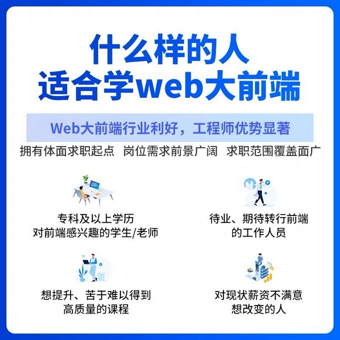

既有适合小白学习的零基础资料,也有适合3年以上经验的小伙伴深入学习提升的进阶课程,基本涵盖了95%以上前端开发知识点,真正体系化!

由于文件比较大,这里只是将部分目录截图出来,每个节点里面都包含大厂面经、学习笔记、源码讲义、实战项目、讲解视频,并且会持续更新!
如果你觉得这些内容对你有帮助,可以扫码获取!!(资料价值较高,非无偿)

结尾
学习html5、css、javascript这些基础知识,学习的渠道很多,就不多说了,例如,一些其他的优秀博客。但是本人觉得看书也很必要,可以节省很多时间,常见的javascript的书,例如:javascript的高级程序设计,是每位前端工程师必不可少的一本书,边看边用,了解js的一些基本知识,基本上很全面了,如果有时间可以读一些,js性能相关的书籍,以及设计者模式,在实践中都会用的到。
自己不成体系的自学效果低效又漫长,而且极易碰到天花板技术停滞不前!**
因此收集整理了一份《2024年Web前端开发全套学习资料》,初衷也很简单,就是希望能够帮助到想自学提升又不知道该从何学起的朋友,同时减轻大家的负担。
[外链图片转存中…(img-L1tTRFvB-1711653580860)]
[外链图片转存中…(img-qIH4TjbZ-1711653580860)]
既有适合小白学习的零基础资料,也有适合3年以上经验的小伙伴深入学习提升的进阶课程,基本涵盖了95%以上前端开发知识点,真正体系化!
[外链图片转存中…(img-sGStgyDa-1711653580861)]
由于文件比较大,这里只是将部分目录截图出来,每个节点里面都包含大厂面经、学习笔记、源码讲义、实战项目、讲解视频,并且会持续更新!
如果你觉得这些内容对你有帮助,可以扫码获取!!(资料价值较高,非无偿)
结尾
学习html5、css、javascript这些基础知识,学习的渠道很多,就不多说了,例如,一些其他的优秀博客。但是本人觉得看书也很必要,可以节省很多时间,常见的javascript的书,例如:javascript的高级程序设计,是每位前端工程师必不可少的一本书,边看边用,了解js的一些基本知识,基本上很全面了,如果有时间可以读一些,js性能相关的书籍,以及设计者模式,在实践中都会用的到。


 1215
1215


 被折叠的 条评论
为什么被折叠?
被折叠的 条评论
为什么被折叠?
 到【灌水乐园】发言


