


    border-right-color: #409eff;

    content: "";

  }

  .bubble-box::after {

    position: absolute;

    right: 100%;

    top: 50%;

    margin-top: -3px;

    border: 8px solid transparent;

    border-right-color: #fff;

    content: "";

  }
[]( )斜三角形气泡
----------------------------------------------------------------
### []( )实现逻辑
还是使用::after,使用它制作一个直角三角形
然后使用transform进行角度的倾斜达到效果。
.bubble-box {
    position: relative;

    border: 2px solid #409eff;

    border-radius: 5px;

    width: 200px;

    height: 50px;

    line-height: 50px;

    text-align: center;

  }

  .bubble-box::after {

    content: "";

    position: absolute;

    border:10px solid transparent;

    border-top-color: #409eff;

    border-right-color: #409eff;

    right: 100%;

    top: 10%;

    transform: skewY(10deg);

  }
[]( )拖尾气泡
--------------------------------------------------------------

### []( )实现思路
仔细观察图片:首先可以看到右下角的拖尾是有弧度的,在CSS中最简单实现弧度的方法:
就是对元素的圆角进行操作,只需要对两条边同时操作,即可产生效果。
`border-bottom-left-radius: 15px 15px;`

然后的话,拖尾是比较小的,并没有图示的大,这个时候再简单的方法,就是在上面加一层白色的div,覆盖掉其中的一部分。
<meta charset="UTF-8" />

<meta http-equiv="X-UA-Compatible" content="IE=edge" />

<meta name="viewport" content="width=device-width, initial-scale=1.0" />

<title>Document</title>

<style>

  .bubble-box {

    position: relative;

    text-align: center;

    width: 200px;

    height: 50px;

    line-height: 50px;

    background-color: #409eff;

    border-radius: 25px;


  }

  .bubble-box::before {

        content: "";

        position: absolute;

        z-index: -1;

        bottom: -2px;

        right: -8px;

        height: 20px;

        border-right: 20px solid #409eff;

        border-bottom-left-radius: 15px 15px;

        -webkit-transform: translate(0, -2px);

  }

  .bubble-box::after {

    content: "";

    position: absolute;

    z-index: 1;

    bottom: -2px;

    right: -56px;

    width: 26px;
最后
自我介绍一下,小编13年上海交大毕业,曾经在小公司待过,也去过华为、OPPO等大厂,18年进入阿里一直到现在。
深知大多数初中级Android工程师,想要提升技能,往往是自己摸索成长,自己不成体系的自学效果低效漫长且无助。
因此收集整理了一份《2024年Web前端开发全套学习资料》,初衷也很简单,就是希望能够帮助到想自学提升又不知道该从何学起的朋友,同时减轻大家的负担。


既有适合小白学习的零基础资料,也有适合3年以上经验的小伙伴深入学习提升的进阶课程,基本涵盖了95%以上Android开发知识点!不论你是刚入门Android开发的新手,还是希望在技术上不断提升的资深开发者,这些资料都将为你打开新的学习之门!
如果你觉得这些内容对你有帮助,需要这份全套学习资料的朋友可以戳我获取!!
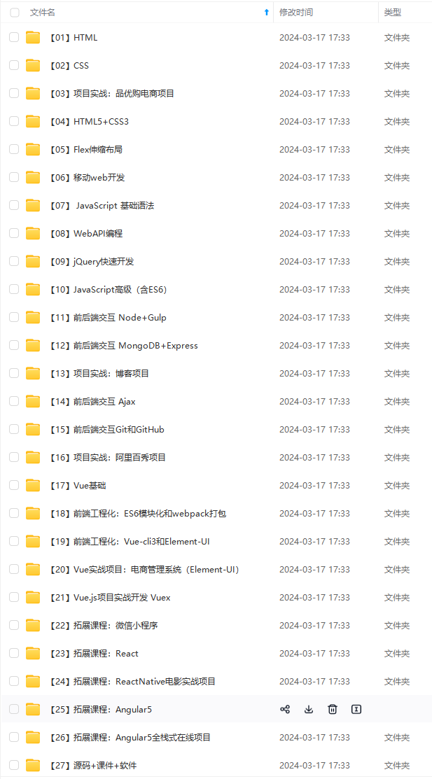
由于文件比较大,这里只是将部分目录截图出来,每个节点里面都包含大厂面经、学习笔记、源码讲义、实战项目、讲解视频,并且会持续更新!
上Android开发知识点!不论你是刚入门Android开发的新手,还是希望在技术上不断提升的资深开发者,这些资料都将为你打开新的学习之门!**
如果你觉得这些内容对你有帮助,需要这份全套学习资料的朋友可以戳我获取!!
由于文件比较大,这里只是将部分目录截图出来,每个节点里面都包含大厂面经、学习笔记、源码讲义、实战项目、讲解视频,并且会持续更新!


 169
169


 被折叠的 条评论
为什么被折叠?
被折叠的 条评论
为什么被折叠?
 到【灌水乐园】发言


