


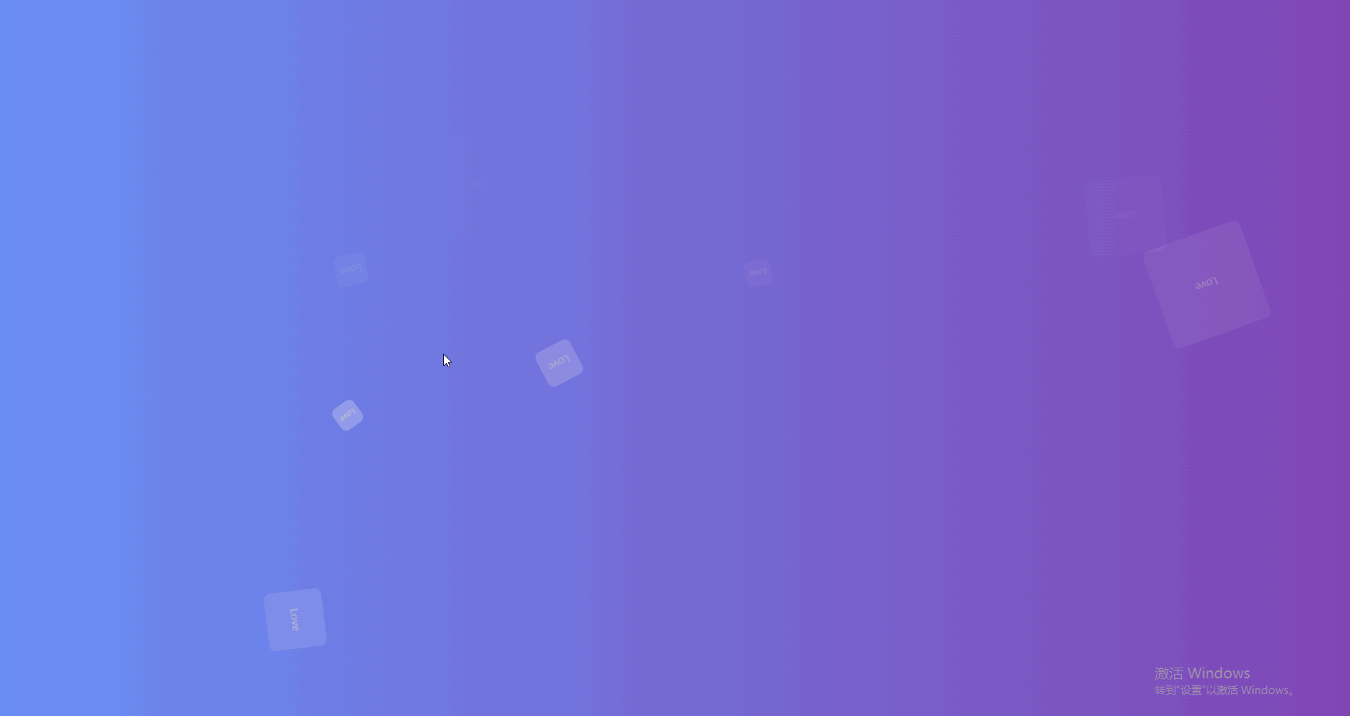
效果:
代码如下:
<!DOCTYPE html>
<html lang="en">

<head>
  <meta charset="UTF-8">
  <meta name="viewport" content="width=device-width, initial-scale=1.0">
  <title>Document</title>
  <style>
    html,
    body {
      height: 100%;
      width: 100%;
      padding: 0;
      margin: 0;
    }

    .bruce {
      height: 100%;
      background-image: linear-gradient(270deg, #8146b4, #6990f6);
    }

    .bubble-bgwall {
      overflow: hidden;
      position: fixed;
      margin: 0 auto;
      width: 100%;
      height: 100%;
      padding: 0;
    }

    .bubble-bgwall li {
      display: flex;
      position: absolute;
      bottom: -200px;
      justify-content: center;
      align-items: center;
      border-radius: 10px;
      width: 50px;
      height: 50px;
      background-color: rgba(255, 255, 255, 0.15);
      color: #ccc;
      animation: bubble 15s infinite;
      z-index: 999;
    }

    .bubble-bgwall li:nth-child(1) {
      left: 10%;
    }

    .bubble-bgwall li:nth-child(2) {
      left: 20%;
      width: 90px;
      height: 90px;
      animation-duration: 7s;
      animation-delay: 2s;
    }

    .bubble-bgwall li:nth-child(3) {
      left: 25%;
      animation-delay: 4s;
    }

    .bubble-bgwall li:nth-child(4) {
      left: 40%;
      width: 60px;
      height: 60px;
      background-color: rgba(255, 255, 255, 0.3);
      animation-duration: 8s;
    }

    .bubble-bgwall li:nth-child(5) {
      left: 70%;
    }

    .bubble-bgwall li:nth-child(6) {
      left: 80%;
      width: 120px;
      height: 120px;
      background-color: rgba(255, 255, 255, 0.2);
      animation-delay: 3s;
    }

    .bubble-bgwall li:nth-child(7) {
      left: 32%;
      width: 160px;
      height: 160px;
      animation-delay: 2s;
    }

    .bubble-bgwall li:nth-child(8) {
      left: 55%;
      width: 40px;
      height: 40px;
      font-size: 12px;
      animation-duration: 15s;
      animation-delay: 4s;
    }

    .bubble-bgwall li:nth-child(9) {
      left: 25%;
      width: 40px;
      height: 40px;
      background-color: rgba(255, 255, 255, 0.3);
      font-size: 12px;
      animation-duration: 12s;
      animation-delay: 2s;
    }

    .bubble-bgwall li:nth-child(10) {
      left: 85%;
      width: 160px;
      height: 160px;
      animation-delay: 5s;
    }

    @keyframes bubble {
      0% {
        opacity: 0.5;
        transform: translateY(0) rotate(45deg);
      }

      25% {
        opacity: 0.75;
        transform: translateY(-400px) rotate(90deg);
      }

      50% {
        opacity: 1;
        transform: translateY(-600px) rotate(135deg);
      }

      100% {
        opacity: 0;
        transform: translateY(-1000px) rotate(180deg);
      }
    }
  </style>
</head>

<body>
  <div class="bruce">
    <ul class="bubble-bgwall">
      <li>Love</li>
      <li>Love</li>
      <li>Love</li>
      <li>Love</li>
      <li>Love</li>
      <li>Love</li>
      <li>Love</li>
      <li>Love</li>
      <li>Love</li>
      <li>Love</li>
    </ul>
  </div>
</body>

</html>


 2659
2659


 被折叠的 条评论
为什么被折叠?
被折叠的 条评论
为什么被折叠?
 到【灌水乐园】发言


