


Button 的主要功能有:
- 触发操作:用户点击 Button 可以触发相应的操作,例如提交表单、搜索、切换页面等。
- 提交数据:Button 可以用于提交表单数据,将用户输入的数据提交到服务器进行处理。
- 执行命令:Button 可以执行系统或应用程序的命令,例如打印、保存、退出等。
- 触发事件:Button 可以触发自定义事件,通过与其他组件配合使用,可以实现复杂的交互效果。
1.创建按钮
语法说明:
Button(label?: string, options?: { type?: ButtonType, stateEffect?: boolean })
Button(options?: {type?: ButtonType, stateEffect?: boolean})
使用:
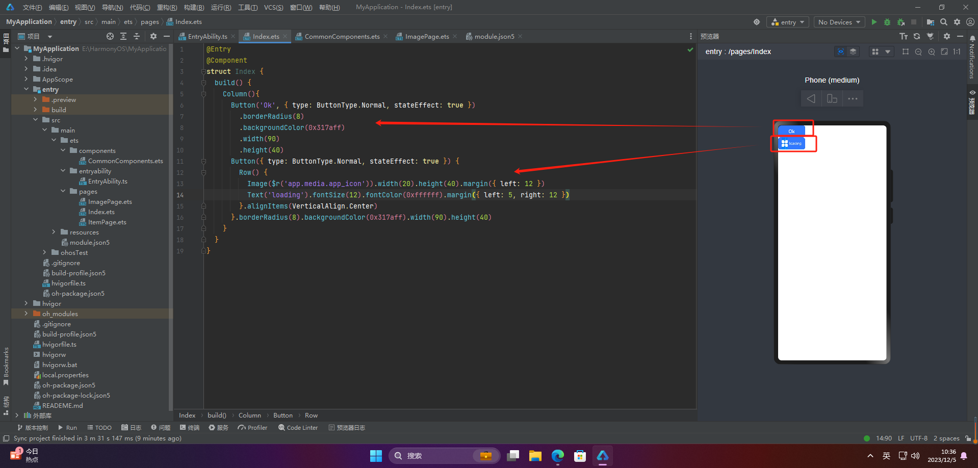
@Entry
@Component
struct Index {
  build() {
    Column(){
      Button('Ok', { type: ButtonType.Normal, stateEffect: true })
        .borderRadius(8)
        .backgroundColor(0x317aff)
        .width(90)
        .height(40)
      Button({ type: ButtonType.Normal, stateEffect: true }) {
        Row() {
          Image($r('app.media.app_icon')).width(20).height(40).margin({ left: 12 })
          Text('loading').fontSize(12).fontColor(0xffffff).margin({ left: 5, right: 12 })
        }.alignItems(VerticalAlign.Center)
      }.borderRadius(8).backgroundColor(0x317aff).width(90).height(40)
    }
  }
}
2.设置按钮类型
@Entry
@Component
struct Index {
  build() {
    Column(){
      Button('Disable', { type: ButtonType.Capsule, stateEffect: false })
        .backgroundColor(0x317aff)
        .width(90)
        .height(40)
      Button('Circle', { type: ButtonType.Circle, stateEffect: false })
        .backgroundColor(0x317aff)
        .width(90)
        .height(90)
      Button('Circle', { type: ButtonType.Normal, stateEffect: false })
        .backgroundColor(0x317aff)
        .width(90)
        .height(90)
    }
  }
}
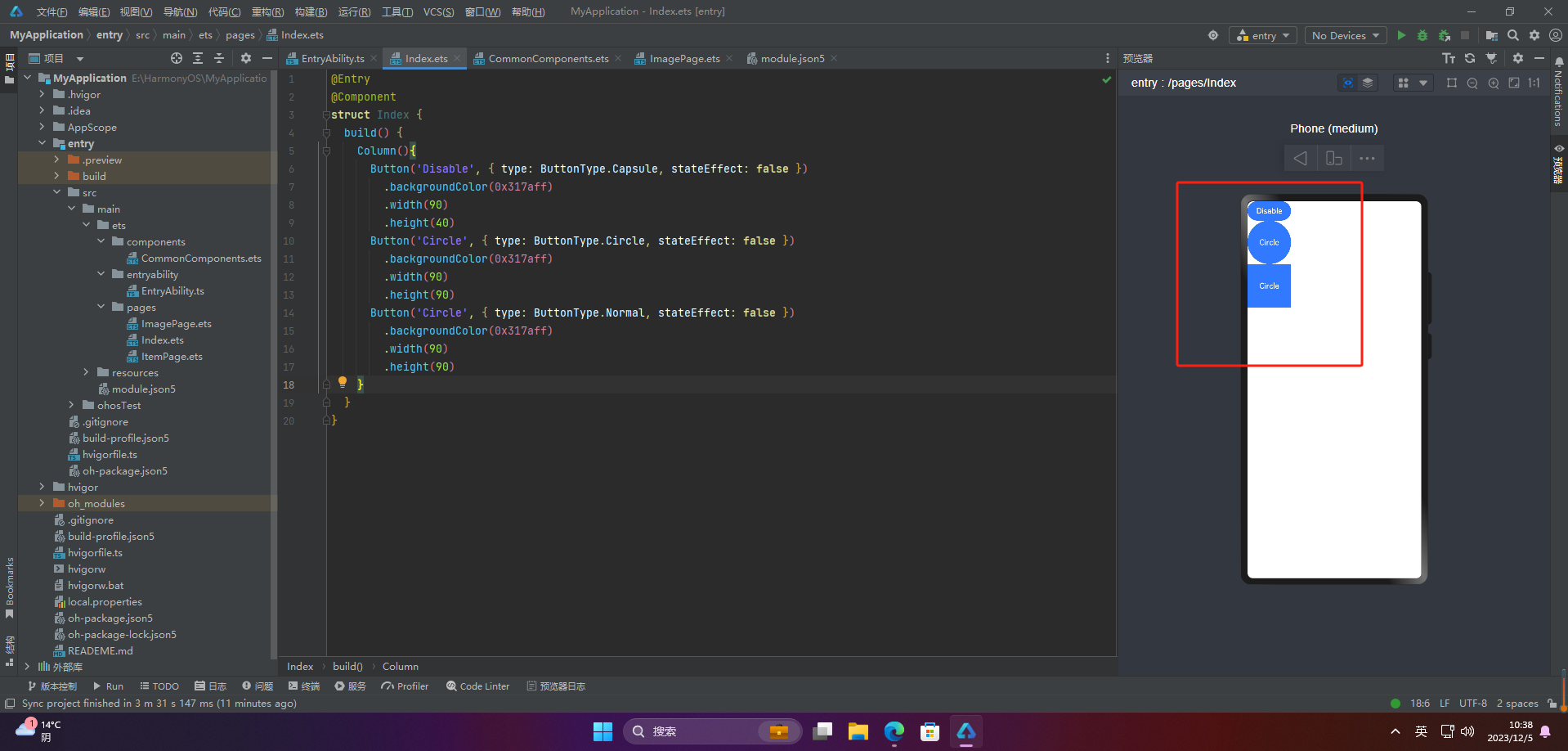
注意:不支持通过borderRadius属性重新设置
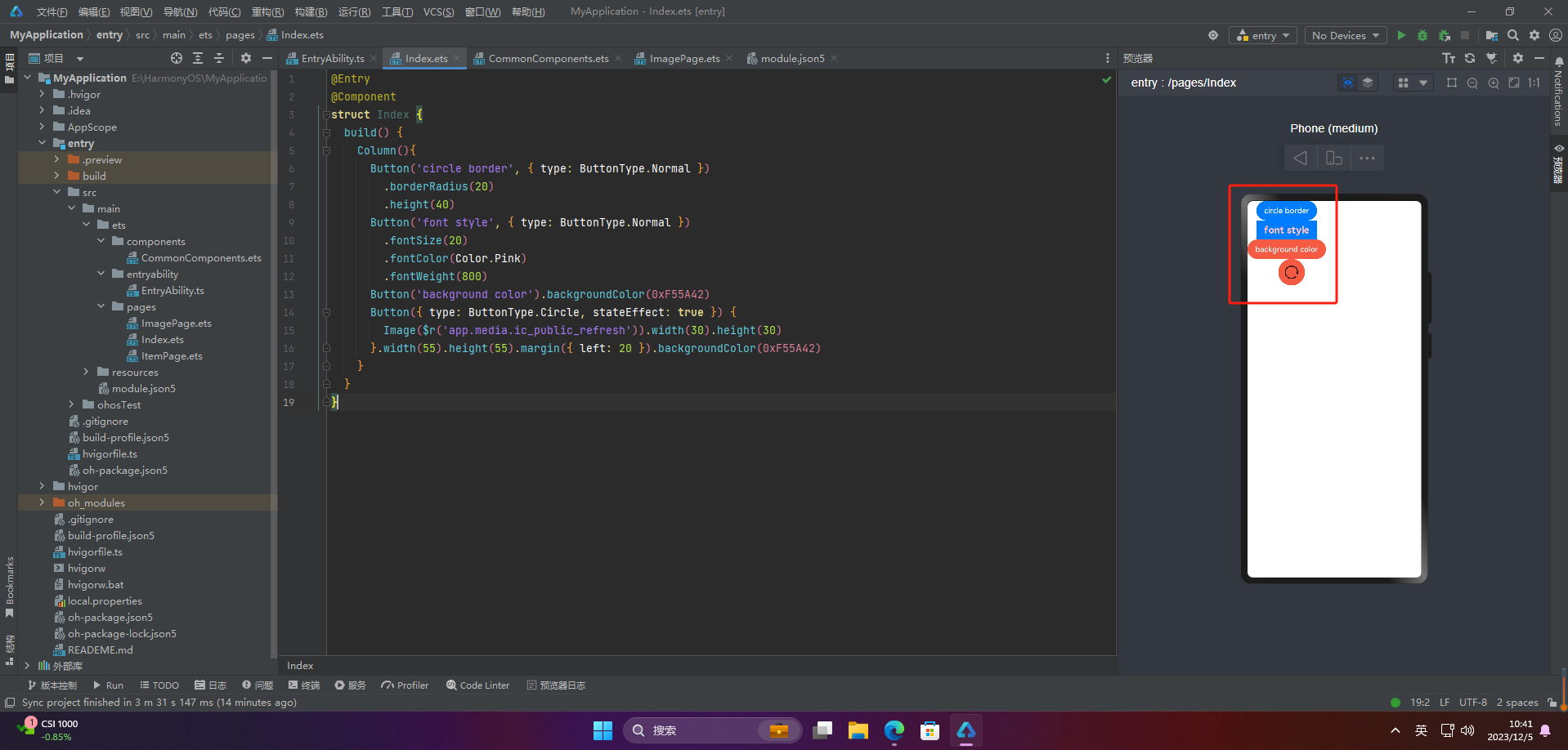
3.自定义样式
@Entry
@Component
struct Index {
  build() {
    Column(){
      Button('circle border', { type: ButtonType.Normal })
        .borderRadius(20)
        .height(40)
      Button('font style', { type: ButtonType.Normal })
        .fontSize(20)
        .fontColor(Color.Pink)
        .fontWeight(800)
      Button('background color').backgroundColor(0xF55A42)
      Button({ type: ButtonType.Circle, stateEffect: true }) {
        Image($r('app.media.ic_public_refresh')).width(30).height(30)
      }.width(55).height(55).margin({ left: 20 }).backgroundColor(0xF55A42)
    }
  }
}
4.添加事件
Button('Ok', { type: ButtonType.Normal, stateEffect: true })
  .onClick(()=>{
    console.info('Button onClick')
  })
5.案例
Button按钮的实际应用场景主要包括以下几个方面:
- 点击提交表单
当用户填写完表单后,点击Button按钮来提交表单数据,使得数据能够被服务器端处理或者保存到数据库中。 - 跳转链接
当用户点击Button按钮时,跳转到指定的网页、应用程序或者其他页面。 - 打开或关闭弹窗
当用户点击Button按钮时,打开或关闭弹窗,可以在弹窗中展示一些信息、广告或者提示。 - 执行某个动作
当用户点击Button按钮时,执行某个操作,比如刷新页面、播放音乐、暂停视频等。 - 切换页面状态
当用户点击Button按钮时,可以切换页面的状态,比如打开或关闭菜单、切换语言、切换主题等。
Button按钮的应用场景非常广泛,基本上所有需要用户交互的场景都可以使用Button按钮来实现。
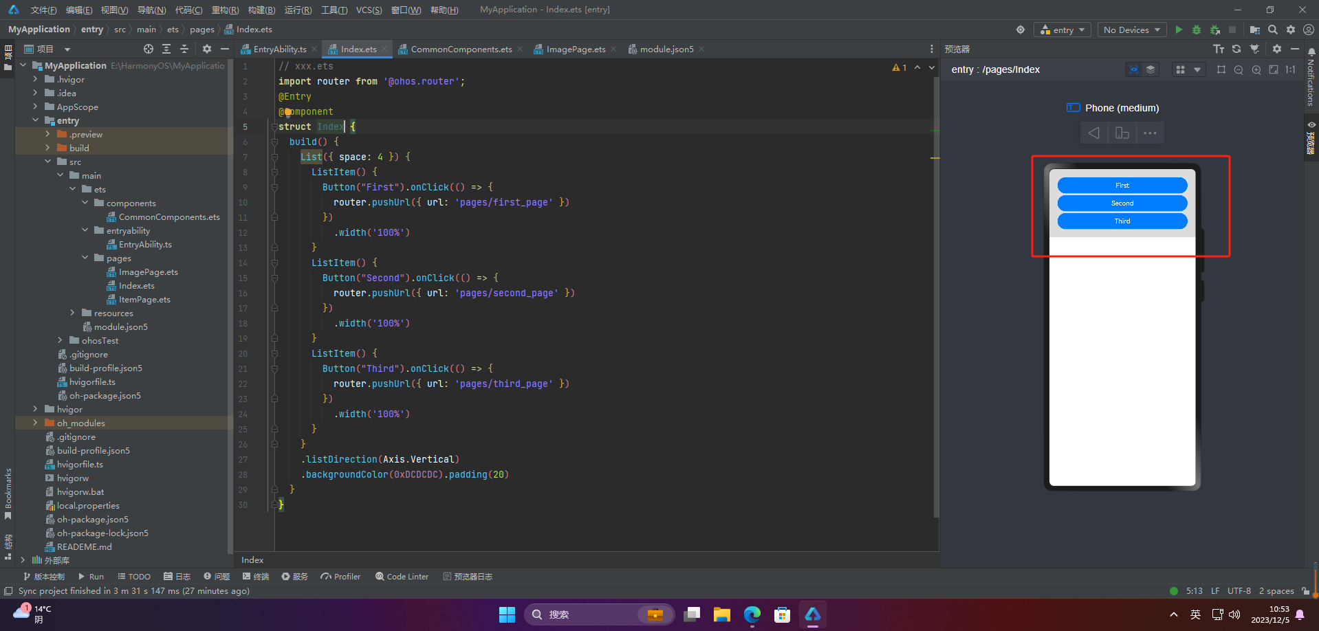
🦋2.1 页面跳转
// xxx.ets
import router from '@ohos.router';
@Entry
@Component
struct ButtonCase1 {
  build() {
    List({ space: 4 }) {
      ListItem() {
        Button("First").onClick(() => {
          router.pushUrl({ url: 'pages/first_page' })
        })
          .width('100%')
      }
      ListItem() {
        Button("Second").onClick(() => {
          router.pushUrl({ url: 'pages/second_page' })
        })
          .width('100%')
      }
      ListItem() {
        Button("Third").onClick(() => {
          router.pushUrl({ url: 'pages/third_page' })
        })
          .width('100%')
      }
    }
    .listDirection(Axis.Vertical)
    .backgroundColor(0xDCDCDC).padding(20)
  }
}
🦋2.2 表单提交
// xxx.ets
import router from '@ohos.router';
@Entry
@Component
struct Index {
**自我介绍一下,小编13年上海交大毕业,曾经在小公司待过,也去过华为、OPPO等大厂,18年进入阿里一直到现在。**
**深知大多数HarmonyOS鸿蒙开发工程师,想要提升技能,往往是自己摸索成长或者是报班学习,但对于培训机构动则几千的学费,着实压力不小。自己不成体系的自学效果低效又漫长,而且极易碰到天花板技术停滞不前!**
**因此收集整理了一份《2024年HarmonyOS鸿蒙开发全套学习资料》,初衷也很简单,就是希望能够帮助到想自学提升又不知道该从何学起的朋友,同时减轻大家的负担。**


**既有适合小白学习的零基础资料,也有适合3年以上经验的小伙伴深入学习提升的进阶课程,基本涵盖了95%以上HarmonyOS鸿蒙开发知识点,真正体系化!**
**由于文件比较大,这里只是将部分目录大纲截图出来,每个节点里面都包含大厂面经、学习笔记、源码讲义、实战项目、讲解视频,并且会持续更新**
**如果你觉得这些内容对你有帮助,可以添加VX:vip204888 (备注鸿蒙获取)**

**一个人可以走的很快,但一群人才能走的更远。不论你是正从事IT行业的老鸟或是对IT行业感兴趣的新人,都欢迎扫码加入我们的的圈子(技术交流、学习资源、职场吐槽、大厂内推、面试辅导),让我们一起学习成长!**
讲义、实战项目、讲解视频,并且会持续更新**
**如果你觉得这些内容对你有帮助,可以添加VX:vip204888 (备注鸿蒙获取)**
[外链图片转存中...(img-SFVmrOMy-1712918526394)]
**一个人可以走的很快,但一群人才能走的更远。不论你是正从事IT行业的老鸟或是对IT行业感兴趣的新人,都欢迎扫码加入我们的的圈子(技术交流、学习资源、职场吐槽、大厂内推、面试辅导),让我们一起学习成长!**


 1051
1051

 被折叠的 条评论
为什么被折叠?
被折叠的 条评论
为什么被折叠?
 到【灌水乐园】发言


