


当loop为true时,在显示第一页或最后一页时,可以继续往前切换到前一页或者往后切换到后一页。如果loop为false,则在第一页或最后一页时,无法继续向前或者向后切换页面。
4.自动轮播
@Entry
@Component
struct Index {
  private swiperController: SwiperController = new SwiperController()
  build() {
    Swiper(this.swiperController) {
      Text("0")
        .width('100%')
        .height('100%')
        .backgroundColor(Color.Gray)
        .textAlign(TextAlign.Center)
        .fontSize(30)

      Text("1")
        .width('100%')
        .height('100%')
        .backgroundColor(Color.Green)
        .textAlign(TextAlign.Center)
        .fontSize(30)

      Text("2")
        .width('100%')
        .height('100%')
        .backgroundColor(Color.Pink)
        .textAlign(TextAlign.Center)
        .fontSize(30)
    }
    .loop(true)
    .autoPlay(true)
    .interval(2000)
  }
}
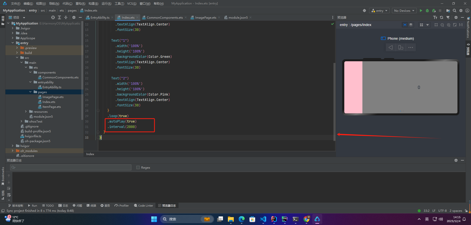
autoPlay为true时,会自动切换播放子组件,子组件与子组件之间的播放间隔通过interval属性设置。interval属性默认值为2000,单位毫秒。
5.导航点样式
@Entry
@Component
struct Index {
  private swiperController: SwiperController = new SwiperController()
  build() {
    Swiper(this.swiperController) {
      Text("0")
        .width('100%')
        .height('100%')
        .backgroundColor(Color.Gray)
        .textAlign(TextAlign.Center)
        .fontSize(30)

      Text("1")
        .width('100%')
        .height('100%')
        .backgroundColor(Color.Green)
        .textAlign(TextAlign.Center)
        .fontSize(30)

      Text("2")
        .width('100%')
        .height('100%')
        .backgroundColor(Color.Pink)
        .textAlign(TextAlign.Center)
        .fontSize(30)
    }
    .indicatorStyle({
      size: 30,
      left: 0,
      color: Color.Red
    })
  }
}
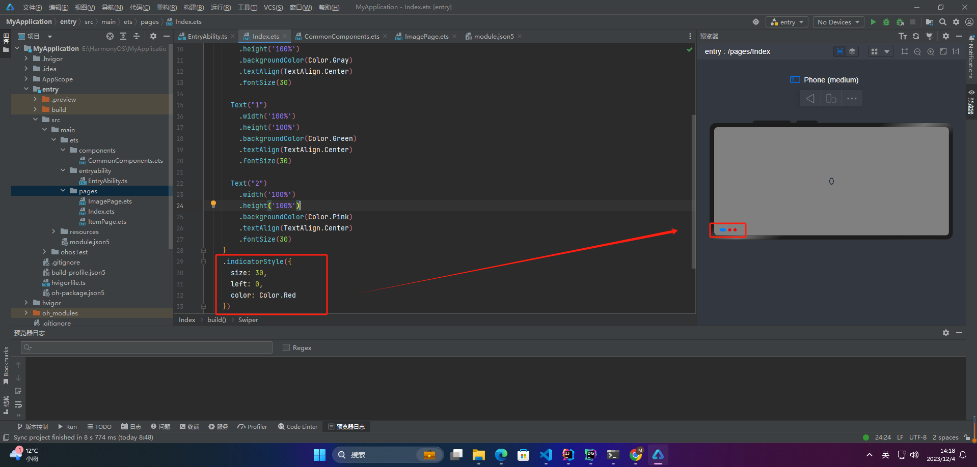
通过indicatorStyle属性,开发者可以设置导航点相对于Swiper组件上下左右四个方位的位置,同时也可以设置每个导航点的尺寸、颜色、蒙层和被选中导航点的颜色。
6.页面切换方式
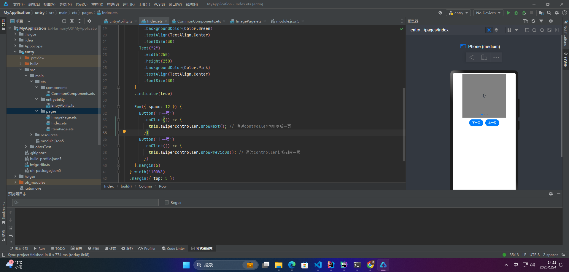
Swiper支持三种页面切换方式:手指滑动、点击导航点和通过控制器
@Entry
@Component
struct Index {
  private swiperController: SwiperController = new SwiperController();

  build() {
    Column({ space: 5 }) {
      Swiper(this.swiperController) {
        Text("0")
          .width(250)
          .height(250)
          .backgroundColor(Color.Gray)
          .textAlign(TextAlign.Center)
          .fontSize(30)
        Text("1")
          .width(250)
          .height(250)
          .backgroundColor(Color.Green)
          .textAlign(TextAlign.Center)
          .fontSize(30)
        Text("2")
          .width(250)
          .height(250)
          .backgroundColor(Color.Pink)
          .textAlign(TextAlign.Center)
          .fontSize(30)
      }
      .indicator(true)

      Row({ space: 12 }) {
        Button('下一页')
          .onClick(() => {
            this.swiperController.showNext(); // 通过controller切换到后一页
          })
        Button('上一页')
          .onClick(() => {
            this.swiperController.showPrevious(); // 通过controller切换到前一页
          })
      }.margin(5)
    }.width('100%')
    .margin({ top: 5 })
  }
}
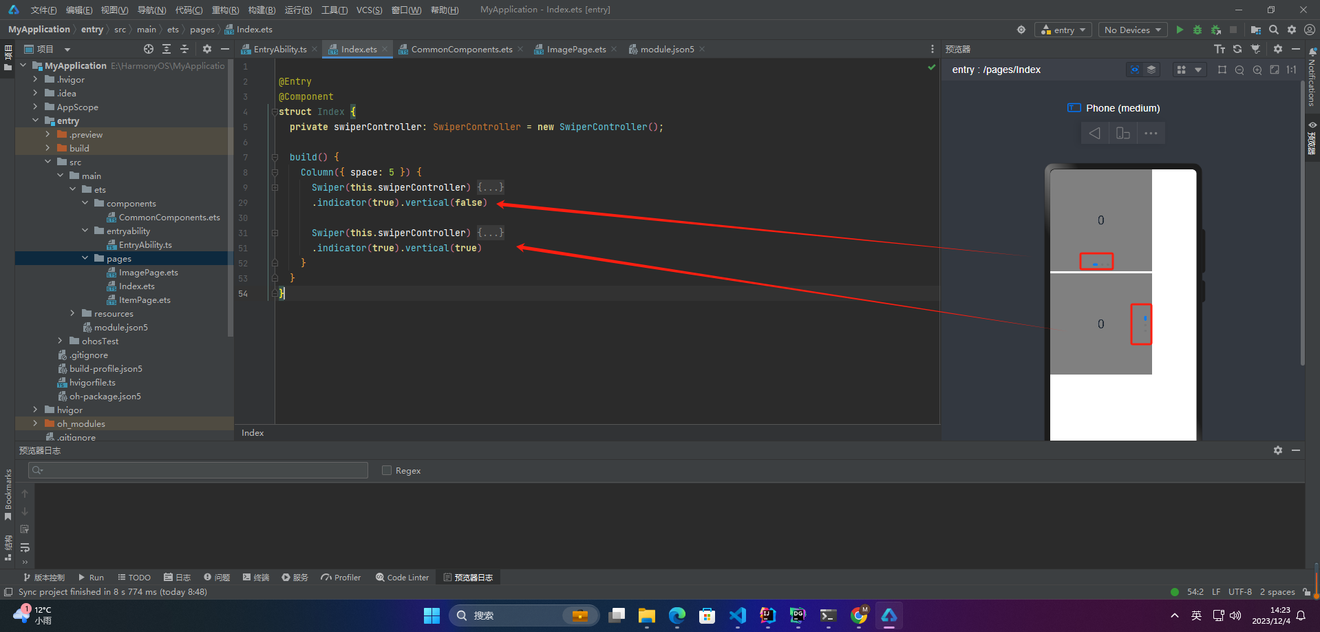
7.轮播方向
vertical为true时,表示在垂直方向上进行轮播;为false时,表示在水平方向上进行轮播。vertical默认值为false
@Entry
@Component
struct Index {
  private swiperController: SwiperController = new SwiperController();

  build() {
    Column({ space: 5 }) {
      Swiper(this.swiperController) {
        Text("0")
          .width(250)
          .height(250)
          .backgroundColor(Color.Gray)
          .textAlign(TextAlign.Center)
          .fontSize(30)
        Text("1")
          .width(250)
          .height(250)
          .backgroundColor(Color.Green)
          .textAlign(TextAlign.Center)
          .fontSize(30)
        Text("2")
          .width(250)
          .height(250)
          .backgroundColor(Color.Pink)
          .textAlign(TextAlign.Center)
          .fontSize(30)
      }
      .indicator(true).vertical(false)

      Swiper(this.swiperController) {
        Text("0")
          .width(250)
          .height(250)
          .backgroundColor(Color.Gray)
          .textAlign(TextAlign.Center)
          .fontSize(30)
        Text("1")
          .width(250)
          .height(250)
          .backgroundColor(Color.Green)
          .textAlign(TextAlign.Center)
          .fontSize(30)
        Text("2")
          .width(250)
          .height(250)
          .backgroundColor(Color.Pink)
          .textAlign(TextAlign.Center)
          .fontSize(30)
      }
      .indicator(true).vertical(true)
    }
  }
}
8.每页显示多个子页面
Swiper支持在一个页面内同时显示多个子组件,通过displayCount属性设置
@Entry
@Component
struct Index {
private swiperController: SwiperController = new SwiperController();
build() {
Swiper(this.swiperController) {
Text("0")
.width(250)
.height(250)
**自我介绍一下,小编13年上海交大毕业,曾经在小公司待过,也去过华为、OPPO等大厂,18年进入阿里一直到现在。**
**深知大多数HarmonyOS鸿蒙开发工程师,想要提升技能,往往是自己摸索成长或者是报班学习,但对于培训机构动则几千的学费,着实压力不小。自己不成体系的自学效果低效又漫长,而且极易碰到天花板技术停滞不前!**
**因此收集整理了一份《2024年HarmonyOS鸿蒙开发全套学习资料》,初衷也很简单,就是希望能够帮助到想自学提升又不知道该从何学起的朋友,同时减轻大家的负担。**


**既有适合小白学习的零基础资料,也有适合3年以上经验的小伙伴深入学习提升的进阶课程,基本涵盖了95%以上HarmonyOS鸿蒙开发知识点,真正体系化!**
**由于文件比较大,这里只是将部分目录大纲截图出来,每个节点里面都包含大厂面经、学习笔记、源码讲义、实战项目、讲解视频,并且会持续更新**
**如果你觉得这些内容对你有帮助,可以添加VX:vip204888 (备注鸿蒙获取)**

**一个人可以走的很快,但一群人才能走的更远。不论你是正从事IT行业的老鸟或是对IT行业感兴趣的新人,都欢迎扫码加入我们的的圈子(技术交流、学习资源、职场吐槽、大厂内推、面试辅导),让我们一起学习成长!**
较大,这里只是将部分目录大纲截图出来,每个节点里面都包含大厂面经、学习笔记、源码讲义、实战项目、讲解视频,并且会持续更新**
**如果你觉得这些内容对你有帮助,可以添加VX:vip204888 (备注鸿蒙获取)**
[外链图片转存中...(img-sbzadtCP-1712919028428)]
**一个人可以走的很快,但一群人才能走的更远。不论你是正从事IT行业的老鸟或是对IT行业感兴趣的新人,都欢迎扫码加入我们的的圈子(技术交流、学习资源、职场吐槽、大厂内推、面试辅导),让我们一起学习成长!**


 1222
1222

 被折叠的 条评论
为什么被折叠?
被折叠的 条评论
为什么被折叠?
 到【灌水乐园】发言


