


自我介绍一下,小编13年上海交大毕业,曾经在小公司待过,也去过华为、OPPO等大厂,18年进入阿里一直到现在。
深知大多数HarmonyOS鸿蒙开发工程师,想要提升技能,往往是自己摸索成长或者是报班学习,但对于培训机构动则几千的学费,着实压力不小。自己不成体系的自学效果低效又漫长,而且极易碰到天花板技术停滞不前!
因此收集整理了一份《2024年HarmonyOS鸿蒙开发全套学习资料》,初衷也很简单,就是希望能够帮助到想自学提升又不知道该从何学起的朋友,同时减轻大家的负担。
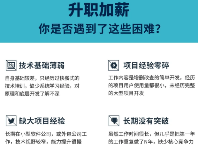
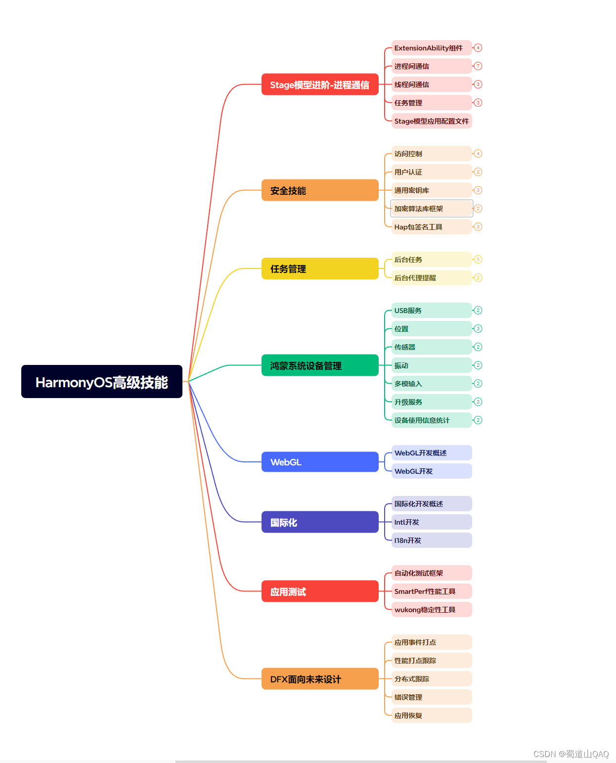
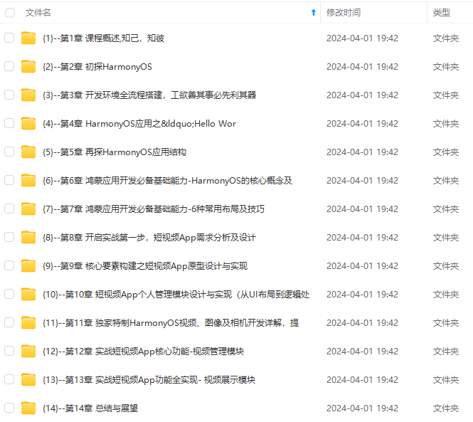
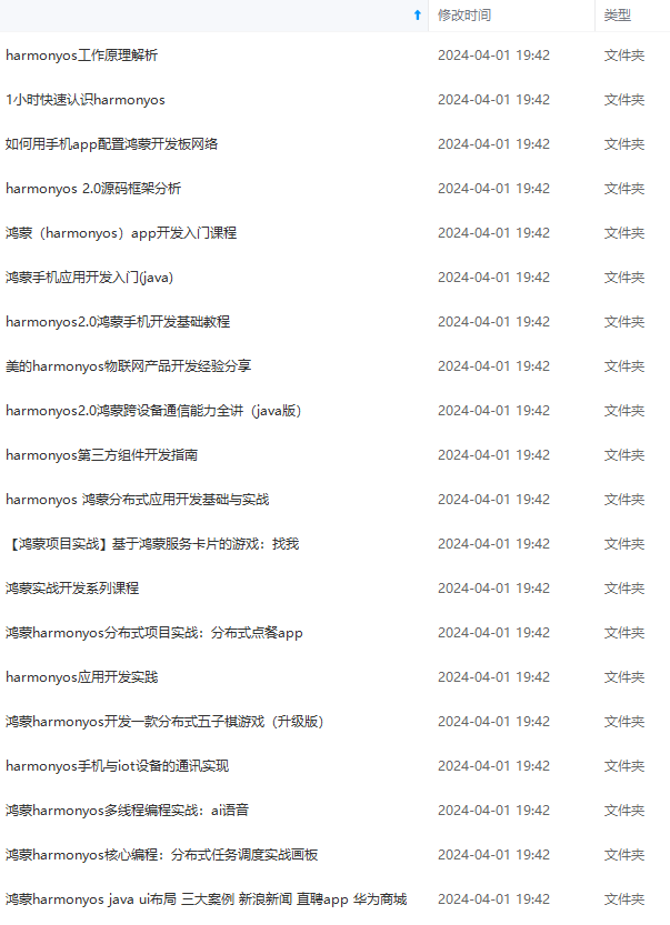
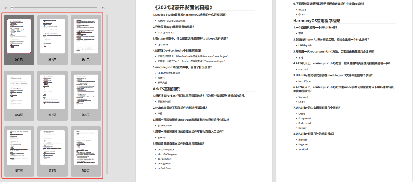
既有适合小白学习的零基础资料,也有适合3年以上经验的小伙伴深入学习提升的进阶课程,基本涵盖了95%以上HarmonyOS鸿蒙开发知识点,真正体系化!
由于文件比较大,这里只是将部分目录大纲截图出来,每个节点里面都包含大厂面经、学习笔记、源码讲义、实战项目、讲解视频,并且会持续更新
如果你觉得这些内容对你有帮助,可以添加VX:vip204888 (备注鸿蒙获取)

一个人可以走的很快,但一群人才能走的更远。不论你是正从事IT行业的老鸟或是对IT行业感兴趣的新人,都欢迎扫码加入我们的的圈子(技术交流、学习资源、职场吐槽、大厂内推、面试辅导),让我们一起学习成长!
textAlign参数类型为TextAlign,定义了以下几种类型:
* Start(默认值):水平对齐首部。

* Center:水平居中对齐。

* End:水平对齐尾部。

#### 设置文本超长显示
当文本内容较多超出了Text组件范围的时候,您可以使用textOverflow设置文本截取方式,需配合maxLines使用,单独设置不生效,maxLines用于设置文本显示最大行数。下面的示例代码将textOverflow设置为Ellipsis ,它将显示不下的文本用 “…” 表示:
Text(‘This is the text content of Text Component This is the text content of Text Component’)
.fontSize(16)
.maxLines(1)
.textOverflow({overflow:TextOverflow.Ellipsis})
.backgroundColor(0xE6F2FD)
效果图如下:

#### 设置文本装饰线
使用decoration设置文本装饰线样式及其颜色,大家在浏览网页的时候经常可以看到装饰线,例如带有下划线超链接文本。decoration包含type和color两个参数,其中type用于设置装饰线样式,参数类型为TextDecorationTyp,color为可选参数。
下面的示例代码给文本设置了下划线,下划线颜色为黑色:
Text(‘HarmonyOS’)
.fontSize(20)
.decoration({ type: TextDecorationType.Underline, color: Color.Black })
.backgroundColor(0xE6F2FD)
效果图如下:
TextDecorationTyp包含以下几种类型:
* None:不使用文本装饰线。
* Overline:文字上划线修饰。

* LineThrough:穿过文本的修饰线。

* Underline:文字下划线修饰。

### 3 Image
Image组件用来渲染展示图片,它可以让界面变得更加丰富多彩。只需要给Image组件设置图片地址、宽和高,图片就能加载出来,示例如下:
Image($r(“app.media.icon”))
.width(100)
.height(100)
效果图如下:

#### 设置缩放类型
为了使图片在页面中有更好的显示效果,有时候需要对图片进行缩放处理。您可以使用objectFit属性设置图片的缩放类型,objectFit的参数类型为ImageFit。
现有原始图片如下:

将图片加载到Image组件,设置宽高各100,设置objectFit为Cover(默认值),设置图片背景色为灰色0xCCCCCC。示例代码如下:
Image($r(“app.media.image2”))
.objectFit(ImageFit.Cover)
.backgroundColor(0xCCCCCC)
.width(100)
.height(100)
效果图如下:

ImageFit包含以下几种类型:
* Contain:保持宽高比进行缩小或者放大,使得图片完全显示在显示边界内。

* Cover(默认值):保持宽高比进行缩小或者放大,使得图片两边都大于或等于显示边界。

* Auto:自适应显示。

* Fill:不保持宽高比进行放大缩小,使得图片充满显示边界。

* ScaleDown:保持宽高比显示,图片缩小或者保持不变。

* None:保持原有尺寸显示。

#### 加载网络图片
比如浏览新闻的时候,图片一般从网络加载而来,Image组件支持加载网络图片,将图片地址换成网络图片地址进行加载。
Image(‘https://www.example.com/xxx.png’)
为了成功加载网络图片,您需要在module.json5文件中申明网络访问权限。
{
“module” : {
“requestPermissions”:[
{
“name”: “ohos.permission.INTERNET”
}
]
}
}
应用访问网络需要申请ohos.permission.INTERNET权限,因为HarmonyOS提供了一种访问控制机制即应用权限,用来保证这些数据或功能不会被不当或恶意使用。


### 4 TextInput


TextInput组件用于输入单行文本,响应输入事件。TextInput的使用也非常广泛,例如应用登录账号密码、发送消息等。和Text组件一样,TextInput组件也支持文本样式设置,下面的示例代码实现了一个简单的输入框:
TextInput()
.fontColor(Color.Blue)
.fontSize(20)
.fontStyle(FontStyle.Italic)
.fontWeight(FontWeight.Bold)
.fontFamily(‘Arial’)
效果图如下:
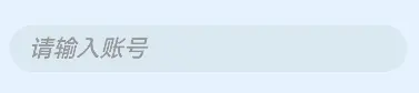
#### 设置输入提示文本
当我们平时使用输入框的时候,往往会有一些提示文字。例如登录账号的时候会有“请输入账号”这样的文本提示,当用户输入内容之后,提示文本就会消失,这种提示功能使用placeholder属性就可以轻松的实现。您还可以使用placeholderColor和placeholderFont分别设置提示文本的颜色和样式,示例代码如下:
TextInput({ placeholder: ‘请输入帐号’ })
.placeholderColor(0x999999)
.placeholderFont({ size: 20, weight: FontWeight.Medium, family: ‘cursive’, style: FontStyle.Italic })
效果图如下:
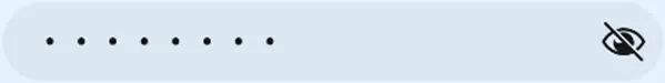
#### 设置输入类型
可以使用type属性来设置输入框类型。例如密码输入框,一般输入密码的时候,为了用户密码安全,内容会显示为“…”,针对这种场景,将type属性设置为InputType.Password就可以实现。示例代码如下:
TextInput({ placeholder: ‘请输入密码’ })
.type(InputType.Password)
效果图如下:

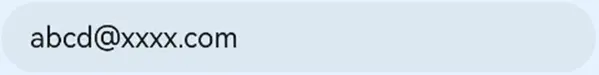
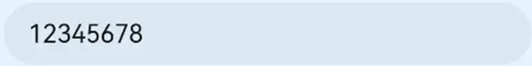
type的参数类型为InputType,包含以下几种输入类型:
* Normal:基本输入模式。支持输入数字、字母、下划线、空格、特殊字符。

* Password:密码输入模式。
* Email:e-mail地址输入模式。
* Number:纯数字输入模式。
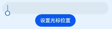
#### 设置光标位置
可以使用TextInputController动态设置光位置,下面的示例代码使用TextInputController的caretPosition方法,将光标移动到了第二个字符后。
@Entry
@Component
struct TextInputDemo {
controller: TextInputController = new TextInputController()
build() {
Column() {
TextInput({ controller: this.controller })
Button(‘设置光标位置’)
.onClick(() => {
this.controller.caretPosition(2)
})
}
.height(‘100%’)
.backgroundColor(0xE6F2FD)
}
}
效果图如下:
#### 获取输入文本
我们可以给TextInput设置onChange事件,输入文本发生变化时触发回调,下面示例代码中的value为实时获取用户输入的文本信息。
@Entry
@Component
struct TextInputDemo {
@State text: string = ‘’
build() {
Column() {
TextInput({ placeholder: ‘请输入账号’ })
.caretColor(Color.Blue)
.onChange((value: string) => {
this.text = value
})
Text(this.text)
}
.alignItems(HorizontalAlign.Center)
.padding(12)
.backgroundColor(0xE6F2FD)
}
}
效果图如下:

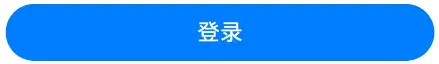
### 5 Button
Button组件主要用来响应点击操作,可以包含子组件。下面的示例代码实现了一个“登录按钮”:
Button(‘登录’, { type: ButtonType.Capsule, stateEffect: true })
.width(‘90%’)
.height(40)
.fontSize(16)
.fontWeight(FontWeight.Medium)
.backgroundColor(‘#007DFF’)
效果图如下:
#### 设置按钮样式
type用于定义按钮样式,示例代码中ButtonType.Capsule表示胶囊形按钮;stateEffect用于设置按钮按下时是否开启切换效果,当状态置为false时,点击效果关闭,默认值为true。
我们可以设置多种样式的Button,除了Capsule可以以设置Normal和Circle:
* Capsule:胶囊型按钮(圆角默认为高度的一半)。

* Circle:圆形按钮。

* Normal:普通按钮(默认不带圆角)。

#### 设置按钮点击事件
可以给Button绑定onClick事件,每当用户点击Button的时候,就会回调执行onClick方法,调用里面的逻辑代码。
Button(‘登录’, { type: ButtonType.Capsule, stateEffect: true })
…
.onClick(() => {
// 处理点击事件逻辑
})
#### 包含子组件


Button组件可以包含子组件,让您可以开发出更丰富多样的Button,下面的示例代码中Button组件包含了一个Image组件:
Button({ type: ButtonType.Circle, stateEffect: true }) {
Image($r(‘app.media.icon_delete’))
.width(30)
.height(30)
}
.width(55)
.height(55)
.backgroundColor(0x317aff)
效果图如下:

### 6 LoadingProgress
.onClick(() => {
// 处理点击事件逻辑
})
包含子组件
Button组件可以包含子组件,让您可以开发出更丰富多样的Button,下面的示例代码中Button组件包含了一个Image组件:
Button({ type: ButtonType.Circle, stateEffect: true }) {
  Image($r('app.media.icon_delete'))
    .width(30)
    .height(30)
}
.width(55)
.height(55)
.backgroundColor(0x317aff)
效果图如下:


 1610
1610

 被折叠的 条评论
为什么被折叠?
被折叠的 条评论
为什么被折叠?
 到【灌水乐园】发言


