


 本文详细介绍了CSS中线性渐变、径向渐变、边框颜色渐变以及文字渐变的原理、语法和示例,展示了如何通过这些技术实现色彩的动态过渡效果。
前言
例如:随着人工智能的不断发展,机器学习这门技术也越来越重要,很多人都开启了学习机器学习,本文就介绍了机器学习的基础内容。
提示:以下是本篇文章正文内容,下面案例可供参考
一、线性渐变
1 渐变的概念
可以让你在两个或多个指定的颜色之间显示平稳的过渡
从一个颜色到其他颜色的过渡,很多的颜色交织在一起,形成比较炫酷的效果。
语法:background-image: linear-gradient(渐变方向, 颜色1[位置1], 颜色2[位置2], 颜色3[位置3]…);
实例如下:
1、渐变方向有以下几种值:
- 使用表示方位的单词
一个方向值时
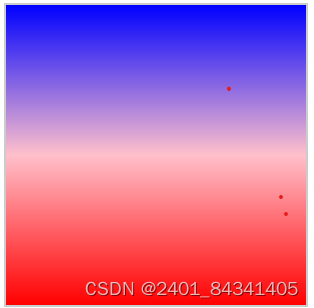
to top 从下到上开始渐变
to bottom 从上到下开始渐变
to left 从左到右开始渐变
to right 从右到左开始渐变
两个方向值时
to right bottom 表示从左上角到右下角开始渐变
to left bottom 表示从右上角到左下角开始渐变
to right top 表示从左下角到右上角开始渐变
to left top 表示从右下角到左上角开始渐变
2.使用角度,单位deg
除了使用关键词to + 方向名词外,我们还可以使用角度来任意定一个方向
一个平面上的角度只有360度,也就是一个圆,使用角度来定义任意一个方向,值 0deg 等于向上(to top),值 90deg 等于向右(to right),值 180deg 等于向下(to bottom)。

3.使用弧度,单位为rad
4.使用turn,代表环绕圆圈的圈数,0.5turn表示半圈,也就是180deg
5.使用grad,表示百分度,400grad表示360deg
兼容写法:
background-image: -webkit-linear-gradient(left,red,green,blue); // 第一个参数表示的开始方向
background-image: -moz-linear-gradient(left,red,green,blue); // 第一个参数表示的开始方向
background-image: -o-linear-gradient(left,red,green,blue); // 第一个参数表示的开始方向
background-image: linear-gradient(to right top,red,green,blue); // 第一个参数表示到的方向
2、渐变梯度
语法:background-image: linear-gradient(90deg,red,blue,50%,pink);
效果如下: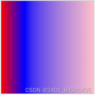
3、透明色做渐变 rgba()
二、径向渐变
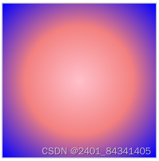
1、简写,默认从中心开始向四周扩散
background-image: radial-gradient(pink,rgb(243, 128, 128),blue)
效果如下:
2、控制渐变
语法:background:radial-gradient(shape size at postion ,start-color1,…,last-color );
		shape:
			circle 圆形
			elipse 椭圆 默认值

		position:
			left right center
			top center bottom
			X、Y轴


		size:
			closest-side 渐变到最近边
			farthest-side 渐变到最远边
			closest-corner 渐变到最近角
			farthest-corner 渐变到最远角
3、重复性渐变
 .box{
            width: 300px;
            height: 300px;
            border: 2px solid #ccc;
            background-image: repeating-radial-gradient(red 20%, pink 30%,blue 40% );
        }
效果如下: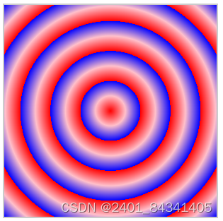
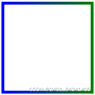
三、边框颜色渐变
1、 线性渐变
语法:border-image: linear-gradient(方向,颜色1,颜色2 …) 内向偏移量;
从左到右的渐变边框
.box{
            width: 300px;
            height: 300px;
            border: 10px solid;
            border-image: linear-gradient(to right,blue,green)2;
        }
效果:
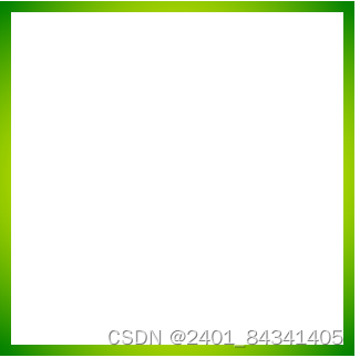
2、径向渐变
语法: border-image: radial-gradient(颜色1 百分比,颜色2 百分比…) 内向偏移量
.box{
            width: 300px;
            height: 300px;
            border: 10px solid;
            border-image: radial-gradient(yellow 50%, green 100%) 5;
        }
效果:
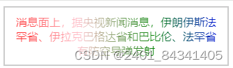
四、文字渐变
代码:
<!DOCTYPE html>
<html lang="en">
<head>
    <meta charset="UTF-8">
    <meta name="viewport" content="width=device-width, initial-scale=1.0">
    <title>Document</title>
    <style>
        .box{
            width: 300px;
            text-align: center;
            border: 2px solid #ccc;
            padding: 10px;
            background-image: radial-gradient(circle farthest-corner at left center,red,pink,green,blue);
            background-clip: text;
            color: transparent;
        }
    </style>
</head>
<body>
    <div class="box">消息面上,据央视新闻消息,伊朗伊斯法罕省、伊拉克巴格达省和巴比伦、法罕省有防空导弹发射</div>
</body>
</html>
效果:


 620
620

 被折叠的 条评论
为什么被折叠?
被折叠的 条评论
为什么被折叠?
 到【灌水乐园】发言


