


框架相关
原生JS虽能实现绝大部分功能,但要么就是过于繁琐,要么就是存在缺陷,故绝大多数开发者都会首选框架开发方案。现阶段较热门是React、Vue两大框架,两者工作原理上存在共通点,也存在一些不同点,对于校招来说,不需要两个框架都学得特别熟,一般面试官会针对你简历中写的框架进行提问。
在框架方面,生命周期、钩子函数、虚拟DOM这些基本知识是必须要掌握的,在学习的过程可以结合框架的官方文档
开源分享:【大厂前端面试题解析+核心总结学习笔记+真实项目实战+最新讲解视频】
Vue框架
知识要点:
1. vue-cli工程
2. vue核心知识点
3. vue-router
4. vuex
5. http请求
6. UI样式
7. 常用功能
8. MVVM设计模式

React框架
知识要点:
1. 基本知识
2. React 组件
3. React Redux
4. React 路由

}
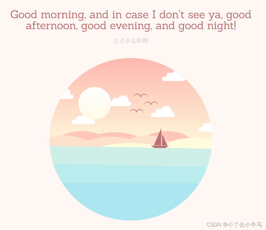
运行效果:
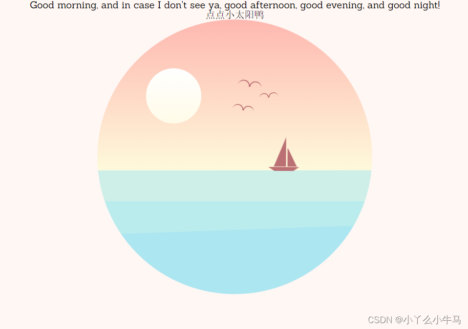
16.2 设置鸟儿飞行的动画
从小变大,展现从远处飞来的动画,以及翅膀的挥动(wing-left/wing-right),在步骤16.1中调用该动画
@-webkit-keyframes bird {
0% {
-webkit-transform: translate(0px, 0px);
transform: translate(0px, 0px);
}
50% {
-webkit-transform: translate(2px, -3px);
transform: translate(2px, -3px);
}
100% {
-webkit-transform: translate(0px, 0px);
transform: translate(0px, 0px);
}
}
@keyframes bird {
0% {
-webkit-transform: translate(0px, 0px);
transform: translate(0px, 0px);
}
50% {
-webkit-transform: translate(2px, -3px);
transform: translate(2px, -3px);
}
100% {
-webkit-transform: translate(0px, 0px);
transform: translate(0px, 0px);
}
}
@-webkit-keyframes wing-right {
0% {
-webkit-transform: rotate(0deg);
transform: rotate(0deg);
}
50% {
-webkit-transform: rotate(10deg);
transform: rotate(10deg);
}
100% {
-webkit-transform: rotate(0deg);
transform: rotate(0deg);
}
}
@keyframes wing-right {
0% {
-webkit-transform: rotate(0deg);
transform: rotate(0deg);
}
50% {
-webkit-transform: rotate(10deg);
transform: rotate(10deg);
}
100% {
-webkit-transform: rotate(0deg);
transform: rotate(0deg);
}
}
@-webkit-keyframes wing-left {
0% {
-webkit-transform: rotate(0deg);
transform: rotate(0deg);
}
50% {
-webkit-transform: rotate(-10deg);
transform: rotate(-10deg);
}
100% {
-webkit-transform: rotate(0deg);
transform: rotate(0deg);
}
}
@keyframes wing-left {
0% {
-webkit-transform: rotate(0deg);
transform: rotate(0deg);
}
50% {
-webkit-transform: rotate(-10deg);
transform: rotate(-10deg);
}
100% {
-webkit-transform: rotate(0deg);
transform: rotate(0deg);
}
}
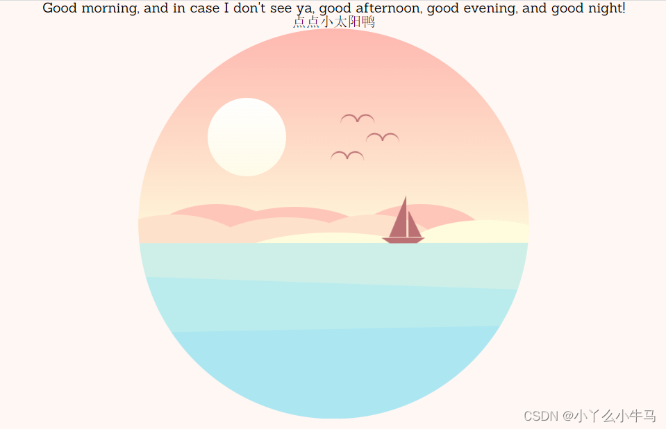
运行效果:

首先设置山峰图层的位置,定位山峰的位置,然后绘制三个图层的山峰,黄色,粉色,红色依次对应top,middle,back三层山峰
.mountains {
position: absolute;
width: 100%;
/* background-color: #ccc;*/
height: 20%;
bottom: 35%;
/* overflow: hidden;*/
}
.mountains-bottom {
opacity: 0.5;
-webkit-transform-origin: center;
-ms-transform-origin: center;
transform-origin: center;
-webkit-transform: scaleY(-1);
-ms-transform: scaleY(-1);
transform: scaleY(-1);
top: 0;
position: fixed;
overflow: hidden;
height: 31.5%;
}
.mountains div,
.mountains div:after,
.mountains div:before {
border-radius: 50%;
position: absolute;
z-index: 200;
}
.mountains * {
-webkit-transition: background 3s ease;
-o-transition: background 3s ease;
transition: background 3s ease;
-webkit-transition-delay: 2s;
-o-transition-delay: 2s;
transition-delay: 2s;
}
.mountain-top,
.mountain-top * {
background: #fffcdd;
}
.mountain-top {
width: 200px;
height: 90px;
top: 18px;
right: 0;
margin-right: -50px;
}
.mountain-top-1 {
position: absolute;
width: 250px;
height: 80px;
top: 15px;
right: 0;
margin-right: 150px;
}
/夜晚的山/
.mountain-top-night {
background: #614da2;
}
.mountain-middle,
.mountain-middle * {
background: #fee1cb;
}
.mountain-middle {
width: 180px;
height: 120px;
top: 12px;
margin-left: 180px;
}
.mountain-middle-1 {
width: 200px;
height: 100px;
top: 3px;
margin-left: -110px;
}
.mountain-middle-2 {
width: 220px;
height: 150px;
margin-left: -250px;
}
.mountain-middle-night {
background: #6154a4;
}
.mountain-back,
.mountain-back * {
background: #fec6b9;
}
.mountain-back {
width: 180px;
height: 120px;
top: 0px;
}
.mountain-back-1 {
width: 200px;
height: 100px;
top: 3px;
margin-left: 80px;
}
.mountain-back-2 {
width: 150px;
height: 80px;
margin-left: 250px;
}
.mountain-back-night {
background: #7980c8;
}
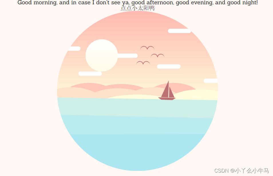
运行效果:
18.1 设置云朵图层的位置,定位云朵位置
.cloud,
.cloud:after,
.cloud:before {
background: #fff;
position: absolute;
z-index: 500;
}
.cloud-1 {
left: 310px;
top: 50px;
}
.cloud-2 {
left: 280px;
top: 150px;
-webkit-animation-delay: 0.2s;
animation-delay: 0.2s;
}
.cloud-3 {
left: 410px;
top: 190px;
-webkit-animation-delay: 0.4s;
animation-delay: 0.4s;
}
.cloud-4 {
left: 160px;
top: 120px;
-webkit-animation-delay: 0.6s;
animation-delay: 0.6s;
}
.cloud-5 {
left: 60px;
top: 170px;
-webkit-animation-delay: 0.8s;
animation-delay: 0.8s;
}
.cloud-6 {
left: 0px;
top: 100px;
-webkit-animation-delay: 1s;
animation-delay: 1s;
}
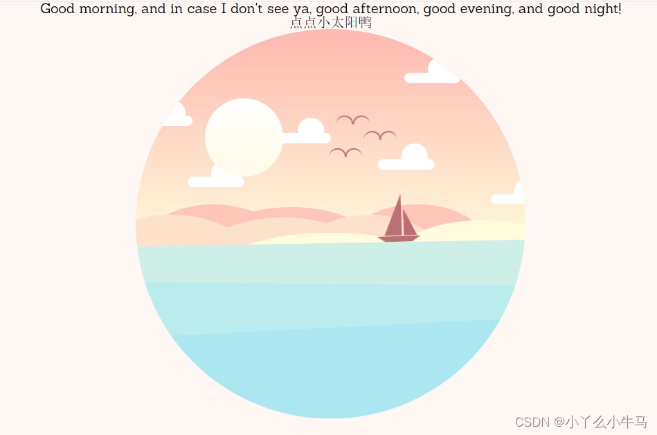
18.2 绘制云朵
18.2.1
.cloud {
width: 65px;
height: 12px;
border-radius: 20px;
-webkit-animation: cloud 4s infinite;
animation: cloud 4s infinite;
}
运行效果:
18.2.2
.cloud:after {
border-radius: 50%;
height: 30px;
left: 27px;
top: -18px;
width: 30px;
}
运行效果:
18.2.3
.cloud:before {
border-radius: 50%;
height: 20px;
left: 12px;
top: -11px;
width: 20px;
}
运行效果:
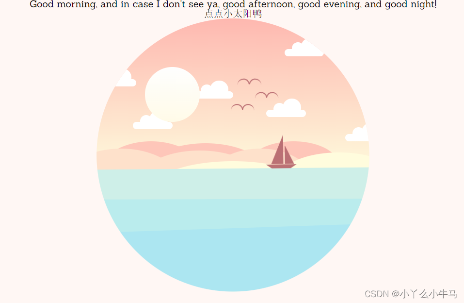
18.3 添加云朵的浮动动画
@-webkit-keyframes cloud {
0% {
-webkit-transform: translate(0px, 0px);
transform: translate(0px, 0px);
}
25% {
-webkit-transform: translate(2px, 2px);
transform: translate(2px, 2px);
}
50% {
-webkit-transform: translate(0px, 0px);
transform: translate(0px, 0px);
}
75% {
-webkit-transform: translate(-1px, -1px);
transform: translate(-1px, -1px);
}
100% {
-webkit-transform: translate(0px, 0px);
transform: translate(0px, 0px);
}
}
@keyframes cloud {
0% {
-webkit-transform: translate(0px, 0px);
transform: translate(0px, 0px);
}
25% {
-webkit-transform: translate(2px, 2px);
transform: translate(2px, 2px);
}
50% {
-webkit-transform: translate(0px, 0px);
transform: translate(0px, 0px);
}
75% {
-webkit-transform: translate(-1px, -1px);
transform: translate(-1px, -1px);
}
100% {
-webkit-transform: translate(0px, 0px);
transform: translate(0px, 0px);
}
}
运行效果:

加入小星星,并添加闪烁动画,步骤还是和之前一样
.stars *,
.stars *:before,
.stars *:after {
border-radius: 50%;
background-color: #fff;
position: absolute;
}
.stars {
opacity: 0;
-webkit-transition: opacity 2s ease;
-o-transition: opacity 2s ease;
transition: opacity 2s ease;
}
.stars-fade {
opacity: 1;
-webkit-transition-delay: 4s;
-o-transition-delay: 4s;
transition-delay: 4s;
}
.star-group-1 {
width: 5px;
height: 5px;
left: 225px;
top: 120px;
animation: twinkle 2s infinite linear;
}
.star-group-1:before {
width: 4px;
height: 4px;
left: 50px;
top: 18px;
opacity: 0.8;
}
.star-group-1:after {
width: 3px;
height: 3px;
left: -35px;
top: 35px;
opacity: 1;
}
.star-group-2 {
width: 5px;
height: 5px;
left: 25px;
top: 175px;
animation: twinkle 1s infinite linear;
}
.star-group-2:before {
width: 4px;
height: 4px;
left: 40px;
top: 14px;
opacity: 0.8;
}
.star-group-2:after {
width: 3px;
height: 3px;
left: 30px;
top: -40px;
opacity: 1;
}
.star-group-3 {
width: 5px;
height: 5px;
left: 125px;
top: 50px;
animation: twinkle 0.8s infinite linear;
}
.star-group-3:before {
width: 4px;
height: 4px;
left: 50px;
top: 20px;
opacity: 0.8;
}
.star-group-3:after {
width: 3px;
height: 3px;
left: 90px;
top: -20px;
opacity: 1;
}
.star-group-4 {
width: 5px;
height: 5px;
left: 300px;
top: 100px;
animation: twinkle 1.2s infinite linear;
}
.star-group-4:before {
width: 3px;
height: 3px;
left: 80px;
top: 60px;
opacity: 0.8;
}
.star-group-4:after {
width: 3px;
height: 3px;
left: 50px;
top: -20px;
opacity: 1;
}
运行效果(将夜晚的opacity设置为1时):

@-webkit-keyframes twinkle {
0% {
opacity: 1;
}
25% {
opacity: 0.3;
}
50% {
opacity: 0.8;
}
75% {
opacity: 0.5;
}
100% {
opacity: 0.8;
}
}
@keyframes twinkle {
0% {
opacity: 1;
}
25% {
opacity: 0.3;
}
50% {
opacity: 0.8;
}
75% {
opacity: 0.5;
}
100% {
opacity: 0.8;
}
}
.shooting-star {
position: absolute;
background: -webkit-gradient(
linear,
left top,
right top,
from(rgba(255, 255, 255, 1)),
to(rgba(255, 255, 255, 0))
);
background: -webkit-linear-gradient(
left,
rgba(255, 255, 255, 1) 0%,
rgba(255, 255, 255, 0) 100%
);
background: -o-linear-gradient(
left,
rgba(255, 255, 255, 1) 0%,
rgba(255, 255, 255, 0) 100%
);
background: linear-gradient(
to right,
rgba(255, 255, 255, 1) 0%,
rgba(255, 255, 255, 0) 100%
);
width: 35px;
height: 3px;
left: 310px;
top: 10px;
-webkit-transform-origin: left;
-ms-transform-origin: left;
transform-origin: left;
-webkit-transform: rotate(-40deg);
-ms-transform: rotate(-40deg);
transform: rotate(-40deg);
}
.shooting {
-webkit-animation: shooting-star 2s 2 ease-in-out;
animation: shooting-star 2s 2 ease-in-out;
-webkit-animation-delay: 5s;
animation-delay: 5s;
}
@-webkit-keyframes shooting-star {
100% {
-webkit-transform: rotate(-40deg)translateX(-450px);
transform: rotate(-40deg)translateX(-450px);
}
}
@keyframes shooting-star {
100% {
-webkit-transform: rotate(-40deg)translateX(-450px);
transform: rotate(-40deg)translateX(-450px);
}
}
p a:link,
p a:active,
p a:visited {
color: inherit;
text-decoration: none;
border-bottom: 1px dotted;
border-bottom-color: inherit;
opacity: 0.6;
}
h1,
p {
color: #bb7074;
-webkit-transition: color 3s;
-o-transition: color 3s;
transition: color 3s;
-webkit-transition-delay: 2s;
-o-transition-delay: 2s;
transition-delay: 2s;
text-align: center;
}
h1 {
margin: 60px 0 10px 0;
font-size: 30px;
position: relative;
}
p {
font-size: 16px;
line-height: 16px;
margin: 40px;
position: relative;
opacity:0.6;
}
p#subtitle {
margin-top: 10px;
}
.text-color {
color: #7980c8;
运行效果:
/2.导入reset.min.css,重置浏览器标签的样式表,重新定义标签样式,覆盖浏览器的CSS默认属性,把浏览器提供的默认样式覆盖掉/
@import url(“https://fonts.googleapis.com/css?family=Sanchez”);
- {
padding: 0;
margin: 0;
-webkit-box-sizing: border-box;
box-sizing: border-box;
}
*:before,
*:after {
content: “”;
position: absolute;
}
/3.设置字体样式/
html {
font-family: “Sanchez”, serif;
}
/4.将我们的元素居中/
.container-wrapper {
width: 100%;
height: 100%;
display: -webkit-box;
display: -ms-flexbox;
display: flex;
-webkit-box-pack: center;
-ms-flex-pack: center;
justify-content: center;
-webkit-box-align: center;
-ms-flex-align: center;
align-items: center;
-webkit-box-orient: vertical;
-webkit-box-direction: normal;
-ms-flex-direction: column;
flex-direction: column;
}
/5.设置背景颜色/
html {
-webkit-transition: background-color 3s ease;
-o-transition: background-color 3s ease;
transition: background-color 3s ease;
-webkit-transition-delay: 2s;
-o-transition-delay: 2s;
transition-delay: 2s;
background-color: #fff7f4;
}
/6.设置动画显示的位置,子绝父相,这是父元素,设置为相对定位/
.container {
width: 450px;
height: 450px;
position: relative;
}
/7.设置夜晚时的背景色,我们将会在js中使用它/
.container-night {
background-color: #e4ecff;
}
/8.根据最终效果,我们将动画显示的区域设置为原型/
.circle-container {
width: 450px;
height: 450px;
-webkit-clip-path: circle(50% at 50% 50%);
clip-path: circle(50% at 50% 50%);
position: absolute;
overflow: hidden;
z-index: 100;
}
/9.绘制白天时天空的样子/
.sky {
position: absolute;
width: 100%;
height: 55%;
top: 0;
background: -webkit-gradient(
linear,
left top,
left bottom,
from(#feb8b0),
to(#fef9db)
);
background: -webkit-linear-gradient(#feb8b0, #fef9db);
background: -o-linear-gradient(#feb8b0, #fef9db);
background: linear-gradient(#feb8b0, #fef9db);
z-index: 1;
overflow: hidden;
}
/10.绘制夜晚时天空的样子,我们使用opacity属性,将其设置为不可见,在js中使用toggleClass方法将该属性切换为1,使其可见。运行效果的图中将该属性设置为了1,方便大家先看到效果/
.sky-night {
position: absolute;
width: 100%;
height: 100%;
background: -webkit-gradient(
linear,
left top,
left bottom,
from(#4c3f6d),
color-stop(#6c62bb),
to(#93b1ed)
);
background: -webkit-linear-gradient(#4c3f6d, #6c62bb, #93b1ed);
background: -o-linear-gradient(#4c3f6d, #6c62bb, #93b1ed);
background: linear-gradient(#4c3f6d, #6c62bb, #93b1ed);
opacity: 0;
-webkit-transition: opacity 3s;
-o-transition: opacity 3s;
transition: opacity 3s;
-webkit-transition-delay: 2s;
-o-transition-delay: 2s;
transition-delay: 2s;
}
/用于切换opacity属性/
.sky-night-fade {
opacity: 1;
}
/11.@-webkit-keyframes 创建动画,设置昼夜交替时天空的变换过程0%为开头动画,100%为动画完成/
@-webkit-keyframes sky-night {
0% {
background: -webkit-gradient(
linear,
left top,
left bottom,
from(#feb8b0),
to(#fef9db)
);
background: -webkit-linear-gradient(#feb8b0, #fef9db);
background: linear-gradient(#feb8b0, #fef9db);
}
100% {
background: -webkit-gradient(
linear,
left top,
left bottom,
from(#4c3f6d),
to(#96b5ee)
);
background: -webkit-linear-gradient(#4c3f6d, #96b5ee);
background: linear-gradient(#4c3f6d, #96b5ee);
}
}
@keyframes sky-night {
0% {
background: -webkit-gradient(
linear,
left top,
left bottom,
from(#feb8b0),
to(#fef9db)
);
background: -webkit-linear-gradient(#feb8b0, #fef9db);
background: -o-linear-gradient(#feb8b0, #fef9db);
background: linear-gradient(#feb8b0, #fef9db);
}
100% {
background: -webkit-gradient(
linear,
left top,
left bottom,
from(#4c3f6d),
to(#96b5ee)
);
background: -webkit-linear-gradient(#4c3f6d, #96b5ee);
background: -o-linear-gradient(#4c3f6d, #96b5ee);
background: linear-gradient(#4c3f6d, #96b5ee);
}
}
/12.设置太阳的位置,并绘制太阳/
.sun-container {
z-index: 10;
position: absolute;
left: 0;
right: 0;
margin: auto;
top: 0;
bottom: 0;
width: 290px;
height: 290px;
/* background-color: rgba(255, 0, 255, 0.2);*/
-webkit-transform-origin: center center;
-ms-transform-origin: center center;
transform-origin: center center;
-webkit-transition: all 5s ease-in-out;
-o-transition: all 5s ease-in-out;
transition: all 5s ease-in-out;
}
.sun {
position: absolute;
width: 90px;
height: 90px;
border-radius: 50%;
background: -webkit-gradient(
linear,
left top,
left bottom,
from(#fefefe),
to(#fffbe8)
);
background: -webkit-linear-gradient(#fefefe, #fffbe8);
background: -o-linear-gradient(#fefefe, #fffbe8);
background: linear-gradient(#fefefe, #fffbe8);
cursor: pointer;
z-index: 10;
}
/13.绘制海洋部分,及其动画效果,同样使用toggleClass设置动画停止后,海洋的样式/
.ocean {
position: absolute;
width: 100%;
height: 45%;
bottom: 0;
background: #ceefe8;
z-index: 200;
-webkit-animation: ocean-top 3s infinite;
animation: ocean-top 3s infinite;
opacity: 1;
-webkit-transition: all 3s ease;
-o-transition: all 3s ease;
transition: all 3s ease;
-webkit-transition-delay: 2s;
-o-transition-delay: 2s;
transition-delay: 2s;
-webkit-transform-origin: top;
-ms-transform-origin: top;
transform-origin: top;
}
.animation-stop {
-webkit-animation: ocean-top 3s forwards;
animation: ocean-top 3s forwards;
height: 42%;
}
/14.绘制夜晚时的海洋,与夜晚时的天空同理/
.ocean-night {
position: relative;
width: 100%;
height: 100%;
background: -webkit-gradient(
linear,
left top,
left bottom,
from(#8da6e6),
to(#788cc9)
);
background: -webkit-linear-gradient(#8da6e6, #788cc9);
background: -o-linear-gradient(#8da6e6, #788cc9);
background: linear-gradient(#8da6e6, #788cc9);
opacity: 0;
-webkit-transition: opacity 3s;
-o-transition: opacity 3s;
transition: opacity 3s;
-webkit-transition-delay: 2s;
-o-transition-delay: 2s;
transition-delay: 2s;
z-index: 500;
}
.ocean-night-fade {
opacity: 1;
}
/15.将海洋分为三层,显得更有层次感,并绘制海洋的动画效果,使海洋浮动起来/
.ocean:before,
.ocean:after {
width: 100%;
bottom: 0;
position: absolute;
z-index: 200;
}
.ocean:before {
height: 75%;
background: #baeced;
-webkit-animation: ocean-middle 3s infinite;
animation: ocean-middle 3s infinite;
}
.ocean:after {
height: 50%;
background: #ace6f1;
-webkit-animation: ocean-bottom 2s infinite;
animation: ocean-bottom 2s infinite;
}
@-webkit-keyframes ocean-top {
0% {
-webkit-transform: rotate(0deg);
transform: rotate(0deg);
}
25% {
-webkit-transform: rotate(-1deg);
transform: rotate(-1deg);
}
50% {
-webkit-transform: rotate(0deg);
transform: rotate(0deg);
}
75% {
-webkit-transform: rotate(1deg);
transform: rotate(1deg);
}
100% {
-webkit-transform: rotate(0deg);
transform: rotate(0deg);
}
}
@keyframes ocean-top {
0% {
-webkit-transform: rotate(0deg);
transform: rotate(0deg);
}
25% {
-webkit-transform: rotate(-1deg);
transform: rotate(-1deg);
}
50% {
-webkit-transform: rotate(0deg);
transform: rotate(0deg);
}
75% {
-webkit-transform: rotate(1deg);
transform: rotate(1deg);
}
100% {
-webkit-transform: rotate(0deg);
transform: rotate(0deg);
}
}
@-webkit-keyframes ocean-middle {
0% {
height: 75%;
}
50% {
height: 77%;
-webkit-transform: rotate(2deg);
transform: rotate(2deg);
}
100% {
height: 75%;
}
}
@keyframes ocean-middle {
0% {
height: 75%;
}
50% {
height: 77%;
-webkit-transform: rotate(2deg);
transform: rotate(2deg);
}
100% {
height: 75%;
}
}
@-webkit-keyframes ocean-bottom {
0% {
height: 50%;
}
50% {
height: 52%;
-webkit-transform: rotate(-2deg);
transform: rotate(-2deg);
}
100% {
height: 50%;
}
}
@keyframes ocean-bottom {
0% {
height: 50%;
}
50% {
height: 52%;
-webkit-transform: rotate(-2deg);
transform: rotate(-2deg);
}
100% {
height: 50%;
}
}
/16.绘制小船,及切换夜晚时小船移出显示范围,同样是使用toggleClass/
.boat {
position: absolute;
width: 50px;
height: 0px;
border-top: 7px solid #bb7074;
border-left: 10px solid transparent;
border-right: 10px solid transparent;
left: 280px;
/* right: -50px;*/
top: -5px;
-webkit-transform-origin: center bottom;
-ms-transform-origin: center bottom;
transform-origin: center bottom;
-webkit-animation: boat 5s infinite;
animation: boat 5s infinite;
-webkit-animation-delay: 0.25s;
animation-delay: 0.25s;
-webkit-transition: all 4s ease-in-out;
-o-transition: all 4s ease-in-out;
transition: all 4s ease-in-out;
}
.boat-sail {
margin-left: -350px;
}
/17.绘制船帆/
.boat,
.boat:before,
.boat:after {
position: absolute;
z-index: 200;
}
.boat:before,
.boat:after {
width: 0;
height: 0;
border: 0 solid transparent;
}
.boat:before {
bottom: 8px;
right: -6px;
border-right-width: 15px;
border-left-width: 0px;
border-bottom: 30px solid #bb7074;
}
.boat:after {
bottom: 8px;
right: 11px;
border-right-width: 0px;
border-left-width: 20px;
border-bottom: 48px solid #bb7074;
}
/17.设置小船在海洋上浮动的动画/
@-webkit-keyframes boat {
0% {
-webkit-transform: rotate(1deg)translate(2px, 0px);
transform: rotate(1deg)translate(2px, 0px);
}
25% {
-webkit-transform: rotate(-1deg) translate(-2px, -2px);
transform: rotate(-1deg) translate(-2px, -2px);
}
50% {
-webkit-transform: rotate(1deg) translate(1px, 0px);
transform: rotate(1deg) translate(1px, 0px);
}
75% {
-webkit-transform: rotate(-1deg) translate(-1px, -2px);
transform: rotate(-1deg) translate(-1px, -2px);
}
100% {
-webkit-transform: rotate(1deg) translate(2px, 0px);
transform: rotate(1deg) translate(2px, 0px);
}
}
@keyframes boat {
0% {
-webkit-transform: rotate(1deg)translate(2px, 0px);
transform: rotate(1deg)translate(2px, 0px);
}
25% {
-webkit-transform: rotate(-1deg) translate(-2px, -2px);
transform: rotate(-1deg) translate(-2px, -2px);
}
50% {
-webkit-transform: rotate(1deg) translate(1px, 0px);
transform: rotate(1deg) translate(1px, 0px);
}
75% {
-webkit-transform: rotate(-1deg) translate(-1px, -2px);
transform: rotate(-1deg) translate(-1px, -2px);
}
100% {
-webkit-transform: rotate(1deg) translate(2px, 0px);
transform: rotate(1deg) translate(2px, 0px);
}
}
/18.绘制月亮,与太阳差不多/
.moon {
position: absolute;
width: 90px;
height: 90px;
border-radius: 50%;
background: -webkit-gradient(
linear,
left top,
left bottom,
from(#fefefe),
to(#fffbe8)
);
background: -webkit-linear-gradient(#fefefe, #fffbe8);
background: -o-linear-gradient(#fefefe, #fffbe8);
background: linear-gradient(#fefefe, #fffbe8);
opacity: 0;
left: 80px;
margin-top: 90px;
-webkit-transition: opacity 1s ease;
-o-transition: opacity 1s ease;
transition: opacity 1s ease;
}
.moon-fade {
opacity: 0.3;
-webkit-transition-delay: 4s;
-o-transition-delay: 4s;
transition-delay: 4s;
}
/19.设置三只鸟儿的位置及样式/
.bird:before,
.bird:after {
border: 2px solid #bb7074;
border-bottom: 0;
width: 18px;
height: 8px;
z-index: 200;
}
.bird {
position: absolute;
-webkit-animation: bird 1s infinite;
animation: bird 1s infinite;
z-index: 200;
-webkit-transition: all 2s ease-in-out;
-o-transition: all 2s ease-in-out;
transition: all 2s ease-in-out;
}
.birds-fly {
margin-left: 150px;
margin-top: -100px;
}
.bird:after {
border-top-left-radius: 18px;
border-top-right-radius: 18px;
border-right: 0;
-webkit-animation: wing-right 1s infinite;
animation: wing-right 1s infinite;
-webkit-transform-origin: bottom left;
-ms-transform-origin: bottom left;
transform-origin: bottom left;
}
.bird:before {
left: -19px;
border-top-right-radius: 18px;
border-top-left-radius: 18px;
border-left: 0;
-webkit-animation: wing-left 1s infinite;
animation: wing-left 1s infinite;
-webkit-transform-origin: bottom right;
-ms-transform-origin: bottom right;
transform-origin: bottom right;
}
.bird-1 {
left: 240px;
top: 140px;
-webkit-transform: scale(0.9)rotate(10deg);
-ms-transform: scale(0.9)rotate(10deg);
transform: scale(0.9)rotate(10deg);
-webkit-animation-delay: 0.4s;
animation-delay: 0.4s;
}
.bird-2 {
left: 280px;
top: 120px;
-webkit-transform: scale(0.8)rotate(-5deg);
-ms-transform: scale(0.8)rotate(-5deg);
transform: scale(0.8)rotate(-5deg);
-webkit-animation-delay: 0.2s;
animation-delay: 0.2s;
}
.bird-3 {
left: 250px;
top: 100px;
-webkit-transform: scale(1)rotate(8deg);
-ms-transform: scale(1)rotate(8deg);
transform: scale(1)rotate(8deg);
}
/20.设置鸟儿飞行的动画,从小变大,展现从远处飞来的动画,以及翅膀的挥动(wing-left/wing-right),在步骤19中调用该动画/
@-webkit-keyframes bird {
0% {
-webkit-transform: translate(0px, 0px);
transform: translate(0px, 0px);
}
50% {
-webkit-transform: translate(2px, -3px);
transform: translate(2px, -3px);
}
100% {
-webkit-transform: translate(0px, 0px);
transform: translate(0px, 0px);
}
}
@keyframes bird {
0% {
-webkit-transform: translate(0px, 0px);
transform: translate(0px, 0px);
}
50% {
-webkit-transform: translate(2px, -3px);
transform: translate(2px, -3px);
}
100% {
-webkit-transform: translate(0px, 0px);
transform: translate(0px, 0px);
}
}
@-webkit-keyframes wing-right {
0% {
-webkit-transform: rotate(0deg);
transform: rotate(0deg);
}
50% {
-webkit-transform: rotate(10deg);
transform: rotate(10deg);
}
100% {
-webkit-transform: rotate(0deg);
transform: rotate(0deg);
}
}
@keyframes wing-right {
0% {
-webkit-transform: rotate(0deg);
transform: rotate(0deg);
}
50% {
-webkit-transform: rotate(10deg);
transform: rotate(10deg);
}
100% {
-webkit-transform: rotate(0deg);
transform: rotate(0deg);
}
}
@-webkit-keyframes wing-left {
0% {
-webkit-transform: rotate(0deg);
transform: rotate(0deg);
}
50% {
-webkit-transform: rotate(-10deg);
transform: rotate(-10deg);
}
100% {
-webkit-transform: rotate(0deg);
transform: rotate(0deg);
}
}
@keyframes wing-left {
0% {
-webkit-transform: rotate(0deg);
transform: rotate(0deg);
}
50% {
-webkit-transform: rotate(-10deg);
transform: rotate(-10deg);
}
100% {
-webkit-transform: rotate(0deg);
transform: rotate(0deg);
}
}
/21.首先设置山峰图层的位置,定位山峰的位置,然后绘制三个图层的山峰,黄色,粉色,红色依次对应top,middle,back三层山峰/
.mountains {
position: absolute;
width: 100%;
/* background-color: #ccc;*/
height: 20%;
bottom: 35%;
/* overflow: hidden;*/
}
.mountains-bottom {
opacity: 0.5;
-webkit-transform-origin: center;
-ms-transform-origin: center;
transform-origin: center;
-webkit-transform: scaleY(-1);
-ms-transform: scaleY(-1);
transform: scaleY(-1);
top: 0;
position: fixed;
overflow: hidden;
height: 31.5%;
}
.mountains div,
.mountains div:after,
.mountains div:before {
border-radius: 50%;
position: absolute;
z-index: 200;
}
.mountains * {
-webkit-transition: background 3s ease;
-o-transition: background 3s ease;
transition: background 3s ease;
-webkit-transition-delay: 2s;
-o-transition-delay: 2s;
transition-delay: 2s;
}
.mountain-top,
.mountain-top * {
background: #fffcdd;
}
.mountain-top {
width: 200px;
height: 90px;
top: 18px;
right: 0;
margin-right: -50px;
}
.mountain-top-1 {
position: absolute;
width: 250px;
height: 80px;
top: 15px;
right: 0;
margin-right: 150px;
}
/夜晚的山/
.mountain-top-night {
background: #614da2;
}
.mountain-middle,
.mountain-middle * {
background: #fee1cb;
}
.mountain-middle {
width: 180px;
height: 120px;
top: 12px;
margin-left: 180px;
}
.mountain-middle-1 {
width: 200px;
height: 100px;
top: 3px;
margin-left: -110px;
}
.mountain-middle-2 {
width: 220px;
height: 150px;
margin-left: -250px;
}
.mountain-middle-night {
background: #6154a4;
}
.mountain-back,
.mountain-back * {
background: #fec6b9;
}
.mountain-back {
width: 180px;
height: 120px;
top: 0px;
}
.mountain-back-1 {
width: 200px;
height: 100px;
top: 3px;
margin-left: 80px;
}
.mountain-back-2 {
width: 150px;
height: 80px;
margin-left: 250px;
}
.mountain-back-night {
background: #7980c8;
}
/22.设置云朵图层的位置,定位云朵位置。/
.cloud,
.cloud:after,
.cloud:before {
background: #fff;
position: absolute;
z-index: 500;
}
.cloud-1 {
left: 310px;
top: 50px;
}
.cloud-2 {
left: 280px;
top: 150px;
-webkit-animation-delay: 0.2s;
animation-delay: 0.2s;
}
.cloud-3 {
left: 410px;
top: 190px;
-webkit-animation-delay: 0.4s;
animation-delay: 0.4s;
}
.cloud-4 {
left: 160px;
top: 120px;
-webkit-animation-delay: 0.6s;
animation-delay: 0.6s;
}
.cloud-5 {
left: 60px;
top: 170px;
-webkit-animation-delay: 0.8s;
animation-delay: 0.8s;
}
.cloud-6 {
left: 0px;
top: 100px;
-webkit-animation-delay: 1s;
animation-delay: 1s;
}
/23.绘制云朵/
.cloud {
width: 65px;
height: 12px;
border-radius: 20px;
-webkit-animation: cloud 4s infinite;
animation: cloud 4s infinite;
}
/24./
.cloud:after {
border-radius: 50%;
height: 30px;
left: 27px;
top: -18px;
width: 30px;
}
/25./
.cloud:before {
border-radius: 50%;
height: 20px;
left: 12px;
top: -11px;
width: 20px;
}
/26.添加云朵的浮动动画/
@-webkit-keyframes cloud {
0% {
-webkit-transform: translate(0px, 0px);
transform: translate(0px, 0px);
}
25% {
-webkit-transform: translate(2px, 2px);
transform: translate(2px, 2px);
}
50% {
-webkit-transform: translate(0px, 0px);
transform: translate(0px, 0px);
}
75% {
-webkit-transform: translate(-1px, -1px);
transform: translate(-1px, -1px);
}
100% {
-webkit-transform: translate(0px, 0px);
transform: translate(0px, 0px);
}
}
@keyframes cloud {
0% {
-webkit-transform: translate(0px, 0px);
transform: translate(0px, 0px);
}
25% {
-webkit-transform: translate(2px, 2px);
transform: translate(2px, 2px);
}
50% {
-webkit-transform: translate(0px, 0px);
transform: translate(0px, 0px);
}
75% {
-webkit-transform: translate(-1px, -1px);
transform: translate(-1px, -1px);
}
100% {
-webkit-transform: translate(0px, 0px);
transform: translate(0px, 0px);
}
}
/27.加入小星星,并添加闪烁动画,步骤还是和之前一样/
.stars *,
.stars *:before,
.stars *:after {
border-radius: 50%;
background-color: #fff;
position: absolute;
}
.stars {
opacity: 0;
-webkit-transition: opacity 2s ease;
-o-transition: opacity 2s ease;
transition: opacity 2s ease;
}
.stars-fade {
opacity: 1;
-webkit-transition-delay: 4s;
-o-transition-delay: 4s;
transition-delay: 4s;
}
.star-group-1 {
width: 5px;
height: 5px;
left: 225px;
top: 120px;
animation: twinkle 2s infinite linear;
}
.star-group-1:before {
width: 4px;
height: 4px;
left: 50px;
top: 18px;
opacity: 0.8;
}
.star-group-1:after {
width: 3px;
height: 3px;
left: -35px;
top: 35px;
opacity: 1;
}
.star-group-2 {
width: 5px;
height: 5px;
left: 25px;
top: 175px;
animation: twinkle 1s infinite linear;
}
.star-group-2:before {
width: 4px;
height: 4px;
left: 40px;
top: 14px;
opacity: 0.8;
}
.star-group-2:after {
width: 3px;
height: 3px;
left: 30px;
top: -40px;
opacity: 1;
}
.star-group-3 {
width: 5px;
height: 5px;
left: 125px;
top: 50px;
animation: twinkle 0.8s infinite linear;
}
.star-group-3:before {
width: 4px;
height: 4px;
left: 50px;
top: 20px;
opacity: 0.8;
}
.star-group-3:after {
width: 3px;
height: 3px;
left: 90px;
top: -20px;
opacity: 1;
}
最后
本人分享一下这次字节跳动、美团、头条等大厂的面试真题涉及到的知识点,以及我个人的学习方法、学习路线等,当然也整理了一些学习文档资料出来是给大家的。知识点涉及比较全面,包括但不限于前端基础,HTML,CSS,JavaScript,Vue,ES6,HTTP,浏览器,算法等等

前端视频资料:

x;
top: 170px;
-webkit-animation-delay: 0.8s;
animation-delay: 0.8s;
}
.cloud-6 {
left: 0px;
top: 100px;
-webkit-animation-delay: 1s;
animation-delay: 1s;
}
/23.绘制云朵/
.cloud {
width: 65px;
height: 12px;
border-radius: 20px;
-webkit-animation: cloud 4s infinite;
animation: cloud 4s infinite;
}
/24./
.cloud:after {
border-radius: 50%;
height: 30px;
left: 27px;
top: -18px;
width: 30px;
}
/25./
.cloud:before {
border-radius: 50%;
height: 20px;
left: 12px;
top: -11px;
width: 20px;
}
/26.添加云朵的浮动动画/
@-webkit-keyframes cloud {
0% {
-webkit-transform: translate(0px, 0px);
transform: translate(0px, 0px);
}
25% {
-webkit-transform: translate(2px, 2px);
transform: translate(2px, 2px);
}
50% {
-webkit-transform: translate(0px, 0px);
transform: translate(0px, 0px);
}
75% {
-webkit-transform: translate(-1px, -1px);
transform: translate(-1px, -1px);
}
100% {
-webkit-transform: translate(0px, 0px);
transform: translate(0px, 0px);
}
}
@keyframes cloud {
0% {
-webkit-transform: translate(0px, 0px);
transform: translate(0px, 0px);
}
25% {
-webkit-transform: translate(2px, 2px);
transform: translate(2px, 2px);
}
50% {
-webkit-transform: translate(0px, 0px);
transform: translate(0px, 0px);
}
75% {
-webkit-transform: translate(-1px, -1px);
transform: translate(-1px, -1px);
}
100% {
-webkit-transform: translate(0px, 0px);
transform: translate(0px, 0px);
}
}
/27.加入小星星,并添加闪烁动画,步骤还是和之前一样/
.stars *,
.stars *:before,
.stars *:after {
border-radius: 50%;
background-color: #fff;
position: absolute;
}
.stars {
opacity: 0;
-webkit-transition: opacity 2s ease;
-o-transition: opacity 2s ease;
transition: opacity 2s ease;
}
.stars-fade {
opacity: 1;
-webkit-transition-delay: 4s;
-o-transition-delay: 4s;
transition-delay: 4s;
}
.star-group-1 {
width: 5px;
height: 5px;
left: 225px;
top: 120px;
animation: twinkle 2s infinite linear;
}
.star-group-1:before {
width: 4px;
height: 4px;
left: 50px;
top: 18px;
opacity: 0.8;
}
.star-group-1:after {
width: 3px;
height: 3px;
left: -35px;
top: 35px;
opacity: 1;
}
.star-group-2 {
width: 5px;
height: 5px;
left: 25px;
top: 175px;
animation: twinkle 1s infinite linear;
}
.star-group-2:before {
width: 4px;
height: 4px;
left: 40px;
top: 14px;
opacity: 0.8;
}
.star-group-2:after {
width: 3px;
height: 3px;
left: 30px;
top: -40px;
opacity: 1;
}
.star-group-3 {
width: 5px;
height: 5px;
left: 125px;
top: 50px;
animation: twinkle 0.8s infinite linear;
}
.star-group-3:before {
width: 4px;
height: 4px;
left: 50px;
top: 20px;
opacity: 0.8;
}
.star-group-3:after {
width: 3px;
height: 3px;
left: 90px;
top: -20px;
opacity: 1;
}
最后
本人分享一下这次字节跳动、美团、头条等大厂的面试真题涉及到的知识点,以及我个人的学习方法、学习路线等,当然也整理了一些学习文档资料出来是给大家的。知识点涉及比较全面,包括但不限于前端基础,HTML,CSS,JavaScript,Vue,ES6,HTTP,浏览器,算法等等
[外链图片转存中…(img-B9uFLppK-1715273367730)]
前端视频资料:
[外链图片转存中…(img-qSeM0jyY-1715273367730)]


 被折叠的 条评论
为什么被折叠?
被折叠的 条评论
为什么被折叠?
 到【灌水乐园】发言


