


深知大多数程序员,想要提升技能,往往是自己摸索成长,但自己不成体系的自学效果低效又漫长,而且极易碰到天花板技术停滞不前!

既有适合小白学习的零基础资料,也有适合3年以上经验的小伙伴深入学习提升的进阶课程,涵盖了95%以上鸿蒙开发知识点,真正体系化!
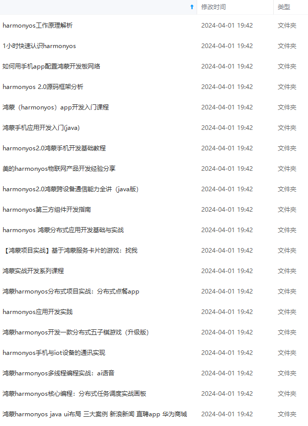
由于文件比较多,这里只是将部分目录截图出来,全套包含大厂面经、学习笔记、源码讲义、实战项目、大纲路线、讲解视频,并且后续会持续更新
环境搭建
完成本篇Codelab我们首先要完成开发环境的搭建,本示例以RK3568开发板为例,参照以下步骤进行:
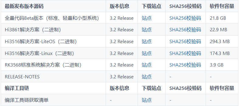
- 获取OpenHarmony系统版本:标准系统解决方案(二进制)。以3.2 Release版本为例:
2. 搭建烧录环境。
1. [完成DevEco Device Tool的安装]( )
2. [完成RK3568开发板的烧录]( )
-
搭建开发环境。
代码结构解读
本篇Codelab只对核心代码进行讲解,对于完整代码,我们会在gitee中提供。
├──entry/src/main/js	              // 代码区
│  └──MainAbility
│     ├──common
│     │  ├──constants
│     │  │  └──commonConstants.js     // 帧动画数据常量
│     │  └──images
│     ├──i18n		                  // 中英文
│     │  ├──en-US.json
│     │  └──zh-CN.json
│     └──pages
│        └──index
│           ├──index.css              // 首页样式文件
│           ├──index.hml              // 首页布局文件
│           └──index.js               // 首页脚本文件
└──entry/src/main/resources           // 应用资源目录
界面布局
本示例使用卡片布局,将四种实现以四张卡片的形式呈现在主界面。每张卡片都使用图文结合的方式直观地向开发者展示所实现效果。
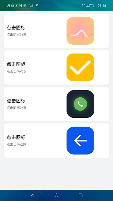
每张卡片对应一个div容器组件,以水平形式分为左侧文本和右侧图片两部分。左侧文本同样是一个div容器组件,以垂直形式分为操作文本与效果描述文本。右侧图片则根据需要使用image组件或image-animator组件。当前示例中,前两张卡片右侧使用的是image组件,剩余两张卡片使用的是image-animator组件。
<!-- index.hml -->
<div class="container">
    <!-- image组件的点击效果 -->
    <div class="card-container" for="item in imageCards">
        <div class="text-container">
            <text class="text-operation">{{ contentTitle }}</text>
            <text class="text-description">{{ item.description }}</text>
        </div>
        <image class="{{ item.classType }}" src="{{ item.src }}" onclick="changeHookState({{ item.eventType }})"
               ontouchstart="changeShadow({{ item.eventType }},true)"
               ontouchend="changeShadow({{ item.eventType }},false)"/>
    </div>

    <!-- image-animator组件的点击效果 -->
    <div class="card-container" for="item in animationCards">
        <div class="text-container">
            <text class="text-operation">{{ contentTitle }}</text>
            <text class="text-description">{{ item.description }}</text>
        </div>
        <image-animator id="{{ item.id }}" class="animator" images="{{ item.frames }}" iteration="1"
                        duration="{{ item.durationTime }}" onclick="handleStartFrame({{ item.type }})"/>
    </div>
</div>
事件交互
为image组件添加touchstart和touchend事件,实现点击图片改变边框阴影的效果,点击触碰结束时,恢复初始效果。
// index.js
// 点击阴影效果
changeShadow(eventType, shadowFlag) {
  if (eventType === 'click') {
    return;
  }
  if (shadowFlag) {
    this.imageCards[0].classType = 'main-img-touch';
  } else {
    this.imageCards[0].classType = 'img-normal';
  }
}
为image组件添加click事件,实现点击切换状态并变换显示图片的效果。
// index.js
// 点击切换状态
changeHookState(eventType) {
  if (eventType === 'touch') {
    return;
  }
  if (this.hook) {
    this.imageCards[1].src = '/common/images/ic_fork.png';
    this.hook = false;
  } else {
    this.imageCards[1].src = '/common/images/ic_hook.png';
    this.hook = true;
  }
}
为image-animator组件添加click事件,实现点击播放帧动画效果。
// index.js
// 点击动画效果方法
handleStartFrame(type) {
  if (type === 'dial') {
    this.animationCards[0].durationTime = CommonConstants.DURATION_TIME;
    this.$element('dialAnimation').start();
  } else {
    if (this.animationCards[1].flag) {
      this.animationCards[1].frames = this.collapse;
      this.animationCards[1].durationTime = this.durationTimeArray[0];
      this.$element('toggleAnimation').start();
      this.animationCards[1].flag = false;
      this.$element('toggleAnimation').stop();
    } else {
      this.animationCards[1].frames = this.arrow;
      this.animationCards[1].durationTime = this.durationTimeArray[1];
      this.$element('toggleAnimation').start();
      this.animationCards[1].flag = true;
      this.$element('toggleAnimation').stop();
    }
  }
}
最后
有很多小伙伴不知道学习哪些鸿蒙开发技术?不知道需要重点掌握哪些鸿蒙应用开发知识点?而且学习时频繁踩坑,最终浪费大量时间。所以有一份实用的鸿蒙(HarmonyOS NEXT)资料用来跟着学习是非常有必要的。
这份鸿蒙(HarmonyOS NEXT)资料包含了鸿蒙开发必掌握的核心知识要点,内容包含了(**ArkTS、ArkUI开发组件、Stage模型、多端部署、分布式应用开发、音频、视频、WebGL、OpenHarmony****多媒体技术、Napi组件、OpenHarmony内核、Harmony南向开发、鸿蒙项目实战等等)鸿蒙(HarmonyOS NEXT)**技术知识点。
希望这一份鸿蒙学习资料能够给大家带来帮助,有需要的小伙伴自行领取,限时开源,先到先得~无套路领取!!
如果你是一名有经验的资深Android移动开发、Java开发、前端开发、对鸿蒙感兴趣以及转行人员,可以直接领取这份资料
获取这份完整版高清学习路线,请点击→纯血版全套鸿蒙HarmonyOS学习资料****
鸿蒙(HarmonyOS NEXT)最新学习路线
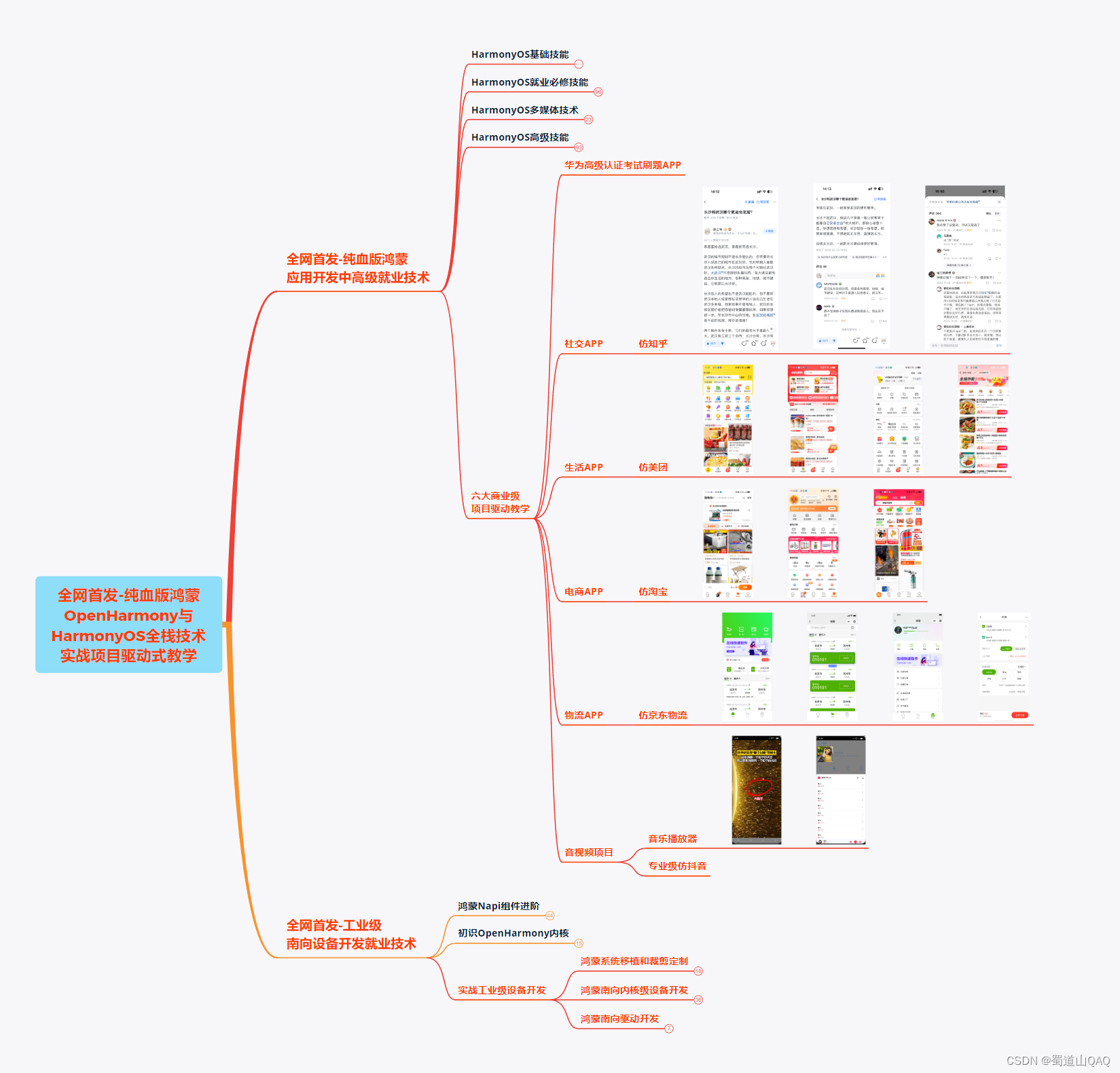
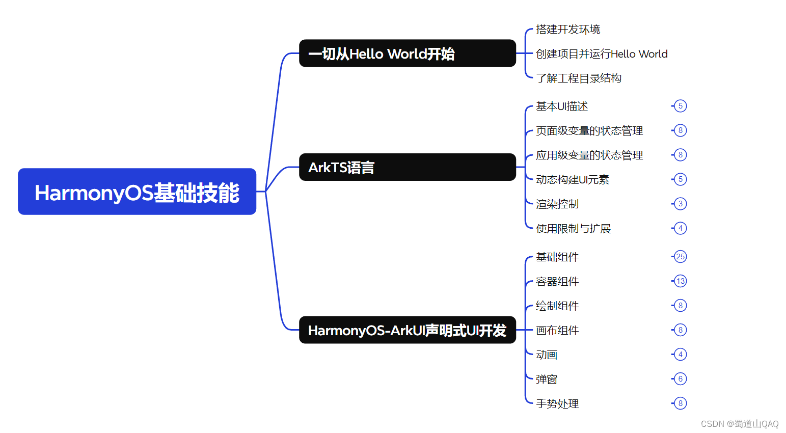
- HarmonOS基础技能
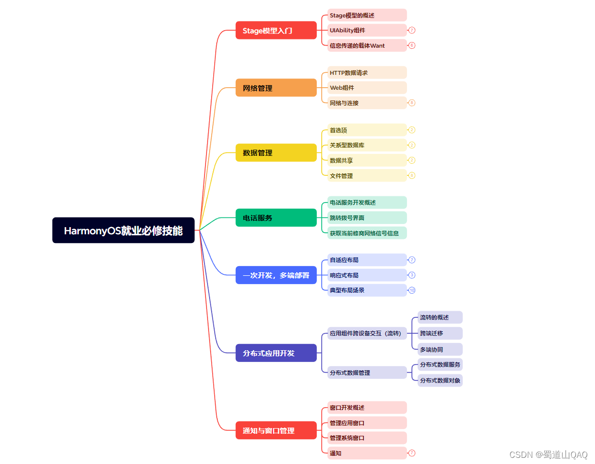
- HarmonOS就业必备技能
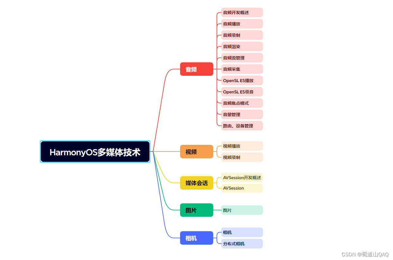
- HarmonOS多媒体技术
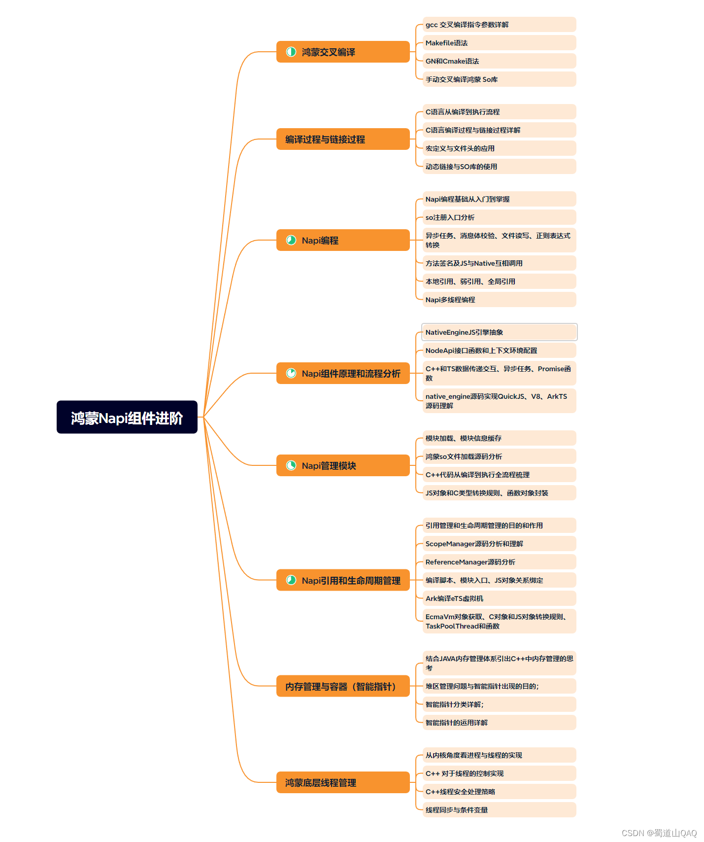
- 鸿蒙NaPi组件进阶
网上学习资料一大堆,但如果学到的知识不成体系,遇到问题时只是浅尝辄止,不再深入研究,那么很难做到真正的技术提升。
一个人可以走的很快,但一群人才能走的更远!不论你是正从事IT行业的老鸟或是对IT行业感兴趣的新人,都欢迎加入我们的的圈子(技术交流、学习资源、职场吐槽、大厂内推、面试辅导),让我们一起学习成长!
堆,但如果学到的知识不成体系,遇到问题时只是浅尝辄止,不再深入研究,那么很难做到真正的技术提升。**
一个人可以走的很快,但一群人才能走的更远!不论你是正从事IT行业的老鸟或是对IT行业感兴趣的新人,都欢迎加入我们的的圈子(技术交流、学习资源、职场吐槽、大厂内推、面试辅导),让我们一起学习成长!


 3768
3768


 被折叠的 条评论
为什么被折叠?
被折叠的 条评论
为什么被折叠?
 到【灌水乐园】发言


