


深知大多数程序员,想要提升技能,往往是自己摸索成长,但自己不成体系的自学效果低效又漫长,而且极易碰到天花板技术停滞不前!
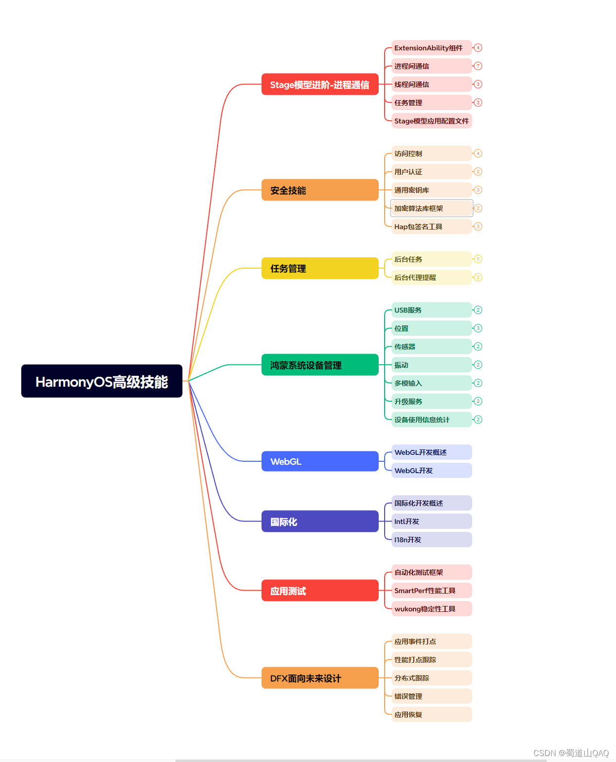

既有适合小白学习的零基础资料,也有适合3年以上经验的小伙伴深入学习提升的进阶课程,涵盖了95%以上鸿蒙开发知识点,真正体系化!
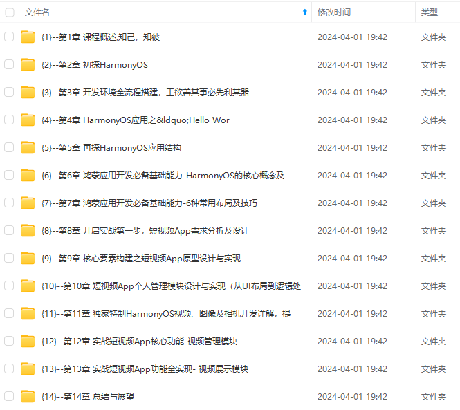
由于文件比较多,这里只是将部分目录截图出来,全套包含大厂面经、学习笔记、源码讲义、实战项目、大纲路线、讲解视频,并且后续会持续更新
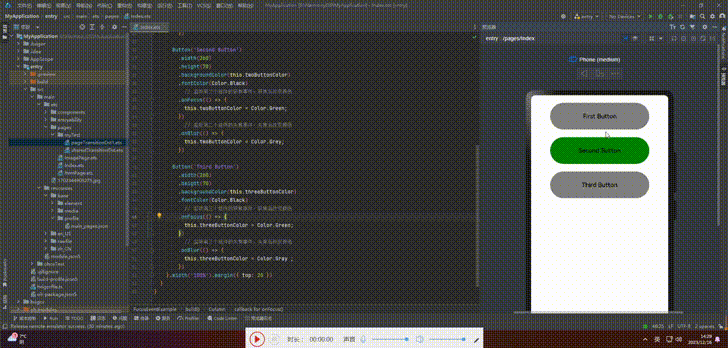
.onBlur(() => {
this.twoButtonColor = Color.Grey;
})
Button(‘Third Button’)
.width(260)
.height(70)
.backgroundColor(this.threeButtonColor)
.fontColor(Color.Black)
// 监听第三个组件的获焦事件,获焦后改变颜色
.onFocus(() => {
this.threeButtonColor = Color.Green;
})
// 监听第三个组件的失焦事件,失焦后改变颜色
.onBlur(() => {
this.threeButtonColor = Color.Gray ;
})
}.width(‘100%’).margin({ top: 20 })
}
}
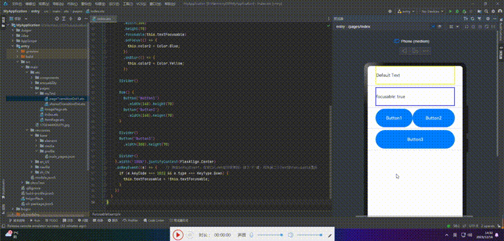
4.设置组件是否获焦
| 组件类型 | 获焦能力 | 默认焦点设定 |
|---|---|---|
| 默认可获焦组件 | 有交互行为的组件,例如Button、Checkbox,TextInput组件,此类组件无需设置任何属性,默认即可获焦。 | 是 |
| 有获焦能力但默认不可获焦组件 | Text、Image组件等,缺省情况下无法获焦,可使用focusable(true)使能。 | 否 |
| 无获焦能力的组件 | 无交互行为的展示类组件,例如Blank、Circle组件,即使使用focusable属性也无法使其可获焦。 | 否 |
按照组件的获焦能力分为三类的表格展示,可以根据需要选择适合的组件类型来实现焦点控制功能。
接口:
focusable(value: boolean)
案例:
// xxx.ets
@Entry
@Component
struct FocusableExample {
@State textFocusable: boolean = true;
@State color1: Color = Color.Yellow;
@State color2: Color = Color.Yellow;
build() {
Column({ space: 5 }) {
Text(‘Default Text’) // 第一个Text组件未设置focusable属性,默认不可获焦
.borderColor(this.color1)
.borderWidth(2)
.width(300)
.height(70)
.onFocus(() => {
this.color1 = Color.Blue;
})
.onBlur(() => {
this.color1 = Color.Yellow;
})
Divider()
Text('focusable: ’ + this.textFocusable) // 第二个Text设置了focusable属性,初始值为true
.borderColor(this.color2)
.borderWidth(2)
.width(300)
.height(70)
.focusable(this.textFocusable)
.onFocus(() => {
this.color2 = Color.Blue;
})
.onBlur(() => {
this.color2 = Color.Yellow;
})
Divider()
Row() {
Button(‘Button1’)
.width(140).height(70)
Button(‘Button2’)
.width(160).height(70)
}
Divider()
Button(‘Button3’)
.width(300).height(70)
Divider()
}.width(‘100%’).justifyContent(FlexAlign.Center)
.onKeyEvent((e) => { // 绑定onKeyEvent,在该Column组件获焦时,按下’F’键,可将第二个Text的focusable置反
if (e.keyCode === 2022 && e.type === KeyType.Down) {
this.textFocusable = !this.textFocusable;
}
})
}
}
5.自定义默认焦点
接口:
defaultFocus(value: boolean)
案例:
// xxx.ets
import promptAction from ‘@ohos.promptAction’;
class MyDataSource implements IDataSource {
private list: number[] = [];
private listener: DataChangeListener;
constructor(list: number[]) {
this.list = list;
}
totalCount(): number {
return this.list.length;
}
getData(index: number): any {
return this.list[index];
}
registerDataChangeListener(listener: DataChangeListener): void {
this.listener = listener;
}
unregisterDataChangeListener() {
}
}
@Entry
@Component
struct SwiperExample {
private swiperController: SwiperController = new SwiperController()
private data: MyDataSource = new MyDataSource([])
aboutToAppear(): void {
let list = []
for (let i = 1; i <= 4; i++) {
list.push(i.toString());
}
this.data = new MyDataSource(list);
}
build() {
Column({ space: 5 }) {
Swiper(this.swiperController) {
LazyForEach(this.data, (item: string) => {
Row({ space: 20 }) {
Column() {
Button(‘1’).width(200).height(200)
.fontSize(40)
.backgroundColor(‘#dadbd9’)
}
Column({ space: 20 }) {
Row({ space: 20 }) {
Button(‘2’)
.width(100)
.height(100)
.fontSize(40)
.type(ButtonType.Normal)
.borderRadius(20)
.backgroundColor(‘#dadbd9’)
Button(‘3’)
.width(100)
.height(100)
.fontSize(40)
.type(ButtonType.Normal)
.borderRadius(20)
.backgroundColor(‘#dadbd9’)
}
Row({ space: 20 }) {
Button(‘4’)
.width(100)
.height(100)
.fontSize(40)
.type(ButtonType.Normal)
.borderRadius(20)
.backgroundColor(‘#dadbd9’)
Button(‘5’)
.width(100)
.height(100)
.fontSize(40)
.type(ButtonType.Normal)
.borderRadius(20)
.backgroundColor(‘#dadbd9’)
}
Row({ space: 20 }) {
Button(‘6’)
.width(100)
.height(100)
.fontSize(40)
.type(ButtonType.Normal)
.borderRadius(20)
.backgroundColor(‘#dadbd9’)
Button(‘7’)
.width(100)
.height(100)
.fontSize(40)
.type(ButtonType.Normal)
.borderRadius(20)
.backgroundColor(‘#dadbd9’)
}
}
}
.width(480)
.height(380)
.justifyContent(FlexAlign.Center)
.borderWidth(2)
.borderColor(Color.Gray)
.backgroundColor(Color.White)
}, item => item)
}
.cachedCount(2)
.index(0)
.interval(4000)
.indicator(true)
.loop(true)
.duration(1000)
.itemSpace(0)
.curve(Curve.Linear)
.onChange((index: number) => {
console.info(index.toString());
})
.margin({ left: 20, top: 20, right: 20 })
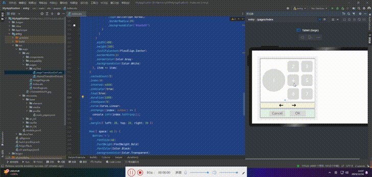
Row({ space: 40 }) {
Button(‘←’)
.fontSize(40)
.fontWeight(FontWeight.Bold)
.fontColor(Color.Black)
.backgroundColor(Color.Transparent)
.onClick(() => {
this.swiperController.showPrevious();
})
Button(‘→’)
.fontSize(40)
.fontWeight(FontWeight.Bold)
.fontColor(Color.Black)
.backgroundColor(Color.Transparent)
.onClick(() => {
this.swiperController.showNext();
})
}
.width(480)
.height(50)
.justifyContent(FlexAlign.Center)
.borderWidth(2)
.borderColor(Color.Gray)
.backgroundColor(‘#f7f6dc’)
Row({ space: 40 }) {
Button(‘Cancel’)
.fontSize(30)
.fontColor(‘#787878’)
.type(ButtonType.Normal)
.width(140)
.height(50)
.backgroundColor(‘#dadbd9’)
Button(‘OK’)
.fontSize(30)
.fontColor(‘#787878’)
.type(ButtonType.Normal)
.width(140)
.height(50)
.backgroundColor(‘#dadbd9’)
.onClick(() => {
promptAction.showToast({ message: ‘Button OK on clicked’ });
})
}
.width(480)
.height(80)
.justifyContent(FlexAlign.Center)
.borderWidth(2)
.borderColor(Color.Gray)
.backgroundColor(‘#dff2e4’)
.margin({ left: 20, bottom: 20, right: 20 })
}.backgroundColor(‘#f2f2f2’)
.margin({ left: 50, top: 50, right: 20 })
}
}
6.自定义TAB键走焦顺序
Button(‘1’).width(200).height(200)
.fontSize(40)
.backgroundColor(‘#dadbd9’)
.tabIndex(1) // Button-1设置为第一个tabIndex节点
Button(‘←’)
.fontSize(40)
.fontWeight(FontWeight.Bold)
.fontColor(Color.Black)
.backgroundColor(Color.Transparent)
.onClick(() => {
this.swiperController.showPrevious();
})
.tabIndex(2) // Button-左箭头设置为第二个tabIndex节点
Button(‘OK’)
.fontSize(30)
.fontColor(‘#787878’)
.type(ButtonType.Normal)
.width(140).height(50).backgroundColor(‘#dadbd9’)
.onClick(() => {
promptAction.showToast({ message: ‘Button OK on clicked’ });
})
.tabIndex(3) // Button-OK设置为第三个tabIndex节点
🦋6.1 groupDefaultFocus
我们分别将某个组件设置为tabIndex节点,设置完之后,只有当我们按下TAB/ShiftTab键在这3个组件上进行焦点切换时,才会出现快速走焦的效果。
为了解决这个问题,我们可以给每个区域的容器设置tabIndex属性。然而,这样设置存在一个问题:当首次走焦到容器上时,焦点会默认落在容器内的第一个可获焦组件上,而不是我们想要的Button1、左箭头、ButtonOK。
为了解决这个问题,我们引入了一个名为groupDefaultFocus的通用属性,该属性接受一个布尔值参数,默认值为false。使用该属性需要与tabIndex属性结合使用,首先使用tabIndex为每个区域(容器)定义焦点切换顺序,然后为Button1、左箭头、ButtonOK这些组件绑定groupDefaultFocus(true)。这样,在首次走焦到目标区域(容器)时,拥有groupDefaultFocus(true)绑定的子组件将同时获取焦点。
// xxx.ets
import promptAction from ‘@ohos.promptAction’;
class MyDataSource implements IDataSource {
private list: number[] = [];
private listener: DataChangeListener;
constructor(list: number[]) {
this.list = list;
}
totalCount(): number {
return this.list.length;
}
getData(index: number): any {
return this.list[index];
}
registerDataChangeListener(listener: DataChangeListener): void {
this.listener = listener;
}
unregisterDataChangeListener() {
}
}
@Entry
@Component
struct SwiperExample {
private swiperController: SwiperController = new SwiperController()
private data: MyDataSource = new MyDataSource([])
aboutToAppear(): void {
let list = []
for (let i = 1; i <= 4; i++) {
list.push(i.toString());
}
this.data = new MyDataSource(list);
}
build() {
Column({ space: 5 }) {
Swiper(this.swiperController) {
LazyForEach(this.data, (item: string) => {
Row({ space: 20 }) { // 设置该Row组件为tabIndex的第一个节点
Column() {
Button(‘1’).width(200).height(200)
.fontSize(40)
.backgroundColor(‘#dadbd9’)
.groupDefaultFocus(true) // 设置Button-1为第一个tabIndex的默认焦点
}
Column({ space: 20 }) {
Row({ space: 20 }) {
Button(‘2’)
.width(100)
.height(100)
.fontSize(40)
.type(ButtonType.Normal)
.borderRadius(20)
.backgroundColor(‘#dadbd9’)
Button(‘3’)
.width(100)
.height(100)
.fontSize(40)
.type(ButtonType.Normal)
.borderRadius(20)
.backgroundColor(‘#dadbd9’)
}
Row({ space: 20 }) {
Button(‘4’)
.width(100)
.height(100)
.fontSize(40)
.type(ButtonType.Normal)
.borderRadius(20)
.backgroundColor(‘#dadbd9’)
Button(‘5’)
.width(100)
.height(100)
.fontSize(40)
.type(ButtonType.Normal)
.borderRadius(20)
.backgroundColor(‘#dadbd9’)
}
Row({ space: 20 }) {
Button(‘6’)
.width(100)
.height(100)
.fontSize(40)
.type(ButtonType.Normal)
.borderRadius(20)
.backgroundColor(‘#dadbd9’)
Button(‘7’)
.width(100)
.height(100)
.fontSize(40)
.type(ButtonType.Normal)
.borderRadius(20)
.backgroundColor(‘#dadbd9’)
}
}
}
.width(480)
.height(380)
.justifyContent(FlexAlign.Center)
.borderWidth(2)
.borderColor(Color.Gray)
.backgroundColor(Color.White)
.tabIndex(1)
}, item => item)
}
.cachedCount(2)
.index(0)
深知大多数程序员,想要提升技能,往往是自己摸索成长,但自己不成体系的自学效果低效又漫长,而且极易碰到天花板技术停滞不前!

既有适合小白学习的零基础资料,也有适合3年以上经验的小伙伴深入学习提升的进阶课程,涵盖了95%以上鸿蒙开发知识点,真正体系化!
由于文件比较多,这里只是将部分目录截图出来,全套包含大厂面经、学习笔记、源码讲义、实战项目、大纲路线、讲解视频,并且后续会持续更新
=> item)
}
.cachedCount(2)
.index(0)
深知大多数程序员,想要提升技能,往往是自己摸索成长,但自己不成体系的自学效果低效又漫长,而且极易碰到天花板技术停滞不前!
[外链图片转存中…(img-r8yqF3pk-1715512631310)]
[外链图片转存中…(img-zRgg2PZg-1715512631310)]
既有适合小白学习的零基础资料,也有适合3年以上经验的小伙伴深入学习提升的进阶课程,涵盖了95%以上鸿蒙开发知识点,真正体系化!
由于文件比较多,这里只是将部分目录截图出来,全套包含大厂面经、学习笔记、源码讲义、实战项目、大纲路线、讲解视频,并且后续会持续更新


 1440
1440

 被折叠的 条评论
为什么被折叠?
被折叠的 条评论
为什么被折叠?
 到【灌水乐园】发言


