


网上学习资料一大堆,但如果学到的知识不成体系,遇到问题时只是浅尝辄止,不再深入研究,那么很难做到真正的技术提升。
一个人可以走的很快,但一群人才能走的更远!不论你是正从事IT行业的老鸟或是对IT行业感兴趣的新人,都欢迎加入我们的的圈子(技术交流、学习资源、职场吐槽、大厂内推、面试辅导),让我们一起学习成长!
☀️3.1.4 FlexAlign.SpaceBetween
Flex主轴方向均匀分配弹性元素,相邻子组件之间距离相同。第一个子组件和最后一个子组件与父元素边沿对齐。
Flex({ justifyContent: FlexAlign.SpaceBetween }) {
Text(‘1’).width(‘20%’).height(50).backgroundColor(0xF5DEB3)
Text(‘2’).width(‘20%’).height(50).backgroundColor(0xD2B48C)
Text(‘3’).width(‘20%’).height(50).backgroundColor(0xF5DEB3)
}
.width(‘90%’)
.padding({ top: 10, bottom: 10 })
.backgroundColor(0xAFEEEE)

☀️3.1.5 FlexAlign.SpaceAround
Flex主轴方向均匀分配弹性元素,相邻子组件之间距离相同。第一个子组件到主轴起始端的距离和最后一个子组件到主轴终点端的距离是相邻元素之间距离的一半。
Flex({ justifyContent: FlexAlign.SpaceAround }) {
Text(‘1’).width(‘20%’).height(50).backgroundColor(0xF5DEB3)
Text(‘2’).width(‘20%’).height(50).backgroundColor(0xD2B48C)
Text(‘3’).width(‘20%’).height(50).backgroundColor(0xF5DEB3)
}
.width(‘90%’)
.padding({ top: 10, bottom: 10 })
.backgroundColor(0xAFEEEE)

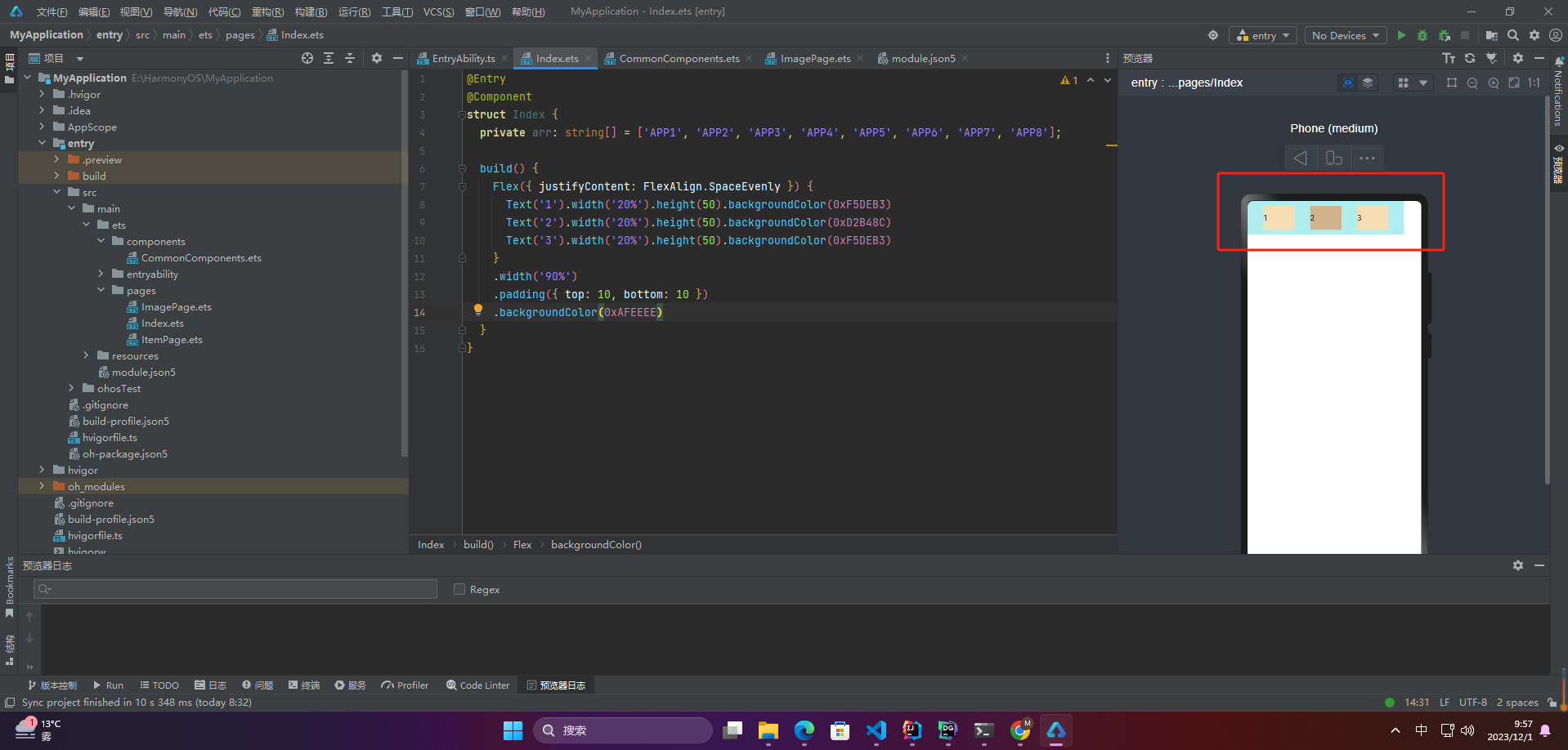
☀️3.1.6 FlexAlign.SpaceEvenly
Flex主轴方向元素等间距布局,相邻子组件之间的间距、第一个子组件与主轴起始端的间距、最后一个子组件到主轴终点端的间距均相等。
Flex({ justifyContent: FlexAlign.SpaceEvenly }) {
Text(‘1’).width(‘20%’).height(50).backgroundColor(0xF5DEB3)
Text(‘2’).width(‘20%’).height(50).backgroundColor(0xD2B48C)
Text(‘3’).width(‘20%’).height(50).backgroundColor(0xF5DEB3)
}
.width(‘90%’)
.padding({ top: 10, bottom: 10 })
.backgroundColor(0xAFEEEE)
3.2 交叉轴对齐方式
Flex弹性布局的交叉轴对齐方式包括以下几种:
ItemAlign.Start:交叉轴起点对齐;ItemAlign.Center:交叉轴中点对齐;ItemAlign.End:交叉轴终点对齐;ItemAlign. Baseline:以第一行文字的基线对齐;ItemAlign.Stretch:默认值,每个子元素都延伸到交叉轴的相同大小。
☀️3.2.1 ItemAlign.Auto
使用Flex容器中默认配置。
Flex({ alignItems: ItemAlign.Auto }) {
Text(‘1’).width(‘33%’).height(30).backgroundColor(0xF5DEB3)
Text(‘2’).width(‘33%’).height(40).backgroundColor(0xD2B48C)
Text(‘3’).width(‘33%’).height(50).backgroundColor(0xF5DEB3)
}
.size({ width: ‘90%’, height: 80 })
.padding(10)
.backgroundColor(0xAFEEEE)

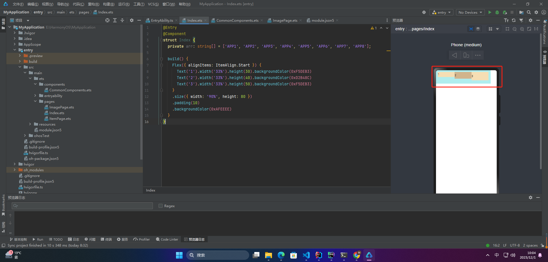
☀️3.2.2 ItemAlign.Start
交叉轴方向首部对齐
Flex({ alignItems: ItemAlign.Start }) {
Text(‘1’).width(‘33%’).height(30).backgroundColor(0xF5DEB3)
Text(‘2’).width(‘33%’).height(40).backgroundColor(0xD2B48C)
Text(‘3’).width(‘33%’).height(50).backgroundColor(0xF5DEB3)
}
.size({ width: ‘90%’, height: 80 })
.padding(10)
.backgroundColor(0xAFEEEE)
☀️3.2.3 ItemAlign.Center
交叉轴方向居中对齐
Flex({ alignItems: ItemAlign.Center }) {
Text(‘1’).width(‘33%’).height(30).backgroundColor(0xF5DEB3)
Text(‘2’).width(‘33%’).height(40).backgroundColor(0xD2B48C)
Text(‘3’).width(‘33%’).height(50).backgroundColor(0xF5DEB3)
}
.size({ width: ‘90%’, height: 80 })
.padding(10)
.backgroundColor(0xAFEEEE)

☀️3.2.4 ItemAlign.End
交叉轴方向底部对齐
Flex({ alignItems: ItemAlign.End }) {
Text(‘1’).width(‘33%’).height(30).backgroundColor(0xF5DEB3)
Text(‘2’).width(‘33%’).height(40).backgroundColor(0xD2B48C)
Text(‘3’).width(‘33%’).height(50).backgroundColor(0xF5DEB3)
}
.size({ width: ‘90%’, height: 80 })
.padding(10)
.backgroundColor(0xAFEEEE)

☀️3.2.5 ItemAlign.Stretch
交叉轴方向拉伸填充,在未设置尺寸时,拉伸到容器尺寸。
Flex({ alignItems: ItemAlign.Stretch}) {
Text(‘1’).width(‘33%’).height(30).backgroundColor(0xF5DEB3)
Text(‘2’).width(‘33%’).height(40).backgroundColor(0xD2B48C)
Text(‘3’).width(‘33%’).height(50).backgroundColor(0xF5DEB3)
}
.size({ width: ‘90%’, height: 80 })
.padding(10)
.backgroundColor(0xAFEEEE)

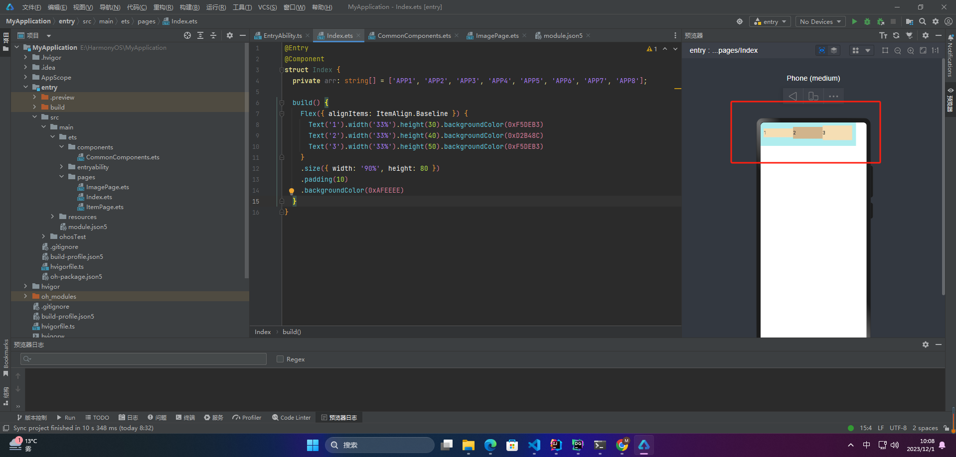
☀️3.2.6 ItemAlign.Baseline
交叉轴方向文本基线对齐
Flex({ alignItems: ItemAlign.Baseline}) {
Text(‘1’).width(‘33%’).height(30).backgroundColor(0xF5DEB3)
Text(‘2’).width(‘33%’).height(40).backgroundColor(0xD2B48C)
Text(‘3’).width(‘33%’).height(50).backgroundColor(0xF5DEB3)
}
.size({ width: ‘90%’, height: 80 })
.padding(10)
.backgroundColor(0xAFEEEE)
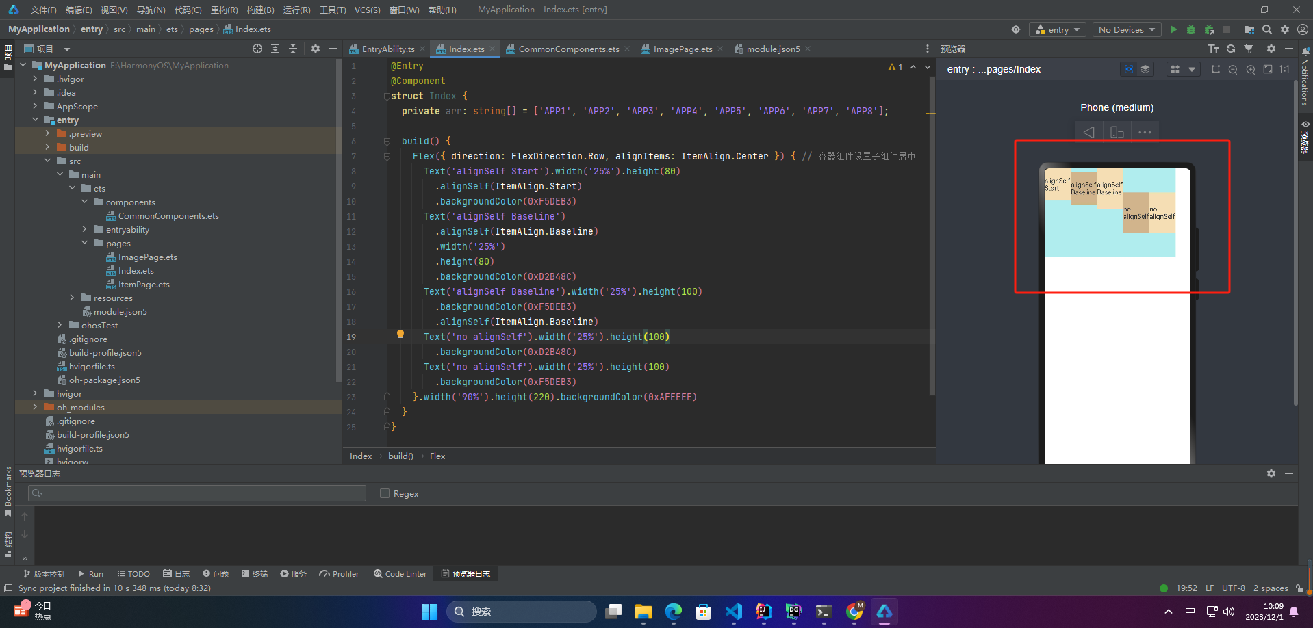
☀️3.2.7 alignSelf
子组件的alignSelf属性也可以设置子组件在父容器交叉轴的对齐格式,且会覆盖Flex布局容器中alignItems配置。如下例所示:
Flex({ direction: FlexDirection.Row, alignItems: ItemAlign.Center }) { // 容器组件设置子组件居中
Text(‘alignSelf Start’).width(‘25%’).height(80)
.alignSelf(ItemAlign.Start)
.backgroundColor(0xF5DEB3)
Text(‘alignSelf Baseline’)
.alignSelf(ItemAlign.Baseline)
.width(‘25%’)
.height(80)
.backgroundColor(0xD2B48C)
Text(‘alignSelf Baseline’).width(‘25%’).height(100)
.backgroundColor(0xF5DEB3)
.alignSelf(ItemAlign.Baseline)
Text(‘no alignSelf’).width(‘25%’).height(100)
.backgroundColor(0xD2B48C)
Text(‘no alignSelf’).width(‘25%’).height(100)
.backgroundColor(0xF5DEB3)
}.width(‘90%’).height(220).backgroundColor(0xAFEEEE)
二、案例
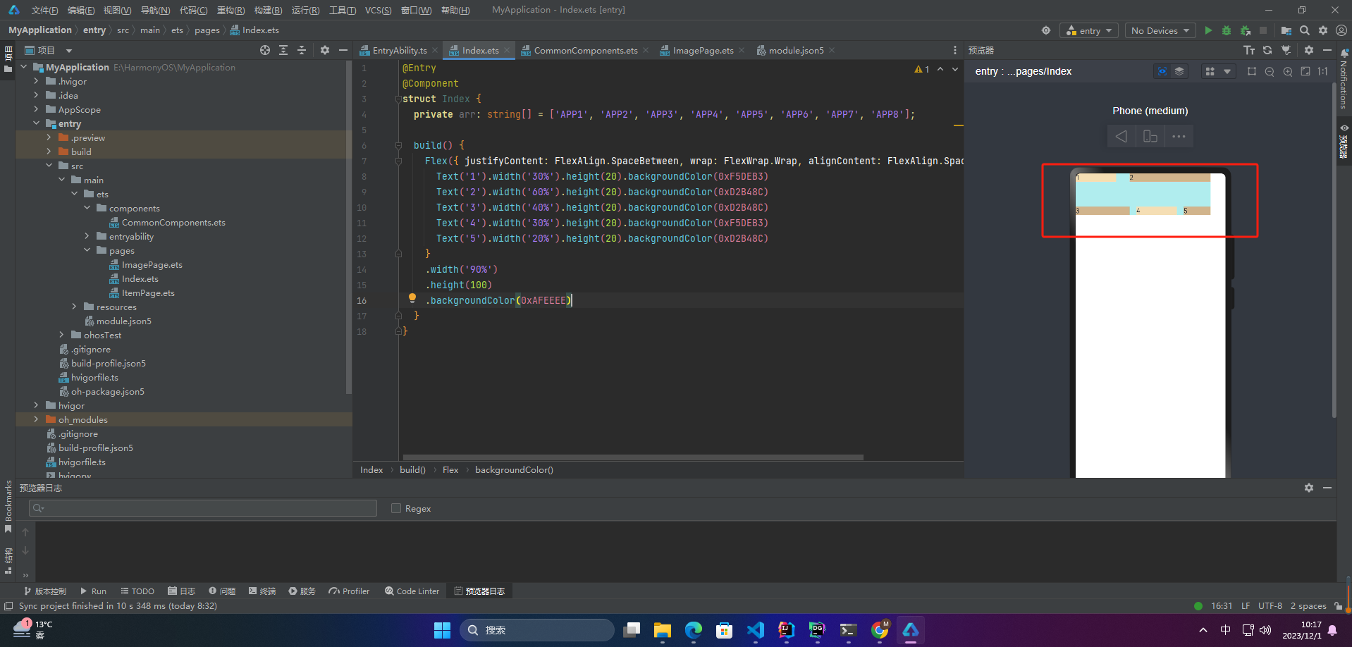
1.多行内容对齐
1.1 Start
Flex({ justifyContent: FlexAlign.SpaceBetween, wrap: FlexWrap.Wrap, alignContent: FlexAlign.Start }) {
Text(‘1’).width(‘30%’).height(20).backgroundColor(0xF5DEB3)
Text(‘2’).width(‘60%’).height(20).backgroundColor(0xD2B48C)
Text(‘3’).width(‘40%’).height(20).backgroundColor(0xD2B48C)
Text(‘4’).width(‘30%’).height(20).backgroundColor(0xF5DEB3)
Text(‘5’).width(‘20%’).height(20).backgroundColor(0xD2B48C)
}
.width(‘90%’)
.height(100)
.backgroundColor(0xAFEEEE)

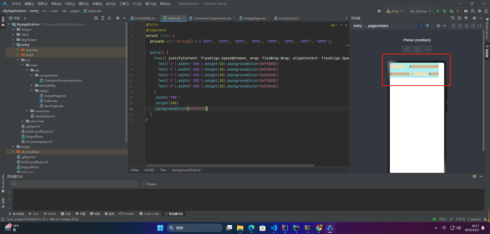
🦋1.2 Center
Flex({ justifyContent: FlexAlign.SpaceBetween, wrap: FlexWrap.Wrap, alignContent: FlexAlign.Center }) {
Text(‘1’).width(‘30%’).height(20).backgroundColor(0xF5DEB3)
Text(‘2’).width(‘60%’).height(20).backgroundColor(0xD2B48C)
Text(‘3’).width(‘40%’).height(20).backgroundColor(0xD2B48C)
Text(‘4’).width(‘30%’).height(20).backgroundColor(0xF5DEB3)
Text(‘5’).width(‘20%’).height(20).backgroundColor(0xD2B48C)
}
.width(‘90%’)
.height(100)
.backgroundColor(0xAFEEEE)

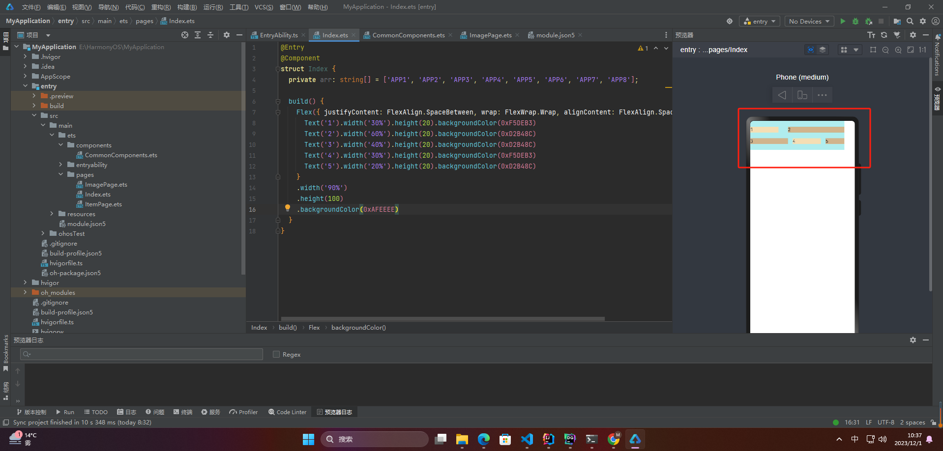
🦋1.3 End
Flex({ justifyContent: FlexAlign.SpaceBetween, wrap: FlexWrap.Wrap, alignContent: FlexAlign.End }) {
Text(‘1’).width(‘30%’).height(20).backgroundColor(0xF5DEB3)
Text(‘2’).width(‘60%’).height(20).backgroundColor(0xD2B48C)
Text(‘3’).width(‘40%’).height(20).backgroundColor(0xD2B48C)
Text(‘4’).width(‘30%’).height(20).backgroundColor(0xF5DEB3)
Text(‘5’).width(‘20%’).height(20).backgroundColor(0xD2B48C)
}
.width(‘90%’)
.height(100)
.backgroundColor(0xAFEEEE)

🦋1.4 SpaceBetween
Flex({ justifyContent: FlexAlign.SpaceBetween, wrap: FlexWrap.Wrap, alignContent: FlexAlign.SpaceBetween }) {
Text(‘1’).width(‘30%’).height(20).backgroundColor(0xF5DEB3)
Text(‘2’).width(‘60%’).height(20).backgroundColor(0xD2B48C)
Text(‘3’).width(‘40%’).height(20).backgroundColor(0xD2B48C)
Text(‘4’).width(‘30%’).height(20).backgroundColor(0xF5DEB3)
Text(‘5’).width(‘20%’).height(20).backgroundColor(0xD2B48C)
}
.width(‘90%’)
.height(100)
.backgroundColor(0xAFEEEE)
🦋1.5 SpaceAround
Flex({ justifyContent: FlexAlign.SpaceBetween, wrap: FlexWrap.Wrap, alignContent: FlexAlign.SpaceAround }) {
Text(‘1’).width(‘30%’).height(20).backgroundColor(0xF5DEB3)
Text(‘2’).width(‘60%’).height(20).backgroundColor(0xD2B48C)
Text(‘3’).width(‘40%’).height(20).backgroundColor(0xD2B48C)
Text(‘4’).width(‘30%’).height(20).backgroundColor(0xF5DEB3)
Text(‘5’).width(‘20%’).height(20).backgroundColor(0xD2B48C)
}
.width(‘90%’)
.height(100)
.backgroundColor(0xAFEEEE)
🦋1.6 SpaceEvenly
Flex({ justifyContent: FlexAlign.SpaceBetween, wrap: FlexWrap.Wrap, alignContent: FlexAlign.SpaceEvenly }) {
Text(‘1’).width(‘30%’).height(20).backgroundColor(0xF5DEB3)
Text(‘2’).width(‘60%’).height(20).backgroundColor(0xD2B48C)
Text(‘3’).width(‘40%’).height(20).backgroundColor(0xD2B48C)
Text(‘4’).width(‘30%’).height(20).backgroundColor(0xF5DEB3)
Text(‘5’).width(‘20%’).height(20).backgroundColor(0xD2B48C)
}
.width(‘90%’)
.height(100)
.backgroundColor(0xAFEEEE)
2.自适应拉伸
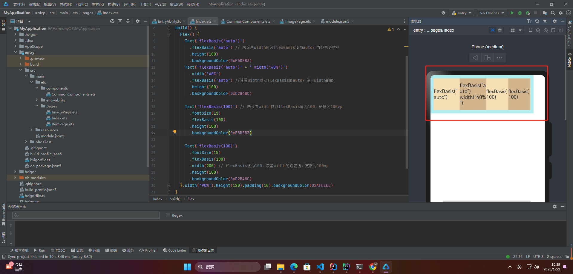
🦋2.1 flexBasis
设置子组件在父容器主轴方向上的基准尺寸。如果设置了该值,则子项占用的空间为设置的值;如果没设置该属性,那子项的空间为width/height的值。
Flex() {
Text(‘flexBasis(“auto”)’)
.flexBasis(‘auto’) // 未设置width以及flexBasis值为auto,内容自身宽松
.height(100)
.backgroundColor(0xF5DEB3)
Text(‘flexBasis(“auto”)’ + ’ width(“40%”)')
.width(‘40%’)
.flexBasis(‘auto’) //设置width以及flexBasis值auto,使用width的值
.height(100)
.backgroundColor(0xD2B48C)
Text(‘flexBasis(100)’) // 未设置width以及flexBasis值为100,宽度为100vp
.fontSize(15)
.flexBasis(100)
.height(100)
.backgroundColor(0xF5DEB3)
Text(‘flexBasis(100)’)
.fontSize(15)
.flexBasis(100)
.width(200) // flexBasis值为100,覆盖width的设置值,宽度为100vp
.height(100)
.backgroundColor(0xD2B48C)
}.width(‘90%’).height(120).padding(10).backgroundColor(0xAFEEEE)
🦋2.2 flexGrow
设置父容器的剩余空间分配给此属性所在组件的比例。用于“瓜分”父组件的剩余空间。
Flex() {
Text(‘flexGrow(2)’)
.flexGrow(2)
.width(100)
.height(100)
.backgroundColor(0xF5DEB3)
Text(‘flexGrow(3)’)
.flexGrow(3)
.width(100)
.height(100)
.backgroundColor(0xD2B48C)
Text(‘no flexGrow’)
.width(100)
.height(100)
.backgroundColor(0xF5DEB3)
}.width(400).height(120).padding(10).backgroundColor(0xAFEEEE)
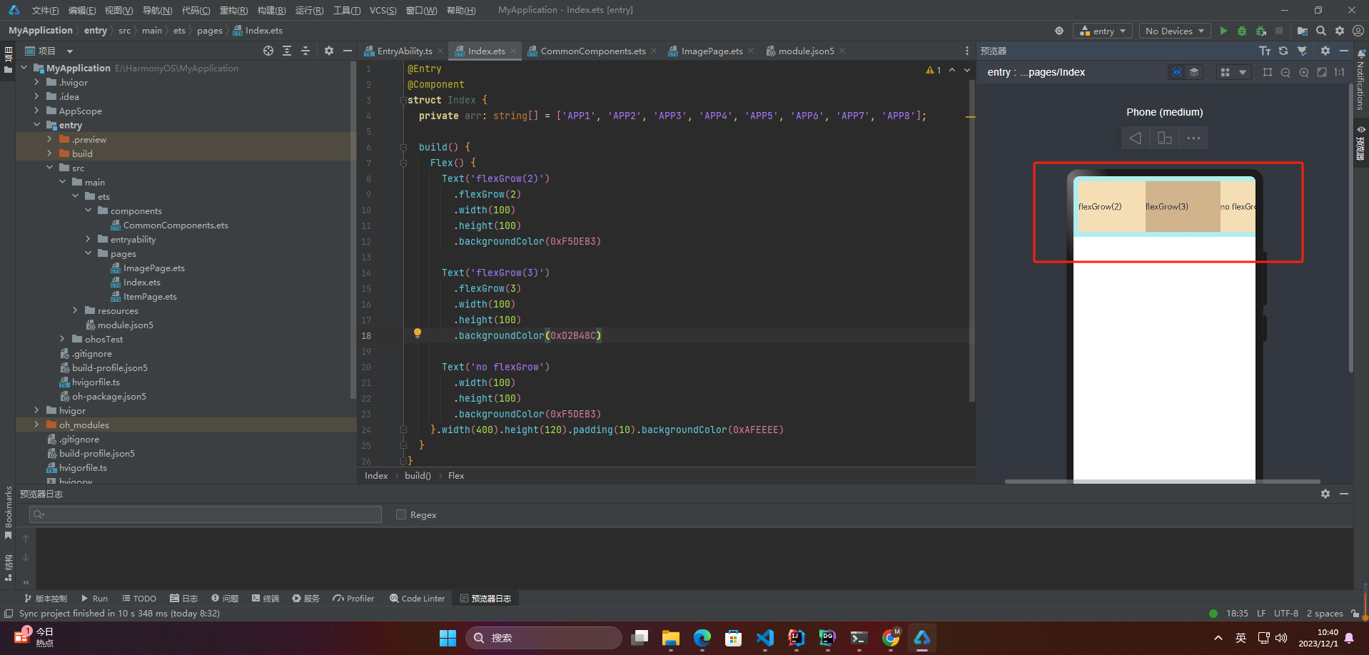
父容器宽度400vp,三个子组件原始宽度为100vp,总和300vp,剩余空间100vp根据flexGrow值的占比分配给子组件,未设置flexGrow的子组件不参与“瓜分”。
第一个元素以及第二个元素以2:3分配剩下的100vp。第一个元素为100vp+100vp2/5=140vp,第二个元素为100vp+100vp3/5=160vp。
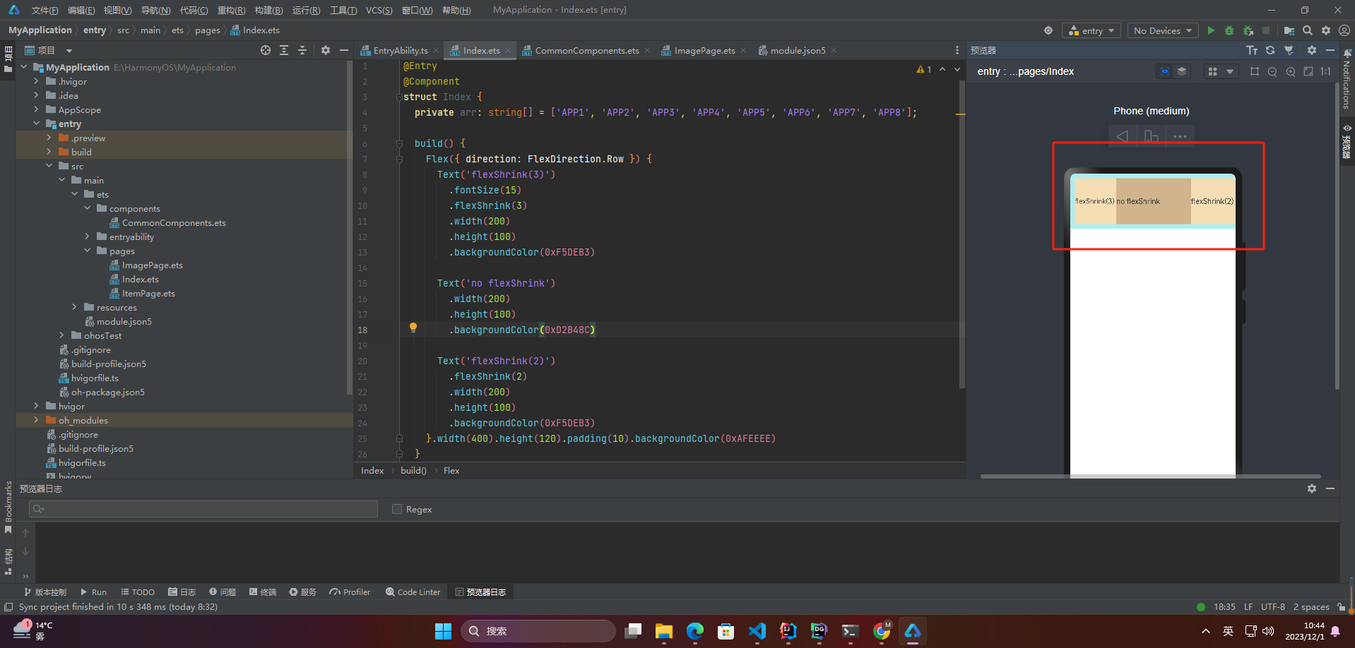
🦋2.3 flexShrink
当父容器空间不足时,子组件的压缩比例。
Flex({ direction: FlexDirection.Row }) {
Text(‘flexShrink(3)’)
.fontSize(15)
.flexShrink(3)
.width(200)
.height(100)
.backgroundColor(0xF5DEB3)
Text(‘no flexShrink’)
.width(200)
.height(100)
.backgroundColor(0xD2B48C)
Text(‘flexShrink(2)’)
.flexShrink(2)
.width(200)
.height(100)
.backgroundColor(0xF5DEB3)
}.width(400).height(120).padding(10).backgroundColor(0xAFEEEE)
🦋2.4 案例
网上学习资料一大堆,但如果学到的知识不成体系,遇到问题时只是浅尝辄止,不再深入研究,那么很难做到真正的技术提升。
一个人可以走的很快,但一群人才能走的更远!不论你是正从事IT行业的老鸟或是对IT行业感兴趣的新人,都欢迎加入我们的的圈子(技术交流、学习资源、职场吐槽、大厂内推、面试辅导),让我们一起学习成长!
0).padding(10).backgroundColor(0xAFEEEE)
🦋2.4 案例
[外链图片转存中…(img-KeH01GW1-1715301809787)]
[外链图片转存中…(img-Y3FlzMAB-1715301809788)]
网上学习资料一大堆,但如果学到的知识不成体系,遇到问题时只是浅尝辄止,不再深入研究,那么很难做到真正的技术提升。
一个人可以走的很快,但一群人才能走的更远!不论你是正从事IT行业的老鸟或是对IT行业感兴趣的新人,都欢迎加入我们的的圈子(技术交流、学习资源、职场吐槽、大厂内推、面试辅导),让我们一起学习成长!


 939
939


 被折叠的 条评论
为什么被折叠?
被折叠的 条评论
为什么被折叠?
 到【灌水乐园】发言


