


一.准备工作
1.首先需要认识在JavaScript中的一些数学代码:
//Math.random() //表示生成一个随机数
//Math.floor() //向下取整
//Math.ceil() //向上取整
//Math.round() //四舍五入
//Math.abs() //取绝对值
//Math.max() //求最大值
//Math.min() //求最小值
//Math.pow() //求幂
//Math.sqrt() //求平方根
//Math.PI //圆周率
//Math.E //自然常数
//Math.log() //求对数
//Math.exp() //求指数
//Math.sin() //求正弦值
//Math.cos() //求余弦值
//Math.tan() //求正切值
//Math.asin() //求反正弦值
//Math.acos() //求反余弦值
//Math.atan() //求反正切值
//Math.atan2() //求两个变量的反正切值
实现过程中需要用到生成随机数和向下取整,来实现生成[0--2]的随机整数数,进而表示剪刀石头布然而 Math.random()是生成一个0--1之间的随机浮点数数 ,不过聪明的我们可以用这行代码让他随机生成0--3之间的浮点数
Math.floor(Math.random()*3) 2.逻辑分析
思考:我们实现一个剪刀石头布需要干什么?如何模拟这个过程?
上面我们用随机数表示石头剪刀布:0--石头;1--剪刀;2---布
用com代表电脑 用user代表玩家
玩家输入或者选择一个结果 去和电脑比拼 那么还需要用到比较运算以及选择结构语句
玩家输入的代码:
use = prompt("请出拳:剪刀、石头、布:", 0 )选择结构代码:
        if(user == com){
            alert("平局!")
        }
        else if(user == 0 && com == 2){
            alert("你输了!")
        }
        else if(user == 1 && com == 0){
            alert("你输了!")
        }
        else if(user == 2 && com == 1){
            alert("你输了!")
        }
        else{
            alert("你赢了!")
        }
二.实现剪刀石头布V1.0版本
过程如下:
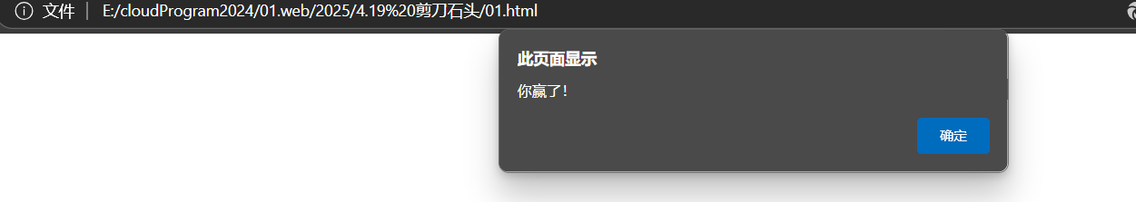
我是玩家我输入0 即代表石头:

结果:
完整代码:
<!DOCTYPE html>
<html lang="zt">
<head>
    <meta charset="UTF-8">
    <meta name="viewport" content="width=device-width, initial-scale=1.0">
    <title>剪刀石头布</title>
</head>
<body>
    <script>

        let com = Math.floor(Math.random()*3)
        let user = prompt("请出拳:剪刀、石头、布:", 0 )
        //0--石头;1--剪刀;2--布
        if(user == com){
            alert("平局!")
        }
        else if(user == 0 && com == 2){
            alert("你输了!")
        }
        else if(user == 1 && com == 0){
            alert("你输了!")
        }
        else if(user == 2 && com == 1){
            alert("你输了!")
        }
        else{
            alert("你赢了!")
        }
    </script>
</body>
</html>
三.实现V2.0版本
我们可以加入图片 让出招可视化
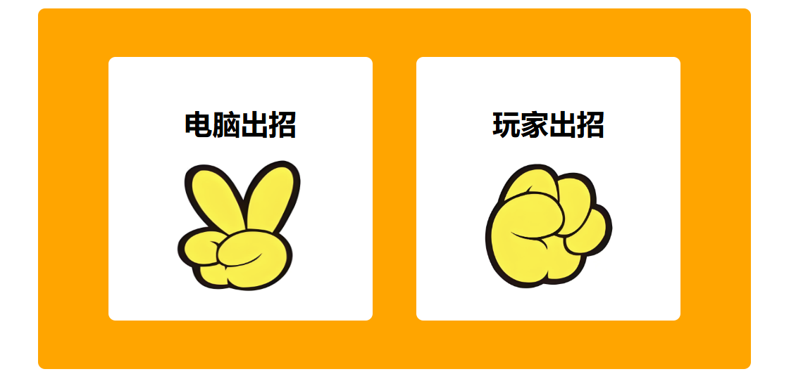
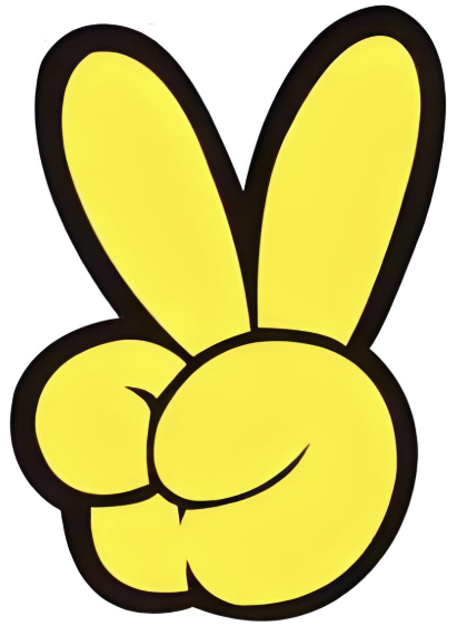
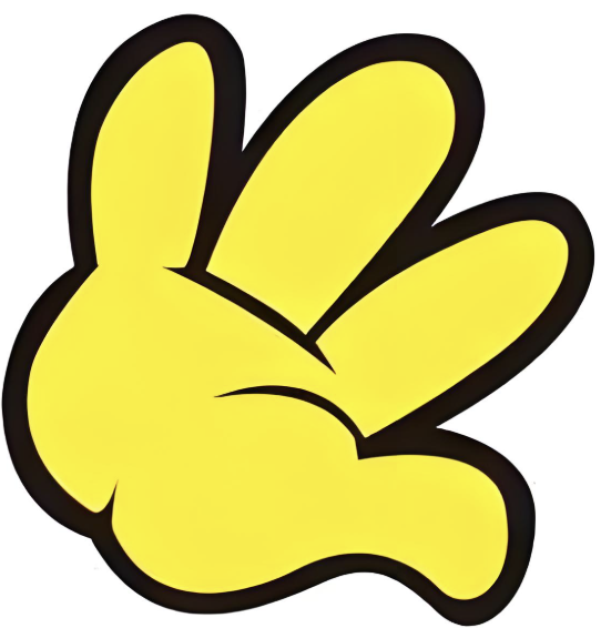
需要的图片:

那我们又要学会一个代码:
        com_img.src = "images/" + com + ".png"
        user_img.src = "images/" + user + ".png"
这两行代码的意思是变量中存储一个图片标签,可修改这个图片标签展示的图片
    <div class="box">
        <div class="left">
            <h1>电脑出招</h1>
            <img src="" alt="" class="c_img">
        </div>
        <div class="right">
            <h1>玩家出招</h1>
            <img src="" alt="" class="u_img">
    </div>
在body标签中引入没有位置的img 在后面的JavaScript中使用上面代码可以修改图片
        let user_img = document.querySelector(".u_img");
        let com_img = document.querySelector(".c_img");

        let com = Math.floor(Math.random()*3)
        let user = prompt("请出拳:剪刀、石头、布:", 0 )
        //0--石头;1--剪刀;2--布
        com_img.src = "images/" + com + ".png"
        user_img.src = "images/" + user + ".png"
我们还需要对网页中图片展示的位置进行css样式修饰
代码:
    <style>
        .box{
            width: 800px;
            height: 400px;
            background-color: orange;
            padding: 5px;
            border-radius: 8px;
            overflow: hidden;
            margin: 100px auto;

            display: flex;
            align-items: center;
            justify-content: center;
            gap: 50px;

        }
        .left,.right{
            width: 300px;
            height: 300px;
            background-color: #fff;
            border-radius: 8px;
            overflow: hidden;
            display: flex;
            gap :20 px;
            flex-direction: column;
            align-items: center;
            justify-content: center;
        }
        .left img ,.right img {
            width: 150px;
            height: 150px;
        }
    </style>
完整代码:
<!DOCTYPE html>
<html lang="zt">
<head>
    <meta charset="UTF-8">
    <meta name="viewport" content="width=device-width, initial-scale=1.0">
    <title>剪刀石头布</title>
    <style>
        .box{
            width: 800px;
            height: 400px;
            background-color: orange;
            padding: 5px;
            border-radius: 8px;
            overflow: hidden;
            margin: 100px auto;

            display: flex;
            align-items: center;
            justify-content: center;
            gap: 50px;

        }
        .left,.right{
            width: 300px;
            height: 300px;
            background-color: #fff;
            border-radius: 8px;
            overflow: hidden;
            display: flex;
            gap :20 px;
            flex-direction: column;
            align-items: center;
            justify-content: center;
        }
        .left img ,.right img {
            width: 150px;
            height: 150px;
        }
    </style>
</head>
<body>
    <div class="box">
        <div class="left">
            <h1>电脑出招</h1>
            <img src="" alt="" class="c_img">
        </div>
        <div class="right">
            <h1>玩家出招</h1>
            <img src="" alt="" class="u_img">
    </div>
    <script>
        let user_img = document.querySelector(".u_img");
        let com_img = document.querySelector(".c_img");

        let com = Math.floor(Math.random()*3)
        let user = prompt("请出拳:剪刀、石头、布:", 0 )
        //0--石头;1--剪刀;2--布
        com_img.src = "images/" + com + ".png"
        user_img.src = "images/" + user + ".png"

        if(user == com){
            alert("平局!")
        }
        else if(user == 0 && com == 2){
            alert("你输了!")
        }
        else if(user == 1 && com == 0){
            alert("你输了!")
        }
        else if(user == 2 && com == 1){
            alert("你输了!")
        }
        else{
            alert("你赢了!")
        }
    </script>
</body>
</html>
四.借助al 实现V3.0版本
我与al的对话是:
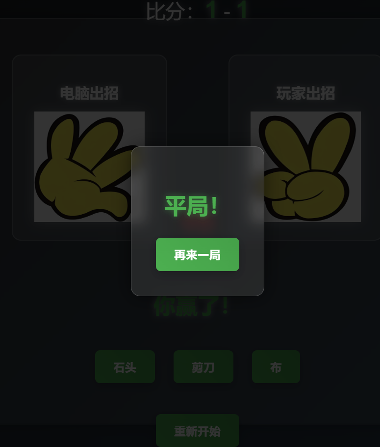
@01.html @images 使用images中的照片优化01.html中的项目 让他有动态的出招效果 并且可以记录输赢情况和比分情况 还可以选择几局几胜模式,当用户不想玩了可以退出 但是又可以重新开始
请优化一下网页显示的比例 可以让他看起来好看一点 尽可能让玩家感受到一种竞技的感觉
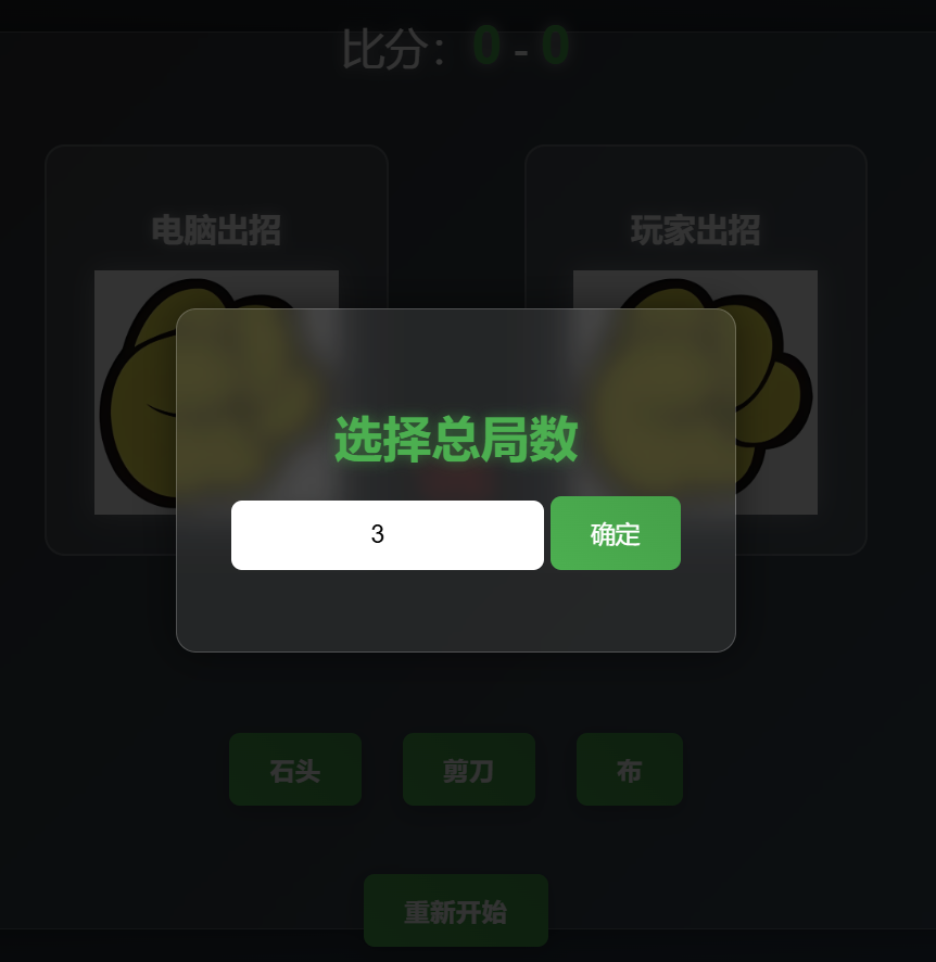
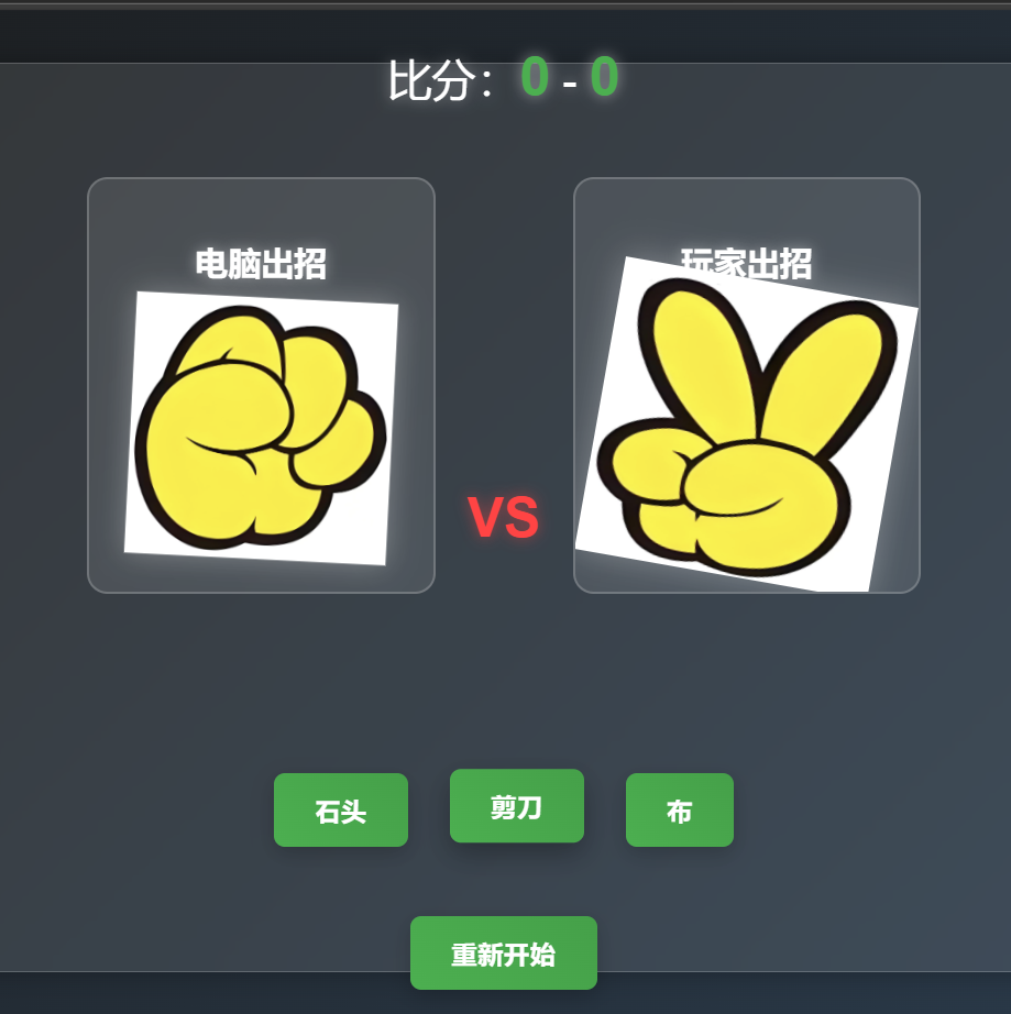
不要在一进去就让我输入几局几胜 帮我弄一个进入游戏 然后在输入 在把电脑出招过程动态化 就是照片闪动
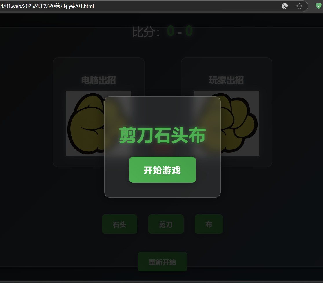
可以说AI 实现的效果非常牛哇!
进入页面:
动态过程也有:
完整代码:
<!DOCTYPE html>
<html lang="zt">
<head>
    <meta charset="UTF-8">
    <meta name="viewport" content="width=device-width, initial-scale=1.0">
    <title>剪刀石头布</title>
    <style>
        body {
            background: linear-gradient(135deg, #1a1a1a, #2c3e50);
            font-family: 'Arial', sans-serif;
            color: white;
            min-height: 100vh;
            margin: 0;
            display: flex;
            justify-content: center;
            align-items: center;
        }
        .box{
            width: 900px;
            height: 600px;
            background: rgba(255, 255, 255, 0.1);
            padding: 30px;
            border-radius: 15px;
            box-shadow: 0 0 20px rgba(0, 0, 0, 0.3);
            backdrop-filter: blur(10px);
            display: flex;
            flex-direction: column;
            align-items: center;
            justify-content: center;
            gap: 30px;
            border: 1px solid rgba(255, 255, 255, 0.2);
        }
        .score-board {
            font-size: 32px;
            margin-bottom: 20px;
            text-align: center;
            text-shadow: 0 0 10px rgba(255, 255, 255, 0.5);
        }
        .score-board span {
            font-size: 40px;
            font-weight: bold;
            color: #4CAF50;
        }
        .game-area {
            display: flex;
            gap: 100px;
            margin-bottom: 30px;
        }
        .left, .right {
            width: 250px;
            height: 300px;
            background: rgba(255, 255, 255, 0.1);
            border-radius: 15px;
            overflow: hidden;
            display: flex;
            flex-direction: column;
            align-items: center;
            justify-content: center;
            transition: all 0.3s ease;
            border: 2px solid rgba(255, 255, 255, 0.2);
            position: relative;
        }
        .left:hover, .right:hover {
            transform: scale(1.05);
            box-shadow: 0 0 20px rgba(255, 255, 255, 0.2);
        }
        .left h1, .right h1 {
            margin: 0;
            padding: 15px;
            font-size: 24px;
            color: #fff;
            text-shadow: 0 0 10px rgba(255, 255, 255, 0.5);
        }
        .left img, .right img {
            width: 180px;
            height: 180px;
            transition: all 0.3s ease;
            filter: drop-shadow(0 0 10px rgba(255, 255, 255, 0.3));
        }
        .result {
            font-size: 36px;
            font-weight: bold;
            margin: 20px 0;
            text-shadow: 0 0 10px rgba(255, 255, 255, 0.5);
            color: #4CAF50;
            height: 50px;
        }
        .controls {
            display: flex;
            gap: 30px;
            margin-bottom: 20px;
        }
        .btn {
            padding: 15px 30px;
            font-size: 18px;
            border: none;
            border-radius: 8px;
            cursor: pointer;
            background: linear-gradient(45deg, #4CAF50, #45a049);
            color: white;
            transition: all 0.3s ease;
            text-transform: uppercase;
            letter-spacing: 1px;
            font-weight: bold;
            box-shadow: 0 5px 15px rgba(0, 0, 0, 0.2);
        }
        .btn:hover {
            transform: translateY(-3px);
            box-shadow: 0 8px 20px rgba(0, 0, 0, 0.3);
        }
        .btn:active {
            transform: translateY(1px);
        }
        .modal {
            display: none;
            position: fixed;
            top: 0;
            left: 0;
            width: 100%;
            height: 100%;
            background-color: rgba(0,0,0,0.8);
            justify-content: center;
            align-items: center;
            z-index: 1000;
        }
        .modal-content {
            background: rgba(255, 255, 255, 0.1);
            padding: 40px;
            border-radius: 15px;
            text-align: center;
            backdrop-filter: blur(10px);
            border: 1px solid rgba(255, 255, 255, 0.2);
            box-shadow: 0 0 30px rgba(0, 0, 0, 0.5);
        }
        .modal-content h2 {
            font-size: 36px;
            margin-bottom: 30px;
            color: #4CAF50;
            text-shadow: 0 0 10px rgba(76, 175, 80, 0.5);
        }
        .vs {
            position: absolute;
            top: 50%;
            left: 50%;
            transform: translate(-50%, -50%);
            font-size: 40px;
            font-weight: bold;
            color: #ff4444;
            text-shadow: 0 0 10px rgba(255, 68, 68, 0.5);
            z-index: 1;
        }
        @keyframes shake {
            0%, 100% { transform: translateX(0); }
            25% { transform: translateX(-5px); }
            75% { transform: translateX(5px); }
        }
        .shake {
            animation: shake 0.3s ease-in-out;
        }
        .start-screen {
            position: fixed;
            top: 0;
            left: 0;
            width: 100%;
            height: 100%;
            background: rgba(0, 0, 0, 0.8);
            display: flex;
            justify-content: center;
            align-items: center;
            z-index: 1000;
        }
        .start-content {
            background: rgba(255, 255, 255, 0.1);
            padding: 40px;
            border-radius: 15px;
            text-align: center;
            backdrop-filter: blur(10px);
            border: 1px solid rgba(255, 255, 255, 0.2);
            box-shadow: 0 0 30px rgba(0, 0, 0, 0.5);
        }
        .start-content h1 {
            font-size: 48px;
            margin-bottom: 30px;
            color: #4CAF50;
            text-shadow: 0 0 10px rgba(76, 175, 80, 0.5);
        }
        .start-btn {
            padding: 20px 40px;
            font-size: 24px;
            background: linear-gradient(45deg, #4CAF50, #45a049);
            color: white;
            border: none;
            border-radius: 10px;
            cursor: pointer;
            transition: all 0.3s ease;
            text-transform: uppercase;
            letter-spacing: 2px;
            font-weight: bold;
            box-shadow: 0 5px 15px rgba(0, 0, 0, 0.2);
        }
        .start-btn:hover {
            transform: translateY(-5px);
            box-shadow: 0 8px 20px rgba(0, 0, 0, 0.3);
        }
        .round-input {
            display: none;
            position: fixed;
            top: 0;
            left: 0;
            width: 100%;
            height: 100%;
            background: rgba(0, 0, 0, 0.8);
            justify-content: center;
            align-items: center;
            z-index: 1000;
        }
        .round-content {
            background: rgba(255, 255, 255, 0.1);
            padding: 40px;
            border-radius: 15px;
            text-align: center;
            backdrop-filter: blur(10px);
            border: 1px solid rgba(255, 255, 255, 0.2);
            box-shadow: 0 0 30px rgba(0, 0, 0, 0.5);
        }
        .round-content h2 {
            font-size: 36px;
            margin-bottom: 20px;
            color: #4CAF50;
            text-shadow: 0 0 10px rgba(76, 175, 80, 0.5);
        }
        .round-input input {
            padding: 15px;
            font-size: 18px;
            border: none;
            border-radius: 8px;
            margin-bottom: 20px;
            width: 200px;
            text-align: center;
        }
        .round-input button {
            padding: 15px 30px;
            font-size: 18px;
            background: linear-gradient(45deg, #4CAF50, #45a049);
            color: white;
            border: none;
            border-radius: 8px;
            cursor: pointer;
            transition: all 0.3s ease;
        }
        .round-input button:hover {
            transform: translateY(-3px);
            box-shadow: 0 5px 15px rgba(0, 0, 0, 0.2);
        }
        @keyframes computerThinking {
            0% { transform: scale(1) rotate(0deg); }
            25% { transform: scale(1.1) rotate(5deg); }
            50% { transform: scale(1) rotate(0deg); }
            75% { transform: scale(1.1) rotate(-5deg); }
            100% { transform: scale(1) rotate(0deg); }
        }
        .computer-thinking {
            animation: computerThinking 0.5s infinite;
        }
    </style>
</head>
<body>
    <div class="start-screen" id="startScreen">
        <div class="start-content">
            <h1>剪刀石头布</h1>
            <button class="start-btn" onclick="startGame()">开始游戏</button>
        </div>
    </div>

    <div class="round-input" id="roundInput">
        <div class="round-content">
            <h2>选择总局数</h2>
            <input type="number" id="roundCount" min="1" max="10" value="3">
            <button onclick="setRounds()">确定</button>
        </div>
    </div>

    <div class="box">
        <div class="score-board">
            比分:<span id="user-score">0</span> - <span id="com-score">0</span>
        </div>
        <div class="game-area">
            <div class="left">
                <h1>电脑出招</h1>
                <img src="images/0.png" alt="" class="c_img">
            </div>
            <div class="vs">VS</div>
            <div class="right">
                <h1>玩家出招</h1>
                <img src="images/0.png" alt="" class="u_img">
            </div>
        </div>
        <div class="result" id="result"></div>
        <div class="controls">
            <button class="btn" onclick="playGame(0)">石头</button>
            <button class="btn" onclick="playGame(1)">剪刀</button>
            <button class="btn" onclick="playGame(2)">布</button>
        </div>
        <button class="btn" onclick="resetGame()">重新开始</button>
    </div>

    <div class="modal" id="gameOverModal">
        <div class="modal-content">
            <h2 id="finalResult"></h2>
            <button class="btn" onclick="resetGame()">再来一局</button>
        </div>
    </div>

    <script>
        let userScore = 0;
        let comScore = 0;
        let totalRounds = 0;
        let currentRound = 0;
        let gameActive = false;
        let computerThinking = false;

        function startGame() {
            document.getElementById('startScreen').style.display = 'none';
            document.getElementById('roundInput').style.display = 'flex';
        }

        function setRounds() {
            const input = document.getElementById('roundCount');
            const rounds = parseInt(input.value);
            if (rounds && rounds > 0 && rounds <= 10) {
                totalRounds = rounds;
                document.getElementById('roundInput').style.display = 'none';
                gameActive = true;
                currentRound = 0;
                userScore = 0;
                comScore = 0;
                updateScore();
                document.getElementById('result').textContent = '';
            } else {
                alert('请输入1-10之间的数字!');
            }
        }

        function playGame(userChoice) {
            if (!gameActive) return;

            const userImg = document.querySelector(".u_img");
            const comImg = document.querySelector(".c_img");
            const result = document.getElementById('result');
            const gameArea = document.querySelector('.game-area');

            // 添加震动效果
            gameArea.classList.add('shake');
            setTimeout(() => gameArea.classList.remove('shake'), 300);

            // 显示玩家选择
            userImg.src = `images/${userChoice}.png`;
            userImg.style.transform = 'scale(1.2) rotate(10deg)';

            // 电脑思考动画
            comImg.classList.add('computer-thinking');
            computerThinking = true;

            // 模拟电脑思考过程
            let thinkCount = 0;
            const thinkInterval = setInterval(() => {
                if (thinkCount < 3) {
                    comImg.src = `images/${Math.floor(Math.random() * 3)}.png`;
                    thinkCount++;
                } else {
                    clearInterval(thinkInterval);
                    computerThinking = false;
                    comImg.classList.remove('computer-thinking');

                    const comChoice = Math.floor(Math.random() * 3);
                    comImg.src = `images/${comChoice}.png`;

                    userImg.style.transform = 'scale(1) rotate(0deg)';
                    comImg.style.transform = 'scale(1) rotate(0deg)';

                    let roundResult = '';
                    if (userChoice === comChoice) {
                        roundResult = "平局!";
                    } else if (
                        (userChoice === 0 && comChoice === 2) ||
                        (userChoice === 1 && comChoice === 0) ||
                        (userChoice === 2 && comChoice === 1)
                    ) {
                        roundResult = "你输了!";
                        comScore++;
                    } else {
                        roundResult = "你赢了!";
                        userScore++;
                    }

                    result.textContent = roundResult;
                    updateScore();
                    currentRound++;

                    if (currentRound >= totalRounds) {
                        checkGameOver();
                    }
                }
            }, 300);
        }

        function updateScore() {
            document.getElementById('user-score').textContent = userScore;
            document.getElementById('com-score').textContent = comScore;
        }

        function checkGameOver() {
            if (userScore > comScore) {
                showGameOver("恭喜你获胜!");
            } else if (comScore > userScore) {
                showGameOver("很遗憾,电脑获胜!");
            } else {
                showGameOver("平局!");
            }
            gameActive = false;
        }

        function showGameOver(message) {
            const modal = document.getElementById('gameOverModal');
            const finalResult = document.getElementById('finalResult');
            finalResult.textContent = message;
            modal.style.display = 'flex';
        }

        function resetGame() {
            document.getElementById('gameOverModal').style.display = 'none';
            document.querySelector(".u_img").src = "images/0.png";
            document.querySelector(".c_img").src = "images/0.png";
            document.getElementById('result').textContent = '';
            startGame();
        }
    </script>
</body>
</html>


 扫一扫
扫一扫


 1752
1752

 被折叠的 条评论
为什么被折叠?
被折叠的 条评论
为什么被折叠?
 到【灌水乐园】发言


