


MATLAB绘图合集包!18种代码和20个绘图小技巧!
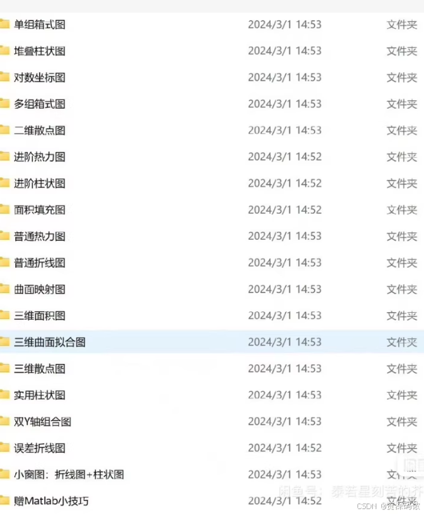
包括单组箱式图、堆叠柱状图、对数坐标图、多组箱式图、二维散点图、进阶热力图、进阶柱状图、面积填充图、普通热力图、普通折线图、曲面映射图、三维面积图、三维曲面拟合图、三维散点图、实用柱状图、双Y轴组合图、误差折线图、小窗图:折线图+柱状图以及一些实用的matlab编程小技巧
文章目录
- 1. 单组箱式图
- 2. 堆叠柱状图
- 3. 对数坐标图
- 4. 二维散点图
- 5. 普通折线图
- 6. 双Y轴组合图
- 7. 误差折线图
- 1. 单组箱式图
- 2. 堆叠柱状图
- 3. 对数坐标图
- 4. 多组箱式图
- 5. 二维散点图
- 6. 进阶热力图
- 7. 进阶柱状图
- 8. 面积填充图
- 9. 普通热力图
- 10. 普通折线图
- 11. 曲面映射图
- 12. 三维面积图
- 13. 三维曲面拟合图
- 14. 三维散点图
- 15. 实用柱状图
- 16. 双Y轴组合图
- 17. 误差折线图
- 18. 小窗图:折线图+柱状图
- 1. Box Plot
- 2. Stacked Bar Chart
- 3. Log-Log Plot
- 4. Multiple Group Box Plot
- 5. 2D Scatter Plot
- 6. Advanced Heatmap
- 7. Advanced Bar Chart
- 8. Area Fill Plot
- 9. Basic Heatmap
- 10. Basic Line Plot
- 11. Surface Mapping Plot
- 12. 3D Area Plot
- 13. 3D Surface Fitting Plot
- 14. 3D Scatter Plot
- 15. Practical Bar Chart
- 16. Dual Y-Axis Combined Plot
- 17. Error Bar Plot
- 18. Small Window: Line Plot + Bar Chart
- 19. MATLAB Tips
为了帮助您开始使用MATLAB进行多种类型的绘图,我将提供一些基础代码示例。这些例子涵盖了您提到的几种类型,并展示了如何在MATLAB中创建它们。
1. 单组箱式图
data = randn(50,1); % 随机生成数据
boxplot(data)
2. 堆叠柱状图
x = [1 2 3]; % X轴值
y = [2 2 3; 2 5 6; 7 9 5]; % 数据,每行代表一个类别
bar(x,y,'stacked')
legend('A','B','C') % 添加图例
3. 对数坐标图
x = logspace(-1,2);
figure
loglog(x,exp(x),'-s')
grid on
4. 二维散点图
x = randn(100,1);
y = randn(100,1);
scatter(x,y)
xlabel('X axis')
ylabel('Y axis')
5. 普通折线图
x = 0:0.1:2*pi;
y = sin(x);
plot(x,y)
xlabel('Angle (radians)')
ylabel('Sine Value')
title('Sine Wave')
6. 双Y轴组合图
x = linspace(0,10);
y1 = sin(x);
y2 = exp(x/10);

figure
yyaxis left
plot(x,y1)
ylabel('Sin(x)')
yyaxis right
plot(x,y2,'--r')
ylabel('Exp(x/10)')
7. 误差折线图
x = 0:pi/10:pi;
y = sin(x);
e = std(y)*ones(size(x));

errorbar(x,y,e)
title('Error bar plot')
以上只是部分示例,针对其他类型的图表如面积填充图、三维图形等,您可以参考MATLAB官方文档获取更多详细信息和代码示例。对于特定需求或更复杂的图表,您可能需要结合多个函数和属性设置来实现您的目标
1. 单组箱式图
data = randn(50, 1);
boxplot(data)
title('Single Group Box Plot')
2. 堆叠柱状图
x = [1 2 3];
y = [2 2 3; 2 5 6; 7 9 5];
bar(x, y, 'stacked')
legend('A', 'B', 'C')
title('Stacked Bar Chart')
3. 对数坐标图
x = logspace(-1, 2);
y = exp(x);
loglog(x, y, '-s')
grid on
title('Log-Log Plot')
xlabel('X axis (log scale)')
ylabel('Y axis (log scale)')
4. 多组箱式图
data = {randn(50, 1), randn(50, 1) + 1, randn(50, 1) - 1};
boxplot(data)
title('Multiple Group Box Plot')
5. 二维散点图
x = randn(100, 1);
y = randn(100, 1);
scatter(x, y)
xlabel('X axis')
ylabel('Y axis')
title('2D Scatter Plot')
6. 进阶热力图
data = rand(10, 10);
heatmap(data)
title('Advanced Heatmap')
7. 进阶柱状图
x = [1 2 3];
y = [2 5 6];
bar(x, y)
hold on
bar(x, y * 0.5, 'FaceColor', 'r')
legend('Full', 'Half')
title('Advanced Bar Chart')
8. 面积填充图
x = 0:0.1:10;
y1 = sin(x);
y2 = cos(x);
fill([x fliplr(x)], [y1 zeros(size(y1))], 'b', 'FaceAlpha', 0.5)
hold on
fill([x fliplr(x)], [y2 zeros(size(y2))], 'r', 'FaceAlpha', 0.5)
title('Area Fill Plot')
9. 普通热力图
data = rand(10, 10);
heatmap(data)
title('Basic Heatmap')
10. 普通折线图
x = 0:0.1:2*pi;
y = sin(x);
plot(x, y)
xlabel('Angle (radians)')
ylabel('Sine Value')
title('Basic Line Plot')
11. 曲面映射图
[X,Y] = meshgrid(-2:0.2:2);
Z = X.*exp(-X.^2 - Y.^2);
surf(X, Y, Z)
title('Surface Mapping Plot')
12. 三维面积图
[X,Y] = meshgrid(-2:0.2:2);
Z = X.*exp(-X.^2 - Y.^2);
surfc(X, Y, Z)
title('3D Area Plot')
13. 三维曲面拟合图
[X,Y] = meshgrid(-2:0.2:2);
Z = X.*exp(-X.^2 - Y.^2);
surf(X, Y, Z)
title('3D Surface Fitting Plot')
14. 三维散点图
x = randn(100, 1);
y = randn(100, 1);
z = randn(100, 1);
scatter3(x, y, z)
title('3D Scatter Plot')
15. 实用柱状图
x = [1 2 3];
y = [2 5 6];
bar(x, y)
title('Practical Bar Chart')
16. 双Y轴组合图
x = linspace(0, 10);
y1 = sin(x);
y2 = exp(x/10);

figure
yyaxis left
plot(x, y1)
ylabel('Sin(x)')
yyaxis right
plot(x, y2, '--r')
ylabel('Exp(x/10)')
title('Dual Y-Axis Combined Plot')
17. 误差折线图
x = 0:0.1:2*pi;
y = sin(x);
e = std(y) * ones(size(x));
errorbar(x, y, e)
title('Error Bar Plot')
18. 小窗图:折线图+柱状图
x = 0:0.1:2*pi;
y = sin(x);
z = linspace(0, 10, length(x));

figure
subplot(2, 1, 1)
plot(x, y)
title('Line Plot')

subplot(2, 1, 2)
bar(z)
title('Bar Plot')
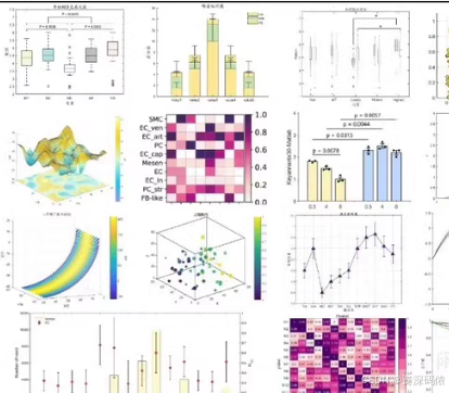
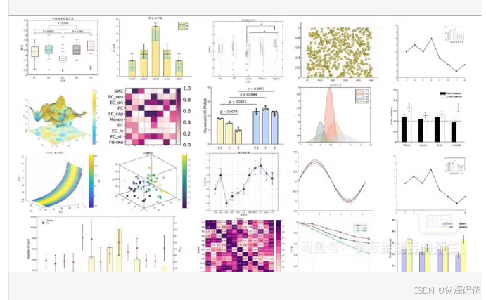
Sure, let’s go through the types of plots shown in the image and provide MATLAB code for each one. The image includes various types of plots such as box plots, bar charts, 3D surface plots, scatter plots, and heatmaps. Here are the MATLAB codes for each type of plot:
1. Box Plot
data = randn(50, 1);
boxplot(data)
title('Single Group Box Plot')
2. Stacked Bar Chart
x = [1 2 3];
y = [2 2 3; 2 5 6; 7 9 5];
bar(x, y, 'stacked')
legend('A', 'B', 'C')
title('Stacked Bar Chart')
3. Log-Log Plot
x = logspace(-1, 2);
y = exp(x);
loglog(x, y, '-s')
grid on
title('Log-Log Plot')
xlabel('X axis (log scale)')
ylabel('Y axis (log scale)')
4. Multiple Group Box Plot
data = {randn(50, 1), randn(50, 1) + 1, randn(50, 1) - 1};
boxplot(data)
title('Multiple Group Box Plot')
5. 2D Scatter Plot
x = randn(100, 1);
y = randn(100, 1);
scatter(x, y)
xlabel('X axis')
ylabel('Y axis')
title('2D Scatter Plot')
6. Advanced Heatmap
data = rand(10, 10);
heatmap(data)
title('Advanced Heatmap')
7. Advanced Bar Chart
x = [1 2 3];
y = [2 5 6];
bar(x, y)
hold on
bar(x, y * 0.5, 'FaceColor', 'r')
legend('Full', 'Half')
title('Advanced Bar Chart')
8. Area Fill Plot
x = 0:0.1:10;
y1 = sin(x);
y2 = cos(x);
fill([x fliplr(x)], [y1 zeros(size(y1))], 'b', 'FaceAlpha', 0.5)
hold on
fill([x fliplr(x)], [y2 zeros(size(y2))], 'r', 'FaceAlpha', 0.5)
title('Area Fill Plot')
9. Basic Heatmap
data = rand(10, 10);
heatmap(data)
title('Basic Heatmap')
10. Basic Line Plot
x = 0:0.1:2*pi;
y = sin(x);
plot(x, y)
xlabel('Angle (radians)')
ylabel('Sine Value')
title('Basic Line Plot')
11. Surface Mapping Plot
[X,Y] = meshgrid(-2:0.2:2);
Z = X.*exp(-X.^2 - Y.^2);
surf(X, Y, Z)
title('Surface Mapping Plot')
12. 3D Area Plot
[X,Y] = meshgrid(-2:0.2:2);
Z = X.*exp(-X.^2 - Y.^2);
surfc(X, Y, Z)
title('3D Area Plot')
13. 3D Surface Fitting Plot
[X,Y] = meshgrid(-2:0.2:2);
Z = X.*exp(-X.^2 - Y.^2);
surf(X, Y, Z)
title('3D Surface Fitting Plot')
14. 3D Scatter Plot
x = randn(100, 1);
y = randn(100, 1);
z = randn(100, 1);
scatter3(x, y, z)
title('3D Scatter Plot')
15. Practical Bar Chart
x = [1 2 3];
y = [2 5 6];
bar(x, y)
title('Practical Bar Chart')
16. Dual Y-Axis Combined Plot
x = linspace(0, 10);
y1 = sin(x);
y2 = exp(x/10);

figure
yyaxis left
plot(x, y1)
ylabel('Sin(x)')
yyaxis right
plot(x, y2, '--r')
ylabel('Exp(x/10)')
title('Dual Y-Axis Combined Plot')
17. Error Bar Plot
x = 0:0.1:2*pi;
y = sin(x);
e = std(y) * ones(size(x));
errorbar(x, y, e)
title('Error Bar Plot')
18. Small Window: Line Plot + Bar Chart
x = 0:0.1:2*pi;
y = sin(x);
z = linspace(0, 10, length(x));

figure
subplot(2, 1, 1)
plot(x, y)
title('Line Plot')

subplot(2, 1, 2)
bar(z)
title('Bar Plot')
19. MATLAB Tips
Tip 1: Quick Random Data Generation
data = randn(100, 1);
Tip 2: Quick Multiple Curves Plotting
x = 0:0.1:2*pi;
y1 = sin(x);
y2 = cos(x);
plot(x, y1, x, y2)
legend('sin(x)', 'cos(x)')
Tip 3: Using Colors and Markers
x = 0:0.1:2*pi;
y = sin(x);
plot(x, y, 'r--o')
title('Red Dashed Line with Circle Markers')
These codes should help you generate the types of plots shown in the image. If you need further customization or have specific data to plot, feel free to ask!


 被折叠的 条评论
为什么被折叠?
被折叠的 条评论
为什么被折叠?
 到【灌水乐园】发言


