


基于前两篇内容,继续完善企业官网页面:
Tailwind CSS 实战:基于 Kooboo 构建企业官网页面(一)-CSDN博客
Tailwind CSS 实战:基于 Kooboo 构建企业官网页面(二)-CSDN博客
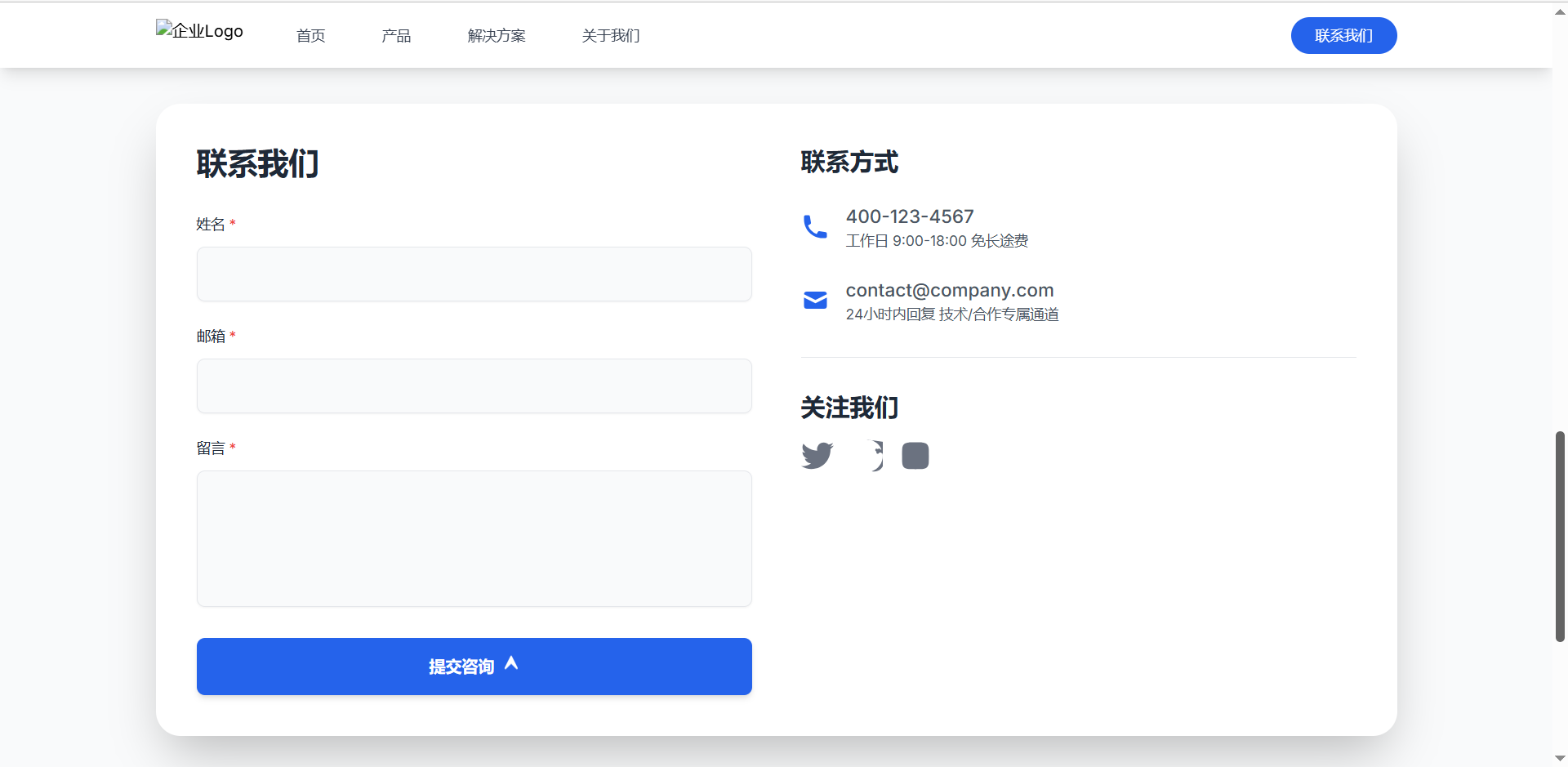
3.5 联系方式
1.1 整体容器
<section class="py-16 bg-gray-50">
  <div class="max-w-7xl mx-auto px-4 sm:px-4 lg:px-8">
代码解释:
-
section标签:py-16:设置上下内边距为16rem(约 256px),为内容区域提供充足的垂直空间。bg-gray-50:背景色为浅灰色(#f9fafb),与内部白色卡片形成对比,突出主体内容。
-
内部容器
div:max-w-7xl:限制最大宽度为 Tailwind 预设的7xl(1440px),避免内容在大屏下过宽。mx-auto:水平居中容器,确保页面布局平衡。px-4 sm:px-4 lg:px-8:响应式内边距,小屏幕(sm)和默认情况左右边距4rem(64px),大屏幕(lg)增加到8rem(128px),适配不同设备。
1.2 核心卡片区域(视觉焦点)
<div class="bg-white rounded-3xl shadow-2xl p-8 sm:p-10 lg:p-10">代码解释:
- 白色卡片容器:
bg-white:白色背景(#fff),与外层浅灰色形成高对比,突出内容区域。rounded-3xl:圆角半径3xl(12px),使卡片边角圆润,符合现代 UI 设计趋势。shadow-2xl:添加深度阴影(drop-shadow),模拟立体悬浮效果,增强视觉层次感。p-8 sm:p-10 lg:p-10:内边距控制内容与卡片边缘的距离,不同屏幕下微调(默认8rem,小屏幕和大屏10rem),确保内容不拥挤。
1.3 响应式网格布局(核心排版)
<div class="grid grid-cols-1 md:grid-cols-2 gap-12">代码解释:
- 网格布局核心类:
grid:启用 CSS 网格布局,实现灵活的列排列。grid-cols-1:默认(小屏幕,<768px>)下为单栏布局,内容垂直堆叠,适配手机端。md:grid-cols-2:中等屏幕及以上(md断点,≥768px)切换为双栏布局,左右分开展示内容(如表单和联系信息),提升大屏利用率。gap-12:网格列间距12rem(192px),确保两列内容有充足的水平空间,避免拥挤。
2. 表单区域
<!-- 表单区域 -->
        <div class="space-y-8">
          <h2 class="text-2xl font-bold leading-tight text-gray-800 md:text-3xl">联系我们</h2>
          <form class="space-y-6">
            <div>
              <label class="block text-sm font-medium text-gray-800 mb-3">
                姓名 <span class="text-red-500">*</span>
              </label>
              <input type="text" required class="w-full rounded-lg border border-gray-200 bg-gray-50 px-6 py-4 text-sm shadow-sm focus:outline-none focus:border-blue-600 focus:bg-white focus:shadow-lg">
            </div>

            <div>
              <label class="block text-sm font-medium text-gray-800 mb-3">
                邮箱 <span class="text-red-500">*</span>
              </label>
              <input type="email" required class="w-full rounded-lg border border-gray-200 bg-gray-50 px-6 py-4 text-sm shadow-sm focus:outline-none focus:border-blue-600 focus:bg-white focus:shadow-lg">
            </div>

            <div>
              <label class="block text-sm font-medium text-gray-800 mb-3">
                留言 <span class="text-red-500">*</span>
              </label>
              <textarea rows="5" required class="w-full rounded-lg border border-gray-200 bg-gray-50 px-6 py-4 text-sm shadow-sm resize-none focus:outline-none focus:border-blue-600 focus:bg-white focus:shadow-lg"></textarea>
            </div>

            <button type="submit" class="w-full bg-blue-600 text-white font-bold py-4 px-8 rounded-lg shadow-md hover:bg-blue-700 hover:shadow-lg focus:outline-none focus:shadow-xl active:bg-blue-600 transition-all duration-200 flex items-center justify-center">
    提交咨询
    <svg class="w-4 h-4 ml-2 animate-bounce" fill="currentColor" viewBox="0 0 20 20">
        <path d="M10.894 1.606a1 1 0 00-1.788 0l-7 14a1 1 0 001.581 1.581L10 11.08l6.125 6.124a1 1 0 001.581-1.581l-7-14z"/>
    </svg>
</button>
          </form>
        </div>
代码解释:
space-y-8:容器内子元素垂直间距为8,使标题与表单间距合理。leading-tight:紧凑行高,减少标题垂直空间。- 输入框
label:block:块级元素,单独占一行。text-sm font-medium:文字大小sm,中等粗细。mb-3:底部边距3,与输入框保持距离。
- 输入框
input:w-full:宽度占满父容器。rounded-lg:圆角lg(较大圆角)。border border-gray-200:灰色细边框。px-6 py-4:内边距,水平6,垂直4。shadow-sm:小阴影,增加立体感。focus:outline-none focus:border-blue-600:聚焦时去除默认轮廓,边框变蓝色。
- 按钮
button:rounded-lg shadow-md:圆角,中等阴影。hover:bg-blue-700:悬停时背景色变深。flex items-center justify-center:按钮内内容水平垂直居中。animate-bounce:图标添加跳动动画。
3. 联系信息区域
 <!-- 联系信息区域 -->
        <div class="flex flex-col justify-start space-y-8">
          <!-- 联系信息 -->
          <div>
            <h3 class="text-2xl font-bold text-gray-800">联系方式</h3>
            <div class="mt-6 space-y-6">
              <div class="flex items-center space-x-4">
                <svg class="w-7 h-7 text-blue-600" fill="currentColor" viewBox="0 0 20 20"><path d="M2 3a1 1 0 011-1h2.153a1 1 0 01.986.836l.74 4.435a1 1 0 01-.54 1.06l-1.548.773a11.037 11.037 0 006.105 6.105l.774-1.548a1 1 0 011.059-.54l4.435.74a1 1 0 01.836.986V17a1 1 0 01-1 1h-2C7.82 18 2 12.18 2 5V3z"/></svg>
                <div>
                  <p class="text-lg font-medium text-gray-600">400-123-4567</p>
                  <p class="text-sm text-gray-600">工作日 9:00-18:00 免长途费</p>
                </div>
              </div>

              <div class="flex items-center space-x-4">
                <svg class="w-7 h-7 text-blue-600" fill="currentColor" viewBox="0 0 20 20"><path d="M2.003 5.884L10 9.882l7.997-3.998A2 2 0 0016 4H4a2 2 0 00-1.997 1.884z"/><path d="M18 8.118l-8 4-8-4V14a2 2 0 002 2h12a2 2 0 002-2V8.118z"/></svg>
                <div>
                  <p class="text-lg font-medium text-gray-600">contact@company.com</p>
                  <p class="text-sm text-gray-600">24小时内回复 技术/合作专属通道</p>
                </div>
              </div>
            </div>
          </div>
代码解释:
flex flex-col justify-start:垂直弹性布局,内容左对齐。flex items-center space-x-4:图标与文字同行显示,水平间距4。border-t border-gray-200:顶部添加上边框,边框类型为灰色细边框,增强内容分区的视觉辨识度pt-8:上内边距8,与上方内容区分。- 社交图标
a标签:text-gray-500 hover:text-blue-600:默认文字灰色,悬停变蓝色。transition-transform duration-300:变换过渡效果,持续300ms,使悬停时的缩放动画平滑自然。transform hover:scale-110:默认无变换,悬停时图标放大到110%。sr-only:屏幕阅读器专用文本,视觉隐藏。
4. 关注我们区域
 <!-- 关注我们 -->
<div class="border-t border-gray-200 pt-8">
    <h3 class="text-2xl font-bold text-gray-800 mb-4">关注我们</h3>
  <div class="flex space-x-4">
        <!-- 第一个社交图标,假设为Facebook -->
        <a href="#" class="text-gray-500 hover:text-blue-600 transition-transform duration-300 transform hover:scale-110 focus:outline-none focus:text-blue-600 focus:scale-110">
            <span class="sr-only">Facebook</span>
            <svg class="w-8 h-8" fill="currentColor" viewBox="0 0 24 24">
                <path d="M24 4.557c-.883.392-1.832.656-2.828.775 1.017-.609 1.798-1.574 2.165-2.724-.951.564-2.005.974-3.127 1.195-.897-.957-2.178-1.555-3.594-1.555-3.179 0-5.515 2.966-4.797 6.045-4.091-.205-7.719-2.165-10.148-5.144-1.29 2.213-.669 5.108 1.523 6.574-.806-.026-1.566-.247-2.229-.616-.054 2.281 1.581 4.415 3.949 4.89-.693.188-1.452.232-2.224.084.626 1.956 2.444 3.379 4.6 3.419-2.07 1.623-4.678 2.348-7.29 2.04 2.179 1.397 4.768 2.212 7.548 2.212 9.142 0 14.307-7.721 13.995-14.646.962-.695 1.797-1.562 2.457-2.549z"/>
            </svg>
        </a>
        <!-- 其他社交图标同理 -->
   </div>
</div>
代码解释:
flex space-x-4:水平排列社交图标,间距统一(4rem),适配不同屏幕宽度,避免换行。w-8 h-8:图标尺寸固定为8rem,视觉整齐,小屏幕下仍易于点击。
效果展示:
3.6 页脚区域
1. 整体容器
<footer class="bg-gray-900 text-gray-300 py-12">
    <div class="max-w-7xl mx-auto px-4 sm:px-6 lg:px-8">
        <div class="grid md:grid-cols-4 gap-8">
代码解释:
md:grid-cols-4:中等屏幕及以上分为 4 列,分别展示公司信息、产品服务、关于我们、法律声明。gap-8:列间距为8,使各模块内容不拥挤。
2. 公司信息区域
<!-- 公司信息 -->
            <div>
                <img src="" alt="企业Logo" class="h-8 w-auto mb-5">
                <p class=" flex items-center">
                    为企业提供全方位的<br>数字化转型方案
                </p>
                <div class="flex space-x-3 mt-5">
                    <a href="#" class="text-gray-400 hover:text-blue-400 transition-colors">
                        <i class="fab fa-facebook-f"></i>
                    </a>
                    <a href="#" class="text-gray-400 hover:text-red-400 transition-colors">
                        <i class="fab fa-instagram"></i>
                    </a>
                    <a href="#" class="text-gray-400 hover:text-green-400 transition-colors">
                        <i class="fab fa-whatsapp"></i>
                    </a>
                </div>
代码解释:
img:展示企业 Logo,h-8 w-auto确保尺寸适配。- 社交图标:通过
flex space-x-3水平排列,hover:text-*实现悬停变色,fab类引用 Font Awesome 品牌图标。
3. 导航模块(产品服务 / 关于我们 / 法律声明)
<div>
  <h4 class="text-white font-medium mb-4">产品服务</h4>
  <ul class="space-y-2 text-sm">
    <li>
        <a href="#" class="hover:text-blue-400 transition-colors flex items-center space-x-2">
        <i class="fas fa-cog"></i>
        <span>提供解决方案</span></a>
    </li>
        <!-- 其他列表项同理 -->
  </ul>
</div>
代码解释:
flex items-center space-x-2使图标与文字同行显示,fas类引用 Font Awesome 常规图标,hover:text-blue-400悬停变色。
4. 版权声明
<div class="border-t border-gray-800 mt-12 pt-8 text-center text-sm">
  <p>© 2024 科技企业. 保留所有权利</p>
  <p class="mt-2">联系方式: <a href="mailto:info@example.com" class="text-blue-400 hover:underline">info@example.com</a></p>
</div>
代码解释:
mt-12 pt-8:顶部外边距和内边距,拉开与上方内容的距离。text-blue-400 hover:underline链接颜色与悬停下划线效果。
效果展示:

总结:
经过前三章的实战,相信你已经掌握了构建企业网站的方法,并对 tailwind css 更加的熟悉。当然,若想获取更多的网站模块可进入 Kooboo官网 查看下载哦~


 扫一扫
扫一扫


 1035
1035

 被折叠的 条评论
为什么被折叠?
被折叠的 条评论
为什么被折叠?
 到【灌水乐园】发言


